Contact Sheet of Discarded Plastic

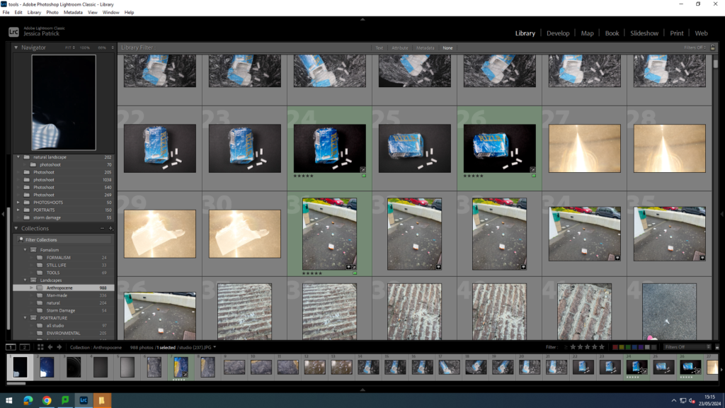

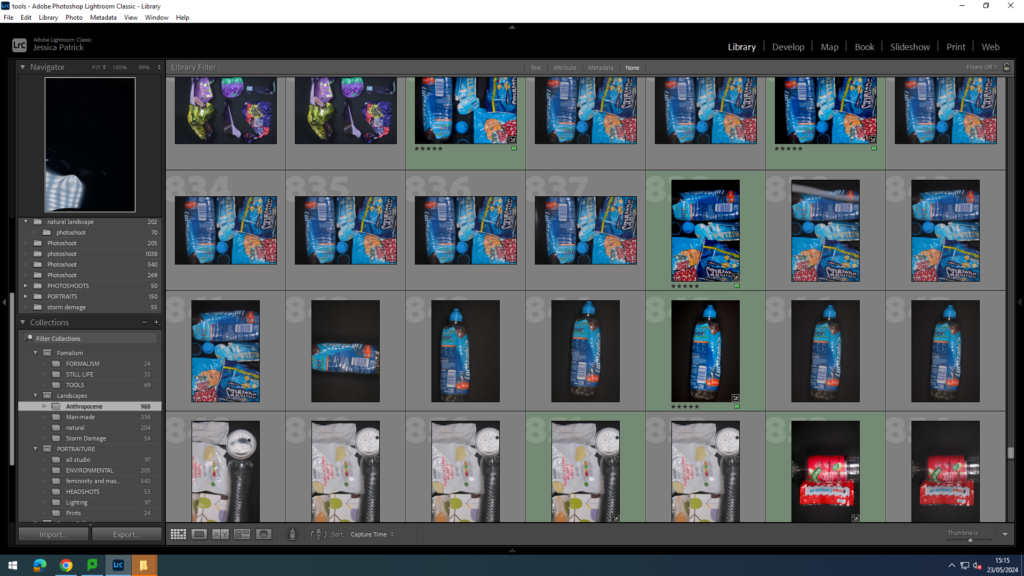


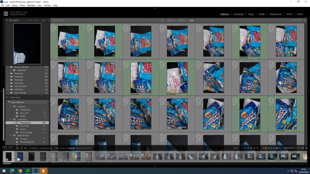
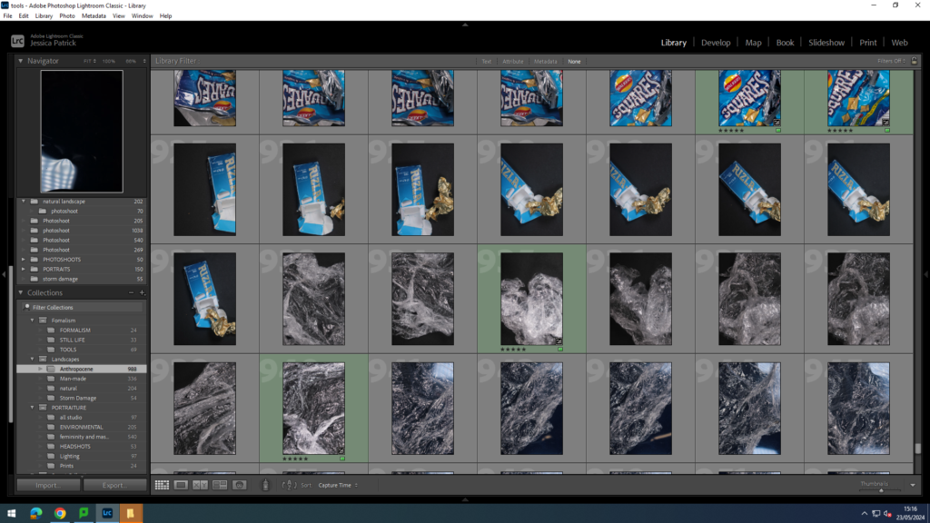


For this photoshoot, I used all the discarded plastic that I had collected from my response to Edward Burtynsky at Harve de Pas beach and Green Street Cemetery. I used the schools studio for these images and I displayed my discarded plastics out on a black sheet in a pattern, with different colours.
Edits


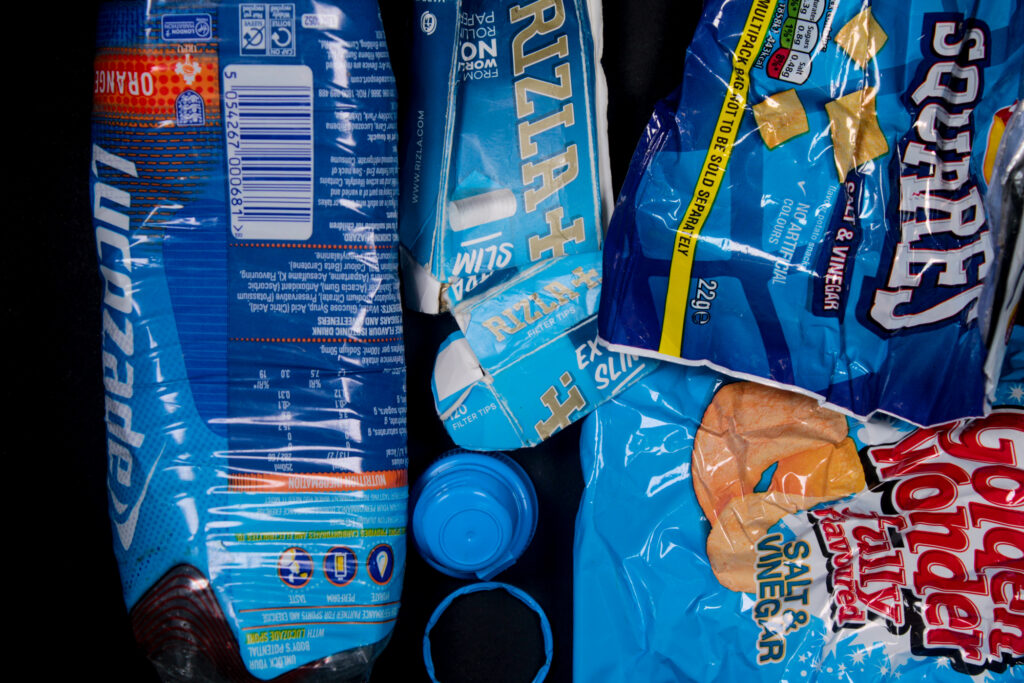
I edited this image by increasing the exposure, contrast, shadows, vibrancy and saturation, while decreasing the highlights and blacks. I did this, so the black background was more of a solid black, instead of having greyer tones. I increased the vibrancy, so that the blue litter would be more vibrant and stand out more against the black background.

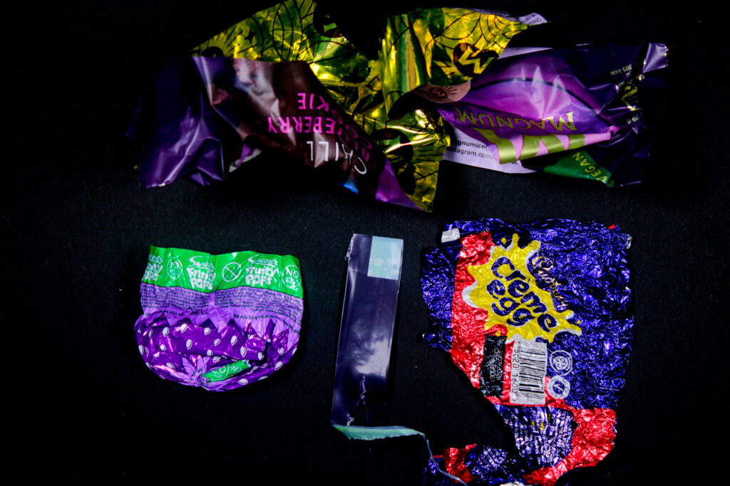
I edited this image by increasing the exposure, contrast, shadows, vibrancy and saturation, while decreasing the highlights, whites and blacks. I did this, so the black background was more of a solid black, instead of having greyer tones. I also wanted to make the purple litter pop more and be more vibrant against the black background.

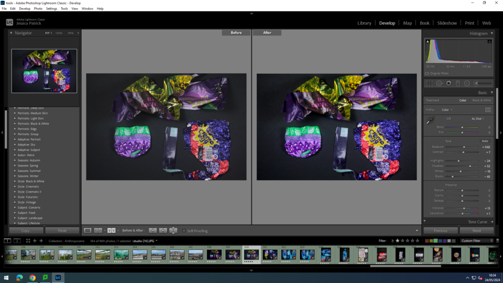
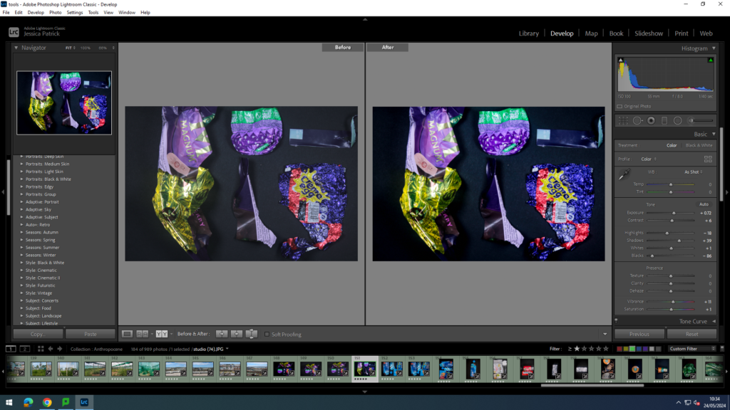
I edited these images in the same way, but I experimented with the placement of the discarded litter, so that I could find the most aesthetic pattern.

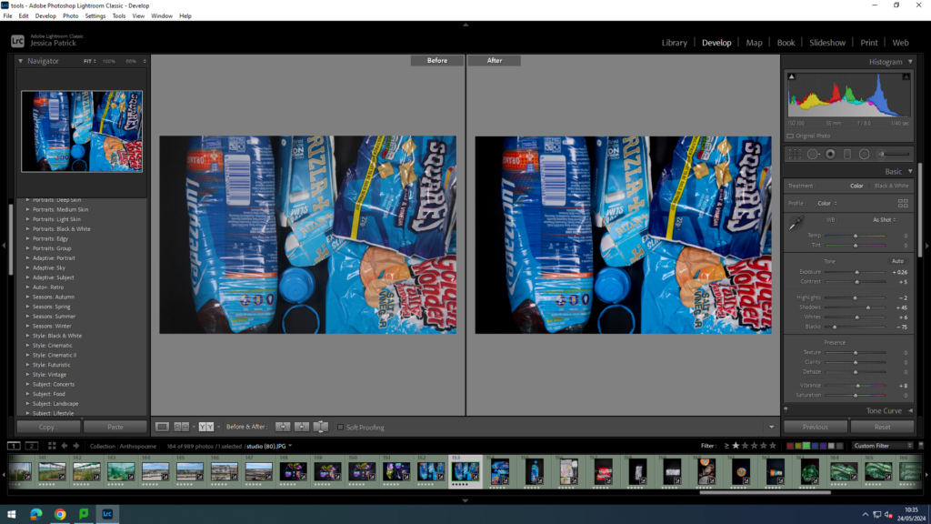
I edited this image by increasing the exposure, contrast, shadows, white and vibrancy,, while decreasing the highlights and blacks. I did this, so the black background was more of a solid black, instead of having greyer tones. I also wanted to make the blue litter stand out more and be more vibrant and eye catching.

I then experimented with the way I presented the litter, so I could find the most appealing pattern.

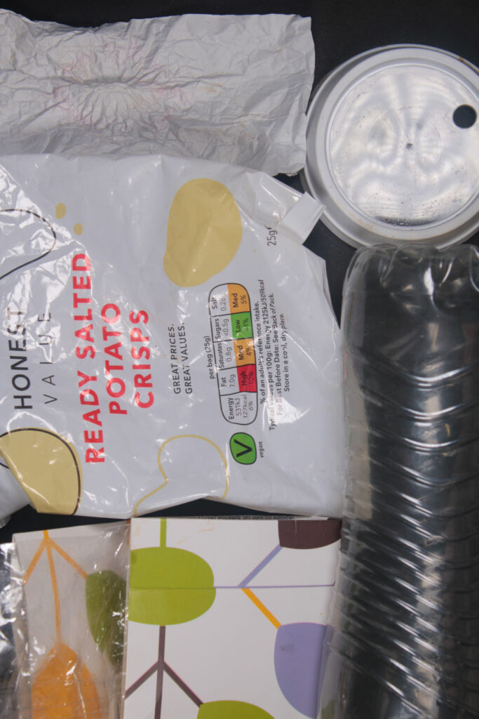
I edited this image by increasing the exposure, contrast, shadows, whites, vibrancy and saturation, while decreasing the highlights and blacks. I did this, so the black background was more of a solid black, instead of having greyer tones. I wanted the white and clear colours to stand out more especially against the black background. I especially wanted the clear rubbish to stand out more, as it can be very hard to be seen.

I edited this image by increasing the exposure, contrast, shadows, vibrancy and saturation, while decreasing the whites, highlights and blacks. I did this, so the black background was more of a solid black, instead of having greyer tones. I also wanted the red colours to stand out more and be more vibrant.
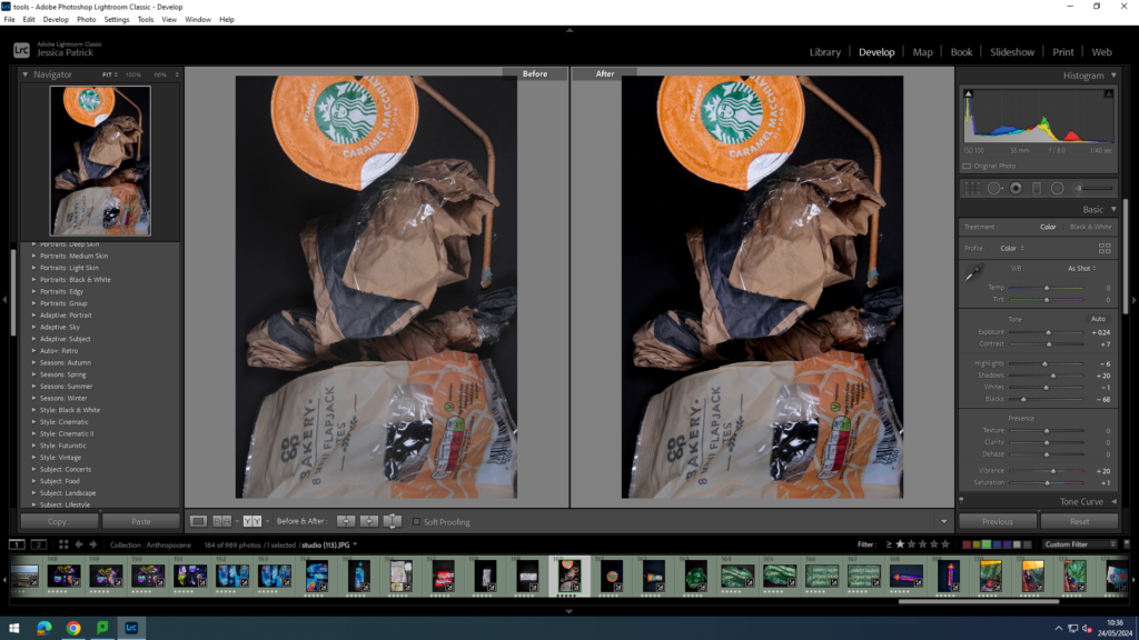
I edited this image by increasing the exposure, contrast, shadows, vibrancy and saturation, while decreasing the highlights and blacks. I did this, so the black background was more of a solid black, instead of having greyer tones. I also wanted the beige tones to stand out more, as they are not as eye capturing or vibrant.
Next, I experimented with single object photos, which Barry Rosenthal did not really do.


I edited these images by increasing the exposure, contrast, shadows, whites, vibrancy and saturation, while decreasing the highlights and blacks. I did this, so the black background was more of a solid black, instead of having greyer tones. I wanted the metallic silver to stand out more and look more metallic and shiny.

I edited this image by increasing the exposure, contrast, shadows, whites, vibrancy and saturation, while decreasing the highlights and blacks. I did this, so the black background was more of a solid black, instead of having greyer tones. I wanted the blue and orange colours in the bottle to be more vibrant and stand out more against the black background.

I edited this image by increasing the exposure, contrast, shadows, vibrancy and saturation, while decreasing the whites, highlights and blacks. I did this, so the black background was more of a solid black, instead of having greyer tones. I wanted this beige/ orange colour to stand out more, as it is not very vibrant.
Then, I experimented with different angles of this.

I edited this image by increasing the exposure, contrast, shadows, whites, vibrancy and saturation, while decreasing the highlights and blacks. I did this, so the black background was more of a solid black, instead of having greyer tones. I also wanted the green and orange colours to stand out more.

I edited this image by increasing the exposure, contrast, shadows, whites, vibrancy and saturation, while decreasing the highlights and blacks. I did this, so the black background was more of a solid black, instead of having greyer tones. I also wanted to make the bag much more vibrant and more of a darker green.
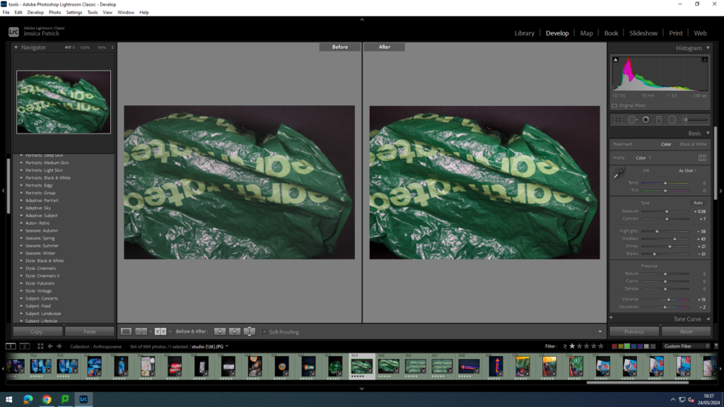


I edited these images in the same way, but experimented with different angles.


I edited this image by increasing the exposure, contrast, shadows, vibrancy and saturation, while decreasing the whites, highlights and blacks. I did this, so the black background was more of a solid black, instead of having greyer tones. I wanted the colours to be much more vibrant as well, as there is many colours on there.


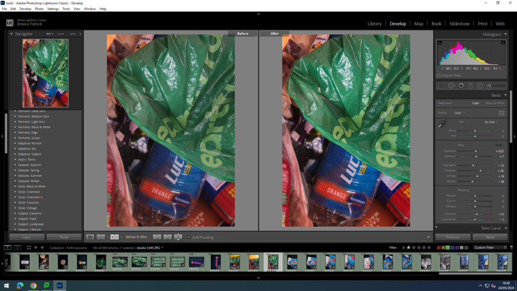
I edited this image by increasing the exposure, contrast, shadows, vibrancy and saturation, while decreasing the highlights and blacks. I did this, so colours would be much more vibrant, as there is so many colours displayed.

I edited this image by increasing the exposure, contrast, shadows, vibrancy and saturation, while decreasing the highlights and blacks. I did this, so the black background was more of a solid black, instead of having greyer tones. I wanted the different range of blues and colours to be more vibrant.


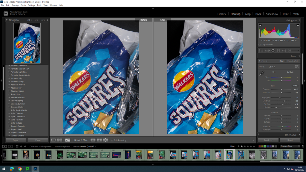

I edited these in the same way, but experimented with the placement of the rubbish.
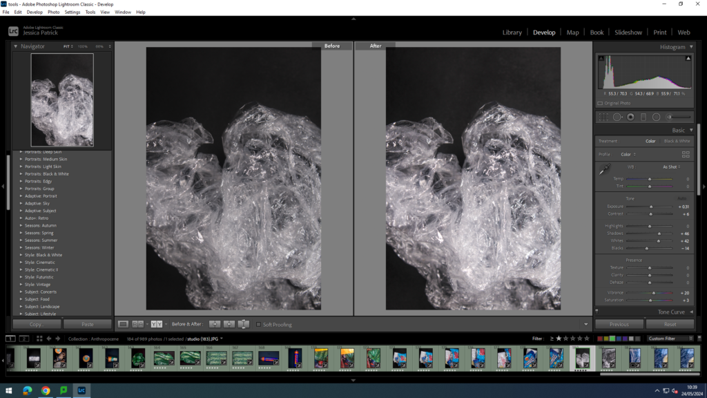

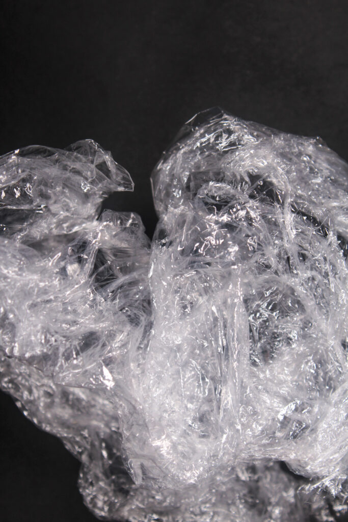
I edited this image by increasing the exposure, contrast, shadows, whites, vibrancy and saturation, while decreasing the highlights and blacks. I did this, so the black background was more of a solid black, instead of having greyer tones. I also wanted the white sections of the cling film to be more of a purer white, rather than more grey.
Experimenting
Me and Katie then experimented with the litter by trying to create a natural environment artificially by using the litter. We tried creating a beach scenery using cling film, yellow rubbish and blue gels.

I edited this image by increasing the exposure, contrast, shadows, whites, vibrancy and saturation, while decreasing the highlights and blacks. I did this so the white would be a purer white and the blue more vibrant, like the ocean.

I edited this image by increasing the exposure, contrast, shadows, whites, vibrancy and saturation, while decreasing the highlights and blacks. I did this so the white would be a purer white and the blue more vibrant, like the ocean. I also wanted to gold/yellow rubbish to be more vibrant and more yellow.


I edited these two images the same, but experimented with my placement of the ‘sand.’
Process
I collected this plastic from Harve Des Pas Beach with Katie.

We collected all the rubbish into a plastic bag and brought it into school. We then arranged the rubbish into patterns and colours on a black card and took photos from a birds eye angle. We also took single shots of the rubbish.
How does this relate to the Theme of Anthropocene
These images relate to the theme of Anthropocene, because it shows the amount of discarded plastic that is littered along our beaches. It also somehow creates beauty out of the discarded plastic, by creating patterns and colour coordinating them. I think the message behind this is that most people do not recognise the effect it is having on the environment, just as they do not recognise the pictures are of discarded plastic at first glance.
How this photoshoot relates to Barry Rosenthal
This photoshoot relates to Barry Rosenthal, because she took photos of discarded plastics that she had found and colour coordinated it and created visually pleasing patterns out of them. She also used a birds eye view as well as a black background in most of her images. However, I also wanted to try create something of my own. Barry Rosenthal created beauty out of this plastic, so me and Katie tried to create a beach setting out of our litter, as we find the beach beautiful as well. I also took single shots of the discarded plastic, which Barry Rosenthal didn’t really do.
Top 11 Final Images

