Anthropocene:
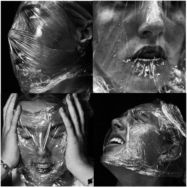
For Anthropocene, I decided to stick to the theme of plastic to focus on for my edited images, so the photos would all link to one theme.

I really like these images and how they were all the same but portraying different emotions, but I wanted to add more. So, I then made them black and white using Adobe Photoshop:

Whilst editing, I increased the brightness and contrast to clearly show the textured lines within the plastic around her face. I also increased the red hue to exaggerate the colour of her lips and cheeks. I really liked these images so I continued further to crop the photos to make them square, and add them into a grid layout.

I think these are really successful images, and I’m happy with the structure of using a grid to produce them. I’m using these photos for my final images because I really like the black and white contrast and how the light reflects off the plastic, so the crumpled texture is clear to see.
Landscapes:

I only chose to use two photos for my final images as I felt they were my strongest and best images I edited. I also think that none of my other photos would link as well as these ones do together.
Topographics:

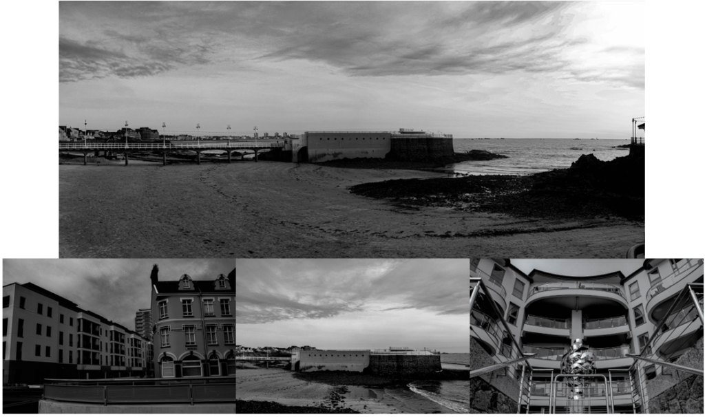
I really like these images because I edited them similarly, so it shows that they were all taken on the same day. I chose to edit them in black and white because I was inspired by the photographer Robert Adams, who focuses on landscape photography and edits his photos into black and white.
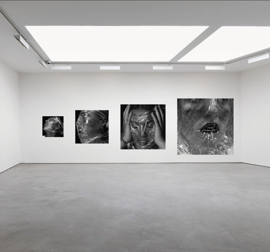
Virtual Gallery:


