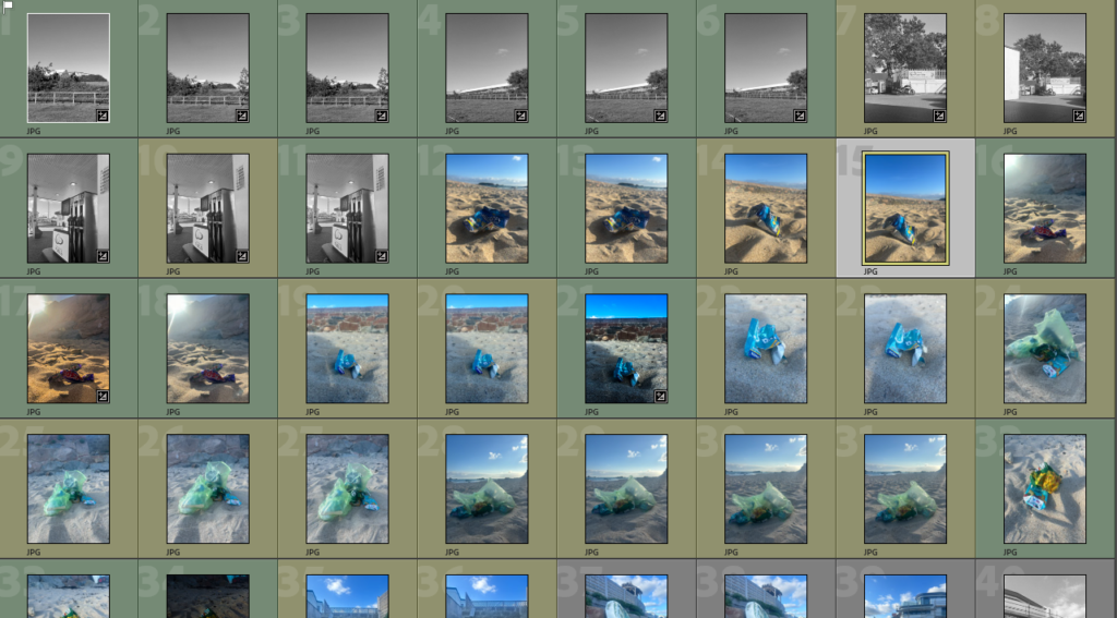
These are some of my images from my photoshoot. I colour labelled them to know which ones were good, and which ones weren’t as good.
These are my final edited images.

I took this picture at a beach, this is because my artist reference also did similar. I like how the colours are vibrant, how the sun reflects off the wrapper, and how the sand looks golden as if it was glorifying littering.

In this image, I like how the colour of the chewing gum packet, nearly matches the colour of the sky. I also like how the shadow enters the picture, as if it was coming in to the whole photo. This gives off a negative, depressing view on littering.

I like the different colours in this picture. I also like the simple but bold statement this photo gives off.

In all my photos, I tried to be as dramatic as possible as Andy Hughes also was in his pictures. I like these images best as I think they look best to represent Andy Hughes work. I liked working with the same style he used as it is different and fun, but also shows a deep meaning in to how our world is affected through human input.
