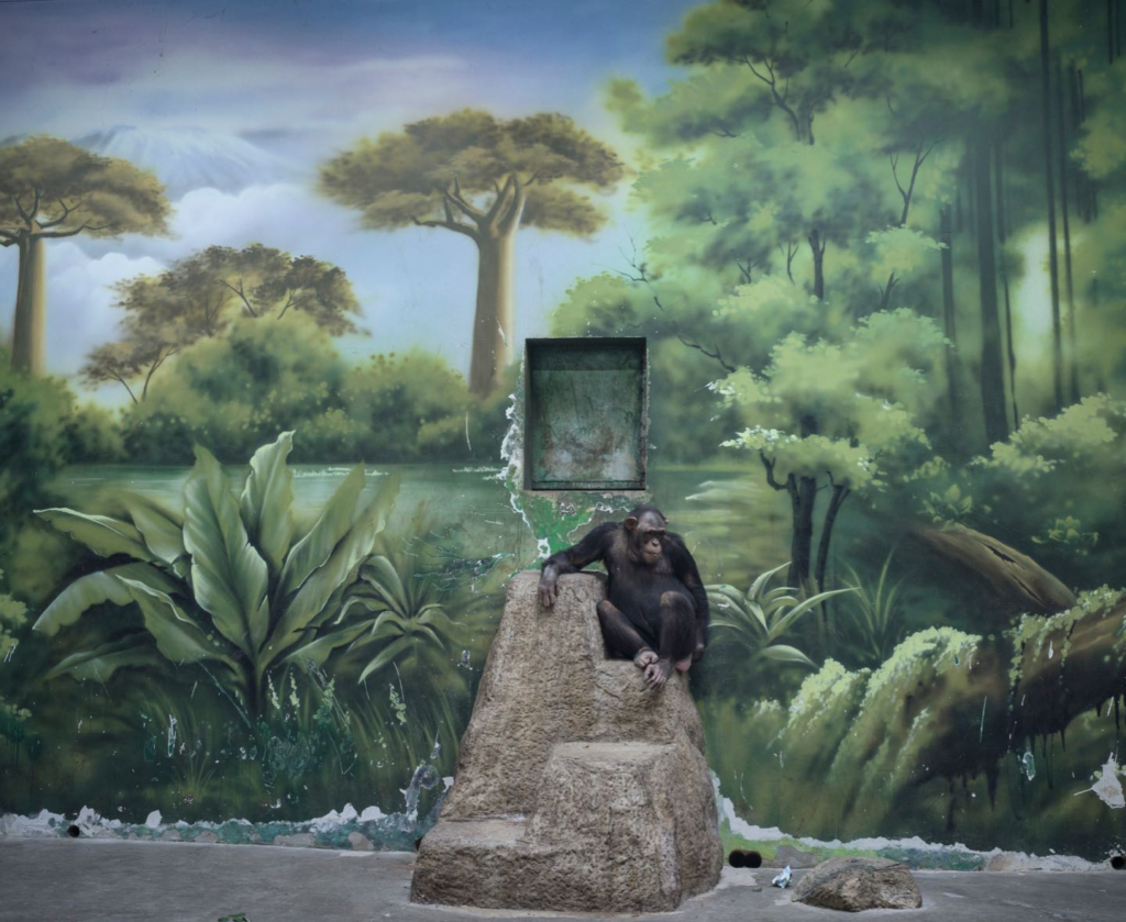
Comparing my work with Nelson’s work:


I chose to compare these photos as they are both similar animals with similar colours within them. Both animals in the photos sort of look lost and isolated. They both display Anthropocene as they are both of animals who are kept in habitats rather than their natural environments due to humans putting them in there for entertainment which zoos provide people.
Testing layouts:

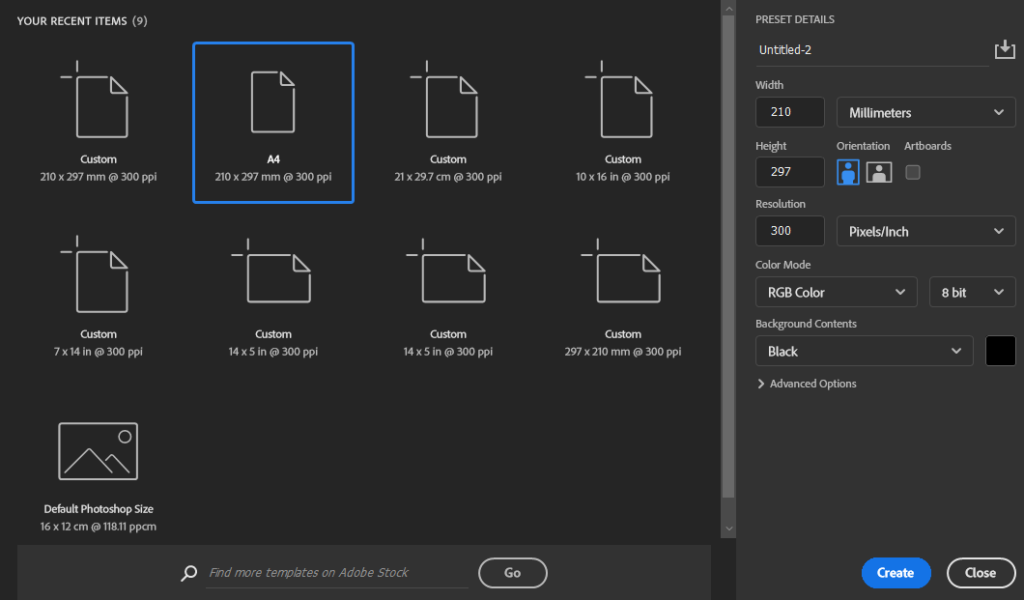
To create the background for my layouts I selected A4 and changed the background contents to black.

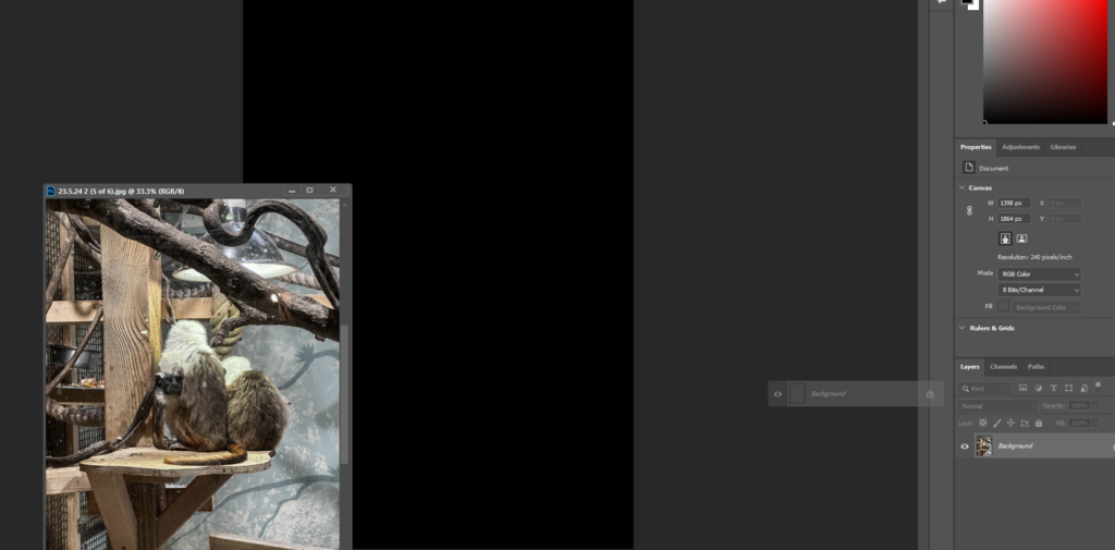
To then place each of the images onto the background I dragged that layer onto the background and adjusted it to fill one quarter of the image.


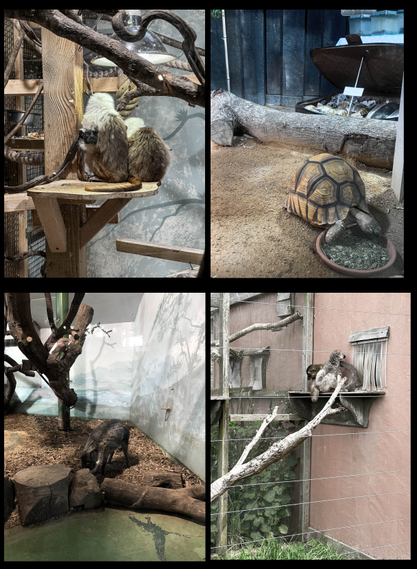
I prefer the second layout as I like the way the wood matches up with the other branch in the photo next to it on the bottom row as it makes the images flow more.
