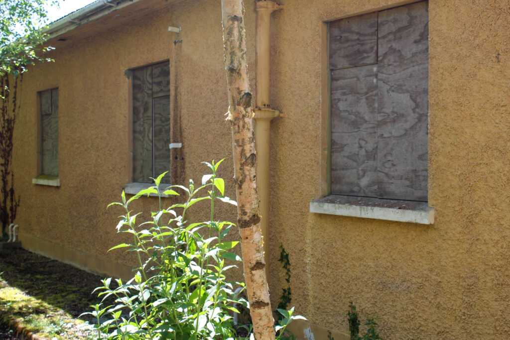
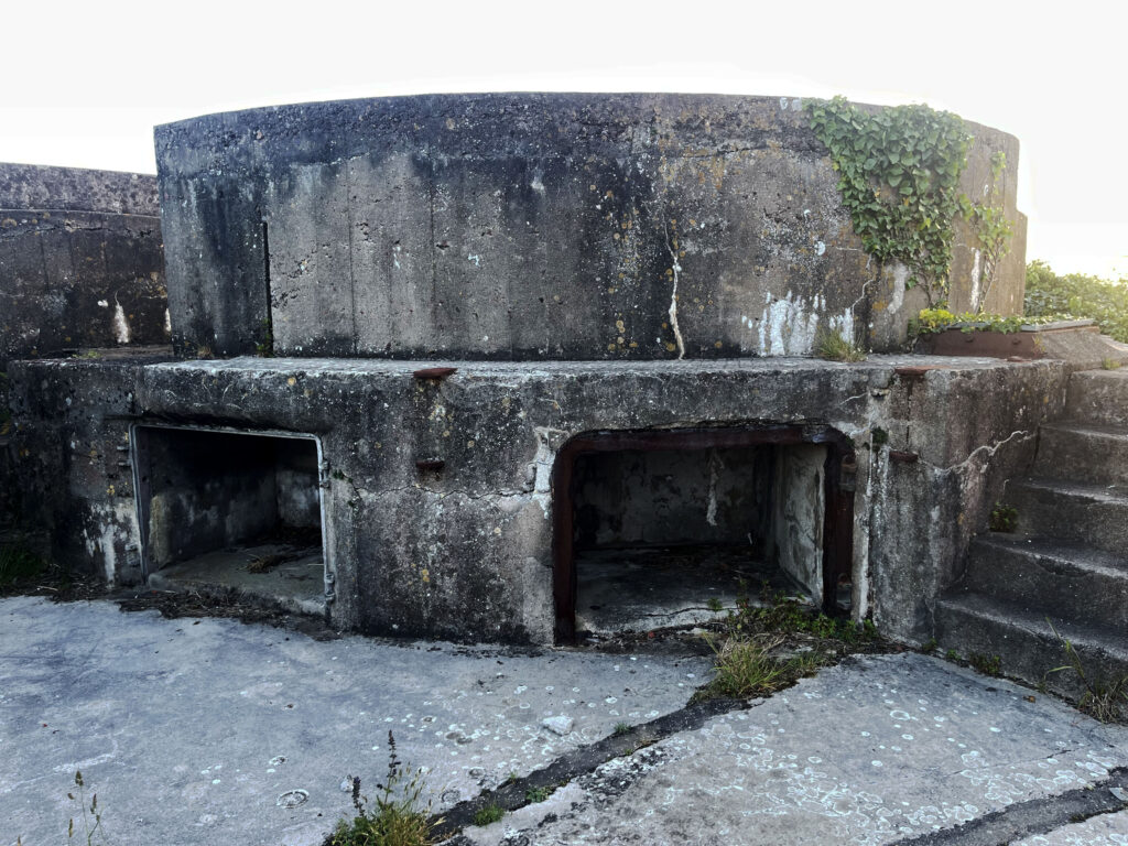
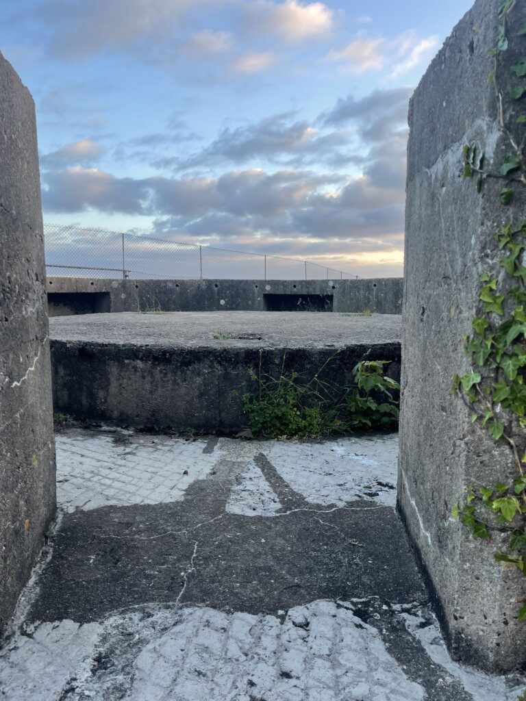
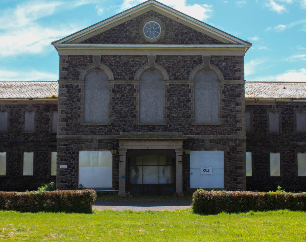
In my final photoshoot I focused on the abandoned St Saviours Hospital that went out of use in 2014 as I felt this property was extremely relevant to my work on the Anthropocene.
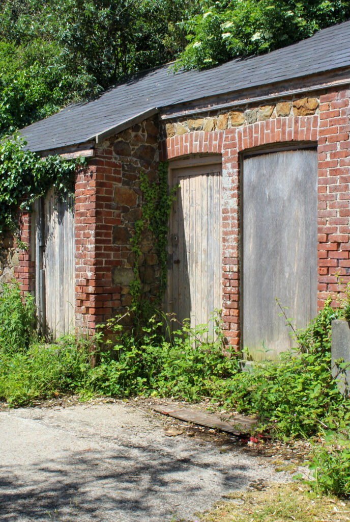
St Saviours hospital is the modernised name of the institution that used to be known as the Jersey Lunatic Asylum – its name being this for nearly 100 years. Its foundation stone was laid on Saturday the 29th of July, 1865 after a long 20 years of the States being criticised for acknowledging that people with learning disabilities and mental health issues needed care in 1847, as this was a period of time where mental health was stigmatised and stereotyped into being clinically insane. Due to this, there was a large reluctance to building this property as a purpose-built asylum however the plans eventually came into play. Within this asylum, levels of care differed in copious amounts. For example, the less ‘severe’ patients would recieve the relatively highest amount of care that could be offered in this undeveloped medical period whilst those who suffered with greater mental health issues were ‘treated like animals’, kept in outhouses on the perimeter in appalling and inhumane conditions. Those who did not reside on the premises were sent to asylums off island in France or England, however others were kept within the General Hospital of which practiced as a poor house and hospital at the time.
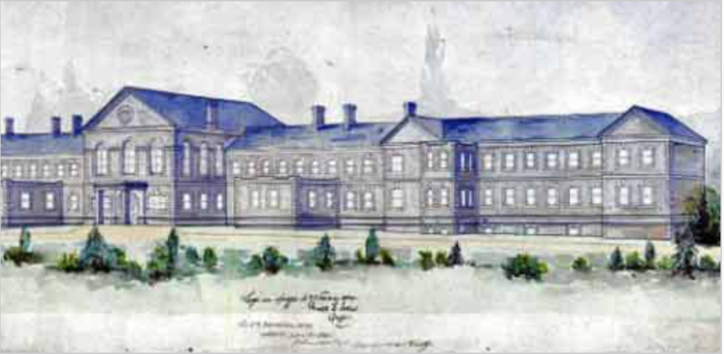
Once the institution had been built, Dr John James Jackson was appointed as the Medical Superintendent in 1868, March 27th. This was when the first 12 patients become admitted from the General Hospital on the following months to come. Each year ‘inmates’ (as named by the press at the time) were taken out around the island to hold an annual picnic, an event that came across somewhat stiff and a rather militaristic affair, with the patients called back to their vehicles with a bugle call, at the sound of which they would all fall in.
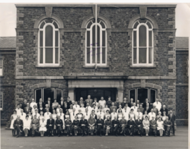
Its name was changed to the Jersey Mental Hospital in 1952 and then again to St Saviour’s Hospital in 1963, however in 2014 its closure occurred due to a new premises being built with two wards consisting of 28 acute assessment and treatment beds. Here, patients finally became treated in a more caring and conscious way in comparison to its neighbours past.
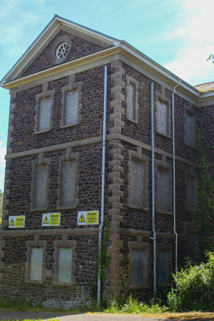
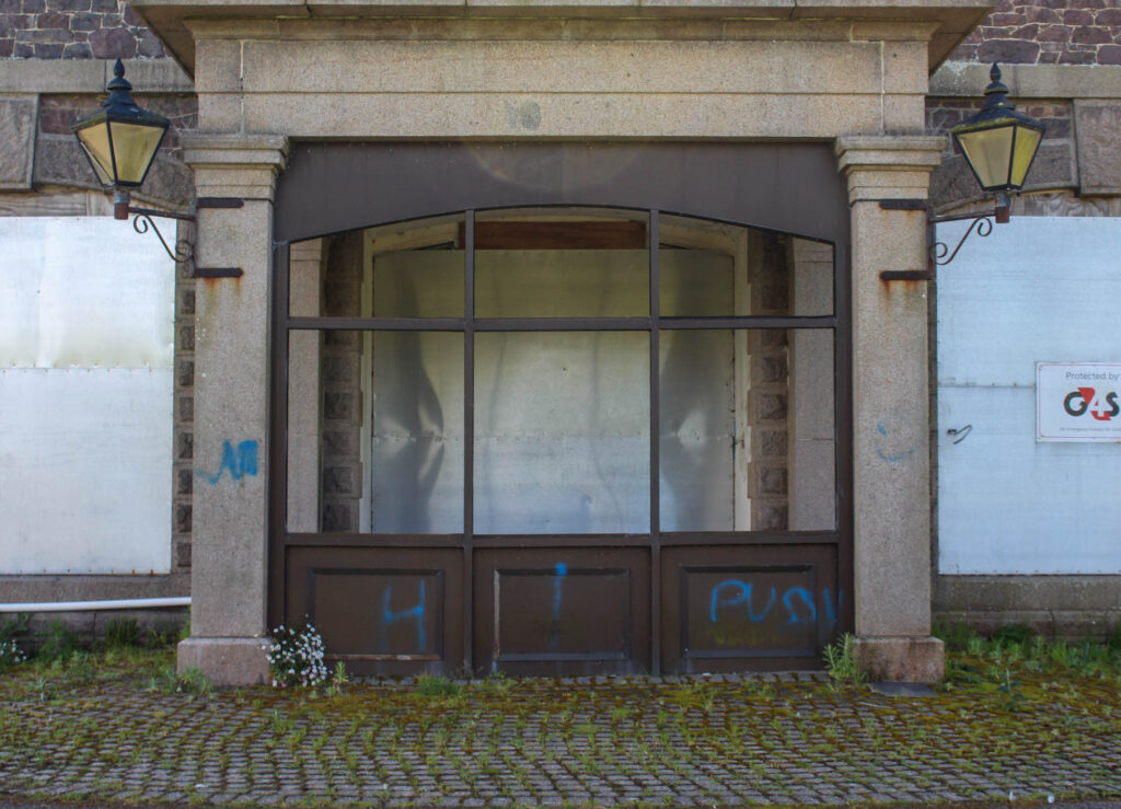
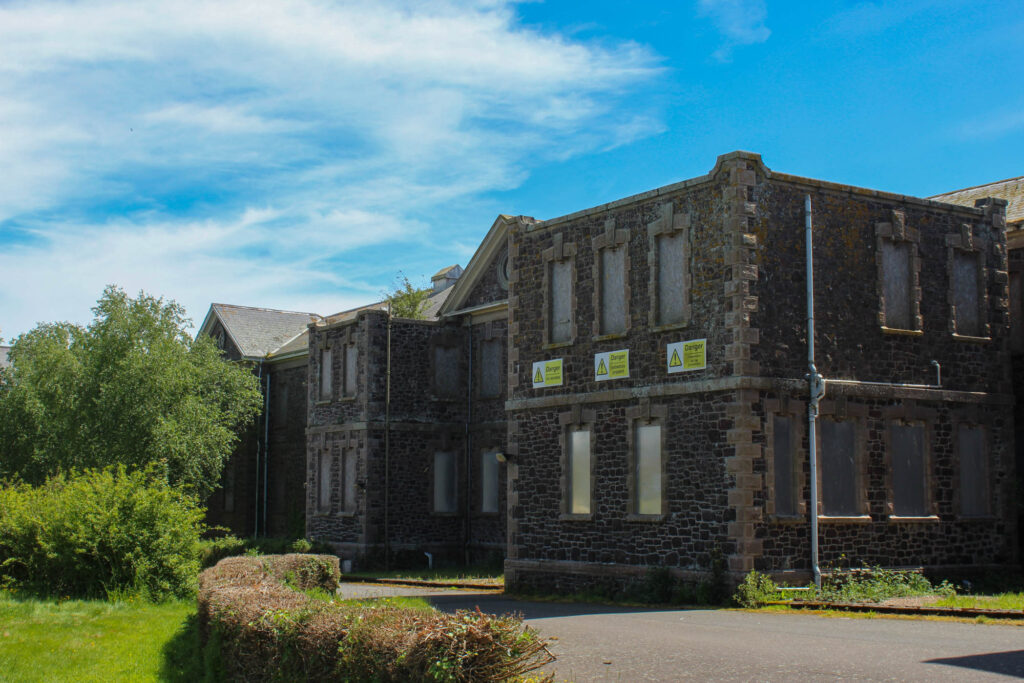
The site now remains here desolate with its blank exterior sticking up out of the overgrown vegetation abandoned for decades, with several proposals for redevelopment of the site worth approximately £15 million.
MY PHOTOSHOOT:
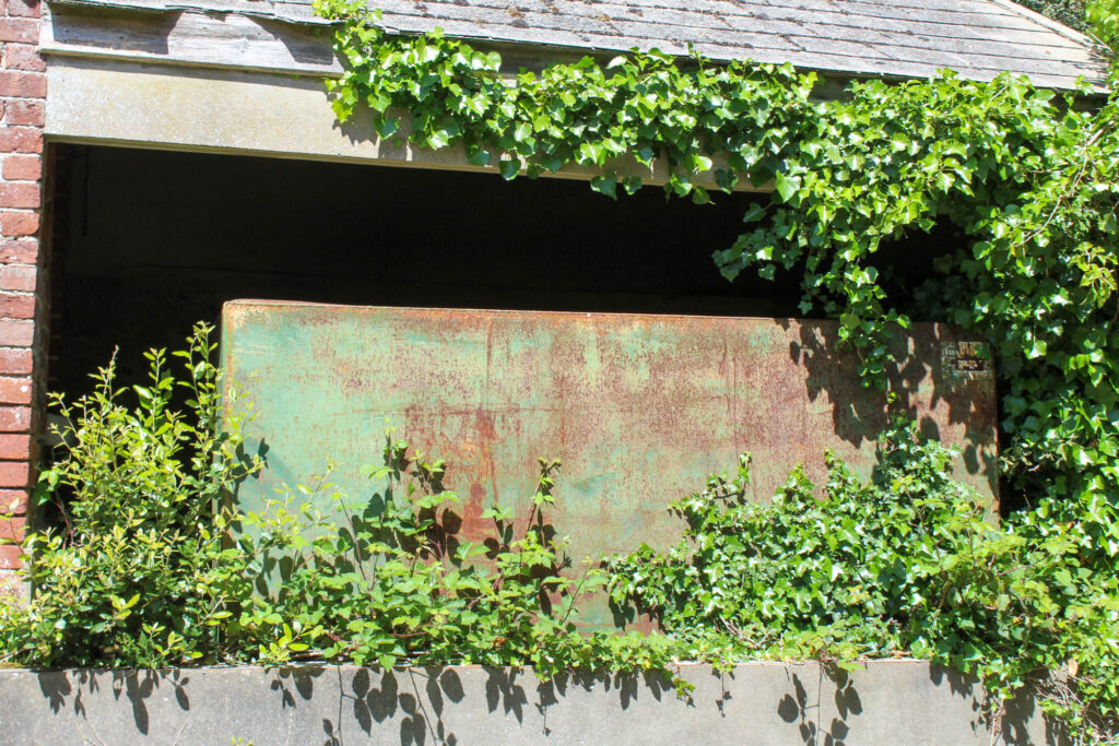
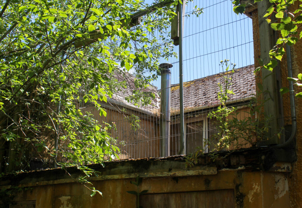
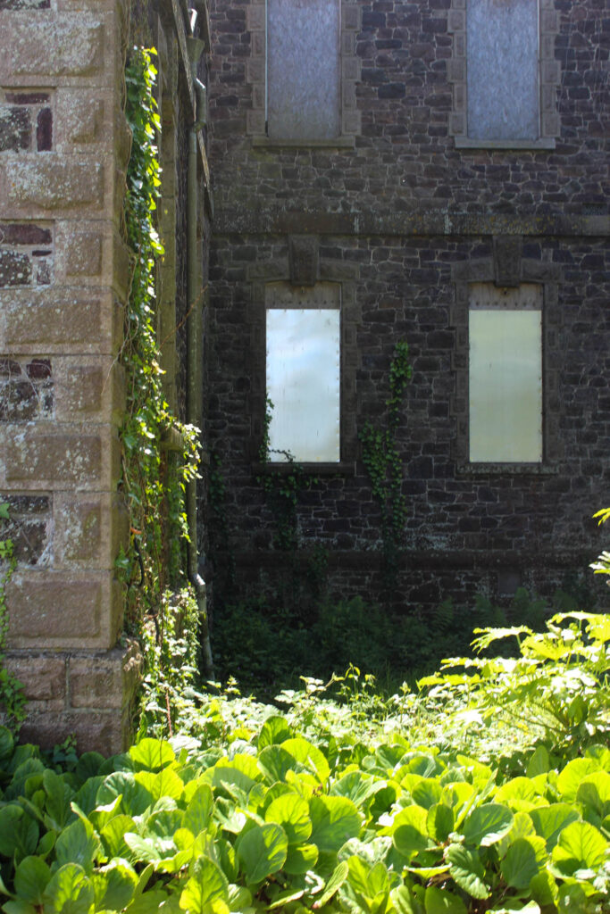
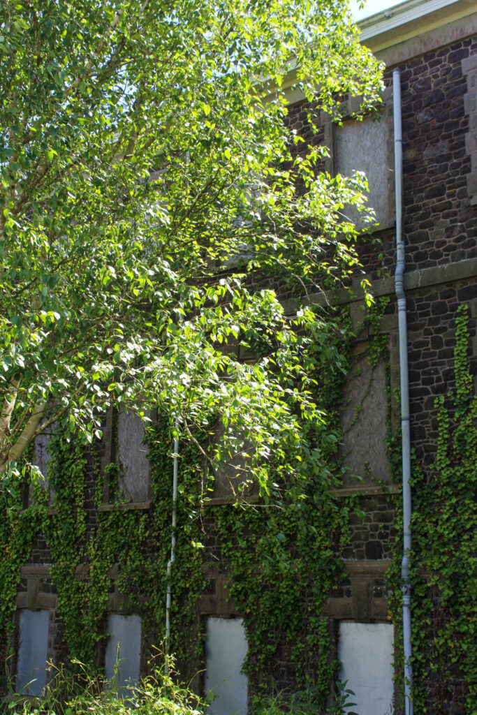
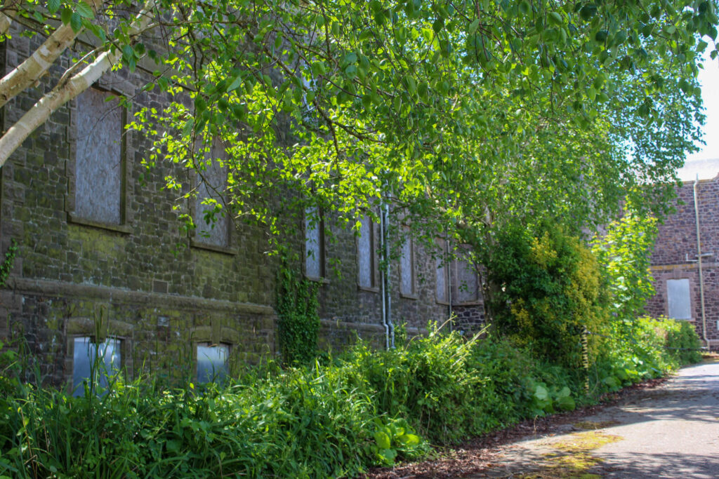
I really wanted to photograph this site as I feel as if it shows a lighter side to the Anthropocene. What I mean by this is that the growth of this greenery over the eerily abandoned asylum shows that something beautiful can come from something that carries so much pain. Alongside this, I feel this is extremely representative of how these deserted properties and structures cause the natural landscape to move in an unruly manner, climbing over it due to it restricting the natures free and usual pattern of growth and forcing it to twist and turn in artificial ways due to this neglecting. I also think that it shows how humanity’s own ignorance prevails and projects into the plants, absorbing this neglecting and portraying this through their wild patterns.
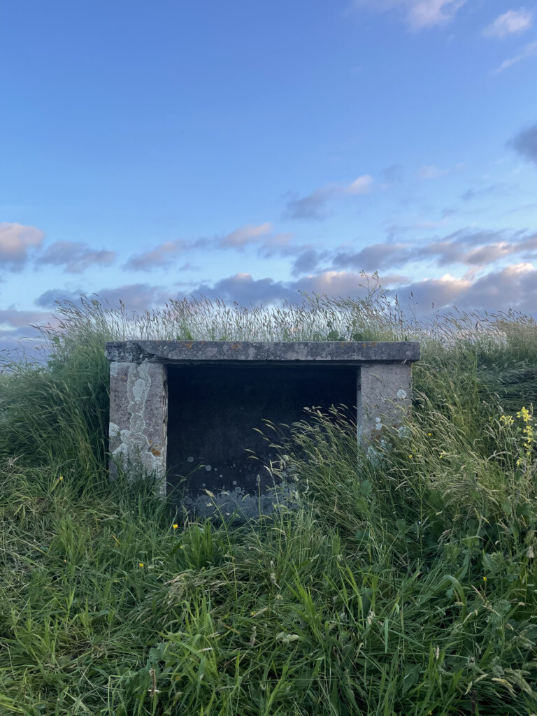
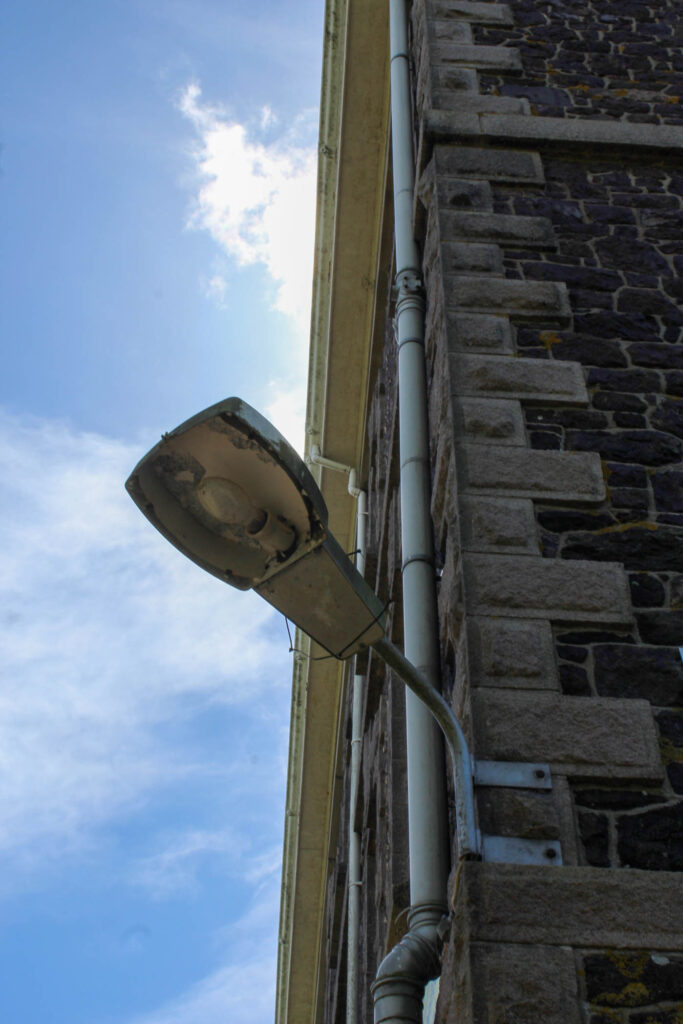
I think the context behind this structure really adds a diffrent perspective towards the Anthropocene. Alongside this, as it was built in the 1800s, there is a clear difference in terms of aesthetics in comparison to neighbouring properties due to modernisation. For example, this was built using a brown and cream colour scheme, using granite bricks to build it. As well as this, the outhouses found have a similar enigmatic tone to them.


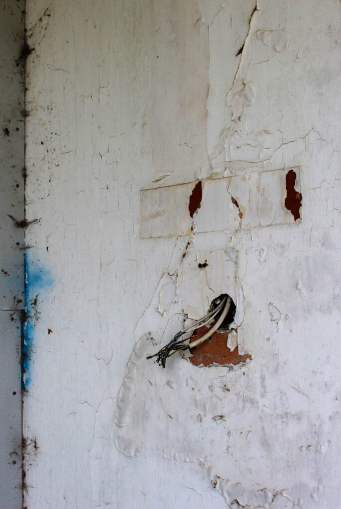
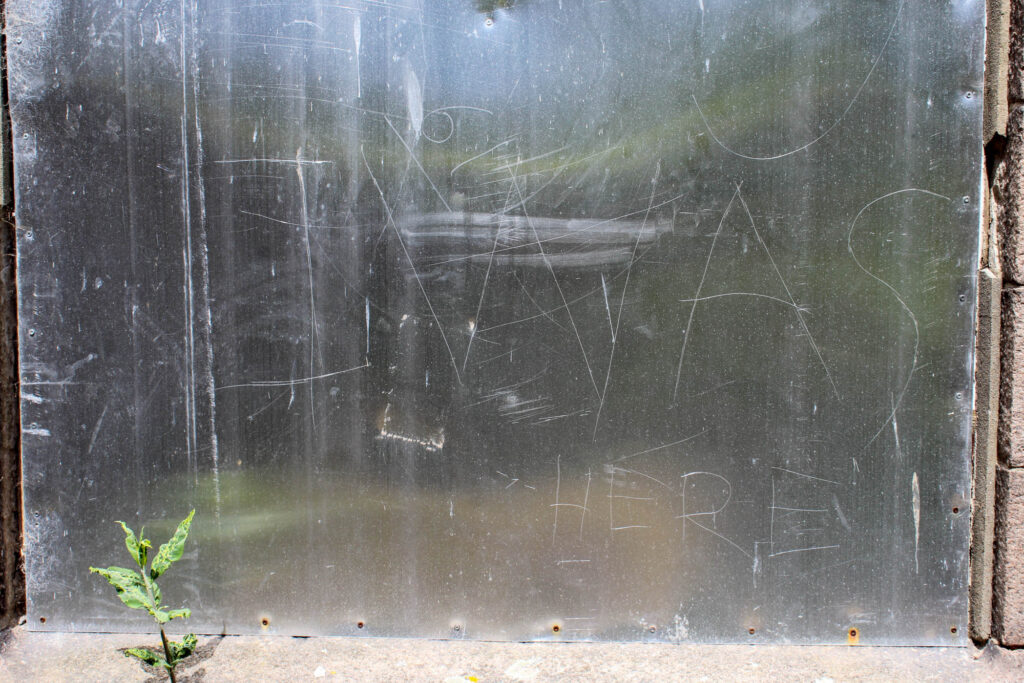
THE OUTHOUSES:
