Here are my final images.
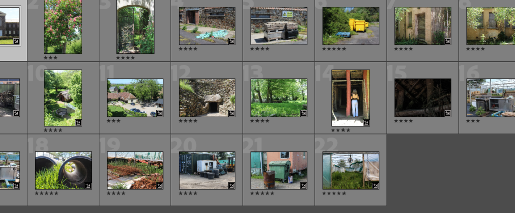
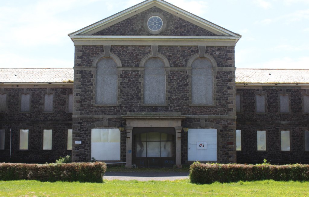
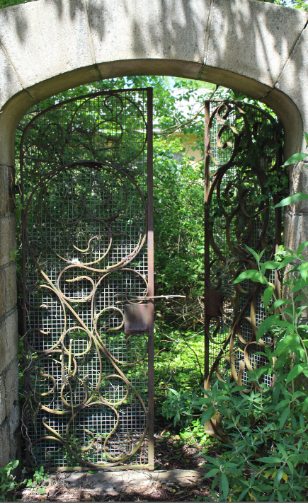
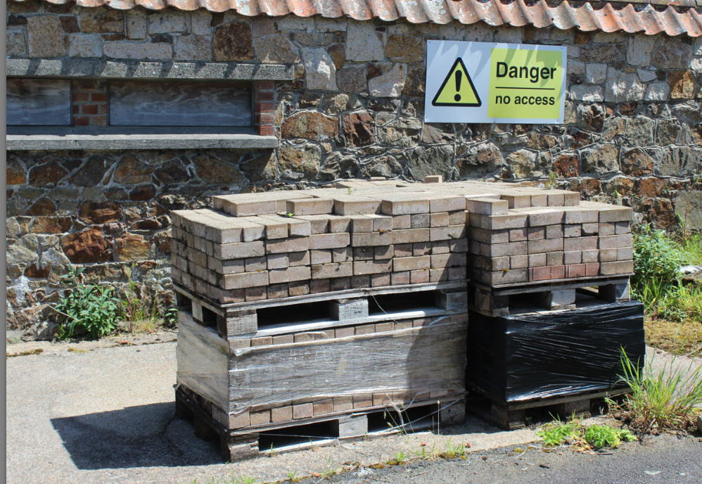
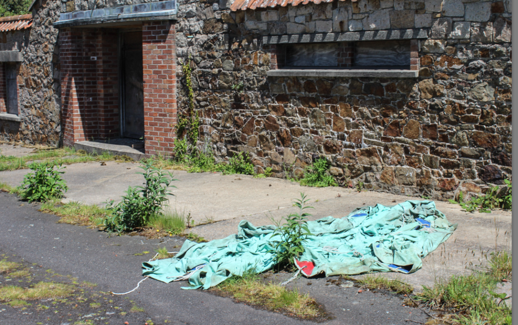
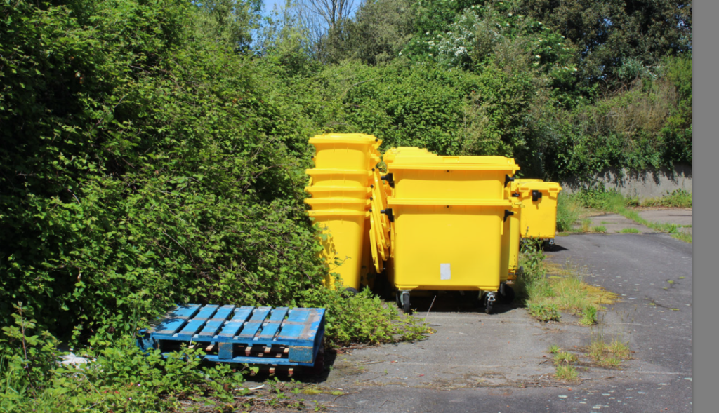
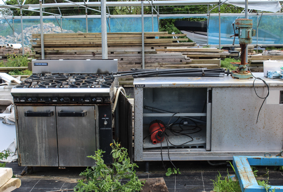
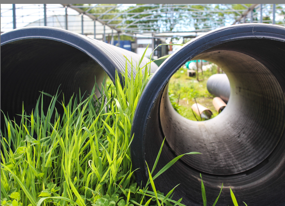
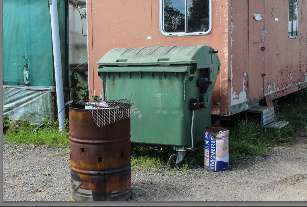
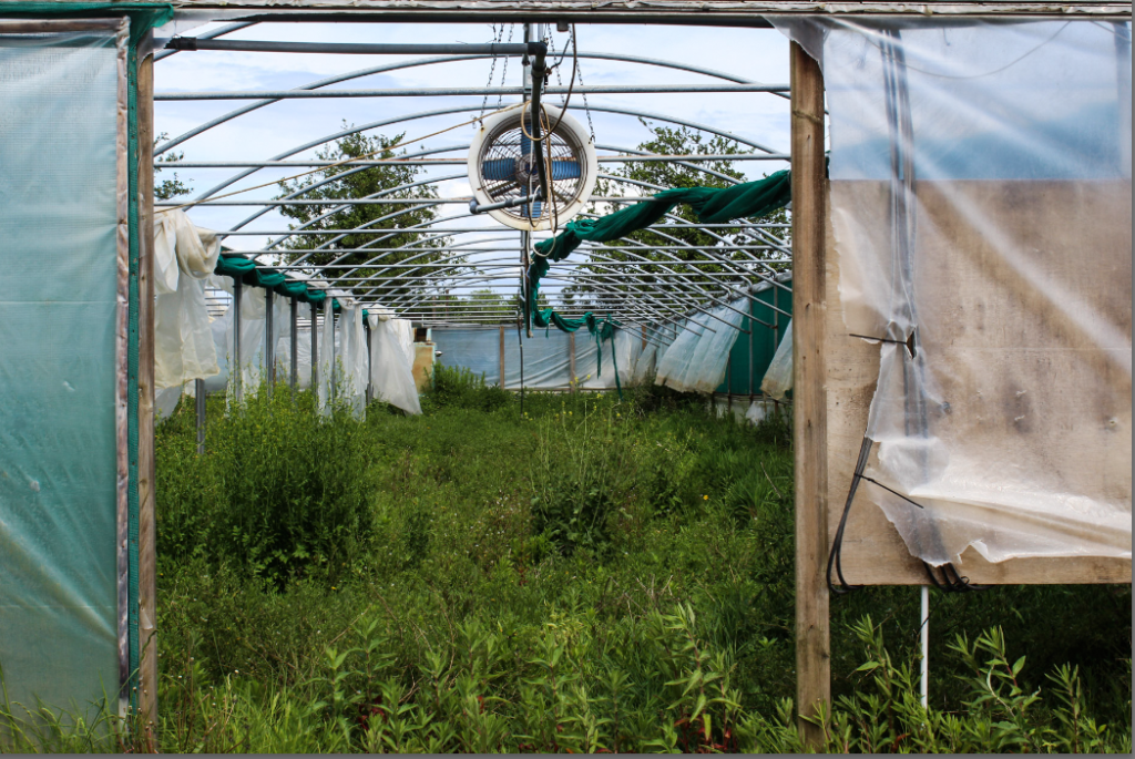
What went well, what went bad or you wish you could’ve performed better?
What I think went well was the daylight lighting, light tone- it was a perfect pin point for each photo. The distance from the camera to the objects to the person was good as it gave off a warm/cold vibe on a 3d vibe I would say as there is lots of different shapes and colours. The place these photos were taken yo could say looks a little historian as there is rusty, old outgrown plants and objects therefore you could say it has been there years if not decade’s. The concept/art behind these images are that I am trying to capture the moment of element within these images because I wanted to get the colour and timing perfect, however I think I could’ve done a few such that would’ve improved my photography, such as making a couple images black and white this would have created a more sympathetic historical look by changing the colour to black and white it definitely would have drawn my eyes in. I also think I could have done better by choosing a more vast area with more rubbish and plastic to represent Keith Arnatt (1930–2008)more and get the higher idea about antropence but overall I am happy with my final images even though there could have been some improvements I am impressed with what I have managed to do.
