This editing style is inspired by Guy Catling and Nick Frank both of whom use blocks of colour or pattern to add into photos, adding emphasise to the point and outlining/highlighting subjects.
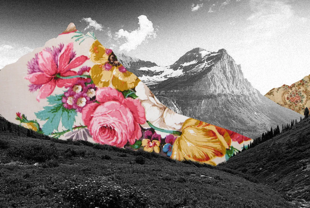
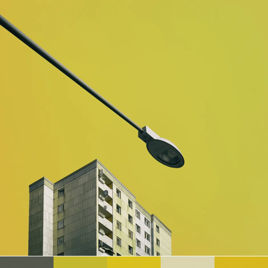
Both Catling and Frank have used bright cheerful colours and patterns to block out sections of photos I want to experiment a bit more with highlighting the subject of the photo. Using a variety of photos I took inspired by Edward Burtnsky and other Anthropocene photographers I will outline the unnatural areas in the natural landscapes.
Trial Photo Edit

The first thing I did was duplicate the background layer and lock the original allowing me to edit one layer while always having a backup clean layer.

The next step was to select the paint tool this means I can draw on the layer. I wanted to use a harsh edge brush with a bright red colour to add intensity to the part I was drawing around.

Following this I use the adjustments to make sure the brush was what I wanted, this being a hard edge, red line brush I can create geometric designs with.
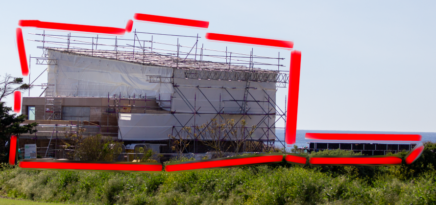
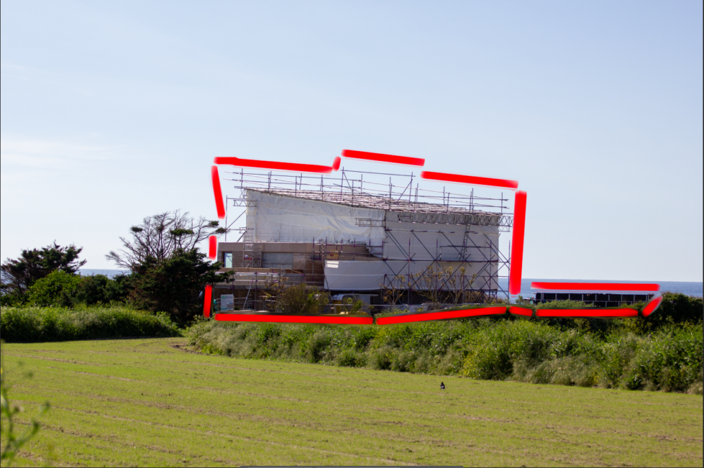
The photo I selected to use was one where a house was being built in the middle of fields, on the sea front. Although this photo was effective anyway the lines added to the feeling of the unnatural shapes and colours from the human impact being disruptive in the environment. To get the breaks in the lines I used one click and then hold down on shift and then click again at another point to create a straight line of colour without having to freehand it. This also allowed me to get the breaks in the lines to show where nature is covering the man made structure or where the structure changes in shape.
Final Edits
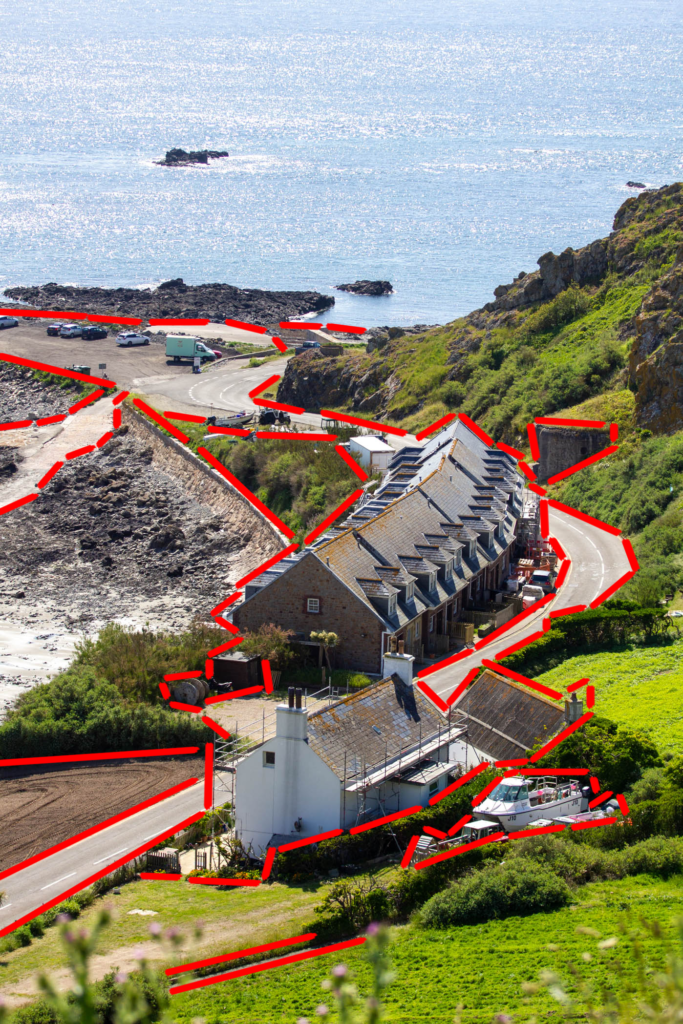
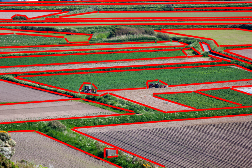
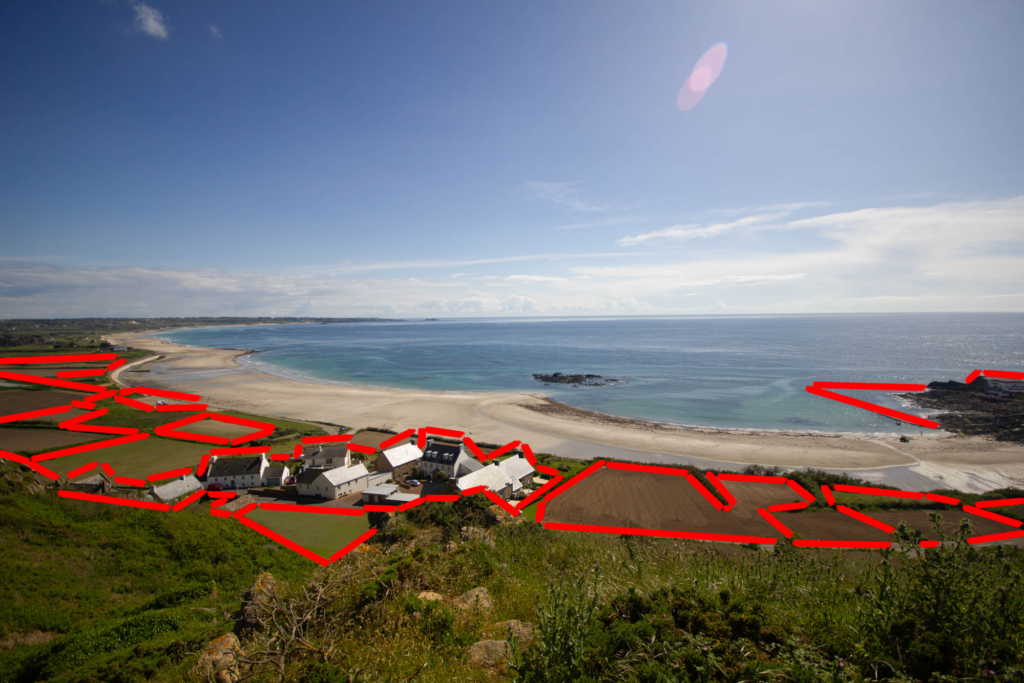
Presenting Final Images


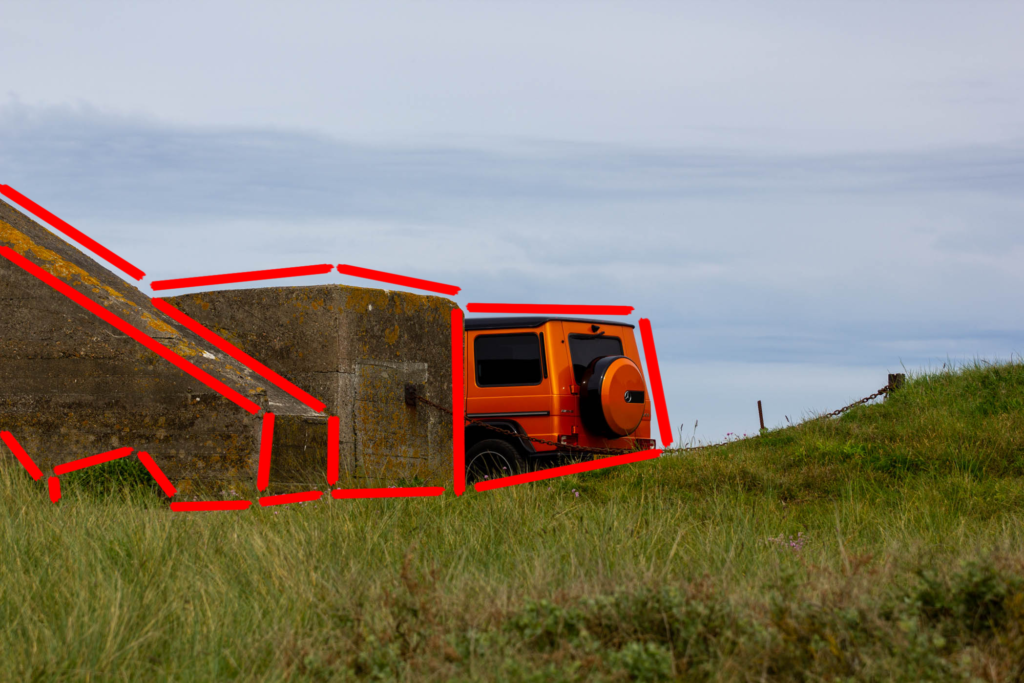
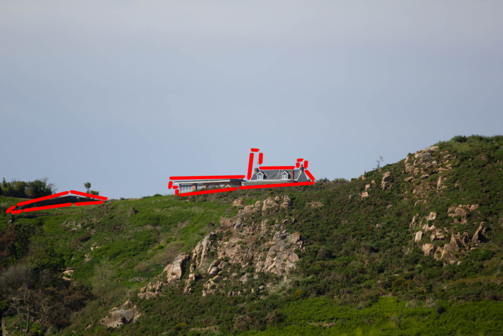
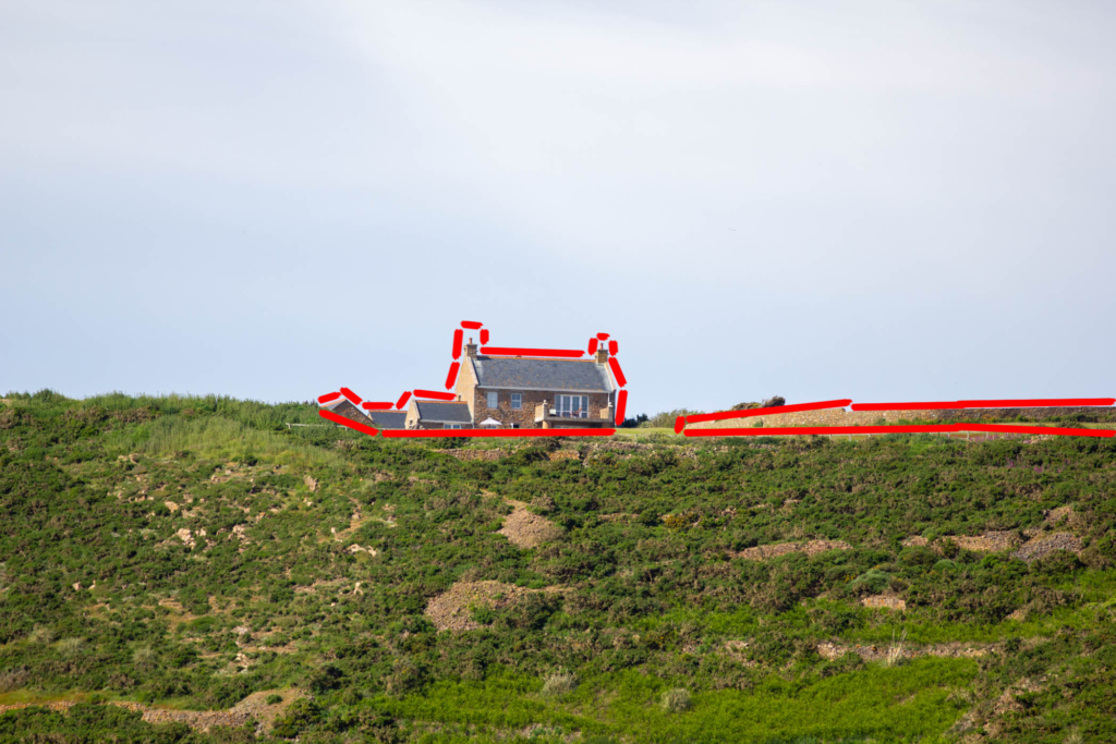
This trio of photos was taken using Edward Burtnsky’s style of high up, overviews of areas impacted by humans. While two are agriculture and one is a mix of agriculture and housing I think the photos connect nicely showing the expanses of which one coast line has been effected and changed by humans for different reasons from, potatoes growing to fisheries to housing and roads.


This trio of photos works well together, making the impact seem tiny in comparison to the natural world alternatively it shows the human impact sneaking up on us quicker than we realise. The middle shot pulls the three together showing that human impact isn’t a new thing in fact we just get more advanced. I like how the orange looks like a step up from the grey concrete and the car will have some advanced technology where as the bunker was created out of necessity but still is impact on the natural world. Although I think this photo looks great as it looks like the car is an extension of the bunker, joining the present and past together with the geometric style but keeping the wide differences apparent.

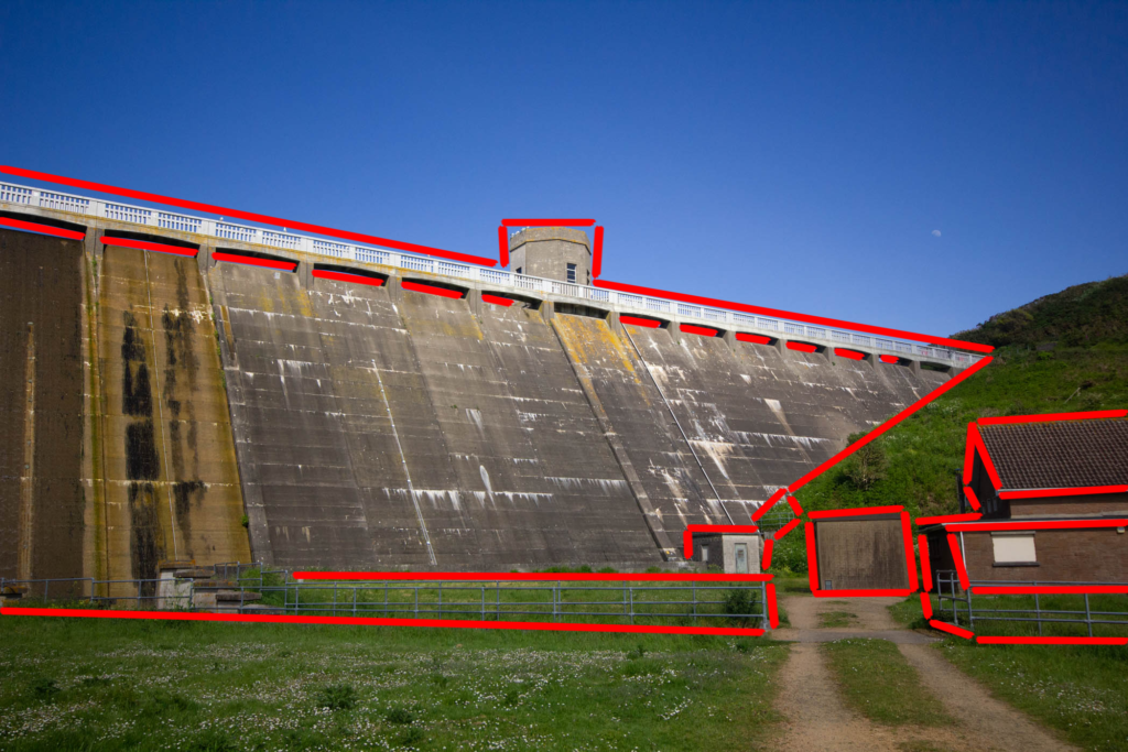
This photo I have used as a single shot as it is a complex image with many things to look at, from the sheer scale of the dam to the smaller unusual square constructions at the base of the photo. The red geometric patterns add to the already harsh lines in the photo showing all the different impacts humans have had on the natural world small like the fencing and large like the dam.
