Mandy Barker Inspired
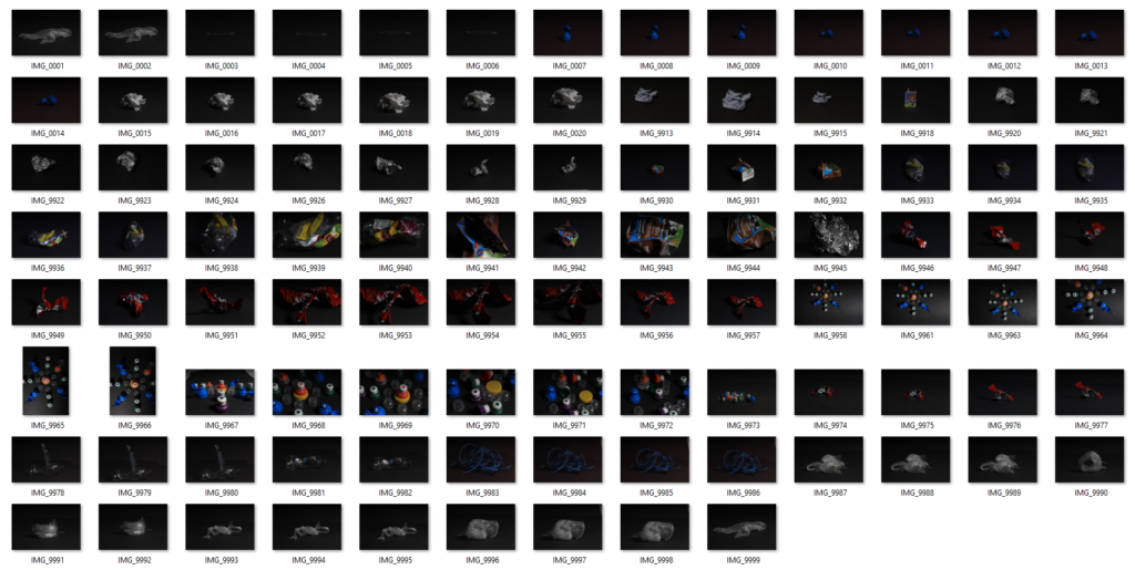
My Strongest image selection:
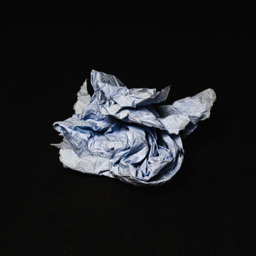
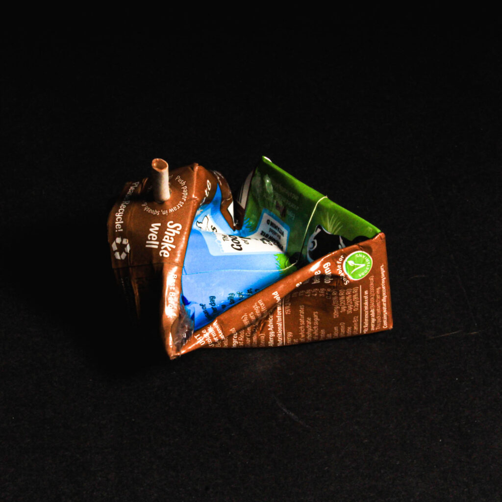
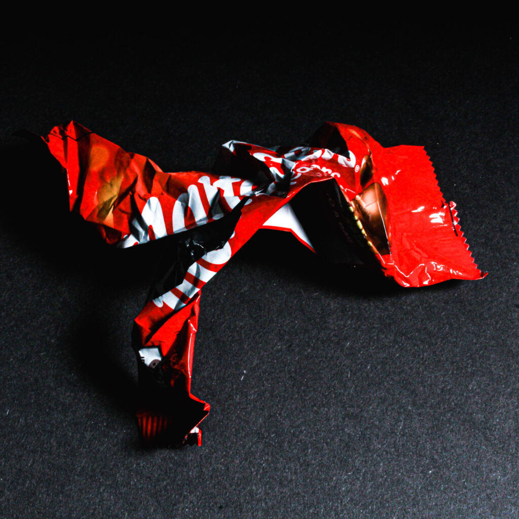
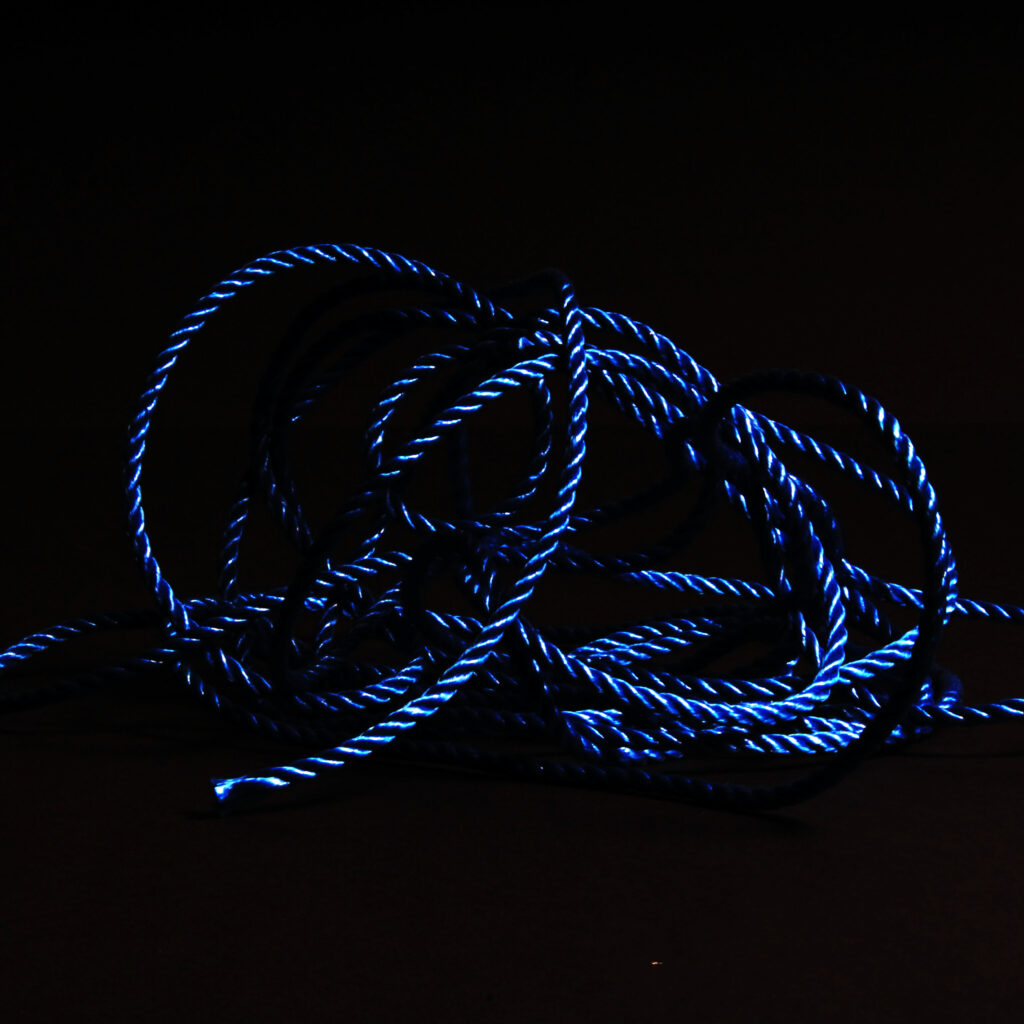
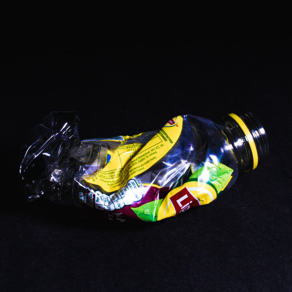
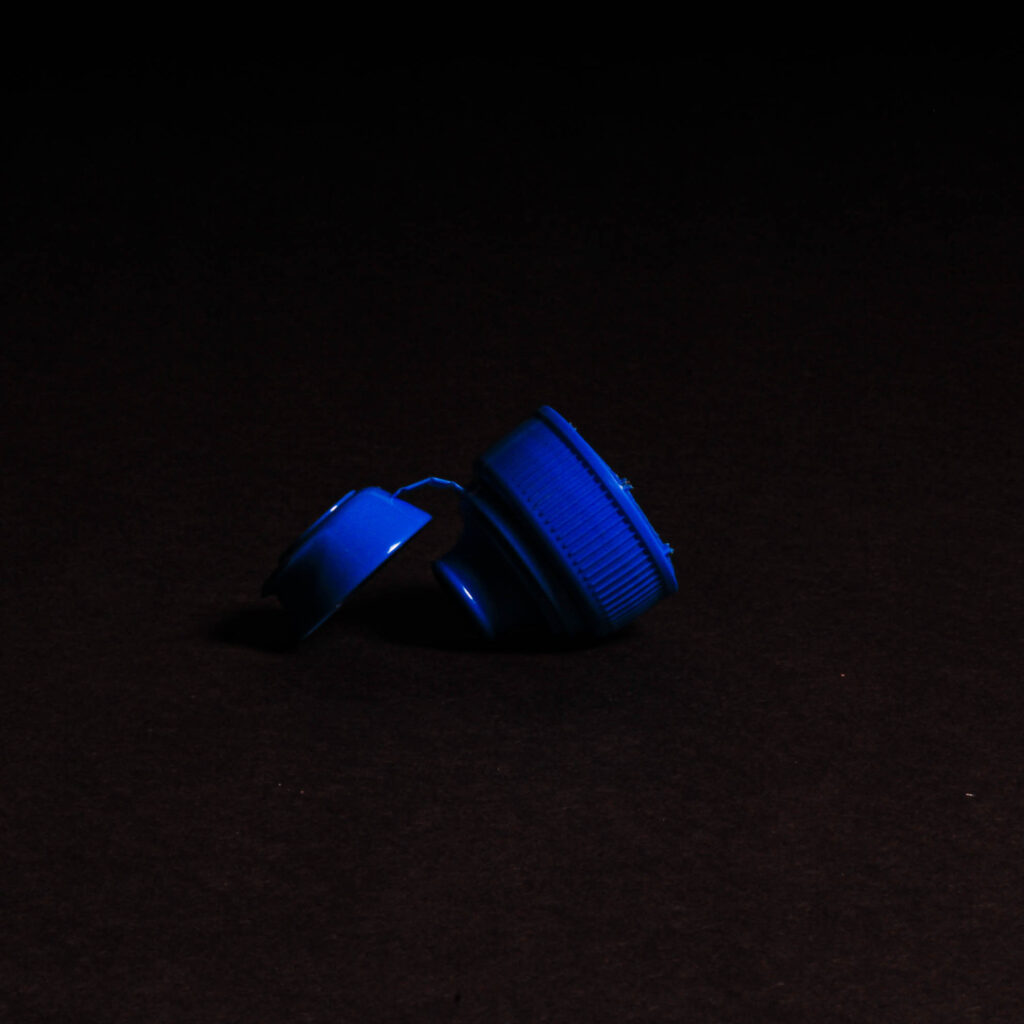
For these images, I have laid them in a grid format to present them all together as I feel as though when presented next to each other, it it more eye-catching rather than one alone. This way, the bright colours also draw attention to themselves especially against the black background. When editing these images, I cropped them into a square to get a closer look and remove some negative space and then I adjusted the exposure and contrast to make sure the background was all dark and that only the individual pieces of litter were the focal points.
A closer composition:
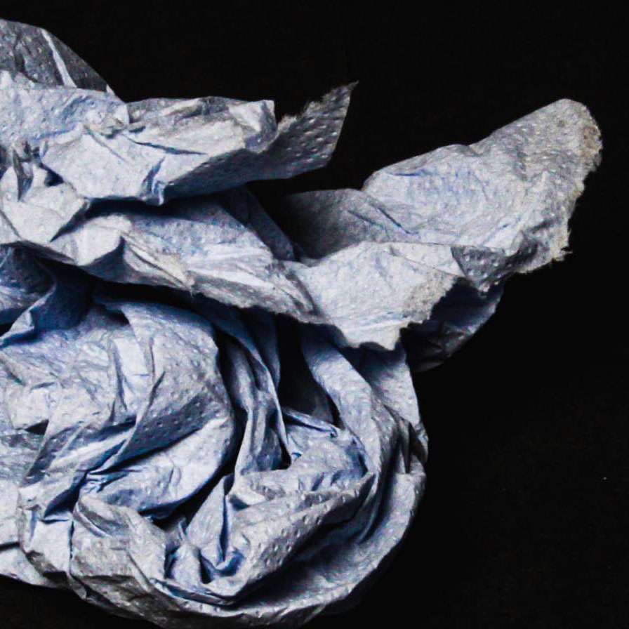
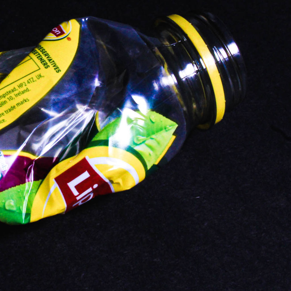
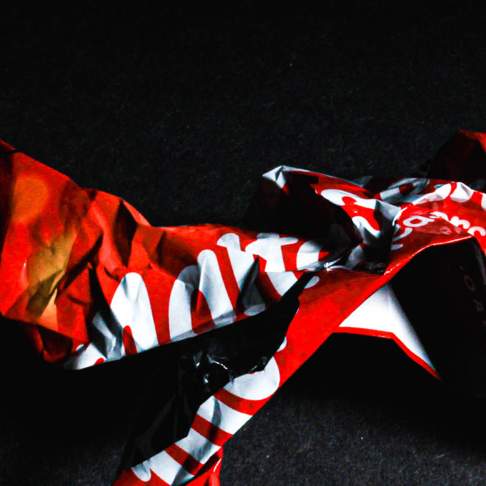
Editing in the style of Vince Brun:
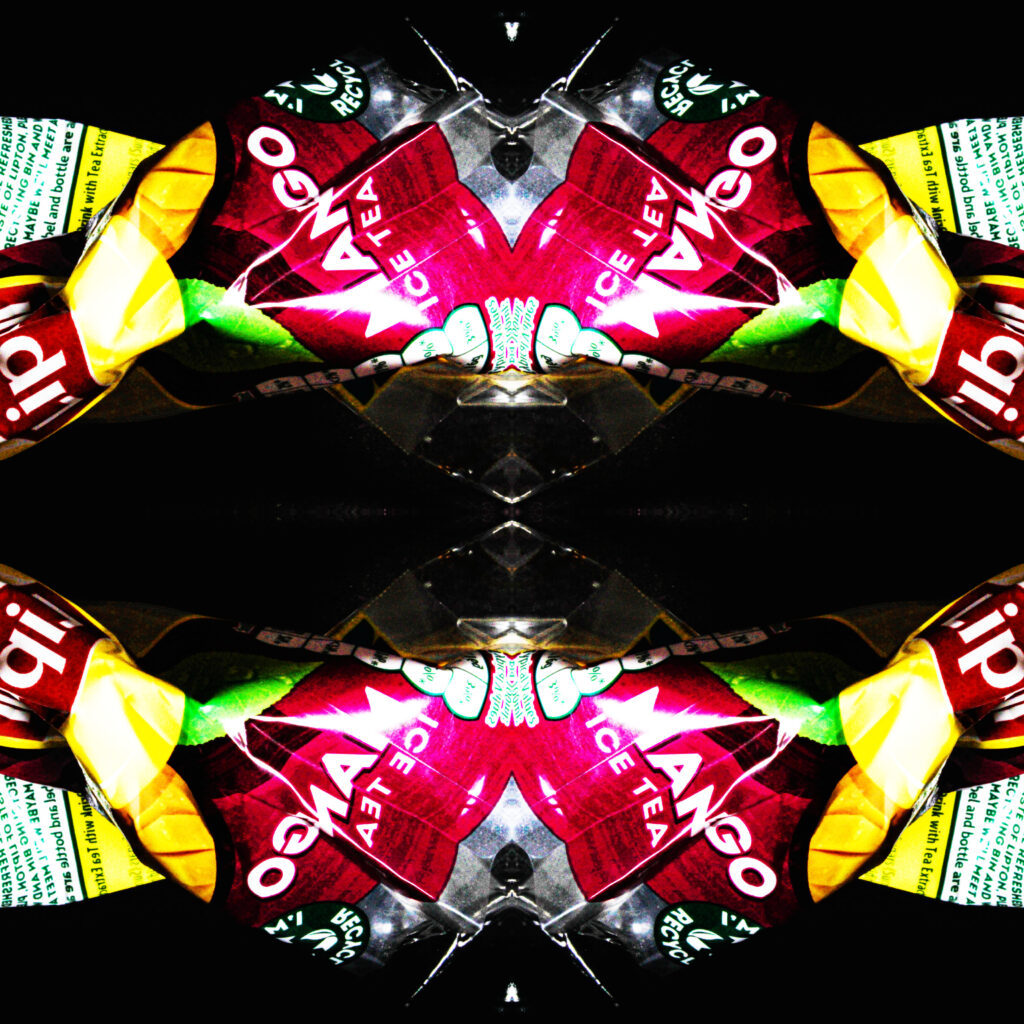
My closer compositions provided more of an abstract outcome which I am going to experiment with further. I intend to use the style of Vince Brun’s creative mirror images to inspire the development of my own photos:
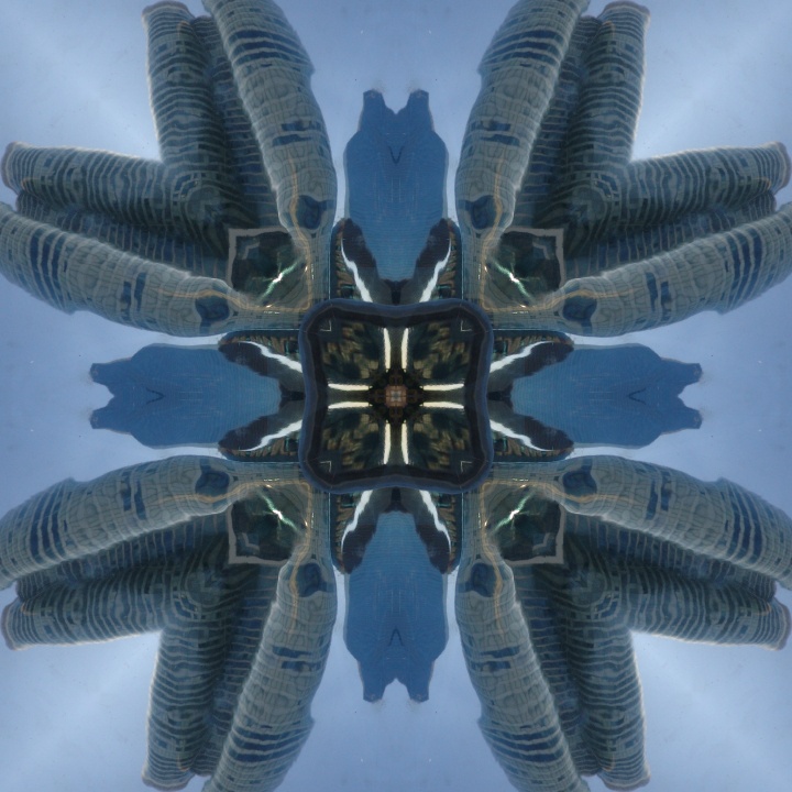
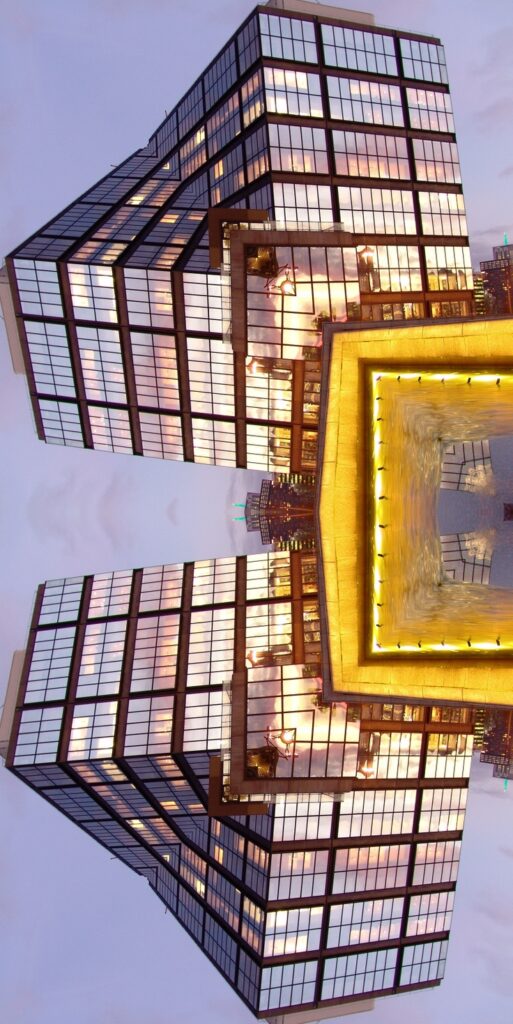
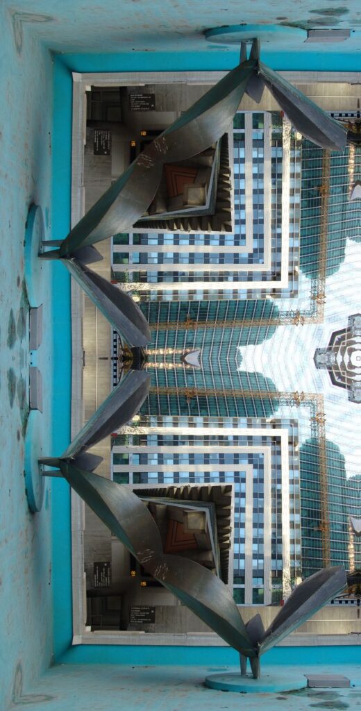
For my first edit, I used a cropped close up image of the rope and extended the layer to be able to copy the image and duplicate it to then flip it horizontally and move beside the first one. Then I did the same thing but flipping it vertically and placed that underneath along with the final duplicate to complete the square. My first attempt:
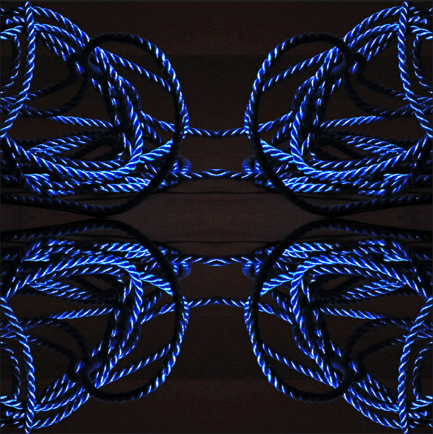
My first attempt turned out well, however I found that there was too much negative space and wanted to try to enclose the area. So I then cropped the original photo even closer and then repeated the process.
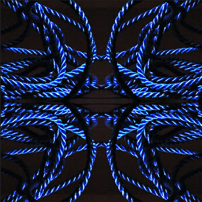
I found that this worked a lot better as it is more abstract and appealing to the eye. Also, the lines and curves of the ropes all lead to the centre of the image For the future photos I them continue ensuring the cropped image didn’t have too much negative space to start off with.
