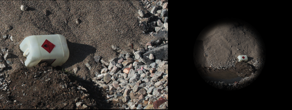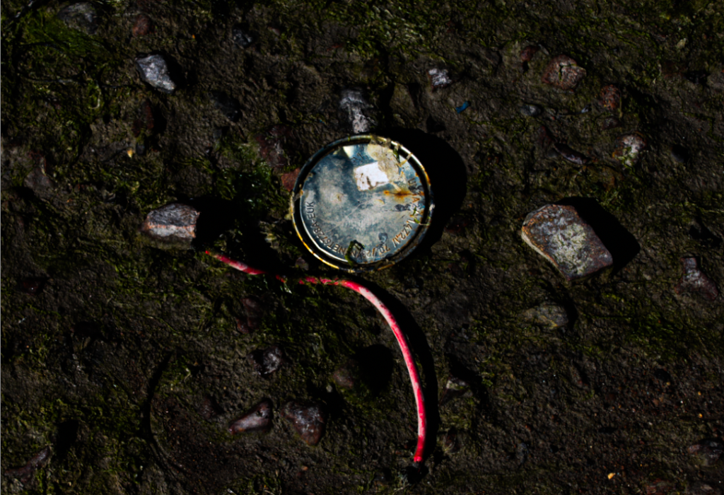
I started with this photo because I really like how it looks and matches with Nicholas’ style.
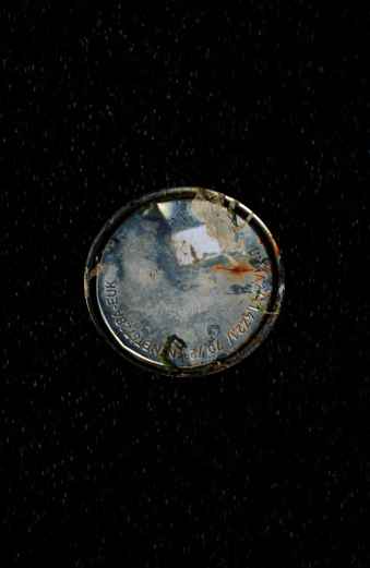
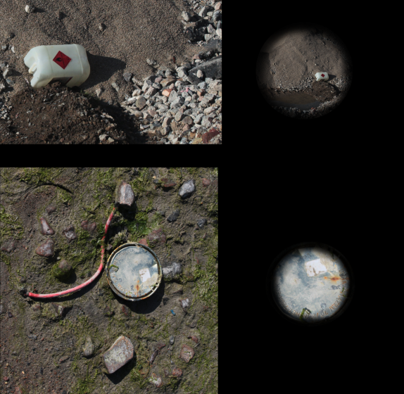
Now that I have done both parts for one photo, I will blend them together to create Nich’s style.
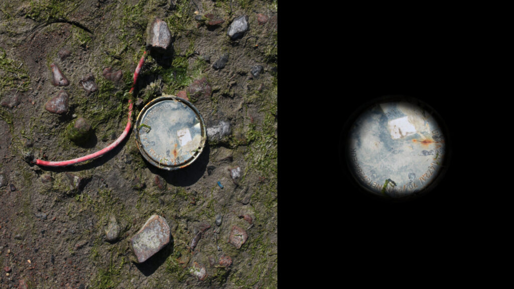
That was my first attempt trying to blend the two photos into one, and I will do more attempts to blend them using my different photos and styles. But I started by adding the main edited photo on the left in full frame with the other objects in the background. Then for the right side, I cut out the circular metallic object put it centre on a black canvas like Nicholas Gallery does, but I also noticed he blends the outside into the background so I added a light 10% black brush around the outside and went over it again until I liked the blend/eyeball look.
