Anthropocene

This image has an empty alt attribute; its file name is altered-landscapes-header-1024x448.jpg

“Never before have we been so closely connected to global climate events,” while, ironically, simultaneously, having “never been so detached from the natural world.” – Mishka Henner

Anthropocene derives from ‘anthropo’ meaning human and ‘cene’ meaning a significant period of time and so means humans effects on the world arround us.

Artists

Keith Arnatt

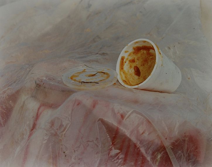
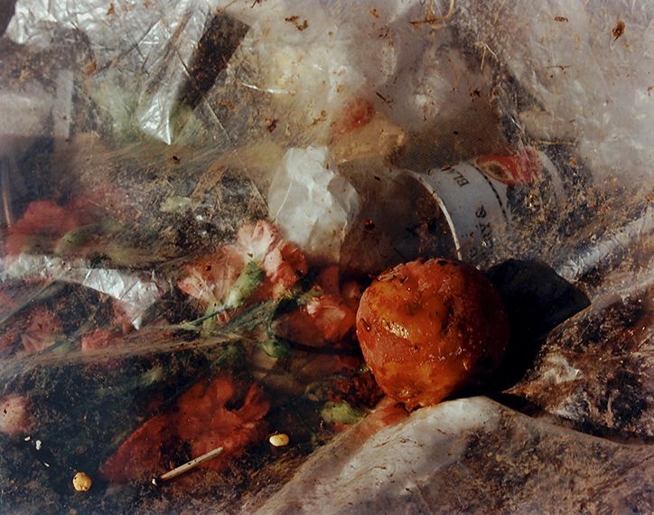
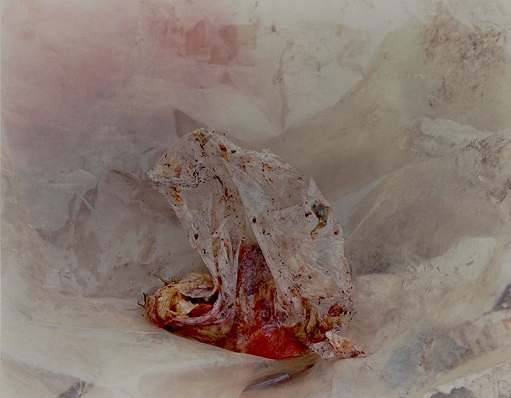
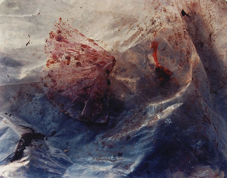
Pictures from a rubbish tip, 1988-89
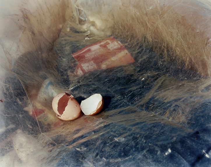
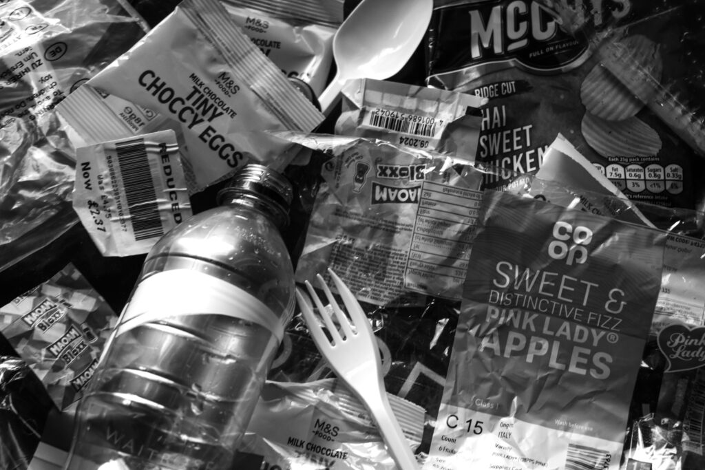
This project showcases old food waste in a way reminiscent of a painting with vibrant colours and dramatic set ups. The use of plastic bags to distort the backgrounds help to create a surreal, stylised appearance which disguises the fact these photographs have been taken at a rubbish tip.

Keith Arnatt produced 5 images in this project. Each one used natural light to take these photographs while out at the tip. The layers of plastic diffuses the light and colours which emphasise the food positioned as the subject. Small items like egg shells are not usually placed in a tip which is usually used for large waste items like ovens and sofas. Tips calculate price by weight and though small things like wrappers don’t contribute to weight, they do show a level of laziness and disinterest in the environment. Instead of throwing this rubbish in the bin or composting the egg shells for example, someone chucked it in a large pile instead. Had there been any consideration for the environment, rubbish would have been properly disposed of.

Naomi White
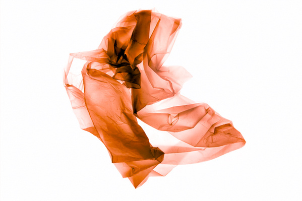
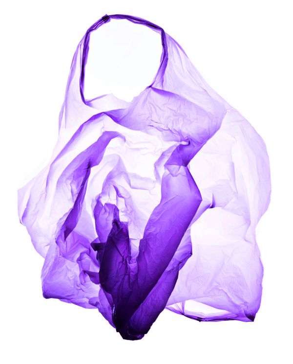
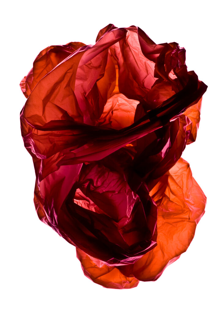
Naomi White explores contemporary issues and political ideas through her photography. How we can shift away from the exploitative model of capitalism into a collective voice of the whole planet? This is a message which aligns with that of the Anthropocene exhibition and I believe is best shown through these photographs where Naomi White uses a studio set up to light up and arrange single-use plastic bags to create a unique set of images.
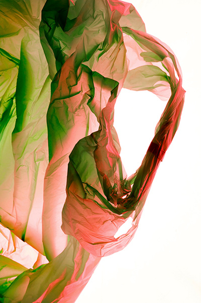
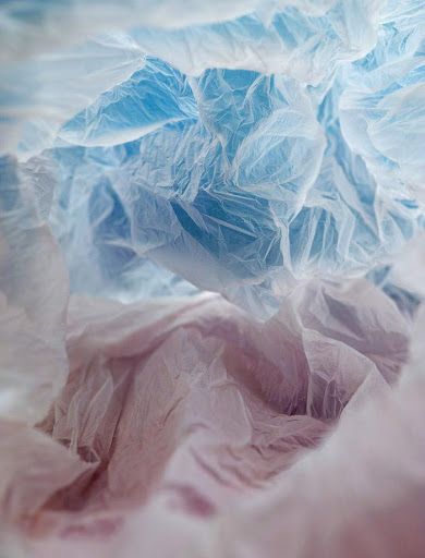
This photograph shows a plastic bag. It was lit from below with a light box to cast unique shadows and to diffuse the light and creates a unique glow which stands out against the white background. 2 Colours are used which would have added either in the studio with colour gels or in post-production using editing techniques. Green is a natural colour and typically represents the natural world and the environment as recycling is also associated with the colour green. Red is the second colour used which contrasts with green. Red has connotations of destruction and heat which could mean it is being used to signify global warming and the destruction of the environment. The use of a plastic bag is significant because it is a single use, thin plastic which will be used once and thrown away. This photograph makes use of this otherwise overlooked plastic and turns the rubbish into a beautiful work of art. By creating an art piece, it changes the way people view and interact with their bags. With so much detail I believe this photograph would have been taken with the macro settings or lens at a close distance. Artificial light appears to be coming through the bag which highlights certain creases and details and creates contrast. The centre of the frame has a clear strip where the bags meet which divides the two. The colours are vibrant and highly saturated to an artificial level reflecting the synthetic materials beings used for the bag. The bag was framed purposefully to only takes up one half of the frame with the other half being a plain bright white.

I believe this photograph would have been taken for several reasons: to showcase the overlooked and underappreciated plastic bags, to raise awareness of an over-reliance on plastic, and to highlight consumerism.

A plastic bag on average is only used for 12 minutes before it is thrown away. The plastic used however takes 1000+ years to decompose in landfill. The abundance of bags causing landfill is seriously damaging to the environment and wildlife. If those bags were slightly more appreciated and used until they broke (like initially intended), waste would decrease in massive numbers as proven with recent regulations. Single-use plastic bags are not sold in shops anymore, instead thicker ‘bags for life’ are the only possible purchase option. These will last longer and could carry heavier shopping hopefully causing shoppers to get more use out of them. Additionally they are only available at a 70p charge. By giving the bags a monetary value it causes people to give them a higher value and therefore be less likely to throw them away. This was a successful move as since the UK laws were pushed, shoppers buying bags has fallen by 98% (measured in 2023). I believe this was the intended purpose behind this image. By photographing the bags and giving them importance, it would in theory cause people to value and utilise bags more before throwing them away.

Before plastic bags, paper bags would have been used for fruits and straw baskets were bought by shoppers when purchasing foods. Plastic only became common place in the 1980s-before their damage was as well known. Since then, the plastic bag has become a staple of shopping. Bags are only one of many products that have become essential and so I believe that these photographs were taken to raise awareness of our over-reliance on plastic. Plastic is used for its durable properties, cheap manufacturing prices and ease of use. This means that it is used in anything from clothing to kitchen appliances. It would be near impossible to completely abandon plastics and move to a ‘sustainable’ alternative due to its widespread use as any material used at such a large scale is not sustainable. This was proven when plastic was first introduced as an alternative to wood and paper due to the sheer number of trees being chopped down. These high requirements have been regularly increasing due to a surge in population and rampant consumerism. This over-reliance and exploitation is an additional reason that I believe Naomi White decided to photograph this plastic bag.

Consumerism in recent years has proven an issue. Low prices are sought after but are only achieved by cutting corners by using factories, sweatshops and cheaper materials. The dip in quality means that the items will not last as long and are therefore thrown away sooner and need replacing. All this rubbish is non-recyclable because cheaper materials are too low quality to repurpose. Additionally people want more which creates a vicious cycle which is best represented by the fashion and textiles industry. 60% off all produced textiles are made with synthetics such as polyester, the same plastic used to produce water bottles. Polyester is significantly cheaper to produce and extremely difficult to recycle. Unlike its organic alternatives (such as cotton), polyester is made of short fibers which easily fall apart, melt in washes and always sits ‘boxy’ whereas cotton is made of long, hollow fibers which allow water to pass through easily and forms a light fabric. These resistant fibers create long lasting garments which can even be recycled. Even still wardrobes have become filled with these synthetic impostors purely due to their availability. These polyester pieces are bought at low prices, worn for a fraction of a year and thrown away for a range of reasons almost always ending in a landfill. Even if they are worn and used for longer before being thrown away microplastics contaminate the water supplies when washed. Although this does not directly affect people it does impact aquatic life. Modern day consumerism is best summed up as: Fast-Fashion brands create garments that are created to look good on a hanger until they get washed and they begin to pull and require replacing. Plastic bags are symbolic of shopping also which I believe makes consumerism an issue Naomi White is warning against.

Mandy Barker
Photoshoots

Photo Shoot Action Plan 1

  • Who – This photoshoot will be inspired by Keith Arnatt. I am going to photograph rubbish and arrangements of objects to showcase the mass of varied waste and the damage caused.
  • What – I would like to visually comment on plastic, mass wastage, non-recycling, disposable society and consumerism. These will be still life images focusing on the items.
  • Where – Keith Arnatt photographed a rubbish tip in natural light which so I will visit several places in natural light where an abundance of rubbish accumulates such as the recycling centre. Will visit: La Collette recycling centre and acorn.
  • Why – To showcase mixed waste and what’s being done with it. Recycling takes rubbish and turns it into something else, charity shops repurpose old items. I would like to contrast these positive parts with negative ones such as overflowing bins and litter which didn’t even reach a bin.
  • How – I will photograph in set out arrangements and also heaps. I would like to experiment with textures also such as clear plastics, damaged textiles and rotting foods. I will also experiment with lighting and background as these will be studio images taken with artificial lighting.

Photoshoot 1
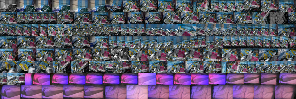
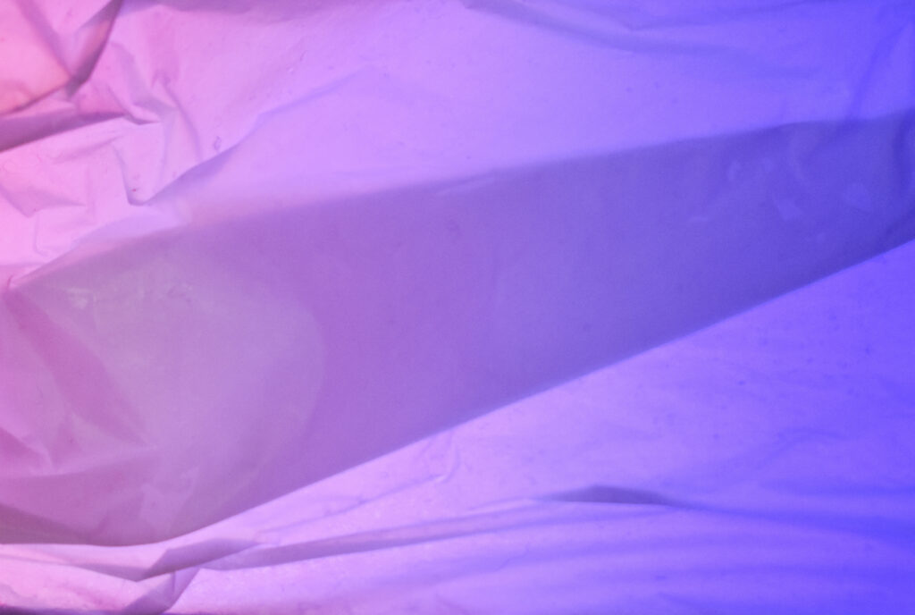
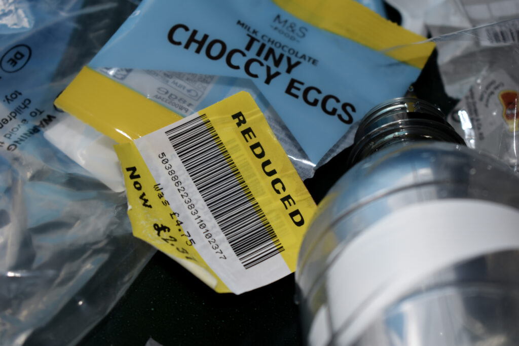
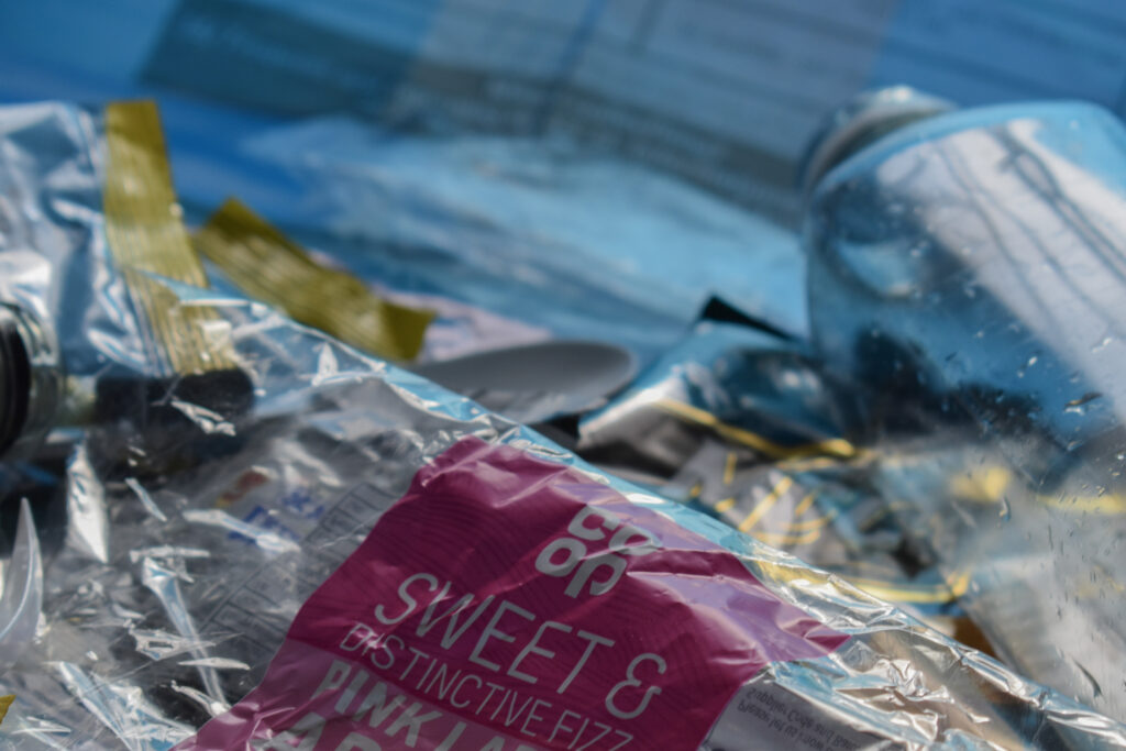
To try and photograph a gradient behind a plastic bag I used my phone to display some colours and I arranged a plastic bag over the top. They didn’t turn out how I’d hoped and next time I would try using a larger bag from further away. I also arranged some plastics into an arrangement with both small and large pieces. I used the sun for light which was bright and caused lots of reflections on the plastic which I should’ve expected and waited until later in the day.
Photoshoot 2
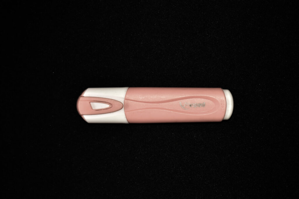
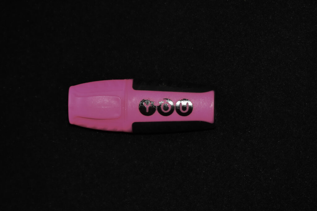
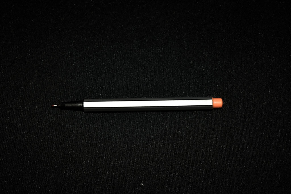
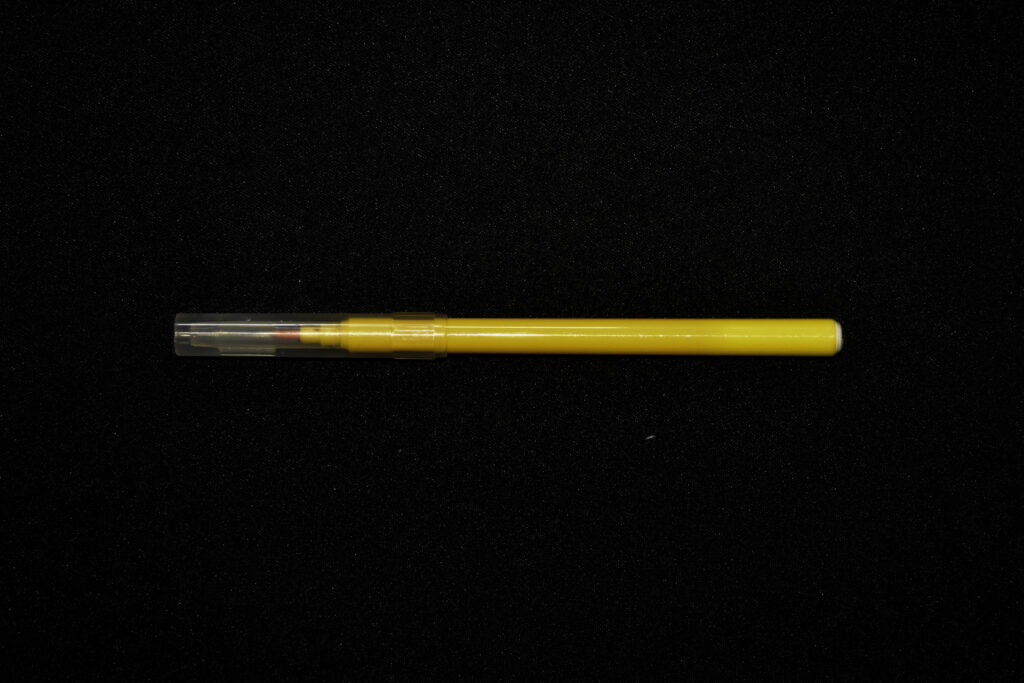
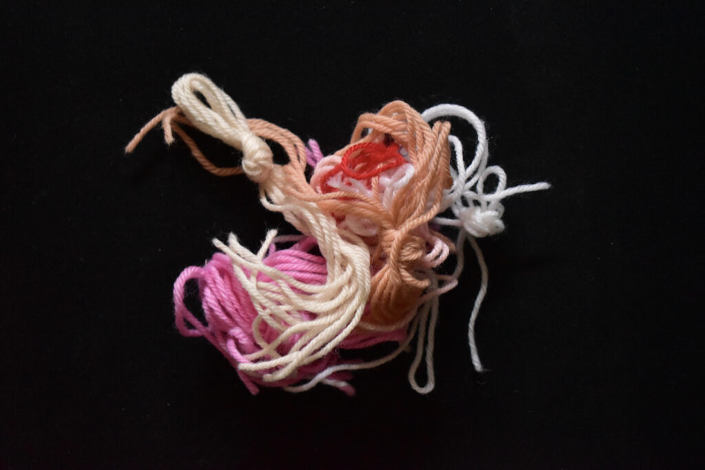
I decided on these 5 images to start building up a ring. I was going to put the string in the middle however I didn’t like how it looked surrounded by the pens.
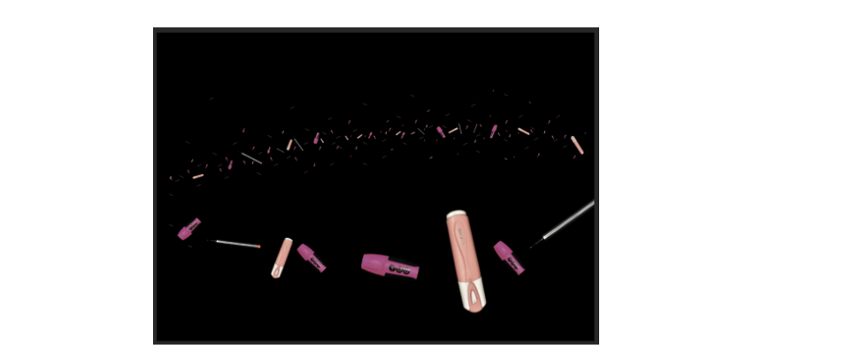
I started adding pieces in two sections: The larger front ones and the small back ring to create depth. I started by adding lots of small items in the background focusing on the ring and moving a few outwards. I then began to add to the front but didn’t overlap any since I was trying to fill space. This looked strange so I added some on top of each other and changed the opacity and added light shading.
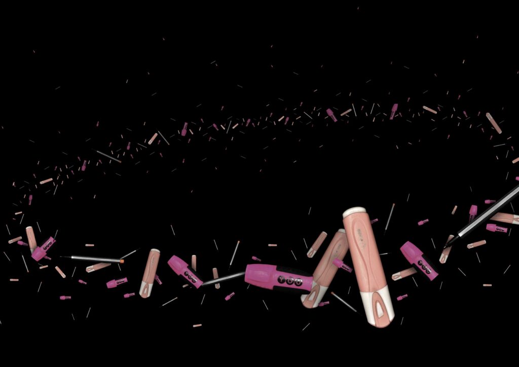
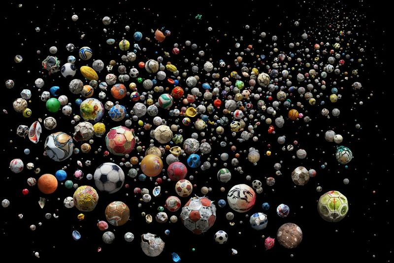
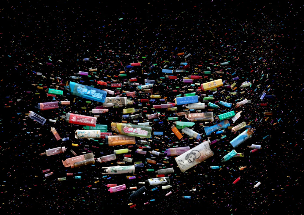
I only used these three objects since their colours were similar and so was their shapes. I wanted to use similar objects in the image like Mandy Barker did so that there would be a more cohesive overall appearance. I noticed that when shrinking the images the whites stood out much more than anything else which didn’t achieve the effect I was after. I made all the smaller objects darker by reducing the opacity and creating layers of colour block to place over the top. I think there is still too much dark and next time I would widen the rings also. If I was going to make another I wouldn’t create a ring and instead would create a gradient with more objects without being focused on colours. All the objects will be the exact same type such as a football but in varying states of decomposition.

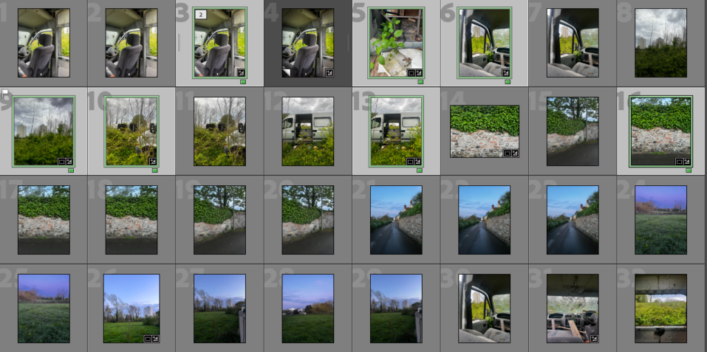
Photoshoot 1

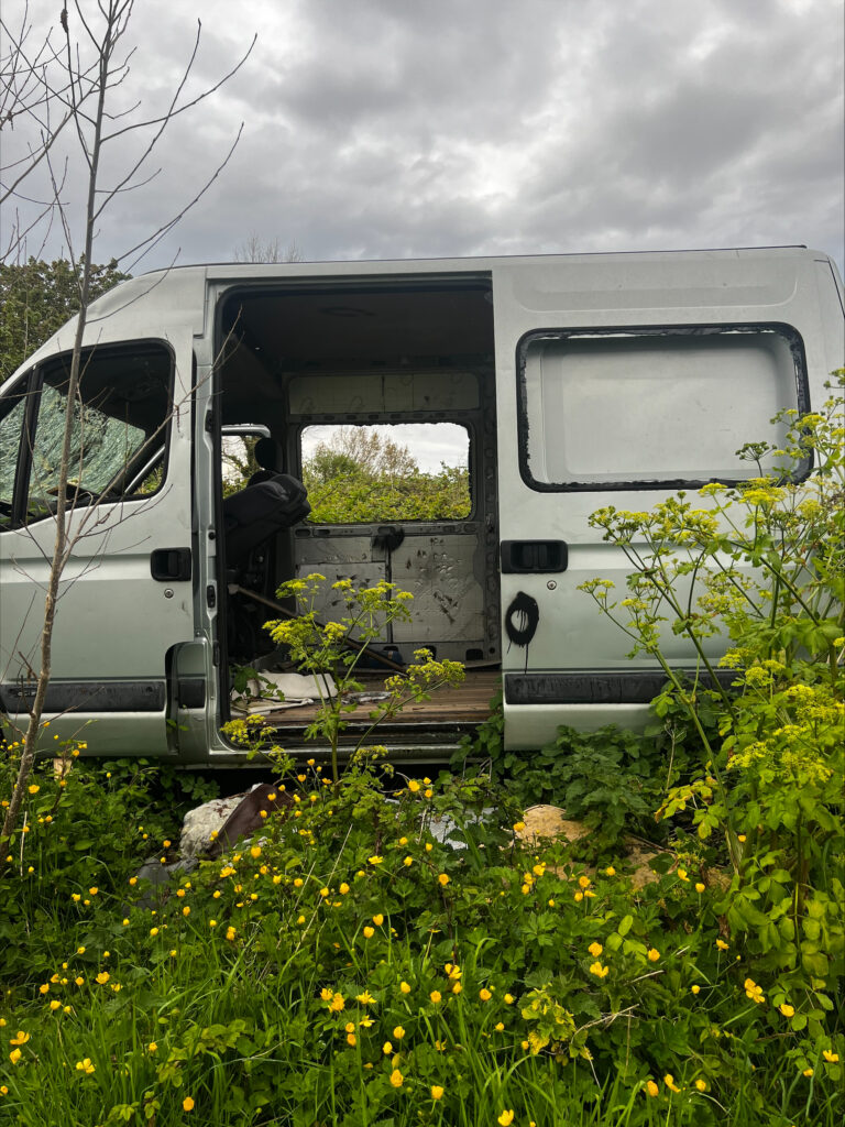
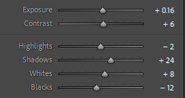
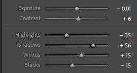
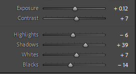
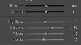
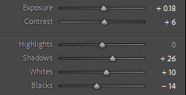
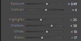
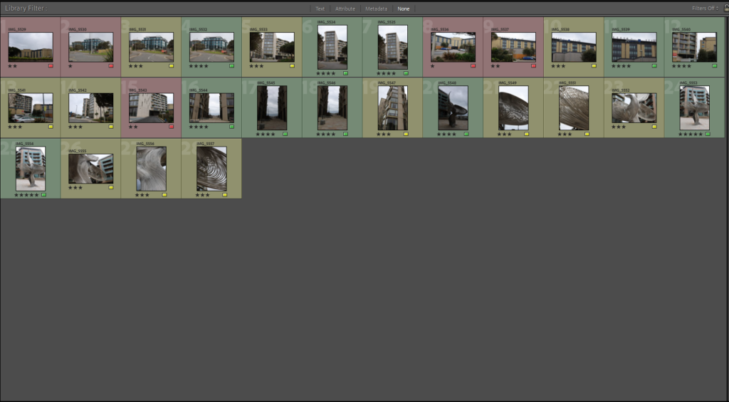
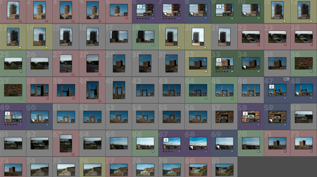
I took a photoshoot based in the area of St Clements near a few farms. I colour-coded my best images and edited them in a more detailed way. Some required more than others.

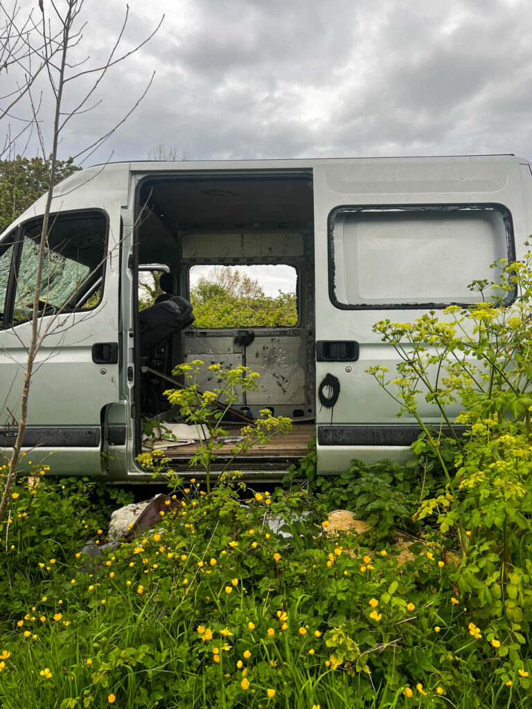
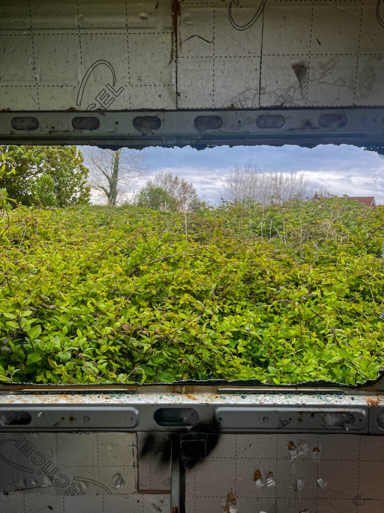
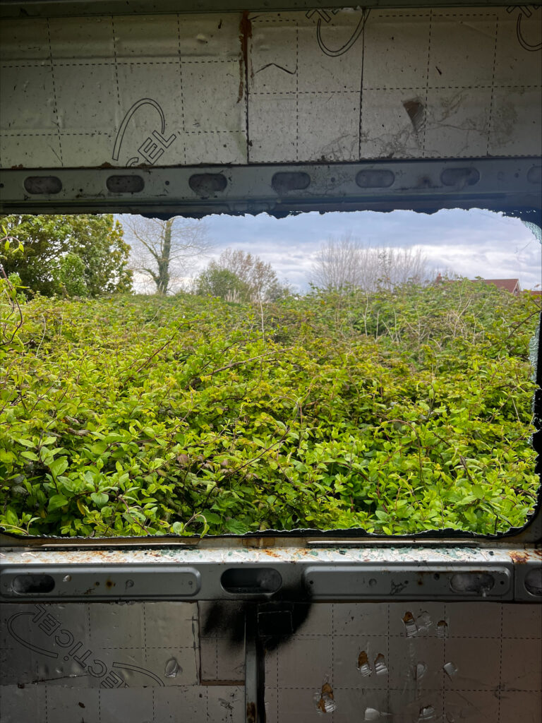
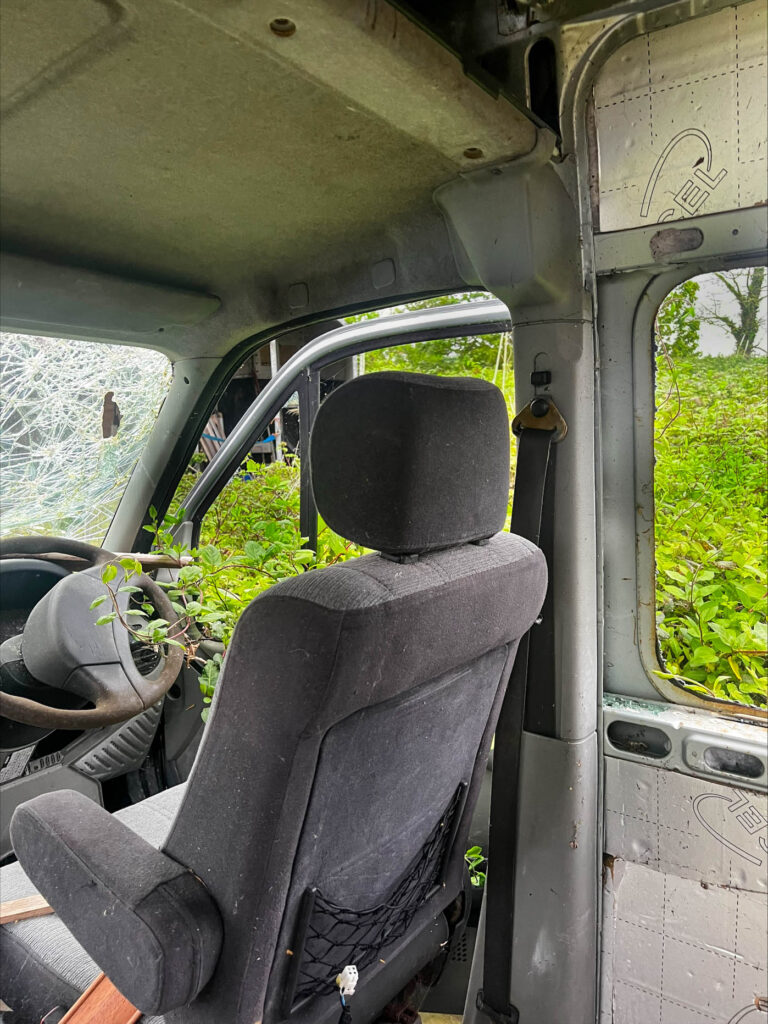
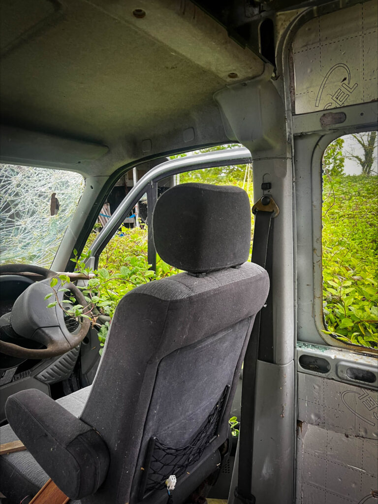
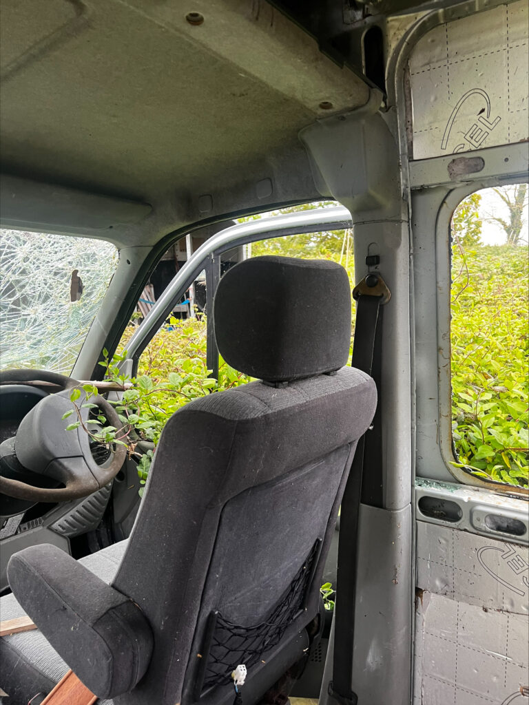
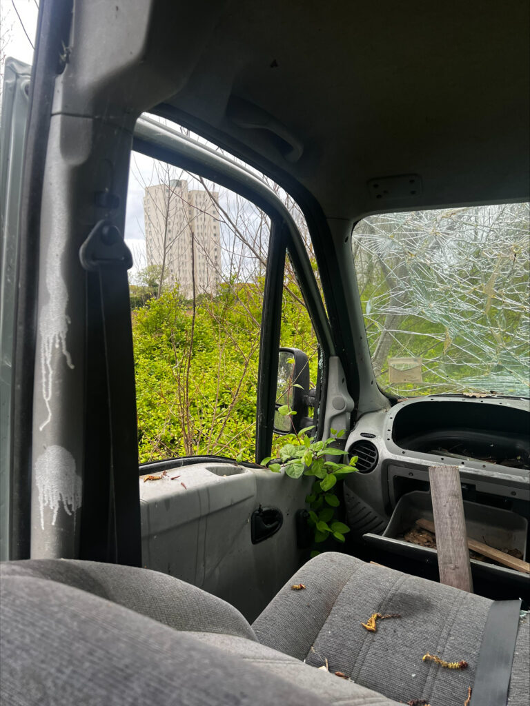
Whilst I was walking I came across an abandoned van that appeared to have been vacant for a long period of time. It had been vandalised quite badly however a thick blanket of greenery remained around it and looked as if it was slowly creeping inside as if it was trying to take over:

My first image is of the exterior of the van submerged in a large growth of weeds in the centre of the field. I wanted to shoot this image as I think that the greyscale look of the van has a high contrast against the greenery and accentuates it to appear more vibrant. I feel that this is a good example of how the abandonment of property and structure causes the natural landscape to grow around and within it, restricting it from truly moving freely and thrive as an ecosystem.

Original image

My second image is taken from inside of the van through one of the many smashed windows, looking onto the large mound of thorns. I wanted to shoot this image because I feel that it allows to see from a perspective that areas like this often are taken advantage of and forgotten about when it is right in front of us. I feel as if it symbolises that we should open our eyes more to acknowledge great natural spaces like this and how so much time is spent indoors when areas like this exist just outside the window.

Original image

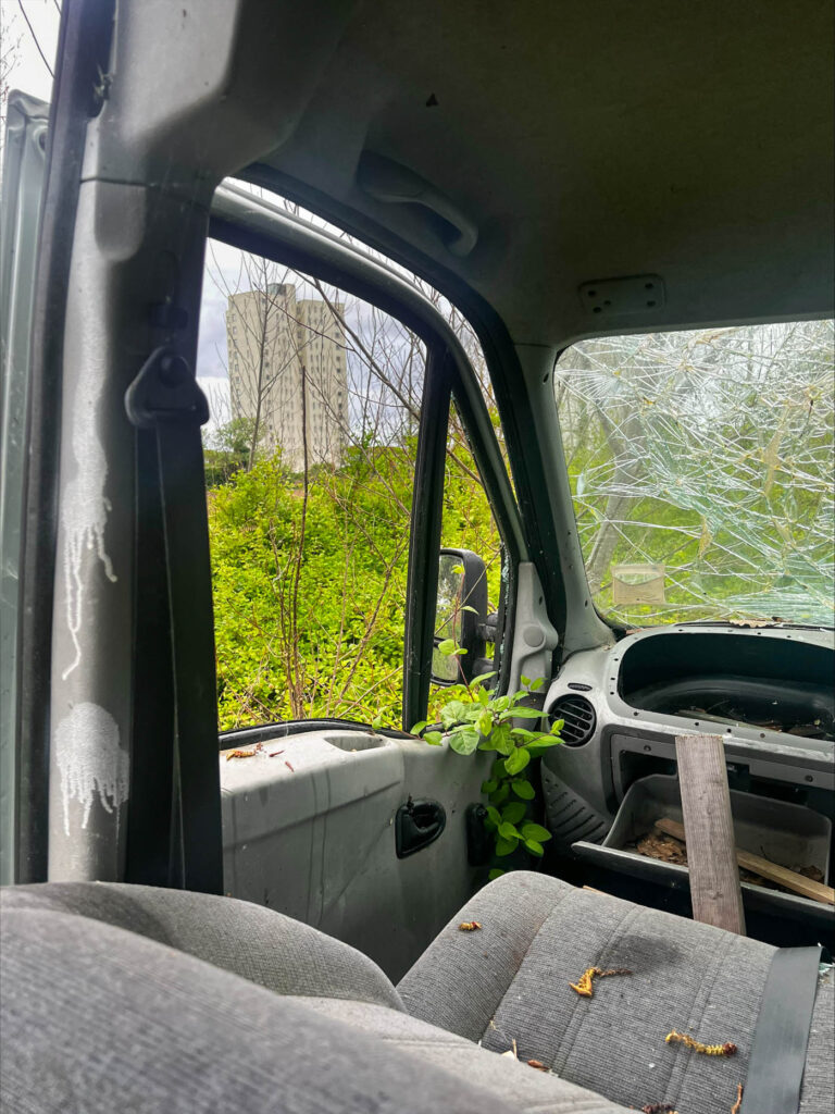
In this image, I chose to position my camera diagonal to the drivers seat of the van in order to capture the entire area of plants behind. In this image, the drivers door is open, allowing the plants to struggle to creep in as there is nowhere else for them to go due to the restriction. I feel like the way the windshield is smashed symbolises how careless and reckless humanity is about the environment, crashing into this field through ignorance.

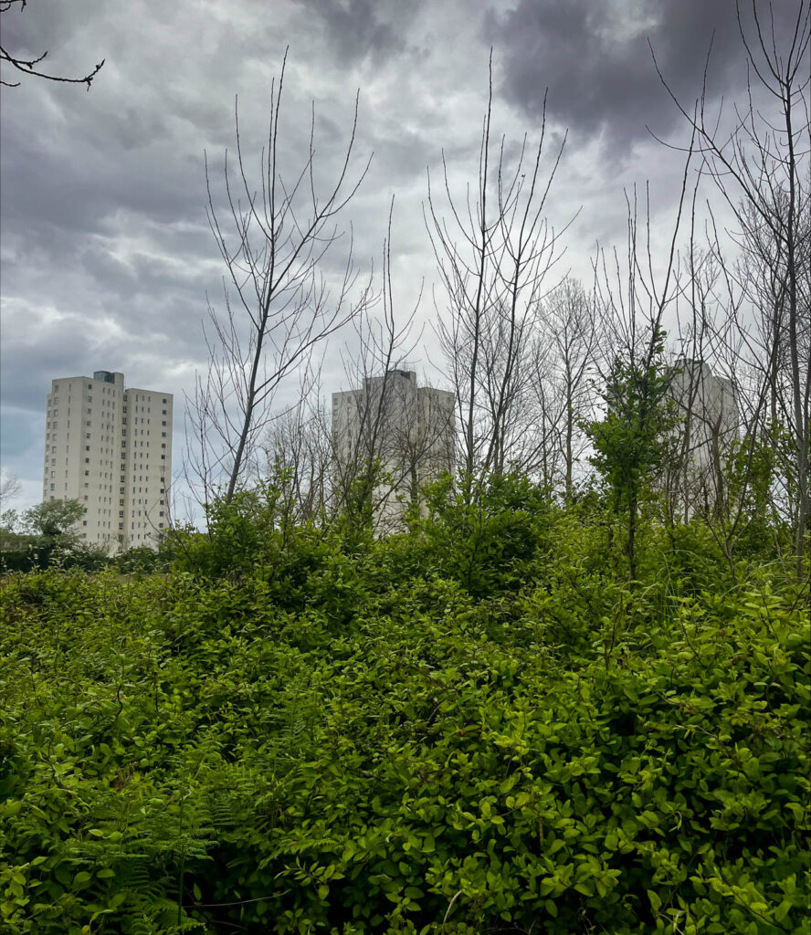
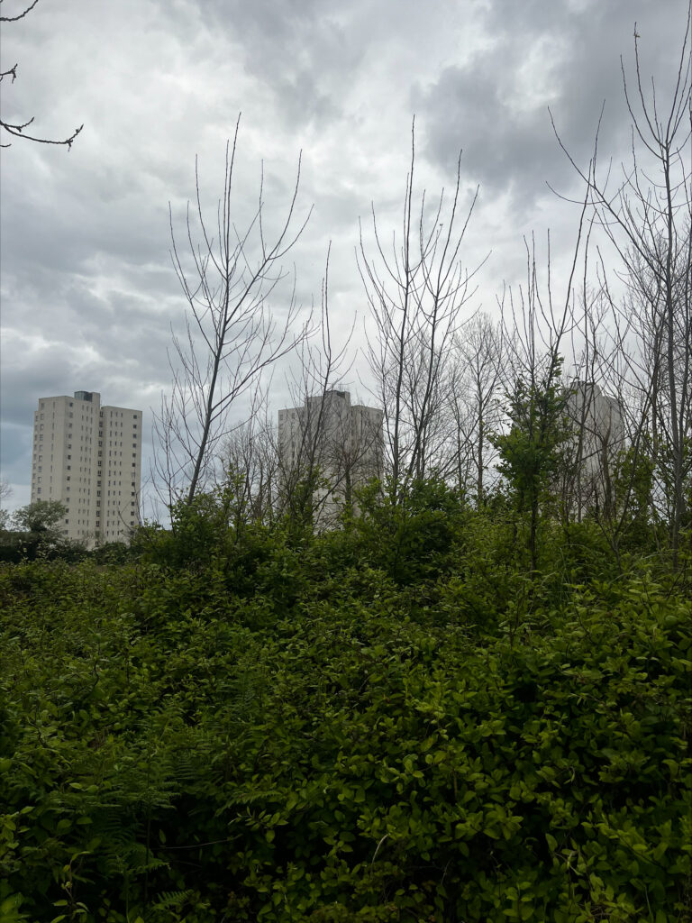
For this image, I rested my camera on the top of the leant back passengers seat to get a shot through the other smashed window. I chose to capture the high rise flats looking through the window peeking behind the greenery because it shows the urbanisation that takes over these great areas for a higher amount of housing.

Original image

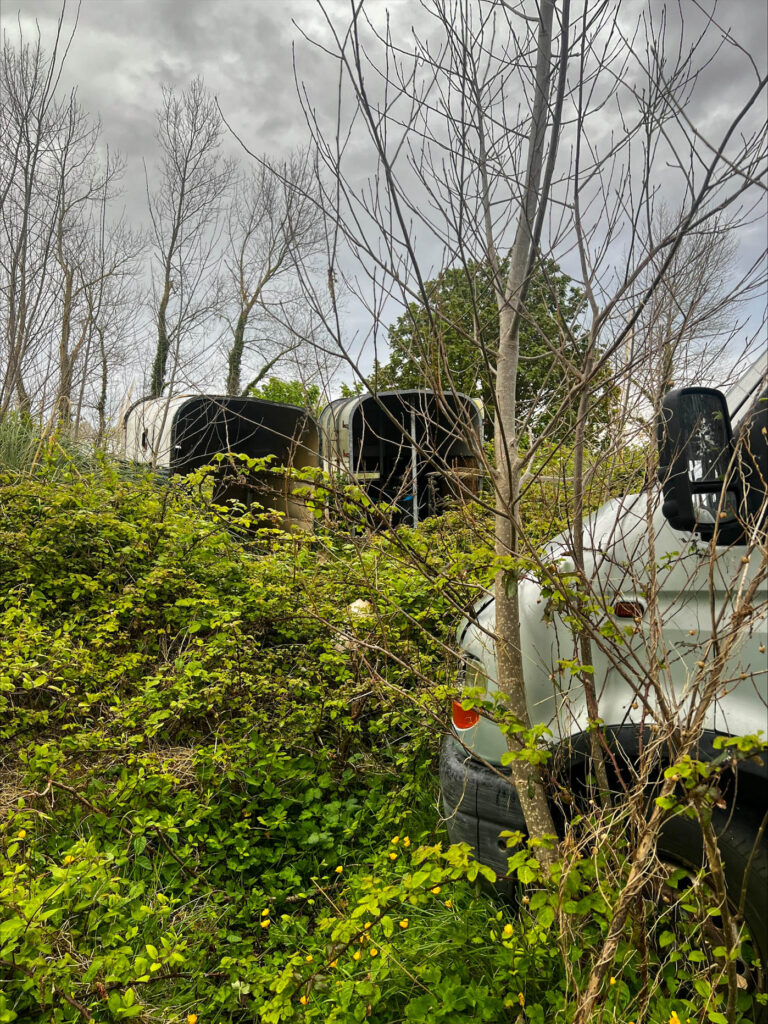
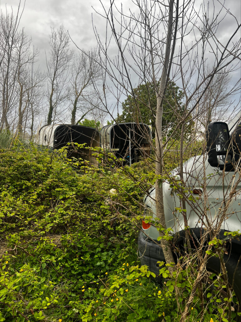
This image is adjacent to the headlights of the van, facing towards two abandoned horses carts used for transporting them from farm to farm. I chose to shoot this as I wanted to include different pieces of abandoned property scattered around the greenery, poking out from behind. I like this image as the foreground consists of this bright crowd of plants however the trees in the background are sparse with leaves, bare and dull.

Original image

For this image, I used the rule of thirds to shoot 3 urban buildings poking out from behind the weeds and trees. I feel as if this represents the way that urbanisation is taking over, so much so that this natural space most likely won’t exist in a few years due to the forthcoming building plans that will be bound to come.

Original image

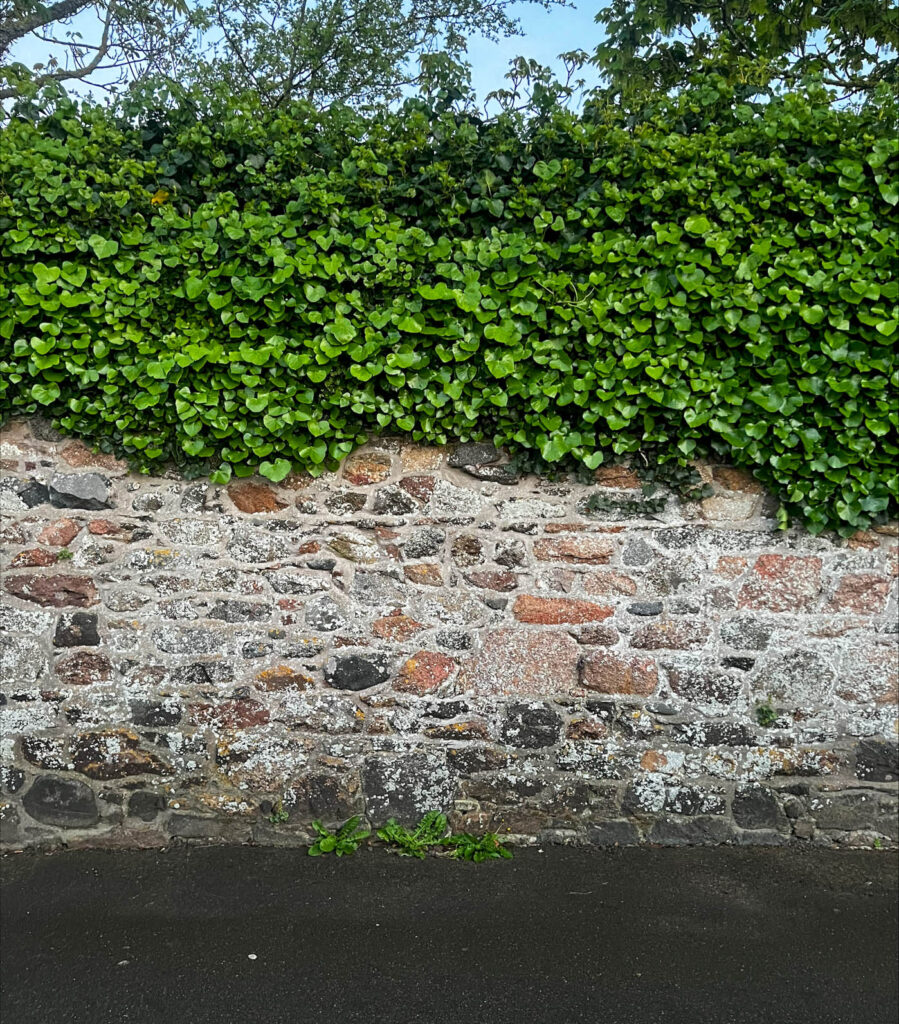
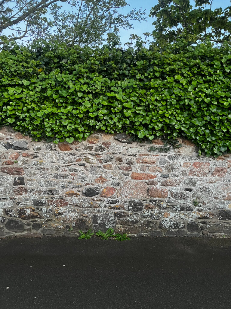
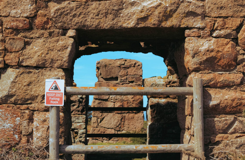
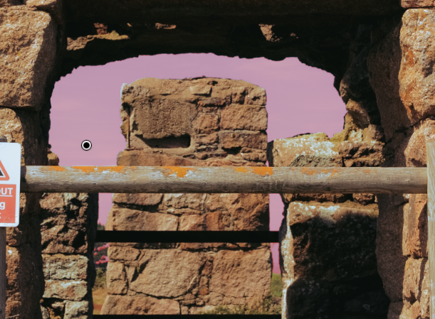
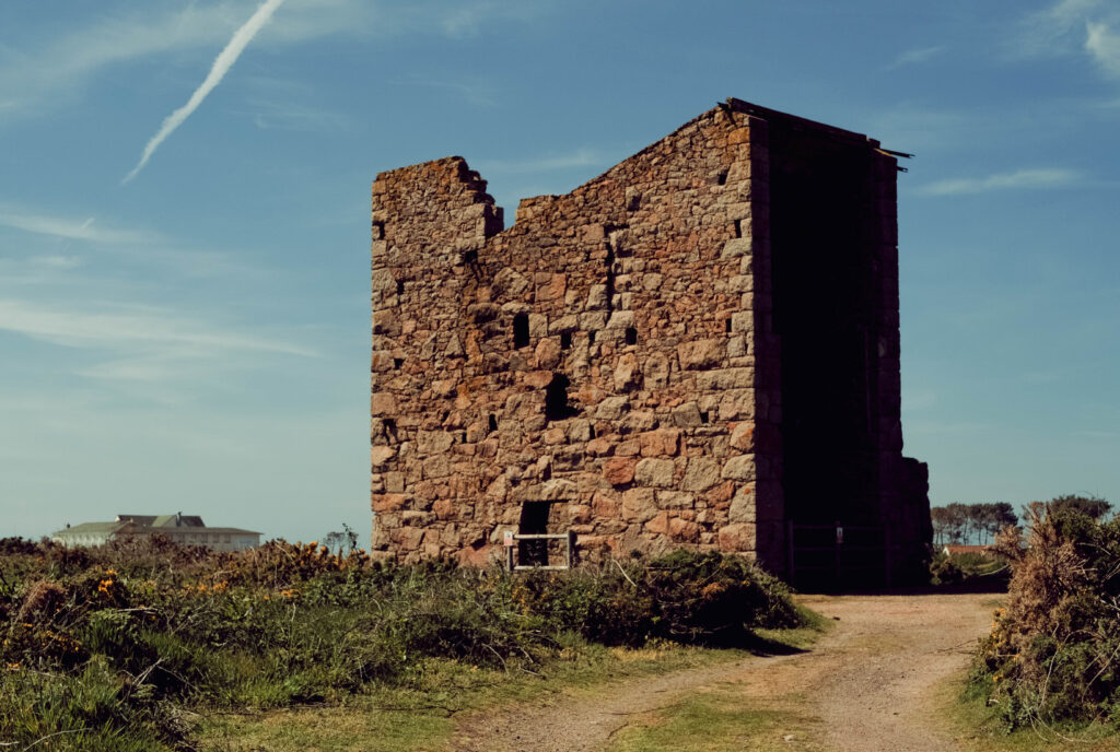
I wanted to shoot this image as I really liked the composition – the way the poison ivy is creeping down this eroded granite wall as these limestone and granite walls are everywhere to be seen in Jersey, something made from a natural resource that formed around 400 million years ago.


PHOTOSHOOT 3

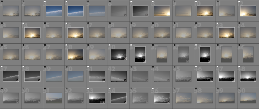
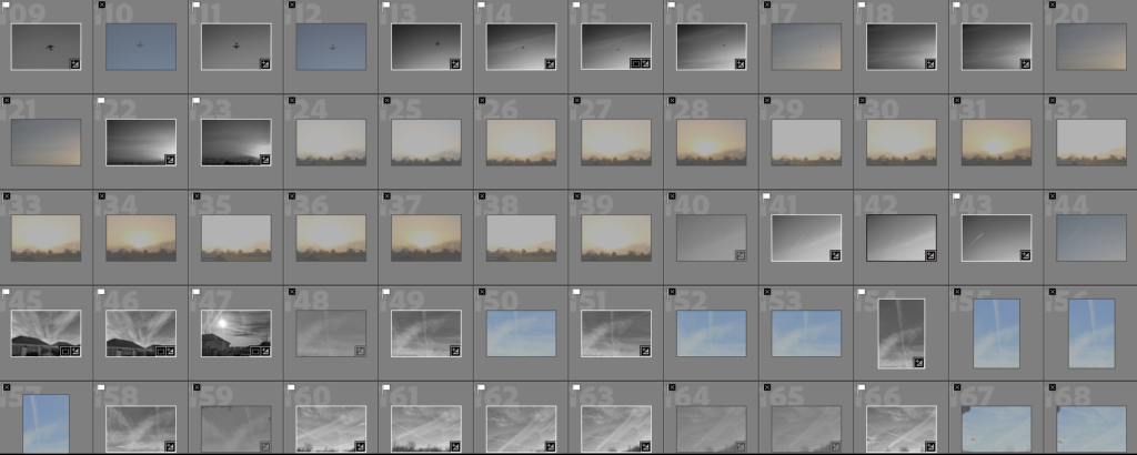
CONTACT SHEET:

ARTIST INSPIRATION:

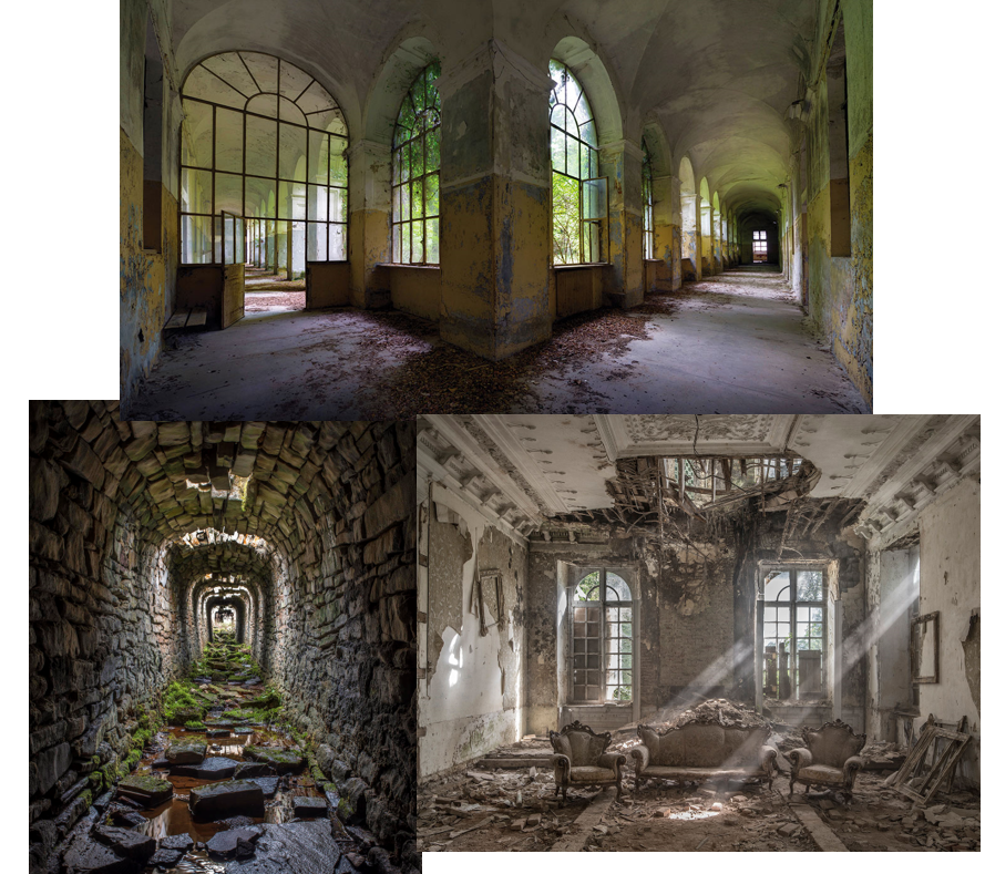
I was inspired by the photographer Matt Emmett, who focuses his photography on old, abandoned buildings. Although these buildings aren’t being used, they still look beautiful even though they are crumbling and decaying.

Examples of his work:

First edit:

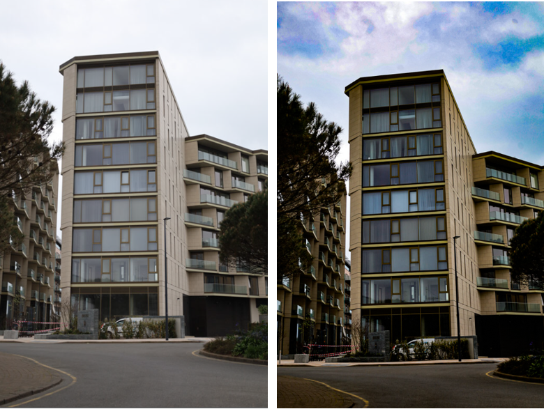
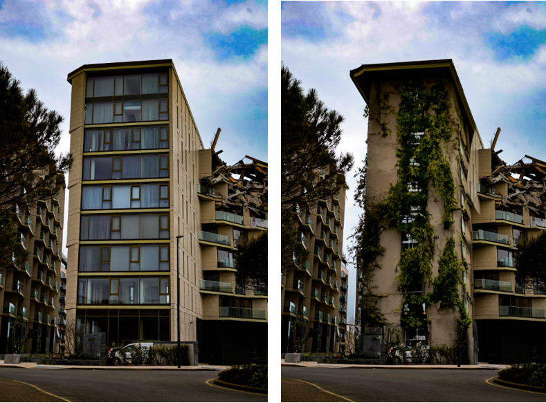
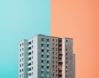
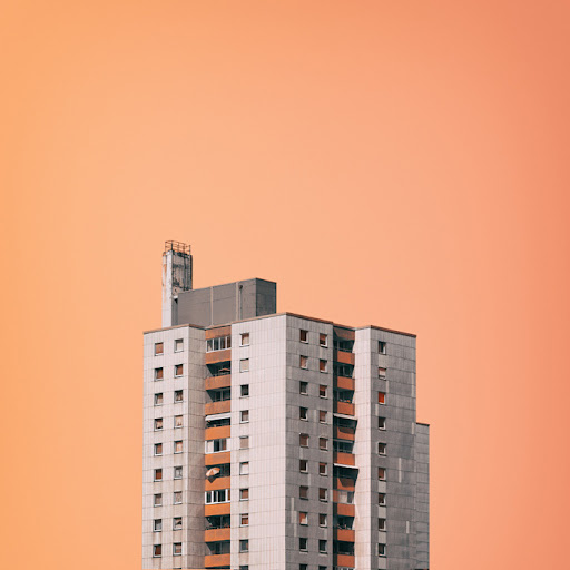
This is the process of my first final edit where I decided to turn a modern, appealing block of apartments into an old, neglected building.

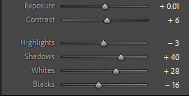
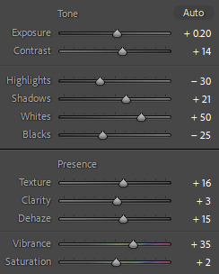
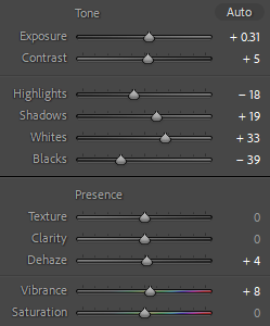
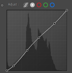
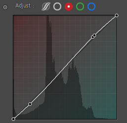
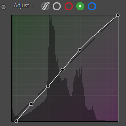
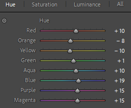
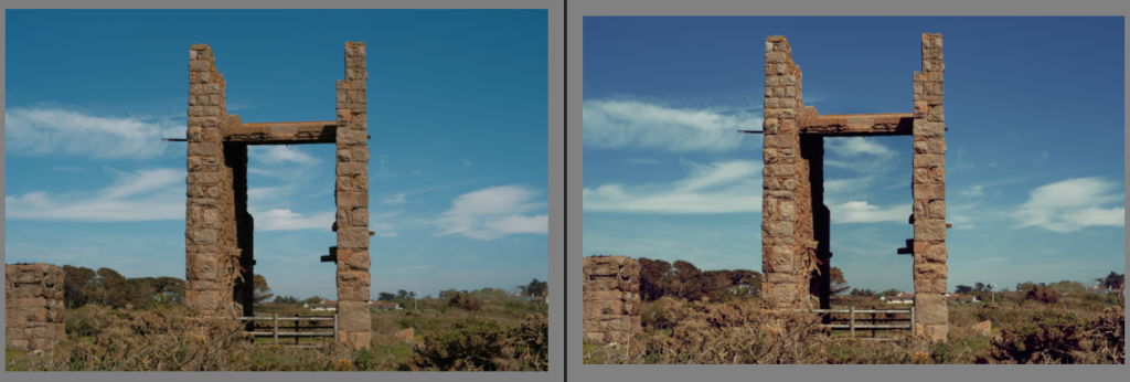
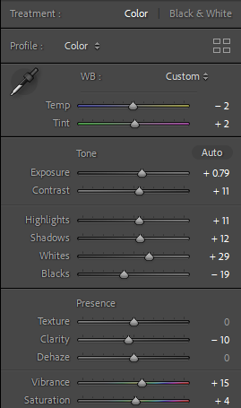
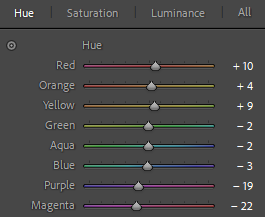
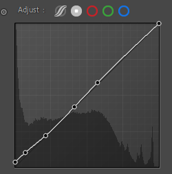
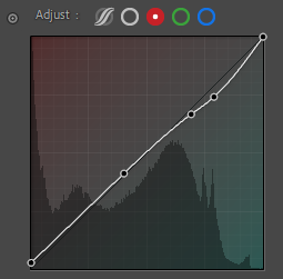
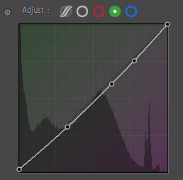
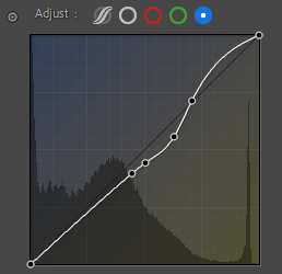
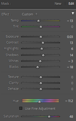
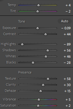
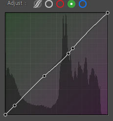
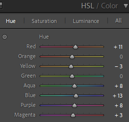
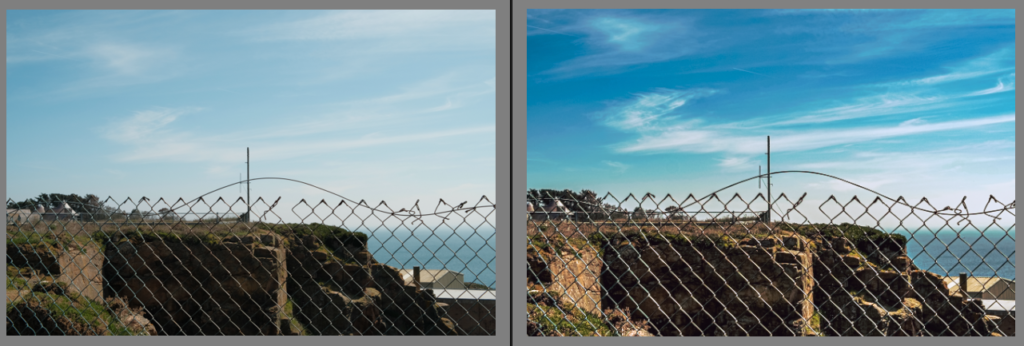
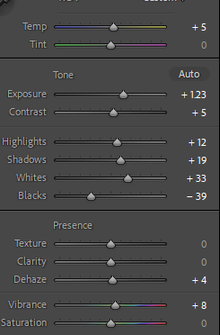
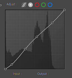
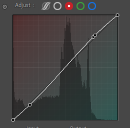
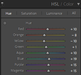
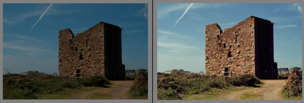
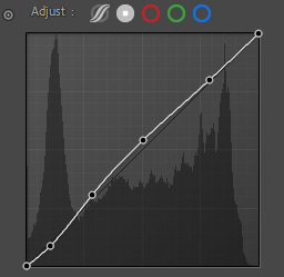
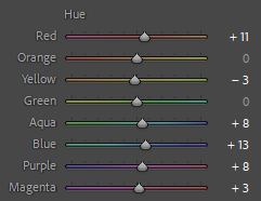
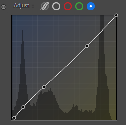
Firstly, I edited the image on Lightroom Classic to add a modernised affect by increasing the saturation and vibrancy of the image. This improved the image as it make the building look more appealing and full of life.

I then used AI in Photoshop to reconstruct the building and make it look as if it is decaying. Finally, I added vines to make it seem as though the building had been deserted and the vines add a natural affect to it.

Second edit:

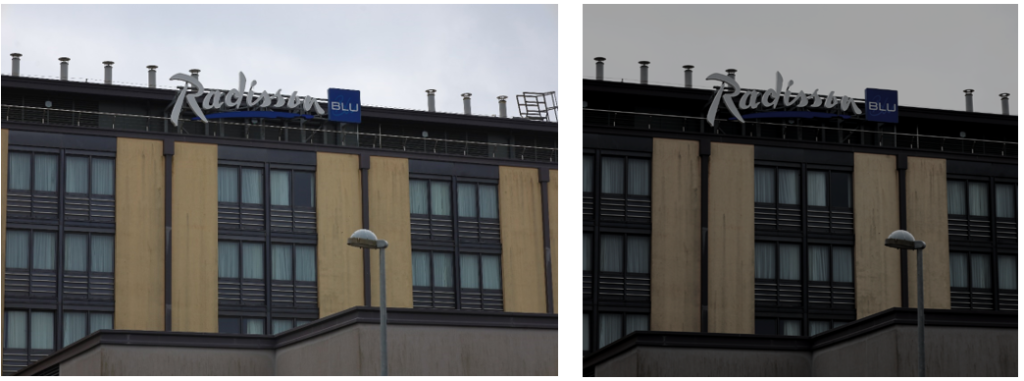
Firstly, I edited the original image using photoshop to make it look monotonous and dull. To do this, I decreased the saturation and vibrancy to make it lack colour. I also increased the contrast so the shadows and darker areas were made to look lifeless. Lastly, I cropped the image to discard any unwanted areas in the image, so I could focus my editing on the main area of the building.

Finally, on photoshop I used AI to completely change my image. I decided to make it look wild and deserted, with added vines on the outside of the building. In conclusion, the block of apartments were changed into a futuristic, neglected building.

I was inspired by Matt Emmett to create and edit these images as I think his photography is meaningful, and it shows that abandoned places can still be viewed as beautiful even though they have been neglected.

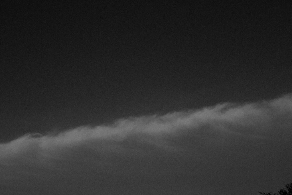
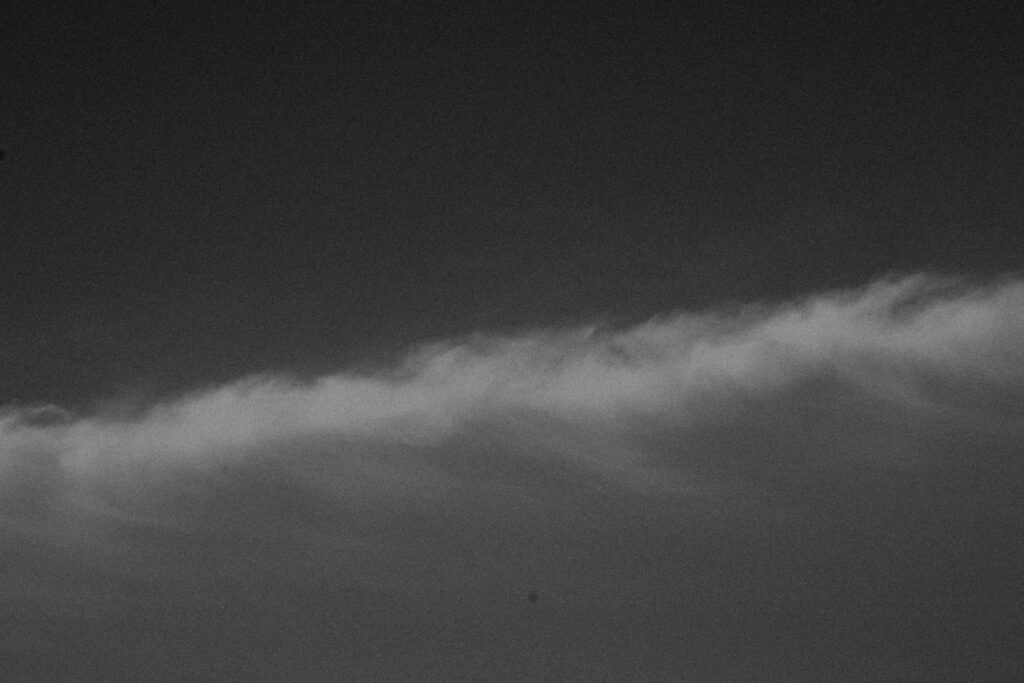
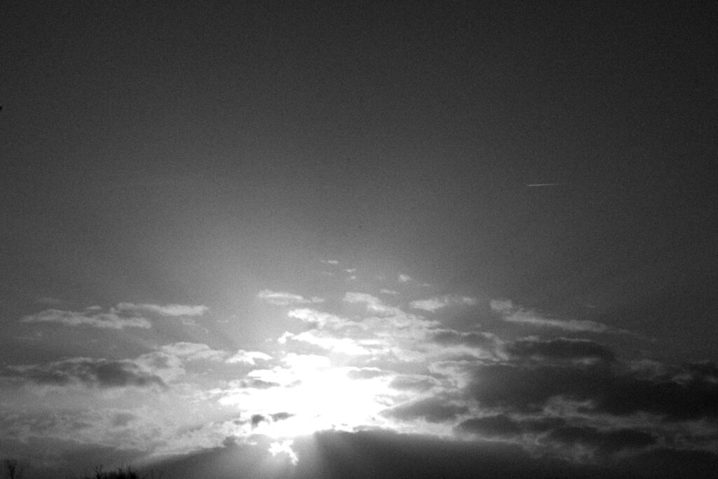
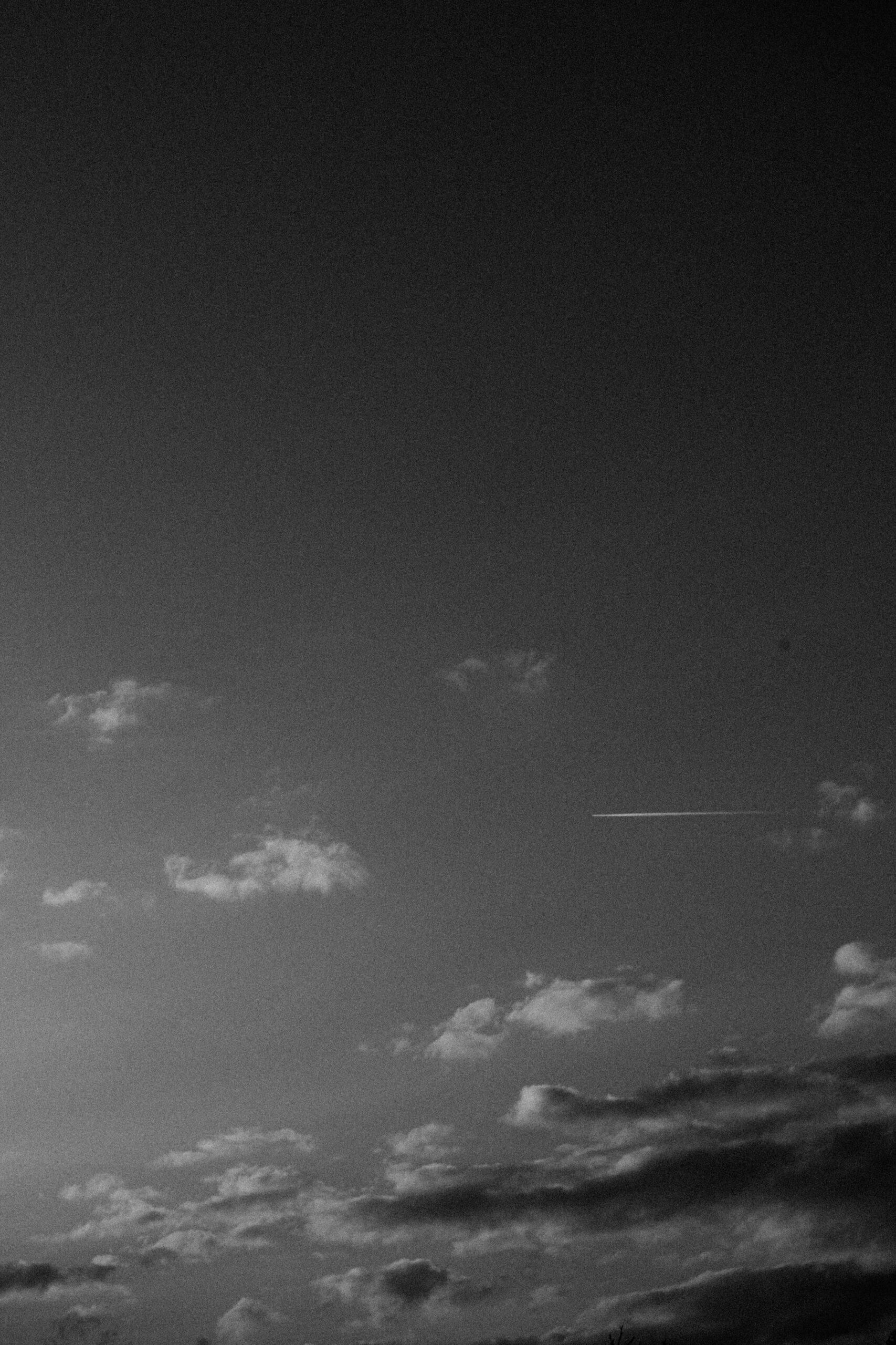
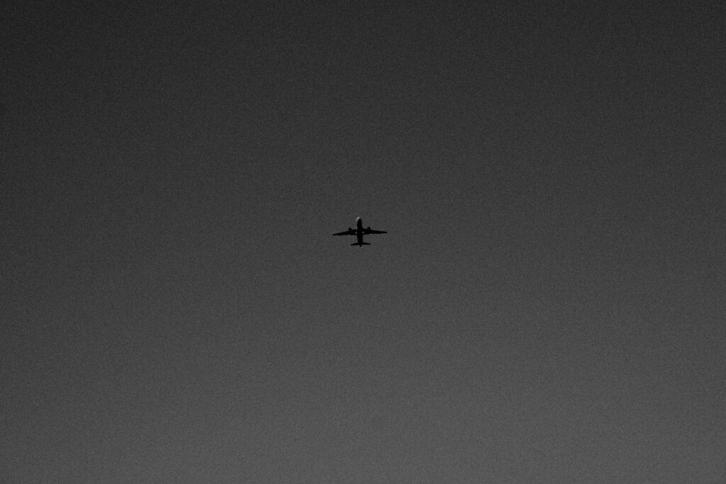
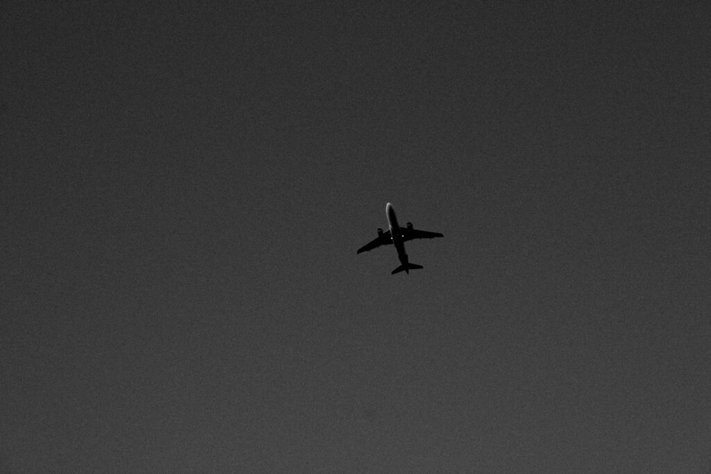
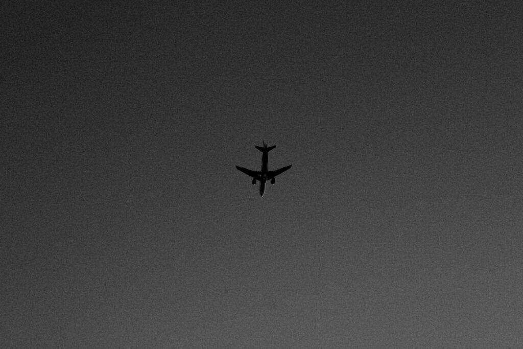
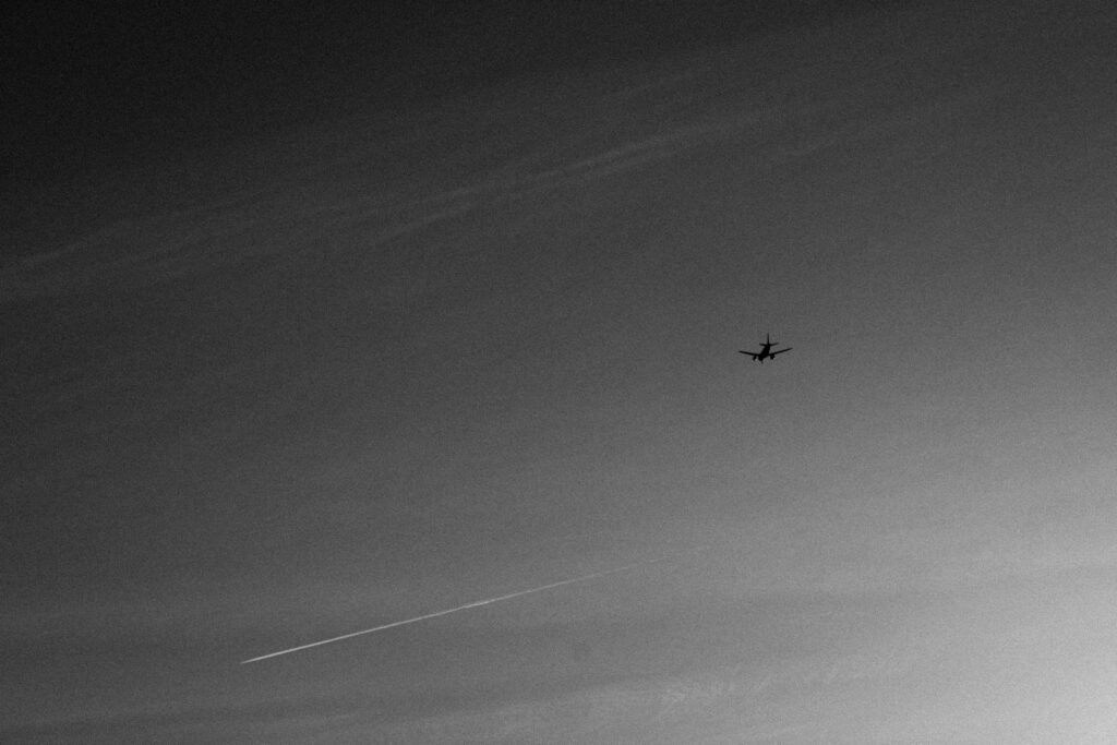
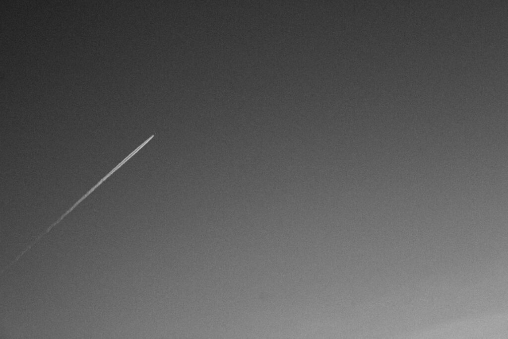
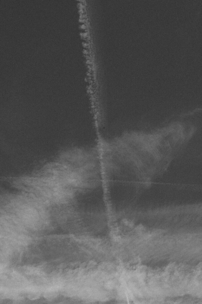
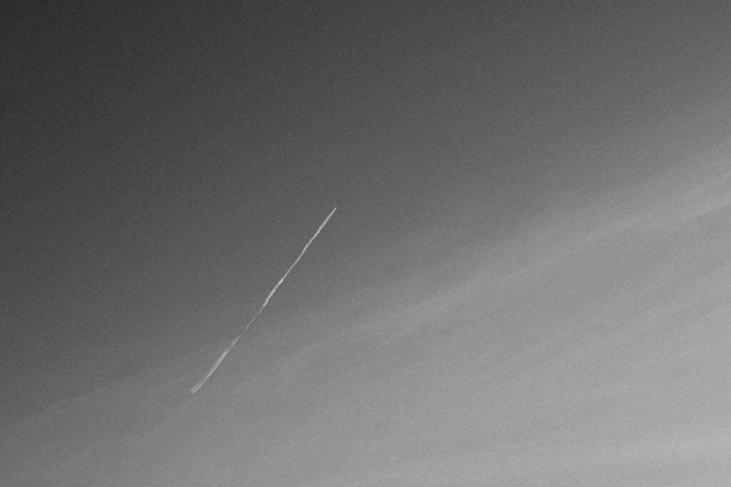
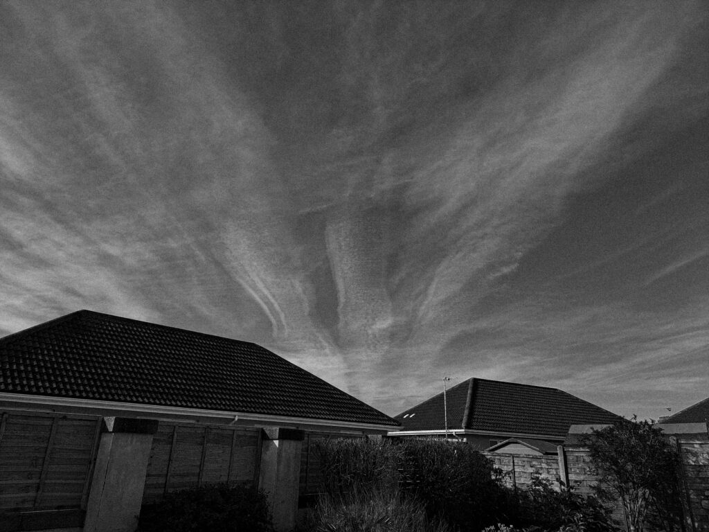
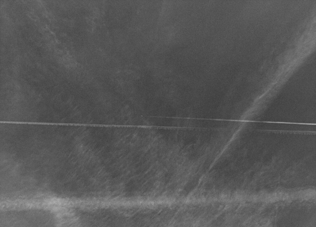
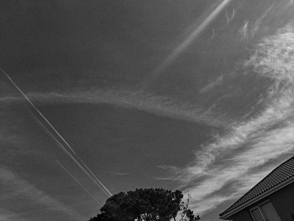
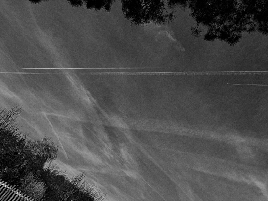
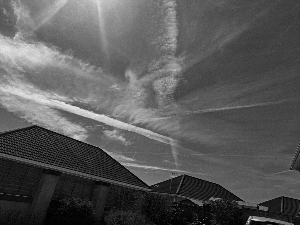
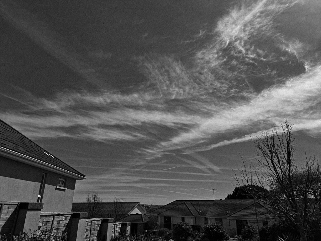
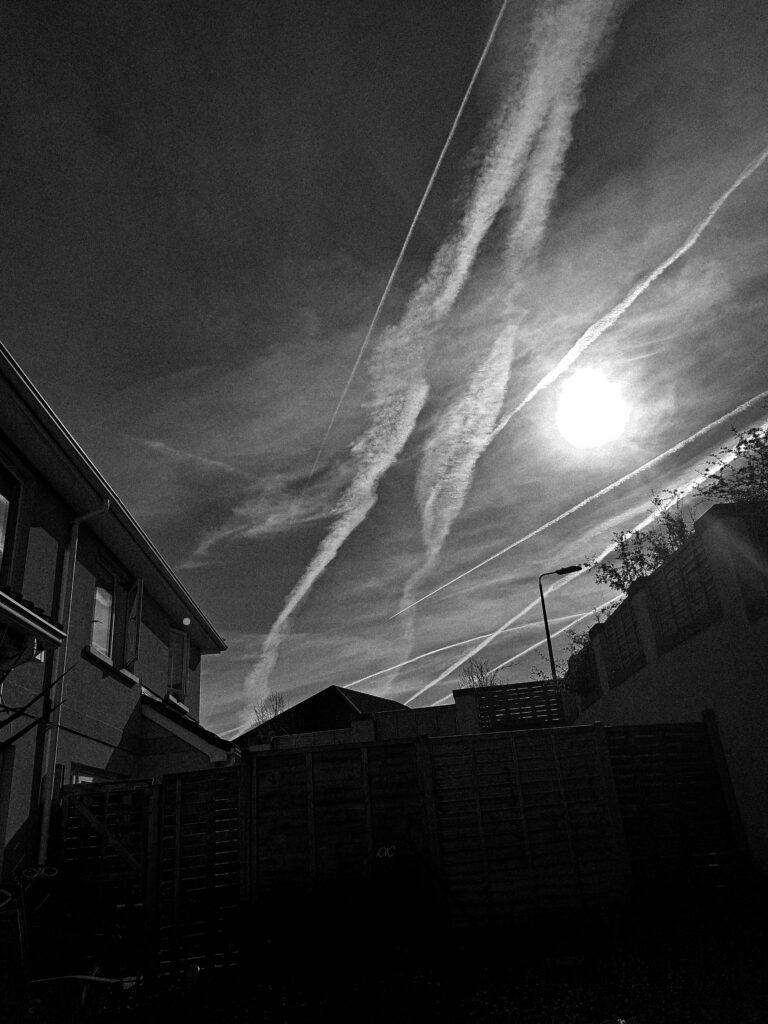
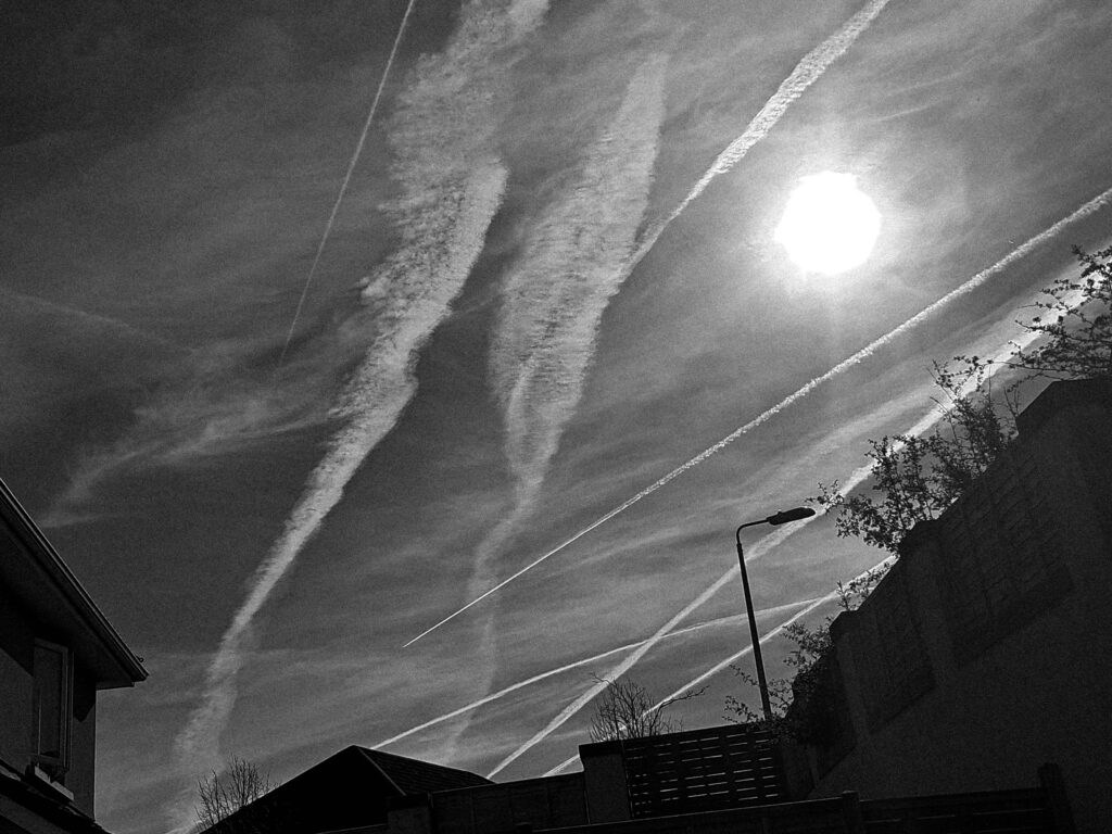
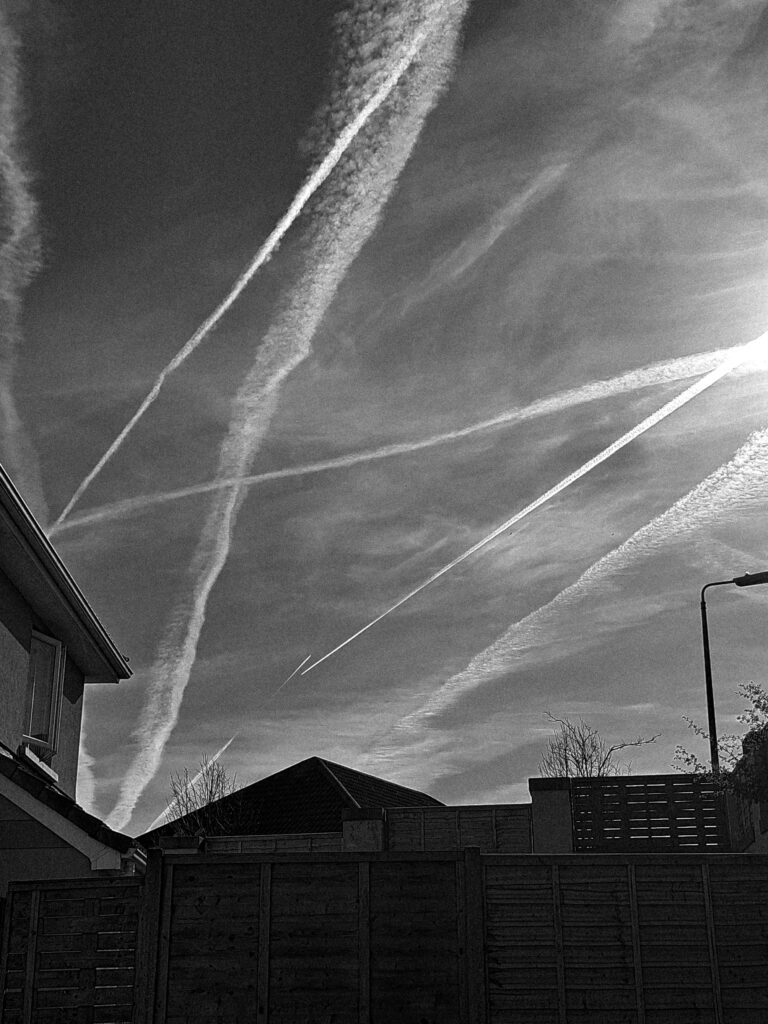
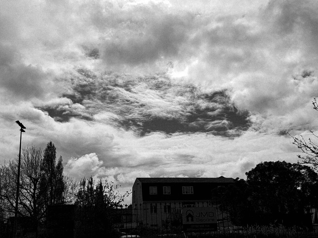
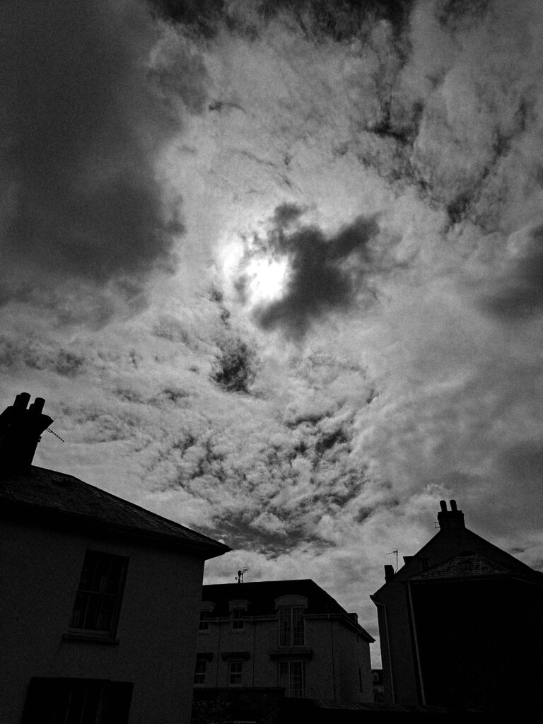
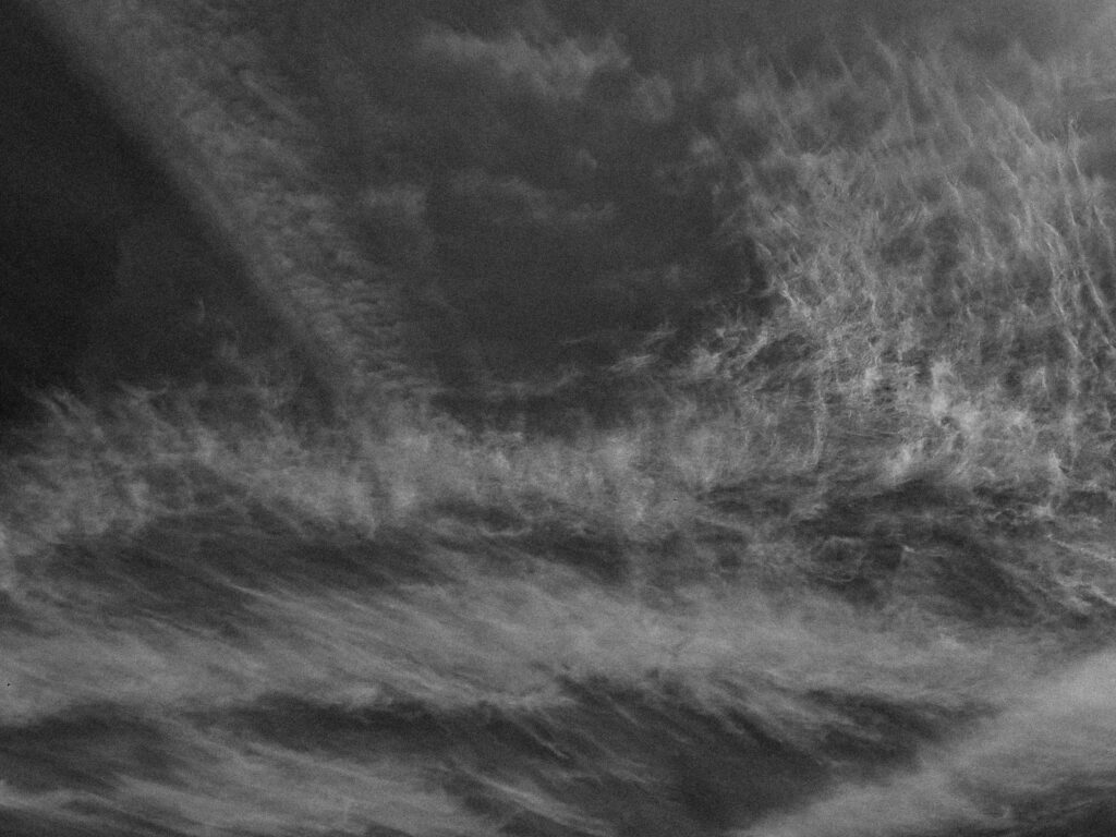
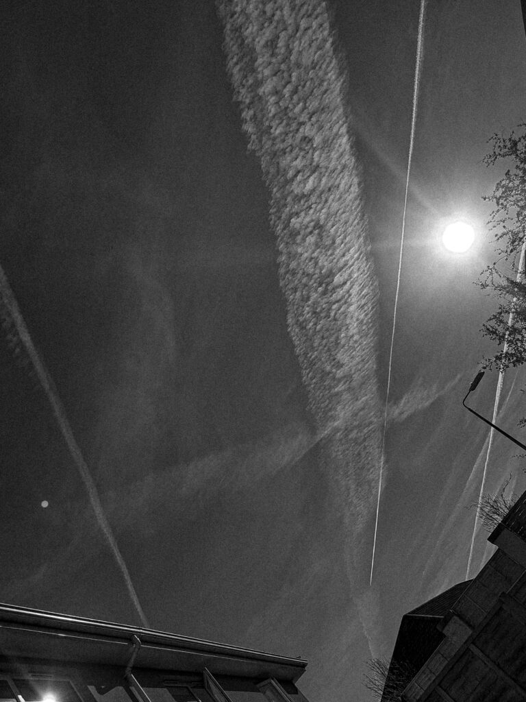
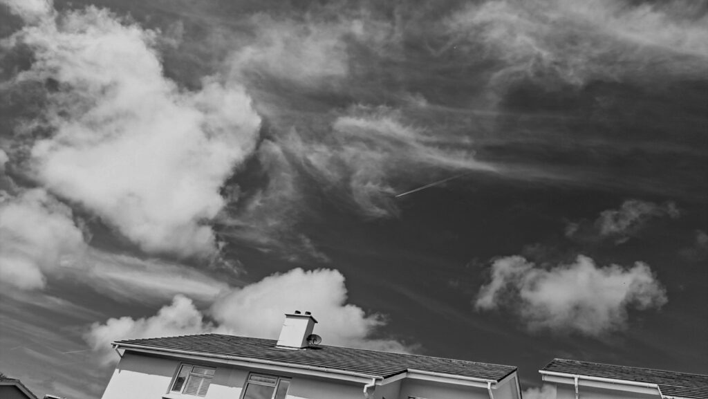
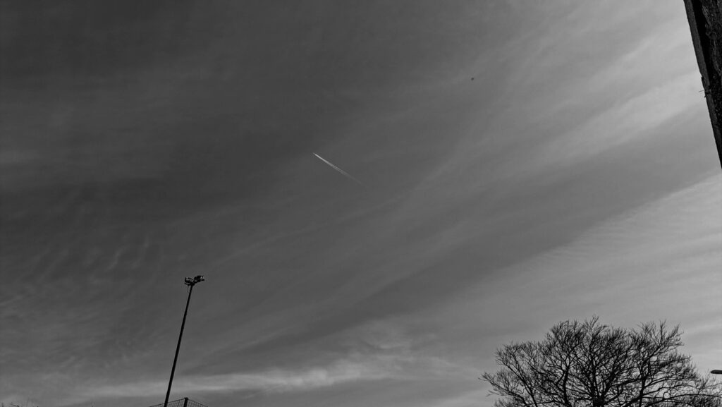
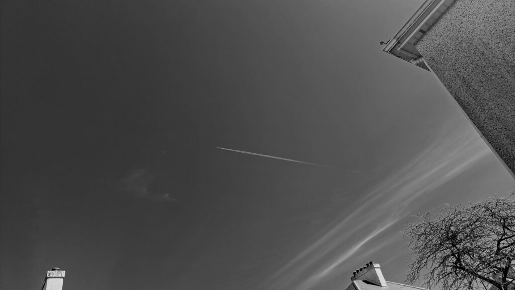
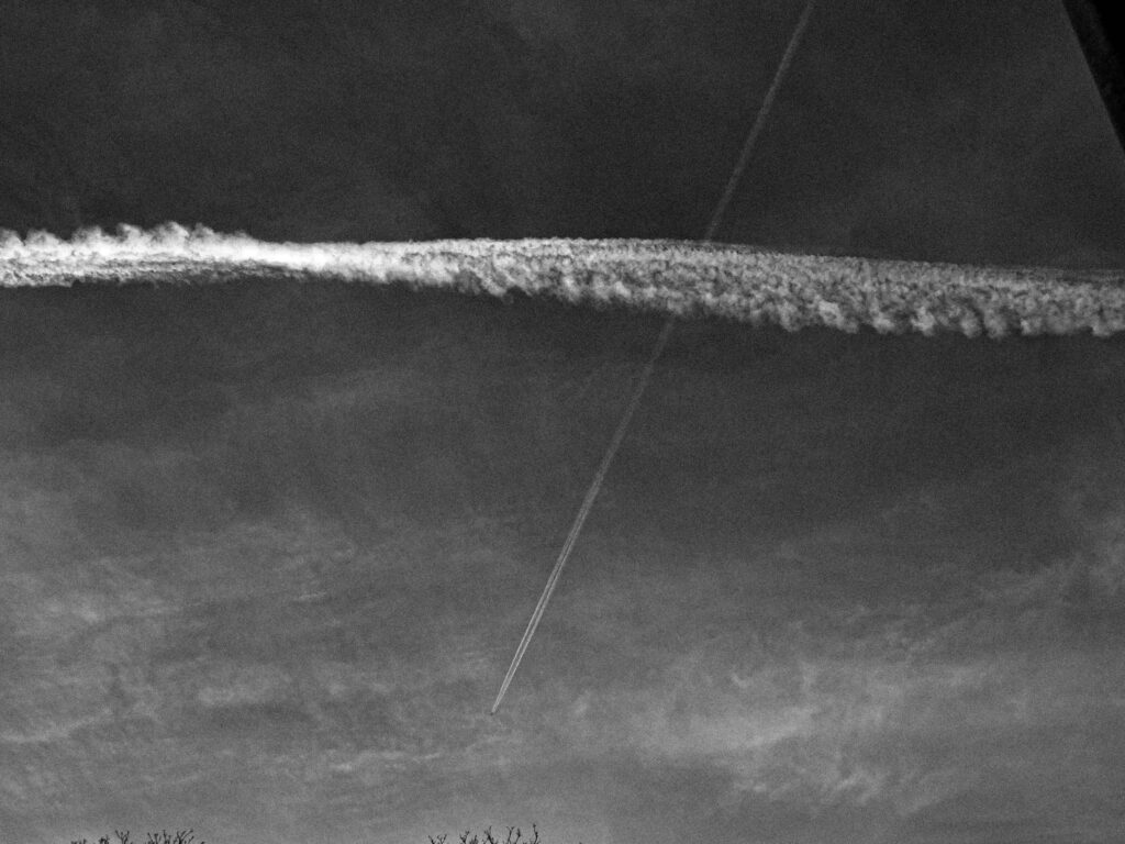
Anthropocene Photoshoot – Cloud Studies and Plane Pollution

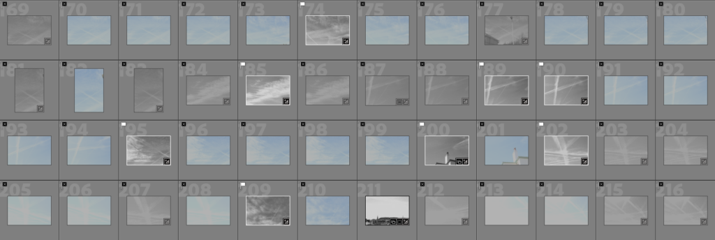
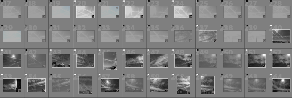
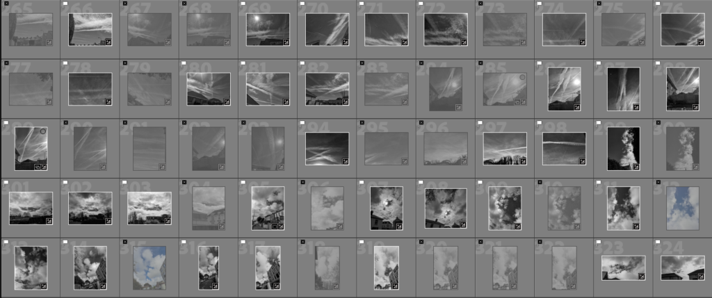
Edited Selected Images

Image Analysis

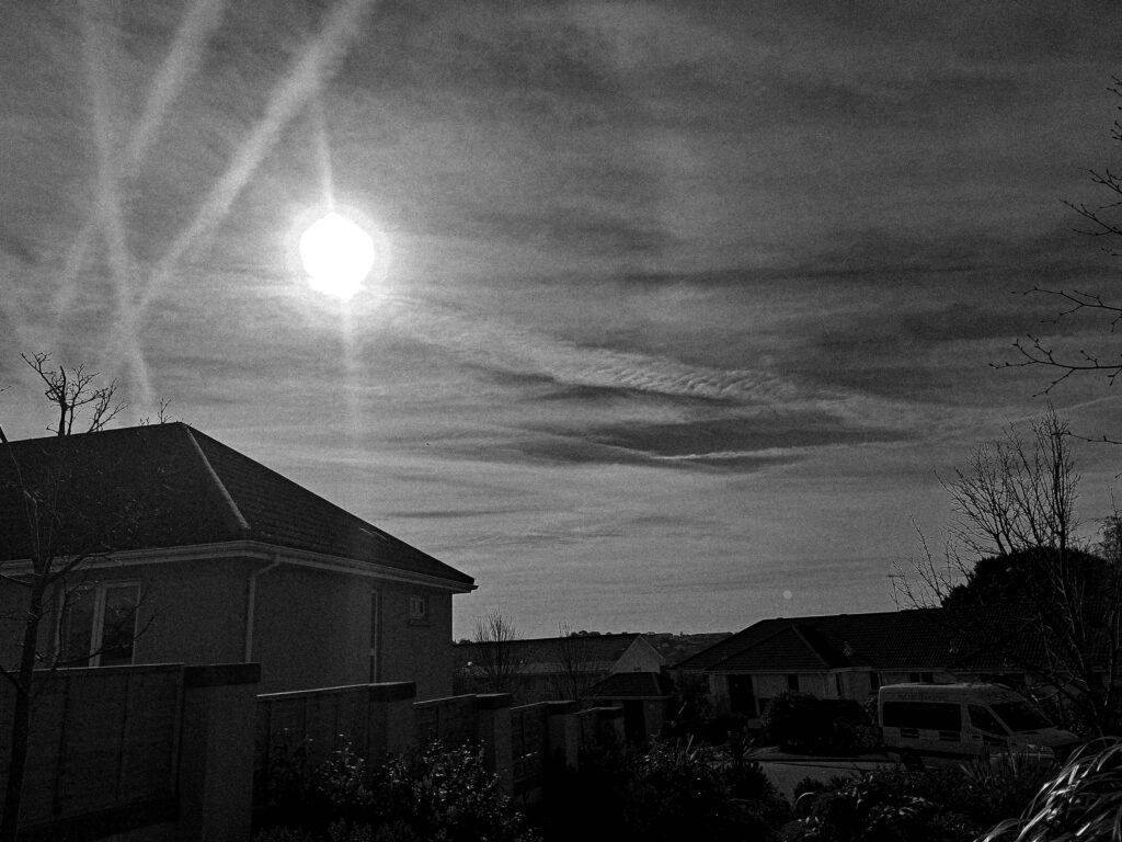
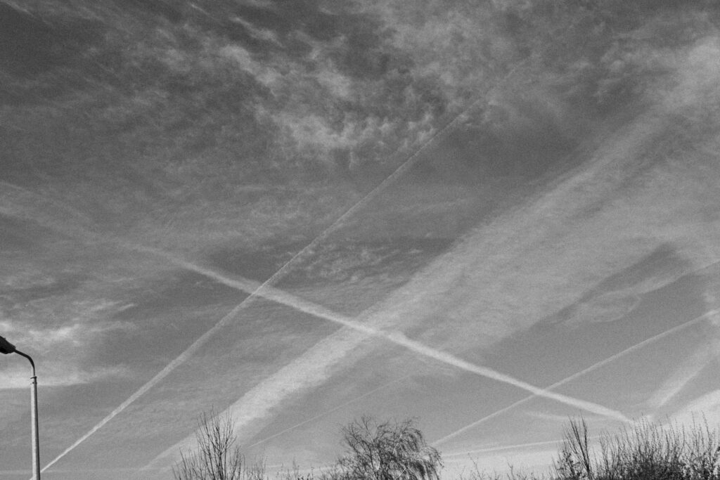
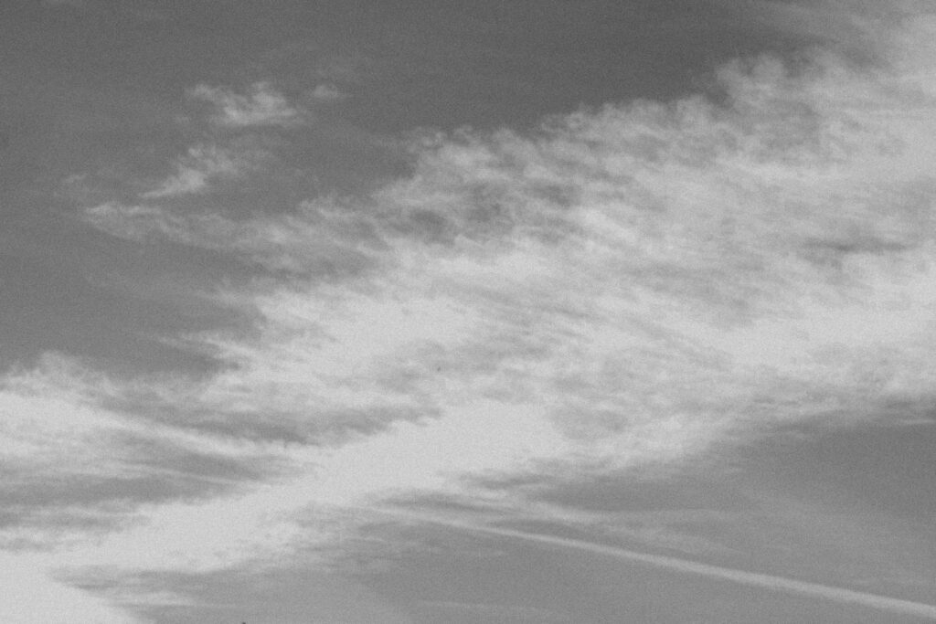
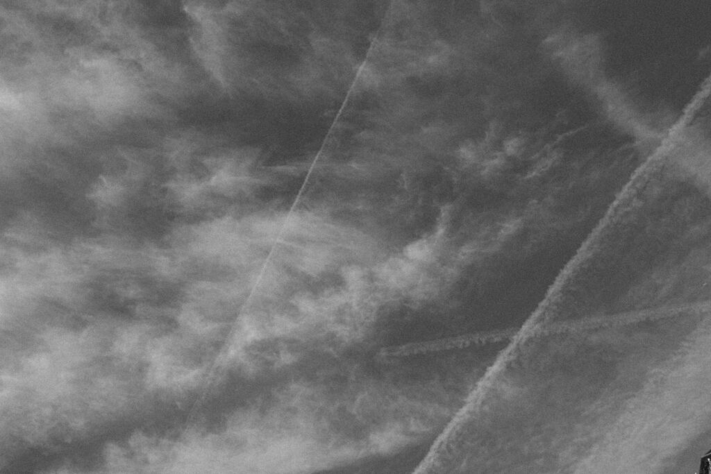
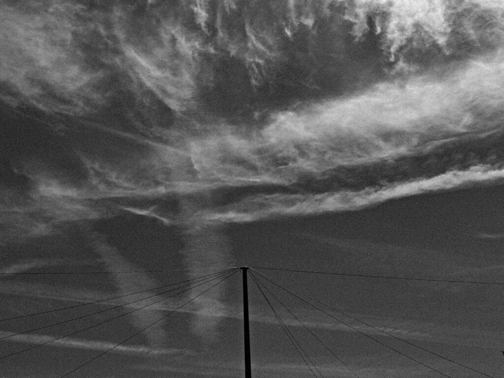
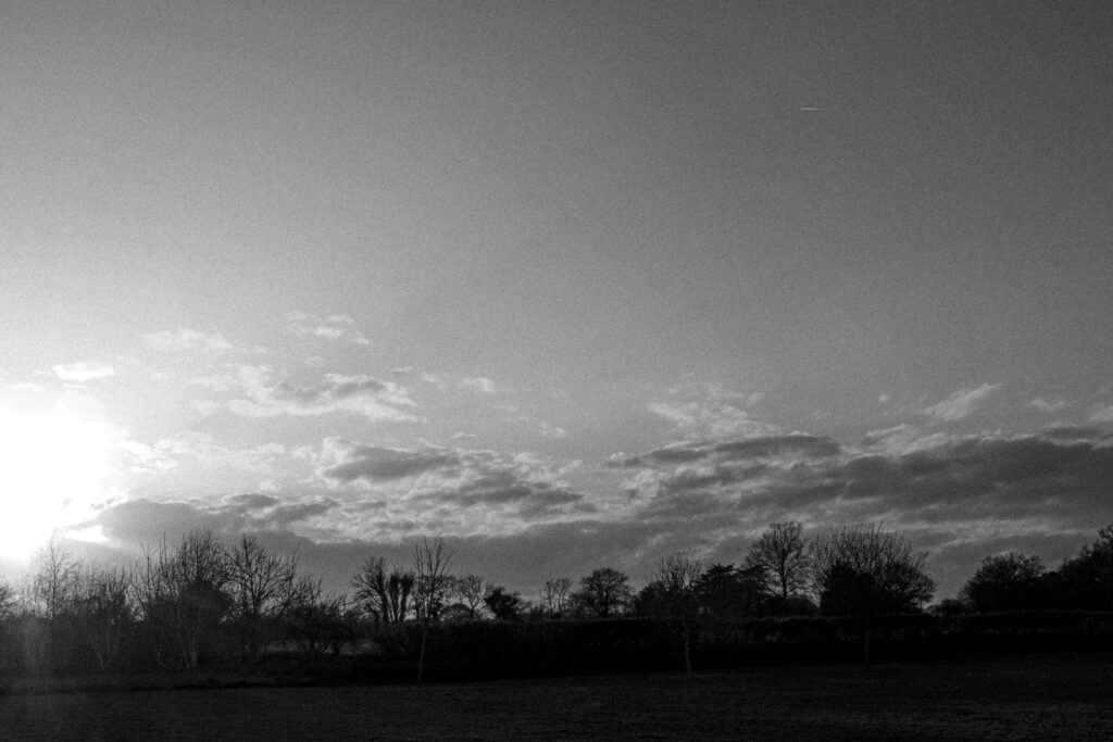
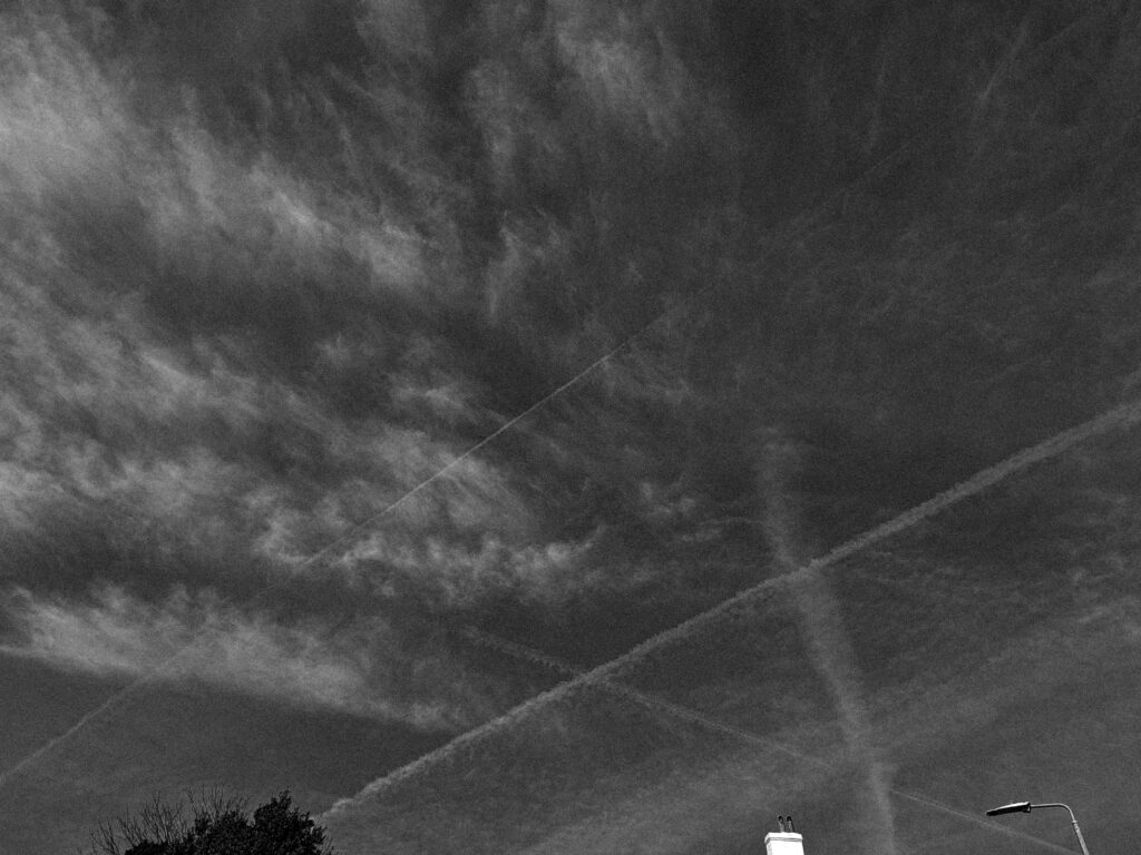
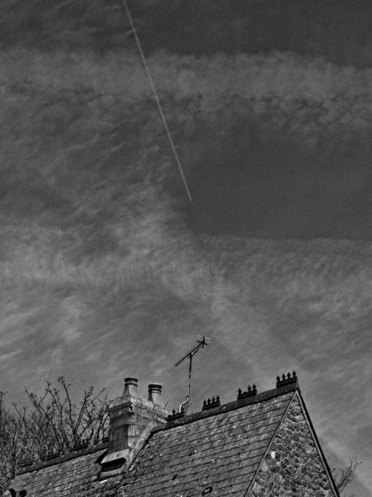
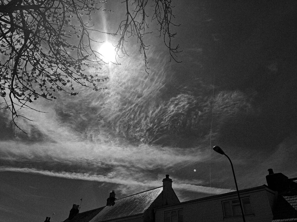
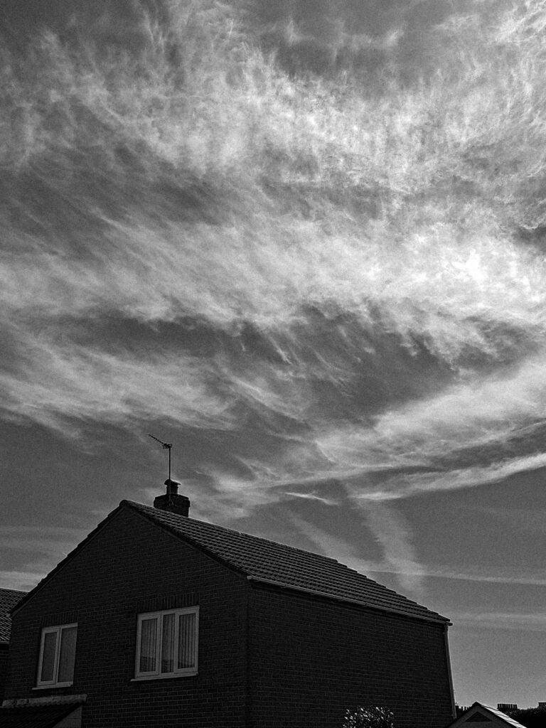
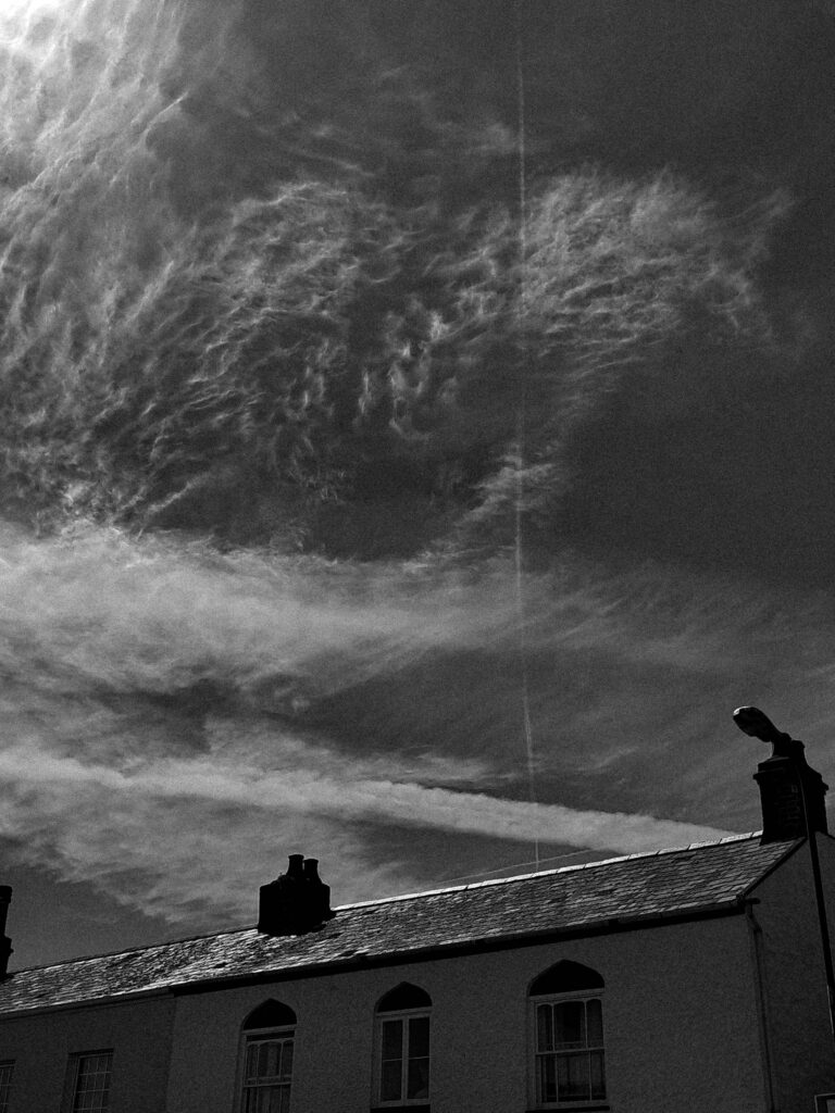
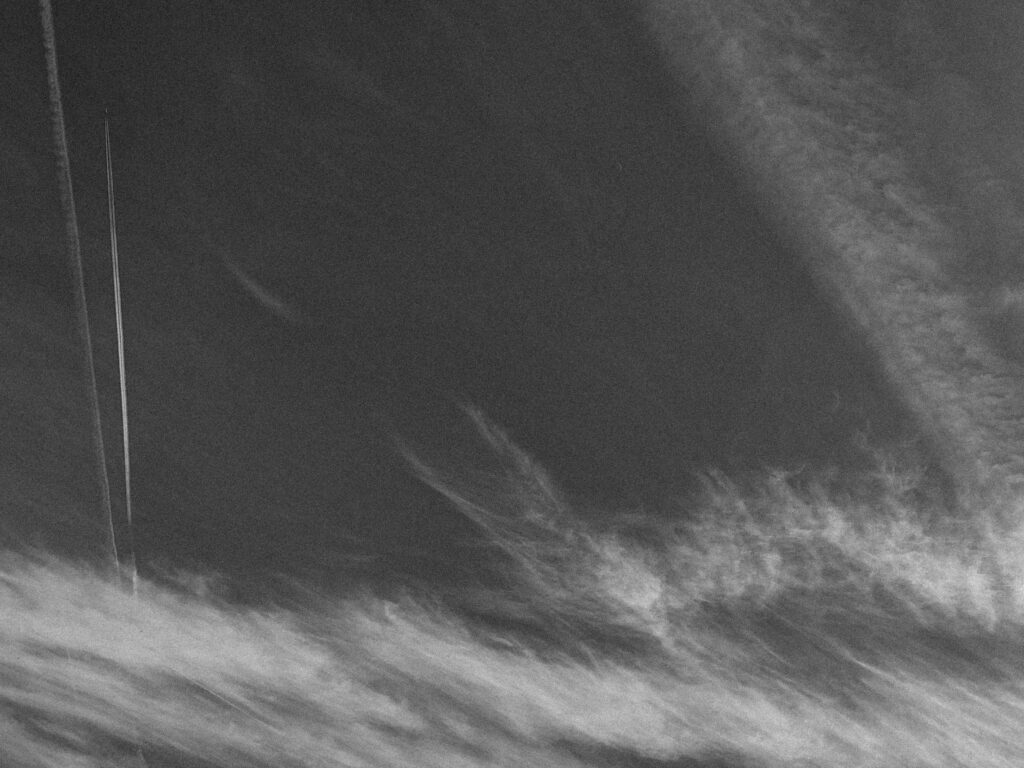
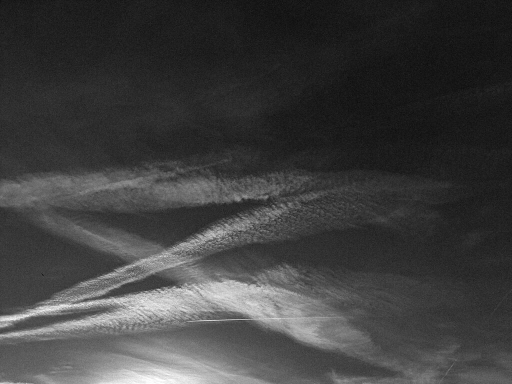
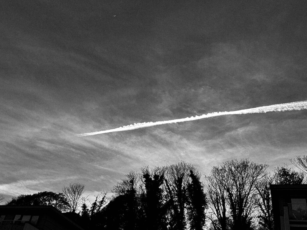
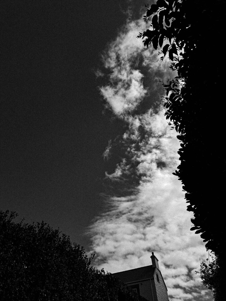
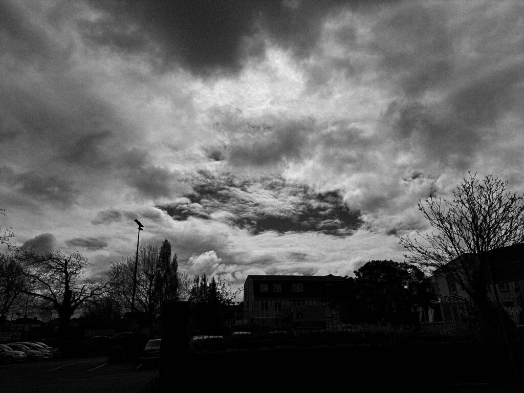
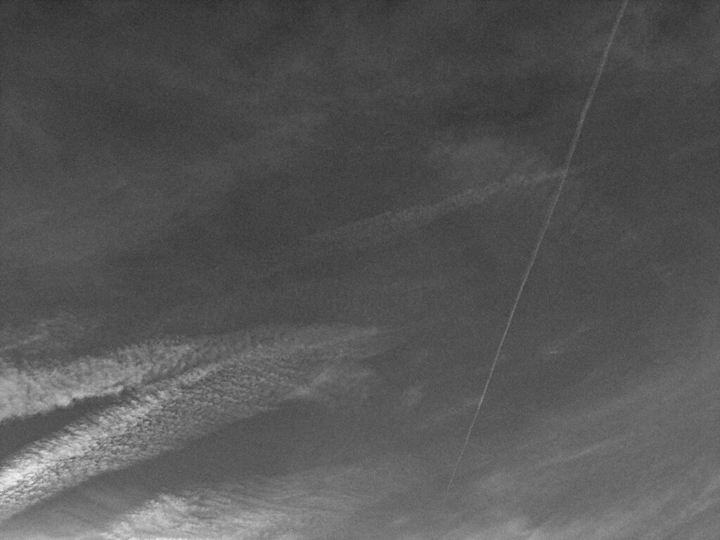
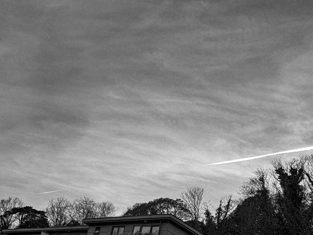
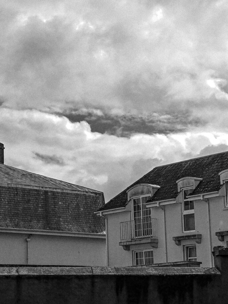
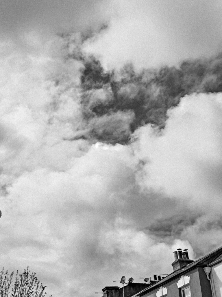
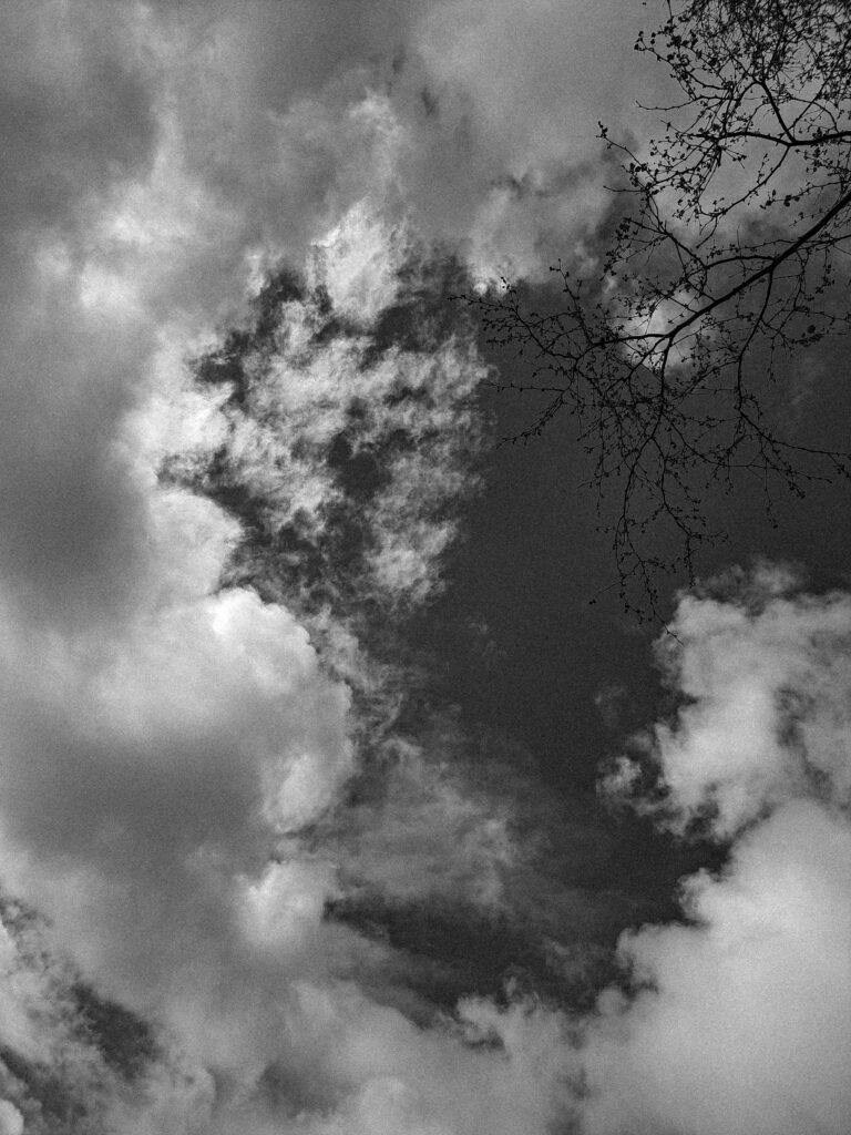
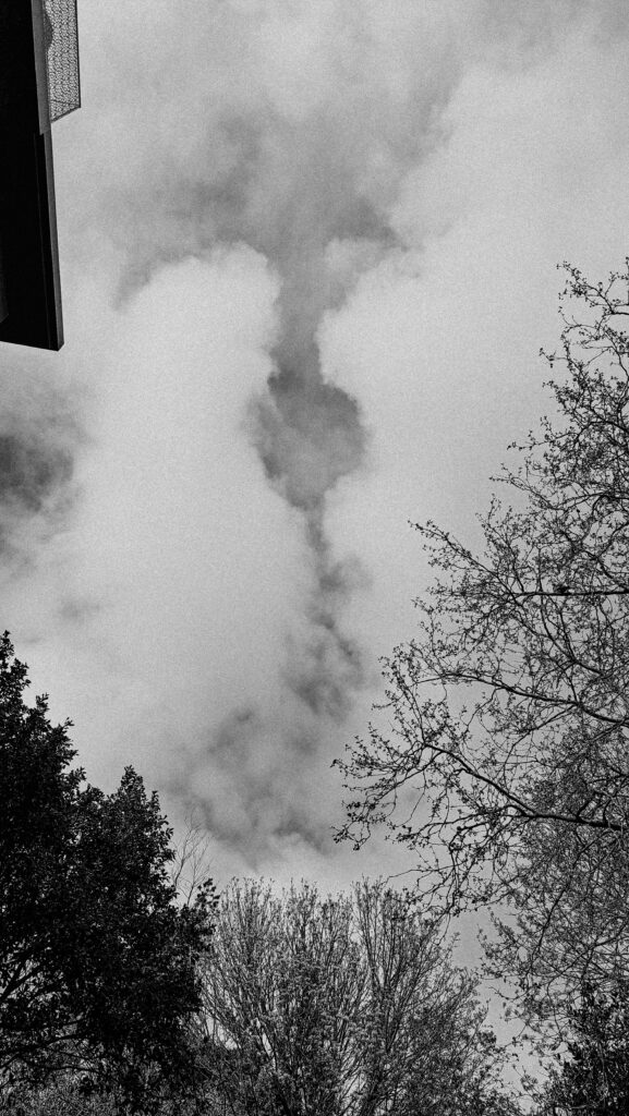
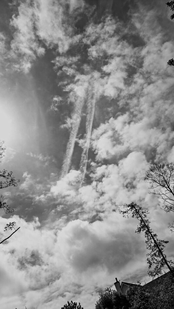
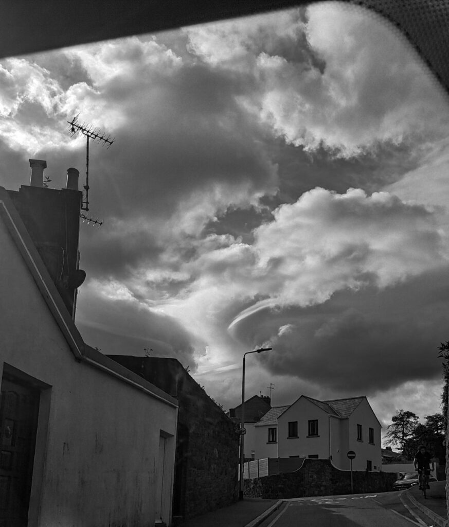
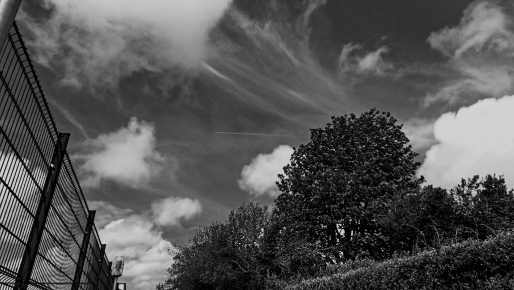
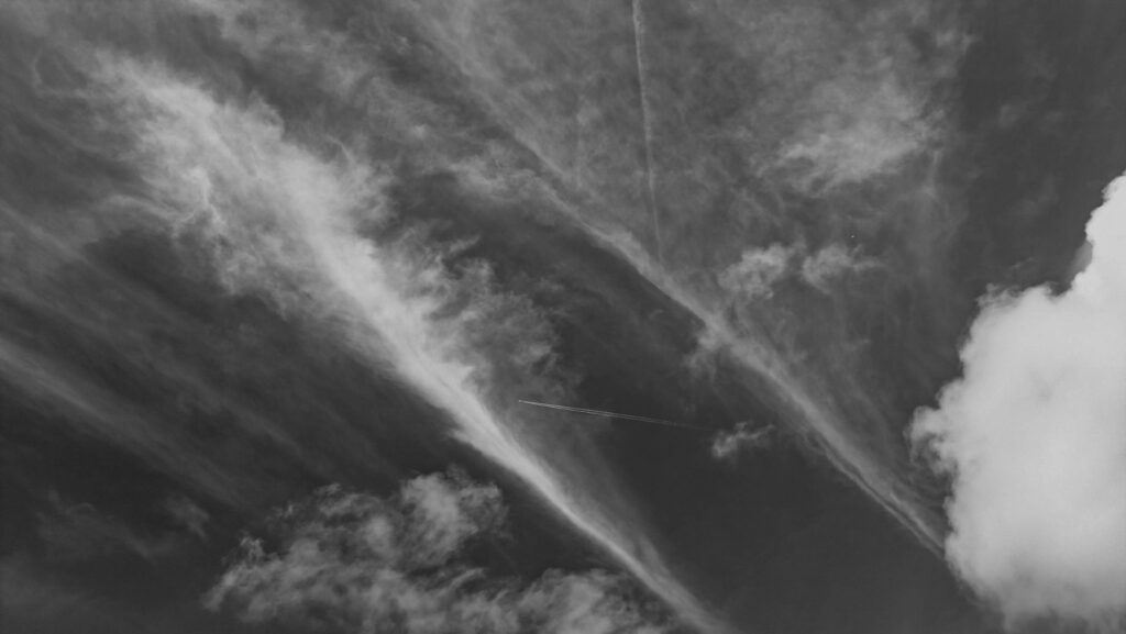
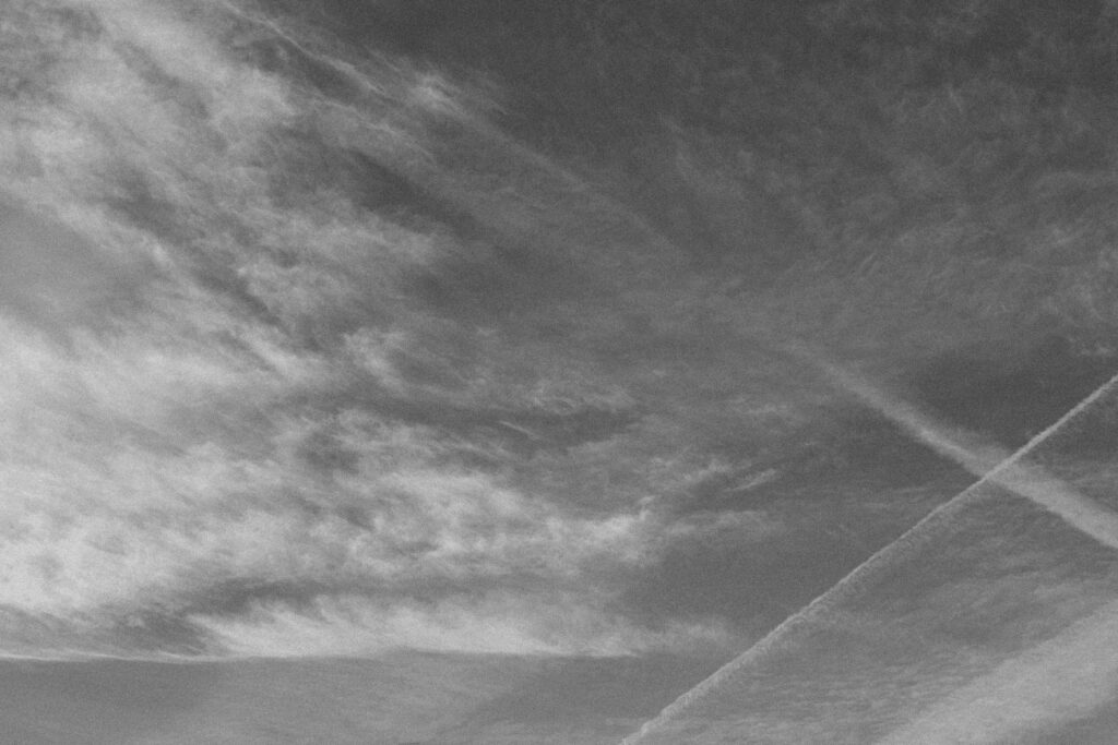
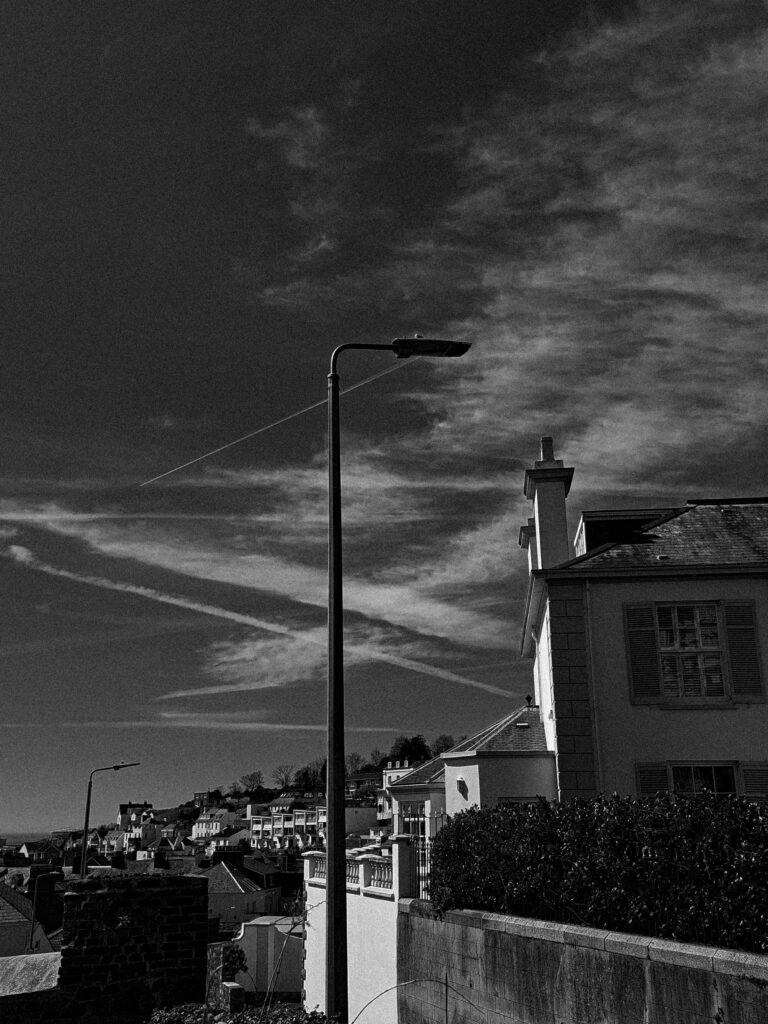
With this photoshoot I aimed to capture the form of both clouds and plane contrails. My main theme, that links to Anthropocene, was plane/air pollution. I specifically wanted to focus on contrails because of their immense contribution to climate change.
Contrails not only cause the Earth’s atmosphere to be more cloudy but also trap energy in the atmosphere and allow a lot of solar radiation to penetrate the Earth’s surface.

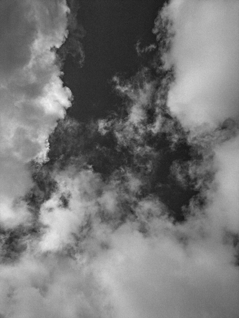
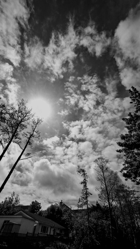
I was heavily inspired by Alfred Stieglitz, his work on cloud studies is very abstract and full of tonal range. He captured the forms of clouds in great detail, showing the variety of shapes that they come in. I wanted to incorporate elements of his work into mine.

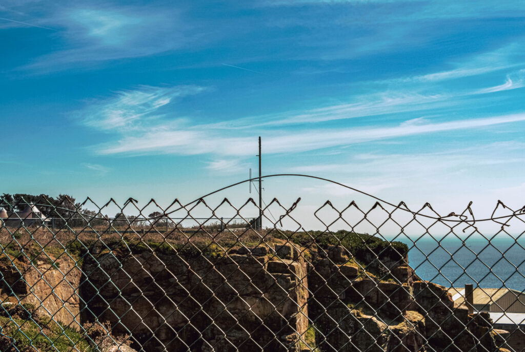
I’ve attempted to achieve this by using a black and white filter to reveal the large ranges of tone and texture in the sky and clouds. I had also made sure the weather conditions I took the photos in were roughly the same so that once I edited them the sky would be a dark grey or black to contrast with the clouds and contrails.

Romanticism

What is Romanticism in photography?

Romanticism placed particular emphasis on emotion, horror, awe, terror and apprehension. Emotion and feeling were central not only to the creation of the work, but also in how it should be read. The following characteristic attitudes of Romanticism are the following: a deepened appreciation of the beauties of nature; a general exaltation of emotion over reason and of the senses over intellect; a turning in upon the self and a heightened examination of human personality and its moods and mental potentialities
What Are the Characteristics of Romanticism?

  1. Emotion and passion.
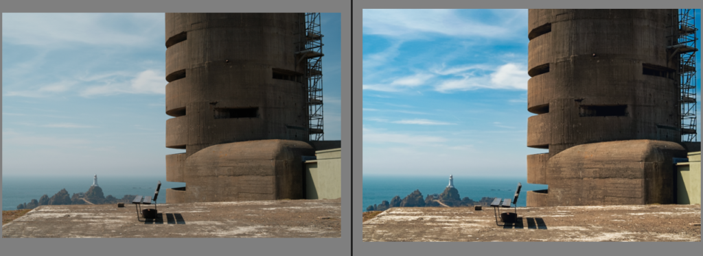
  2. The critique of progress.
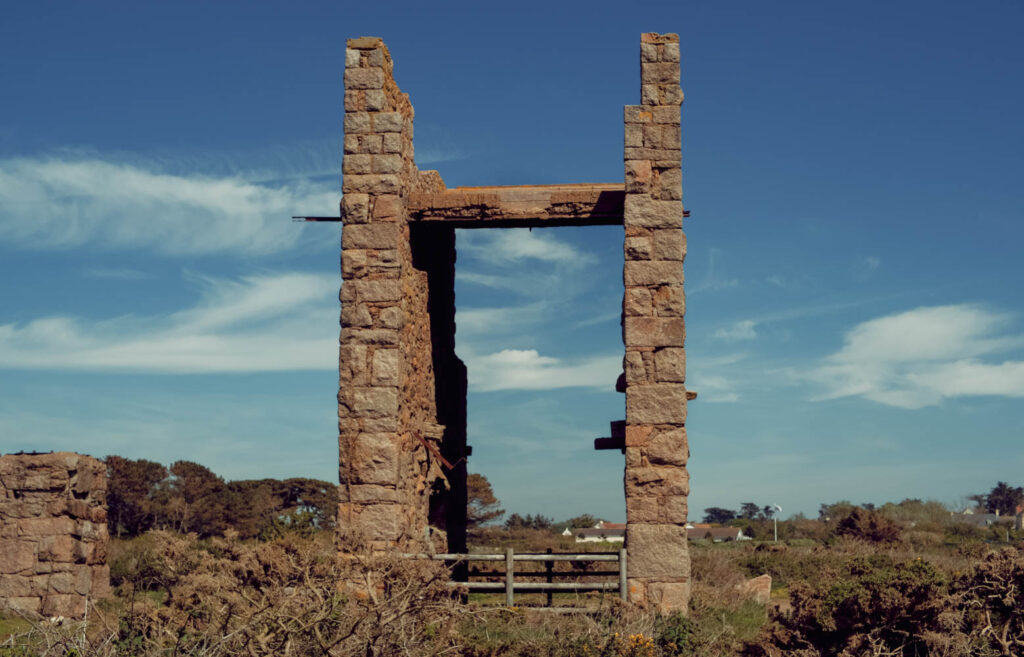
  3. A return to the past.
  4. An awe of nature.
  5. The idealization of women.
  6. The purity of childhood.
  7. The search for subjective truth.
  8. The celebration of the individual

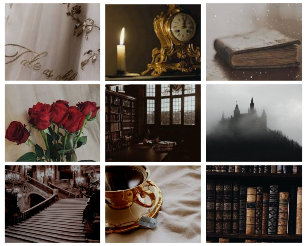
Mood Board

Romanticism of Rural life/outcome

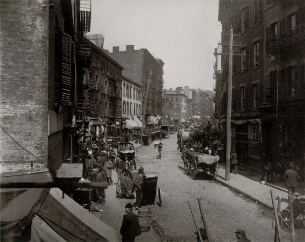
Nineteenth century urban society romanticized rural life. “The frontier farmer was idealized, and it was held to be true that life in the west fostered independence and self-reliance.” It was believed that life on the frontier consisted of a classless society in which people were judged not by their family name or position, but on their character, ability, and talent. The belief in “the nobility of country life” and the “purity of lives lived so close to the soil” contributed to the acceptance of the placing out movement by nineteenth century society. The west was viewed as the perfect place for the “urban poor to begin over and reach their full potential.” Brace actively pursued the placing out of New York City children in homes in rural America as a result of this idealization of rural life. He viewed the city as “an evil place full of temptations and unsavory associates.” Brace believed that children were easily corrupted by the immorality and wickedness they witnessed on the city streets and that this exposure doomed them to a life of crime and misery.

The country, on the other hand, represented a healthy, wholesome environment filled with opportunities for prosperity. Brace held a “startling idealized portrait of country folk.” He believed the tables of rural America overflowed with an abundance of nutritious food which rural families would be happy to share with hungry children. Brace believed that rural America was the “cradle of wholesome values.” He enthusiastically believed that rural families could be trusted to embrace the disadvantaged children of poor and educate them to become successful, productive members of society. The determination of Brace and the CAS to remove children from New York City, transport them across the country, and place them in rural homes, was a direct result of the romanticized view of rural life held by the majority of people living in nineteenth century society.

ANTHROPOCENE plan

An•thro•po•cene

(n) The proposed current geological epoch, in which humans are the primary cause of permanent planetary change. From anthro (or anthropos in Ancient Greek), for “human,” and cene (or kainos in Ancient Greek), for “recent”.

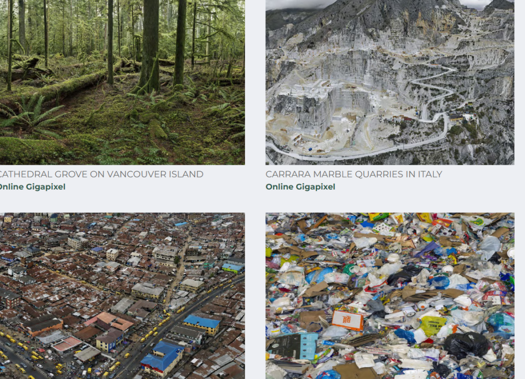
The Anthropocene Project is a multidisciplinary body of work combining fine art photography, film, virtual reality, augmented reality, and scientific research to investigate human influence on the state, dynamic, and future of the Earth.

Focusing on the idea of the environment and nature I am going to photograph images similar to these for my photoshoot.

 Anthropocene would have many events marking human-induced impacts on the planet, including the mass extinction of large vertebrates, the development of early farming, land clearance in the Americas, global-scale industrial transformation during the Industrial Revolution which also shows us the cause and effect of humans on the planet.

Typologies Artist Reference

Mandy Barker

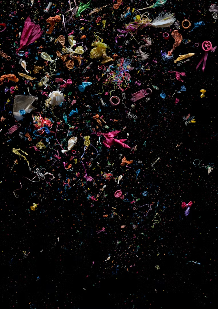
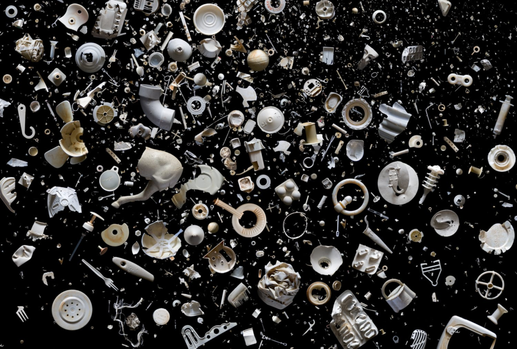
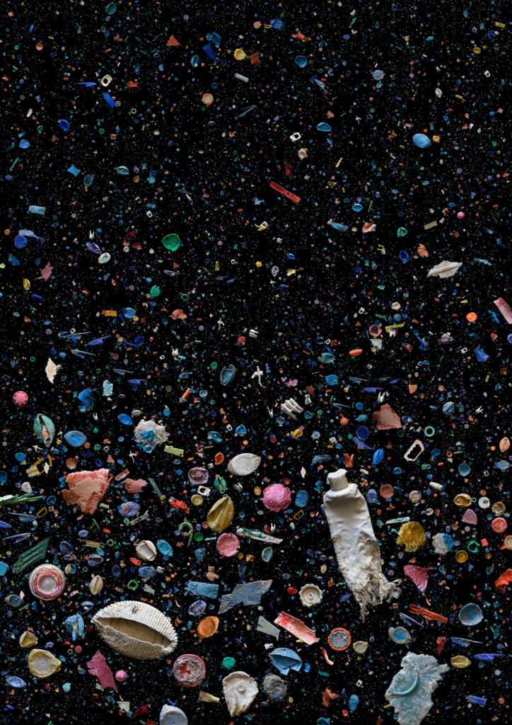
Photographer Mandy Barker creates deceptively eye-catching images to document the pandemic of plastic debris in the world’s waterways. Barker, who is based in Leeds, UK, works closely with scientists to collect trash from our oceans and beaches on the edges of nearly every continent. One research expedition covered the debris field (stretching to Hawaii) that resulted from Japan’s 2011 tsunami and earthquake; she has also explored the Inner Hebrides in Scotland with Greenpeace. Barker manipulates her findings in Photoshop, mimicking the manner in which ocean water holds these objects in suspension. Swirls of colors and patterns draw in the viewer’s eye, only to realize that these visually appealing compositions consist of garbage that animals have attempted to chew, plastic pellets, tangles of fishing line, and water-logged soccer balls. The artist describes her work in a statement on her website: The aim of my work is to engage with and stimulate an emotional response in the viewer by combining a contradiction between initial aesthetic attraction along with the subsequent message of awareness. The research process is a vital part of my development as the images I make are based on scientific fact which is essential to the integrity of my work.

Examples Of Her Work

Evaluation Of Her Work

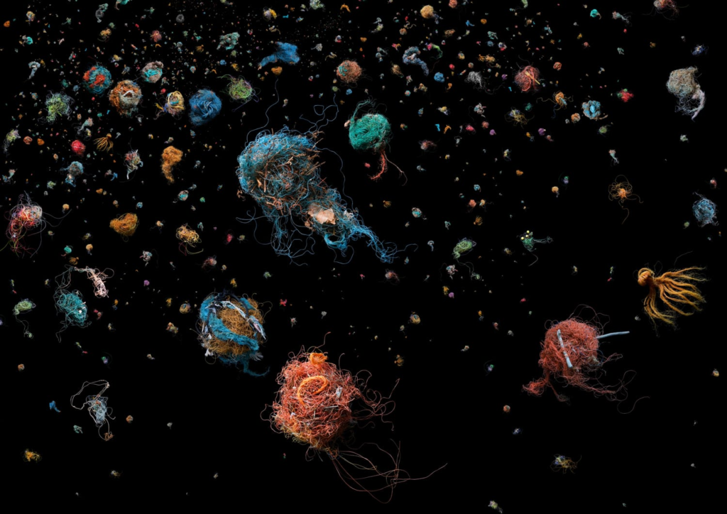
SOUP: Bird’s Nest © Mandy Barker. Ingredients; discarded fishing line that has formed nest-like balls due to tidal and oceanic movement. Additives; other debris collected in its path.

Barker uses lighting in an intense but careful way, she doesn’t really use lighting to shadow anything or portray anything, but rather uses it to create the black background to portray the deep sea. This image doesn’t have any tonal range within the background but rather just a clean clear back background, there is a colour difference within the fishing line, which she has used to turn these pieces of fishing line into something of jellyfish. This image is very textured, within you can see that the fishing line is almost dimensional, it is living and popping out of the screen. The image creates a lot of pattern, repetition of debris, repetition of jellyfish. Her compositions creates a lead for the eye, with the finer details of the ‘smaller’ jellyfish within the background as they descend further away. Jelly fish can handle a lot of harsh conditions and with the amount we pollute our seas and the amount that our oceans are being overfished it is creating an environment where they can and will thrive. Her imagery is a form of conceptualism, it creates a concept and a meaning, taking what is killing the marine life and making it look like the marine life, which iterates that our marine life cannot be replicated no matter how hard we try, and once our pollution of the ocean kills it all off we have to face that consequence.

Developed final images, presentation and evaluation.
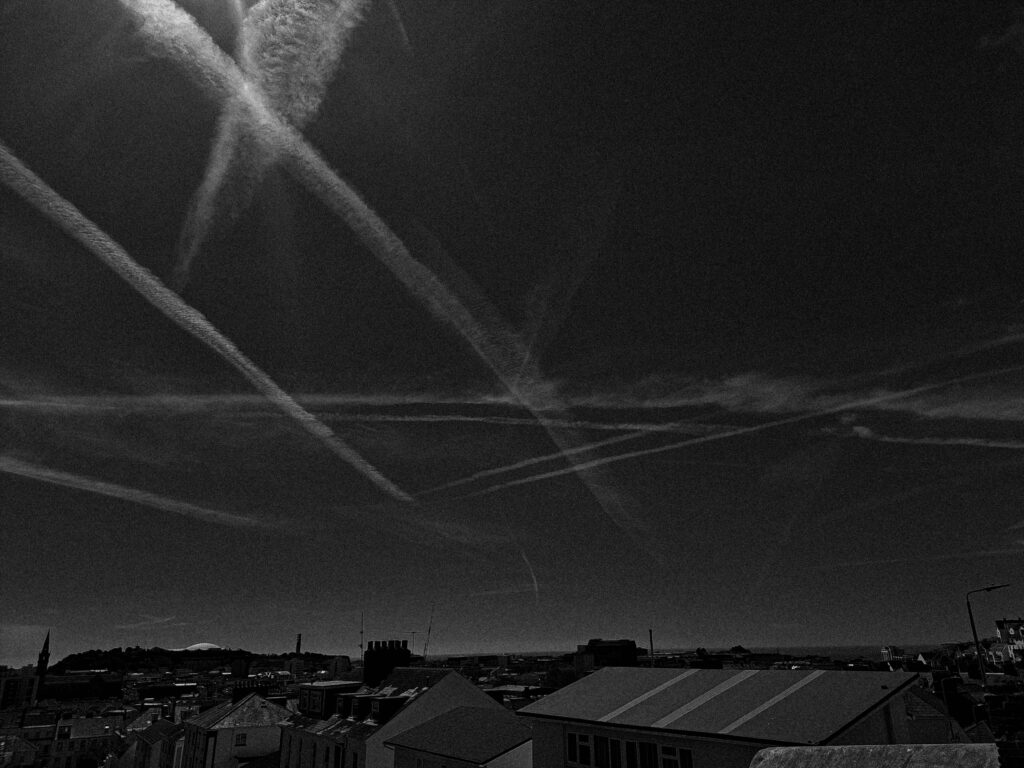
Images prt1:

Images prt2:

Image prt3:

Presentation

Presentation 1:

Presentation 2:

Presentation 3:

Evaluation

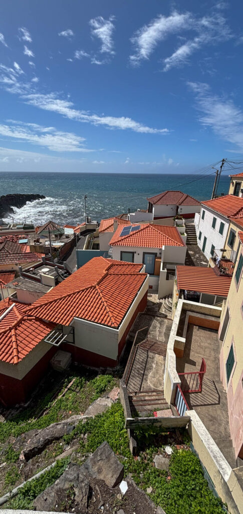
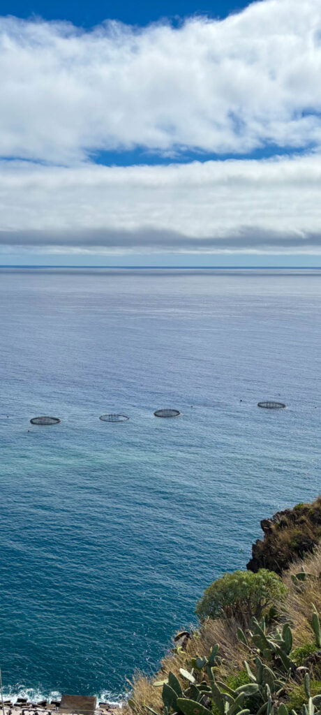
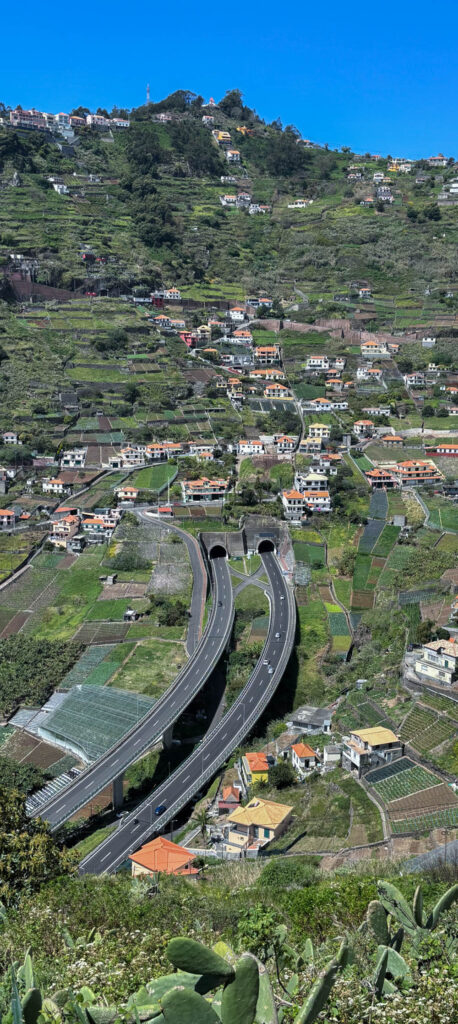
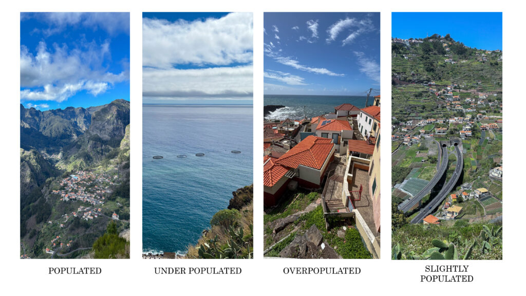
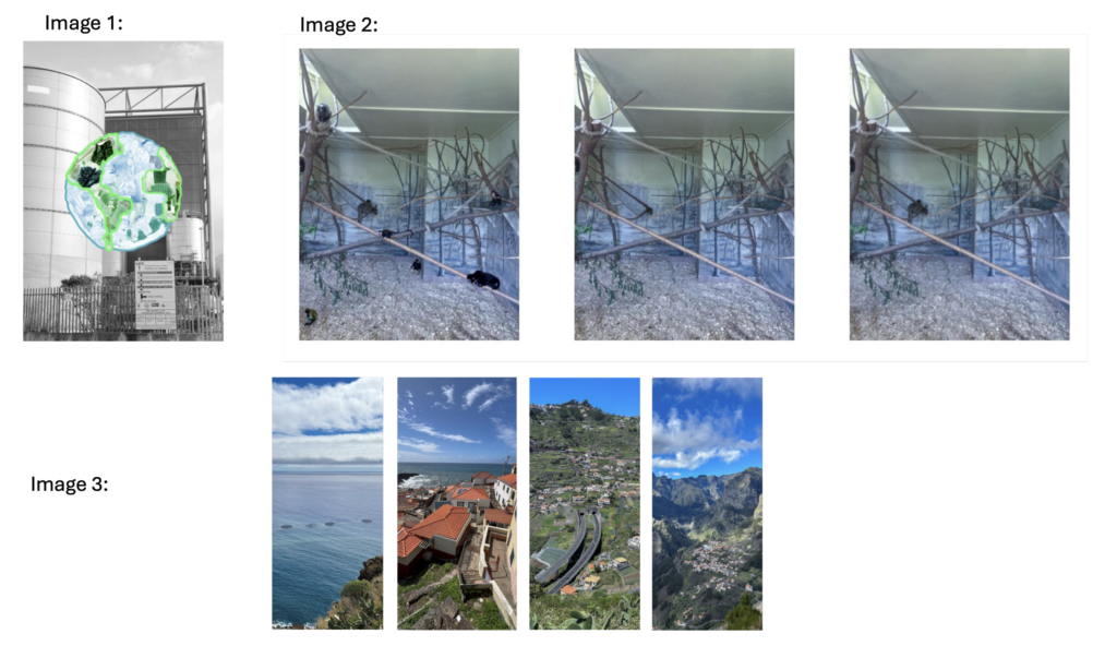
Overall, I think that my pictures are obvious and powerful. This is proven in my images prt1 where it is a series of pictures that show different areas, highlighting the amount of population in the area, etc…populated and unpopulated. This whole concept was created by myself. I did this to show how different developed and not so developed areas look like and to bring some realization that, the images that show an area where it isn’t as developed, will gradually become areas that are overly populated due to the fact that population is rapidly increasing. In these images, I cropped the area where I wanted the focus to mostly be in, so I basically created a focal area for audience to look at instead of getting distracted with the landscape of the images. I think that when it comes to the editing of these images, I did really well, especially enhancing colour and meaning. However, I think that these images could’ve had some more creativity to it, like AI generated stuff to make the images more interesting and maybe some type of design on the picture or some type of zoom in to the part of the image where is showed the population, to spotlight what I was trying to show, even more.

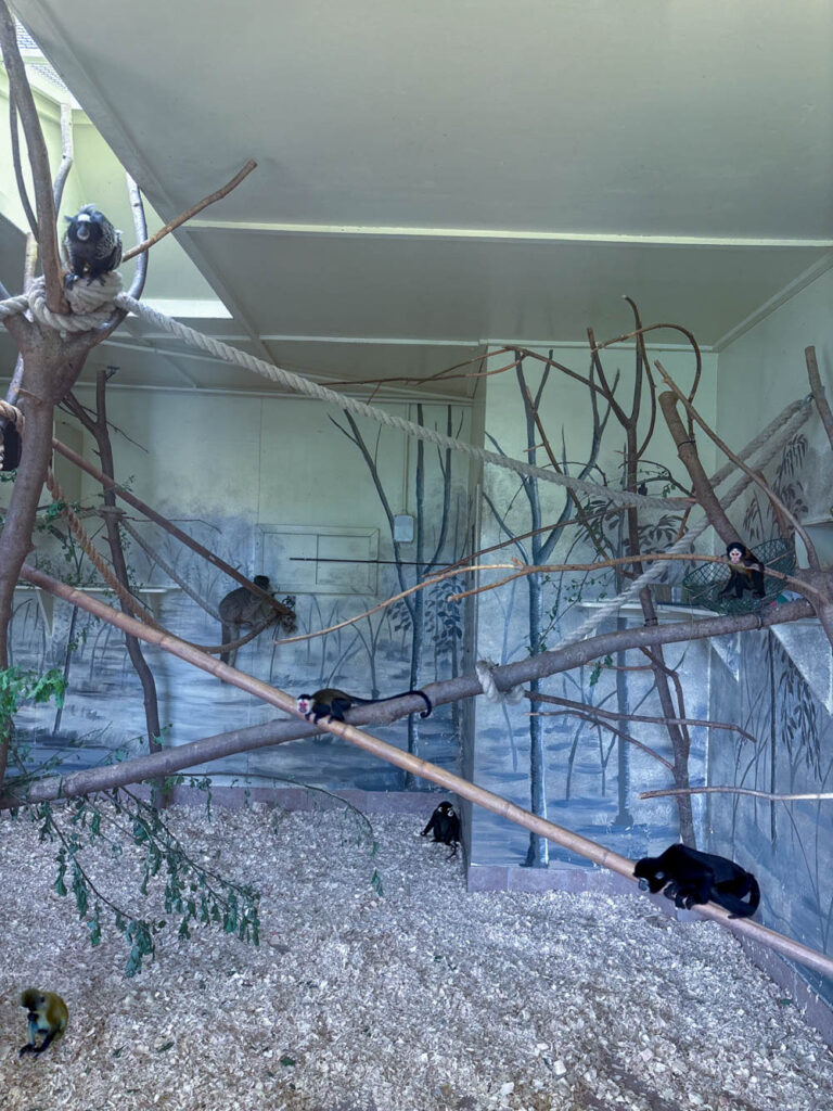
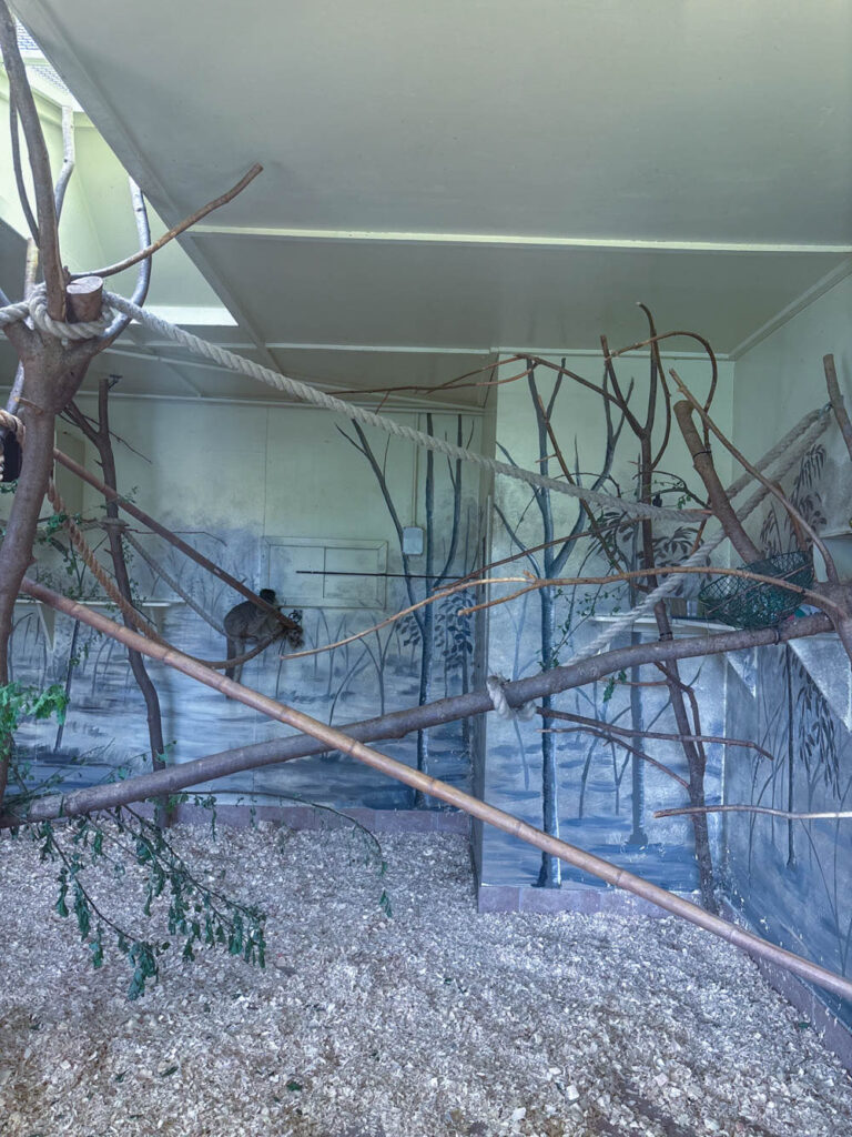
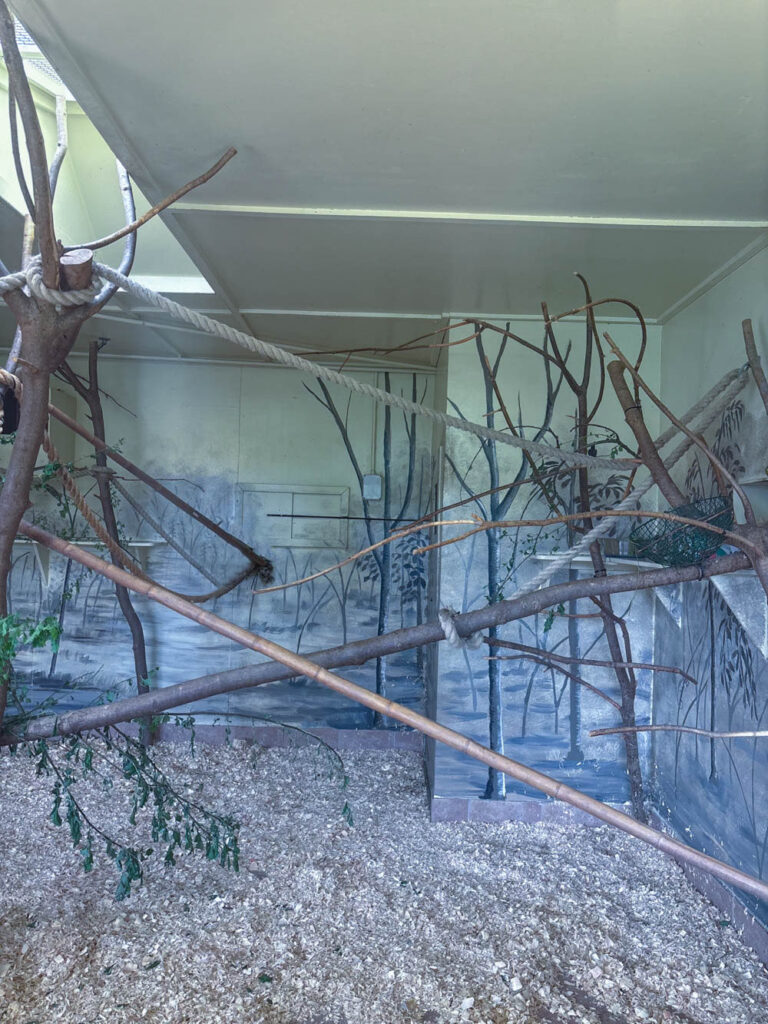
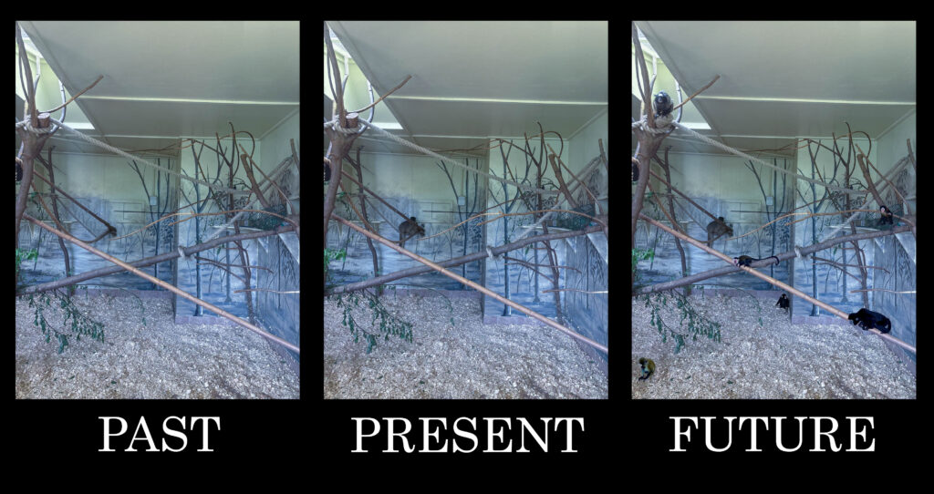
In images prt2, its shows a trio which consists of a photo where there isn’t any monkeys, a photo with one monkey and lastly a photo with loads of monkeys. This was to show the past, present and future of what animals in captivity look/looked like. I think that my colouring in these images are cold and sad which was intentional as I wanted to portray what the animals in captivity feel like. I wanted the audience to feel a sadness wash over them, to make them feel bad for supporting or stepping foot on a business like that. I think that my presentation is clear in terms of what I wanted to communicate. I also think that the meaning is influential and firm. However, I think that there is some improvements I could have done to these images. I could’ve made the image that represents the past (no monkeys), as a little brighter to imply happiness because no animals are being held captive, the image that shows the present (one monkey), I could’ve shown the image slightly more gloomy and cold to display the sadness the animals feel, being held captive and last the image that shows the future (loads of monkeys) I could’ve made it really dark and miserable to indicate how the animals will feel as they gradually get stolen from their families in scary amounts.

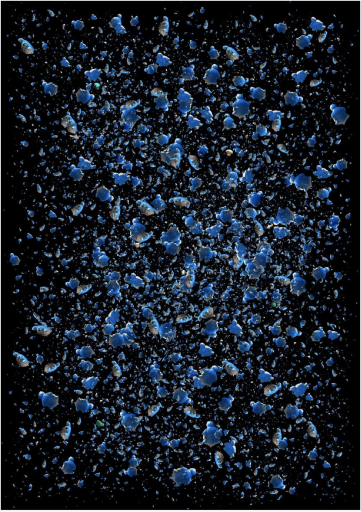
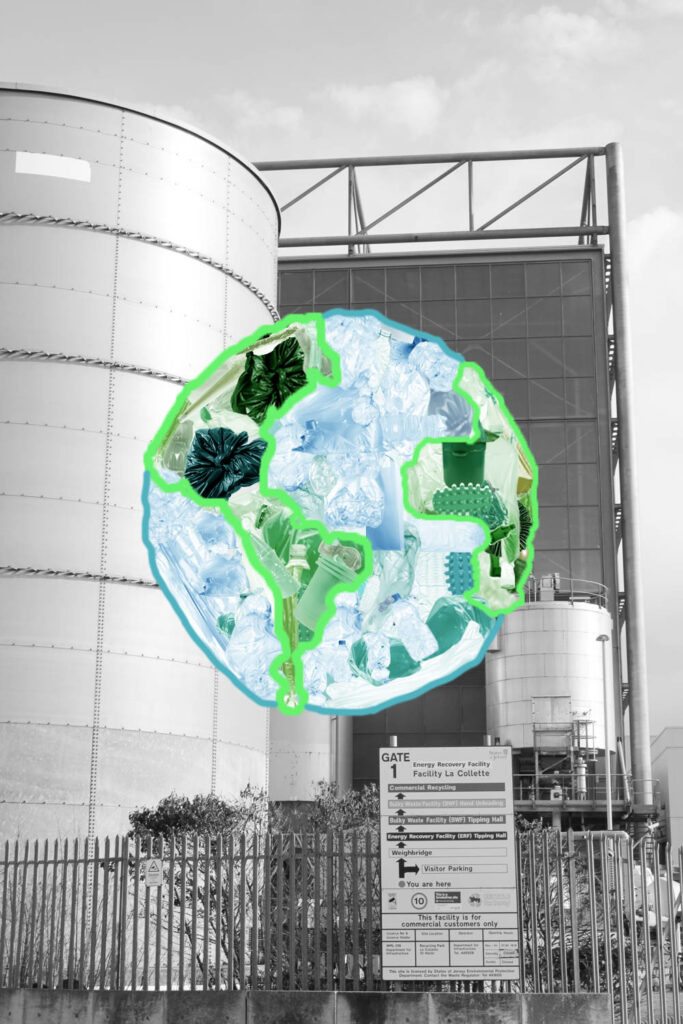
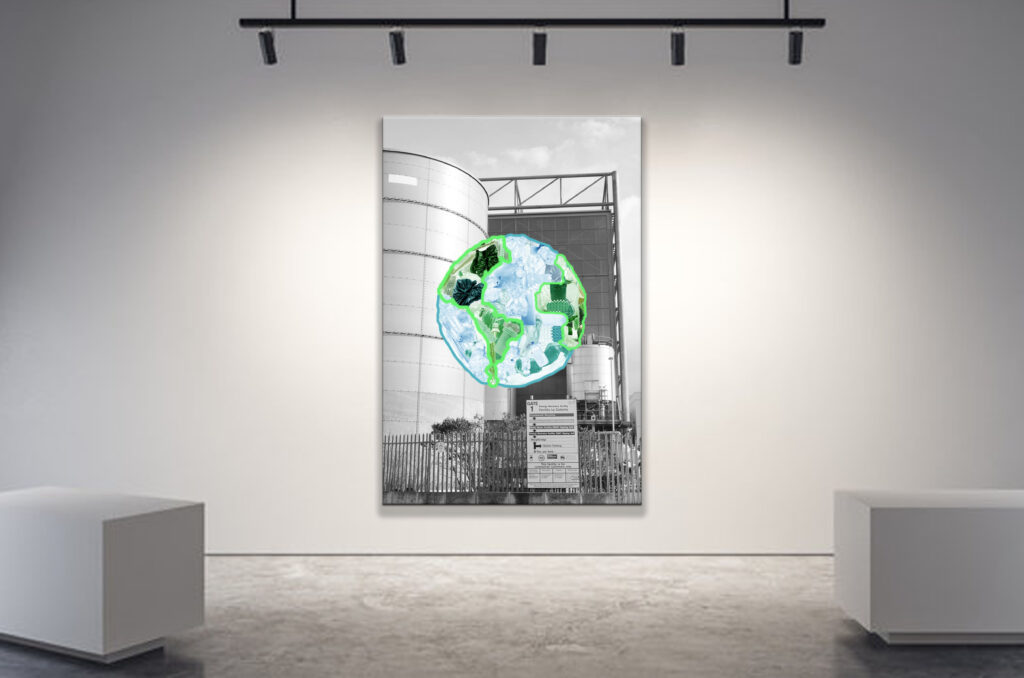
Lastly, I believe that Image prt3 is a really captivating image. It has creativity and uniqueness and I think that the image is pretty self explanatory. The use of contrast between black and white and colour really makes it eye opening. I also think that the use of AI generated litter was powerfully used as it shows a world full of rubbish, which foreshadows what earth will look like in the future. The urban landscape behind the earth, in black and white, suggests a certain fault towards urbanisation. However, I strongly believe that the intention behind this image could’ve had a more obvious meaning. This could’ve been done by adding some text to the black and white background, like ‘reason?’ or ‘urbanisation’ plastered all over the background. I could’ve had some text at the bottom of the image to explain what the image is implying just in case people didn’t quite get it which would be alarming because the message is quite clear.
Finally, I think that my overall projects were really good. I think that the message I wanted to portray in my images were really clear and had depth. However small improvements that lacked in my images could’ve really made my images better and more understandable.

Compare and contrast

In terms of the compare and contrast, I believe that my 1st image has an evident inspiration through Mandy Baker, the photographer. I think that my image shows that complexity that Mandy bakers work has and this is definite through the use of cropping litter and placing the litter in precise formation to create something etc…Earth. I am also able to prove my influence of Mandy Baker in Image 1 by having bright, eye opening colours. However my work is quite different to Mandy Bakers. First of all, my litter is AI generated and her litter was litter that she physically found. I also outlined the colours on the plastic earth to give it more depth and obviousness of what I was trying to show, which was an earth created with plastic to bring awareness of what earth might look like if we don’t change. Finally, a difference my image has to Mandy Bakers work is the fact that I have a black and white background instead of just black which shows an urban landscape. My intention was to show what earth was gonna become and the reason behind it, (industrial related things).

For my image 2, it shows a series of pictures which one of them including loads of monkeys, the other with no monkeys, and the last one having one monkey. This trio was to show what captivity might look like in the future and what it looked like before. The picture with no monkeys, shows the past where captivity of animals wasn’t a thing and it was a time where animals thrived in their natural habitat, then the image with one monkey shows the present, which is where humans are stripping animals from their life and family for solely entertainment purposes. Lastly the picture with loads of AI generated monkeys, shows what the future will look like, humans will not get enough of captivating animals and will create crowded enclosures. These images are meant to bring consciousness towards animals who are being forced out of their home. This image is heavily governed my Zed Nelsons work especially in his work “The Anthropocene illusion’, where it shows images of animals held in captivity where their enclosure is painted or manipulated by humans to make them ‘feel at home’. I liked how he captured the animals in captivity and his message. My work is obviously themed by his work because not only do I captivate animals confined, I also show that exploited background created by humans . However my work is different because instead of leaving the picture as it was originally taken which was the single monkey in the artificial habitat, I created a startling reality of what humans will do to poor, innocent animals.

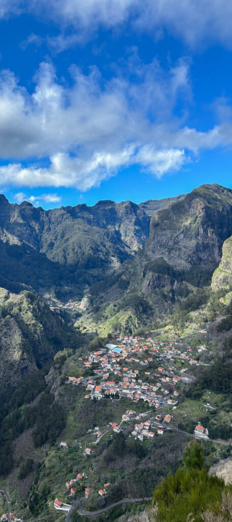
Lastly, Image 3 creativity was mostly mine. I took pictures of different places in Maderia island, some where it was overly populated, unpopulated, slightly populated and populated. This was to show how different places can be more developed or not as developed and populated. These set of images were made to also bring knowledge of that fact that the pictures that are showing a slightly populated or unpopulated environment will become the populated or overly populated over time, which should be alarming. However these images all have one thing in common when it comes to Nelsons and Bakers work, they all explore Anthropocene and bring awareness directed at the wrong that we are doing.