Artist Evaluation – Edward Burtynsky

Edward Burtynsky was born on February 22, 1955 in Canada. He is a Canadian photographer and artist known for his large photographs of Anthropocene photos that cover the issues of climate change and overpopulation.
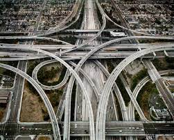
In this photograph, Burtynsky took it from almost a birds eye view to show the demolition of the natural world due to the overpopulation of humans. The intertwining of the roads in this photo give almost a hypnotizing feel to them, and showing the lack of space and different levels that the roads sit on and how they sit above and below each other show the extremality of the issues that we face as a human population and our natural world.

The complexity of this photo really interests me because of the hypnotising way that the roads have been laid. This could almost have an underlying feeling of control and order. First glance this looks good however the idea of the natural living and the natural landscapes being non existent is such an unhealthy view and issue that the world is facing to this day.
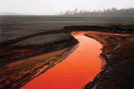
In this photo, he shows the brutal truth of how these issues are affecting the natural world and everyone living in it. His work is very impactful and I want to make my work as impactful as his and spread awareness on my chosen topics. His use of raw unfiltered photos, and not trying to cover up the reality is very moving and blunt, which shows the unfiltered reality and theme of his photos very clearly.

Edward uses the colour red in the lake / river as the main focus of his photo and I feel like the inclusion of the colour red really contributes to the negative connotations surrounding his photos. The colour red has very unpleasant connotations surrounding it due to its link to religious and general beliefs such as the ‘devil’ being red, and even red being the colour of blood. This symbolism could show how awful the impact from us as a human race is having on the natural world.

PHOTOSHOOT 2

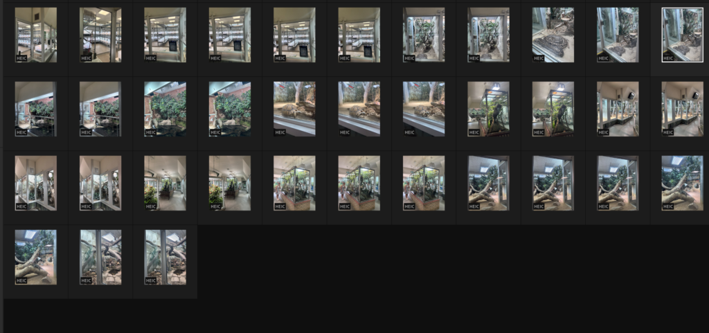
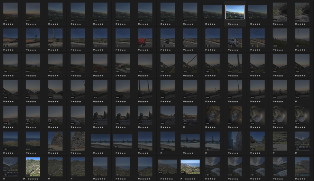
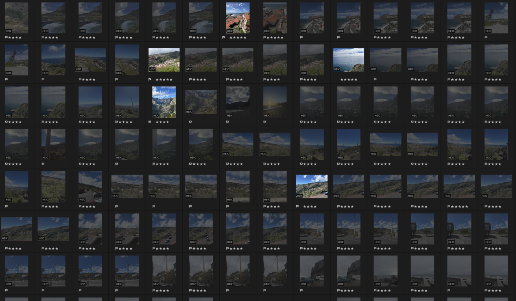
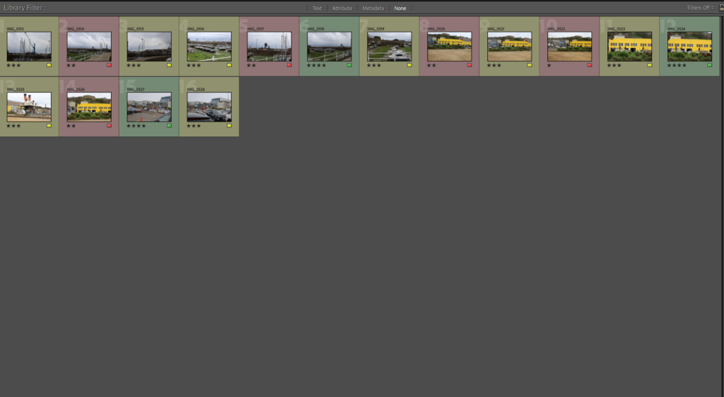
CONTACT SHEET:

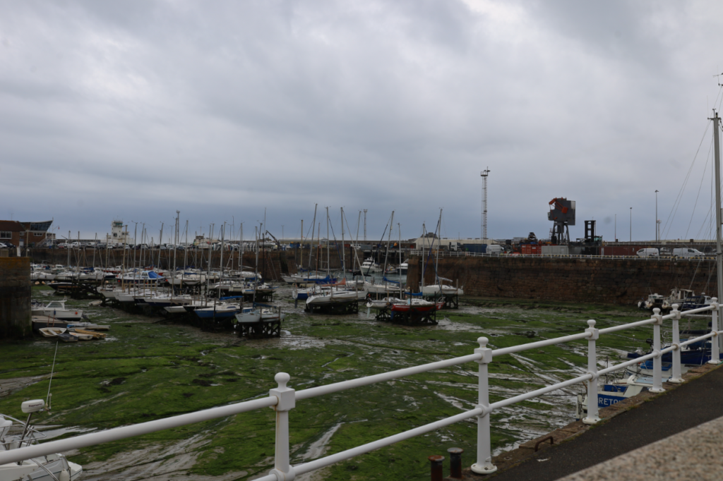
My images:

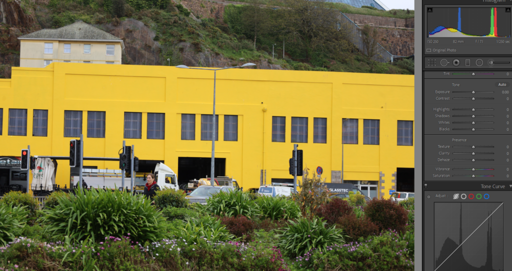
Before:

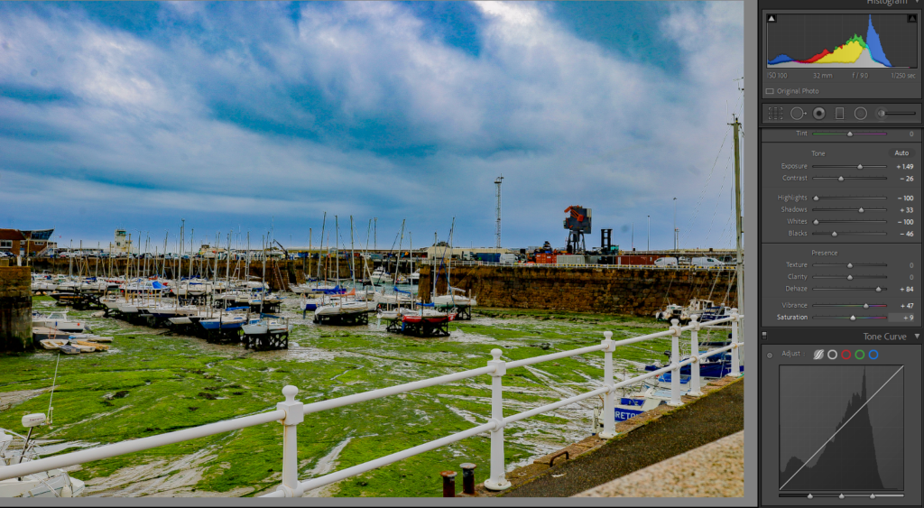
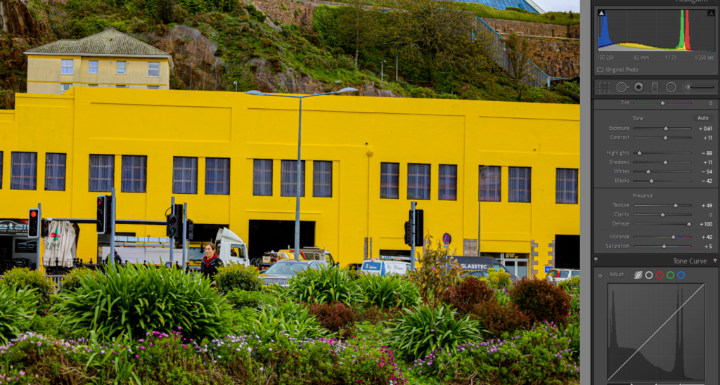
After:

For this image, I increased the vibrancy and saturation to make the photo look more exciting and engaging, rather than characterless. Before I edited this image, it was producing a sombre, upsetting feeling because the lighting was darker, so therefore the image was dull and colourless.

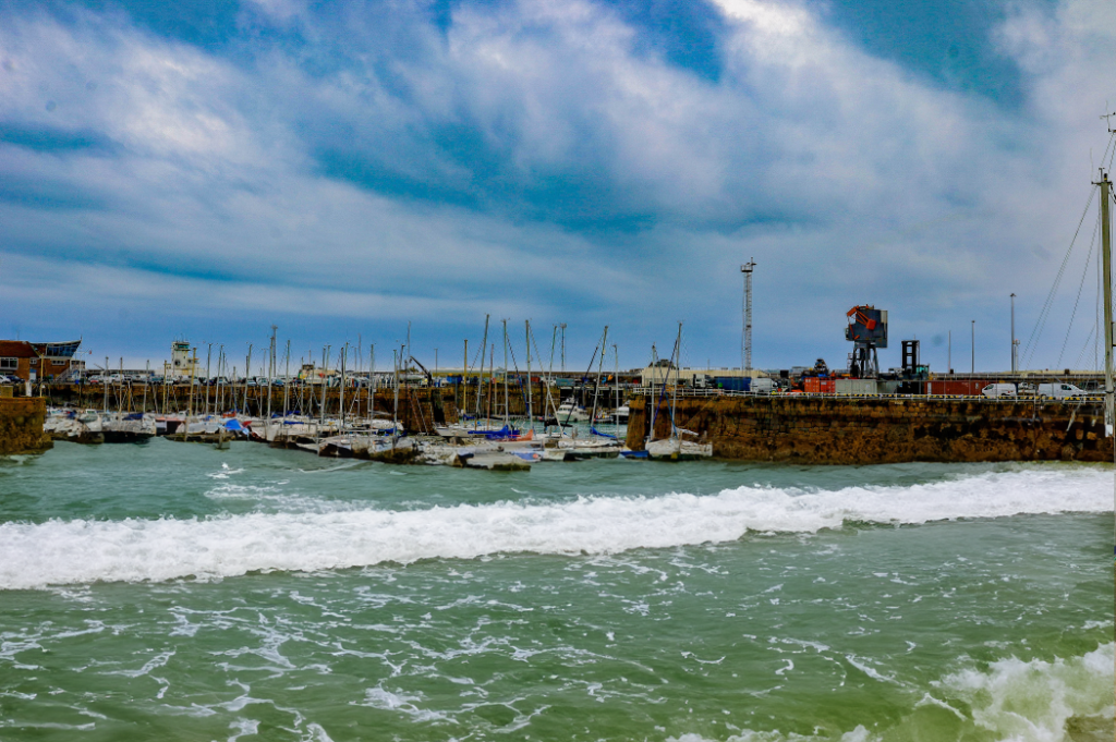
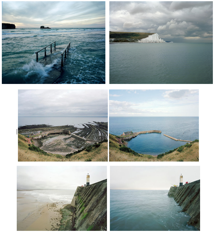
I continued to further edit this image by using AI, and I think this changed the image as it shows the rising tide in the harbour. Rising tides can be due from change in the water cycle which has been affected and impacted on by humans. This reflects on Anthropocene, as it shows the natural change in tides from low to high.

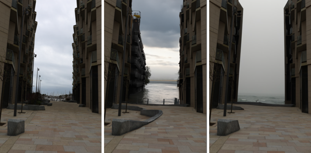
For this image, I came out with two successful photos of riding tides. To do this, I used AI on photoshop. Here, you can see that the buildings in the background have been affected by these unexpected rising tides, and it looks as though the buildings are sinking. The photos look natural, and suggest that high tides can be damaging to the human life.

Artist Inspiration

I was inspired by the photographer Michael Marten who is a seascape and landscape photographer with an interest in tides, seasons, and other natural phenomena.

“I am interested in showing how landscape changes over time through natural processes and cycles. The camera that observes low and high tide side by side enables us to observe simultaneously two moments in time, two states of nature.” -Michael Marten

Examples of his work:

Before:

After:

I really like this image because it shows the contrast between the large, yellow building which feels out of place, compared to the nature in the foreground of the image. I made the vibrancy of the colours more illuminous to make the landscape look more lively. I think the final edit of the image was really successful and the contrast between the dark, black windows compared to the bright yellow building makes the lines in the image stand out and make it look sharp.

Additional artist inspiration: Keld Helmer Petersen

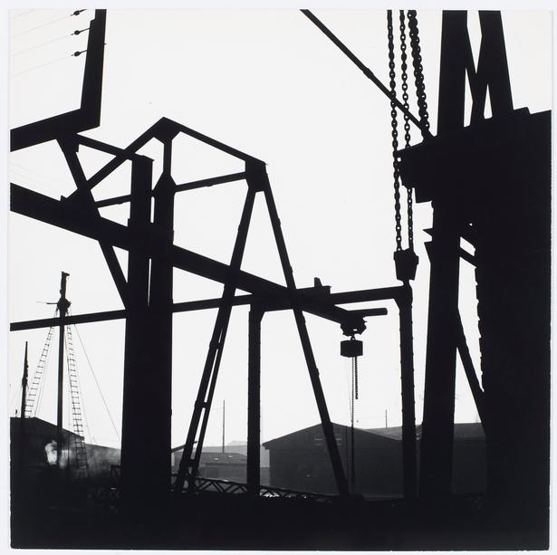
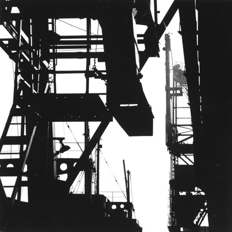
Keld Helmer-Petersen was born 23rd August 1920 in Copenhagen, where he lived and worked most of his life until his death in 2013. He started photographing in 1938, when he was given a camera as a high school graduation gift. In just a few years he began working in a visual figurative language.

Keld Helmer-Petersen was one of the most influential Danish photographers in the 20th Century. His career spanned 70 years and he had strong interest in modern architecture, industrial areas and structures.

I really like Helmer-Petersen’s work because it is original and unique. He uses lines to construct an image.

Examples of his work:

10 Keld Helmer-Petersen ideas | helmer, light in the dark, water  architecture
10 original vintage photographs from the series Sydhavnen 2 by Keld Helmer- Petersen on artnet

Mandy Barker

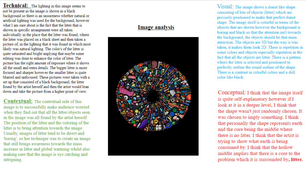
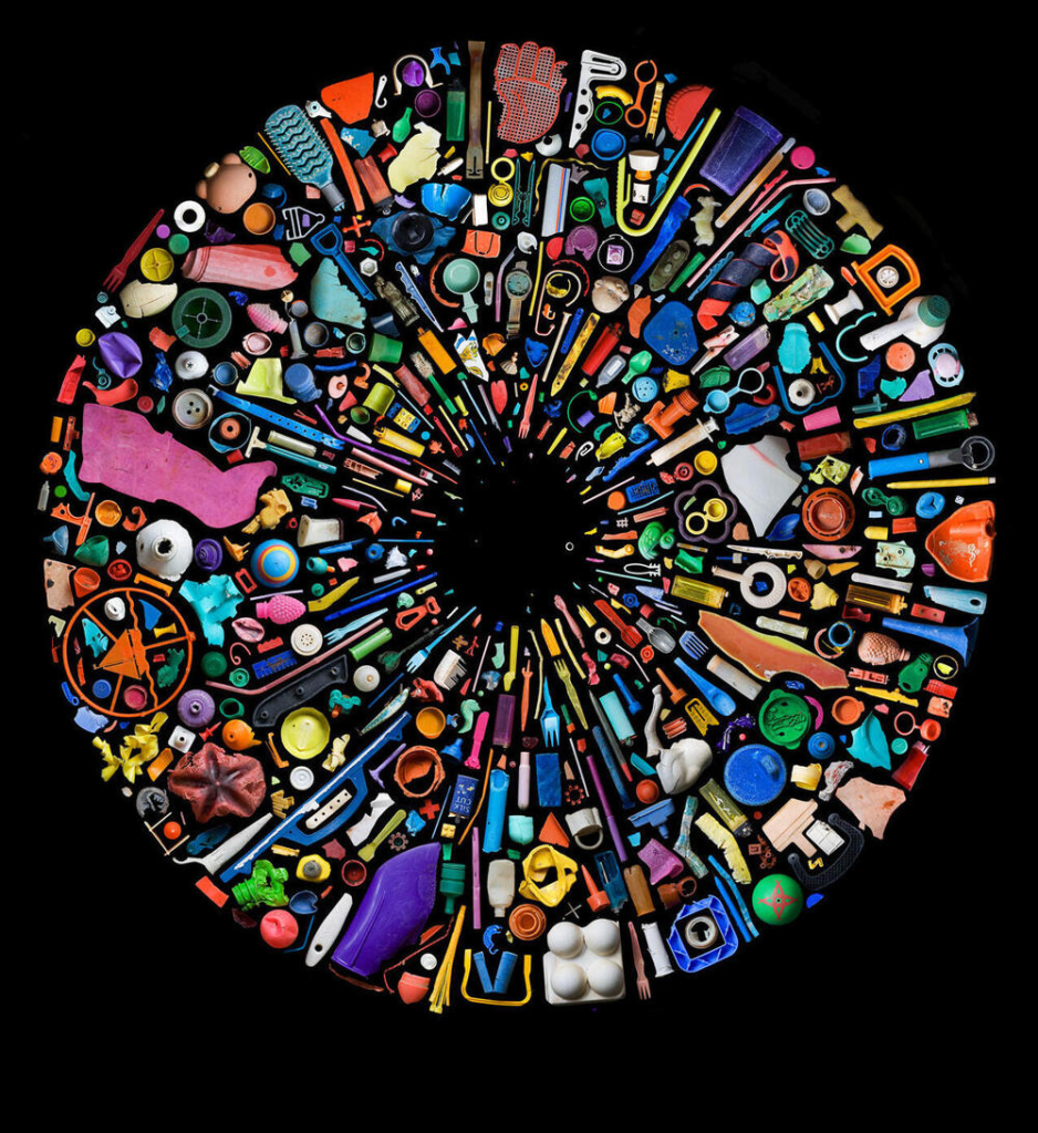
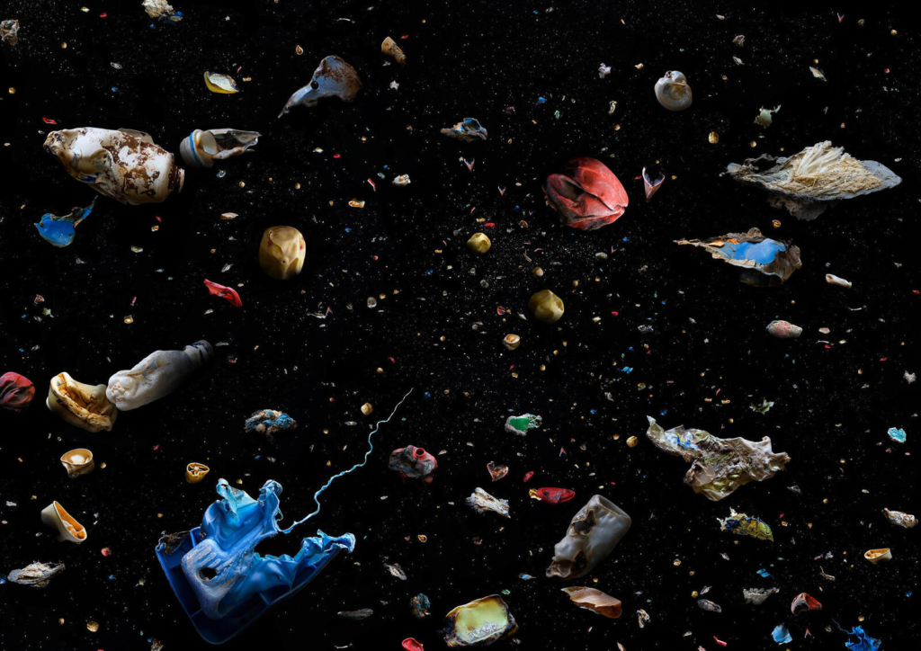
Mandy Barker is a British photographer, who is mostly known for her work with plastic and litter from the ocean. She has also worked with scientists to try and attract attention and awareness to the extremely large amount of plastic that ends up in the sea.

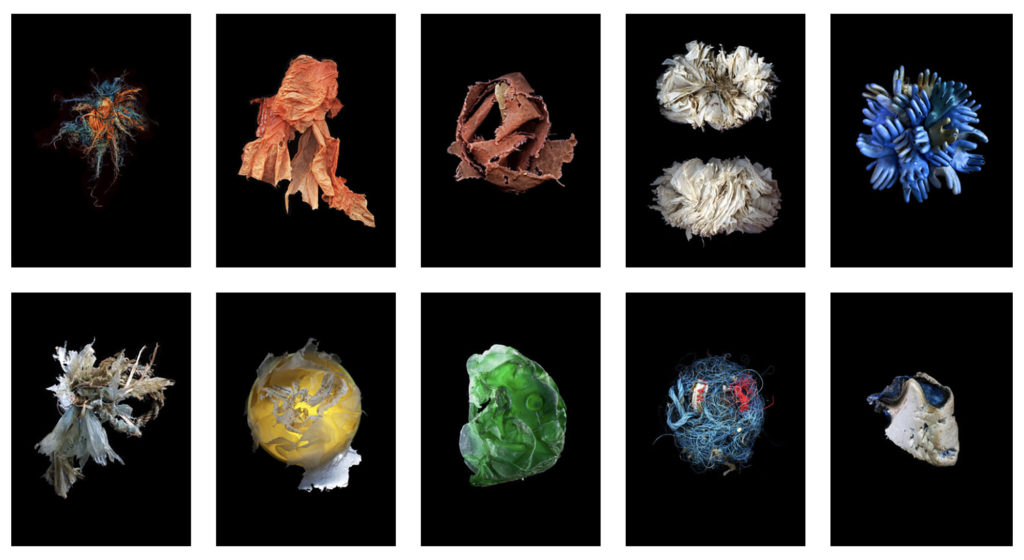
When taking her photos, she uses artificial lighting to focus on one piece of litter per image, ensuring that it is the one and only focal point. The image become abstract, colourful and textured. Your eye is drawn to each one, wondering what it is against the stark black background. She captures them in a way that they look like they are still floating around in the ocean pointlessly. The black, negative space frames each item and creates an endless background. It also allows the vibrant colours to stand out, enhancing their artificial characteristic.

On first impression these images are strikingly beautiful; saturated rainbow bits of colour organised into decorative ensembles. Clearly this is a construct to deceive the viewer, was that your original intention setting out? Or how did your ideas evolve?

Mandy Baker’s deliberate placement of the garbage, transforms it into something beautiful. Sometimes the patterns are geometric, and other times their placement looks more organic, like planets floating in an endless universe. Plastics never decompose but biodegrade into smaller fragments. The explosion of plastic in her images, exaggerate this notion.

My intention aesthetically was for Barker to attract people to the image and for them to question what it represented. In recognising that what they were looking at was their own waste collected from our ocean, viewers would have a more lasting impact and message of awareness.