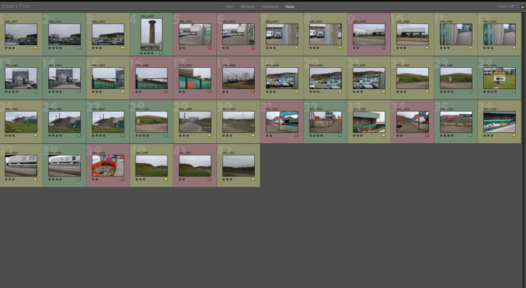
CONTACT SHEET:
I explored with different filters to add onto the same image to see which ones I prefer or look the best. Here are a few examples that I chose to lay out in a grid:
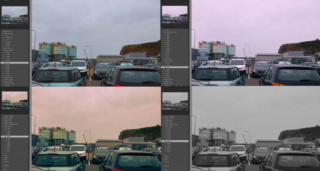
This photo shows the contrast between the old water tanks that were built many years ago in St. Helier compared to the grassy cliff on the opposite side of the photograph.
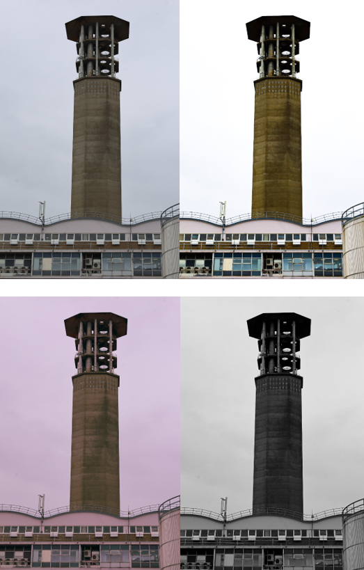
I like these edits because it links back to topographics also. I think having presented this images in a grid, the photo has become more interesting and bright rather than the initial photo which is dull and colourless.
Initial edit:
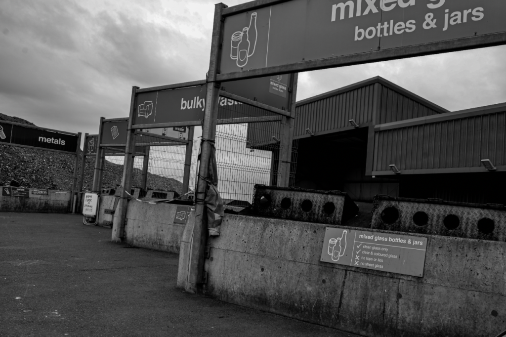
Final edit:
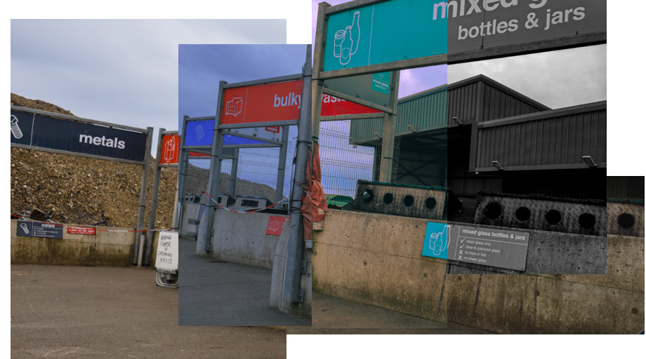
I experimented with montaging different edits of the same image to create one final photo. I think this is quite successful and I really like the way this came out because it shows the different ways to edit images using different filters and tones.
Before:
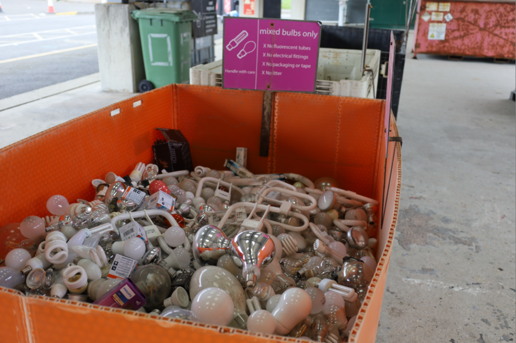
After:
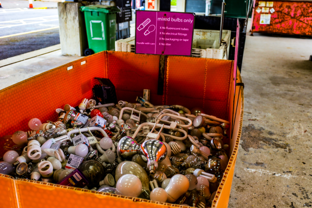
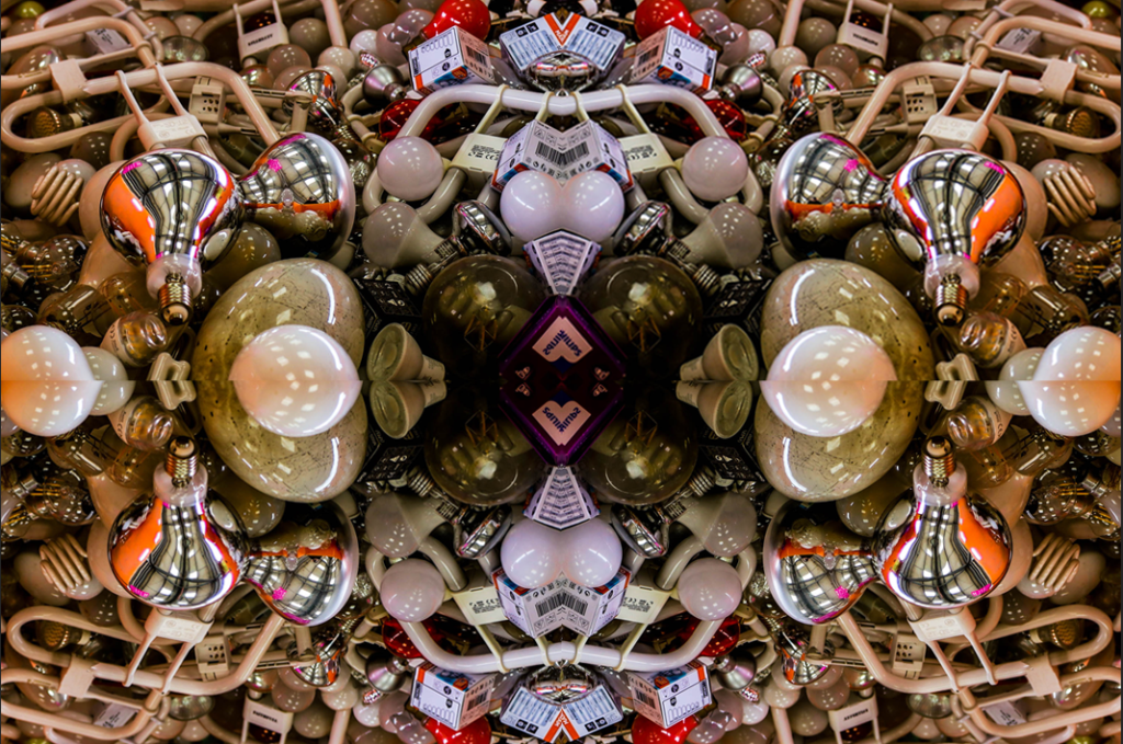
At first, I edited this image to make the colours more vibrant and illuminous, rather than lifeless and monotonous. Then, I cropped the image to the size I wanted it including the wanted contents of the image. I created four copies and flipped them four times in opposite directions to create this final outcome.
