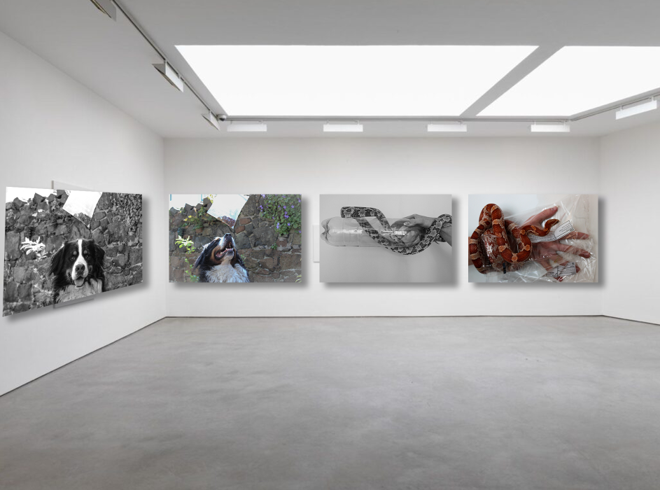
My photos are in order of my favourite images and final results from the typography and Anthropocene topic. For all the images in the galleries I made, I added perspective to each and distorted them to make them the right shape for the perspective. This made sure that all the images where correctly placed against the walls where they are on the side or at an angle. I added drop shadows to make it look like they are mounted against the wall for a more realistic look. I used different galleries for each theme. Where I have more final images than the other I used a more strategic gallery where I can fit more images into it, for example typography has the most final images so I went with a more spacious and complex design that has the most area to put images so I could fit all my chosen images in. However, my Anthropocene gallery is square shaped as I did not have many final images so I went with a gallery that would be easy to fill without it looking underwhelming compared to my typography gallery.
Typography + Anthropocene Gallery

Typography Gallery

Anthropocene Gallery

