I chose my first photoshoot to be of vehicles and fuels. I chose this theme as I was inspired by Edward Burtynsky’s photos of cars.
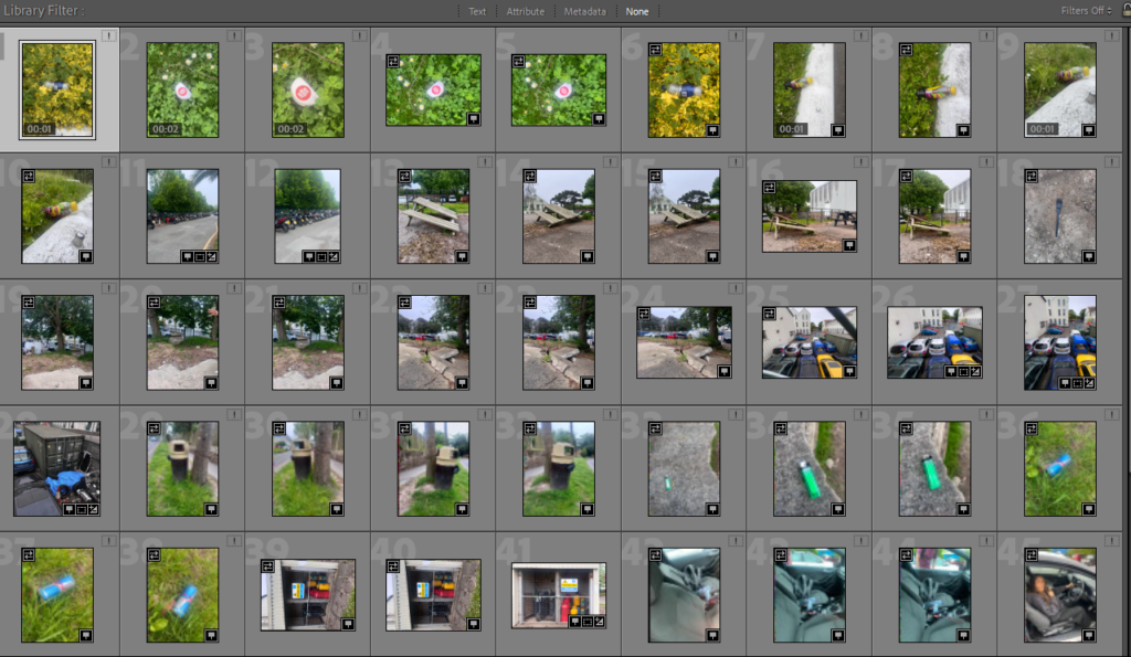
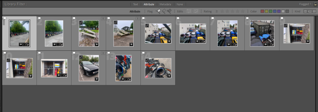
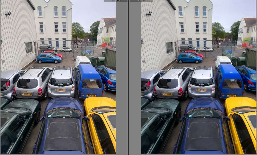
This image is of old broken cars that are used for parts. I thought this related to the topic as I think that cars are a big part of pollution and their fuels and emissions. I also chose to take pictures of cars from an angle looking down as I was inspired by Edward Burtynsky’s work on images of cars. I decided to keep the picture in colour as I think that it looked boring in black and white, whereas in colour it you can see all the details of the cars that aren’t being used and are broken. I also think the colours made it look messy which I liked because it makes you have to look properly into the image which is quite scruffy when you first glance at it but when you look into the details it gives you more of a story behind the image that the cars are being used for scraps which you may not see when you originally look at the image.
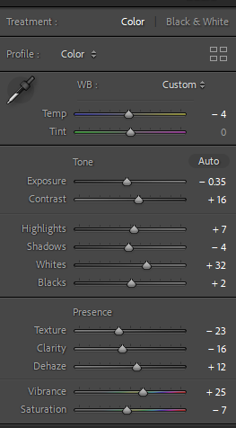
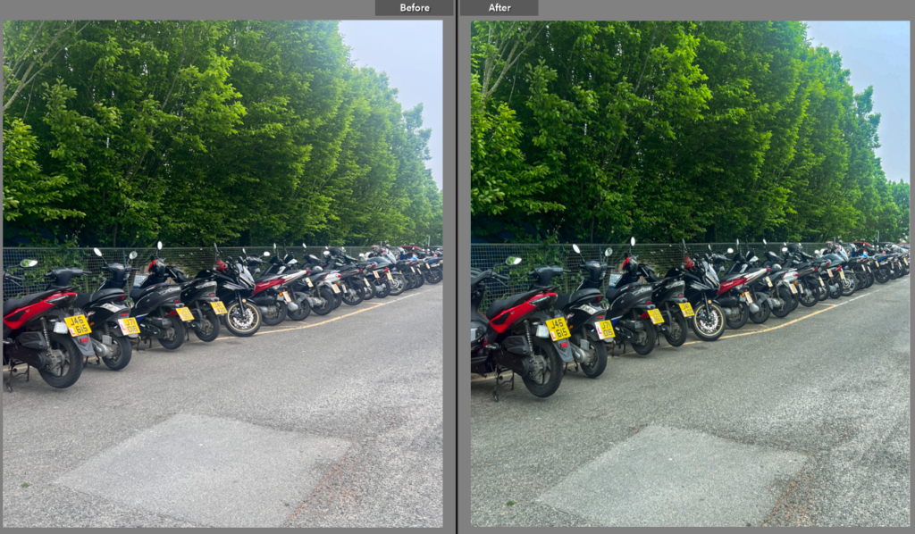
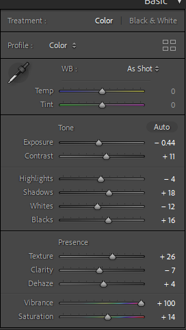
I decided to take this picture as it was also inspired by Edward Burtynsky’s car images but instead I chose to take pictures of a lot of PED bikes and motorbikes, instead of a large amount of cars. This image is different to the car image as the cars where being used for scraps but instead these bikes work. I started off edited this image by cropping it as there was lots of the road in the image and it looked bad. I made the image darker but made all the colour stand out more which matched the colours of the first picture of cars in the scrap so they look nice together.
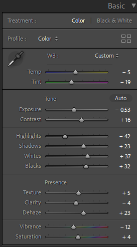
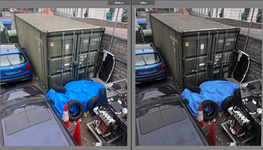
This is another image of scraps and cars being used for scraps. I chose to edit this image because it goes along well with my theme for this photoshoot. this image is different to the other so far because it isn’t based particularly on cars there are other things in this image like cones, tyres and a big container box. I chose to also edit this image differently from the other two vibrant images and went for a duller less vibrant picture. I achieved this by minimally editing the tone just turning the highlights up slightly and the whites and blacks both down slightly.
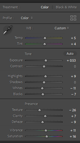
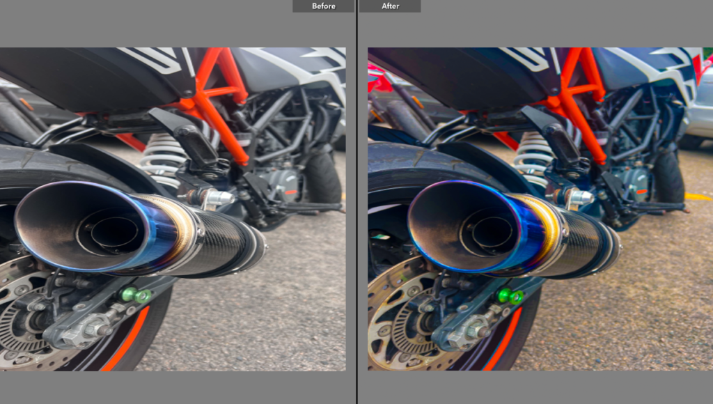
This image is of a motorbike exhaust. I chose this image because it is a more detailed picture of one specific thing instead of taking a picture where there is a lot going on like in the other pictures. For this image I turned vibrancy up all the way, I liked how this turned out because it made the image really stand out and shows every detail of the bike.
