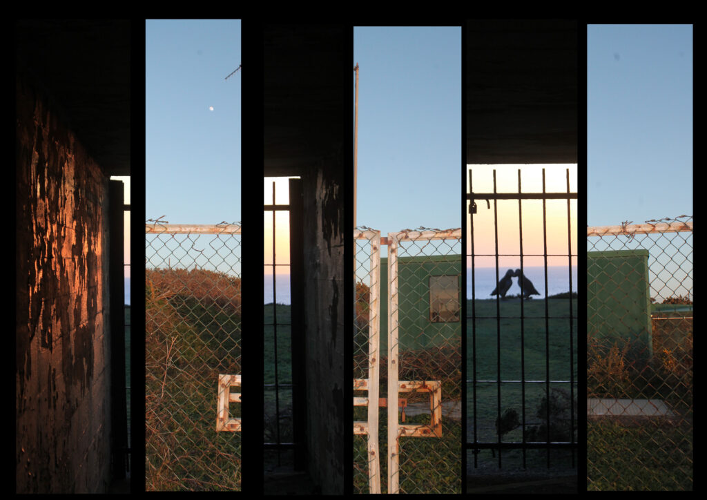
The reason I have chosen to display my images in this way is because they both have the same type of lighting, being natural daylight, with the sun quite low and setting. This gives a less intense look but a vaster tonal range. They are also both taken with a wider angles lens, and are both portrait photos rather than landscape. They have a similar yellowy golden colour temperature which gives them both a warm feeling. I have used foam board to originally mount the 6 pieces of image and then stuck it into black card to create a vast tone between light and dark. This makes the image 3D and gives it a simple repetition pattern, I have jumbled up the composition of the two images with each other, creating a hybrid blend of harmony. This changes a person’s viewpoint of the image, and creates an illusion which people would generally get lost within. By doing this I have combined the history and context of the two images, see one image is of a sculpture of the puffins taken through the gates of a bunker, this contrast the history of the bunker with the futuristic sculpture. Maybe showing that no matter how hard we try to change, and rebuild the earth our past will always follow us. I have contrasted that image with a image of a radio tower taken only a few meters away. I think this portrays irony within trying to save the planet and the animals, whilst literally creating disruption a few meters away. I think this is quite a conceptual image as people really have two look at it to understand and work out how he two images have been put together.

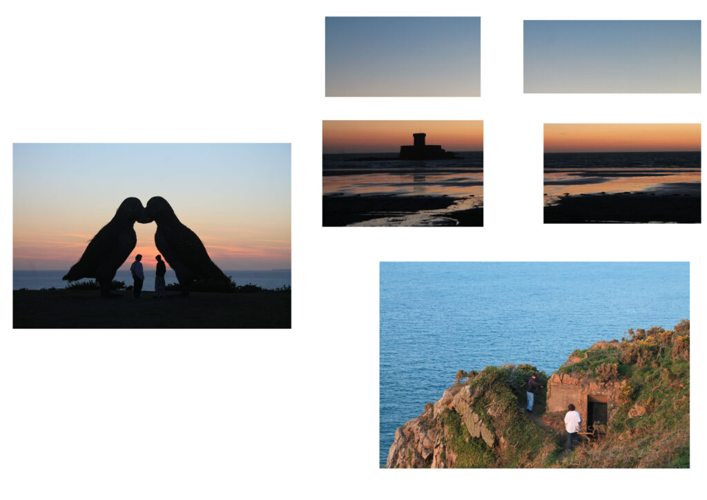
The reason I have chosen to portray these three images in this way is yet again because they all have a similar daylight to them, with the sun setting, and all have that warm feeling. I stuck these images on a big piece of black card after putting them on foam board. There is a 3D pattern to these images, and a lot of space between them but one of the main reasons I have put these together and cut the top right into four is because I wanted to change the harmony, I wanted to disrupt a person’s point of view, and create tension in people’s minds so they don’t actually know where to look first. I think I have achieved this by mixing up the images, cutting it into four and having so many bright bold colours. The reason I have done this is because of a contextual elect, the bottom right image is a photo of an old bunker, and the top right image is a photo of an old castle, whereas the photo in the middle on the left is quite a new and modern structure. This can get people’s minds thinking about the past and the future and the present. It can make them wonder how the damage that we used to leave was just a simple structure whereas now the damage we are leaving is endangering animals.

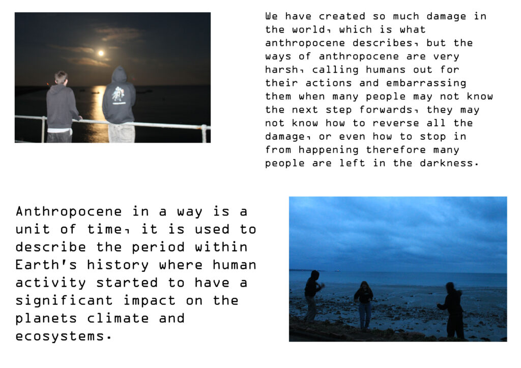
The reason I have chosen to put these two images together is because they have a similar lighting to them, a dimmer gloomier tone rather than my most recent warm pictures. The image on the top left is also under exposed, making the moon look like the sun, although this makes the photo a little bit blurry I think it correlates well with my idea of being left in the darkness. I mounted the images and the text onto foam and then onto black card. This makes them 3D and stand out, I have made no ‘middle image’ so that nothing stands out massively as I wanted both the photos to be equal. The reason I have decided to include text is too add a context to get my point across. I didn’t want these images too just be seen as people having fun and just throwing rocks, I wanted the image too be seen as something more, something like people being lost in the darkness. When you read the description it makes the images quite conceptual and makes your brain think more about the image creating an essence of having to listen to me and my ideas and agree with them, almost brain manipulating humans into changing their ways.

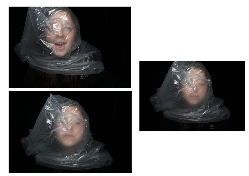
The reason that I have chosen to put these images together is basically because they are all the same thing. They are taken with studio lighting ( flash ) and have a black curtain background creating a massive tonal range. You can see texture within my images, where the paper bag is wrinkled and my model is trying to breath it in. I wanted to create drama, a dramatic piece to embarrass humans as they have done this to animals but just find it insane when it happens to one of them. I think these images are really conceptual as they really get people thinking about how they would like it, and they very clearly wouldn’t, so this embarrses people.
