Why is Ed Ruscha my inspiration?
My plan is to link an artist that I have studied previously (Ed Ruscha) to the theme of Anthropocene. This is because Ruscha chose to photograph the trivial objects like gas stations to express his interest in the things we usually ignore. Through elevating these humble structures to the status of art, Ruscha asks the viewers to review the notion of beauty and value. From my research I can gather that Ruscha mainly photographed petrol stations in Santa Monica Boulevard and Pacific Coast Highway and Melrose Avenue between 1974 and 1975. He has managed to complete over 40 shoots since 2007. I also chose to focus on Mitchell because he captures ancient and vintage buildings, in which I assume he does this to create nostalgia. I can recreate this by going to St Helier as I believe that is a place that carries many historical buildings rather than newer.
How does the artist link to my aim?

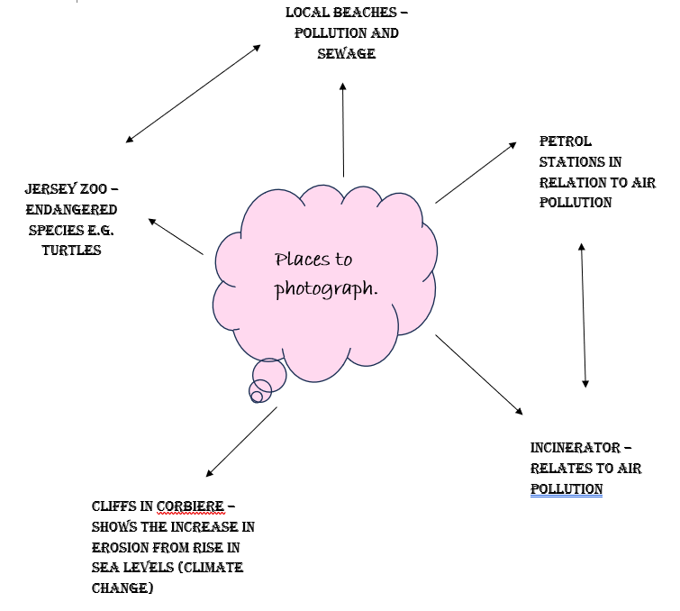
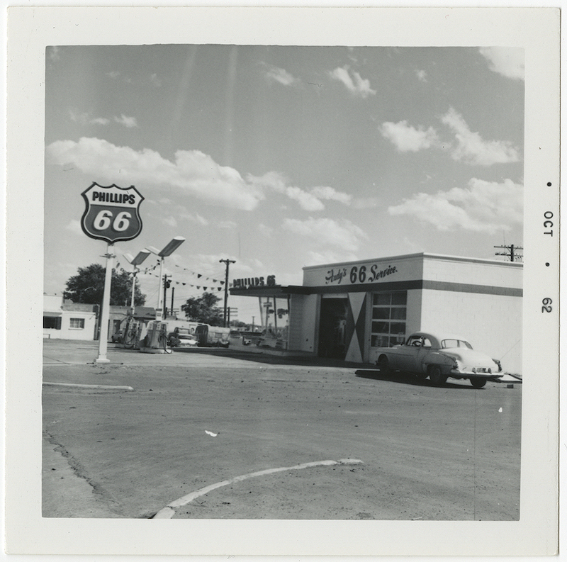
I can successfully link Ruscha’s work to my own because petrol stations are one of the main causes of air pollution, in which I am trying to send a message to the viewer on the dangers of air pollution, and also how it has been normalized through recent decades due to new, advanced technology. Therefore the main focus of my photoshoots will be local petrol stations and I will approach this by using similar methods to Ruscha e.g colours, editing and angles. I like the angle of how Ruscha captures his photos, as he incorporates a large setting within the image which helps the viewer gather more of a realistic idea. I also find it interesting that the photos are not taken from an accurate deadpan angle, but they are slightly off centre. This could be seen as unusual for photographers to do as it can sometimes make the image look rushed. However I do not believe this within Ruscha’s images because it is still in focus and includes the features that need to be included.
Another interesting factor within Ed Ruscha’s work is the border around the edge of the image that also includes the date. I find this very intriguing because it adds an old aesthetic, and makes the viewer link this image to images taken on a polaroid camera. The use of the image being in black and white also adds to this theme because we know that colour in photographs was only enabled in the early 2000s.
