Naomi White
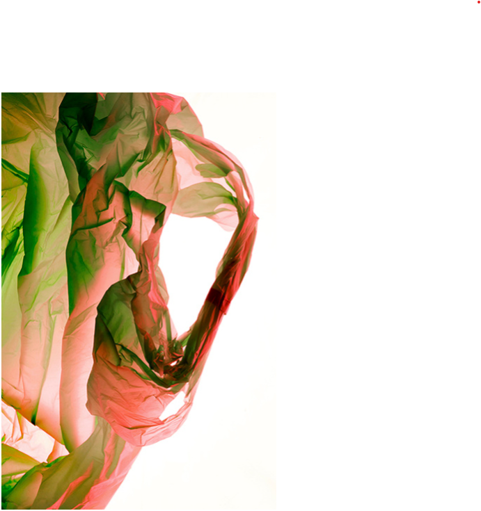
Naomi Whites photoshoots include plastic bags under a studio light. This is to portray how this brightly coloured thing can effect so much of the world. As we know nearly all plastic ends up in the ocean due to litter being dumped into rivers.
“In Plastic Currents, the every day plastic bag is transformed by light, turned from something familiar into something strange. Undulating and fluid these forms transition from non-biodegradable, reviled plastic bags into seemingly organic forms, imitating the very nature they threaten.”
My Main Inspiration From Her
“Through explorations of the material I am interested in the way plastic responds to touch, its surface, its weight, how it clings to lighter elements like lint and dirt through static electricity, and the way each bag is its own marvel.”
Her description of the exploration of the material is going to be my main inspiration for my images, the images I would like to produce include the use of how plastic can transform, whether it be floating through the air, ditched within the sea or transformed into fashion.
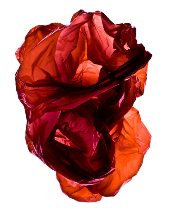
Although I don’t want to just take images of plastic under a studio light to do this, I still think that she has been my main inspiration, showing the beauty of plastic but also how it can kill, taking something so regular and making it so unique.
Image analysis
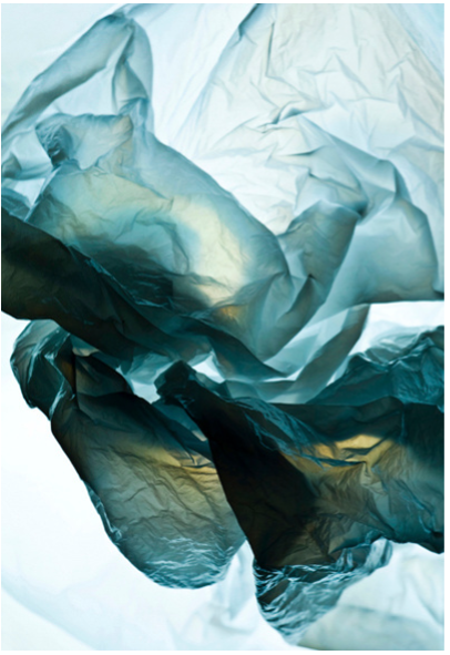
The use of fluorescent lighting portrays the true colors of what would generally be described as just a ‘clear plastic bag’. This is also exposed by the bright white background. The 3 dimensional aspect of this image adds texture, showing all the crinkle’s of the plastic bag, showing its lifetime and portraying how it may almost be up. It all portrays a very clear conceptional idea about how bags and plastic have gone through alot, showing how this inanimate object can react to things such as touch and useaged.
The use of fluorescent flash studio lighting creates a more dynamic effect, it is a lot more intense than natural lighting which really extenuates the blue,green and yellow colours of the plastic bag which wouldn’t be seen during natural daylight. There is a sharp, focused lens used, generally meaning higher aperture which really captures a more significant depth of field when it comes to all the ageing within the plastic. It has a good tonal range and looks like a higher exposure has been used, as the image looks to have been taken on a white light box. There is lots of texture and tonal range within the image, for example the gradient of the different colours as the plastic wears down, and the wrinkles which can be seen throughout the bag have a 3D form. The images has been selectively cropped to show just the inner/middle of the plastic bag where it would have aged the most. Which leads the eye into this middle ground forepoint. This plastic bag has a historical context too it which can be displayed throughout its ageing. It makes a person wonder, where the bag would have gone and been, how many people would have used this bag and where it actually originated from. But it also leads people to think about how many of these bags are actually out there, how much waste humans have made and how it will never die. How much harm we must have caused to the earth by using thousands of these each day, and the worry about the fact that this is still continuing, there is someone purchasing a brand new plastic bag right now which will yet again never die, and we are just letting our earth suffer. Naomi White made people feel this by taking something so regular that we see every day and simply making it look different by adding more depth into such a simple thing.
Lucas Foglia
Today, nature both heals us and threatens us. As we spend more time than ever indoors looking at screens, neuroscientists demonstrate that time outside is vital to human health and happiness. Yet, we are vulnerable to the storms, droughts, heat waves, and freezes that result from climate change.
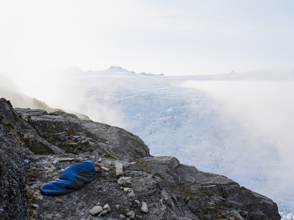
His project ‘human nature’ contains a series of images of humans pictured surrounded by nature’s strongest elements’ such as volcanoes, and caves. The photographs examine our need for wild places in the context of the Anthropocene.
My Main Inspiration From Him
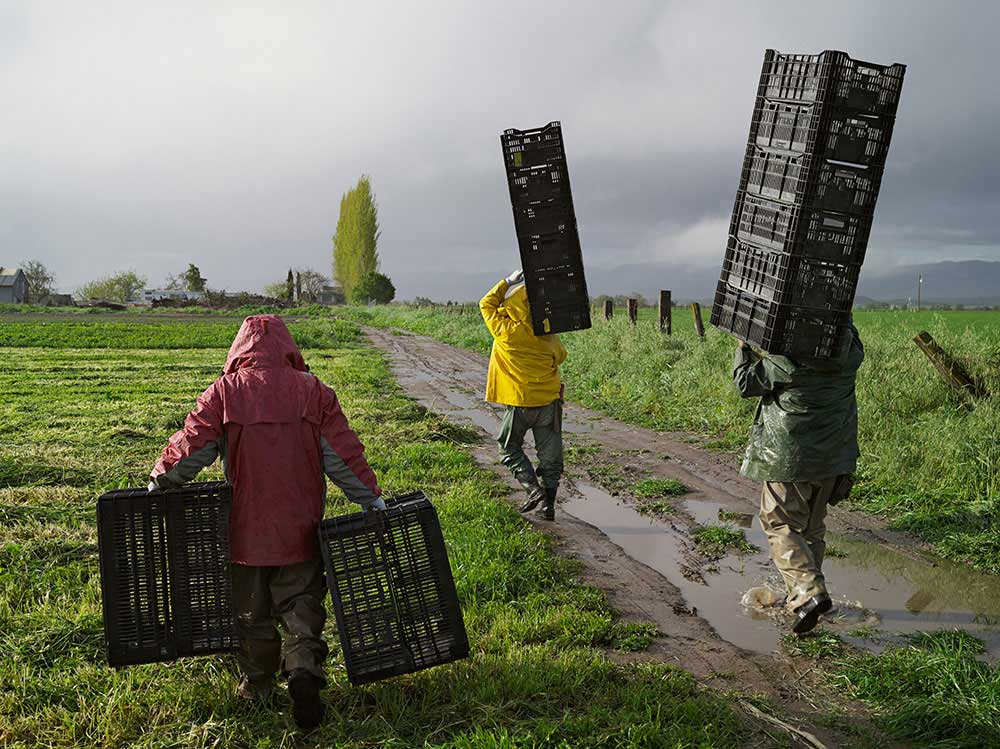
Obviously just being a A-Level student I don’t have the facilities to photograph all these crazy element’s of photography within Lucas’s work, but I want to still be able to capture an element of humans interacting with anthropogenic locations. This image is my main inspiration due to the way that the people are interacting with the natural landscape, and how they are still going through any weather, no matter the fact that they are walking separately they are still in this together, they are all-in the same location, doing the same thing, and battling through the same weather. I really like the idea of anthopece bringing people together.
Image Analysis
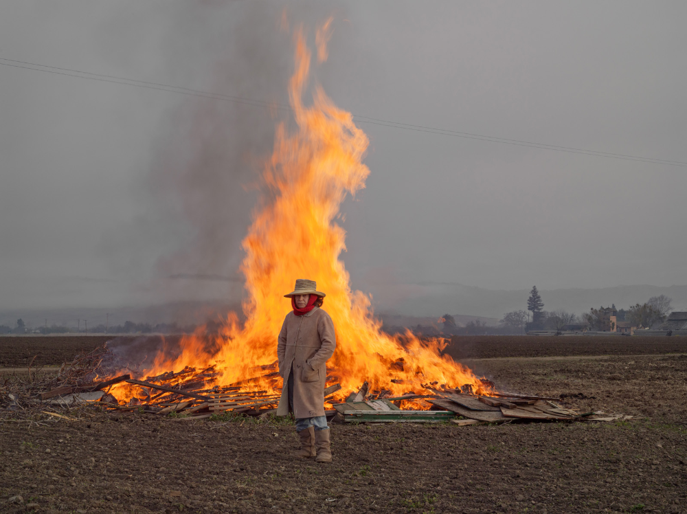
This image is very conceptual, with the lighting have a binary opposition of the dark sky and the bright fire. It portrays the extremes of mother nature, and how she can sometimes contrast herself. The tonal range within the image portrays of darker dimmed colours and then is contrasted by the brighter colours of the fire. This image also uses space perception to portray how humans can stand right next to the thing that they are using to destroy the world, and look proud about it, like that’s what makes them human. This image shows the raw elements and composer of anthropocene and how people are effecting’s the world.
This image has used natural daylight but also the natural flame behind the model to light up the image. It has a wild level of control due to the fire burning in a wild pattern. And has quite distant lighting. The depth of field is very deep, making you mainly focus on the lit up burning fire rather than the natural sky light. There is a motion blur at the top of the flame where it is turning from fire into smoke, oxidising. The image is quite grainy due to the use of moving light. It has quite a warm white balance, with the use of oranges and yellows spread throughout. There is a sharp shift in tone, when it comes to the grey dim background, bright orange middle ground and greeny dying foreground. The image is 2D but also 3D in a way, the woman stood still doesn’t seem to be popping out at all but the wild flame almost attacks your eyes. Your eye is led to the fire straight away, but then also led to the weird harmony and separation of the image, the way all the colours seem to be working together yet fighting against each other, there’s almost a tension within the image. Something that would instantly catch someone’s eye would be the deep black smoke coming out of the flames, our brains have been embedded with bad thoughts when it comes to black smoke, not just how bad that can be for the environment but also just how bad it can be for someone to breath in, it is a very conceptual image, making you really think. The essence of being placed in front of one of the strongest elements in the world makes people think just how easy things like that are, everyday people use lighters but the fact that the earth offers so much where you can just go out and abuse the fire element makes people really value the earth more, and may also make them think about their mistakes.
