Anthropocene & Artist Research

What Is The Anthropocene?

Anthropocene is sometimes used to describe the period of time where human activity had a substantial impact on Earths climate and environment. The Anthropocene began in the 1950s. The word combines the Greek words “anthropo” which means “human”, and “-cene”, which is the standard suffix for “epoch” in geological time. The term was coined and made popular by biologist Eugene Stormer and chemist Paul Crutzen in 2000.

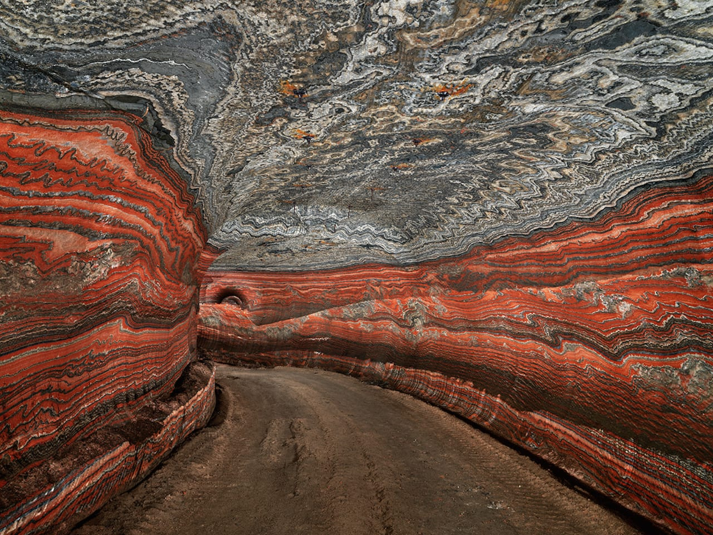
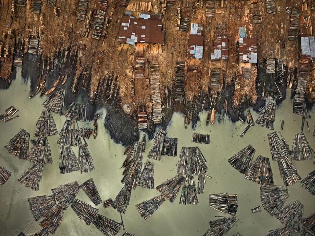
Edward Burtynsky
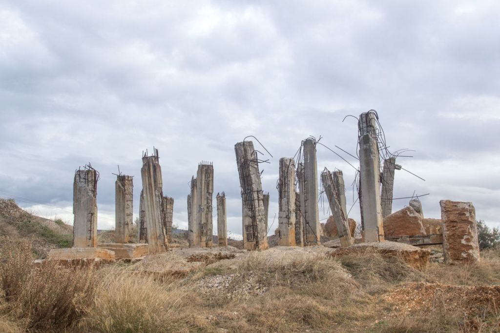
George Marazakis
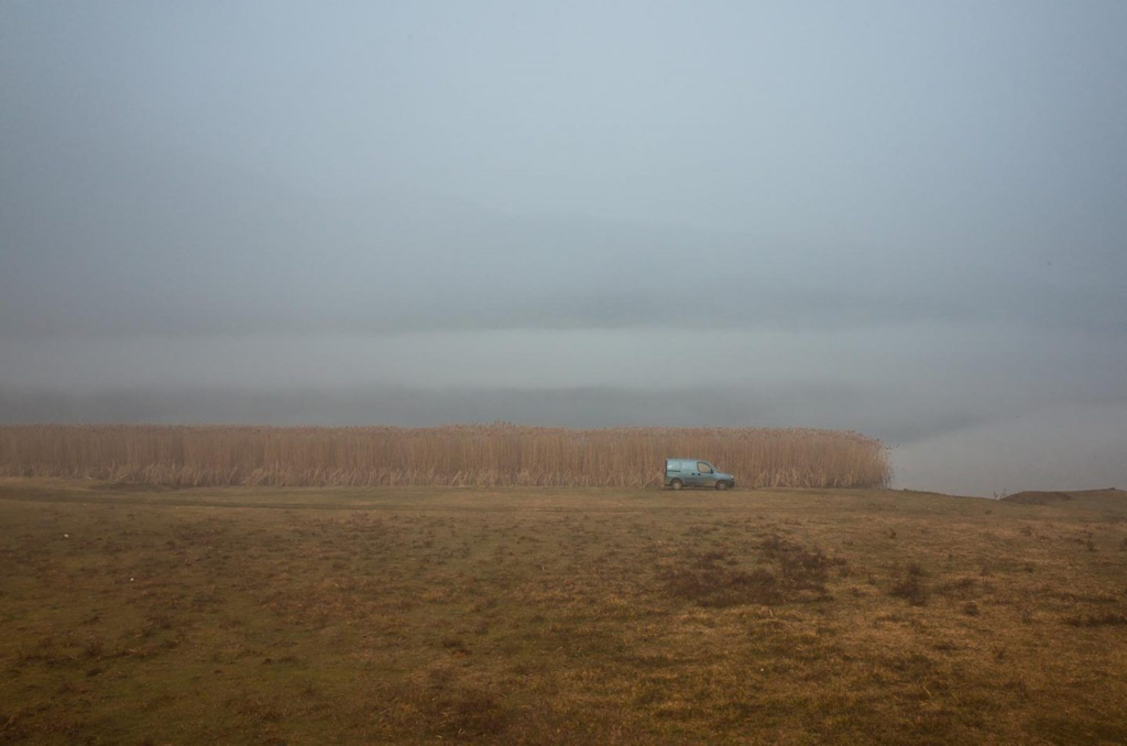
Alessandro Zanoni
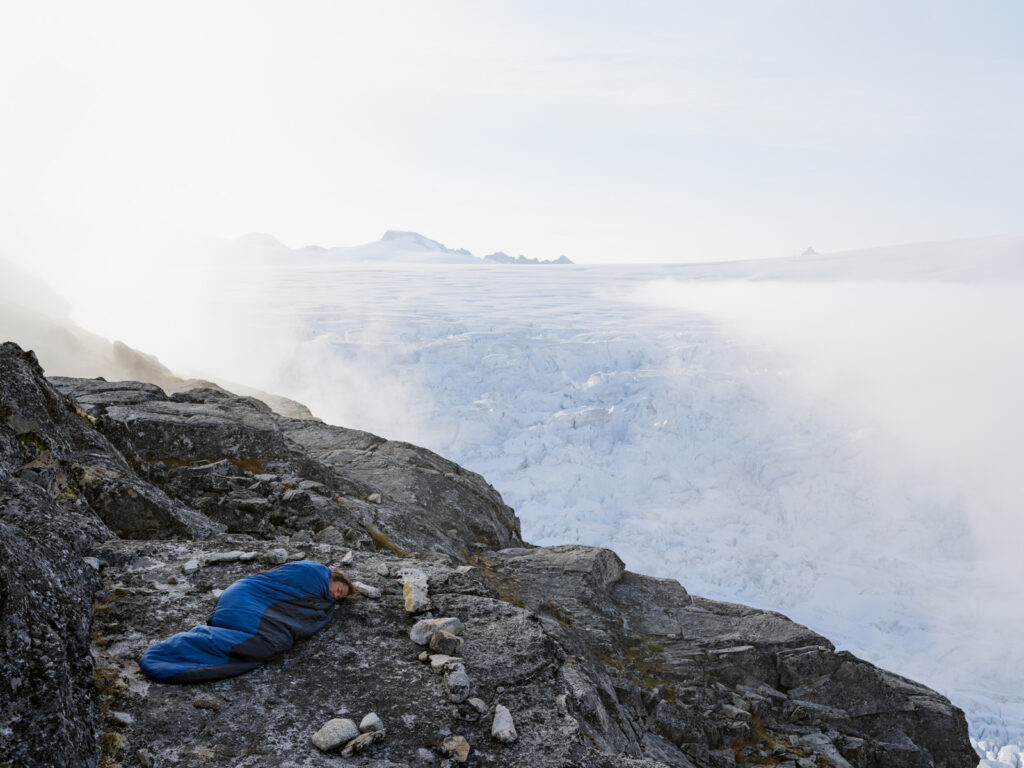
James Balog

Scientists have agreed that the acceleration of global warming and climate change is mostly through human activity, rather than natural processes. Four of the main causes of the Anthropocene is agriculture, urbanisation, deforestation and pollution.

These human actions cause changes in water cycle, imbalances and destructions of marine and terrestrial ecosystems, an increase of extreme meteorological phenomena, and the acidification of the oceans or disappearance of forests. Some examples of photographers which have focused their photography on the Anthropocene are; Edward Burtynsky, George Marazakis, Alessandro Zanoni, James Balog, etc.


Edward Burtynsky

Edward Burtynsky is a Canadian photographer, who is best known for his global industrial landscapes which represent over 40 years of his dedication to shining a light on the detrimental impact of the human industry on the planet. He was born February 22, 1955 of Ukrainian heritage in St. Catharine’s, Ontario. Furthermore, Burtynsky received his BAA in Photography/Media Studies from Toronto Metropolitan University in 1982, as well as receiving both an Alumni Achievement Award in 2004 and an Honorary Doctorate in 2007.
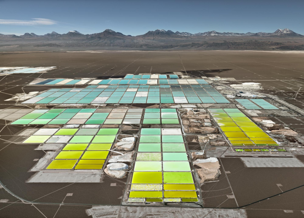
Edward Burtynsky was a director for the documentary released in 2018 called; ‘Anthropocene: The Human Epoch’, which takes a look at six continents and twenty different countries to capture the catastrophic effects that humans have had on Earth’s climate and environment over the last century. Burtynsky states; “I have come to think of my preoccupation with the Anthropocene — the indelible marks left by humankind on the geological face of our planet — as a conceptual extension of my first and most fundamental interests as a photographer. I have always been concerned to show how we affect the Earth in a big way. To this end, I seek out and photograph large-scale systems that leave lasting marks.” which shows his focus when photographing these types of landscapes related to the Anthropocene.


George Marazakis

George Marazakis is a Greek photographer who considers and approaches the Anthropocene as a concept and title for a series, dealing with human activity having dominating effects on the climate and environment. Marazakis was born in 1976 in Creta Island, Greece. He studied Mechanical Engineering and works for the Municipal of Heraklion.

George Marazakis’ series called ‘A Cure for Anthropocene’ considers how humanity’s impact on Earth’s geology is so critical that the current Geological epoch which began 11,650 years ago, Holocene, is being proposed to be replaced by a new one called Anthropocene. Marazakis states; “If we assume that humans, and by extension, human civilization is a product of nature, considering the way that appeared, as small growing changes in topography, an external observer could describe it as an autoimmune disease attacking its own body. However, what would be considered as a disease is our very existence and the cure, the ecological movement, does not aim at the salvation of the planet but at the salvation of human existence on the planet.” which shows his concern for the Anthropocene.

This is a digital landscape photograph by George Marazakis, from his series “A Cure for Anthropocene”. The composition features a factory emitting clouds of smoke far in the background as the focal point, surrounded by barren fields and mountains behind it. The road acts as leading lines which start in the foreground, stretches past the midground, and draws the viewers eyes towards the background’s industrial buildings. I believe this photo does not follow the rule of thirds, because the horizon is more centred in the image, and the focal point does not fall on any of the rule of third lines. The lighting appears to be natural daylight on a cloudy, overcast day.

No aspects of the photo are overexposed or underexposed, and the contrast appears to be not too strong. The depth of field is sharp so I believe the aperture is f/11, as the background and midground is clear and not blurry. The shutter speed appears to be 1/125, and the image is not grainy, so I believe the ISO is around 100-200. Furthermore, the context of this image aims to shed light on the Anthropocene, and the pollution released from these industrial buildings, caused by humans.

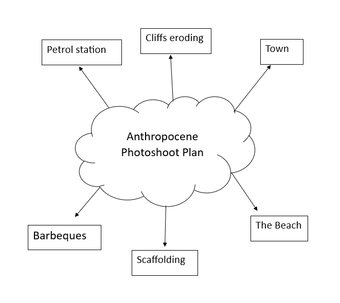
Anthropocene Photoshoot Plan.

Idea 1.

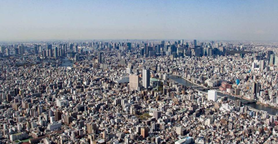
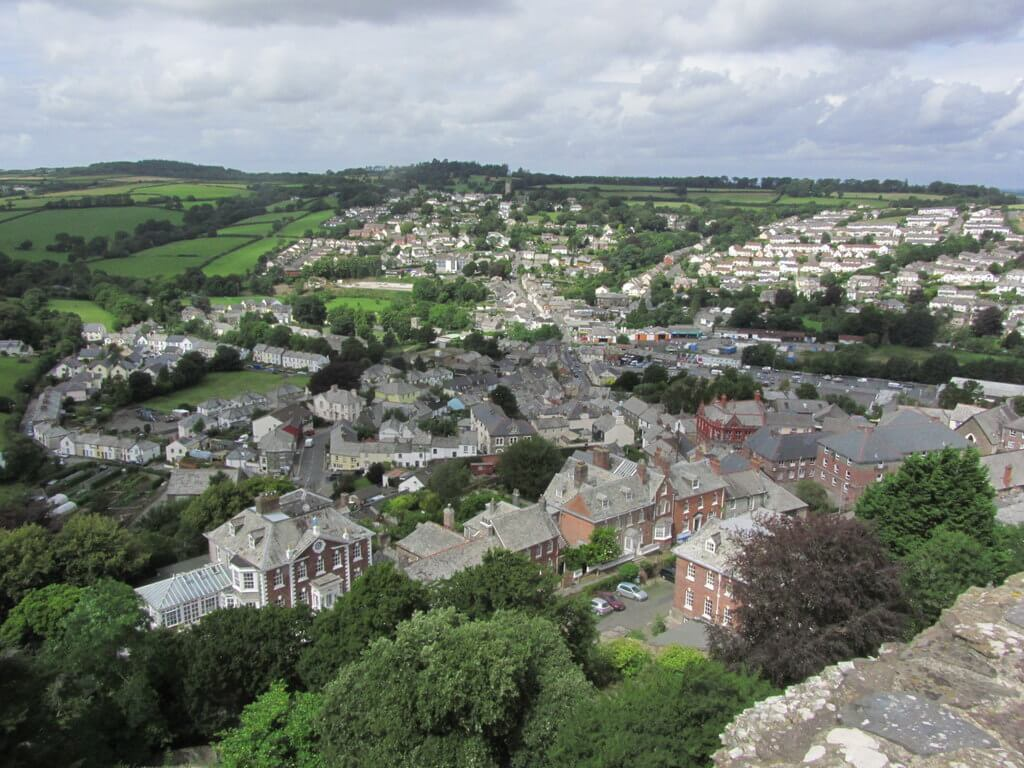
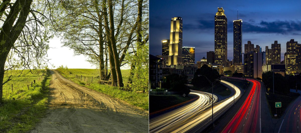
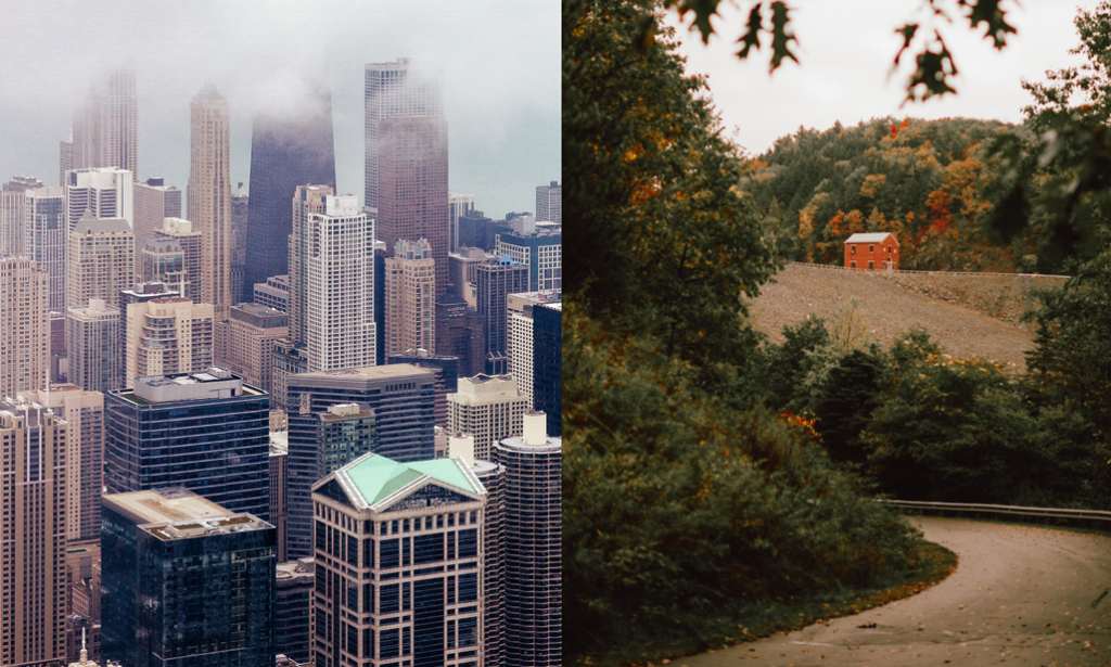
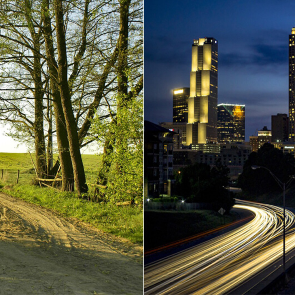
I would like to photograph Jersey from a high angle to represent how urbanisation has taken over the natural landscapes and resulted in a world, full of cars and buildings. I think these photos will also show. I am going to create images in densely populated areas, where there is lots of people, technology and buildings, next to areas that look similar, which are deserted, filled with natural elements and demonstrate humans impact. My locations for my urban areas will be based on areas such as St Helier, Town, St Aubin. And my locations for my natural landscape will be St Ouen, St John, St Mary and places that are mostly untouched by humans. Having two photos side by side with a similar shape e.g.
  • A straight path
  • A winding road
  • An upwards view
  • A low angle view

This with help the viewer to get a direct view of what the earth would be like if it was untouched by humans compared to the destruction we have already caused. This conveys a powerful message bout Anthropocene with relating to technology and human activity.

PERSPECTIVES-

Play on words by discovering multiple angles and perspectives, whilst also discussing the different perspectives on views when it comes to global warming and Anthropocene, e.g. disbelief and conspiracy theorists.

These images are some examples of work I would like to replicate in my photoshoot.

Photoshoot Idea 2

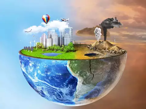
For this photoshoot, I would like to photograph simple emissions into the atmosphere, that affect the earth more than we realize. I feel these side by side comparisons (diptych) with create a meaningful message on how the earth is meant to be and how it has been transformed. One side filled with trees, plants and natural landscapes, compared to urban buildings and light will create an impactful picture which will make further meaning come across.

Earth warming main contributors:

Burning petrol when we drive.

Burning oil or gas for home heating.

Incorrectly disposing of rubbish.

Food waste.

Deforestation.

Using electricity generated from coal, natural gas, and oil.

Travelling via boat or plane.

There are many household objects that are bad for the environment such as:

  • Tea Bags – Wet Wipes
  • Plastic straws – Suncream
  • Chopsticks – Laundry Detergent
  • Microbeads – Toothpaste
  • Razors – Cigarettes
  • Coffee – Exfoliating face wash
  • Glue – Hairspray
  • Light bulbs – Mattresses
  • Sandwich Bags – Bleach
  • Hand Gel – Cleaning sprays

I would like to photograph these items and edit them in photoshop to create an array of images of simple waste item which build up into long-term issues.

Photoshop Idea.

I would also like to work in Photoshop, to display images similar to these. By using different lines, shapes and icons, I want to to represent the waves, radiation and air pollution caused from technology. To replicate this, I need to find a high up area for an angle what is looking down from above, this area would also have to be densely populated with lots of houses, buildings and roads. I think this would be a good idea to be able to convey the invisible elements of Anthropocene caused by technology and explore its effects. For this I will use generative fill and Ai on Adobe Photoshop to achieve this effect. I want my images to represent all the waves and radiation that are being used constantly through the world and especially in highly populated areas with lots of roads, cars, workplaces and leisure locations.
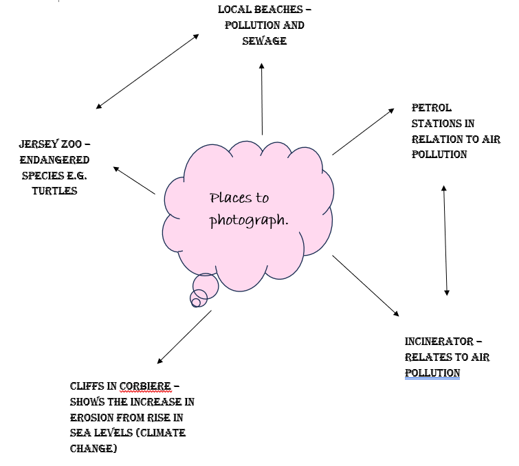
Experimentation with Ai.

Ed Ruscha – Artist Reference (Anthropocene)

Who is Edward Ruscha?

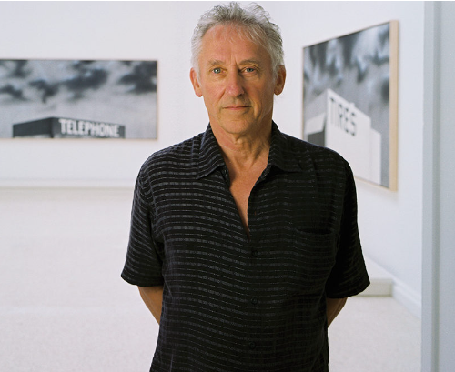
Edward Joseph Ruscha IV is an American artist associated with the pop art movement. He has worked in the media of painting, printmaking, drawing, photography, and film. He is also noted for creating several artist’s books. Ruscha lives and works in Culver City, California.
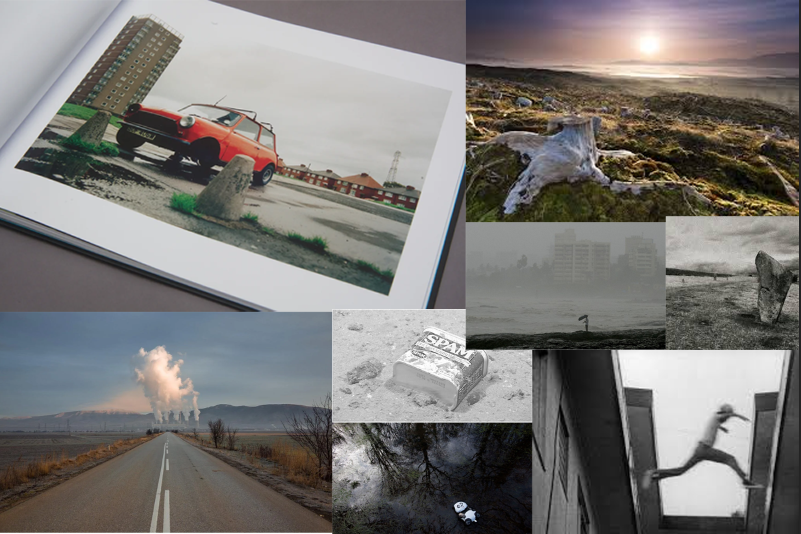
Who was Ruscha inspired by?

In the 1960s, inspired by artists like Raymond Hains, René Magritte, Jasper Johns, and Kurt Schwitters, Ruscha became a vibrant part of the art scene surrounding Ferus Gallery in Los Angeles. Ruscha became well known in the late 1950s when he began making small collages using images and words taken from everyday sources such as advertisements. This interest in the everyday led to him using the cityscape of his adopted hometown Los Angeles – a source of inspiration he has returned to again and again.

Why did Ruscha typically take photos of gas stations?


The son of an insurance auditor, Ruscha was raised in Oklahoma City, but moved to L.A. in 1956. The gas stations he photographed all sat on Route 66, the highway he rode on his regular visits home.

“I just had a personal connection to that span of mileage between Oklahoma and California,” Ruscha explain

The gasoline station is Ruscha’s most iconic image. He began

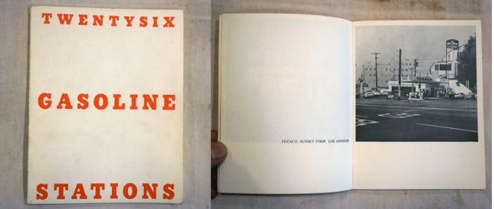
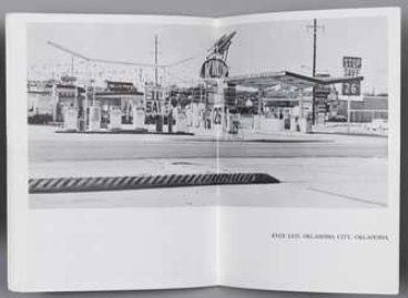
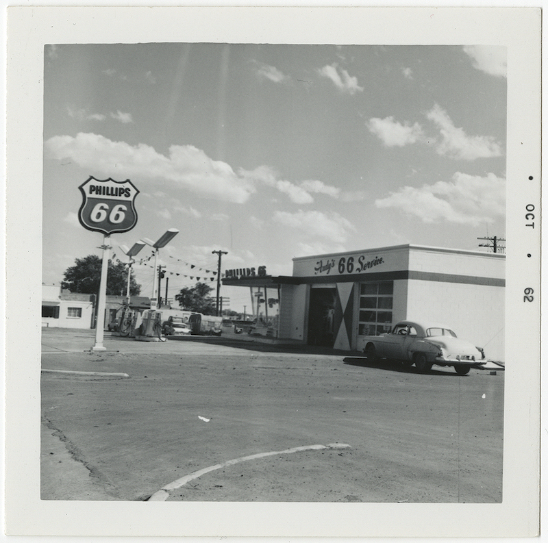
The gasoline station is Ruscha’s most iconic image. He began experimenting with the subject in his first artist’s book, Twentysix Gasoline Stations (1963), which reproduces a series of banal photographs the artist took while driving on Route 66 between Los Angeles and his hometown of Oklahoma City.

Ed Ruscha often edited his images to collage all together to make it even more eye catching then it is. This is called TYPOLOGY.

A photographic typology is a single photograph or more commonly a body of photographic work, that shares a high level of consistency. This consistency is usually found within the subjects, environment, photographic process, and presentation or direction of the subject.

An example of typology

Ed Ruscha’s typology

Mood board of Ruscha’s work within gas stations

As shown, Ed Ruscha clearly had a love and soft spot of gas stations in the 1960’s. He typically preferred photographing in black and white especially as colour was starting to evolve during 1970’s as a number of American photographers turned increasingly to colour. This creates an interesting factor to Ruscha as he decided too keep it in black and white during the time colour was trending due to it starting. However, as these photos were taken in this time it may of been more challenging and difficult to be able to get them in colour. Until well into the 1970s, the only photographs that were actually collected and exhibited were in black-and-white. The reluctance to accept colour photography was mainly due to conservation reasons, since the pigmentation in early colour photographs was highly unstable.

Twentysix Gasoline Stations (1963)

As seen, Ruscha made a book and documented him taking images of 26 gas stations and put them into a famous book in a very simple and dull layout. The simple layout and the black and white images makes not the book itself interesting but the images as his aim and intention was to get viewers to focus on the images rather than the pages in the book.

It is often considered to be the first modern artist’s book, and has become famous as a precursor and a major influence on the emerging artist’s book culture, especially in America. The book delivers exactly what its title promises, reproducing 26 photographs of gasoline stations next to captions indicating their brand and location. 

Ruscha has said:

I wasn’t coming out here [California] to do anything in particular, or to be anything in particular except…except out of Oklahoma…a long way from Oklahoma, that’s what I wanted to be, and everything it stood for. And away from the Catholic Church too, and Sister Daniella who beat my knuckles with a pencil the one year I was in parochial school.

Image Analysis

In this image, its interesting as it depends on the way you view it. One factor is, the fact it is deserted and you can instantly tell that is there is not many surroundings. This could be on purpose as his intention and aim may to get the viewer to focus on the gas station itself or to show the different features and difference within each gas station in California. This makes the viewer think of things that you wouldn’t think of on an every day basis. This is what makes his photos so interesting as he is the first to take something of something so simple but yet an underlying fascination. The photo is in black and white possibly to keep it in an old aesthetic but also to stop viewers from getting distracted and to focus on the gas station. It is slightly fuzzy which represents and tells modern viewers that it was taken before cameras had evolved. It is a bit unclear so it makes it difficult for viewers to focus but challenges them to look harder to create more time viewed on each image.

Anthropocene Definition/ Introduction

What is it?

Anthropocene in a way is a unit of time, it is used to describe the period within Earth’s history where human activity started to have a significant impact on the planets climate and ecosystems. This period is also sometimes known as the period of the great acceleration, things like carbon dioxide emissions and global warming that have significantly impacted our planet.

Plastic Pollution

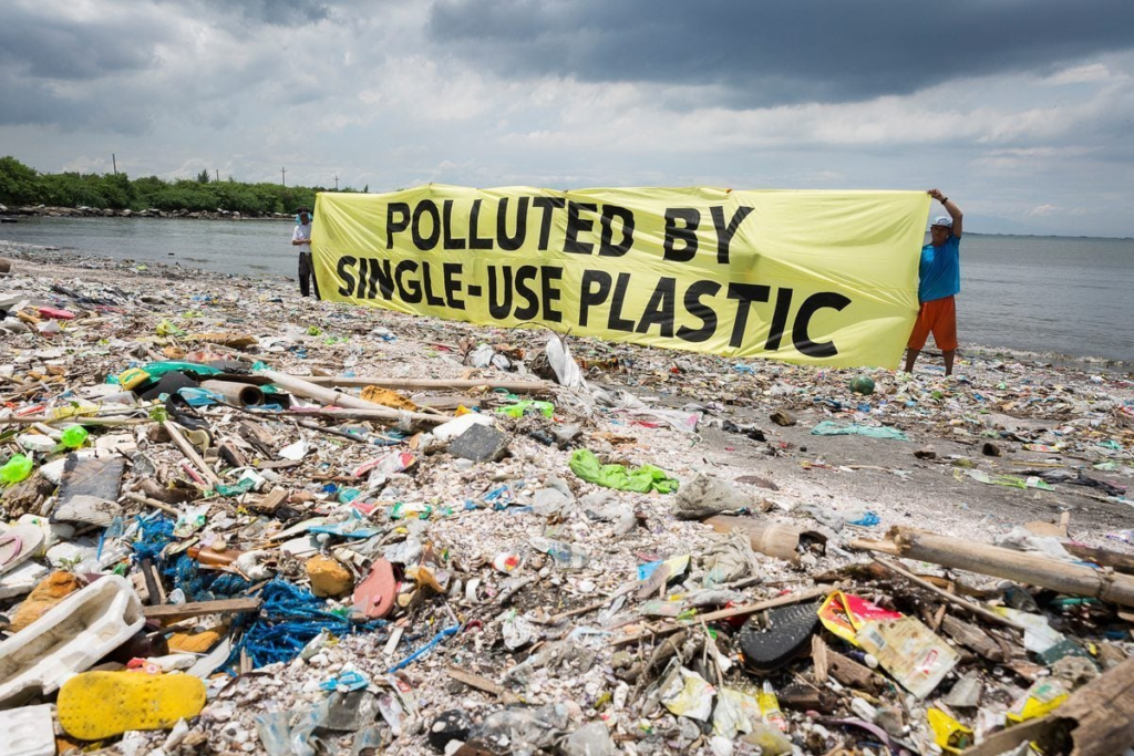
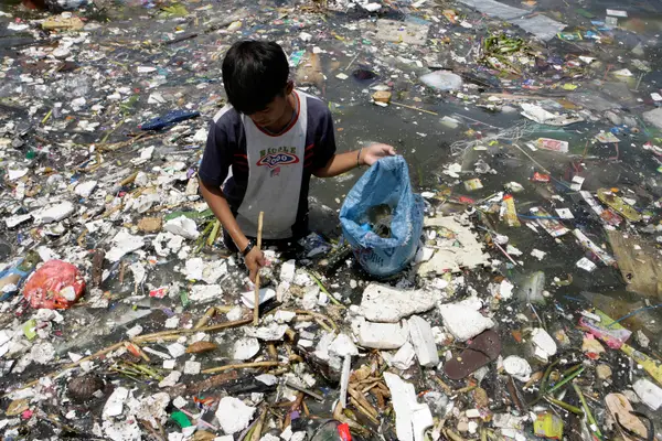
One main key aspect of the world’s pollution is plastic, the earth is now awash with plastic with millions of tons being produced every year, plastic doesn’t biodegrade which ends up littering soil and ocean beds. Scientists are going as far to study if plastic is the peak of anthropocene, the golden spike.

Why would we explore the concept

Humans tend to be very sensitive about their actions, humans like to think that they are the alpha and always correct, so bringing out their flaws and confronting them tends to get a rise out of them mainly in a positive way. By embracing anthropocene we can show humans what they have created and just how significant the damage they are doing is, which in turn will hopefully embarrass them in a way causing them to alter their ways and become better people altogether. It was a collective of the whole population that created this mess, so we will need a collective of the whole population to reverse these effects’ and save our planet, one person at a time.

Anthropocene Artist Case Studies- Naomi White & Lucas Foglia

Naomi White

Naomi Whites photoshoots include plastic bags under a studio light. This is to portray how this brightly coloured thing can effect so much of the world. As we know nearly all plastic ends up in the ocean due to litter being dumped into rivers.

“In Plastic Currents, the every day plastic bag is transformed by light, turned from something familiar into something strange. Undulating and fluid these forms transition from non-biodegradable, reviled plastic bags into seemingly organic forms, imitating the very nature they threaten.”

My Main Inspiration From Her


“Through explorations of the material I am interested in the way plastic responds to touch, its surface, its weight, how it clings to lighter elements like lint and dirt through static electricity, and the way each bag is its own marvel.”

Her description of the exploration of the material is going to be my main inspiration for my images, the images I would like to produce include the use of how plastic can transform, whether it be floating through the air, ditched within the sea or transformed into fashion.

Although I don’t want to just take images of plastic under a studio light to do this, I still think that she has been my main inspiration, showing the beauty of plastic but also how it can kill, taking something so regular and making it so unique.

Image analysis

The use of fluorescent lighting portrays the true colors of what would generally be described as just a ‘clear plastic bag’. This is also exposed by the bright white background. The 3 dimensional aspect of this image adds texture, showing all the crinkle’s of the plastic bag, showing its lifetime and portraying how it may almost be up. It all portrays a very clear conceptional idea about how bags and plastic have gone through alot, showing how this inanimate object can react to things such as touch and useaged.

The use of fluorescent flash studio lighting creates a more dynamic effect, it is a lot more intense than natural lighting which really extenuates the blue,green and yellow colours of the plastic bag which wouldn’t be seen during natural daylight. There is a sharp, focused lens used, generally meaning higher aperture which really captures a more significant depth of field when it comes to all the ageing within the plastic. It has a good tonal range and looks like a higher exposure has been used, as the image looks to have been taken on a white light box. There is lots of texture and tonal range within the image, for example the gradient of the different colours as the plastic wears down, and the wrinkles which can be seen throughout the bag have a 3D form. The images has been selectively cropped to show just the inner/middle of the plastic bag where it would have aged the most. Which leads the eye into this middle ground forepoint. This plastic bag has a historical context too it which can be displayed throughout its ageing. It makes a person wonder, where the bag would have gone and been, how many people would have used this bag and where it actually originated from. But it also leads people to think about how many of these bags are actually out there, how much waste humans have made and how it will never die. How much harm we must have caused to the earth by using thousands of these each day, and the worry about the fact that this is still continuing, there is someone purchasing a brand new plastic bag right now which will yet again never die, and we are just letting our earth suffer. Naomi White made people feel this by taking something so regular that we see every day and simply making it look different by adding more depth into such a simple thing.

Lucas Foglia

Today, nature both heals us and threatens us. As we spend more time than ever indoors looking at screens, neuroscientists demonstrate that time outside is vital to human health and happiness. Yet, we are vulnerable to the storms, droughts, heat waves, and freezes that result from climate change.

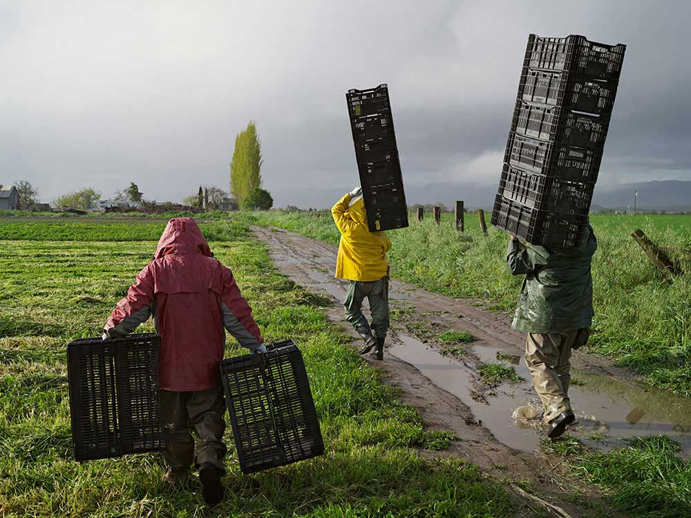
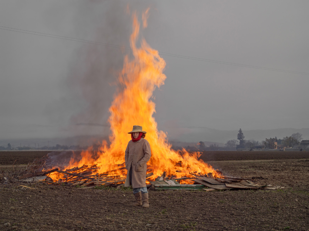
His project ‘human nature’ contains a series of images of humans pictured surrounded by nature’s strongest elements’ such as volcanoes, and caves. The photographs examine our need for wild places in the context of the Anthropocene.

My Main Inspiration From Him

Obviously just being a A-Level student I don’t have the facilities to photograph all these crazy element’s of photography within Lucas’s work, but I want to still be able to capture an element of humans interacting with anthropogenic locations. This image is my main inspiration due to the way that the people are interacting with the natural landscape, and how they are still going through any weather, no matter the fact that they are walking separately they are still in this together, they are all-in the same location, doing the same thing, and battling through the same weather. I really like the idea of anthopece bringing people together.

Image Analysis

This image is very conceptual, with the lighting have a binary opposition of the dark sky and the bright fire. It portrays the extremes of mother nature, and how she can sometimes contrast herself. The tonal range within the image portrays of darker dimmed colours and then is contrasted by the brighter colours of the fire. This image also uses space perception to portray how humans can stand right next to the thing that they are using to destroy the world, and look proud about it, like that’s what makes them human. This image shows the raw elements and composer of anthropocene and how people are effecting’s the world.

This image has used natural daylight but also the natural flame behind the model to light up the image. It has a wild level of control due to the fire burning in a wild pattern. And has quite distant lighting. The depth of field is very deep, making you mainly focus on the lit up burning fire rather than the natural sky light. There is a motion blur at the top of the flame where it is turning from fire into smoke, oxidising. The image is quite grainy due to the use of moving light. It has quite a warm white balance, with the use of oranges and yellows spread throughout. There is a sharp shift in tone, when it comes to the grey dim background, bright orange middle ground and greeny dying foreground. The image is 2D but also 3D in a way, the woman stood still doesn’t seem to be popping out at all but the wild flame almost attacks your eyes. Your eye is led to the fire straight away, but then also led to the weird harmony and separation of the image, the way all the colours seem to be working together yet fighting against each other, there’s almost a tension within the image. Something that would instantly catch someone’s eye would be the deep black smoke coming out of the flames, our brains have been embedded with bad thoughts when it comes to black smoke, not just how bad that can be for the environment but also just how bad it can be for someone to breath in, it is a very conceptual image, making you really think. The essence of being placed in front of one of the strongest elements in the world makes people think just how easy things like that are, everyday people use lighters but the fact that the earth offers so much where you can just go out and abuse the fire element makes people really value the earth more, and may also make them think about their mistakes.

photoshoot action plan – in relation to Ed Ruscha

Why is Ed Ruscha my inspiration?

My plan is to link an artist that I have studied previously (Ed Ruscha) to the theme of Anthropocene. This is because Ruscha chose to photograph the trivial objects like gas stations to express his interest in the things we usually ignore. Through elevating these humble structures to the status of art, Ruscha asks the viewers to review the notion of beauty and value. From my research I can gather that Ruscha mainly photographed petrol stations in Santa Monica Boulevard and Pacific Coast Highway and Melrose Avenue between 1974 and 1975. He has managed to complete over 40 shoots since 2007. I also chose to focus on Mitchell because he captures ancient and vintage buildings, in which I assume he does this to create nostalgia. I can recreate this by going to St Helier as I believe that is a place that carries many historical buildings rather than newer.

How does the artist link to my aim?

I can successfully link Ruscha’s work to my own because petrol stations are one of the main causes of air pollution, in which I am trying to send a message to the viewer on the dangers of air pollution, and also how it has been normalized through recent decades due to new, advanced technology. Therefore the main focus of my photoshoots will be local petrol stations and I will approach this by using similar methods to Ruscha e.g colours, editing and angles. I like the angle of how Ruscha captures his photos, as he incorporates a large setting within the image which helps the viewer gather more of a realistic idea. I also find it interesting that the photos are not taken from an accurate deadpan angle, but they are slightly off centre. This could be seen as unusual for photographers to do as it can sometimes make the image look rushed. However I do not believe this within Ruscha’s images because it is still in focus and includes the features that need to be included.

Another interesting factor within Ed Ruscha’s work is the border around the edge of the image that also includes the date. I find this very intriguing because it adds an old aesthetic, and makes the viewer link this image to images taken on a polaroid camera. The use of the image being in black and white also adds to this theme because we know that colour in photographs was only enabled in the early 2000s.

Anthropocene Moodboard/Plan Of Ideas

Mood board

Why?

I want my photographs to enrapture how man have changed things along the island, I want to portray a concept of change, how we have damaged this planet and in what ways we can fix it. I think by taking photos of people with plastic on the ocean will create something, as you look at the images you wonder to yourself “Did they pick that litter up”, but in reality at home you are the one using single use plastic, harming the earth yourself yet you are so worried about how other people are.

Photoshoot Ideas-

Idea 1,

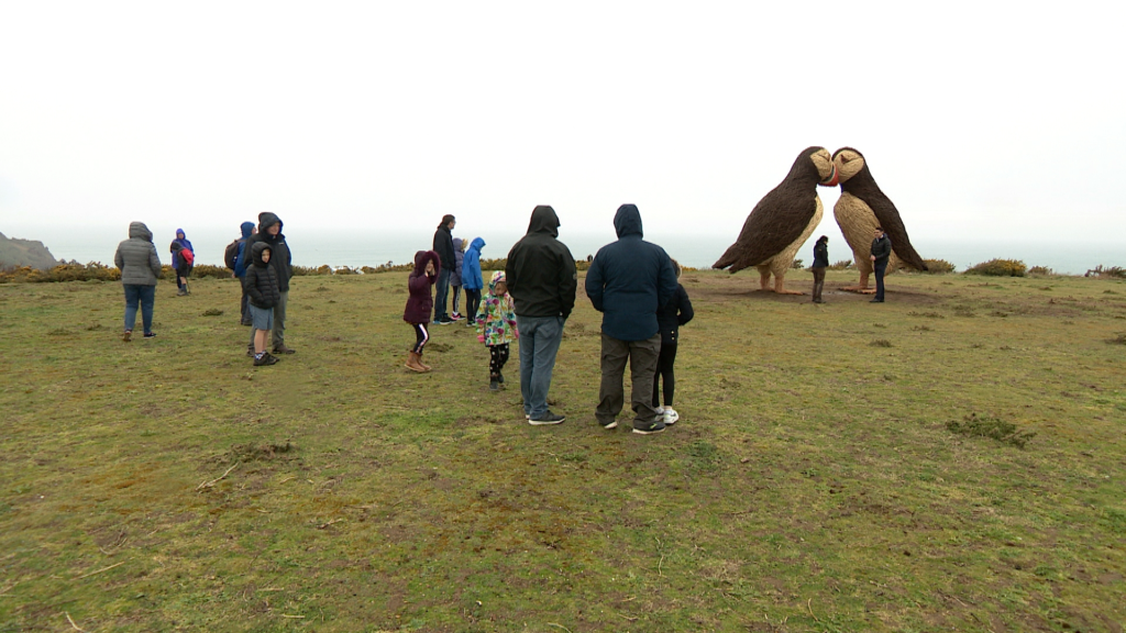
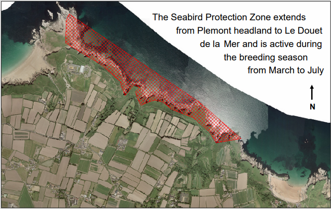
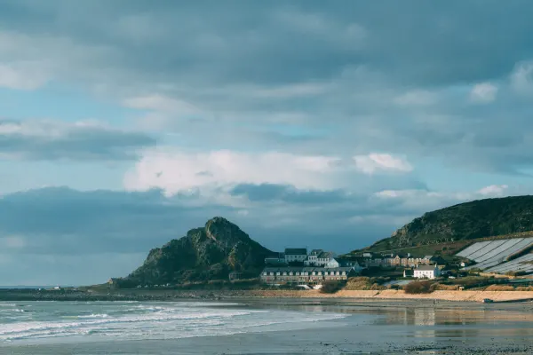
Photoshoot at Plemont where the puffins are and the bunker there, also images off the cliff side, in order to show our everchanging landscape, and the man made structure of the puffins and how it has implanted its self in-between the never-ending nothingness of nature.

Idea 2,

My second idea will be a group of people sat at either a harbour or a beach within the gloomy weather, to portray how the weather is changing due to climate change, and how humans think that its too late to reverse any damage that they have created. I will take these at places like St.Cathrines breakwater and La Saline car park.

Idea 3,

My third idea is too take some inspiration from Naomi White and Lucas Foglia , I want to embed plastics and plastic bags within my im ages as a representation of people facing their consequences.

Overall Plan

Creating a plan to capture “Anthropocene images”—photographs that reflect human impact on the Earth in the current geological age—requires a blend of visual storytelling, a deep understanding of environmental issues, and a sensitivity to how these impacts manifest in everyday life. Here’s a comprehensive plan to guide your project:

1. Define Your Concept and Theme

  • Anthropocene Overview: The Anthropocene is the proposed current geological age viewed as the period during which human activity has been the dominant influence on climate and the environment. This can include themes of environmental degradation, technological advancements, urbanization, deforestation, pollution, etc.
  • Narrow Your Focus: Decide what aspect of the Anthropocene you want to explore. Some ideas include:
    • Pollution: Air, water, and land pollution.
    • Climate Change: Evidence of rising sea levels, droughts, or wildfires.
    • Urbanization: Expanding cities, infrastructure, and human-made landscapes.
    • Biodiversity Loss: Endangered species, deforestation, or changing ecosystems.
    • Resource Extraction: Mining, oil drilling, or agriculture.
    • Technology and Surveillance: The omnipresence of digital technologies, smart cities, and surveillance.

2. Research and Identify Locations

  • Urban Areas: Look for places where human infrastructure and nature collide or have transformed the landscape, such as cities, industrial zones, or sprawling suburbs.
  • Nature Sites Impacted by Humans: Consider places like deforested areas, polluted rivers, waste dumps, or wildlife habitats affected by human intervention.
  • Industries and Factories: Capture images in places like manufacturing plants, mining sites, or energy production facilities.
  • Rural Areas: Sometimes the Anthropocene is more evident in rural landscapes, where agriculture, logging, or overuse of resources is visible.

3. Develop a Shooting Style

  • Wide-Open Landscapes vs. Close-Up Details: Wide shots can convey large-scale environmental destruction, while detailed shots can capture the impact on individual elements of nature (polluted water, deteriorating structures, wildlife struggling with human development).
  • Contrast: Show the clash between nature and human progress. Capture the juxtaposition of man-made objects with natural elements (e.g., an oil rig against a backdrop of a natural landscape).
  • Light and Mood: Depending on the subject, adjust your lighting. Harsh midday light can emphasize the starkness of industrial landscapes, while the golden hour might lend a more poignant, melancholic feel.
  • Long Exposure or Time-lapse: Consider long-exposure shots to show movement in urban spaces or time-lapses of changing landscapes (e.g., the erosion of coastlines, or construction projects).

4. Shooting Techniques

  • Documentary Style: Focus on realism and authenticity. You may want to shoot images that tell a story, similar to documentary photography. This could include people in these environments and their relationship to the changes happening around them.
  • Aerial Photography: If possible, use drones or aerial shots to provide a bird’s-eye view of environmental changes, urban sprawl, deforestation, or agricultural monocultures.
  • Night Photography: Urban environments can look dramatically different at night, where lights, smog, or artificial landscapes come to the forefront.
  • Perspective: Experiment with unusual perspectives—looking from above, low to the ground, or through windows or fences— to reveal different layers of interaction between humans and nature.

5. Photo Series and Narrative

  • Consider structuring your images into a cohesive photo series, where each photograph adds to the overall narrative of human impact.
  • Use captions or small narratives to add context. The Anthropocene is about the story of human interaction with the Earth over time, so offering insight into the history or consequences of a place can add depth to your project.
  • For example, in a series on deforestation, you might juxtapose images of thriving forest ecosystems against those of clear-cut land, followed by a close-up of machinery and the resulting barren ground.

6. Editing and Post-Processing

  • Enhance the Message: Post-processing should be used to enhance your narrative. If your aim is to emphasize destruction or deterioration, you might adjust contrast, saturation, or introduce desaturation to make images look more somber.
  • Manipulate Colors for Impact: High contrast and heavy editing can evoke a sense of crisis. For example, you might intensify the browns, oranges, or reds of polluted skies or urban decay.
  • Add Texture: Subtle textures, like dust or grain, can increase the tactile feeling of environmental damage or neglect in your images.

7. Incorporate Human Presence

  • Humans are integral to the Anthropocene. Including people in your photos—workers, consumers, or activists—can convey how humans interact with or are affected by environmental changes.
  • Contradictions: Show the contrasts in human behavior—people benefiting from industries that harm the environment, or individuals working to restore ecosystems.

8. Social Commentary

  • Many photographers who work within this theme, such as Edward Burtynsky, have an underlying social commentary. Consider how your images can raise awareness, evoke emotion, or call for action.
  • Use images to show the consequences of unchecked industrialization, environmental destruction, or consumerism.

9. Ethical Considerations

  • Authenticity: Ensure that your images reflect the real impacts of human activity without exaggerating or misrepresenting.
  • Respect for Subjects: Be sensitive to the communities or individuals whose lives are impacted by these phenomena. This includes obtaining permission if necessary and respecting privacy.

10. Exhibition or Sharing

  • Online Platforms: If you want to reach a global audience, consider sharing your images on social media platforms, photography blogs, or online galleries. Instagram and platforms like 500px can help you build visibility.
  • Physical Exhibitions: You could organize an exhibition to present the images in a physical space. You might pair the images with text, statistics, or video to help tell the story.
  • Collaboration with Activists/NGOs: Partnering with organizations involved in environmental or social justice issues can help get your message out to a wider audience and have an impact.

Example Timeline for the Project

Week 1-2: Conceptualization and Planning

  • Finalize theme and select locations.
  • Research environmental issues and any necessary permits.
  • Organize your gear and plan logistics.

Week 3-4: Location Scouting and First Round of Shooting

  • Begin photographing key locations based on your research.
  • Capture a variety of angles, light conditions, and perspectives.

Week 5-6: Continued Shooting and Editing

  • Refine your shots and add any human presence if necessary.
  • Begin initial edits for lighting, contrast, and narrative flow.

Week 7-8: Final Edits and Arrangement

  • Complete editing of all images.
  • Arrange photos into a cohesive series or narrative.

Week 9-10: Preparation for Exhibition

  • Finalize captions, narratives, or additional media.
  • Consider how best to display your work, either digitally or in physical form.

This plan is flexible, so feel free to adjust based on the locations you have access to and the specific Anthropocene themes that resonate with you. The project has the potential to spark important conversations about humanity’s role in shaping the planet’s future.

Mock Up Of Final Images Anthropocene

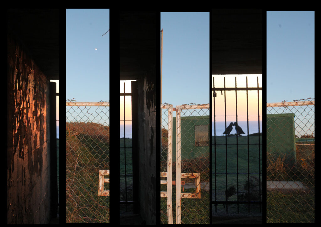
The reason I have chosen to display my images in this way is because they both have the same type of lighting, being natural daylight, with the sun quite low and setting. This gives a less intense look but a vaster tonal range. They are also both taken with a wider angles lens, and are both portrait photos rather than landscape. They have a similar yellowy golden colour temperature which gives them both a warm feeling. I have used foam board to originally mount the 6 pieces of image and then stuck it into black card to create a vast tone between light and dark. This makes the image 3D and gives it a simple repetition pattern, I have jumbled up the composition of the two images with each other, creating a hybrid blend of harmony. This changes a person’s viewpoint of the image, and creates an illusion which people would generally get lost within. By doing this I have combined the history and context of the two images, see one image is of a sculpture of the puffins taken through the gates of a bunker, this contrast the history of the bunker with the futuristic sculpture. Maybe showing that no matter how hard we try to change, and rebuild the earth our past will always follow us. I have contrasted that image with a image of a radio tower taken only a few meters away. I think this portrays irony within trying to save the planet and the animals, whilst literally creating disruption a few meters away. I think this is quite a conceptual image as people really have two look at it to understand and work out how he two images have been put together.

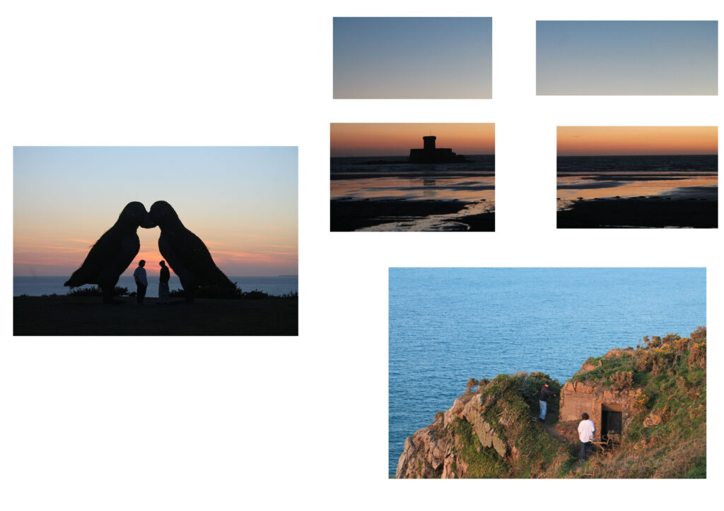
The reason I have chosen to portray these three images in this way is yet again because they all have a similar daylight to them, with the sun setting, and all have that warm feeling. I stuck these images on a big piece of black card after putting them on foam board. There is a 3D pattern to these images, and a lot of space between them but one of the main reasons I have put these together and cut the top right into four is because I wanted to change the harmony, I wanted to disrupt a person’s point of view, and create tension in people’s minds so they don’t actually know where to look first. I think I have achieved this by mixing up the images, cutting it into four and having so many bright bold colours. The reason I have done this is because of a contextual elect, the bottom right image is a photo of an old bunker, and the top right image is a photo of an old castle, whereas the photo in the middle on the left is quite a new and modern structure. This can get people’s minds thinking about the past and the future and the present. It can make them wonder how the damage that we used to leave was just a simple structure whereas now the damage we are leaving is endangering animals.

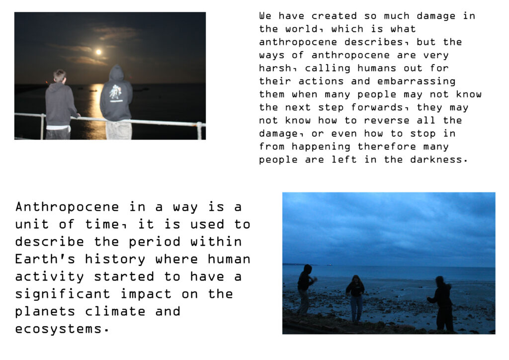
The reason I have chosen to put these two images together is because they have a similar lighting to them, a dimmer gloomier tone rather than my most recent warm pictures. The image on the top left is also under exposed, making the moon look like the sun, although this makes the photo a little bit blurry I think it correlates well with my idea of being left in the darkness. I mounted the images and the text onto foam and then onto black card. This makes them 3D and stand out, I have made no ‘middle image’ so that nothing stands out massively as I wanted both the photos to be equal. The reason I have decided to include text is too add a context to get my point across. I didn’t want these images too just be seen as people having fun and just throwing rocks, I wanted the image too be seen as something more, something like people being lost in the darkness. When you read the description it makes the images quite conceptual and makes your brain think more about the image creating an essence of having to listen to me and my ideas and agree with them, almost brain manipulating humans into changing their ways.

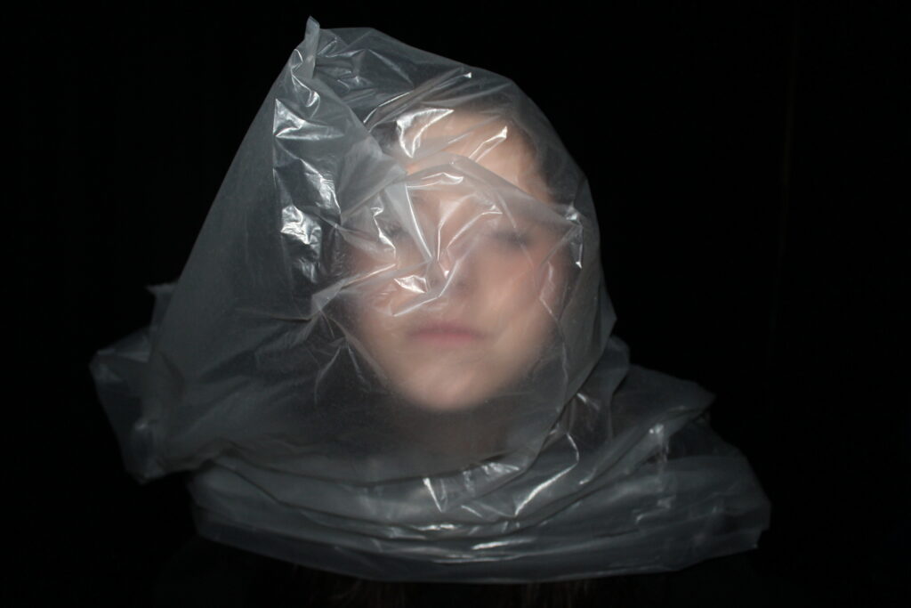
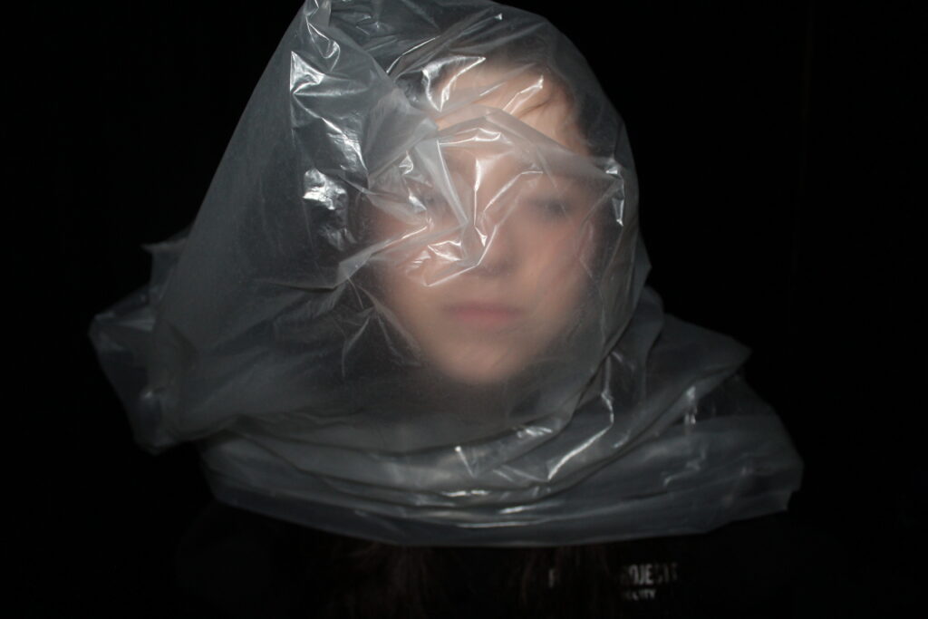
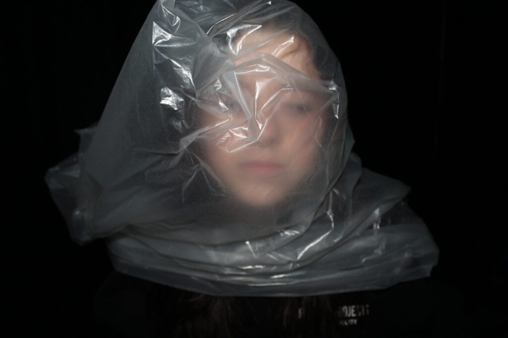
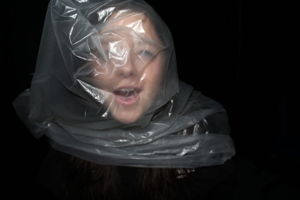
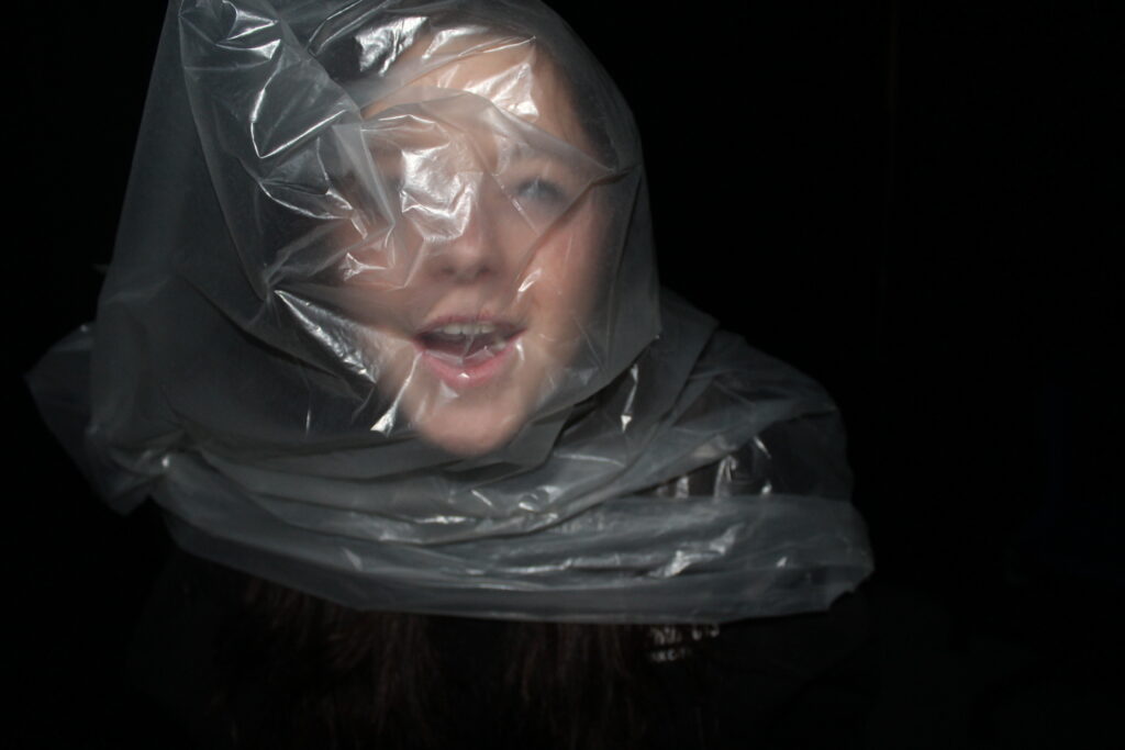
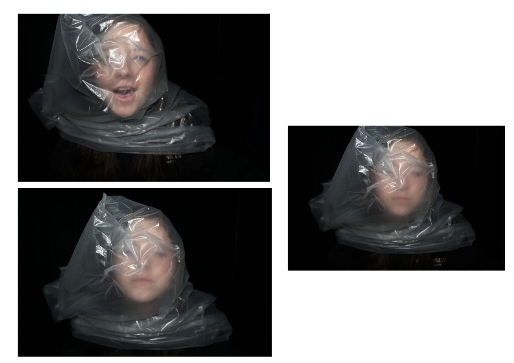
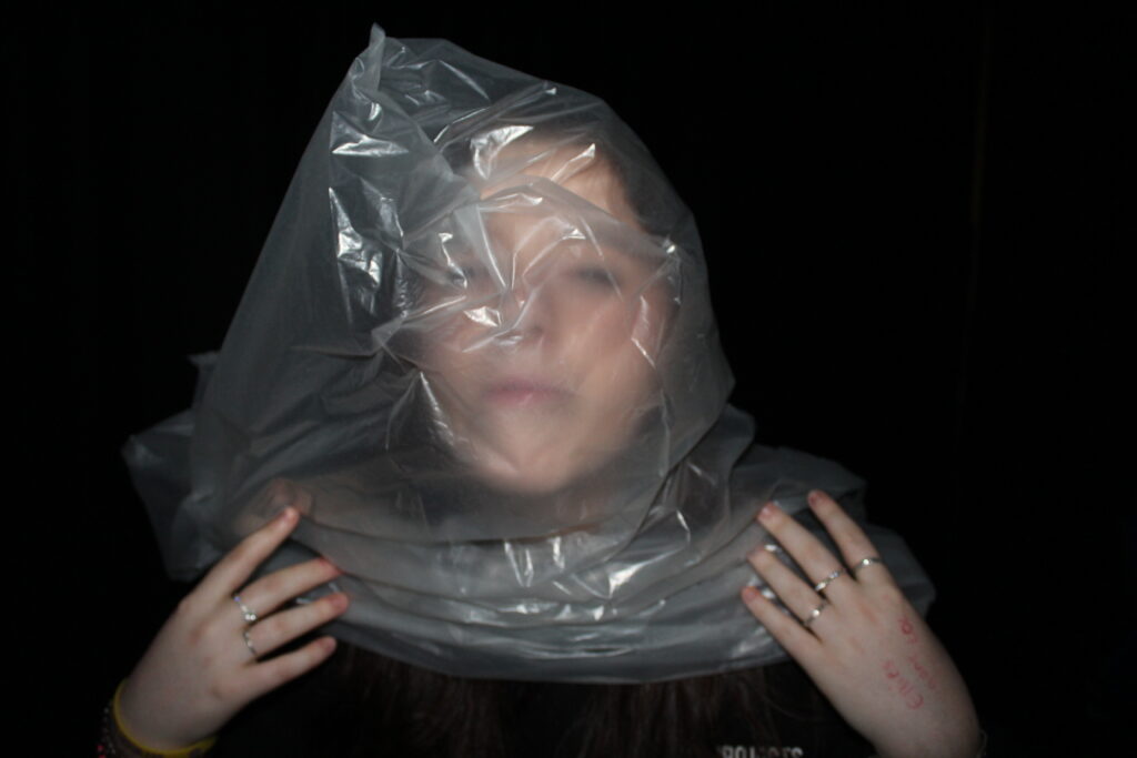
The reason that I have chosen to put these images together is basically because they are all the same thing. They are taken with studio lighting ( flash ) and have a black curtain background creating a massive tonal range. You can see texture within my images, where the paper bag is wrinkled and my model is trying to breath it in. I wanted to create drama, a dramatic piece to embarrass humans as they have done this to animals but just find it insane when it happens to one of them. I think these images are really conceptual as they really get people thinking about how they would like it, and they very clearly wouldn’t, so this embarrses people.