Robert Adams Artist Research

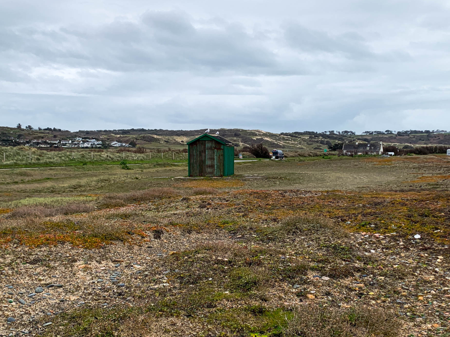
Robert Adams is an American photographer who has focused on the changing landscape of the American West. His work first came to prominence in the mid-1970s through his book The New West and his participation in the exhibition New Topographics: Photographs of a Man-Altered Landscape in 1975. 

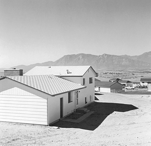
Offering solemn meditations on the landscapes of California, Colorado, and Oregon, Adams’s black-and-white photos document the changes wrought by humans upon nature.

When Adams returned to Colorado to begin what he anticipated would be a career in teaching, he was dismayed by the changes he saw in the landscape. He bought a 35-mm camera, taught himself the fundamentals of photography, and began making pictures infused with a love for the geography of his home state.

Born on May 8, 1937 in Orange, NJ, his family moved around the Midwest throughout his childhood, finally settling in Wheat Ridge, CO in 1952. Adams went on to study English at the University of Redlands and received his PhD in English from the University of Southern California in 1965. It wasn’t until the near completion of his dissertation for USC that Adams began to take photography seriously, learning techniques from professional photographer Myron Wood and reading Aperture magazine. In the 1970s, he was released the book The New West (1974), and a year later was included in the seminal exhibition “New Topographics: Photographs of a Man-Altered Landscape.” Adams has twice been the recipient of the Guggenheim Fellowship and once the recipient of a MacArthur Fellowship.

Robert Adams was born in Orange, New Jersey, in 1937. His refined black-and-white photographs document scenes of the American West of the past four decades, revealing the impact of human activity on the last vestiges of wilderness and open space. Although often devoid of human subjects, or sparsely populated, Adams’s photographs capture the physical traces of human life: a garbage-strewn roadside, a clear-cut forest, a half-built house. An underlying tension in Adams’s body of work is the contradiction between landscapes visibly transformed or scarred by human presence and the inherent beauty of light and land rendered by the camera. his work also conveys hope that change can be effected, and it speaks with joy of what remains glorious in the West

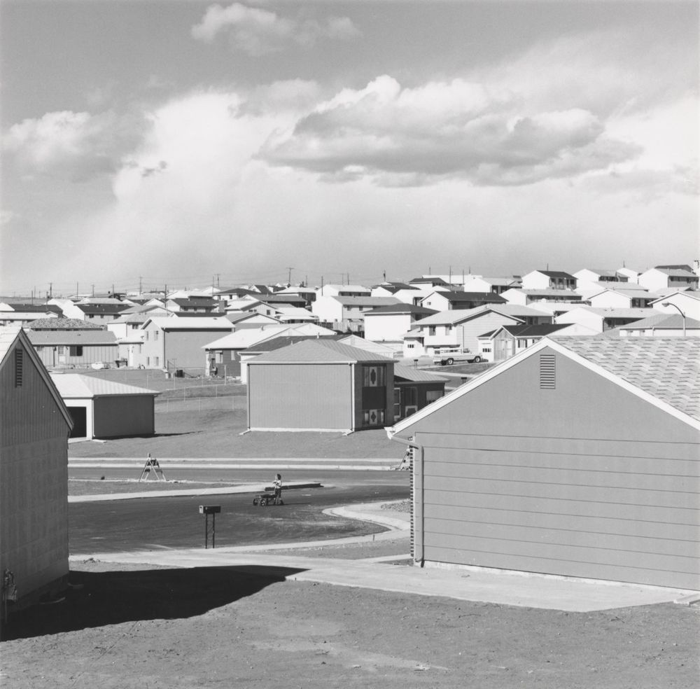
I think this image successfully captures how humankind have ruined Earths natural beauty by polluting it with various bland, repetitive houses. There is not a wide range of tones seen in this image which I think is on purpose in order to emphasise the idea of how mundane and dull we are making our planet by constantly expanding and building on natural landscapes, stripping the Earth of its beauty. This image is quite boring to look at due to the lack of range in tones and the boring houses which all look the same. However, I think it does make the viewer realise how much damage we are doing to the Earth, which is an important message to convey. This has inspired me to take images of densely built areas with a lack of tonal range as I feel it could help society to realise the flaw with constantly expanding and building on these landscapes.

Photoshoot 1 Plan:

Edward Burtynsky response:

What I’m inspired by:

Edward Burtynsky depicts locations where there is an increasing level of industrialisation and its impacts on humans and nature. The use of his wide angle camera and abstract view helps to show this.

For the photo shoot I would like to go to sites where you can see industrial parts as well as rural. I want to capture the contrast between the landscapes because I think this gives an interesting photo to look at. This shows in ways the beginning of industrialisation which I think is an interesting concept to explore in Anthropocene. I would like to capture the abstract and intricate look by experimenting with different views, so by having up close and slightly more far away images. I don’t want there to be much negative space because without, it gives the photo more depth, engaging you more. At first it might look to much and overcrowded but this makes it more memorable.

Places to photoshoot:

  • Val de la mare reservoir – capturing from different views around: walk ways, different parts of they headland, buildings/ bridges, how the water flows around the headland. I think this will show a unique contrast between the industrial parts and rural parts as I’ll capture from wider angles which will show more areas of the landscape while also creating abstract looks.
  • Ronez Quarry – for this I want to capture it from a far so I can capture the landscape from a birds eye view in response to Edward Burtynsky. This will show the landscape from an interesting perspective as you’ll be able to see interesting formations and the landscape differently.

Edward Burtynsky mostly uses drones to capture his photography, capturing very unique photos. In response of my own work I want to still capture the unique forms, but instead capturing from far away angles but editing it to creating an abstract look.

Mandy Barker

Mandy Barker (1964) is a British photographer who is most known for her work with marine plastic debris. Barker has worked alongside scientists in the hopes of bringing more awareness to the mass amount of plastic that is currently floating around in our oceans.

Mandy Barker grew up collecting shells and driftwood, she now collects plastic for her photography work. Barker creates eye capturing images through ugly facts of pollution and plastic waste. Barker is well known for her ‘SOUP’ series which is created from ‘Plastic soup’. This is made up from the plastic debris which is suspended in the ocean, this is only 30% of the plastic which enters the ocean, the other 70% sinks. Barker regularly takes part in world research expeditions to recover plastic which she then uses for her photography work. Originally Barker took photos of the plastic on the beach as she found it however she didn’t believe she was getting the recognition which she needed to make an impact. This led to her new style of working in which she collected plastic and took photos of it up against a black sheet to create beautiful images which would capture peoples attention and then get the message across.

“clean-ups are brilliant to remove the plastic that’s there, but we shouldn’t be needing to clean up. We should be stopping it from actually entering the ocean. That’s the most important thing.” Mandy Barker

Mandy barker uses her SOUP project to bring attention to the increasing concern on oceanic plastic. She does this through travelling the world, visiting beaches and collecting bits of plastic with a range of different sized objects from microplastics to commonplace objects such as toothbrushes and bottle caps. Back in her studio Barker then uses these objects to create large dizzying photographs. She thoughtfully arranges these objects and takes these photographs from various distances, composing these images with the aim to overwhelm as well as educate the public about the detrimental effects of marine plastic.

I have chosen to respond to Mandy Barker as I like how her work looks as it is full of bright colours and it creates an illusion that it is something that it is not. I also like the aim behind Barkers work which is to capture peoples eyes through the beauty of the image and then display them with the ugly truth which is how people have effected earth in a negative way. Barker’s work relates to the theme of Anthropocene to a high level as it shows exactly how people have negatively impacted the earth through littering and she does this through collecting all the litter and other debris that she can find and photographing it.

At a first glance this photo appears to be a beautiful brightly coloured image which almost looks like it has been taken from out of space or underwater. However when you look closely it is actually made up of many bottle caps which have been merged together using editing. This shows how many bottle caps Mandy Barker has come across during her time recovering plastic across beaches and shores. This photo shows Barkers aim with her photography, her aim is to catch peoples eyes with a beautiful image to then display them with the hard truth of Anthropocene and how people have had a bad impact on earth.

How will I respond?

To respond to Mandy Barker I will collect rubbish from around my house and I will then use a black background to photograph it. I will use a camera to take these photos. I will use rubbish collected from my house to show just how much rubbish people use daily.

The New Topographics

Who were the New Topograhpics?

New Topographics was a term coined by William Jenkins in 1975 to describe a group of American photographers (such as Robert Adams and Lewis Baltz) whose pictures had a similar banal aesthetic, in that they were formal, mostly black and white prints of the urban landscape. The New Topographics were inspired by Albert Renger Patszch and the notion of The New Objectivity.

They were inspired by the man-made, selecting subject matter that was matter-of-fact. Parking lots, suburban housing and warehouses were all depicted with a beautiful stark austerity, almost in the way early photographers documented the natural landscape.

The stark, beautifully printed images of the mundane but oddly fascinating topography was both a reflection of the increasingly suburbanised world around them, and a reaction to the tyranny of idealised landscape photography that elevated the natural and the elemental. They began to take pictures in 1975 in America. This was just after World War II in which people began to come back to America from the war and lots of places were being rebuilt due to the destruction. The New Topographics wanted to highlight and criticise human kind’s desire to expand and to show the interactions between humans and non-humans (nature).

Robert Adams was a key figure in the New Topographics movement. He revolutionised the way in which the American West was depicted on film, highlighting the effects of industrialisation upon what was once a vast, imposing wilderness. Depicting the unwavering presence and beauty of nature in the face of human intervention was a key element of the project for Adams.

“we also need to see the whole geography, natural and man-made, to experience a peace; all land, no matter what has happened to it, has over it a grace, an absolute persistent beauty.” -Robert Adams.

The New Topographics highlights the presence of humanity in natural landscapes whereas Ansel Adams photographed only nature and separated it from human presence. His images intended to provoke feelings of awe and pleasure whereas the Topographics often create a sense of despair in their images through the use of straight on angles and lack of enhanced tonal range. The Topographics didn’t only focus on how their images would look but how it would make the viewer feel too. By foregrounding, rather than erasing human presence, the photographs place people into a stance of responsibility towards the landscape’s future.

Photo Analysis:

Overall, I don’t really like the aesthetics of the image as there’s a lack in tonal range and the straight on angle doesn’t give the image any uniqueness or allow the viewer to see the natural landscape behind it as the house is blocking it. However, I think the use of the straight angle is good for portraying the idea of humans expanding too much and covering these beautiful natural landscapes with their creations. This may cause the viewer to think more deeply about how their constant building of new places is destroying the earths beauty and may even lead to a change in society. The lighting seen in this image is quite monochrome and boring due to it being taken in the middle day not allowing for any soft lighting to be seen in the image. However, their images are more realistic than Ansel Adams because of their use of the normal daylight that people will see if they were to go to these places, not creating a false narrative about these places and creating unrealistic expectations.

Experimenting with AI filters

I used the Adobe Photoshop app 2024 to use the Neural Filters option to experiment with the different filter that are available.

This was my photo before I made any changes to it using the filters. I chose to use this photo as it is a simple photo which includes some land and some sky therefore it is able to show how the filters take effect.

To access the filters you must select ‘filter’ and then ‘Neural Filters’. I chose to use the Landscape Mixer filter as my photo is a landscape. To activate the filter you must turn it on using the switch that is to the side of it. I then adjusted the strength to make sure the photo didn’t look too unrealistic.

This was my first photo using the filters and I like the way that it has turned the sky into a more purple colour and it has made the clouds look more intense. However it has changed the ‘Lifeguard’ into another thing which is unable to be read.

Next I chose a different filter and this time I wanted to experiment with how it would look if I increased the ‘night’ option which caused the photo to look like it has been taken during the night time.

In this photo the sand has been changed into a grass which looks realistic and the clouds have been turned darker to give the illusion that it has been taken at night time.

Presenting my photos from the new topographics photoshoot

In this layout I got the edited photo of the outside of Pier road car park and paired it with another photo I took of the car park.

I was going to create a drop shadow on the photos but decided to put a border around them instead and to take it to another level I made the border gradient to give it more effect.

For this one I got the HDR edit I made and two other photos I took of the incineration plant. I positioned them in photoshop and added a drop shadow to make them look like they were placed on top of the white background.

Virtual Gallery

I selected some of my final images and edits, as well as other images I like which I took, and placed them into a virtual gallery as a way of showcasing the photos I took for the new topographics.

AI Generative Fill

I experimented with AI generative fill using the Photoshop app. I used my photos of deadpan photography to do this.

First edit:

I wanted to adjust my image to make it appear that it is in the future, for example adding factories and rising the water to show climate change. This links to the next theme of Anthropocene which is how humans have negatively impacted the world.

When using the generative fill tool it provides you with 3+ options to choose from every time you use it. I used the phrase ‘add factories’ when prompting my AI. It provided me with 3 options this time, and I chose to use the second option as it looked realistic as it didn’t add too much and also didn’t add too little.

Final outcome:

I then prompted the AI tool to add rising rides to the lower half of the image to show how Jersey will look at some point in the future due to the rising tides and global warming. I also prompted it to add more cars to show how the population size is also increasing. I think this is a very successful image as the AI has created realistic adjustments and it has even included the reflections of the buildings and cars from the real photo as well as the AI factory.

Second edit:

Next I used this almost empty image which I took down in Saint Ouens.

In this photo I went for the same theme of adding factories and rising water, I find this one to be not as realistic as the first one was as I feel I may have added too much and it looks fake.

Anthropocene

Anthropocene is the way in which humans have had an impact on earth. It can be shown through photography by taking photos of things such as wastage, pollution, litter, and other negative things which have come about due to human activity. Animals are suffering the effects of the increasing population size as the need for more food increases the amount of animals being killed also increases, Economists estimate that by the year 2050, global meat production must increase by 73 percent to meet the expected 43 percent boost to the world’s population. Due to this animals are kept in unfair, inhumane conditions and bred for the one purpose being human consumption which is completely unfair.

As we enter a new era, the Anthropocene, the two largest threats that face humanity are the climate crisis and biodiversity collapse. In recent decades, human populations have risen, placing increased pressure on natural resources. This has caused a considerable rise in Greenhouse Gas emissions such as carbon dioxide, methane and nitrous oxides from expanding agriculture and burning of fossil fuels. Approximately 77% of land and 87% of oceans have been directly modified by human impacts and therefore, sustainable growth often appears impossible. Due to an increasing human population and rising consumer demands contributing to the climate crisis, not to mention the large amounts of fossil fuels we emit each day causing humans to be the biggest cause of climate change and we must now make a change to stop climate change. Although a relatively new science, blue carbon (carbon stored by the ocean) has become increasingly appealing as a marine-based solution. However, macroalgae, things like seaweed, are yet to be included in such assessments. This is a huge disadvantage to European coastal areas and islands, such as Jersey, as their marine habitats are often macroalgae-dominated. Jersey, in the Channel Islands, may utilise its sizeable intertidal zone to restore current macroalgal habitats, facilitate new growth or establish seaweed aquaculture. Approximately 1730 tonnes of organic carbon are currently stored in brown macroalgae biomass in Jersey’s intertidal zone. Additionally, sheltered areas of coastline contained significantly higher densities of carbon and habitats varied significantly in their carbon stock. Another major sign of Anthropocene in Jersey is the large amount of scaffolding works which are constantly taking place all over the island. These scaffolding events demonstrate the largely increasing population and how we are almost running out of space and constantly in need of new houses or flats. This clearly demonstrates how people have an effect on earth as we are always destroying the land in order to make more space for humans in order to keep up with our forever increasing population size.

 Analysis:

This photo was taken by Alexander Grir and it strongly demonstrates how bad climate change has gotten. This photo of polar bear feeding from a garbage dump was taken by the Russian village of Belushya Guba during 2018, 6 years ago meaning this could be much worse now. Soon after this during 2019 a state of emergency was declared due to dozens of polar bears entering the villagers home as well as other public buildings. The polar bears were forced to compete for food on land due to the melting arctic ice leading to the destruction of their natural habitat. This shows the theme of Anthropocene as it demonstrates how humans have had a negative impact on earth by ruining animals habitat’s as a result of climate change and the emission of fossil fuels.

To respond to this theme

Edward Burtynsky

Edward Burtynsky is a Canadian photographer and artist, known well for his large format photographs of industrial landscapes. He has photographed from many locations around the world capturing industrial landscapes showing how this impacts nature and human existence. Beginning in the late 1970s, he started to capture natural landscapes from a formalist perspective showing unique compositions that were inspired by abstract expressionist paintings.

https://www.ideelart.com/magazine/edward-burtynsky

Burtynsky’s most famous photographs are landscape views, with some altered by the industry, for example mine tailings, quarries, or scrap piles. The ways he captures his photographs creates depth and unique structures, showing us from different unique points that give different perspectives.

Burtnysky’s work engages and brings you closer into the photo, as you are looking from unique perspectives from a far which gives you a more in depth and abstract view. The photo is quite unusual to the viewer at first, meaning we don’t see destruction and industrialisation from perspectives like this. This engages the viewer more because from wider and detailed angles, it allows them to see things differently so they can look at things differently during climate change. The photos communicate a strong message, linking to Anthropocene.

Instead of capturing modernist and interesting compositions, he began looking for subject matter which allowed him to make social, political, economical, and cultural statements with his work. He creates a series called Tilted Railcuts captured the physical trauma and destruction of land caused by contractions of rail roads. He then created a series called Homesteads, documenting precarious ways in which humans transform their natural surroundings when constructing neighbourhoods, towns

In response to Burtynsky’s work I want to capture from absract views showing the unique angles and formations that link to Anthropocene. I really like this style of photographs because they are a different styles to what we

The New Topographics: photoshoot, edits & evaluation

I went on a photo walk around Harve de pas and La Collette. Afterwards I continued the walk and went around fort regent and pier road. I took these photos using a mix between a DSLR camera and my phone camera. In total taking 237 photos.

Edits

I edited this photo by cropping and rotating it, so it was more centred. I also increased the sharpening to make the image look more clear, and I made minor adjustments to the temp and contrast to improve the overall image.

I like this photo as I feel like it does a good job at depicting the industrial landscape due to the objects in the photo, like the metal fence and metal thing in the middle. Furthermore I am also pleased with the Lighting in the photo as there aren’t too many shadows and the lighting is consistent throughout the photo with no incredibly dark or light patches.

I also made an edited copy of the photo in Black & White in the editing style of John Schott’s topographic photos. I feel that the photo also looks good like this.

Photo edit #2

The photo above I took of the landscape of St.Helier and shows urbanisation. I like the way there is a church in the middle of the photo surrounded with buildings, it really captures the urban sprawl and is a good anchor point for the photo.

I edited the photo to improve the contrast and exposure, as the contrast wasn’t the best. I also cropped the image to make the church more centred and the image more level. After some small changes to the image levels and tones I felt it looked much better and less bland.

Photo edit #3

For my third edit I am going to experiment with creating a high dynamic range (HDR) photo. To start I got the three photos I took using exposure bracketing.

The photo on the left is the result of merging the photos in Lightroom to make the photo have a high dynamic range.

The Camera lens was a bit dirty when I took these photos so I removed any marks with the spot remover tool. I am really pleased with how the photo turned out and I believe it looks much better now the Photo is HDR. I also feel the photo represents industrial landscape really well as it contains the incineration plant and the chimney in it with them being the main focus of the image.

Photo edit #4

I decided to edit this photo to enhance the sky as I wanted to improve its exposure, I did this by using the graduated filter. I also Removed any marks caused by the camera and made minor adjustments to the whites and blacks.

Evaluation

Out of editing all my favourite/best outcomes from the New Topographics, this photo below is my favourite. As it really shows the industrialisation which is a common theme in the new topagraphics. I also feel that the photo has an interesting feel to it as there is a lot going on in the photo, architecture wise.

I struggled to choose between this edit or the one in black and white, but after careful consideration I felt that the colour looks more better in the photo compared to it being in black & White.

Analysing the photo I took

In the photo the technical elements are not really important, but the lighting is good and there are no badly lit areas making all the photo easier to see. The temperature is also on the warmer side which is helped by the way the sun was shining when I took the photo.

The colour in the photo is mainly beige and grey/silver which can be seen as being quite dull, reflecting on what people see industrial architecture as. The blue of the sky almost creates a contrast, brightening the photo up and making it look less dull, as I feel if the sky was overcast the photo would probably look quite depressing and gloomy.

The photo has a variety of lines with horizontal, vertical and diagonal lines, however there are no leading lines. The texture and pattern in the photo are quite evident as on the left the silver structure is kind of shiny helped by the vertical lines which wrap around it creating depth. on the right there are the bricks on the building which are repeated across the building, creating pattern. The structure on the left, the metal fence in the middle and the bricks on the building on the left help give the photo a rough texture which fits in well with the theme of industrial architecture.

Next Steps

Next I need to focus on presenting my photos which I could do as a collage and/or a virtual gallery.