Photoshoot 1 Plan:

Edward Burtynsky response:

What I’m inspired by:

Edward Burtynsky depicts locations where there is an increasing level of industrialisation and its impacts on humans and nature. The use of his wide angle camera and abstract view helps to show this.

For the photo shoot I would like to go to sites where you can see industrial parts as well as rural. I want to capture the contrast between the landscapes because I think this gives an interesting photo to look at. This shows in ways the beginning of industrialisation which I think is an interesting concept to explore in Anthropocene. I would like to capture the abstract and intricate look by experimenting with different views, so by having up close and slightly more far away images. I don’t want there to be much negative space because without, it gives the photo more depth, engaging you more. At first it might look to much and overcrowded but this makes it more memorable.

Places to photoshoot:

  • Val de la mare reservoir – capturing from different views around: walk ways, different parts of they headland, buildings/ bridges, how the water flows around the headland. I think this will show a unique contrast between the industrial parts and rural parts as I’ll capture from wider angles which will show more areas of the landscape while also creating abstract looks.
  • Ronez Quarry – for this I want to capture it from a far so I can capture the landscape from a birds eye view in response to Edward Burtynsky. This will show the landscape from an interesting perspective as you’ll be able to see interesting formations and the landscape differently.

Edward Burtynsky mostly uses drones to capture his photography, capturing very unique photos. In response of my own work I want to still capture the unique forms, but instead capturing from far away angles but editing it to creating an abstract look.

Mandy Barker

Mandy Barker (1964) is a British photographer who is most known for her work with marine plastic debris. Barker has worked alongside scientists in the hopes of bringing more awareness to the mass amount of plastic that is currently floating around in our oceans.

Mandy Barker grew up collecting shells and driftwood, she now collects plastic for her photography work. Barker creates eye capturing images through ugly facts of pollution and plastic waste. Barker is well known for her ‘SOUP’ series which is created from ‘Plastic soup’. This is made up from the plastic debris which is suspended in the ocean, this is only 30% of the plastic which enters the ocean, the other 70% sinks. Barker regularly takes part in world research expeditions to recover plastic which she then uses for her photography work. Originally Barker took photos of the plastic on the beach as she found it however she didn’t believe she was getting the recognition which she needed to make an impact. This led to her new style of working in which she collected plastic and took photos of it up against a black sheet to create beautiful images which would capture peoples attention and then get the message across.

“clean-ups are brilliant to remove the plastic that’s there, but we shouldn’t be needing to clean up. We should be stopping it from actually entering the ocean. That’s the most important thing.” Mandy Barker

Mandy barker uses her SOUP project to bring attention to the increasing concern on oceanic plastic. She does this through travelling the world, visiting beaches and collecting bits of plastic with a range of different sized objects from microplastics to commonplace objects such as toothbrushes and bottle caps. Back in her studio Barker then uses these objects to create large dizzying photographs. She thoughtfully arranges these objects and takes these photographs from various distances, composing these images with the aim to overwhelm as well as educate the public about the detrimental effects of marine plastic.

I have chosen to respond to Mandy Barker as I like how her work looks as it is full of bright colours and it creates an illusion that it is something that it is not. I also like the aim behind Barkers work which is to capture peoples eyes through the beauty of the image and then display them with the ugly truth which is how people have effected earth in a negative way. Barker’s work relates to the theme of Anthropocene to a high level as it shows exactly how people have negatively impacted the earth through littering and she does this through collecting all the litter and other debris that she can find and photographing it.

At a first glance this photo appears to be a beautiful brightly coloured image which almost looks like it has been taken from out of space or underwater. However when you look closely it is actually made up of many bottle caps which have been merged together using editing. This shows how many bottle caps Mandy Barker has come across during her time recovering plastic across beaches and shores. This photo shows Barkers aim with her photography, her aim is to catch peoples eyes with a beautiful image to then display them with the hard truth of Anthropocene and how people have had a bad impact on earth.

How will I respond?

To respond to Mandy Barker I will collect rubbish from around my house and I will then use a black background to photograph it. I will use a camera to take these photos. I will use rubbish collected from my house to show just how much rubbish people use daily.

The New Topographics

Who were the New Topograhpics?

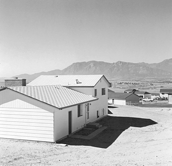
New Topographics was a term coined by William Jenkins in 1975 to describe a group of American photographers (such as Robert Adams and Lewis Baltz) whose pictures had a similar banal aesthetic, in that they were formal, mostly black and white prints of the urban landscape. The New Topographics were inspired by Albert Renger Patszch and the notion of The New Objectivity.

They were inspired by the man-made, selecting subject matter that was matter-of-fact. Parking lots, suburban housing and warehouses were all depicted with a beautiful stark austerity, almost in the way early photographers documented the natural landscape.

The stark, beautifully printed images of the mundane but oddly fascinating topography was both a reflection of the increasingly suburbanised world around them, and a reaction to the tyranny of idealised landscape photography that elevated the natural and the elemental. They began to take pictures in 1975 in America. This was just after World War II in which people began to come back to America from the war and lots of places were being rebuilt due to the destruction. The New Topographics wanted to highlight and criticise human kind’s desire to expand and to show the interactions between humans and non-humans (nature).

Robert Adams was a key figure in the New Topographics movement. He revolutionised the way in which the American West was depicted on film, highlighting the effects of industrialisation upon what was once a vast, imposing wilderness. Depicting the unwavering presence and beauty of nature in the face of human intervention was a key element of the project for Adams.

“we also need to see the whole geography, natural and man-made, to experience a peace; all land, no matter what has happened to it, has over it a grace, an absolute persistent beauty.” -Robert Adams.

The New Topographics highlights the presence of humanity in natural landscapes whereas Ansel Adams photographed only nature and separated it from human presence. His images intended to provoke feelings of awe and pleasure whereas the Topographics often create a sense of despair in their images through the use of straight on angles and lack of enhanced tonal range. The Topographics didn’t only focus on how their images would look but how it would make the viewer feel too. By foregrounding, rather than erasing human presence, the photographs place people into a stance of responsibility towards the landscape’s future.

Photo Analysis:

Overall, I don’t really like the aesthetics of the image as there’s a lack in tonal range and the straight on angle doesn’t give the image any uniqueness or allow the viewer to see the natural landscape behind it as the house is blocking it. However, I think the use of the straight angle is good for portraying the idea of humans expanding too much and covering these beautiful natural landscapes with their creations. This may cause the viewer to think more deeply about how their constant building of new places is destroying the earths beauty and may even lead to a change in society. The lighting seen in this image is quite monochrome and boring due to it being taken in the middle day not allowing for any soft lighting to be seen in the image. However, their images are more realistic than Ansel Adams because of their use of the normal daylight that people will see if they were to go to these places, not creating a false narrative about these places and creating unrealistic expectations.

Experimenting with AI filters

I used the Adobe Photoshop app 2024 to use the Neural Filters option to experiment with the different filter that are available.

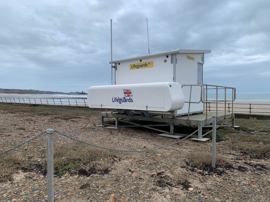
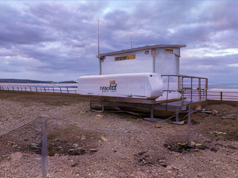
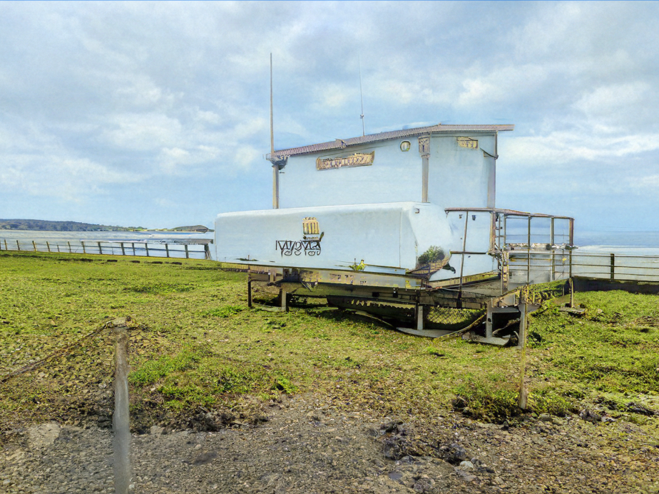
This was my photo before I made any changes to it using the filters. I chose to use this photo as it is a simple photo which includes some land and some sky therefore it is able to show how the filters take effect.

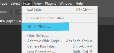
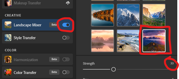
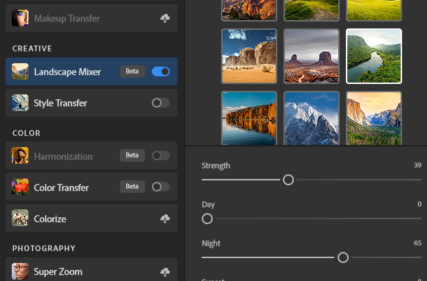
To access the filters you must select ‘filter’ and then ‘Neural Filters’. I chose to use the Landscape Mixer filter as my photo is a landscape. To activate the filter you must turn it on using the switch that is to the side of it. I then adjusted the strength to make sure the photo didn’t look too unrealistic.

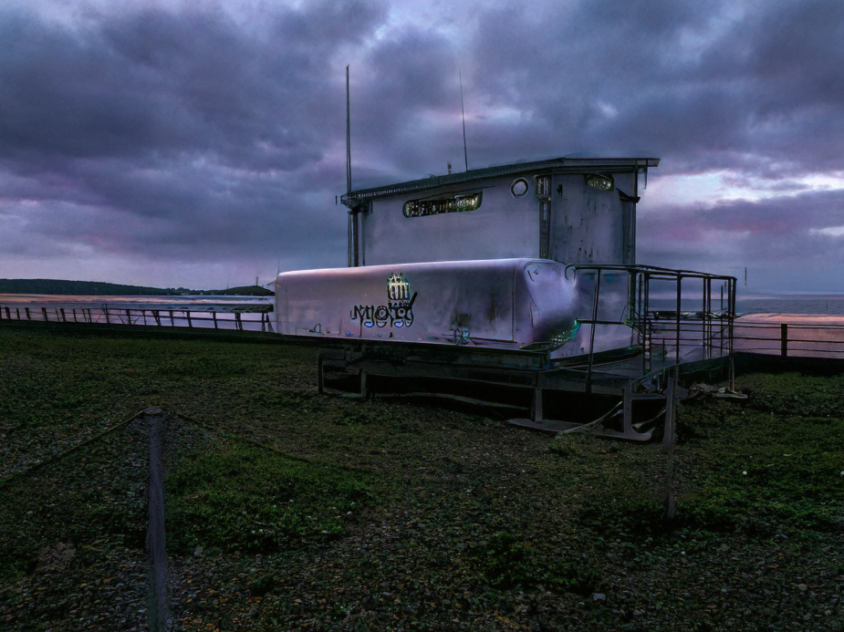
This was my first photo using the filters and I like the way that it has turned the sky into a more purple colour and it has made the clouds look more intense. However it has changed the ‘Lifeguard’ into another thing which is unable to be read.

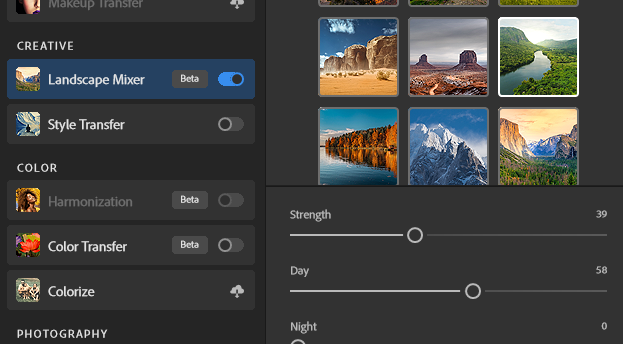
Next I chose a different filter and this time I wanted to experiment with how it would look if I increased the ‘night’ option which caused the photo to look like it has been taken during the night time.

In this photo the sand has been changed into a grass which looks realistic and the clouds have been turned darker to give the illusion that it has been taken at night time.

Presenting my photos from the new topographics photoshoot

In this layout I got the edited photo of the outside of Pier road car park and paired it with another photo I took of the car park.

I was going to create a drop shadow on the photos but decided to put a border around them instead and to take it to another level I made the border gradient to give it more effect.

For this one I got the HDR edit I made and two other photos I took of the incineration plant. I positioned them in photoshop and added a drop shadow to make them look like they were placed on top of the white background.

Virtual Gallery

I selected some of my final images and edits, as well as other images I like which I took, and placed them into a virtual gallery as a way of showcasing the photos I took for the new topographics.

AI Generative Fill

I experimented with AI generative fill using the Photoshop app. I used my photos of deadpan photography to do this.

First edit:

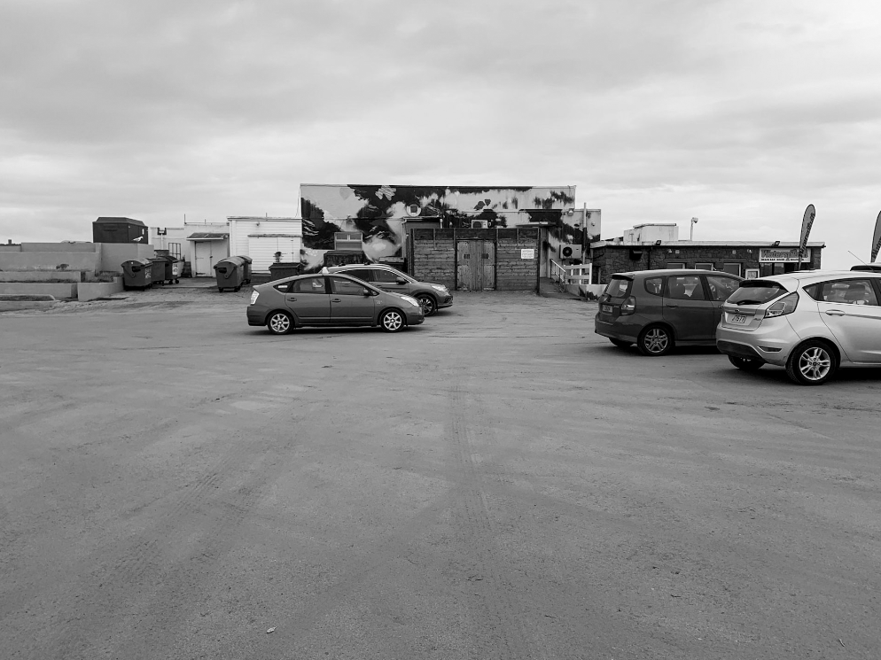
I wanted to adjust my image to make it appear that it is in the future, for example adding factories and rising the water to show climate change. This links to the next theme of Anthropocene which is how humans have negatively impacted the world.

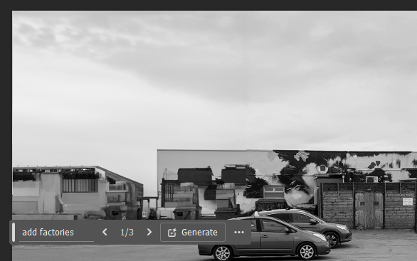
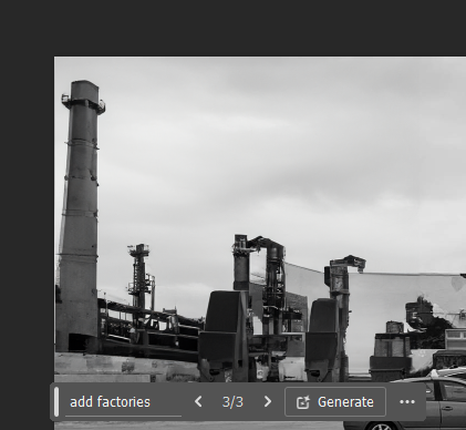
When using the generative fill tool it provides you with 3+ options to choose from every time you use it. I used the phrase ‘add factories’ when prompting my AI. It provided me with 3 options this time, and I chose to use the second option as it looked realistic as it didn’t add too much and also didn’t add too little.

Final outcome:

I then prompted the AI tool to add rising rides to the lower half of the image to show how Jersey will look at some point in the future due to the rising tides and global warming. I also prompted it to add more cars to show how the population size is also increasing. I think this is a very successful image as the AI has created realistic adjustments and it has even included the reflections of the buildings and cars from the real photo as well as the AI factory.

Second edit:

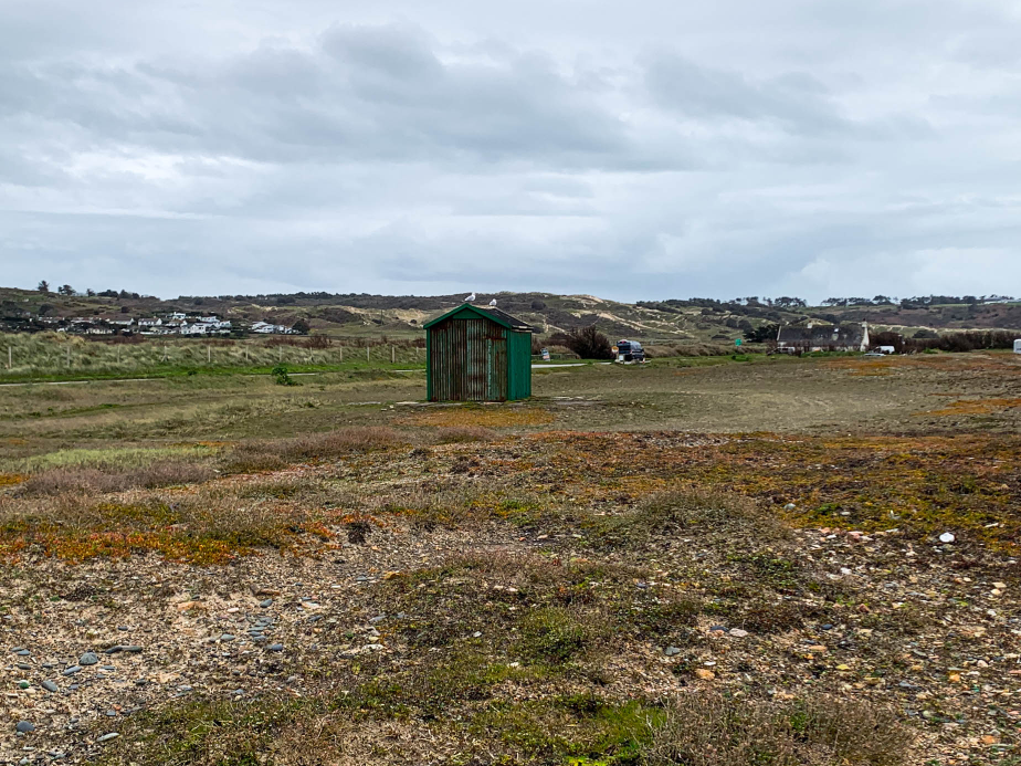
Next I used this almost empty image which I took down in Saint Ouens.

In this photo I went for the same theme of adding factories and rising water, I find this one to be not as realistic as the first one was as I feel I may have added too much and it looks fake.