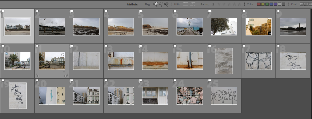
Contact Sheet:


I chose my favourite images that I took at Harve Des Par flagged them and then highlighted green the ones I wanted to edit.


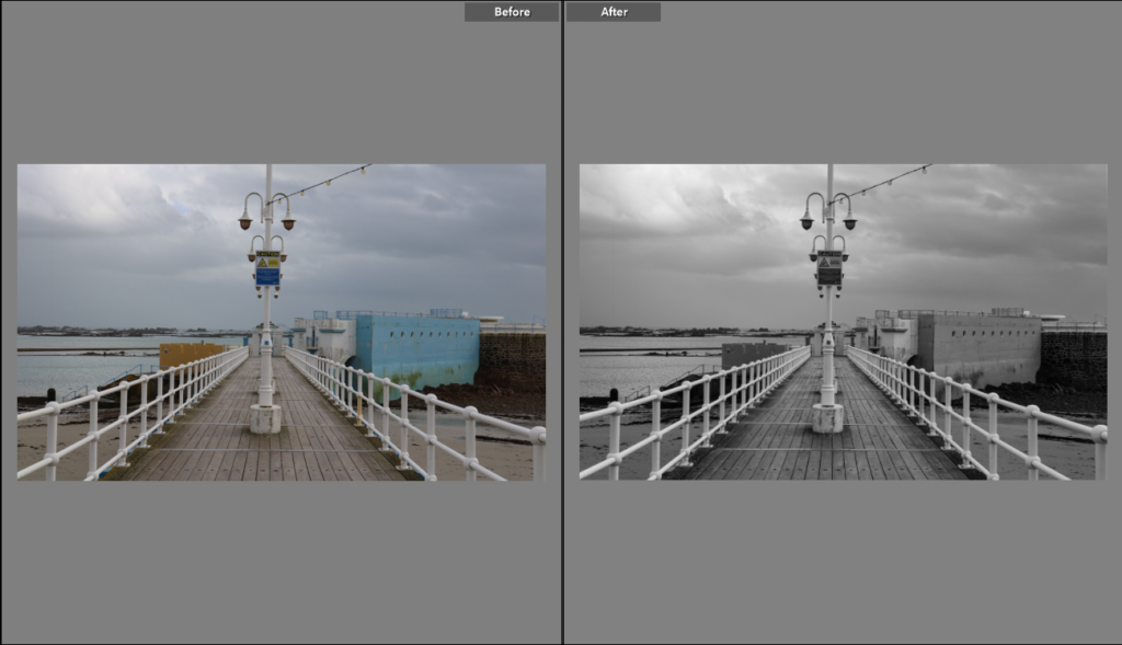
This image is of Harve Des Par is a lamp post with the pool in the background. This image was originally in colour but I changed it to black and white. It was a cloudy day when this photo was taken so the lighting was adjusted using the camera settings. The lamp post looks misplaced in the image as the settings around doesn’t match it making it look outlandish and singular. I turned up the texture, clarity and dehaze for detail and depth in the image


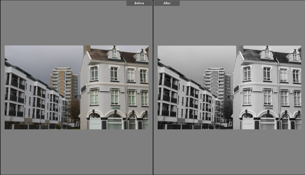
This image is of the flats and houses at La Colette. For this picture I angled the camera towards the flats with some more flats and houses towards the front half of the image. On the houses there is a Harve Des Par sign. I like this in the image as it shows the location where the image was taken and adds detail to the image. I changed the original image to black and white and turned down the temperature and tint for a colder image. I turned the exposure and contrast up for more dimension and turned up texture and clarity for more detail in the buildings.
