Photoshoot 1
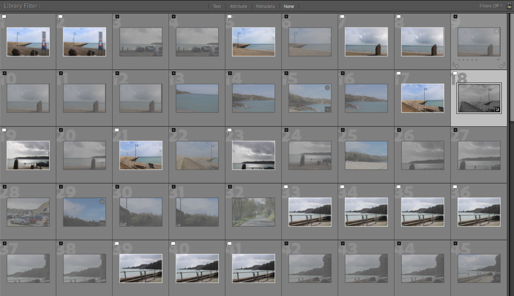
Contact sheet:
I started off with 113 photos of different places around Jersey these places were: Gorey, St Catherines, Archirondel.
Flagged photos:
I then flagged the images I thought looked best and there were 49 remaining.
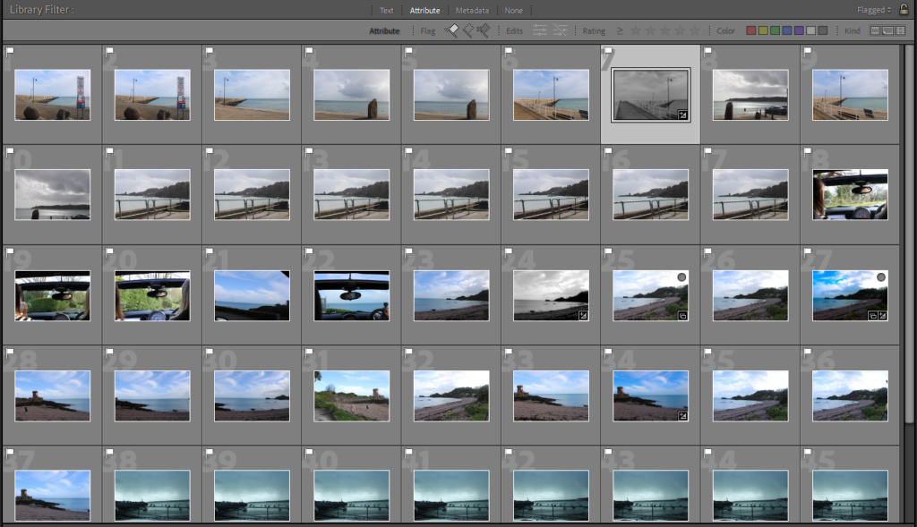
After I flagged the photos I went through them and chose my favourite of each setting and scenery. Lots of the Landscape photos I chose looked similar so I went through each one and chose my favourite.
Landscape 1:
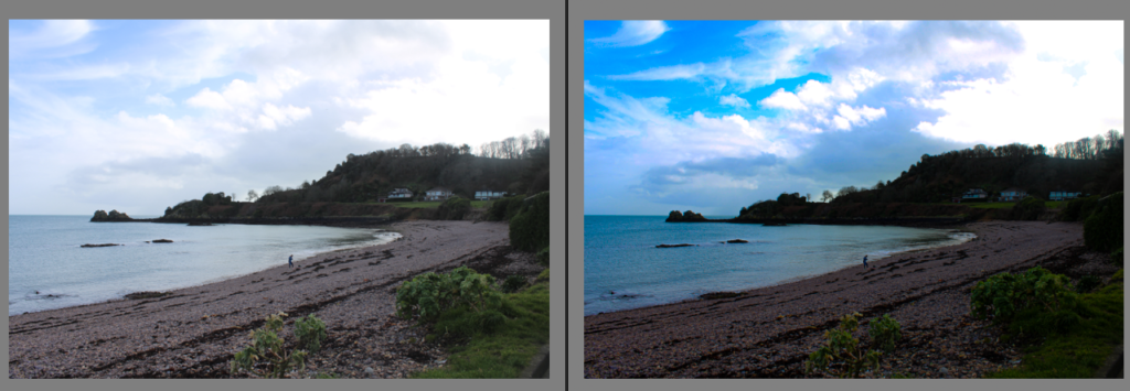
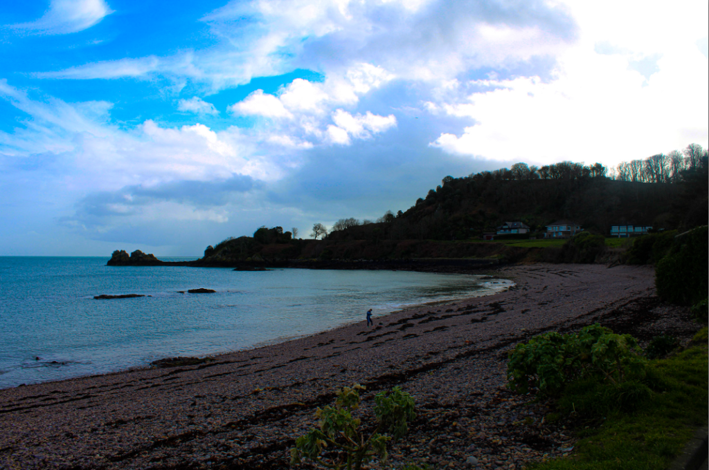
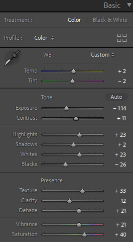
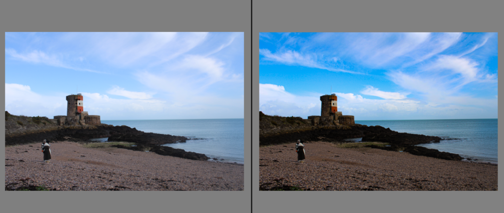
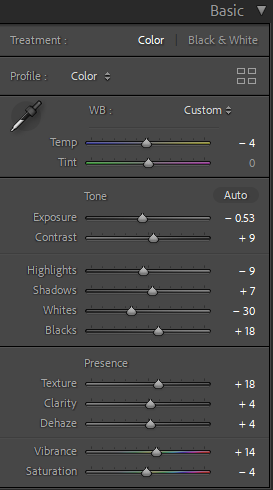
For this image I turned the vibrance up and the temp a bit to make the colours brighter. I turned up the texture and dehaze as the original looked a bit unclear and this made sure the nature in this image was clearly visible.
Landscape 2:

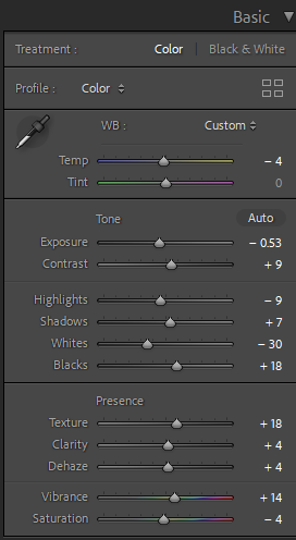
For this image I didn’t like the original way it looked as I thought it looked dull. To change this is turned up the vibrance and made the colours in the image really bold and stand out.
Landscape 3:
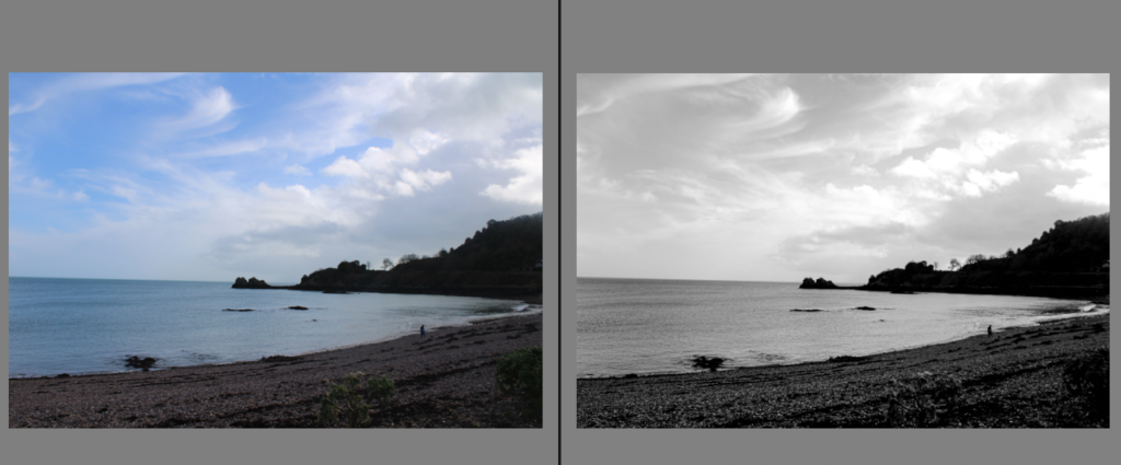
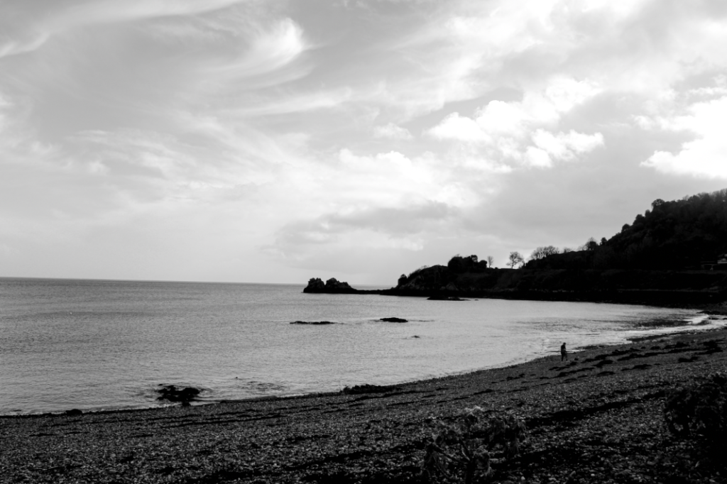
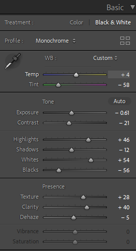
For this image I changed it to black and white because I think it looks good with the dark hills and the foliage. I turned up the texture and clarity to show all the rocks and patterns in the waves.
Landscape 4:
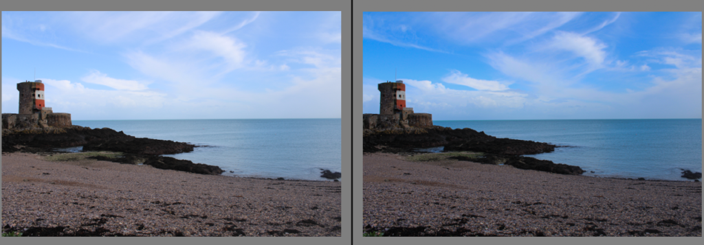
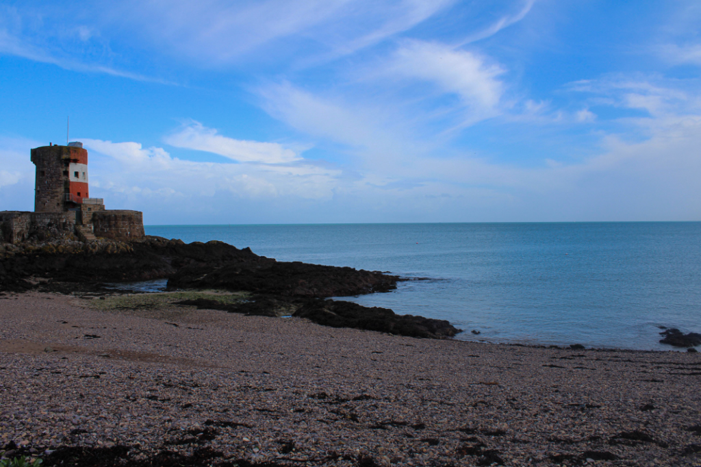
For this photo I turned up the vibrancy to make the sky bright blue as I think it looks really pretty with the brightness of the sea. The castle looks really nice with the natural scenery which is opposite to the theme of the new Typographics
Landscape 5:
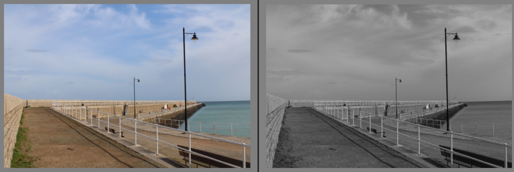
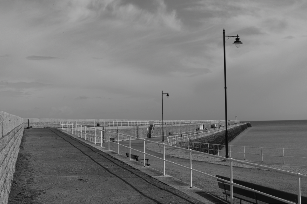
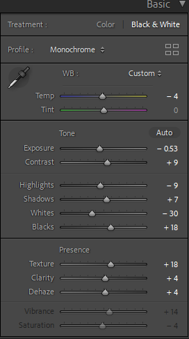
This image of St Catherines Pier was originally in colour I turned it to black and white. The lampposts was a main part of my reason to turn it to black and white as they gave off this vintage, olden day look which is why I think it suits the black and white. I turned up the contrast, texture, clarity and dehaze to make everything look more clear and less mixed together. Another thing I like about this image is the clouds, they look like they are being pulled away making this photo look very dark.
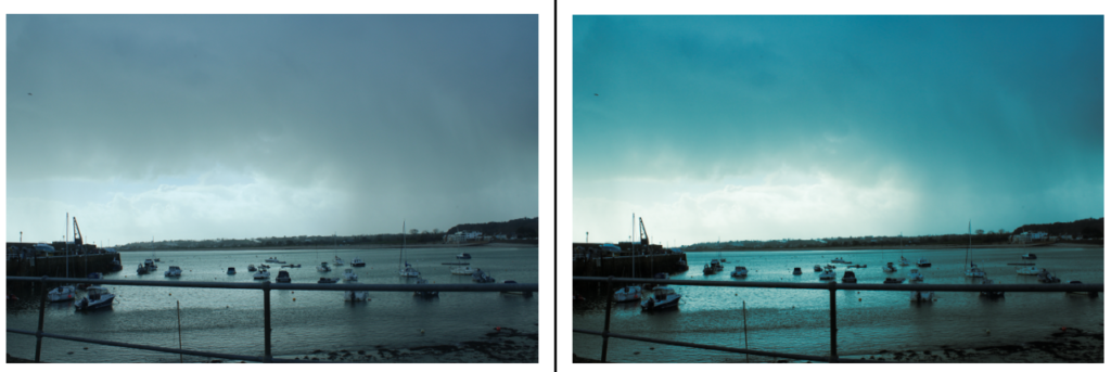
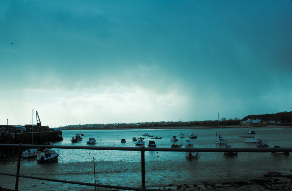
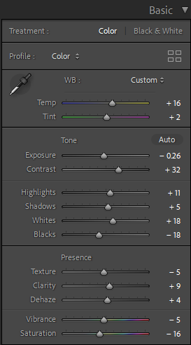
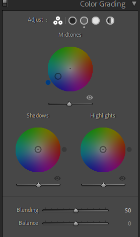
For this image it is much darker than any of the other ones. I added blue mid-tones to the image to make it look a lot moodier. I love how this turned out because you can see the darkness is the clouds and the see, this made the image look a lot more dramatic and it gives off a scary vibe which I think looks really good with the theme. The original looked very grey and less vibrant which to me looked boring and dull, by turning up the contrast, highlights and whites this made it more bright, then by turning the mid-tones a dark blue gave this photo a lot more contrast to the final image.
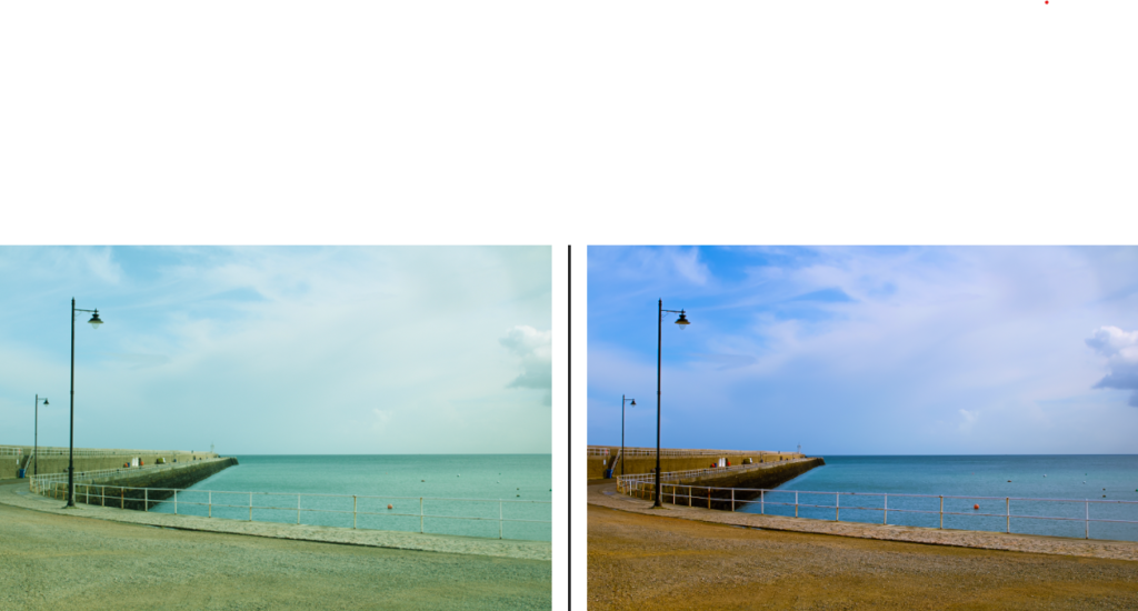
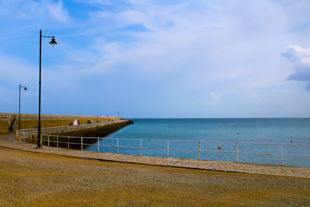
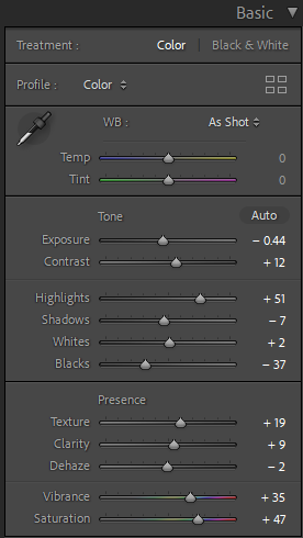
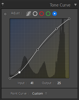
This image is much more vibrant where the yellow and blue tones of the path and the sea are really bright, I turned up the contrast to make this look better. I also turned up the vibrance and saturation to make the image look brighter and stand out.
Photoshoot 2
For my second landscape photoshoot I chose to take pictures around town.
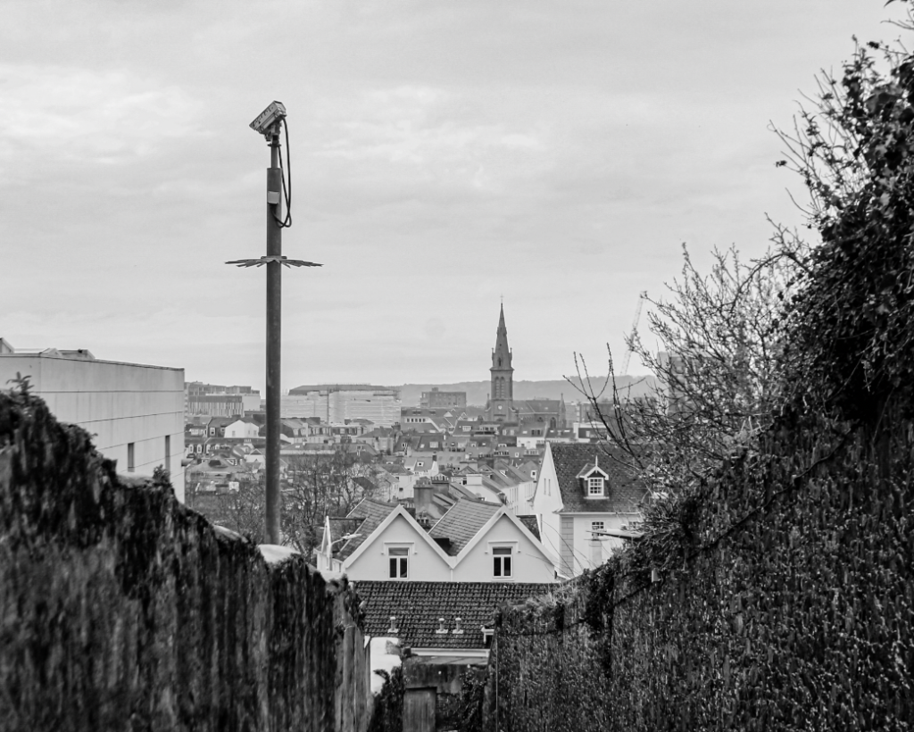
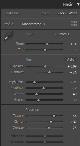
For this image I went to the top of highlands hill and took a picture of the view from there. I changed the image to black and white as I think it suited the image better than from when it was in colour. For the overall tone I turned everything down as I like the dark look at the front and as the buildings go further back it gets lighter.
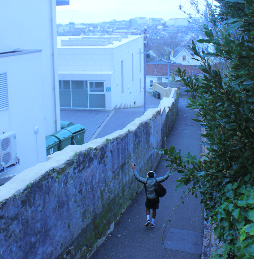
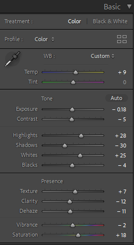
For this imagine I also took it on highlands hill. In the image you can see lots of buildings with foliage on the right side of the picture. The thing that stands out in this image is a person. I gave the image a blue tint as I think the blue makes the picture look cold which I like and I think it matches the vibe well. I turned the texture up for more detail. I turned down the exposure as the lighting looked weird with the blue tint.
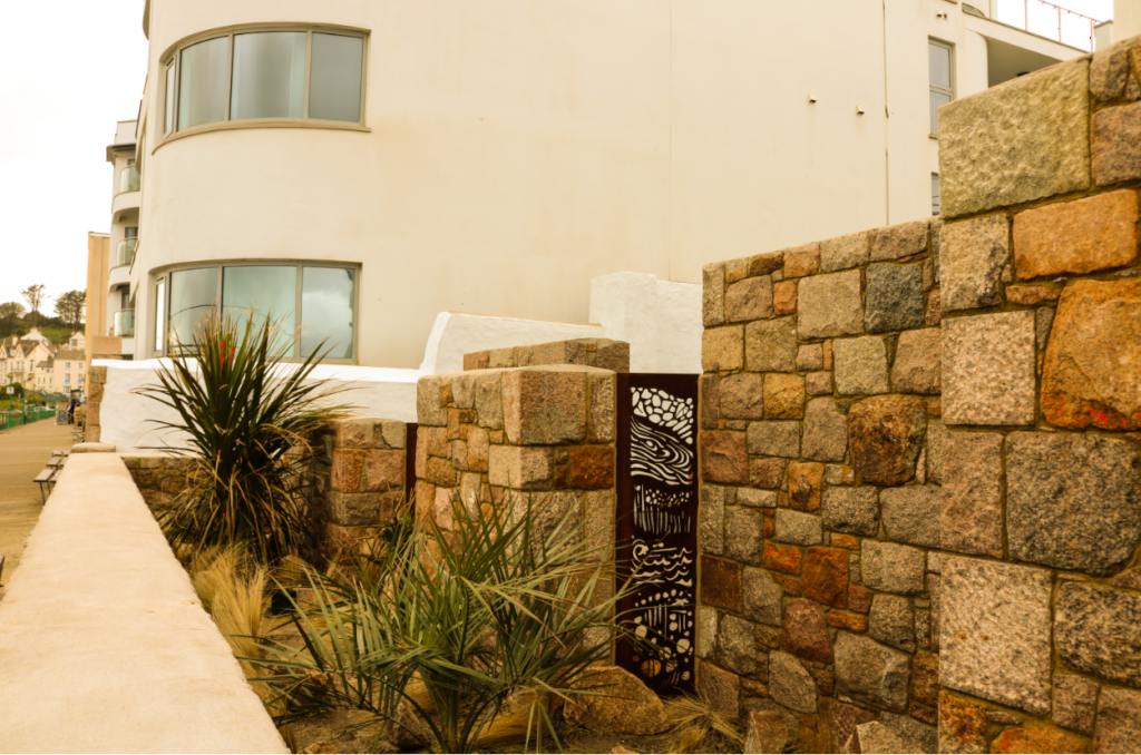
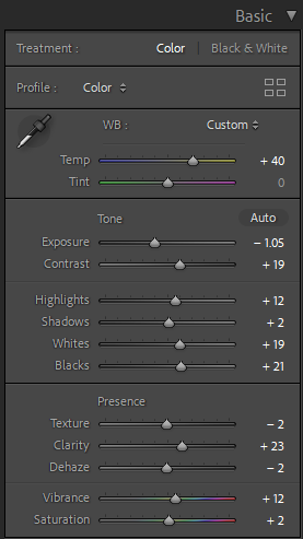
This image was taken near Harve Des Par. I gave the picture a yellow tint to give the image a yellowish retro look. I think the features in the image suit this look because of its suburban look. I turned up the exposure, contrast and highlights so yellow tint didn’t make the image look too dark.
