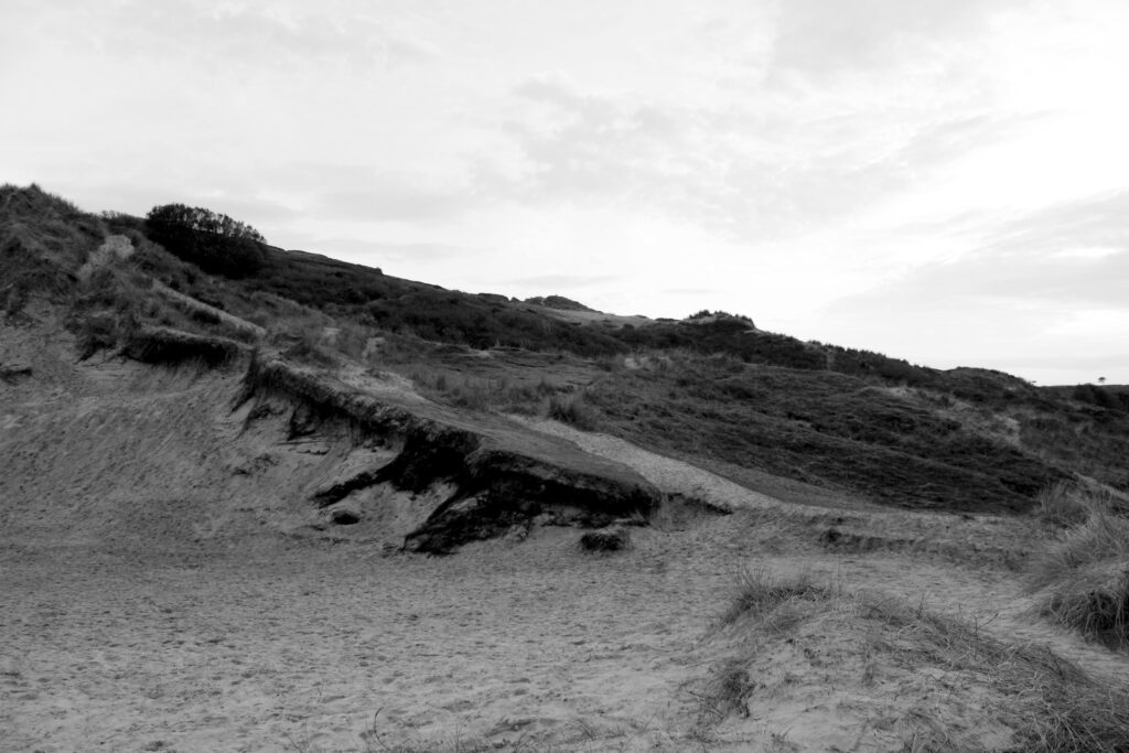

In this photoshoot I looked at the sandy dunes specifically and how it can intertwine and show inspiration from Ansel Adams’s work. I looked after different pictures from many different perspectives and from different heights to get different views. Despite the heights of the hills not being as high as Ansel Adams’ I was still able to get a nice range of different photographs from a different stance.
In my photoshoot I took them in daylight so the textures are able to be seen, if I were to taken them in a darker setting the outlines and different gradients of the photograph would not been able to be seen, especially if I were to edit them in a black and where monochromatic scale then the features would not show up clearly as I want them too. Despite the dunes not presenting themselves as high as they appear in person rather than on camera, I believe they look interesting and dramatic due to the different patterns and appearance of the grass, greenery, sand and rock.


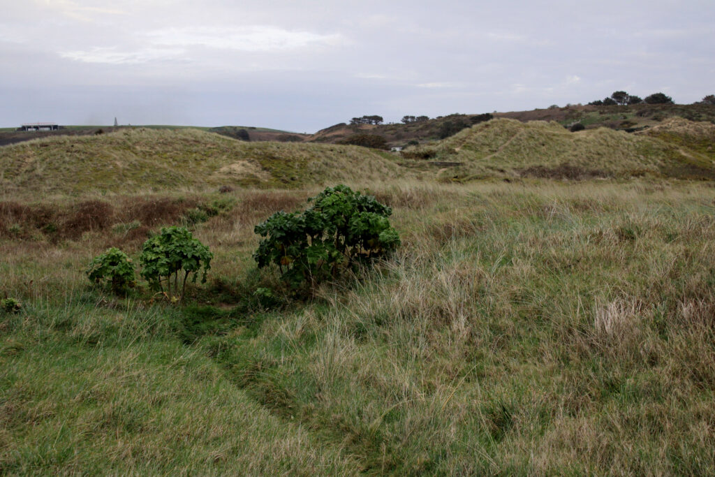
I think that in the photographs above I have tried to display my ideas of natural landscapes. I believe it was a good locations where the combination of the dunes of sand and the different textures of grass and the land especially with the different heights put into perspective. I took photographs from many perspectives eg. up close, from below, from above, across the horizon, zoomed into a specific area highlighted etc.
I believe that the photographs produced and presented on the page look interesting and how the different textures are shown looks appealing as it not just a flat structure and flat organisation of subjects. I believe that the black and white contrast to the colour looks even more dramatic with the shadowed and darker shades presented the difference between the light and dark shadows looks.
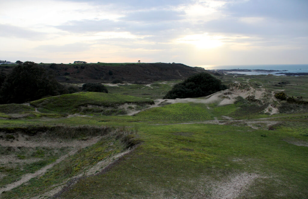
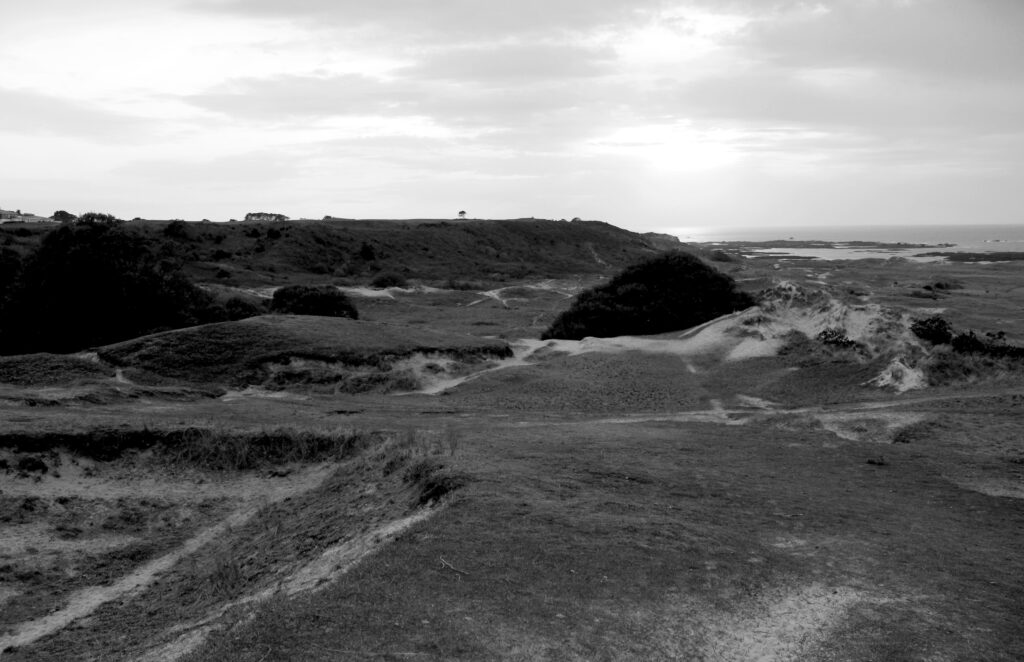
In the photographs above I show the difference between the light and the quality. The white and dark tonalities look more prominent in the black and white photograph therefore looking similar to the photographic work of Ansel Adams where his “Zone System” comes into play where the level the darker tones range at 0-4 mostly in that specific photograph and the brighter ones from 7-10.
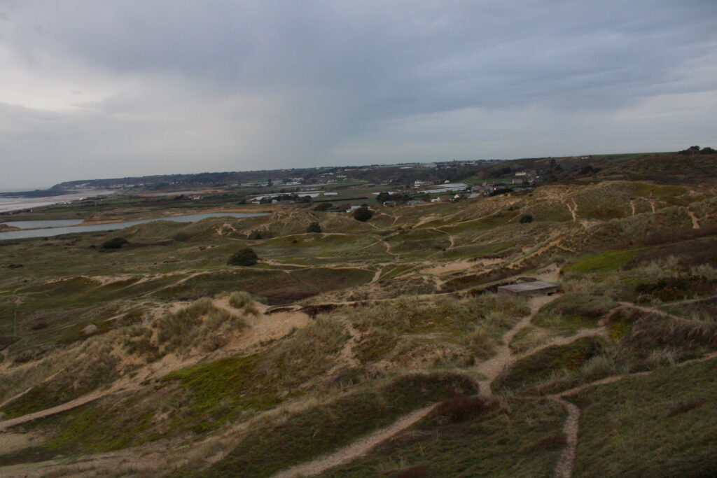

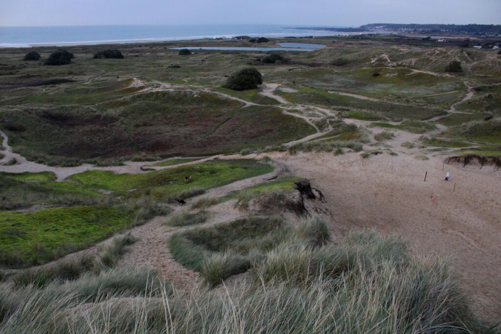
In the photographs above I believe that the landscapes looks interesting as the different patterns of the paths looks almost as if the continuous patch of greenery is almost cut and disassociated, it almost looks as if it’s separating from it.
The combination of the sand and different coloured/shaded grass looks almost like a swirl patter as the landscape presented is not in a straight pattern (almost looks like a maze or a map where there is many paths and journeys).
Especially in the first photograph below the previous writing the “map/maze” ideas comes into terms as it shows the landscape below in a bigger perspective whereas the second photograph the landscape below is cut off in half but the landscapes and feature closer to the lens which is a complex of textures of sand especially and rock at a slant.
The third photograph looks directly downwards onto the landscapes in a lower down perspective. The photograph includes the ocean and the element of the coast so not only is the greenery included the contrast between that also appears.
The integration of natural vs man-made is evident here where the subtle element of man made structures is presented here.

