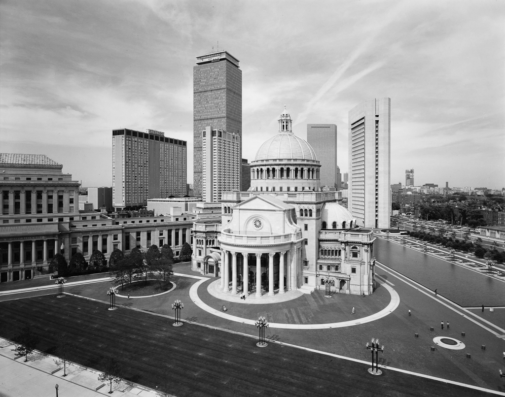
New Topographics

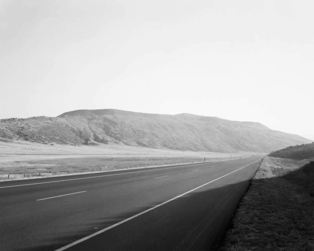
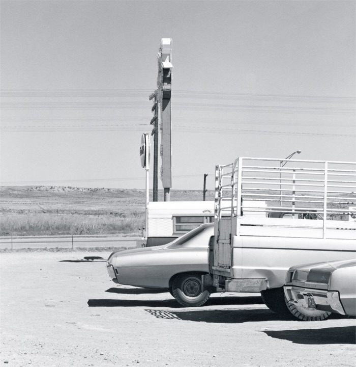
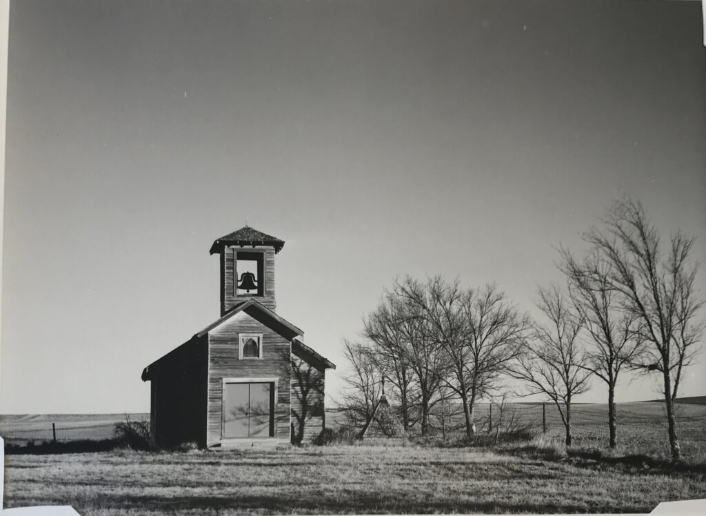
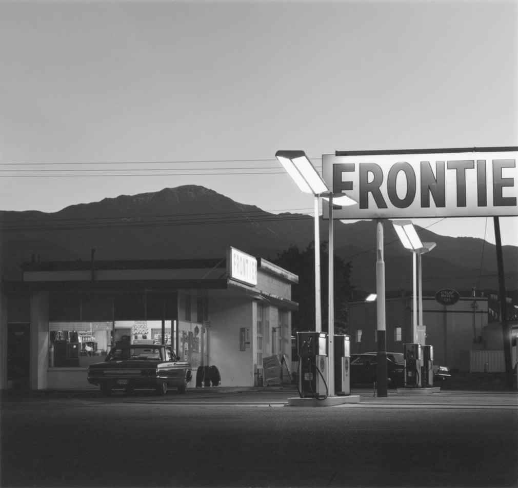
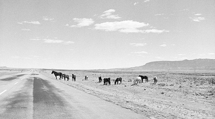
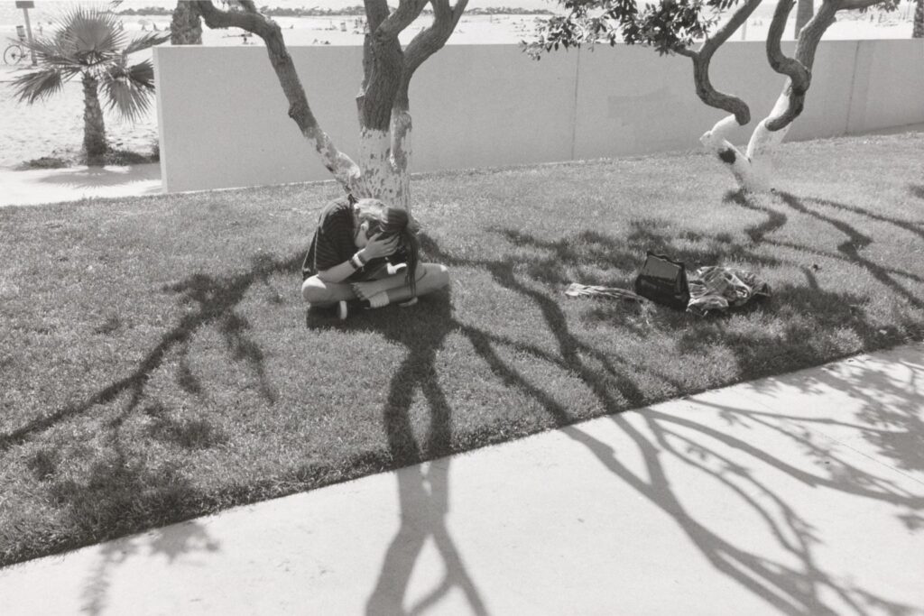
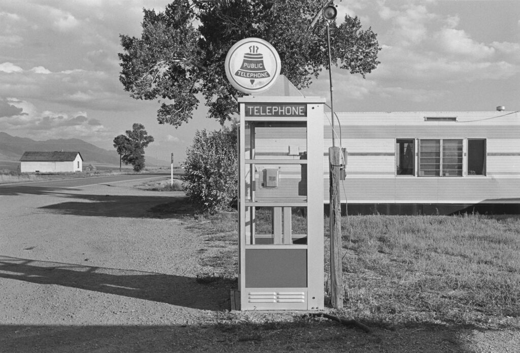
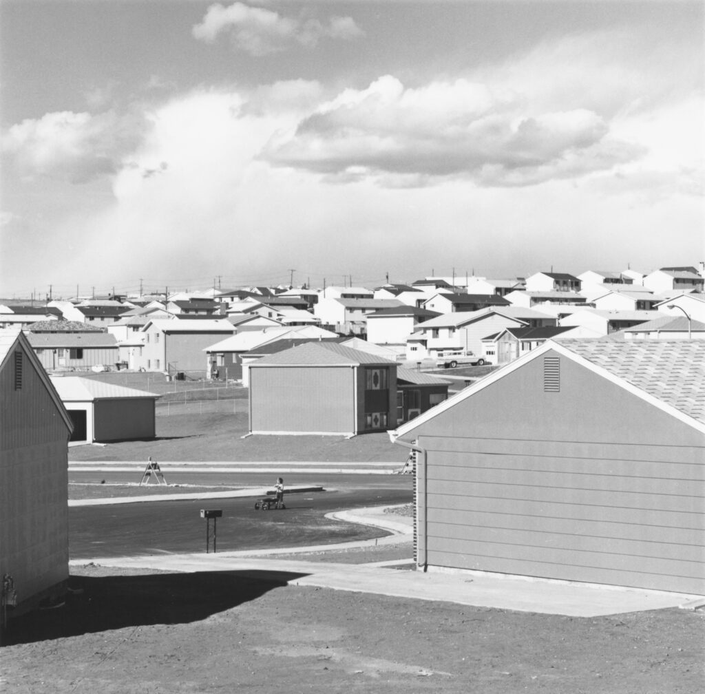
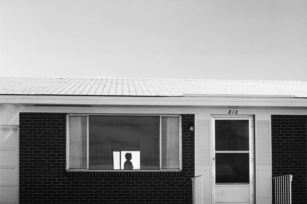
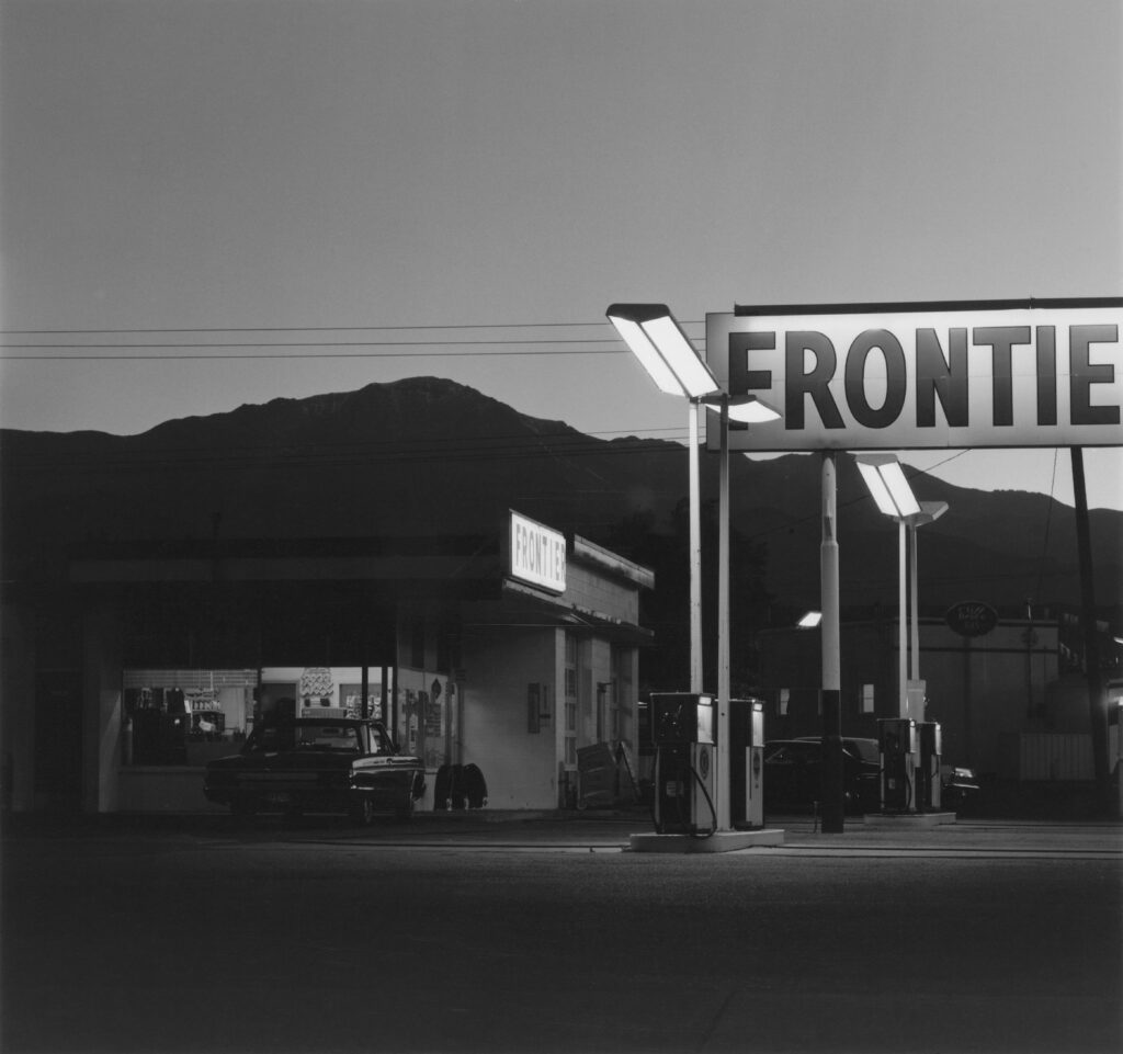
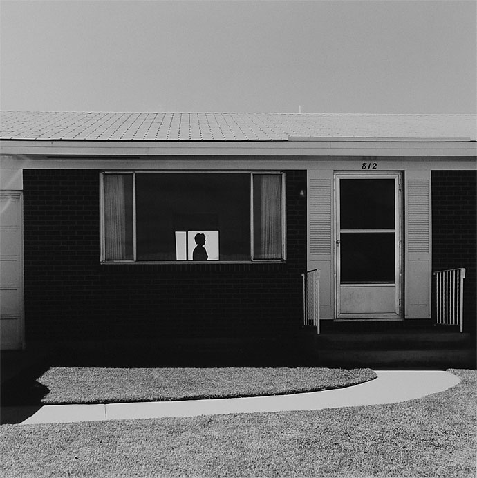
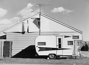
New Topographics was a response to increasingly suburban surroundings and idealised landscape photography showcasing and elevating the natural world. It showcases the effect of man on the surrounding world and a sense of beauty in its dull change. These are documentary photographs typically contrasting square manmade buildings with soft mountains capes and open land. New Topographics saw the work of Ansel Adams and found the ideas of environmental protection and preservation inspiring however the approach disingenuous. He showed the beauty of the natural landscape without the effects of man by carefully framing whereas new Topographics would move the camera slightly to show a trailer park. They aimed to preserve the environment by showing the effects of man on the environment. Humans want for constant expansion and the need for more housing post war meant that more and more space was being cut up and built on. Influential artists included:

  • Nicholas Nixon
  • Henry Wessel Jr
  • Bernd and Hilla Becher
  • Robert Adams

Robert Adams photographs could be split in two. On one half there would be a traditional landscape slightly too far away and the second half would contrast with a road or building with harsh lines and dull appearances. He rose to prominence through his project ‘The New West’ and participation in the exhibition ‘The New Topographics: Photographs of Man Altered Landscapes’ in 1975.

Case Study – Henry Wessel
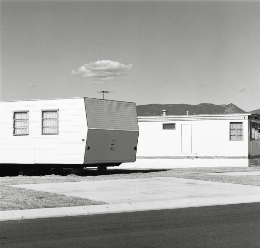
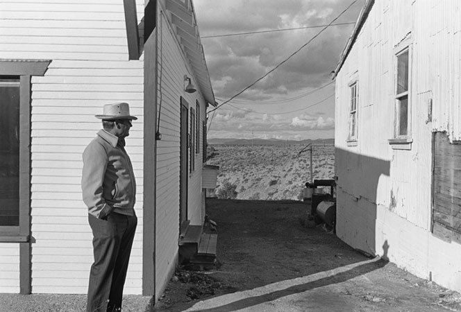
Henry Wessel was an American photographer and one of ten collaborators in the exhibition ‘New Topographics: Photographs of a Man Altered Landscape’. His work consists of isolated observations of the typical environment surrounding him such as roads and pavements.
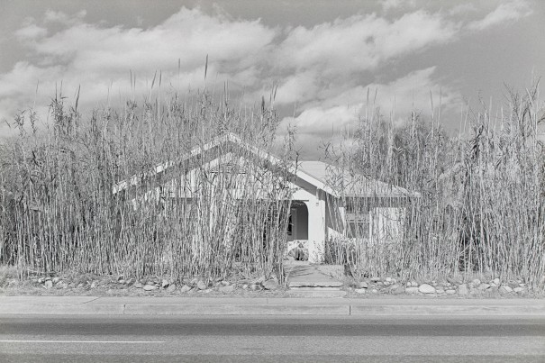
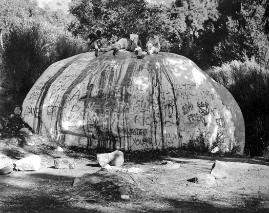
This photograph focuses on a house surrounded by a growing plant such as maze or grass. This plant towers over the house like nature taking back the space. The house is a small one-story bungalow which is associated with the elderly which plants the idea that the plants haven been trimmed due to a lack of ability or that the house has been abandoned. This photograph is also in black and white made up of mid tone greys and whites. This light colour pallet creates a softer atmosphere and radiates a bright, sunny day. The only dark parts are inside the house to create depth. This also makes the outside seem more friendly than the inside of a building commenting on the isolation and coldness of modern buildings/communities. Additionally there is no sign of life inside such as a light to show that the building is still in use furthering the idea that it has been abandoned and unappreciated. This photograph sits eye to eye with the building which would require the photographer to be stood far away. This causes the road to take up the bottom of the frame. This shows how plant life has to push through human created surfaces such as pavements and roads. The plant life has been surrounded by stones and tarmac without a second thought.

Henry Wessel Jr took this photograph in landscape to reflect the reach of the house as its short but wide. If this was taken in portrait it would make the building seem even smaller and showcase more of the sky which isn’t the focus of this image. The plant life is cut off by the frame which shows how much space it has taken unlike the house which is rigid in shape and doesn’t fill the whole frame. The house is visible through the plants which shows it only thin coverage as surrounding the plants is harsh materials which is difficult to grow through. The contrast between the bottom half of the image and the top half shows a balance. The top half shows the natural sky and the plants while the bottom half shows the building and the road however they met and merge in the middle.

I believe this photograph is to show consumerism and a lack of care for the environment. This is shown through the abandoned building and overgrowing plants. The house with harsh lines and unnatural shapes stands apart from the grass like plant. Houses are built using precious resources, take up beautiful land and only get a lifespans time of use for one single person. The environment and its resources are not one persons financial gain, the land would have probably been used by wildlife and plant life and since the plants have been left long enough to grow over 4 meters minimum (which depending on the plant could take anything from 1 year upwards.) they have begun to slowly take back their land.

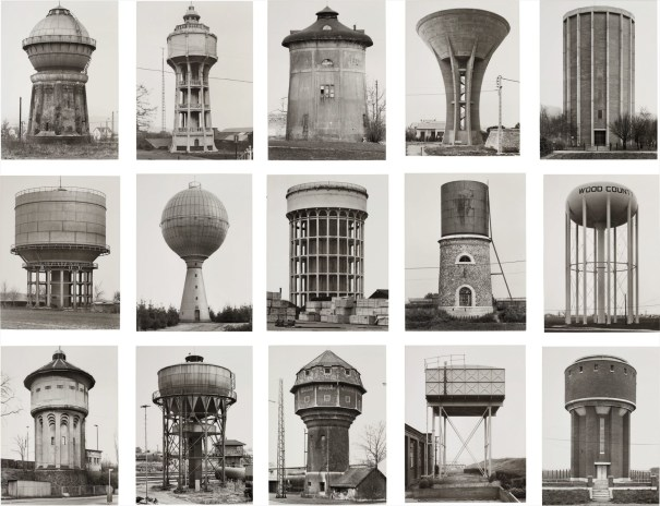
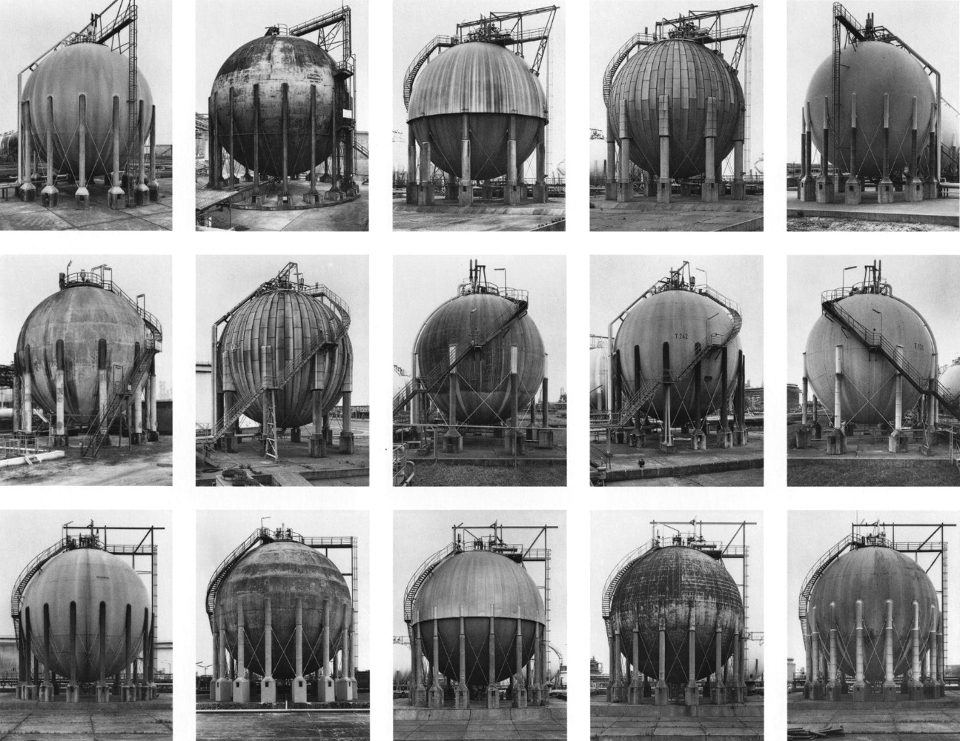
Bernd and Hilla Becher – Typology
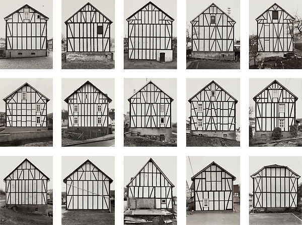
This German couple were the only Europeans in the exhibition new Topographics. They were inspired by another German photographer who experimented with typology. Typology is the study of types. The inspiration showed dried plants in a triptych.

The couple photographed disappearing industrial architecture around Europe and north America such as water tanks. They never included people in their images as the focus was solely on the architectural feats. The couple were influential in the appreciation of industrial architecture.
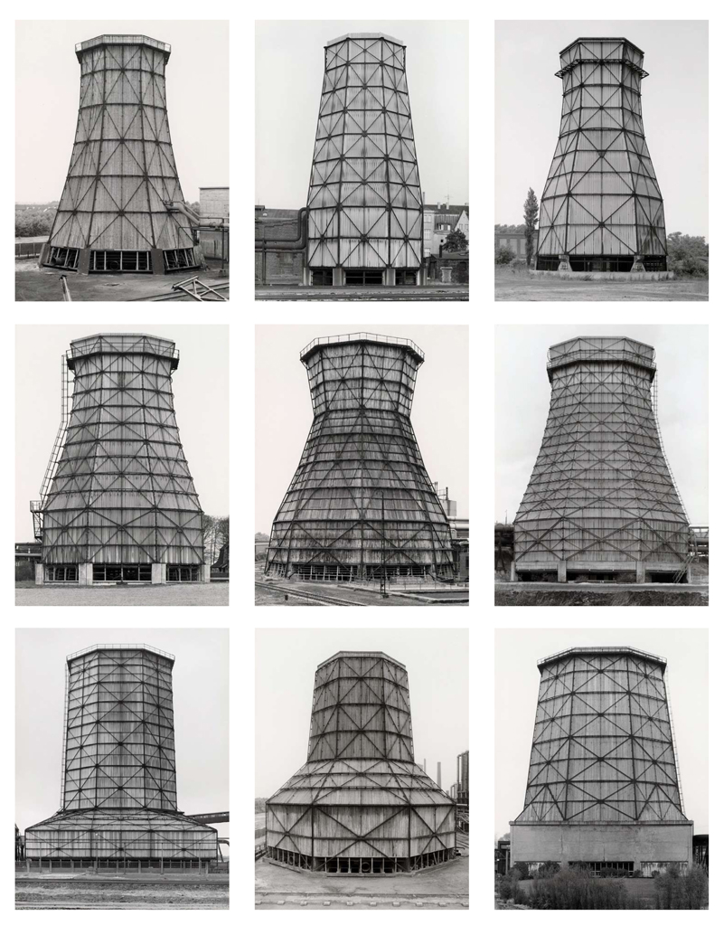
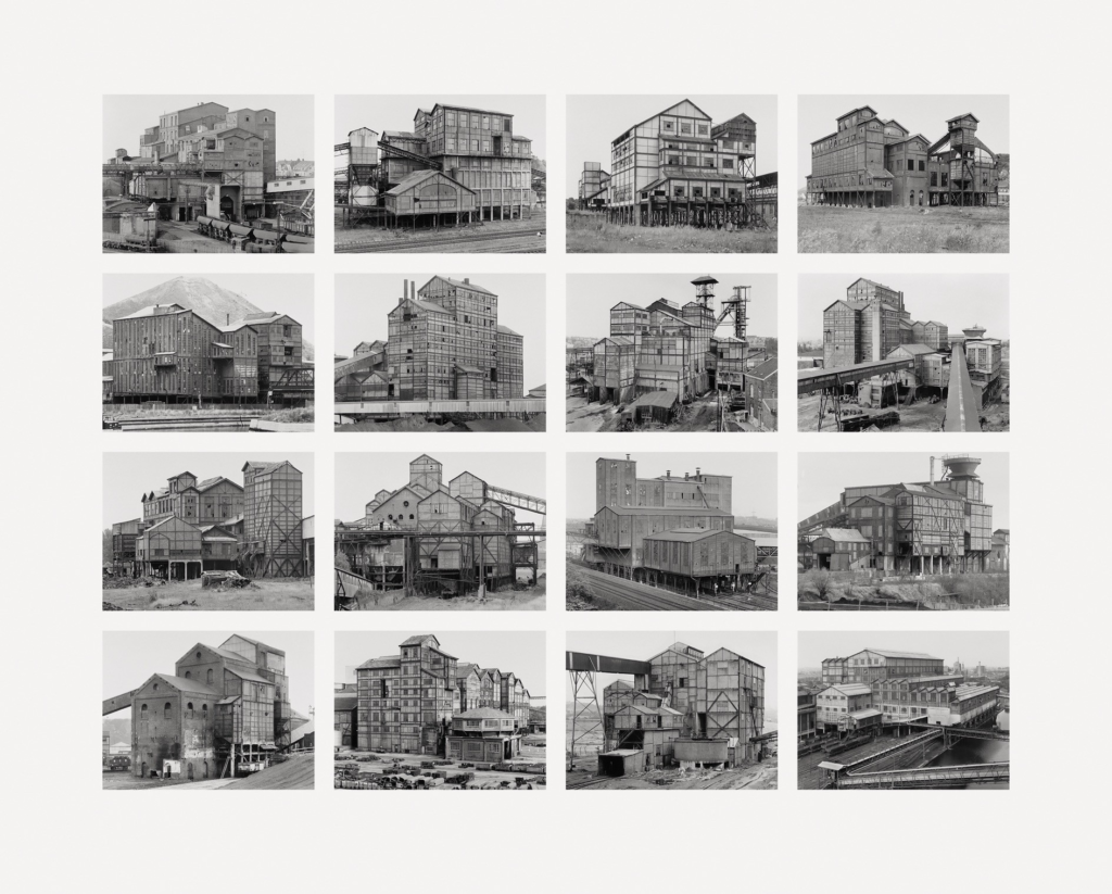
Each of these images have been taken with a similar distance and angle. This uniform approach helps to link each one and to create a more coherent grid, which was a staple of their work. This grid presents 9 different images of the same industrial sculpture. Each one is from a different location with different designs. Since they all have the same function they are bound to have similarities such as size and materials however what’s suppressing is the different shapes they have. By combining these in a grid it showcases these differences and the detail put into a simple structures composition. Since Bernd and Hilla Becher photographed disappearing industrial structures this grid would have been made to highlight the unlikely beauty in these temporary industrial tools. Had you stumbled across one of these in an area naturally you wouldn’t acknowledge the structures or their intricate composition.

The pair used a large-format camera, same as Ansel Adams, which would produce high quality black and white photographs on glass sheets. They would photograph on overcast days for dingy lighting, a white background and to present the structures as they would be seen. Between the lights and darks is a clear contrast which differentiates the sky, building and its metalwork. This lighting was different to natural landscape photographers who photographed early or late for soft lighting. Occasionally when the sky was blue without clouds, they would use a blue filter to compensate. A blue filter creates a cooling effect to correct warm lighting and can enhance shadows. The photographs are taken in portrait to cut out backgrounds and get close to the subject. These tight frames draw attention to the subject matter and create an intimate aesthetic showing the photographers appreciation while also showcasing the height. The angle is at normal eyelevel and has been taken ‘dead pan’ which in comparison to the structures appears low which furthers the massiveness of these structures and makes them seem powerful. The dead pan approach is an approach which showcases the subject as is without decorating or manipulating it in anyway which was deliberately used to showcase the structures in their natural state.

The metalwork and shape is what differentiates each structure. Not only are these factors significant in the functionality of the structures but also creates a unique appearance. The metal bars creates lines which compliment the subjects shape and have unique patterns which makes it a shame that they will be taken down. If each one looked the exact same then there wouldn’t be any attachment to the structures. Time and thought had clearly gone into the appearance of these structures and would mostly go unrecognised by the public. In contrast, the metal bars are rigid harsh lines which are clearly man-made and resemble prison bars. This menacing message of captivity and lack of power could also be highlighting the photographers feelings about the environment. They have a lack of power against man made structures which take over the landscapes. The new Topographics was made to showcase how the landscapes are being destroyed and this photograph is significant in showcasing the feeling surrounding this topic.

Photoshoot 1

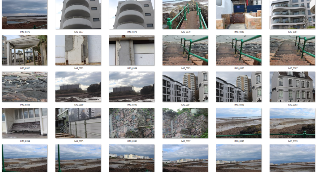
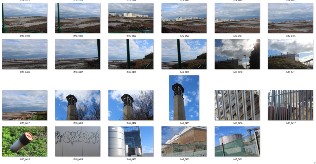
This photoshoot covered both seascapes and industrial spots. Over the hour the weather changed several times. There was mist, rain, sun and clear skies which made lots of images look different.
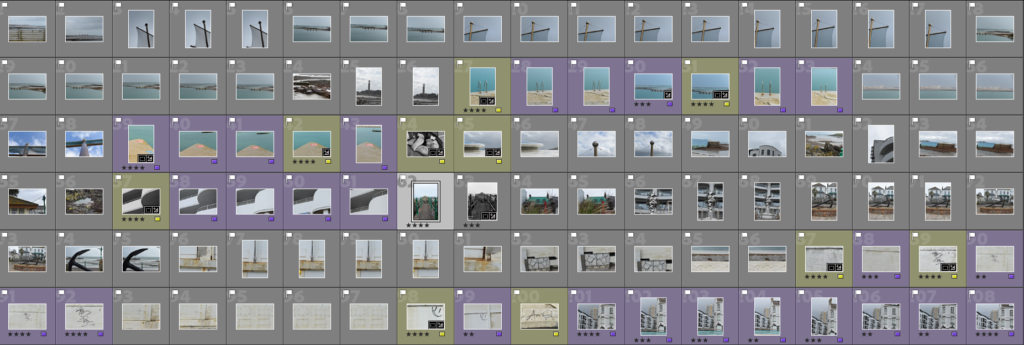
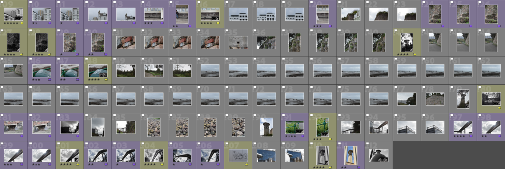
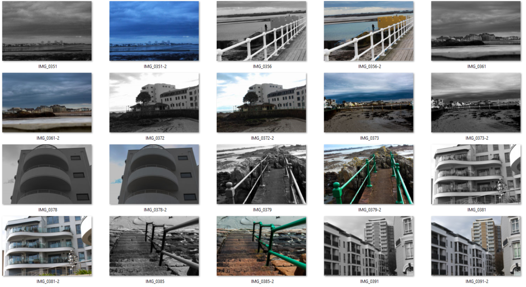
I changed the photographs to black and white, cropped them and rotated each one. In addition I adjusted the contrast slightly and I think these images turned out better than the coloured ones. This is because I don’t think that the colour images fit into the new topographics theme as much as the others.

Panorama

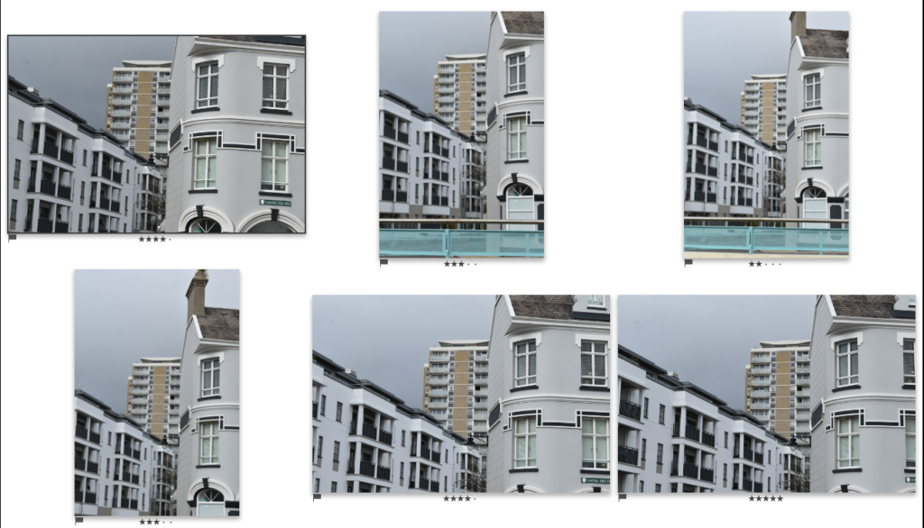
I used some images of the same setting taken a slight different angle. This meant that using about 5 different images could show space on either sides of a normal image which creates a wide angle. The first one shows the jagged edges created when combining the images and the second shows it cropped for a clean shape. I liked the unique shape created and will try experimenting with this shape at a later point. There are two automatic panorama features: One in photoshop and one in Lightroom.

Photoshop

In photoshop the panorama option is accessible by selecting file(on the home screen)>Automate>Photo merge.
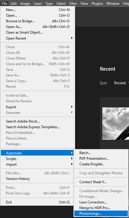
A pop up appears which has several different layout options. For panorama images the perspective option needs to be selected. To choose the images the files need to be selected from the files on the hard drive once the browse option is selected.

The combined images are then combined into one photoshop tab. This allows for further editing which would be absent in Lightroom.
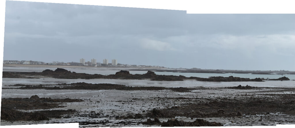
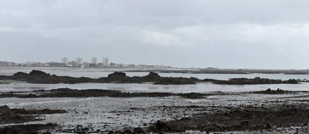
When taking the initial photographs I managed to hold the camera at a consistent angle which produced an image with a naturally rectangular shape. I didn’t like this one as much for two reasons: This one doesn’t show the high rise flats and there was no interesting shape created.
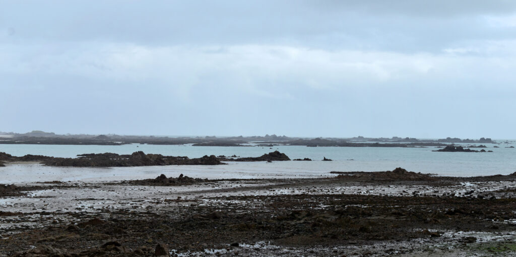
After experimenting with the first two, I combined more images and kept the jagged shape. I like how this image turned out edit wise however next time I will be taking a photograph of a landscape with a more consistent and interesting subject such as higher tide and more rocks.

Lightroom

In Lightroom you select all the images that will be used and then the panorama option is under photo merge.

A pop up appears which is where final alterations are made. This then merges the images into one final Lightroom image which cannot be altered outside of typical Lightroom editing.
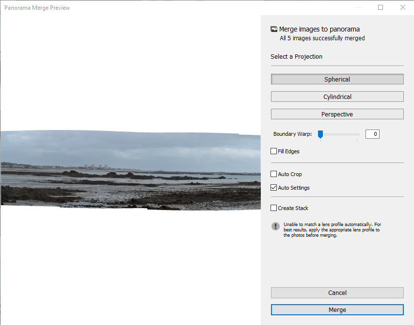
Using the Lightroom option I produced another strangely shaped panorama image. I wanted to experiment a bit more with the outcome so changed the image to black and white.

Final Images
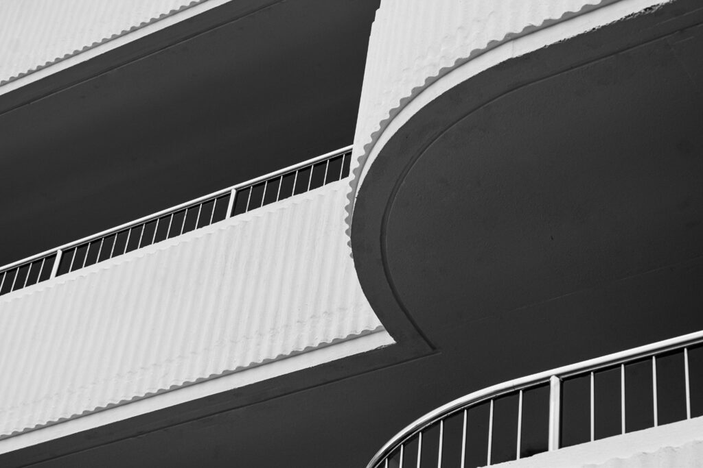
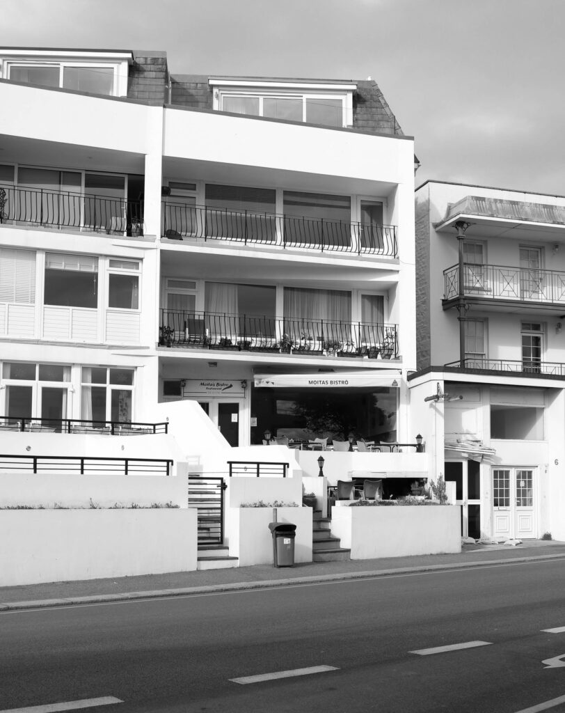
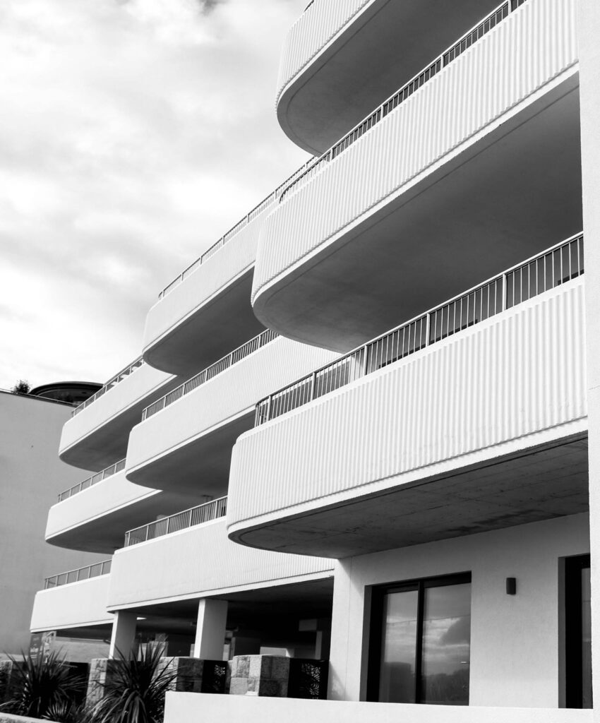
This image has interesting lines and shows off modern architecture with simple colours and basic shapes. There is little going on with the shapes or exterior however it so obviously man made. I like the different floors with the contrasting shades and I think the shapes came out well.
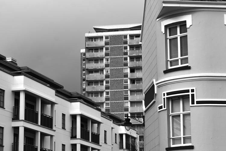
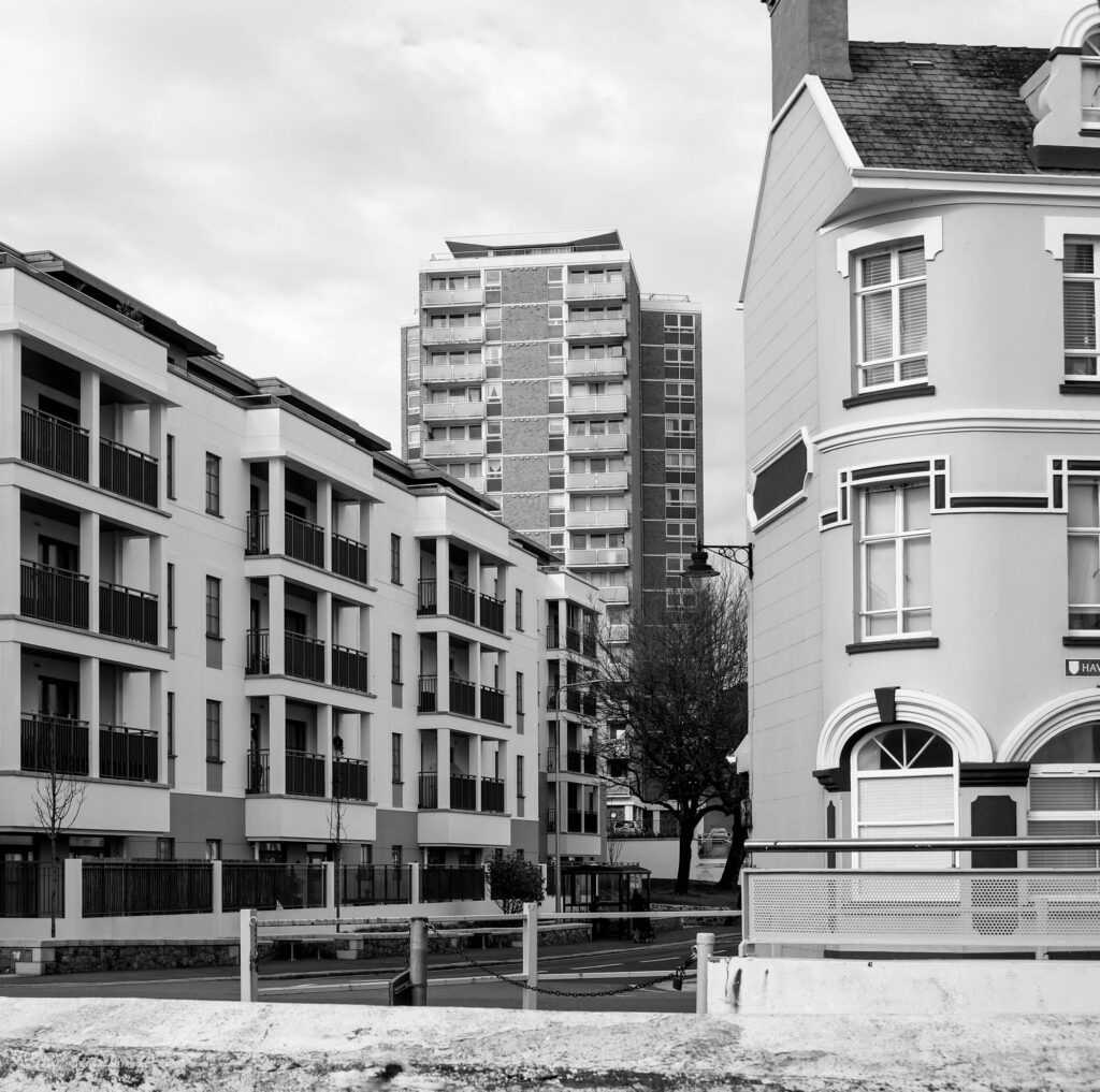
This one is split into 3. The first part is the old building taking up the right side of the frame. The second part fills the middle of the frame with a reasonably aged and outdated block of flats. The size of this high riser is rare on island. The left part of the frame shows a modern block of flats that only finished construction recently. Representative of jerseys varying architecture. I would have liked the sky to have been a lighter white to contrast with he shadows of the buildings.
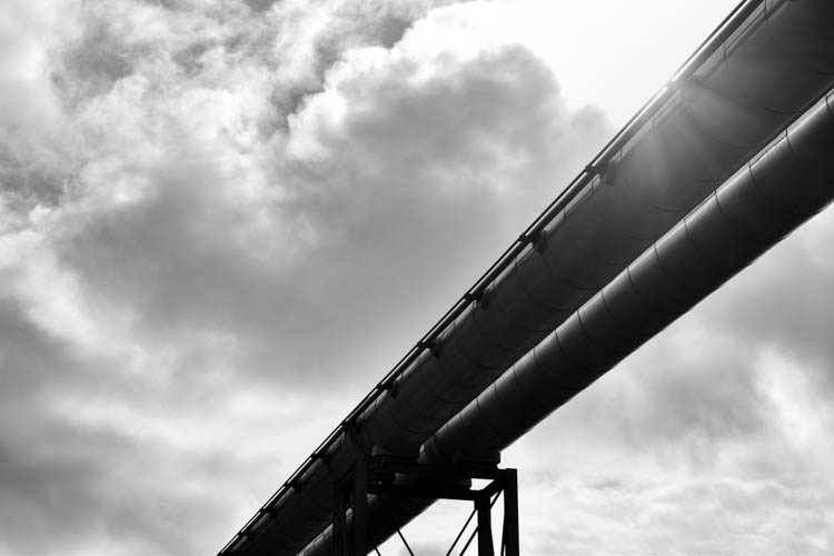
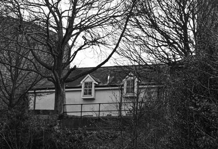
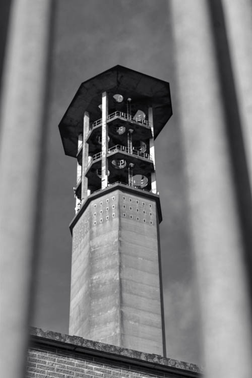
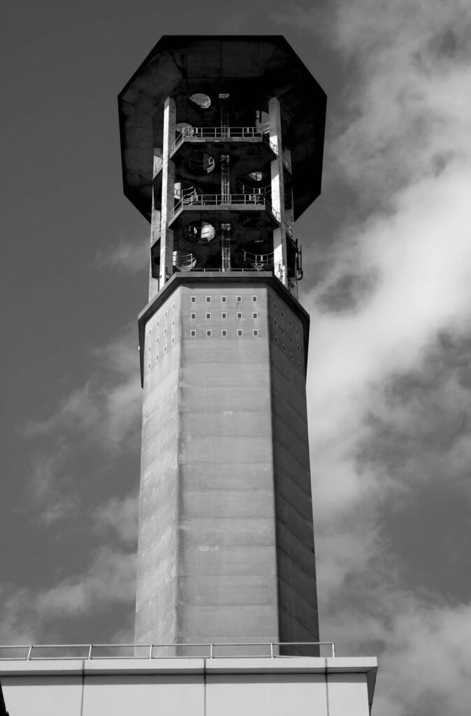
This image shows an industrial structure is ‘polluting’ the sky and blocking out the sun. The details are still visible on the beams despite increasing the contrast.

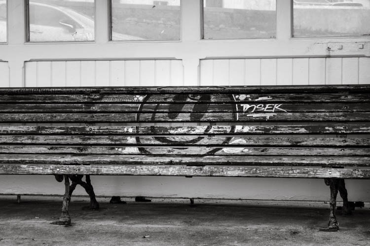
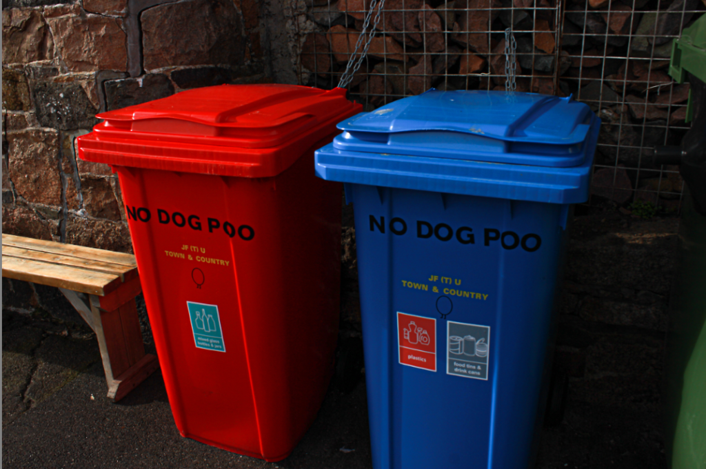
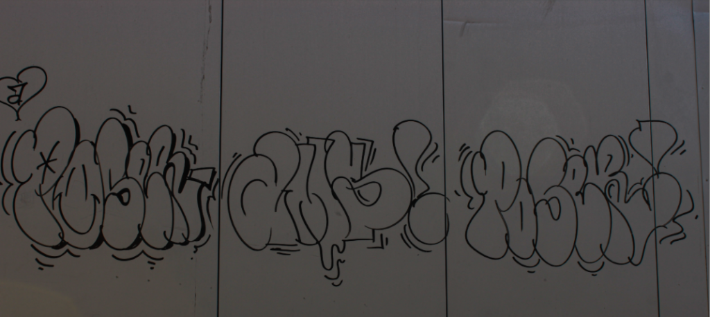
I like this photograph because it shows a lack of respect for the environment. there’s litter on the ground and graffiti on the bench which has taken valuable land space and gets much use.

Joe Deal

“The Great Plains of North America exists for me both as a physical landscape and as an idea, or internal landscape” – Joe Deal

Joe Maurice Deal was an American landscape photographer, who became one of the ten founding photographers of specializing in depicting how the landscape of the earth had been transformed by people. Born in Topeka, Kansas on August 12, 1947, Deal attended the Kansas City Art Institute where he subsequently earned his Bachelor of Fine Arts degree. After his graduation in 1970, Deal worked as a janitor and guard at at the George Eastman House in New York within its museum of photography instead of enrolling in the military. This led to him receiving his Masters degree in photography alongside his Masters of Fine Arts degree in the University of New Mexico, paving his way to becoming one of the participants in the movement of New Topographics.

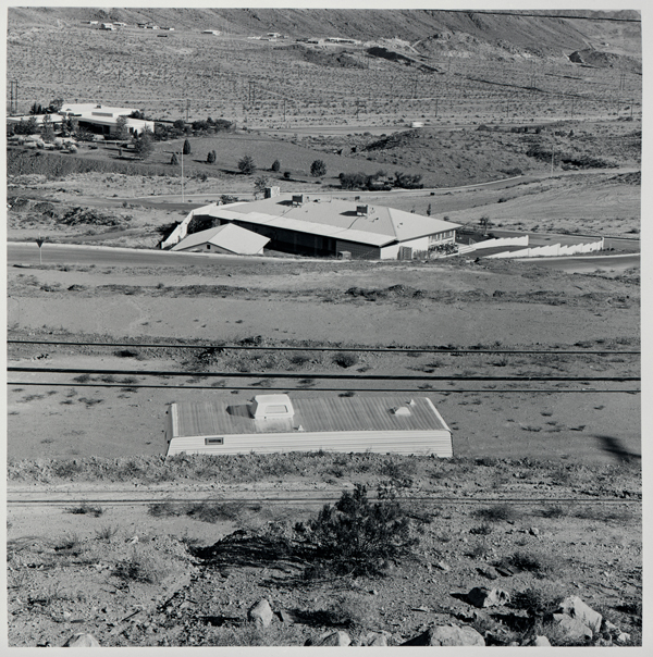
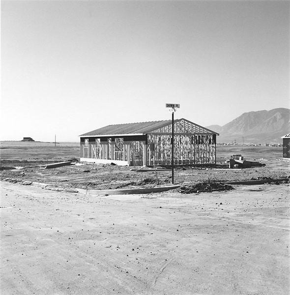
During the mid-70s, Joe Deal was chosen for an exhibition, alongside 9 other photographers, curated by William Jenkins named “New Topographics: Photographs of a Man-Altered Landscape” at the International Museum of Photography at George Eastman House. This was an exhibition focusing on the effects human beings as a society have on the landscape and furthermore, the globe. Deal contributed 18 black and white photographs in a 32 cm × 32 cm format, submitting newly constructed homes against the desolate landscape of the American Southwest. These housing developments were presented at various stages of completion, using indicators of development from newly-laid roads with construction materials spread nearby, adjacent to mounds of dirt and other piles of destroyed plants.

“anthropological rather than critical, scientific rather than artistic.” – William Jenkins

Joe Deal and his colleagues rejected Romanticism from their predecessors and aimed to achieve a realistic and straightforward document of contemporary society by using emotional indifference. Through square formatting, viewers could read the landscape as if it was traces of human decision-making. The moments of too-perfect symmetry in the patterns of rocks and bushes expose the landscaping as unnatural. Joe Deal photographed suburban development in the form of construction sites which become contrasted against the large piles of refuse and empty lots regularly shown in these images that suggest the wastefulness of abandoned projects. By framing the land in this way, he created a space where his viewers must consider the cost of rapid growth in the fragile desert and how dangerously this would be impacting these natural spaces that should be protected and preserved.

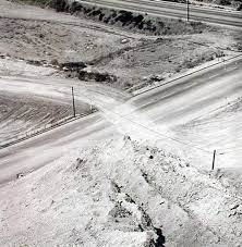
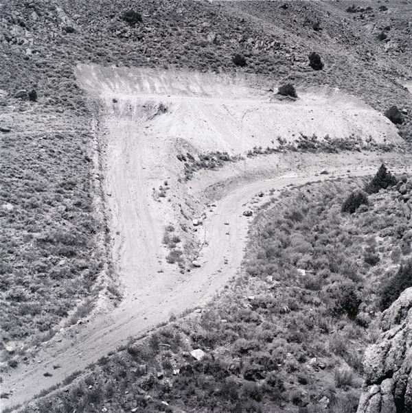
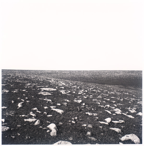
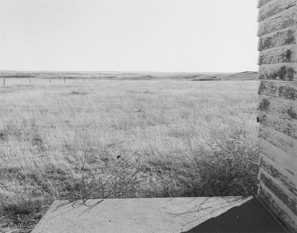
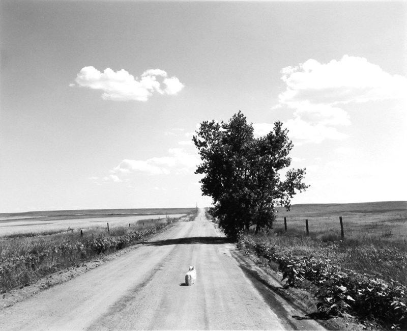
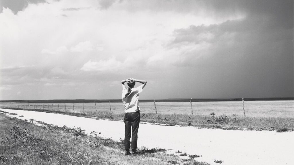
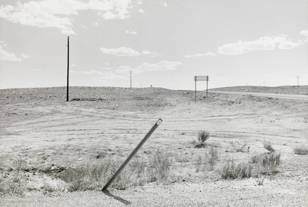
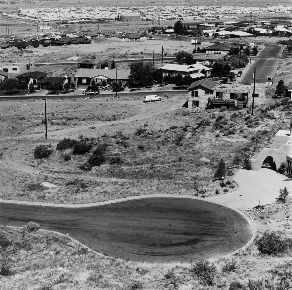
Deal trained his camera on landscapes that had been overlooked by the prominent photographers of the preceding generation, people like Ansel Adams, Eliot Porter and Minor White. Instead of majestic, snow-covered peaks or meadows dotted with wildflowers following the ideas of Romanticism and the Sublime, Deal chose to photograph places torn down and demolish irrevocably by human hands. These were landscapes most people would consider unredeemably ugly or entirely disregard without taking any notice of it, like this image of the dirt road in Wyoming. Deal wanted to blankly show the reality of the world and how the effect of humans on a non-human area will be the reason the world simply becomes no longer, without the façade of tranquillity or beauty, just the truth. Many people when first confronted with this image wouldn’t believe much about it, yet behind the image itself is a concept of urbanization.

 Analysis:

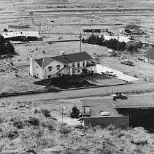
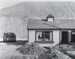
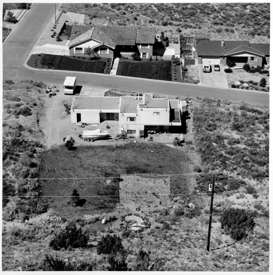
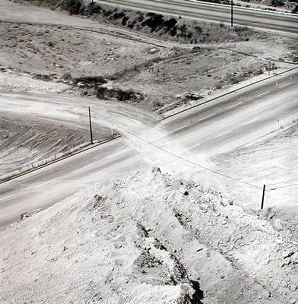
Joe Deal’s work actively focused on the destruction of these natural spaces due to the inclusion of construction sites against the decaying deserts with rubble and waste discreetly scattered around. The angle of the camera looking above and over this area whilst using a 32 cm × 32 cm format causes the viewer to face and understand the uneasy coexistence of man and nature along the San Andreas Fault in Southern California. This was a key feature continued through into his portfolio of images, “The Fault Zone,” in which he created after his huge success within the “New Topographics: Photographs of a Man-Altered Landscape” by William Jenkins. His worked acted revolutionary towards Romanticism and ideas of The Sublime in landscape photography. In a monotone way, Deal presented tract houses, industrial sites, motel, warehouses and highway projects in a deadpan and uninflected style, looking at these spaces straight on. The mundane style of this image, this desolate areas guided by three homes with a dividing road resonates with climate change and global warming as it depicts how humans are consistently “having a want for more”, urbanizing and emptying these natural spaces, blankly showing society the personal intrusion we do consciously or unconsciously. The scattered construction materials discreetly point out to the viewer, unmanipulated, alongside the tire marks swirling around on the grass, giving evidence of human interruption. The housing is shown in a more accurate 3D form through the shot being taken from a high angle, contrasting against the harsh decaying bushes surrounding, patchy and destroyed. The black and white gives a large tonal range, resembling Ansel Adams’ work, appearing perfectly exposed. The image brings a lot of sharp and fine detail taken in daylight yet even though it is quite far away, the long depth of field captures it at a wide angle. The cropped section of grass laid out purposefully at the back of the house, being the focal point, appears wilted and especially sparse being left to be destroyed by the next building development.

A few of his other exhibitions:

In these images, Deal took these images on the concept of geology and land use however are seen to be memorable from their beautiful composition and structures rather than subject matter.

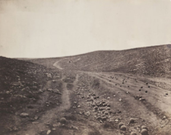
In West and West: Reimagining the Great Plains, Deal used a gird format once again. In this series, Joe Deal captured much of the Midwestern United States which led to it being exhibited at University of Arizona’s Centre for Creative Photography in Tucson, Arizona. This series opened at Rhode Island School of Design which led to it being presented again at being presented at New York City’s Robert Mann’s Gallery. This image gives a clear notification towards the work of Roger Fenton in his series of the Valley of the Shadow of Death due to their composition. The resemblance between the two is very obvious, and has connotations towards how the landscape changes over the years.

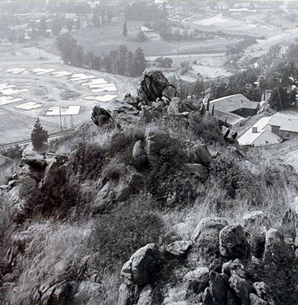
Subdividing the Inland Basin featured suburban areas east of Los Angeles, tending to include people within the landscape. This is a notification towards the way humans almost ‘conquer’ the landscape, for example in this image this is done through graffiti as if society claims these beautiful things only to destroy them in a selfish way.

Robert Adams

Robert Adams was best know for his photographs both natural and commercialized landscapes of the American West. Adams grew up in Colorado, earning a PhD in English at the University of California. He then began to start teaching at a college where he started photographing various landscapes of nature and architecture, using a 35mm reflex camera.

Adams criticises the degradation of natural landscapes, making clear that his work is primarily focused on light. He communicated this through his series of nocturnal landscapes called, Summer Nights Walking. During this series, between 1976-1982, he capturing photos during summer evenings where he could achieve a nocturnal effect. In this project he photographed sidewalks, trees, and fields that were lit up by the moonlight or streetlamps. This created a ‘new vision of landscapes.’

“I think if you placed me almost anywhere and gave me a camera you could return the next day to find me photographing. It helps me, more than anything I know, to find home.”

ROBERT ADAMS

Editing my storm landscape photos

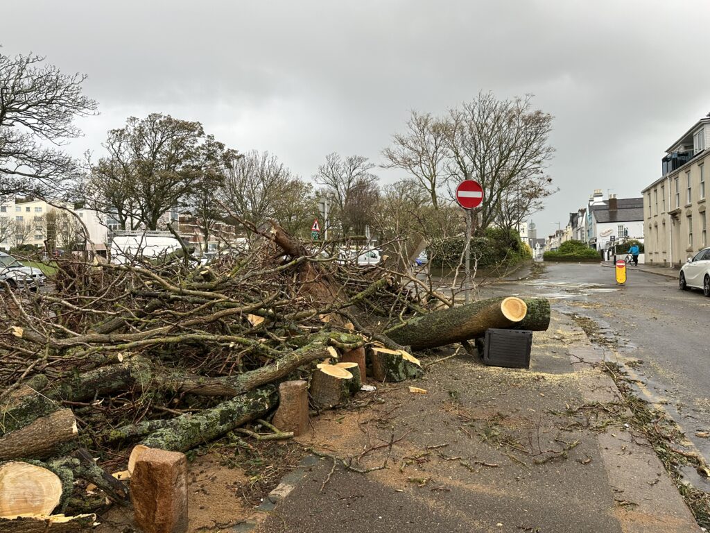
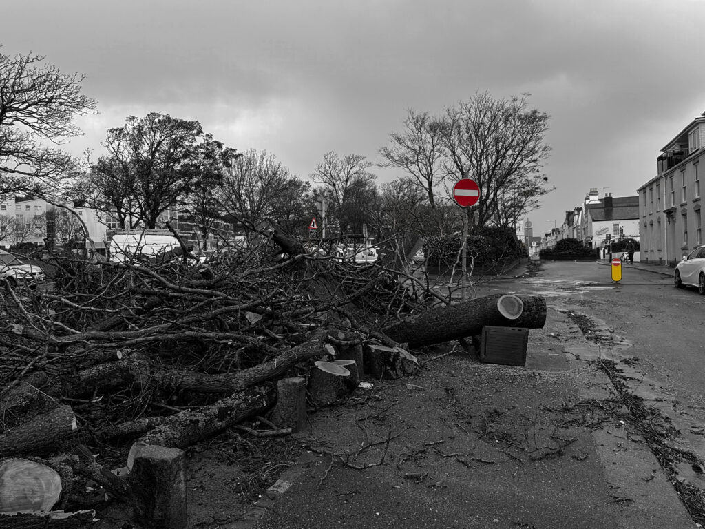
This is one of the photos I took after the storm.

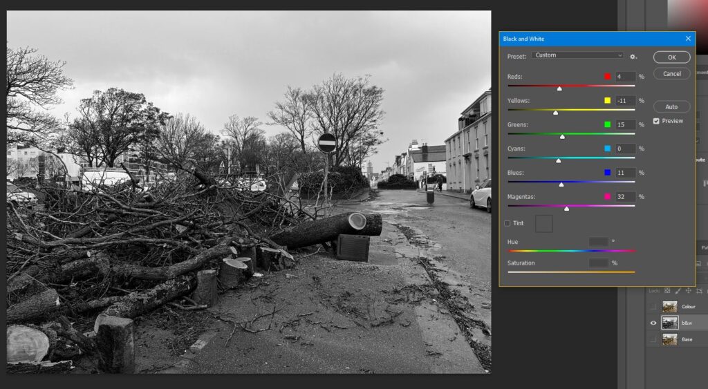
For the photo I applied a Black and White filter and adjusted the levels.

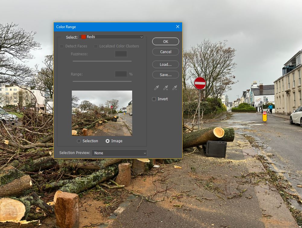
Before I made the photo Black and White I made a copy of the layer and used the colour range selection tool to select the reds as I want the reds to show in my B&W photo.

The tool selected the reds then I did Ctrl+Shift+i to invert the selection and pressed delete and I was left with this. I also did the same for the yellow thing in the background.

After doing some final finishing touches, this was the end result. I am quite pleased with the end result as I feel it looks good and the reds and yellow in the photo go well and really compliment it.

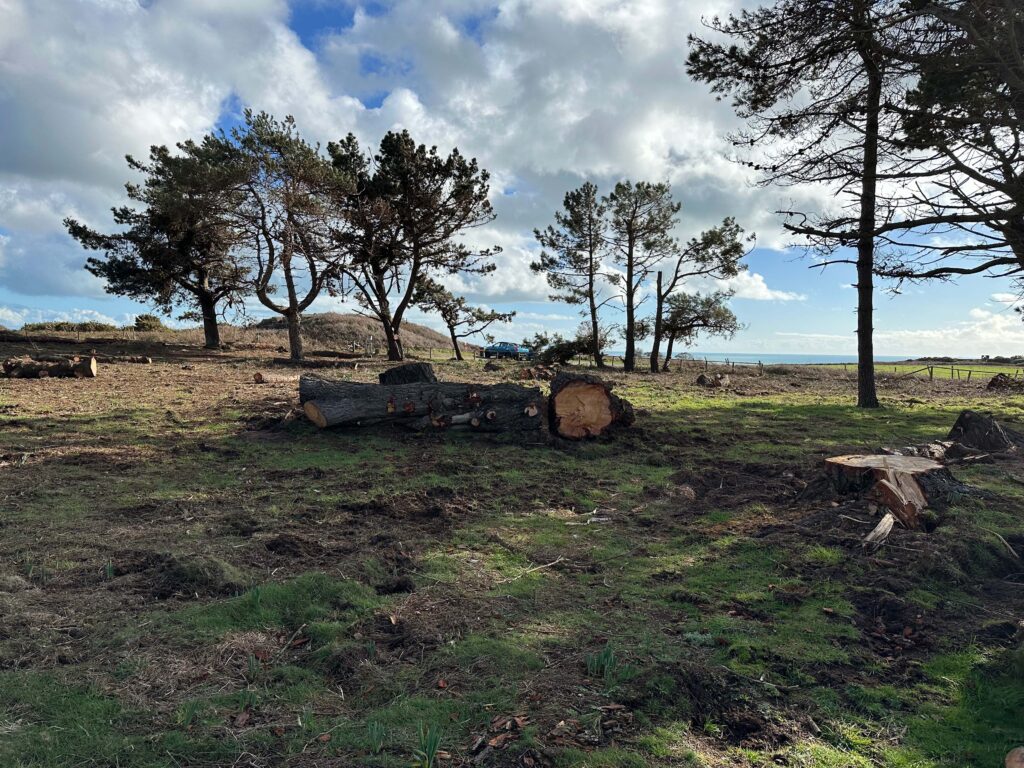
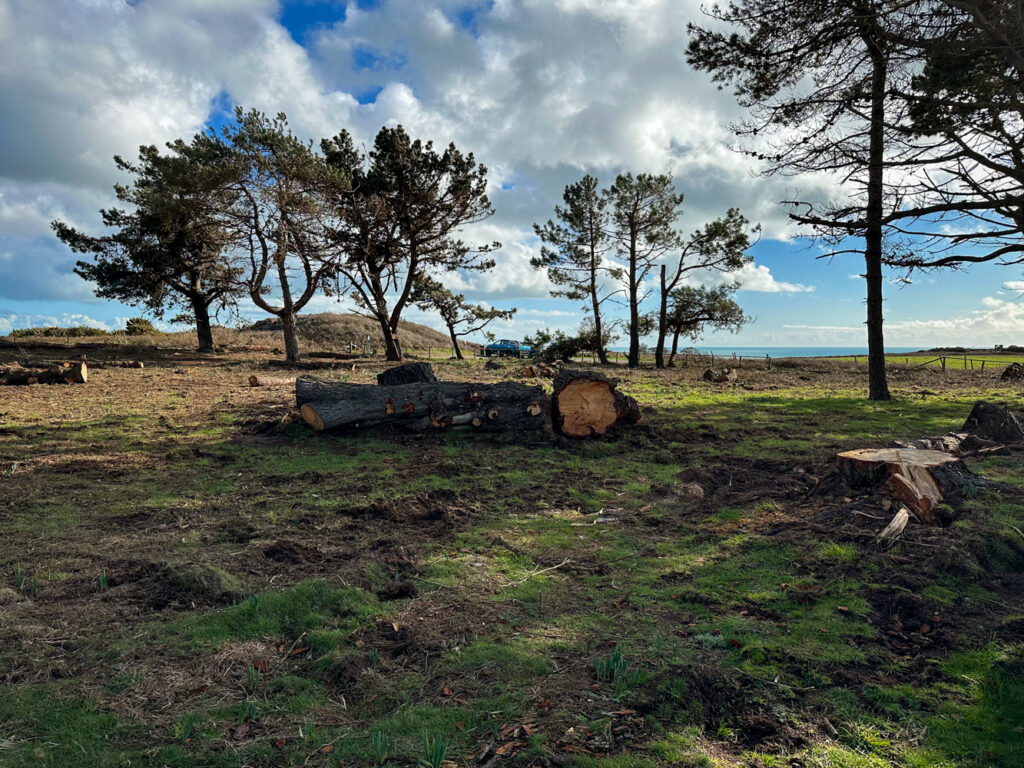
Photo #2 edit

On the Left photo I slightly adjusted the saturation for the grass making it look greener and for the sky to make it slightly enhanced. The contrast, whites and shadows was also slightly increased, whilst also gradually decreasing the highlights and blacks. Basically small adjustments to enhance the photo.

On the right photo is the same photo but in Black and White as another variation.

I chose the edited colour photo as the better one, rather than the one in black and white, as I really like the colour detail and the contrast.

My Take on The New Topographic

My take on Topographic Photography.

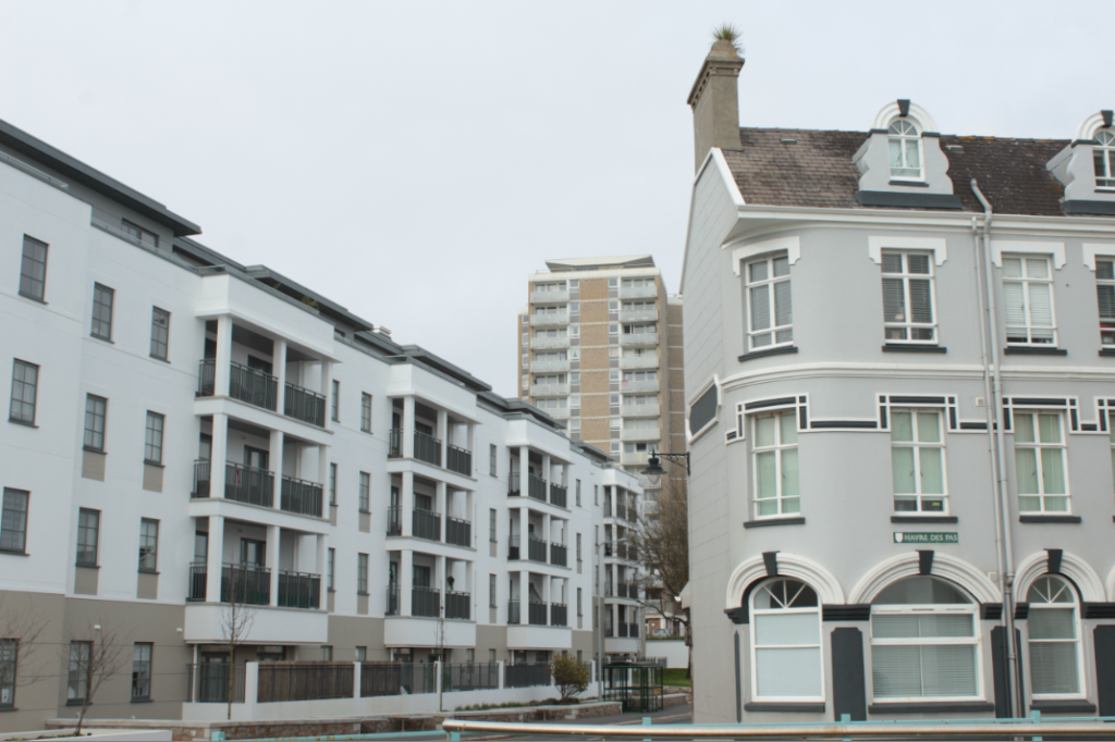
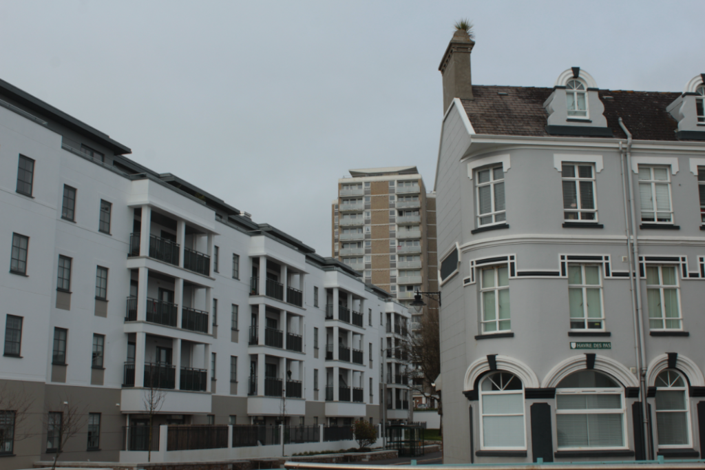
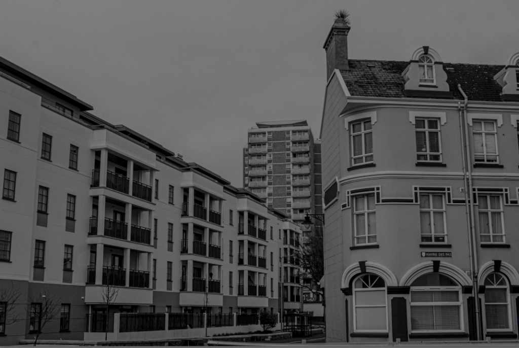
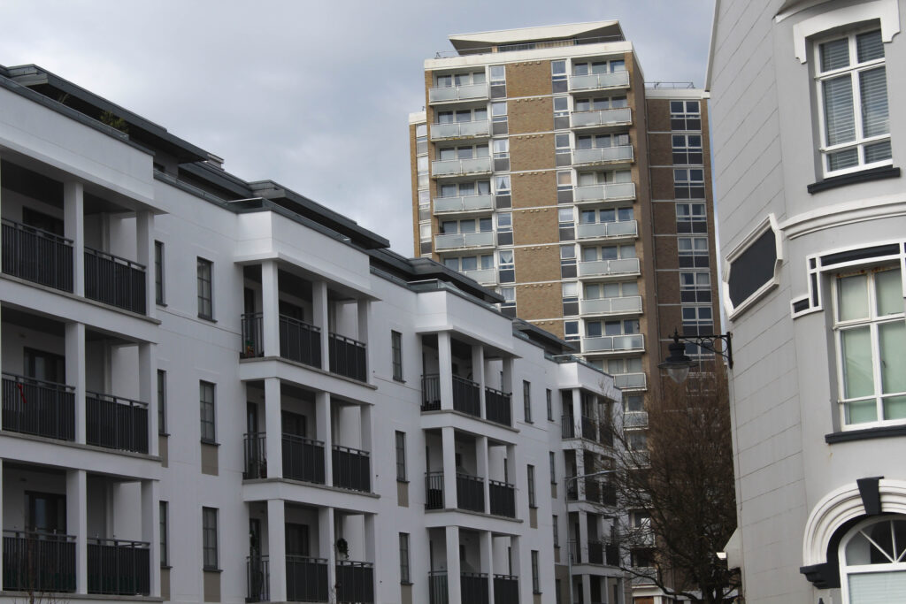
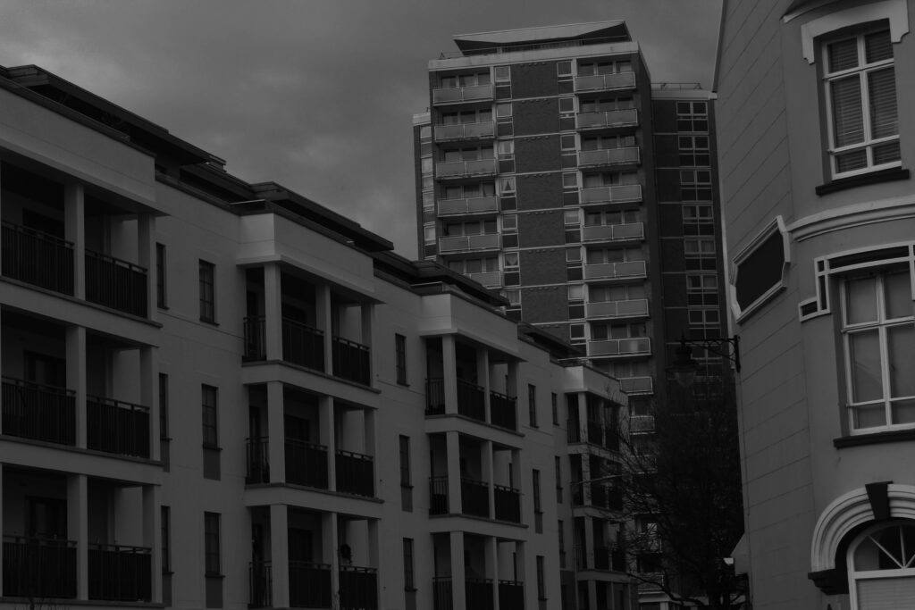
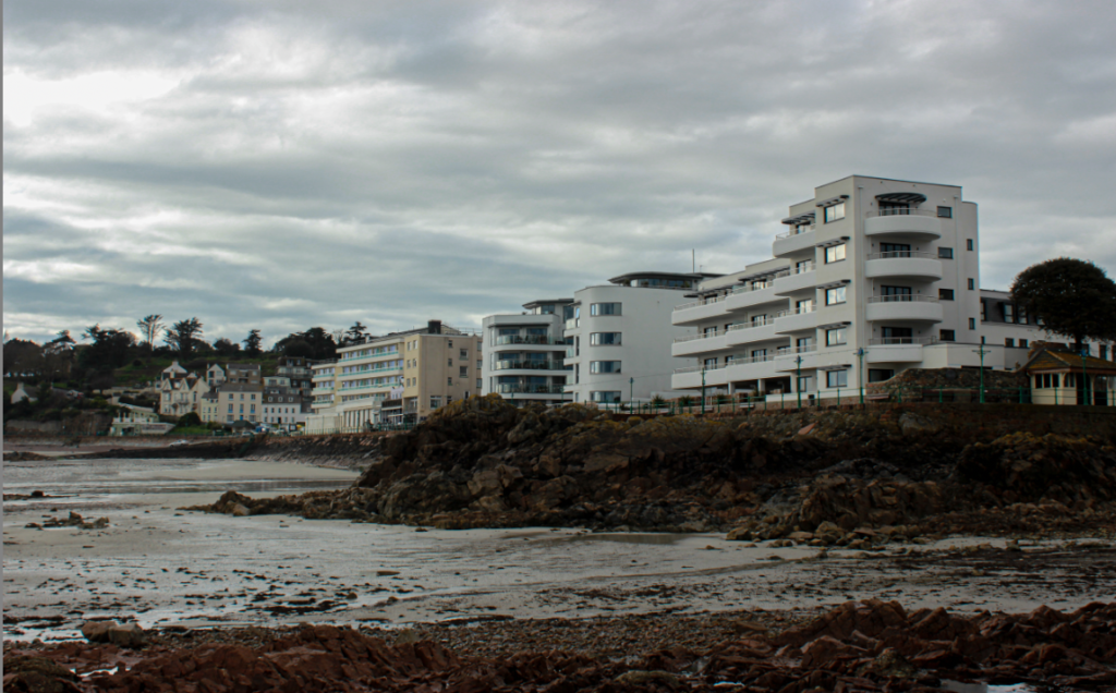
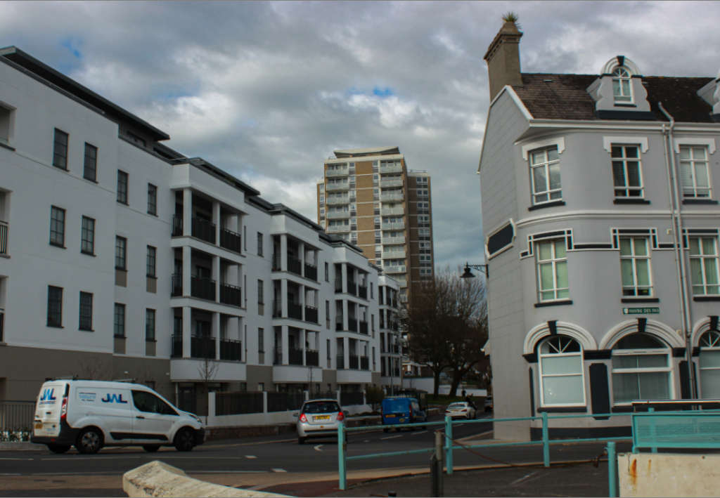
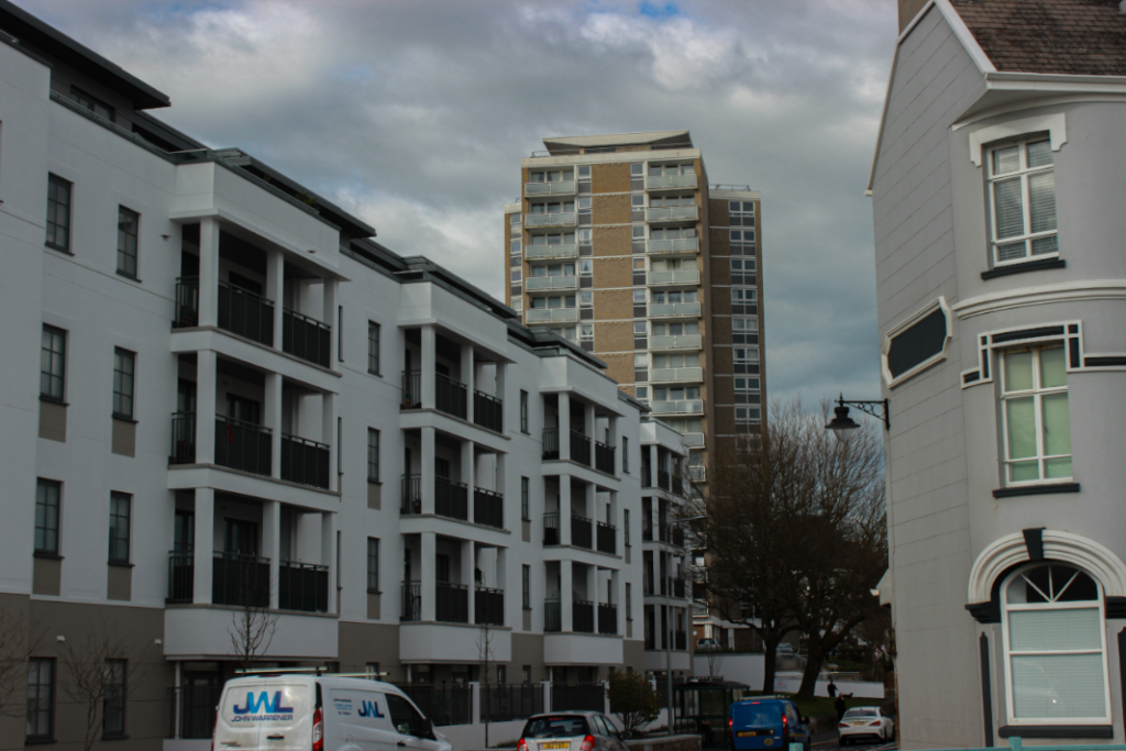
I started by seeing this perfect angle with these three buildings next to each other. At first they look similar, but if you look closely you can see they are all different styles with the front right building being old fashioned with the curved walls and windows and with the pointy roof chimney. The building in the back being 50/50 old and new with the old style of colours/windows and materials. But the new style with balcony’s and straight edged walls and so finally the long building to the left being fully modern with the white plane walls, mixed with black balcony gates, plus modern looking windows and straight walls and roof.

I really liked how these three different exposures looked but I felt confident with trying the B/W style on it. This worked very well with still showcasing each era of buildings but also the same contrast gives the photo the same idea of buildings.

This was the final photo after editing and the B/W added on top of it came out just as I imagined. I also love how each building is a different shape with the left building being rectangular going away from the camera. The right square-like building standing flat, face-on towards the camera and then the tall building in the background still very distant from the other two but still stands out as a main view in the photo.

Introduction to New Topographics

The term ‘New Topographics’ was first invented by William Jenkins in 1975 to describe a group of American photographers who made pictures that had similar banal aesthetics. Their images where mostly black and white prints of urban landscapes.

(Banal Aesthetics –  Post-industrial realism style)

New Topographics was inspired by Albert Renger Patszch and the concept of The New Objectivity. It was a reaction to the increase of urban environments and industrialisation. Many who were associated with this type of photography were inspired by man-made subjects such as parking lots, suburban housing and warehouses.

An exhibition at the International Museum of Photography in Rochester, New York featured photographers, such as Bernd and Hilla Becher, who showed the growing unease about how the natural landscape was being taken away by suburbanisation.

(Suburbanisation – A population shift from historic core cities or rural areas into suburbs, resulting in the formation of urban sprawl)

Here are some examples of photographer’s work that focused on New Topographics:

Aufbereitungsanlagen 2008 by Bernd and Hilla Becher
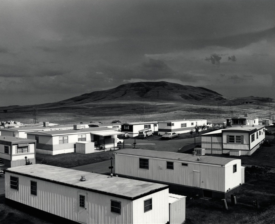
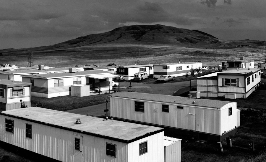
Mobile Homes, Jefferson County, Colorado 1973 by Robert Adams
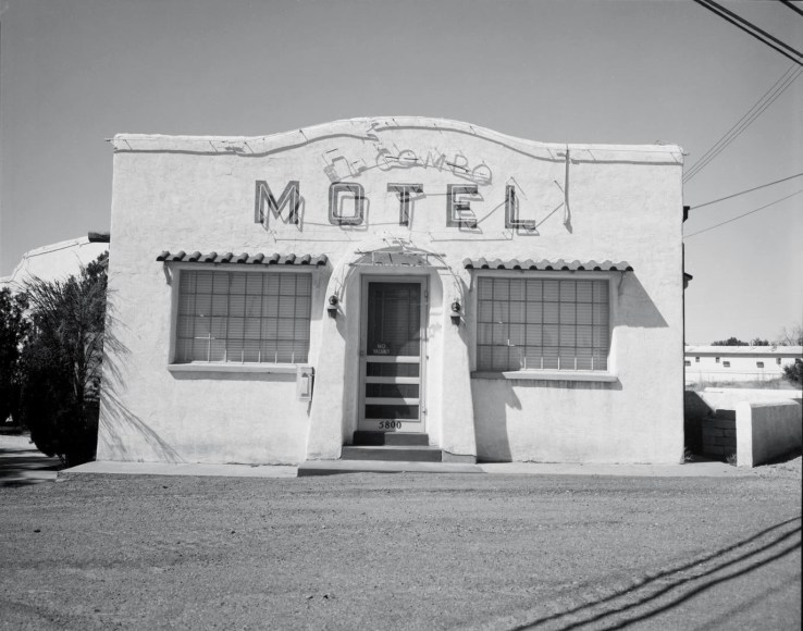
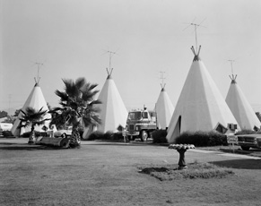
Route 66 Motels by John Schott
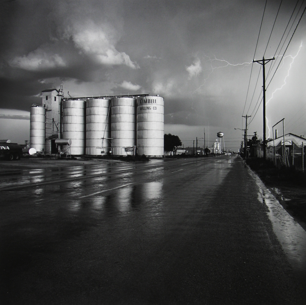
Grain Elevator and Lightning Flash, Lamesa, Texas 1975 by Frank Gohlke

The New Topographics

What was The New Typo graphics

The new Topographics was a term coined by William Jenkins in 1975 to describe a group of American photographers such as Robert Adams and Lewis Baltz who had a similar Banal Aesthetic, in that they were formal, mostly black and white prints of the urban landscape. The photos often captured the tension between natural scenery and the mundane structures of post war America.

What Inspired the New Topographics

Many of the photographers associated with new typographics including Robert Adams, Lewis Baltz, Nicholas Nixon and Bernd and Hiller Becher, were inspired by the man-made, selecting subject matter that was matter-of-fact.

Image Analysis

This photo separates the natural beauty of the mountain and then the trailer park below it juxtaposing the negative and the positive of the post was in America as many Americans lost their homes from the destruction of the was and couldn’t afford to stay in their houses any longer as they might of lost their families or their partners to the war. The colour in this image is in Black and white which makes the image look more dramatic and more powerful, which gives the image a dark and sombre look to it.

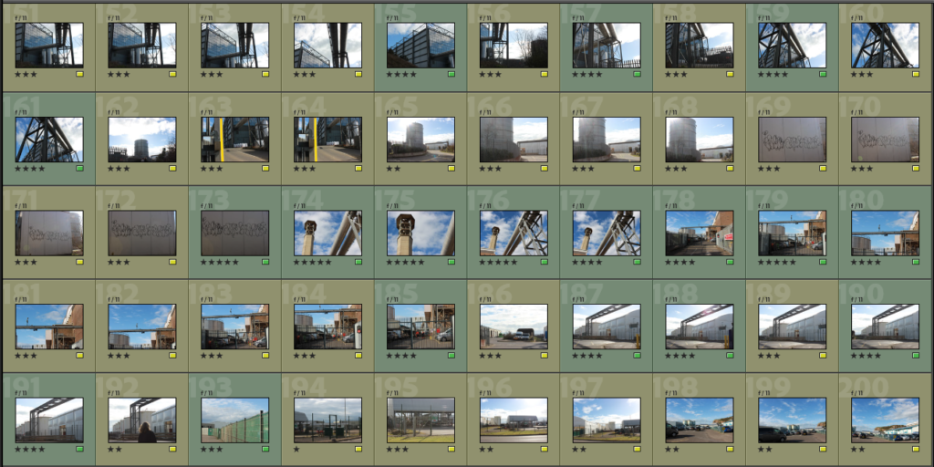
Industrialised building photoshoot

Edited Images

Best Images

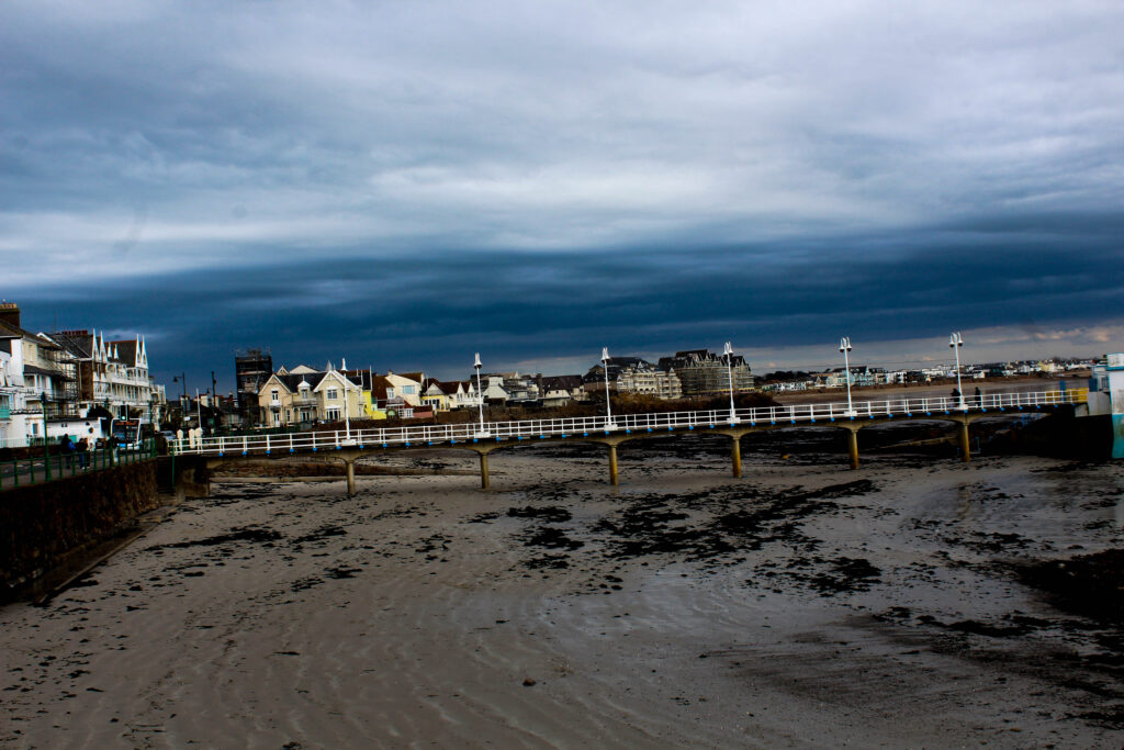
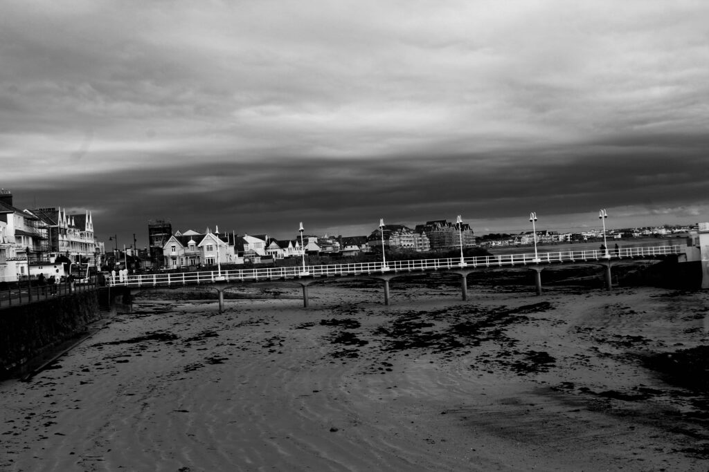
These are two of my best images as they capture industrialisation the best. The lines and shapes in these two images make the photos look so much more interesting and different. The line of the poles in the first image is a really good focal point and the lines in the sand direct your eyes to the focal point. The colour of the sky also makes the poles stand out more as the contrast between the dark sky makes the white look more vibrant.

In the second image the building in the background has been there for many years and is quite old but in the foreground the building has only just been built and is very modern . Which contrasts between old and new. The tree in the background suggests that this place was once overflowing with nature until industrialisation took over and buildings needed to be built to accommodate for the growing population.

Edited best photos

I changed the colour into black and white and then changed the darkness of the sky to give a more dramatic and darkened contrast between the sky and the rest of the image.

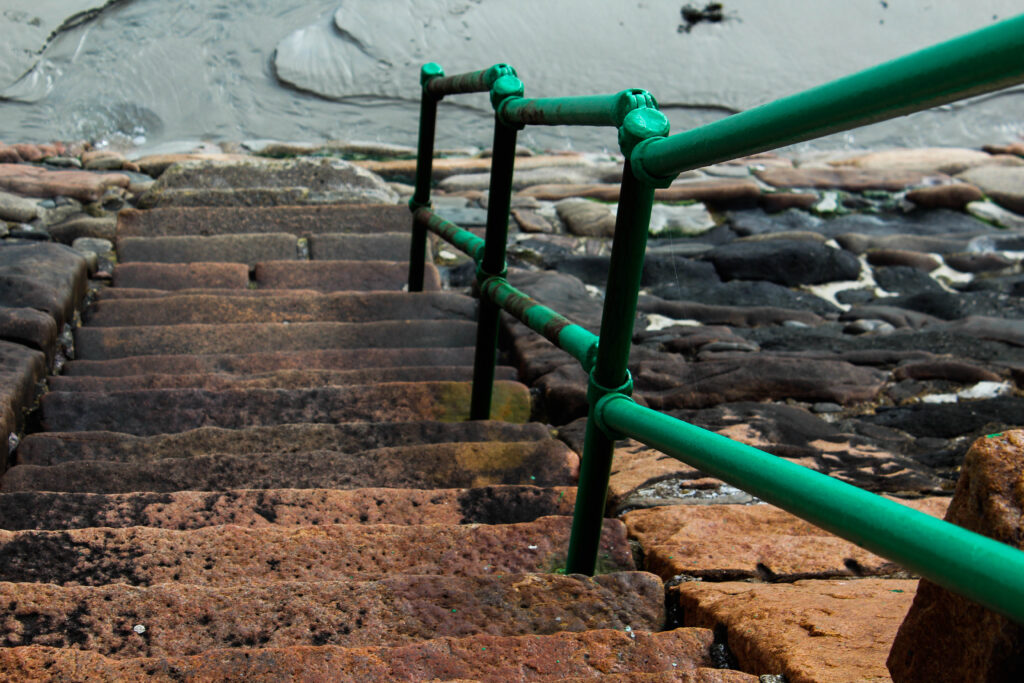
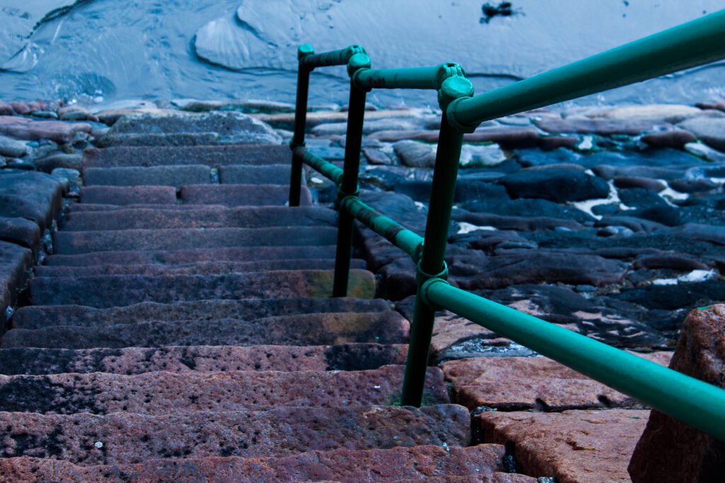
I further experimented with my photos and made this image of the stairs a darker shade of blue and altered the angle of the stairs making the stair rail straighter and look more in line with the stairs.

For this image I made the image on the right a lot darker by increasing the shadows and decreasing the amount of whites on the image.

Havre Des Pas Photoshoot.

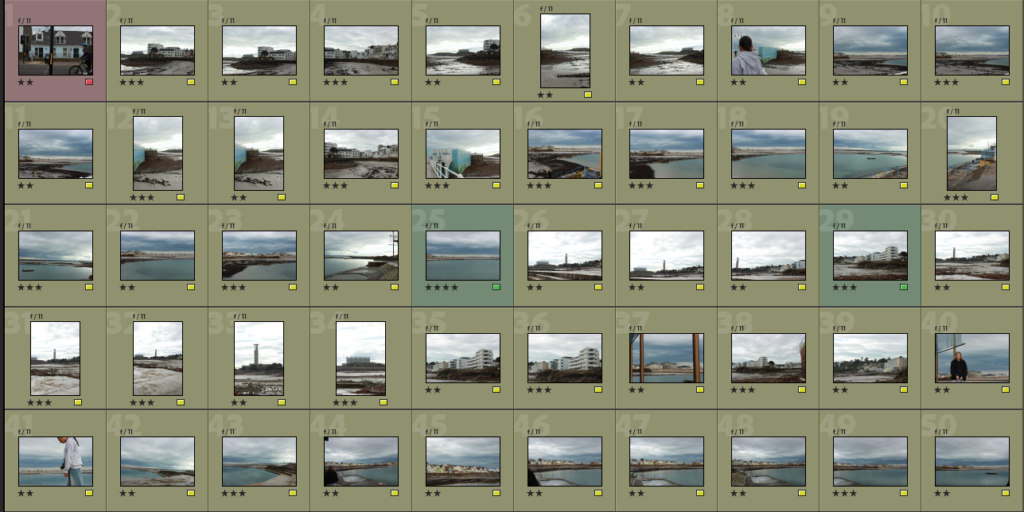
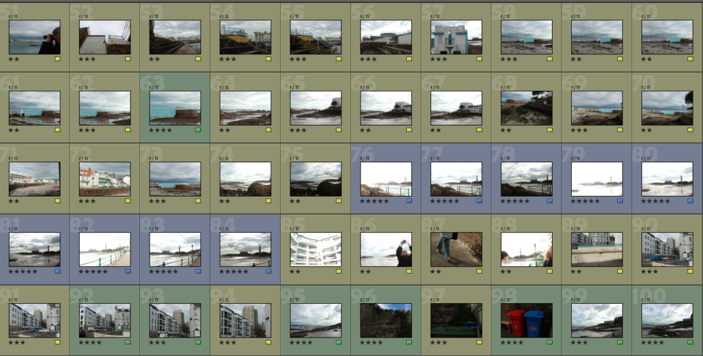
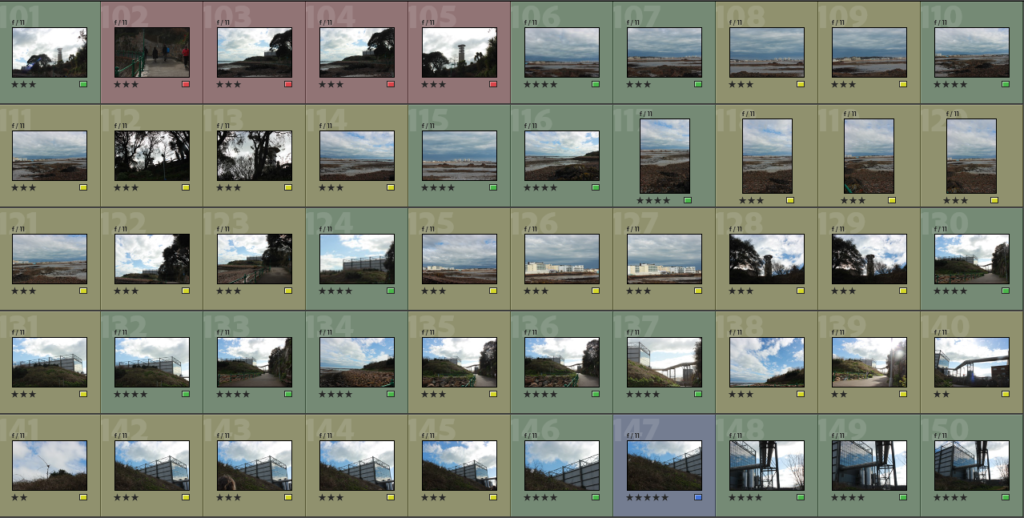
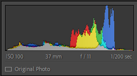
These are the camera settings I used for this photoshoot:

I also switched to the landscape setting and pressed the cloud option for the white balance. I ensured that I stuck to an ISO of 100, and had the Aperture between f/11 to f/16.

I also needed to remember to:

  • Keep my foreground and background sharp
  • Capture the foreground details
  • Straightened my horizons
  • Don’t shoot everything at eye level, use different angles
  • Pick the right time of day

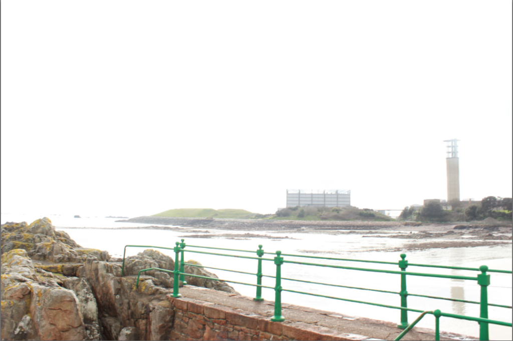
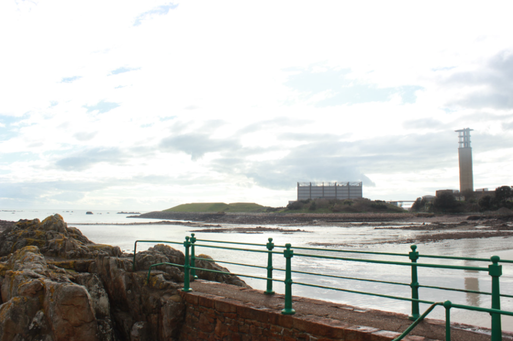
HDR Images.Exposure Bracketing

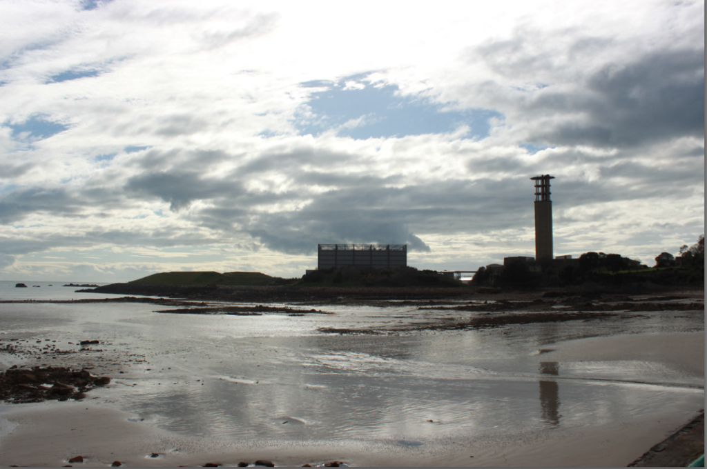
HDR IMAGE 1:

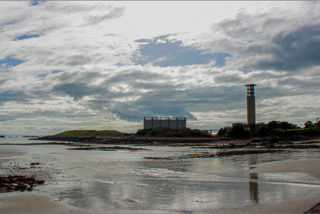
HDR IMAGE 2:

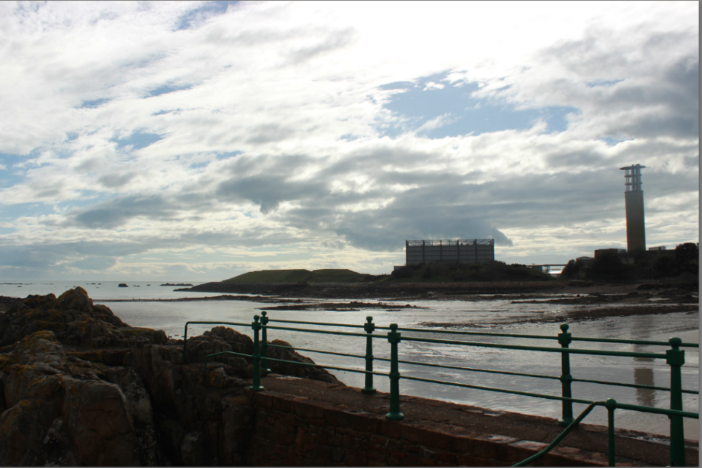
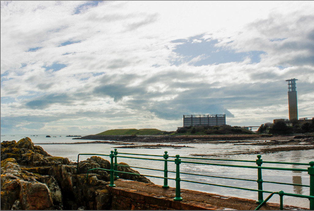
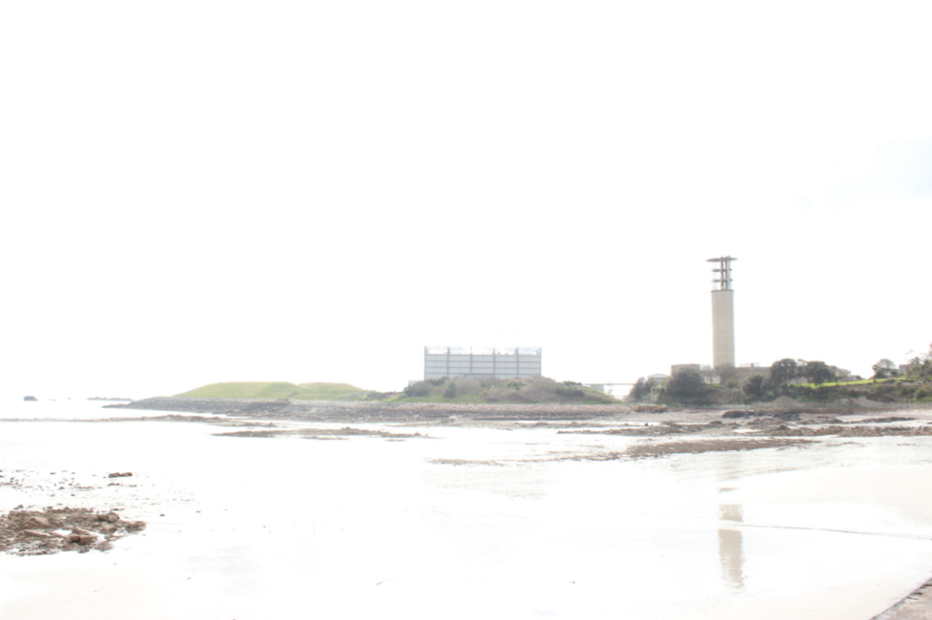
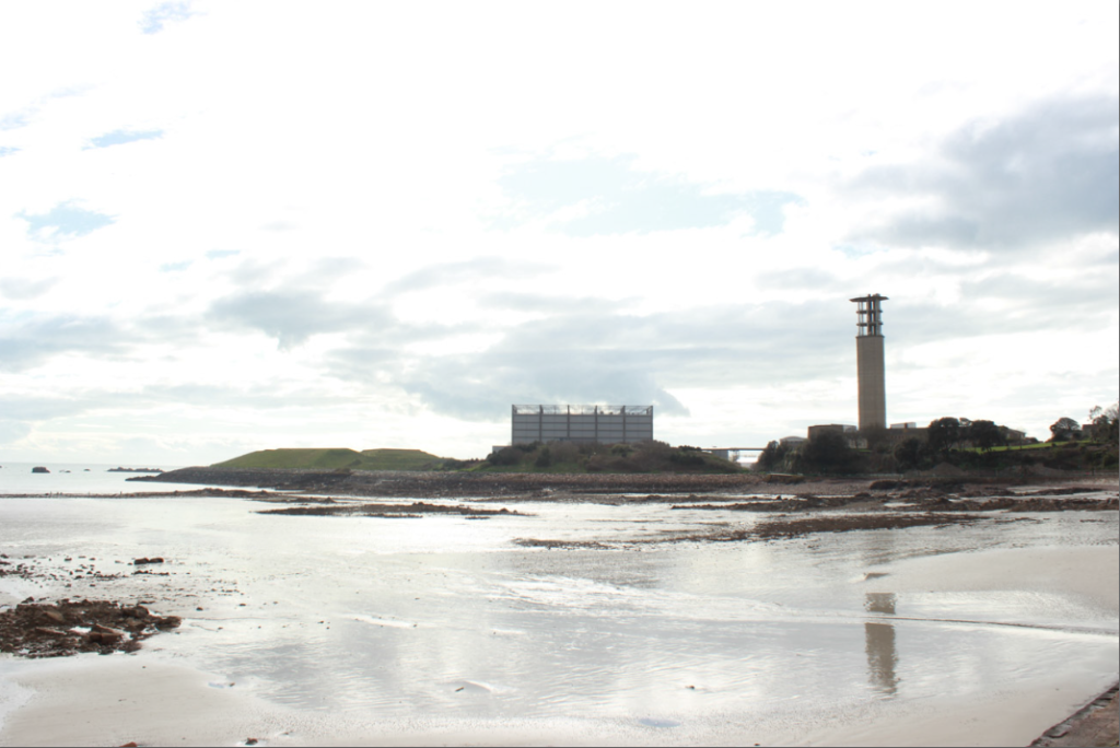
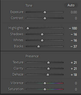
I attempted 2 different exposure bracketing images. After adjusting my camera settings (using the exposure compensation dial, and turning it to -1, take a photo, turn it to 0, take a photo, and then set it to +1 and take the third photo). I then imported them into Lightroom and merged them together to create the images. I then repeated this process once again. To improve this, next time I need to take a burst of 3 photos at once instead of needing to click it 3 separate times, this is because the camera is likely to move and change position slightly within the time it takes to press the button.

Best Images+ Edits.

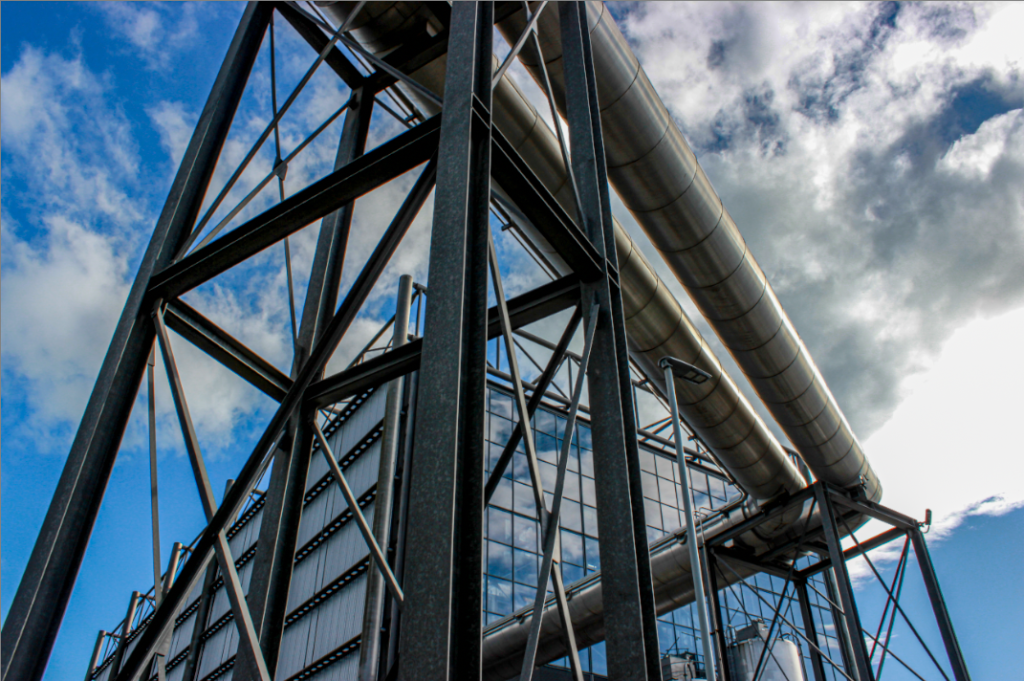
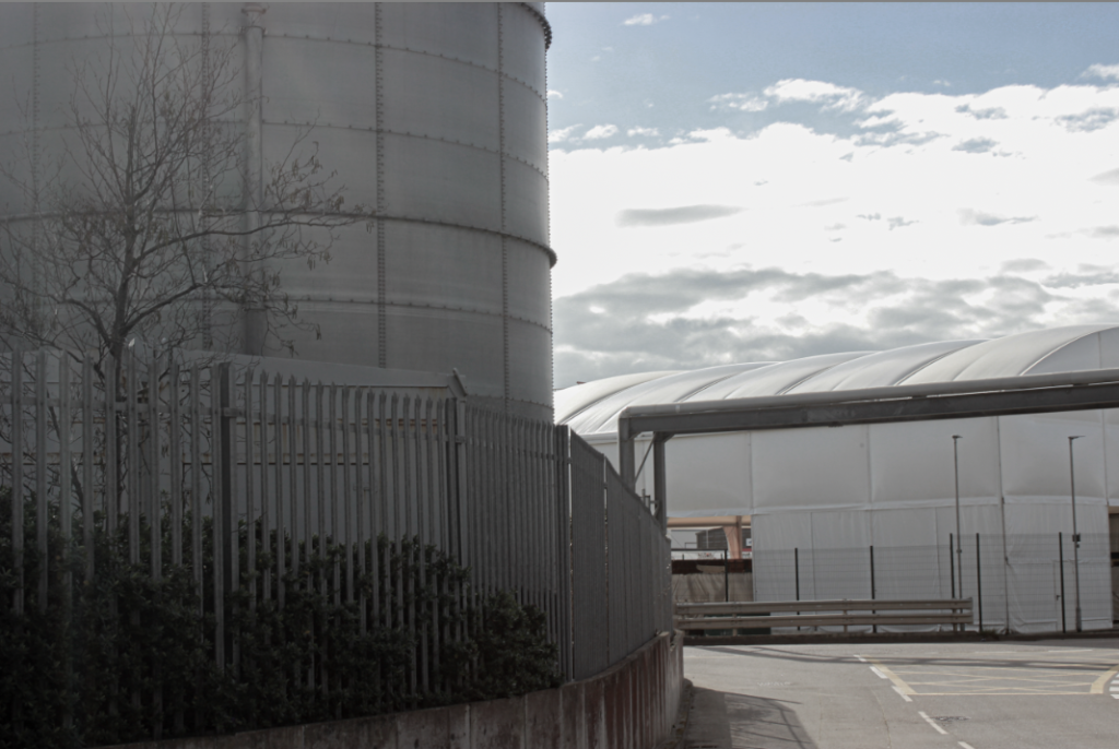
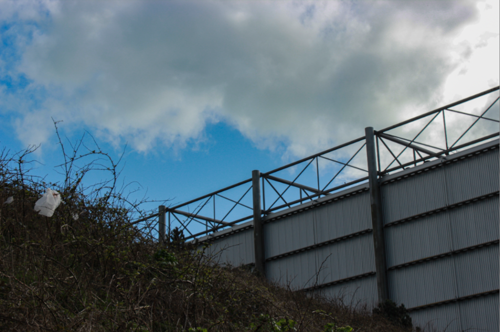
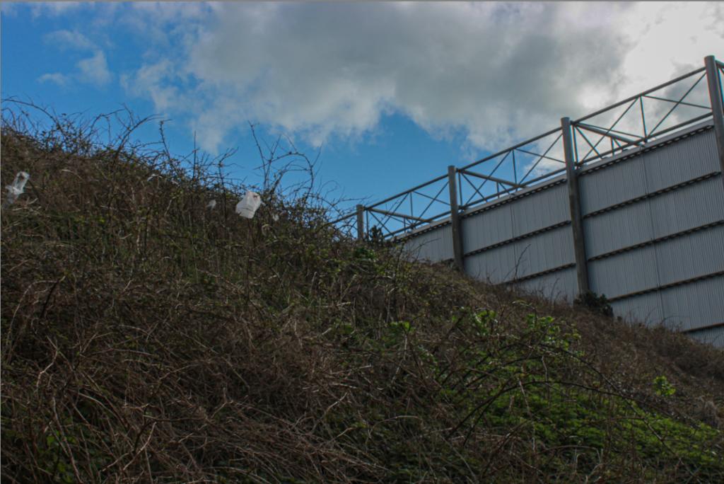
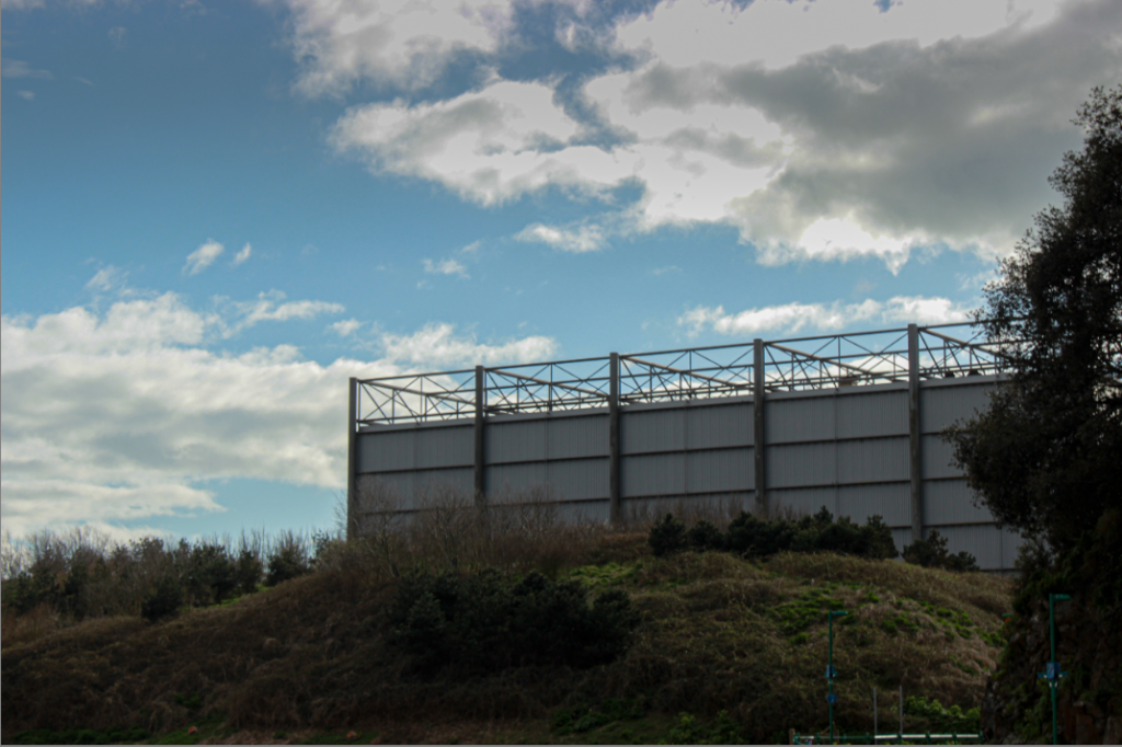
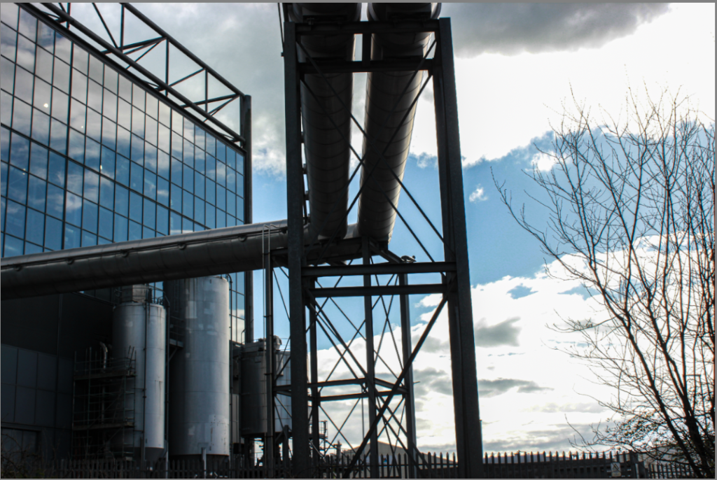
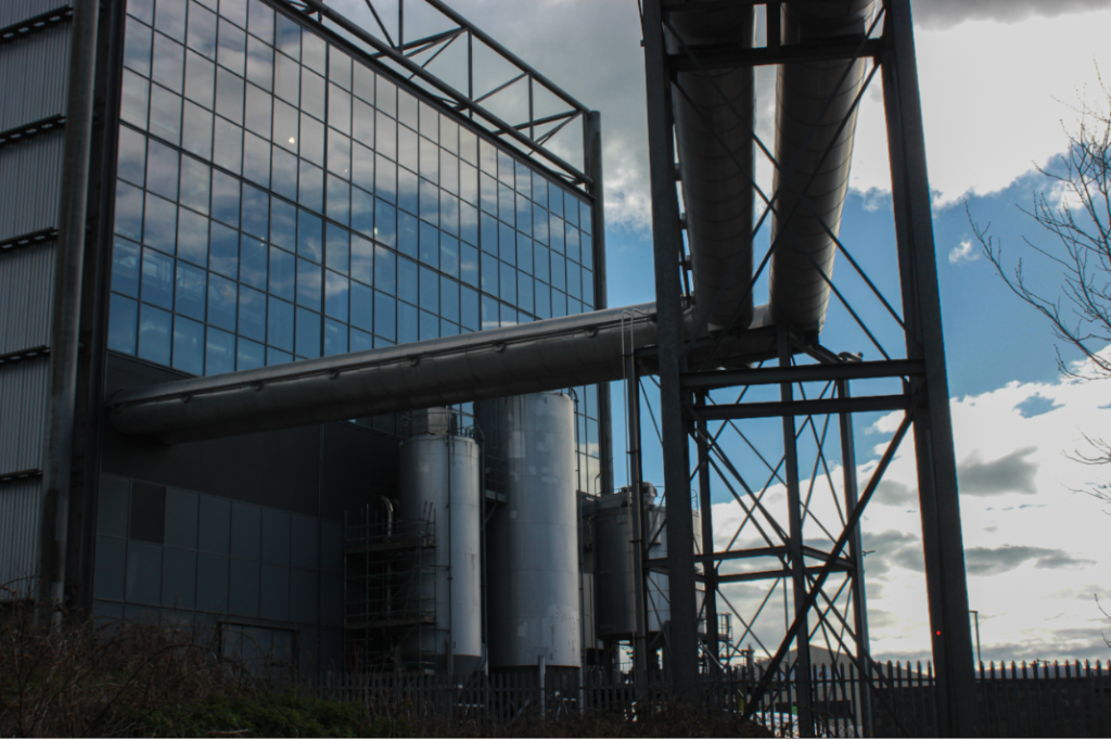
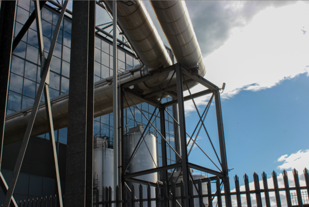
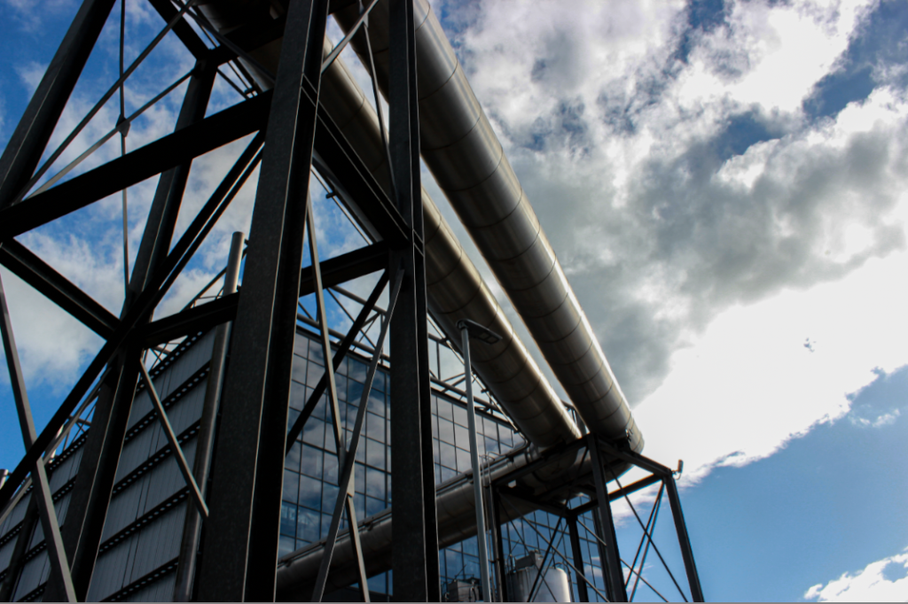
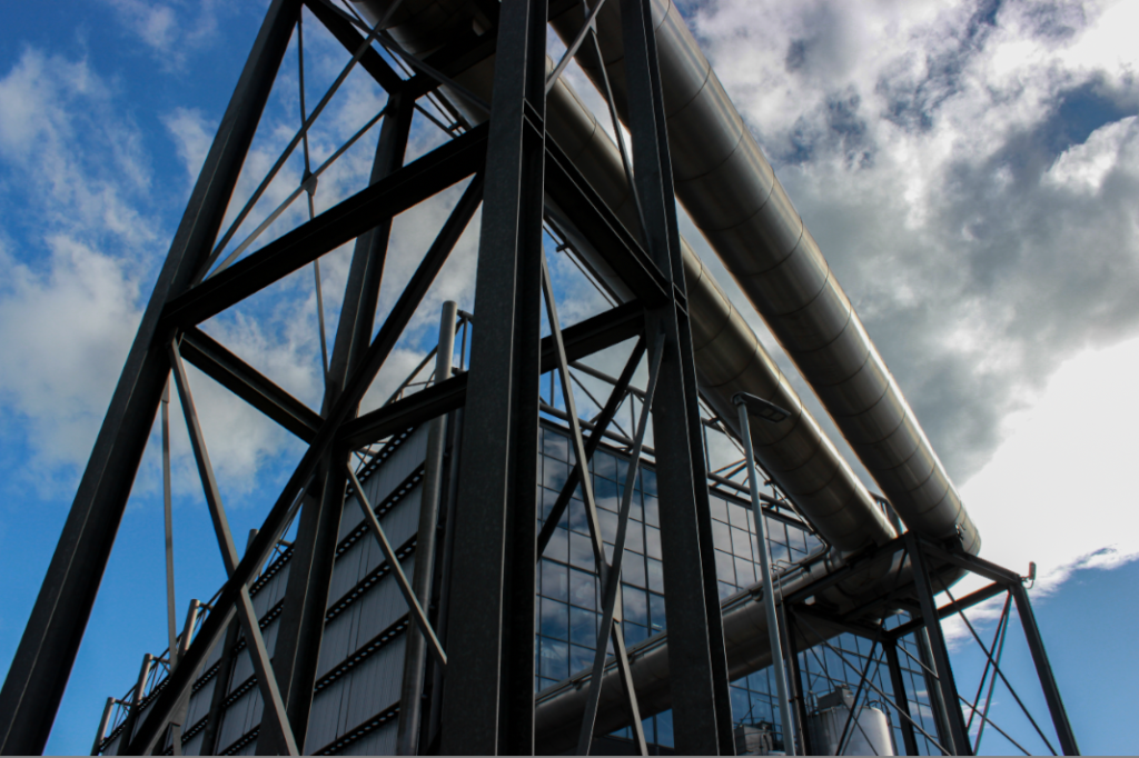
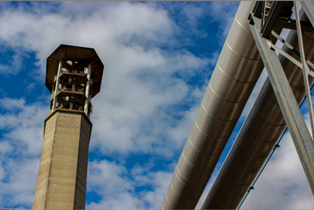
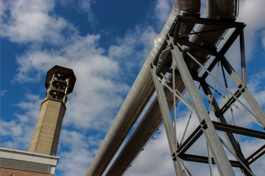
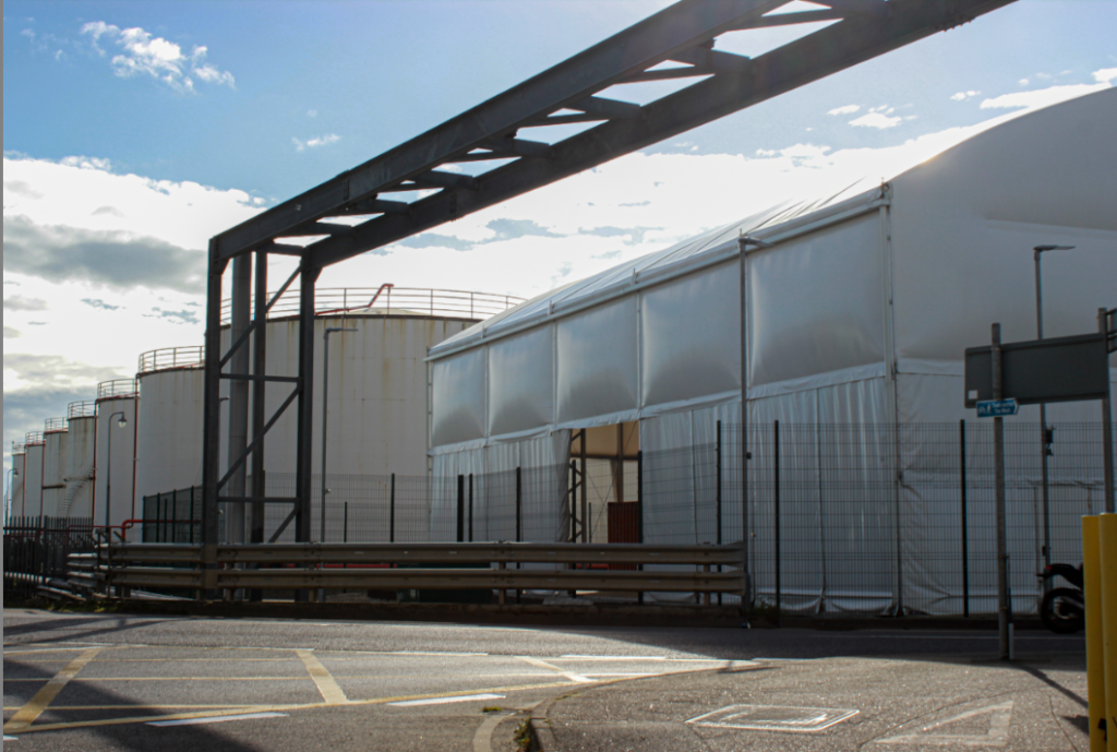
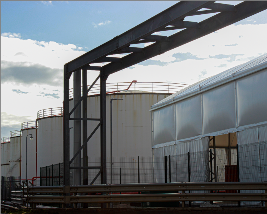
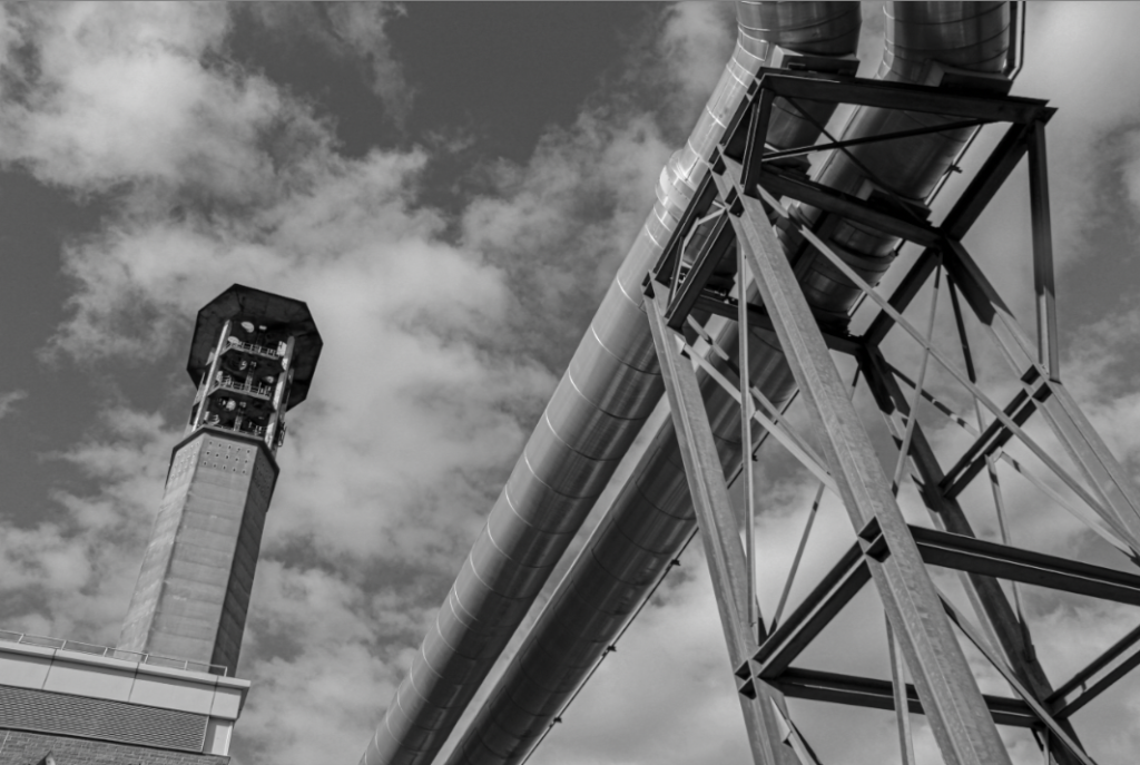
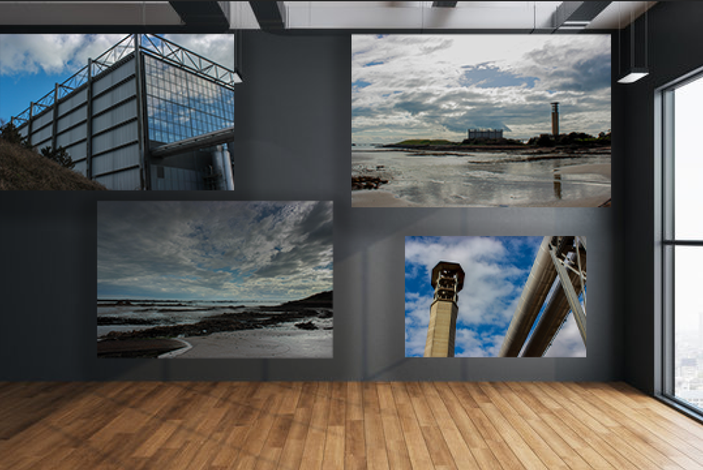
These are my two favourite photos I took for this photoshoot. I like the first photo because of the angle facing upwards, and how the sky is blue with the sun is shining on the metal. It is also showing the vast industrial structures, which show the great power that they generate. To improve it, next time I would like the sky to be more cloudy and grey to also replicate a more morbid and dark approach to my photos.

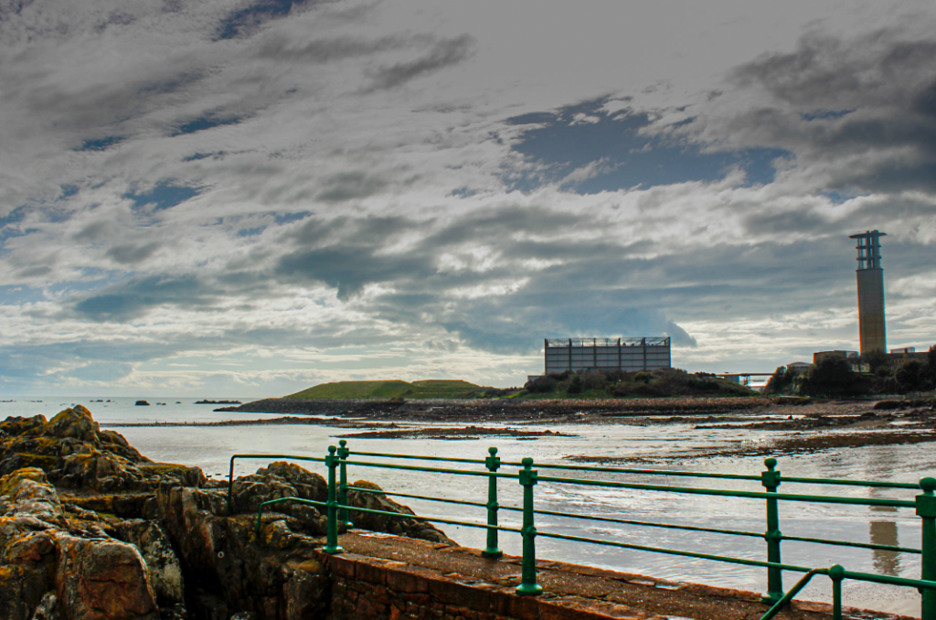
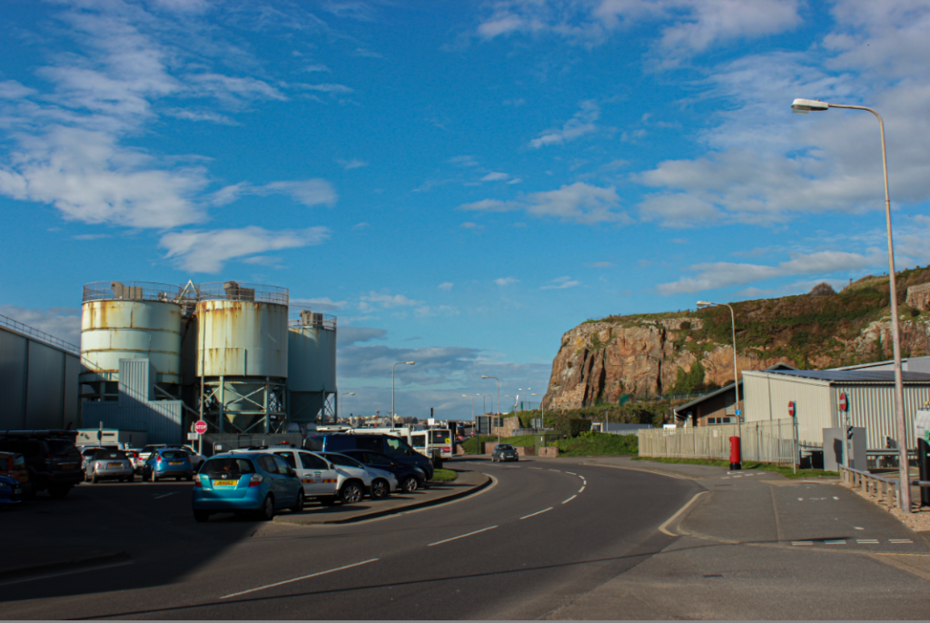
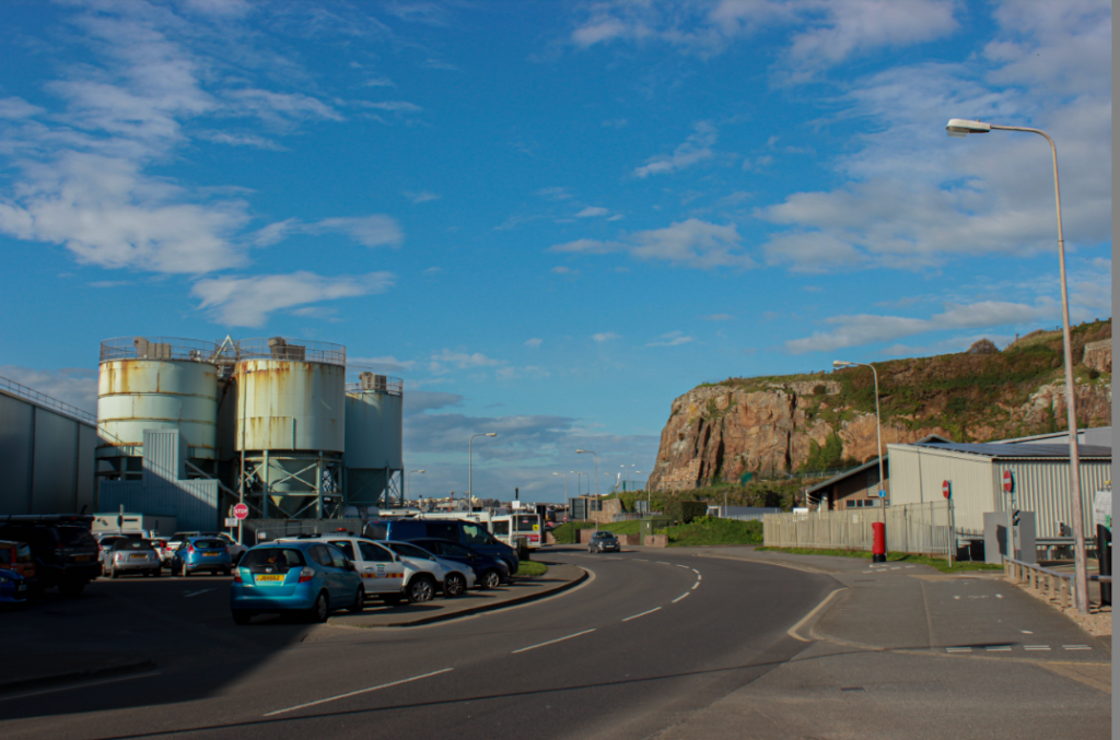
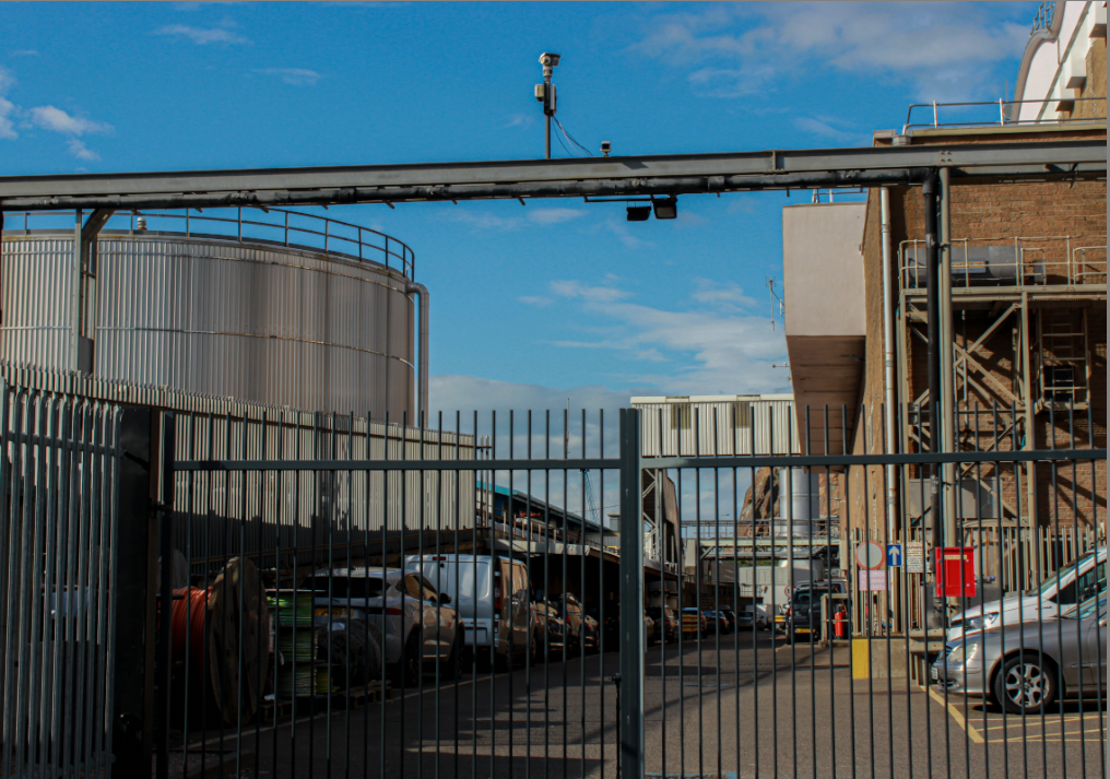
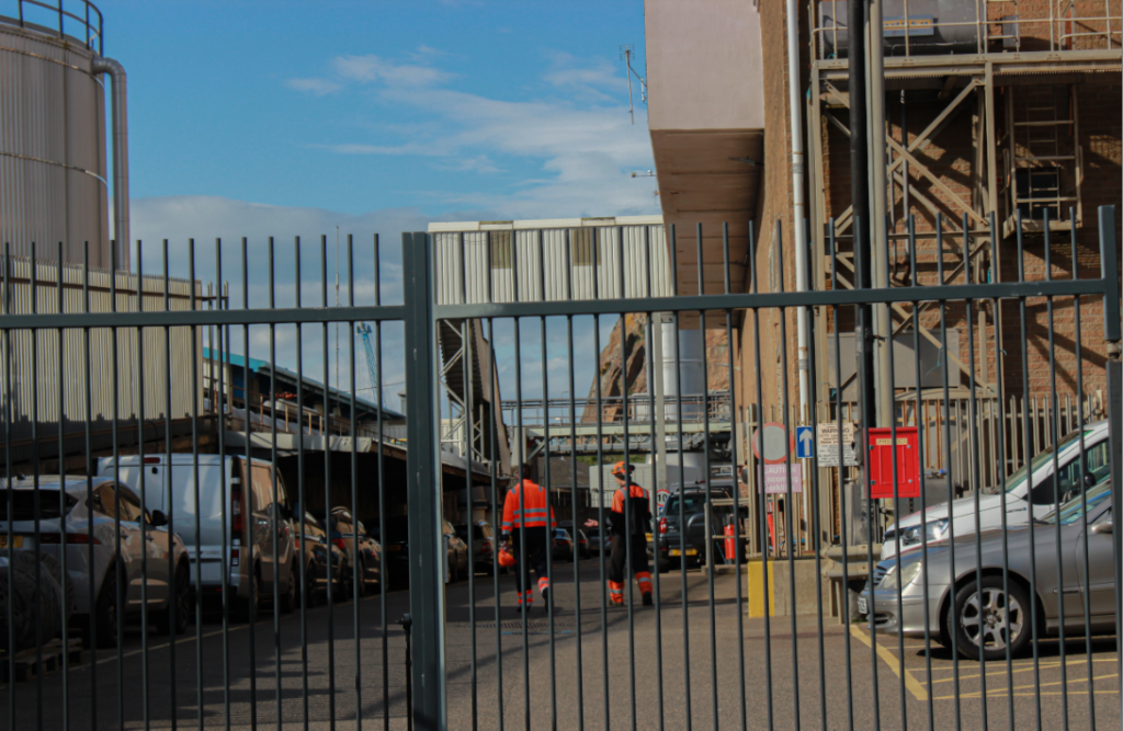
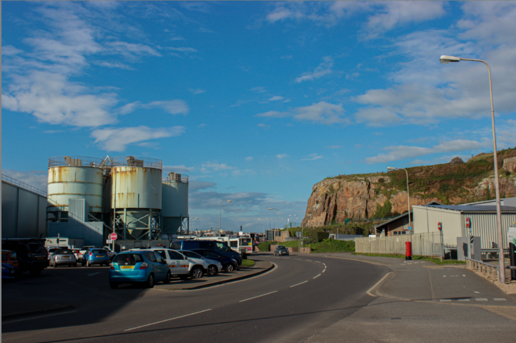
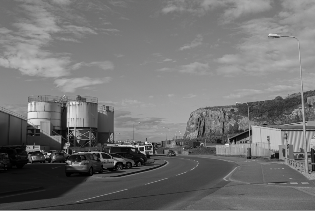
I also like the second image because it is demonstrating the divide between the urban landscape and the natural landscape. They are facing each other and this photo captures how beautiful the natural mountain is compared to the rusty and dirty machinery and how it possibly ruins the landscape by showing the replacement of natural earth, to urbanised cars, buildings and machinery. I also like the deadpan approach in this image and how is is showing the straightforward angle which gives a ‘raw’ image feeling. To improve next time I should attempt to time the photograph as to when there is no cars driving past, I also would have taken it at a more straight on and direct angle and be aware of my camera slightly slanting to one side.

My Favourite Edited Images.

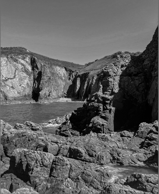
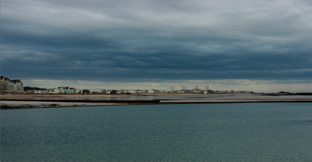
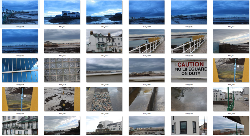
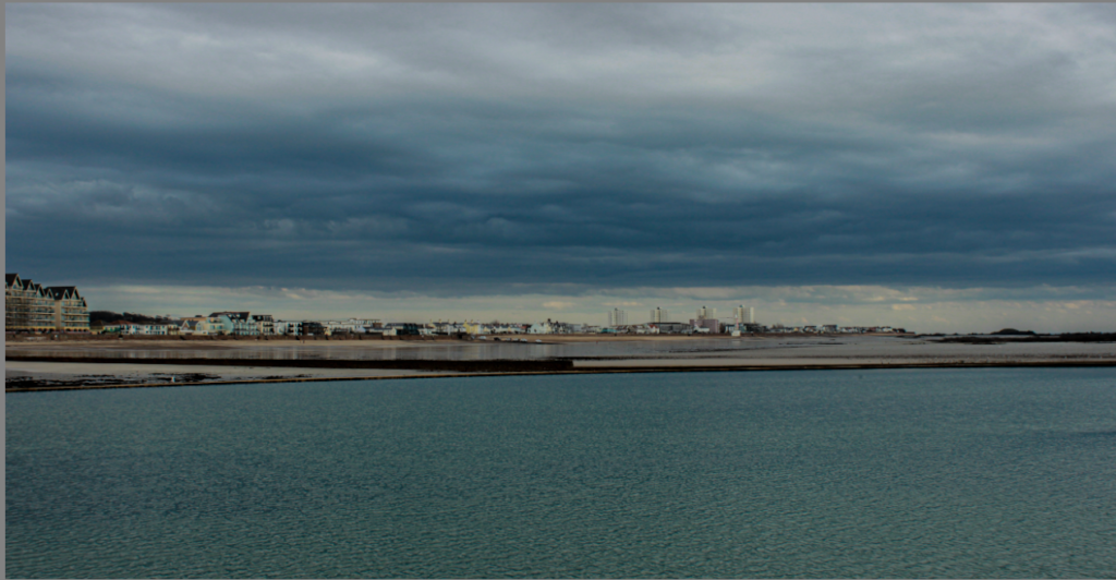
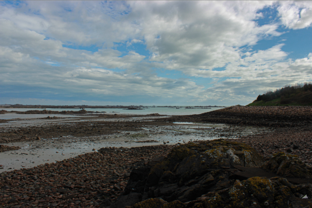
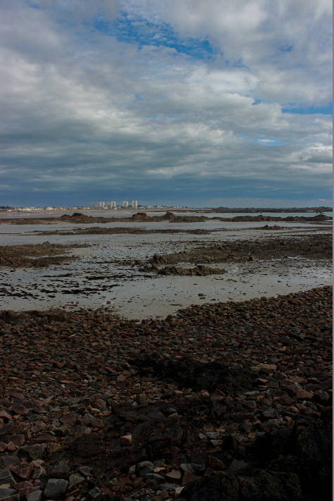
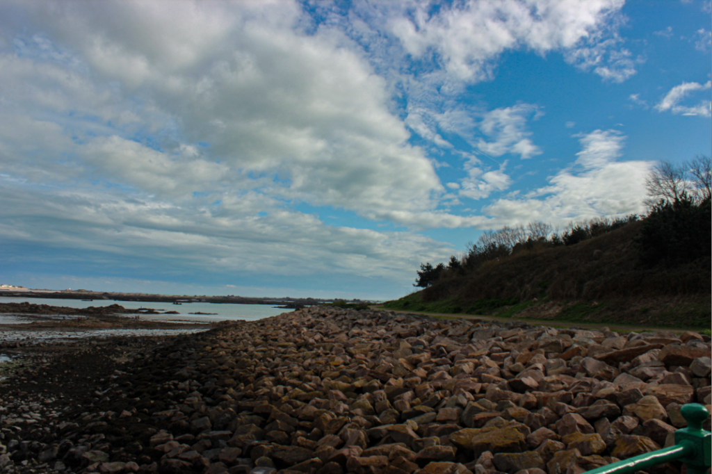
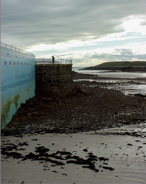
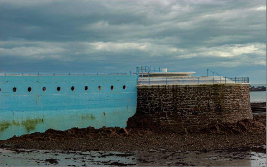
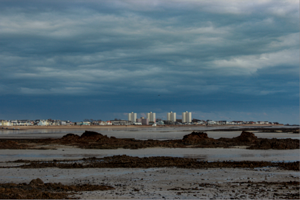
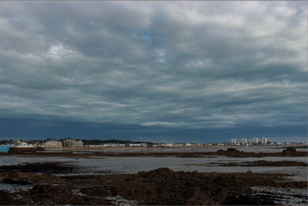
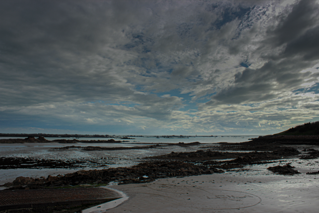
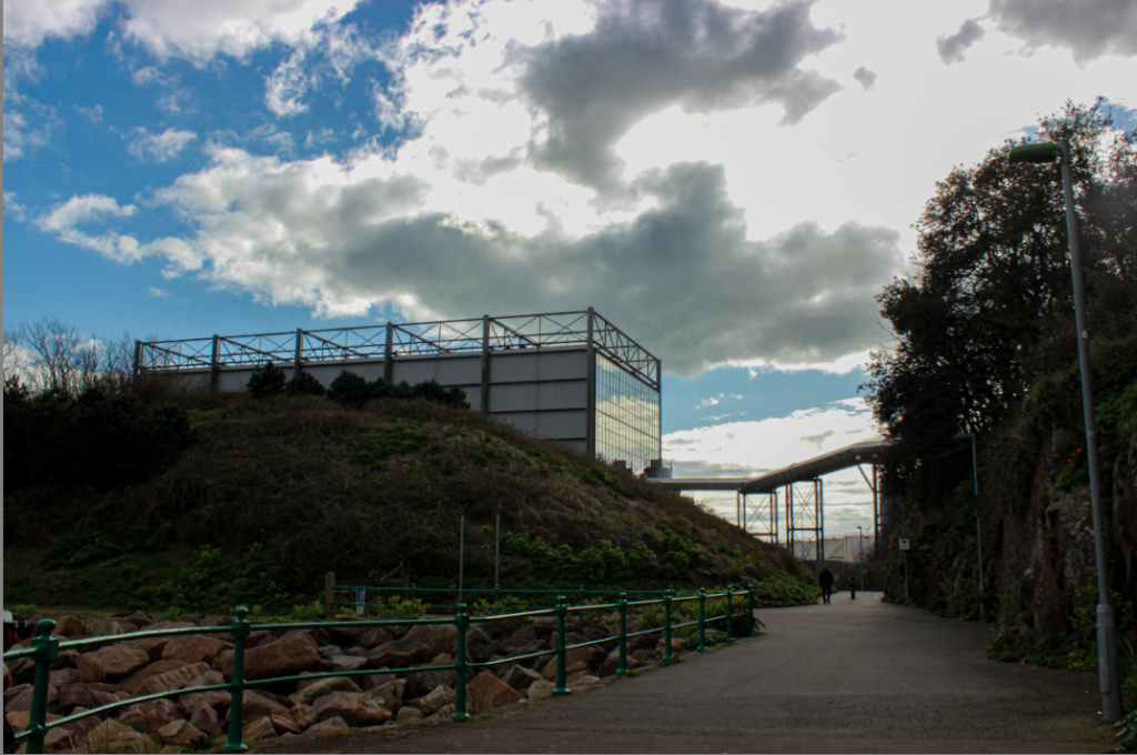
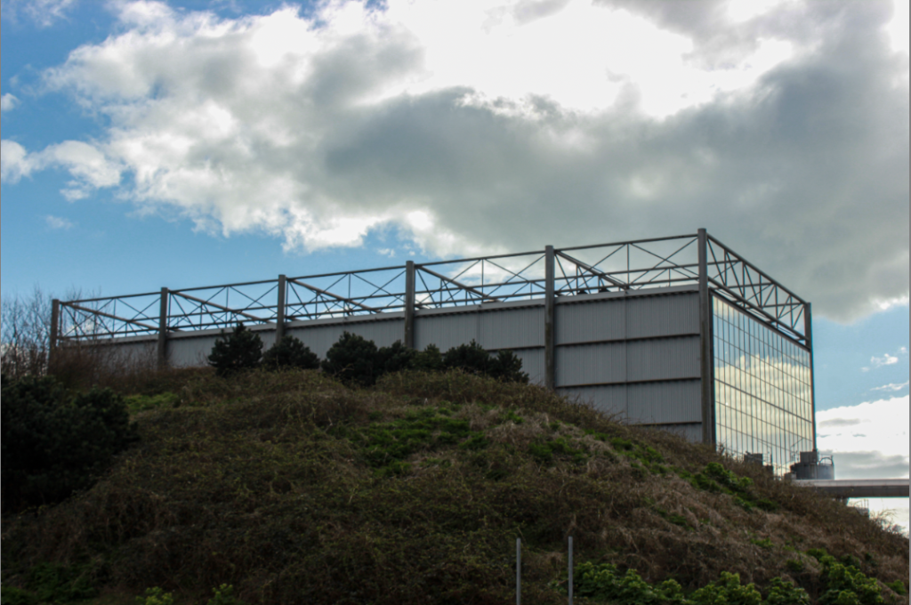
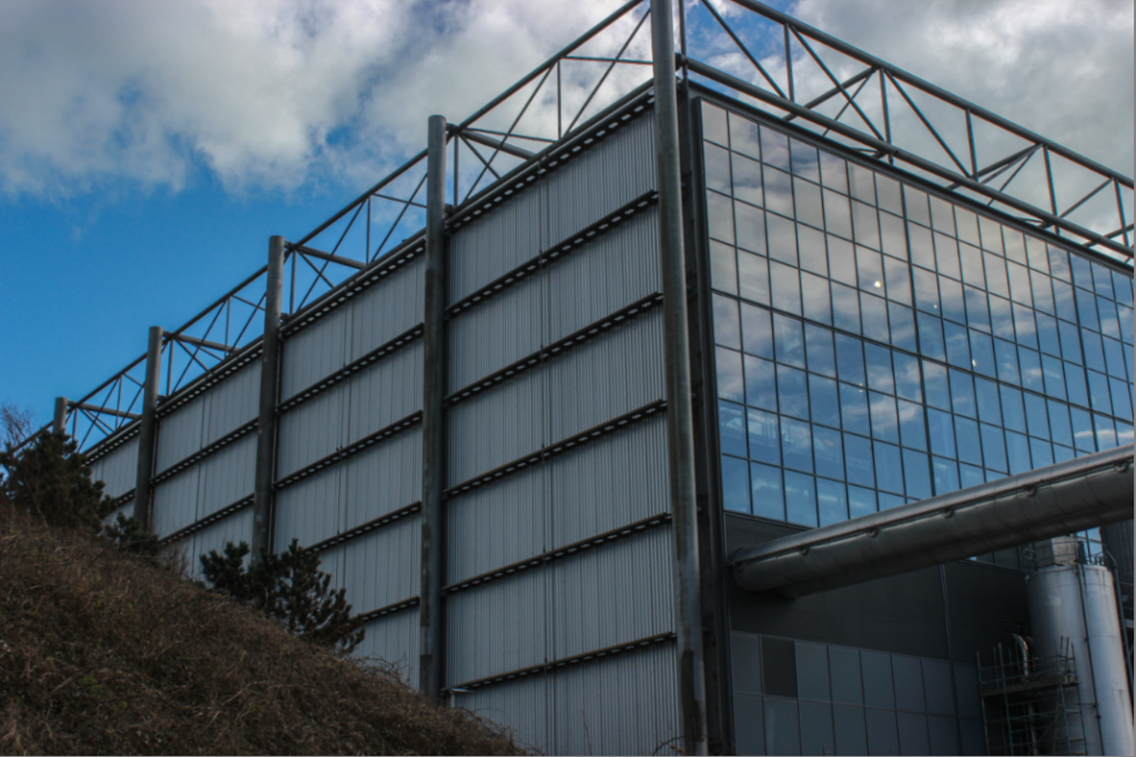
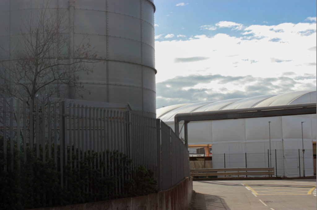
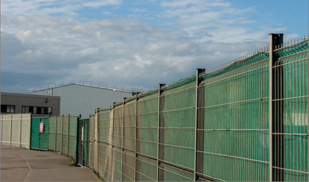
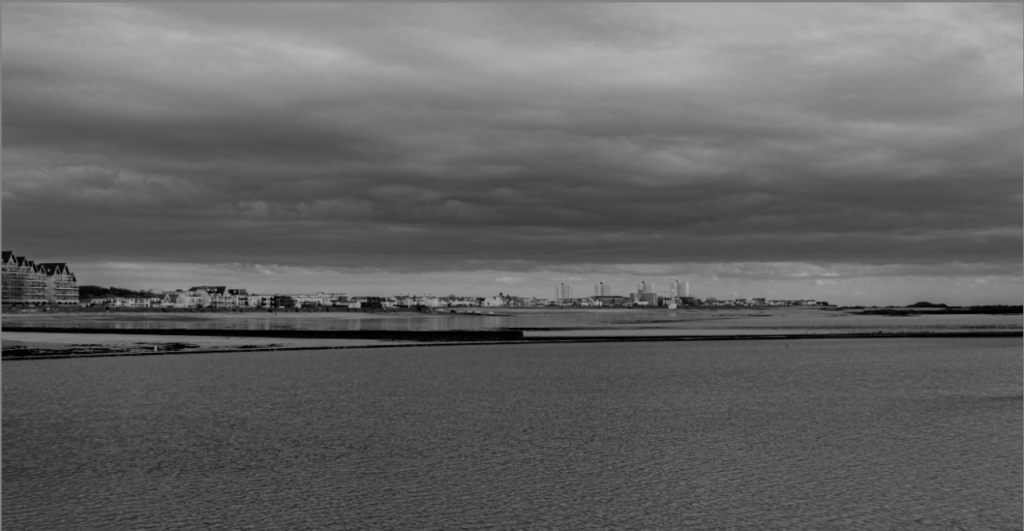
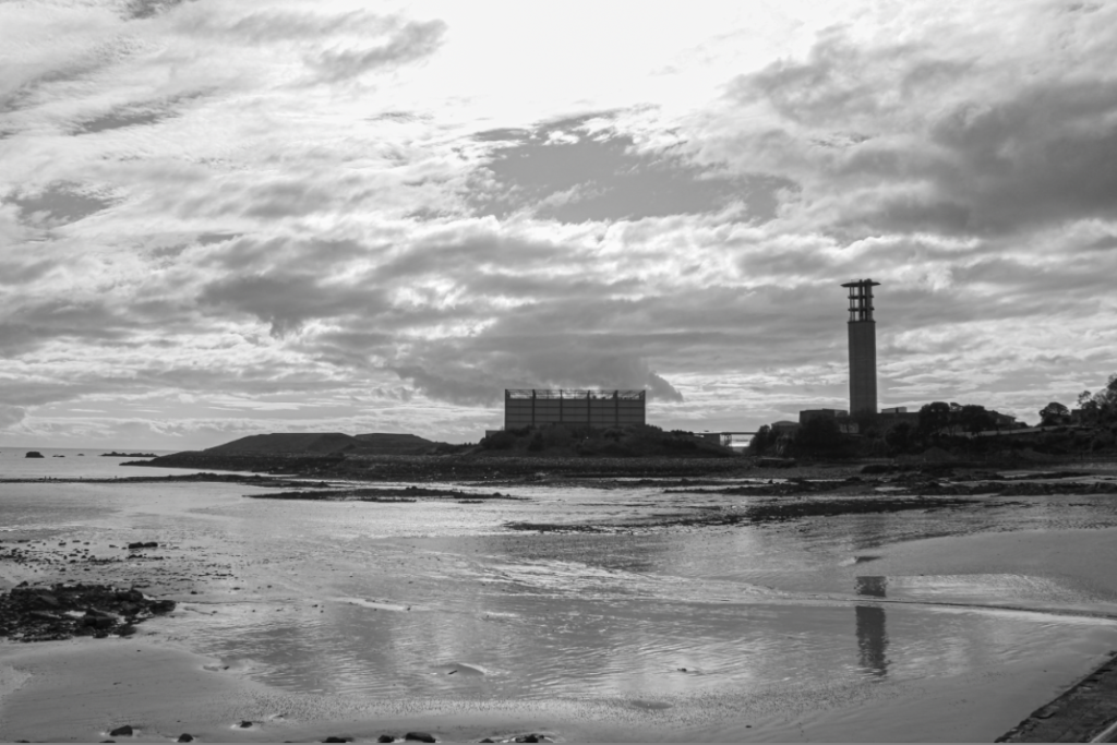
For this Havre Des Pas photoshoot, I decided to capture both natural and urbanised landscapes. I began with the beach an its natural beauty, these photos capture the sea, sand and rocks and demonstrate the natural landscapes of Jersey. My photos then progress from the original landscapes that exists before it is acted upon by human culture and into an urbanised landscape and how the action of man has such a huge consequence of the development on the territory, as a whole. I particularly like photos of the machinery and how the metal glistens in the sun, I think small effects like this create beauty even though they cause such destruction. Throughout Jersey the growth of local industries including agriculture,
tourism, and financial services has helped grow the population of the Island. However, Urban areas are major contributors to climate change, they are responsible for 71 to 76 per cent of CO2 emissions from global final energy use. I decided to focus on highlighting the beauty and amazing modernisation of technology, but also highlighting how much money, climate change, sacrifices and landscape loss goes into the industrialisation of Jersey.
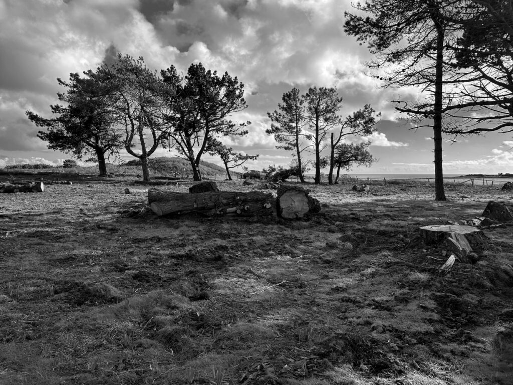
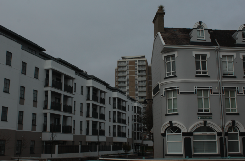
Black and White Images.
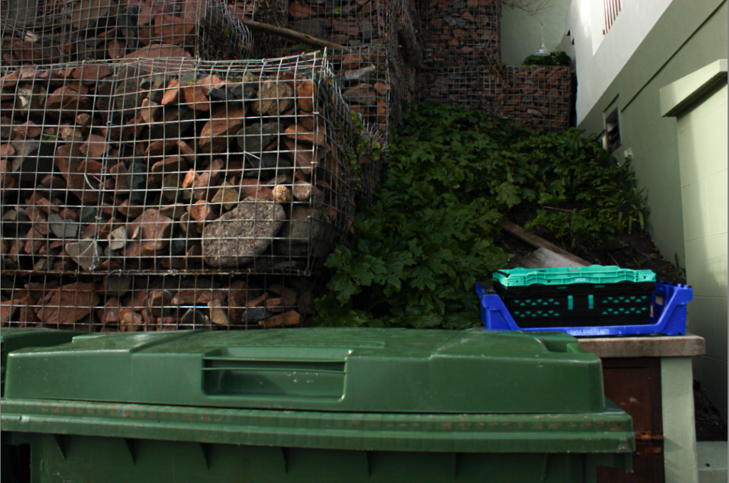
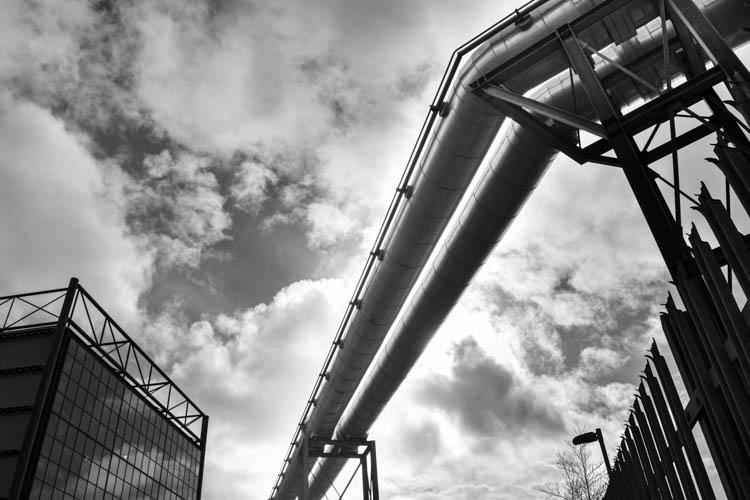
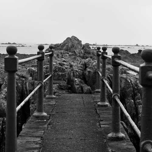
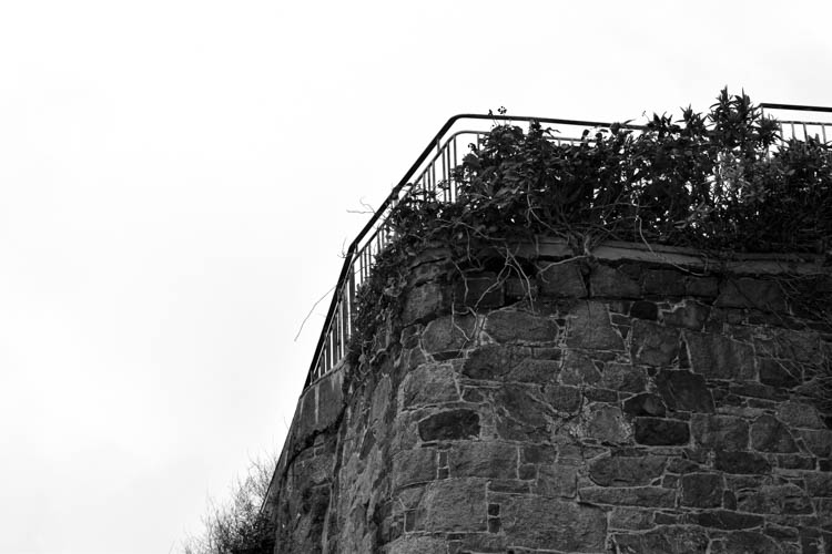
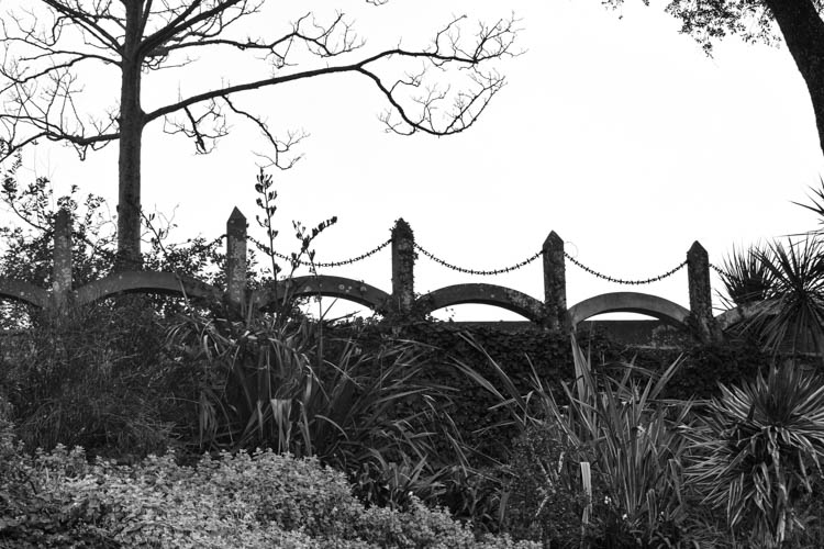
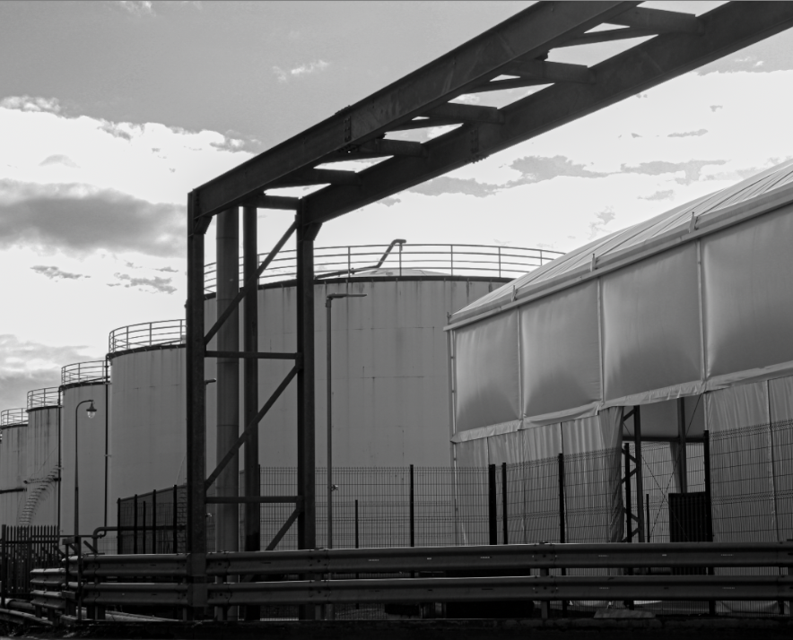
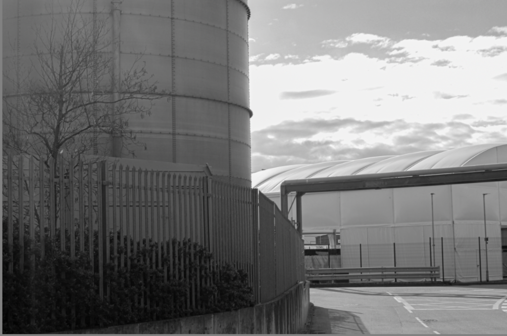
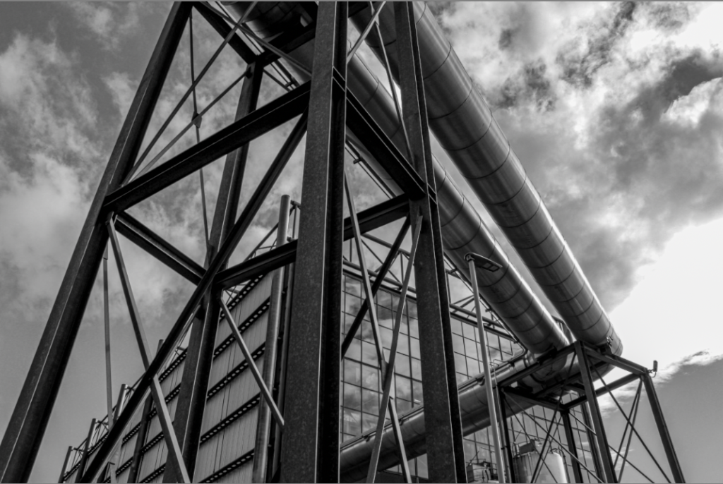
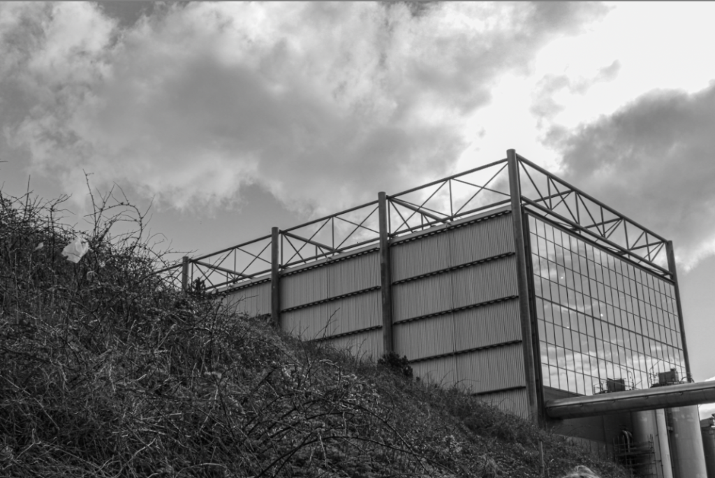
I also decided to create some black and white images from this photoshoot. This is to create a slightly more meaningful and morbid affect to the images when photographing Jersey’s landscapes and how they have been replaced with machinery. This ties into New Topographics as many of the photographers took black and white prints.

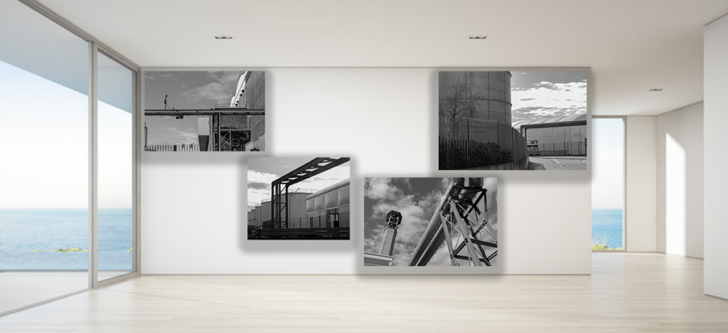
I also created virtual galleries to display my favourite photos in both black and white and colour, however, to improve I would like my photos to be a slightly better quality, this will help me to see them displayed better.