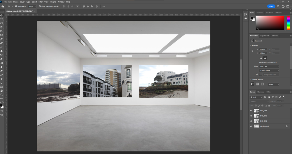
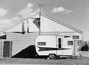
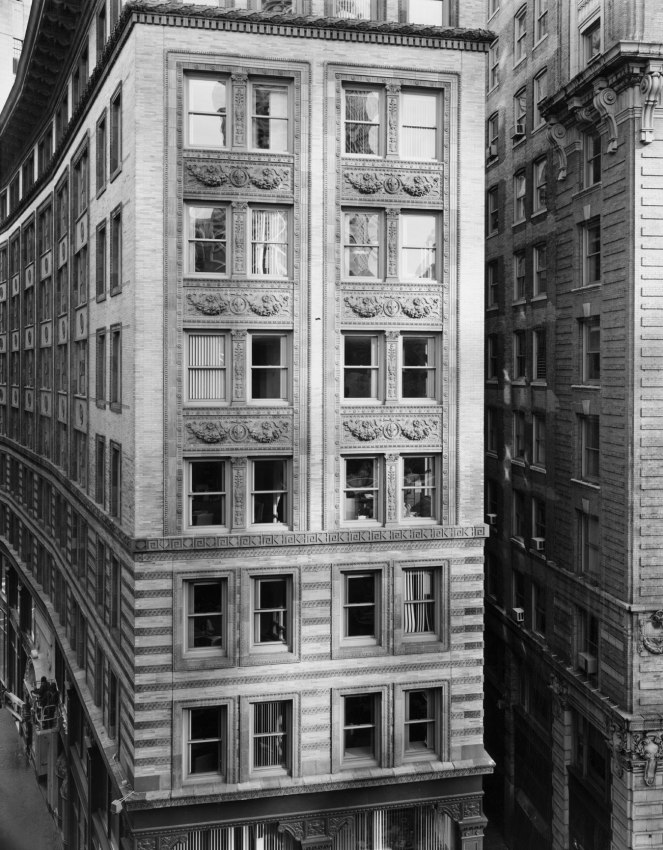
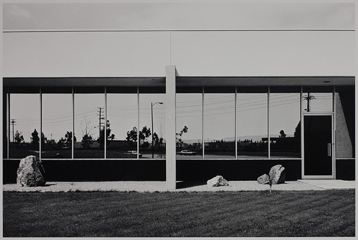
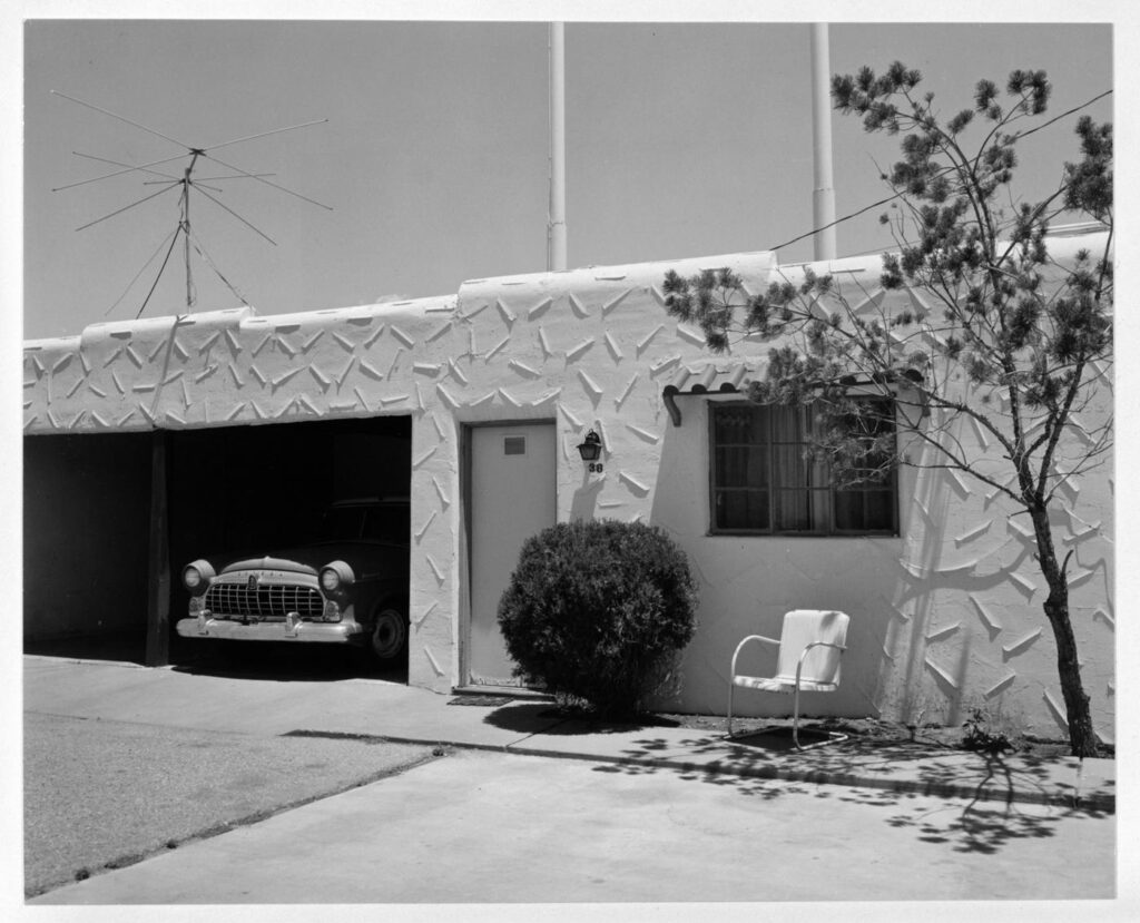
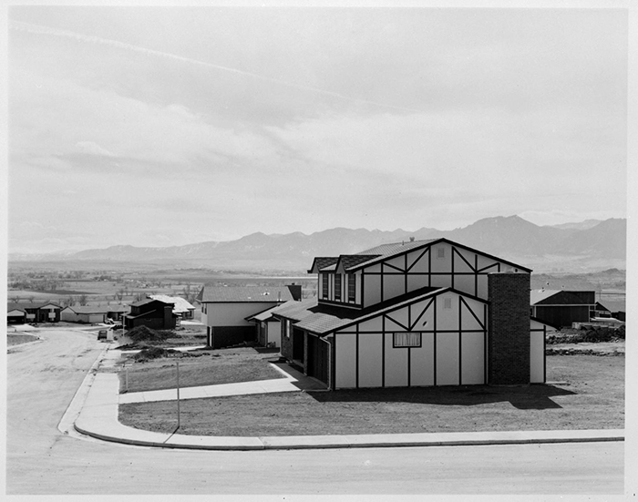
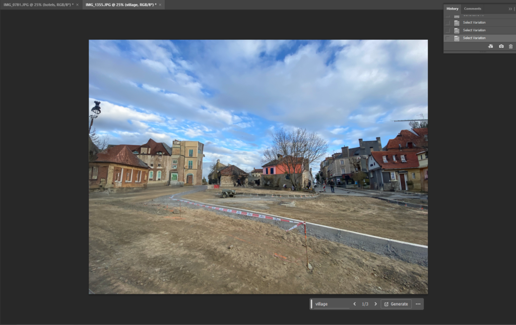
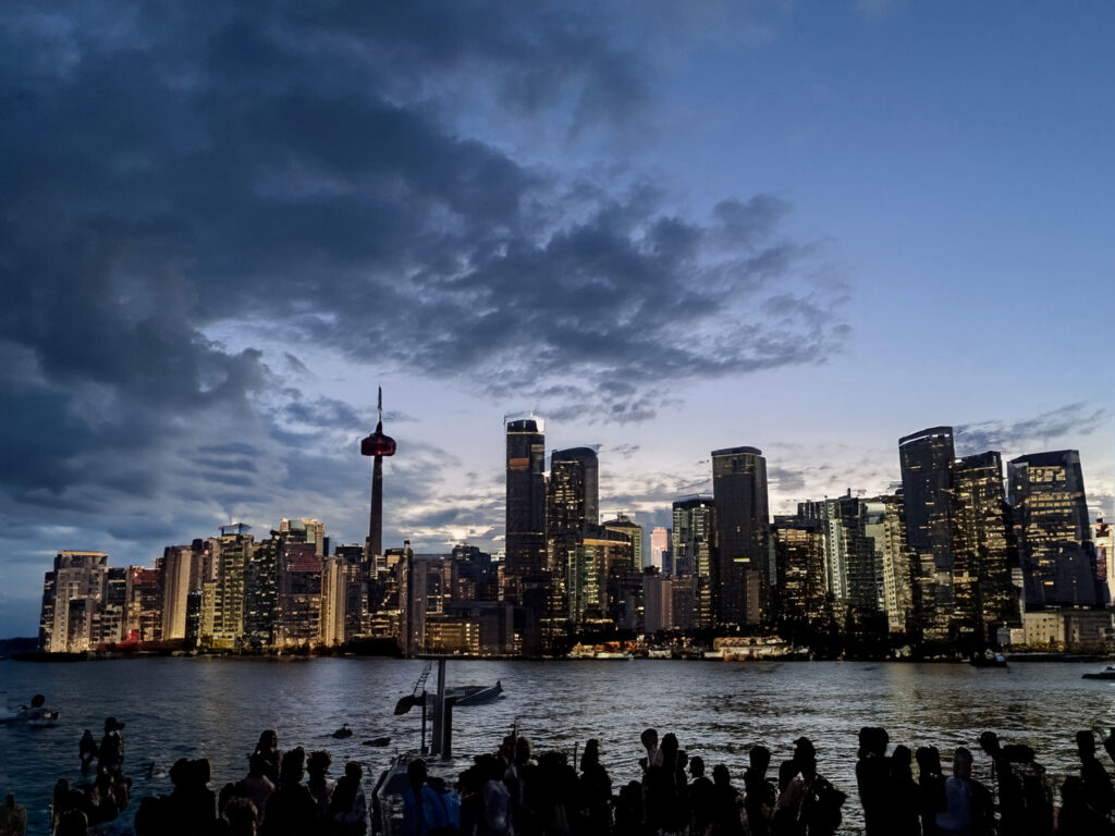
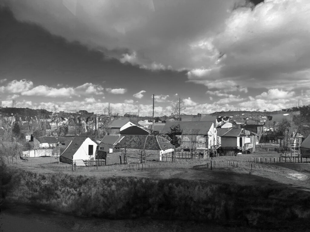
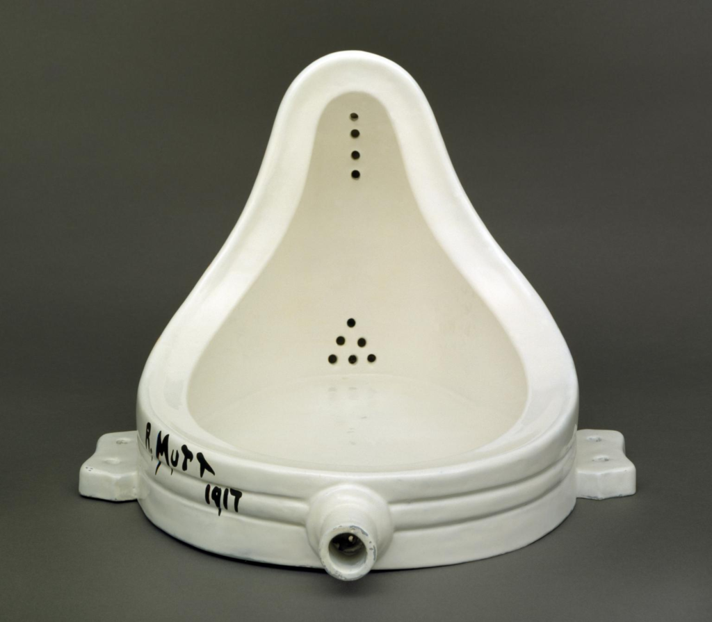
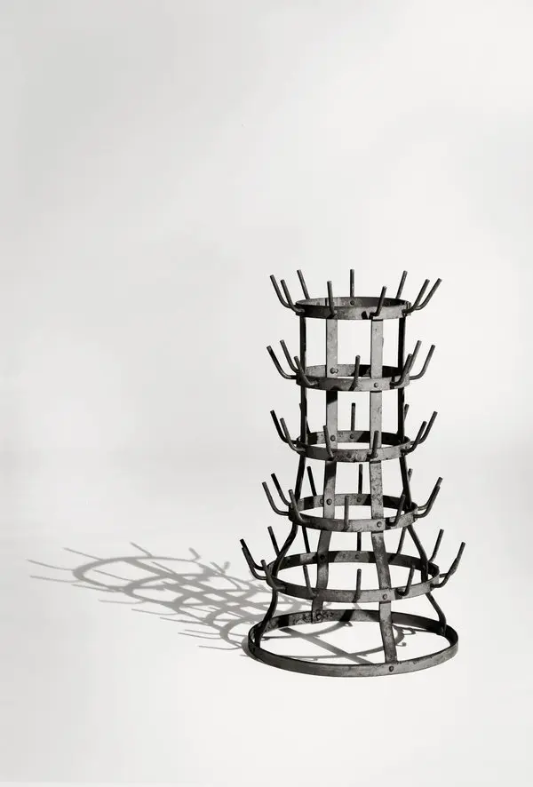
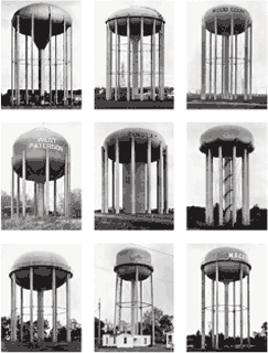
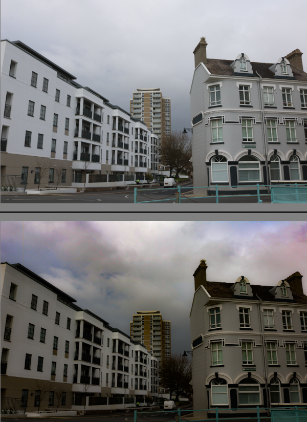
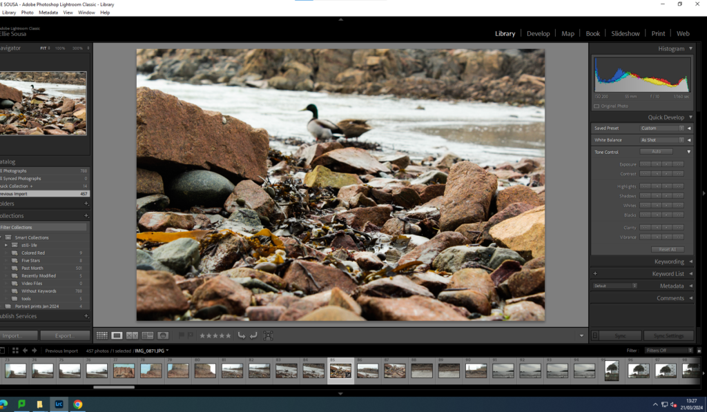
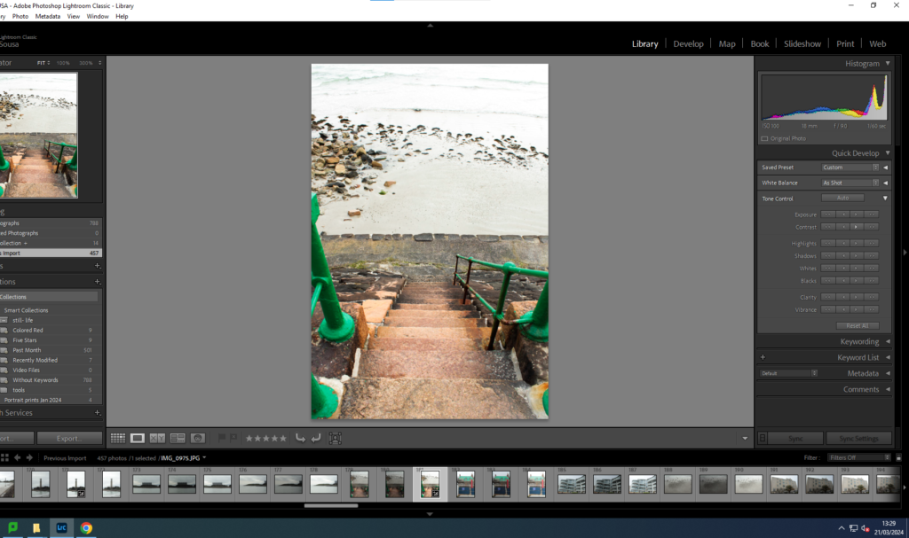
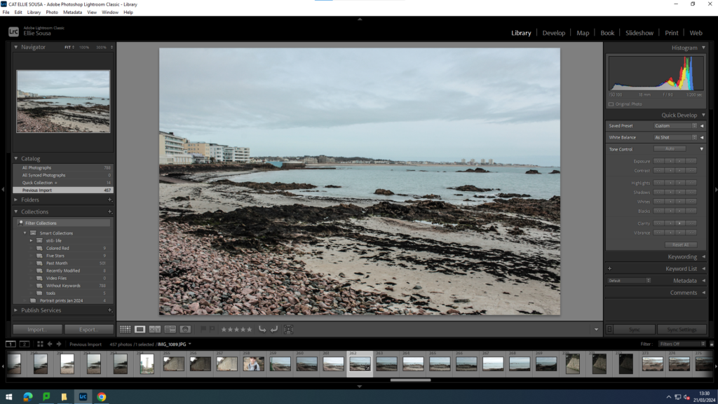
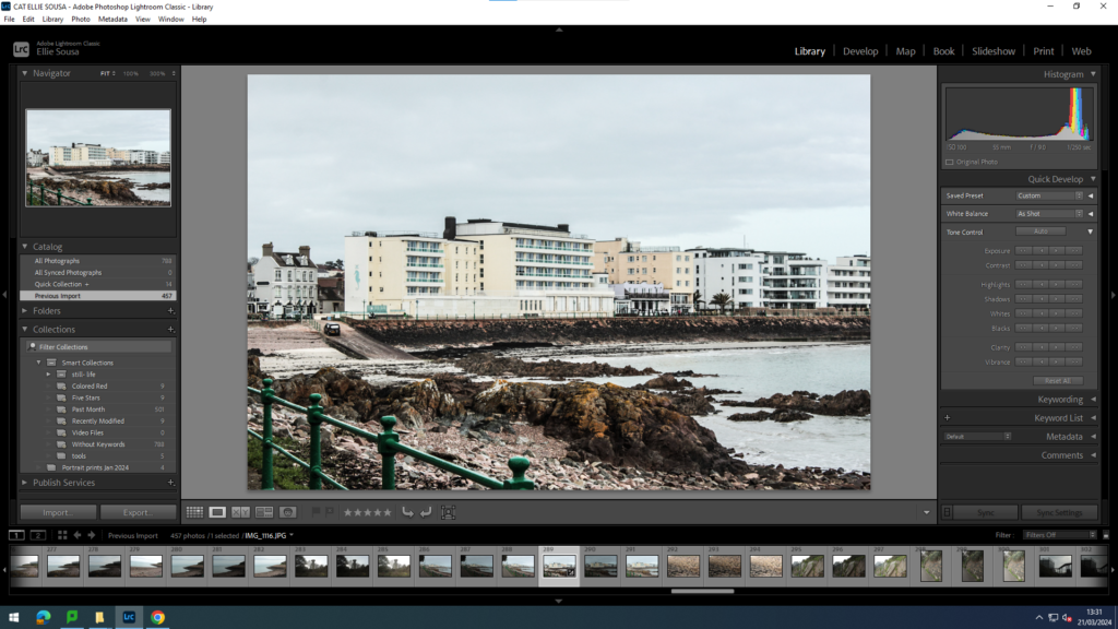
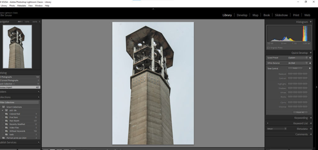
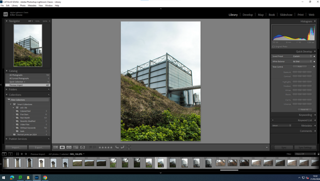
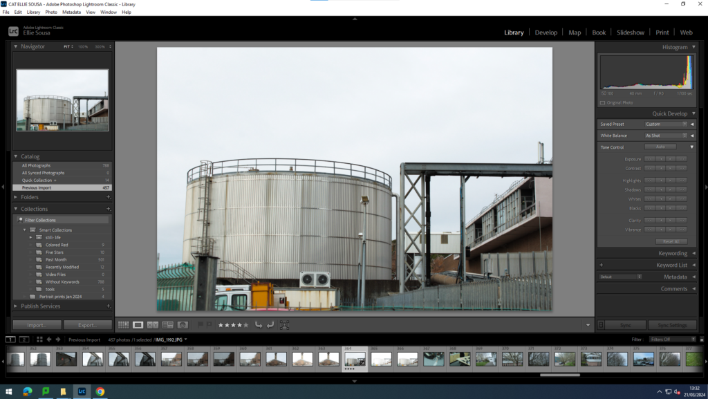
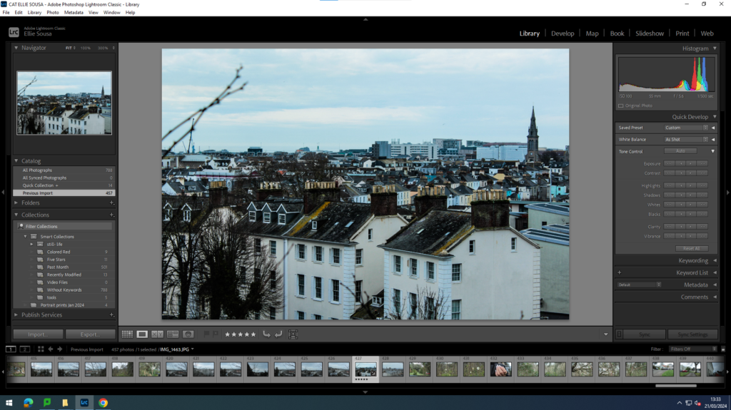
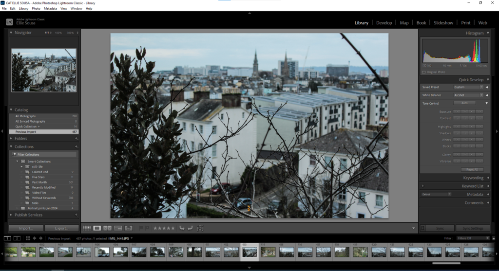
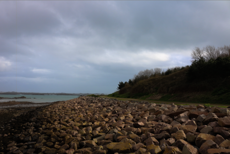
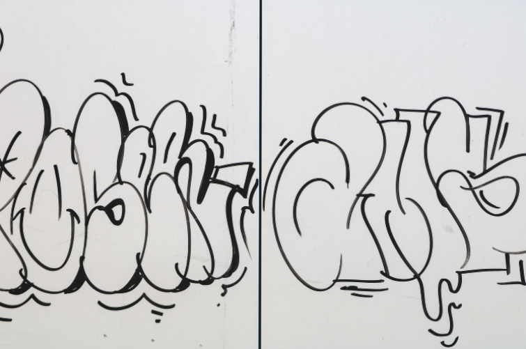
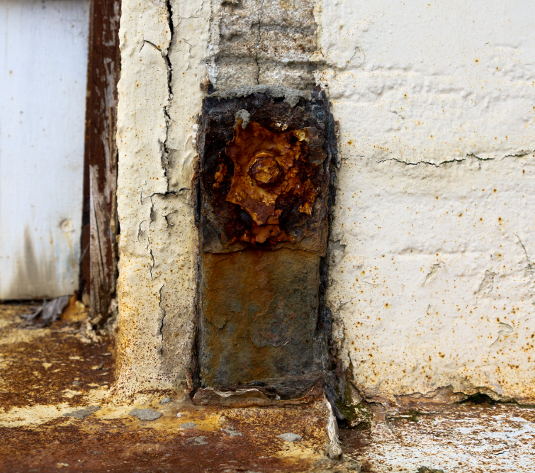
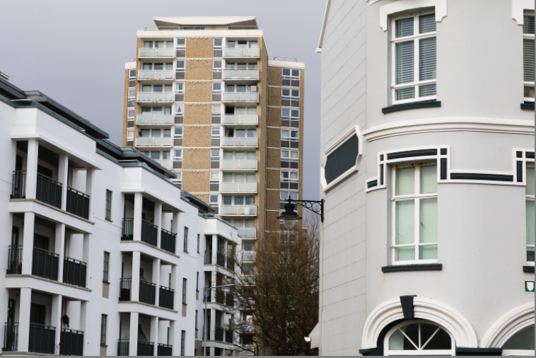
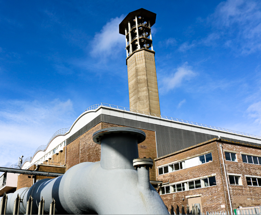
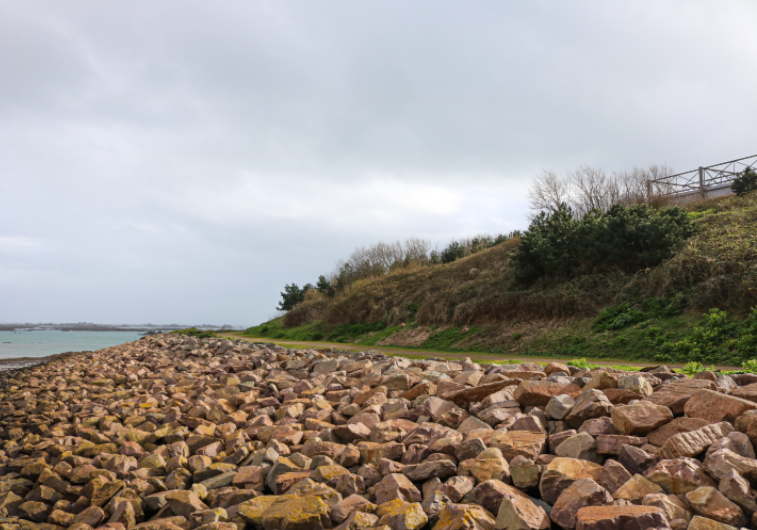
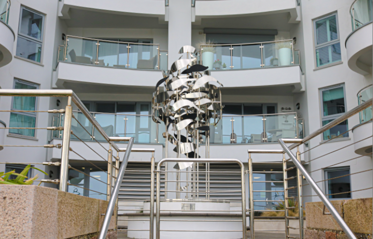
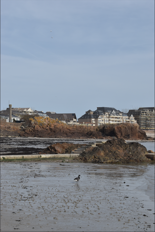
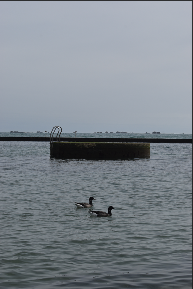
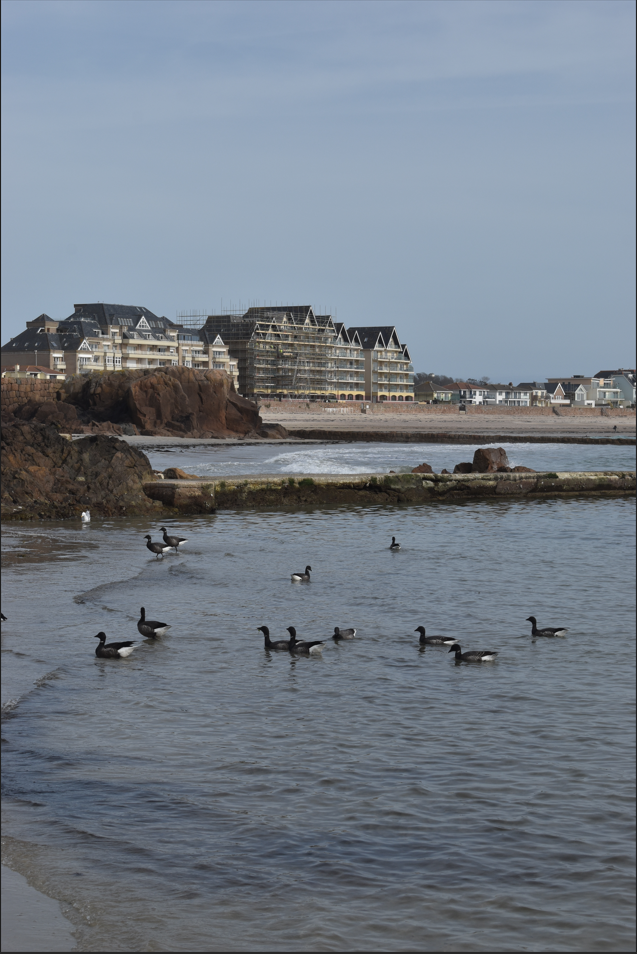
This is my New Topographics virtual gallery. I chose these images because they represent The New Topographics style the best. And with the image in the middle, the buildings range from very old to extremely modern, which suggests that the surroundings have been built up over time.
Monthly Archives: March 2024
Filters
The New Topographic
Beginning in the 1970s, a group of photographers including Robert Adams, Lewis Baltz and Nickolas Nixon were associated with the 1975 exhibition New Topographic; this was Photographs of man- altered landscapes. The exhibition displayed their work, it showed how they focused on different kind of landscapes rather than those found naturally or at national parks. They showed landscape photography in a new way, focusing on urban landscape areas around America post-war, such as suburban areas like freeways, gas stations, or industrial parks. This was a new reflection to the suburban world around them, as they began to explore different and new ways of capturing landscapes.
The New Topographic show how photographers have responded to man’s impact on the land, they began to photograph urban landscapes with human activity, rather than just natural landscapes.
This new style suggested a ‘cool detachment’ from the more perfect and pristine landscapes of the natural/ man-made world. The New Topographic showed new scenes of everyday American Landscape.
playing around with AI
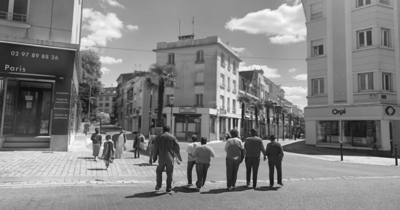
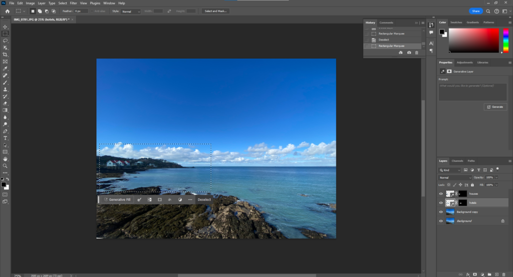
Here I’m using one of my landscape images from France, where there aren’t any people in the image. I decided to try and add some people to my image by selecting the place I wanted them in and simply asking it to put people in that space. I would say it can be difficult to add things with AI as sometimes they do what you want, I did have to ask AI different suggestions to get the best people. Sometimes the people would look at big weird and you could tell that they are aren’t real but it still adds some details to my image and with a quick glance you cant really tell that the people are fake. One negative thing about AI is they don’t always produce what your looking for, Although they do give you 3 options from you suggestion but sometimes it doesn’t do exactly what I need it to do. Making my image black and white helped to hide any odd colours added.
Here I’ve experimented on photoshop to show that AI can generate many different things. For example for one idea I can ask Ai to generate a city from 1950 and then ask if Ai can generate a city from the 2000’s to see the differences in times and how AI perspective is based on different time periods, I also used black and white photos to really show the differences between the time periods as different cameras were invented and had different affects to the photograph.
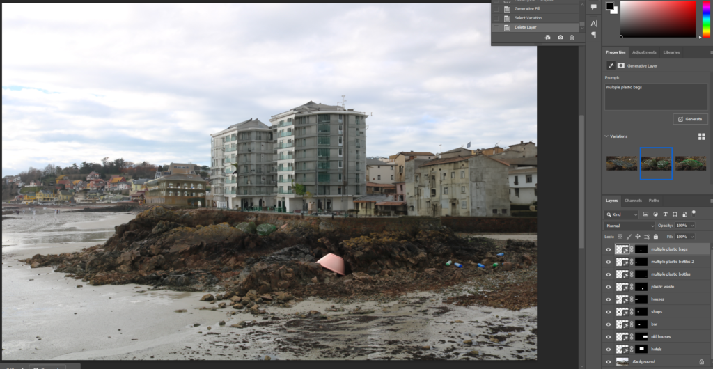
Here I photoshopped buildings around the edge of the pier and wall next to the beach and also added plastic bottles and bags around the area to show how plastic has developed on beaches and how its killing wild life and killing the earth slowly. Its a way of saying if people don’t start trying to ant to fix the world and its disasters. Instead we are making the problems worse with no shame or guilt. The world has already got many animals extinct and has global warming what else do we need to happen to get peoples attention.
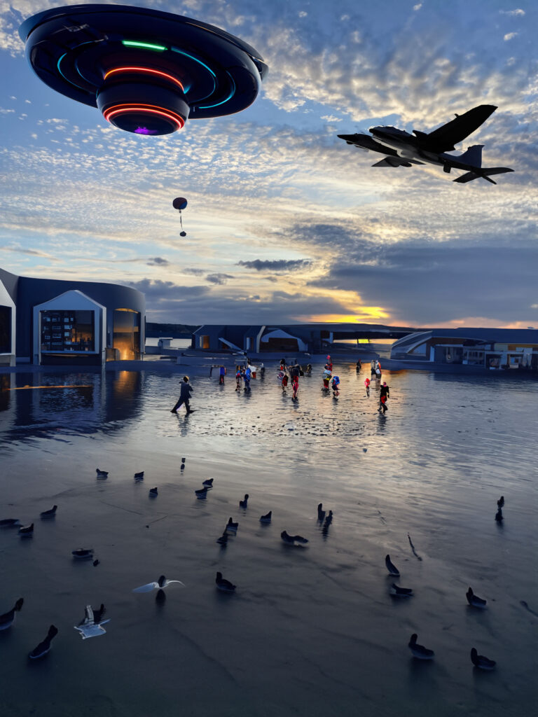
Playing around with AI helped me understand how it worked and what to do if something went wrong, this was purely just an experiment. Although AI can help add some extra details it doesn’t always have an accurate effect and can make the image look very weird. For example, on the image on the left, I tried adding pigeons, however, that didn’t go too well as most of the pigeons are just random shapes added to the bottom of my photo. I also tried adding lights to my image and it added a big space ship, which is not what I asked. Although AI is very helpful at adding and removing things it can just make the image look worse. Depending on how specific you are and what you are asking for. Even though this was just an experiment its good to know what AI can help me with.
Bernd and Hilla Becher
‘buildings where anonymity is accepted to be the style’.
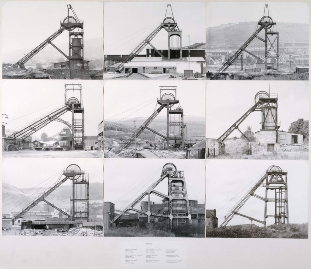
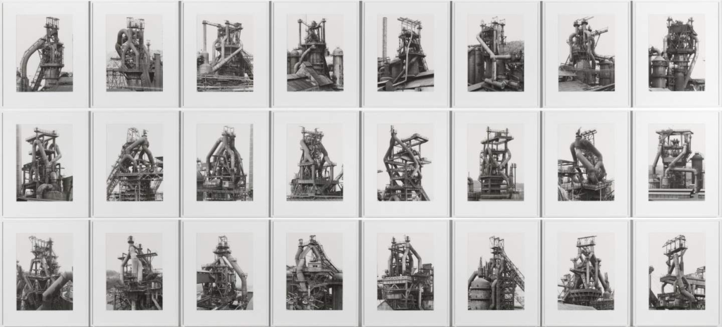
Bernhard “Bernd” Becher and Hilla Becher, née Wobeser (1931–2007; 1934–2015) were a married collaborative duo of German conceptual artists and photographers. In the forty years in which they worked together, they are best known for their extensive focuses on the disappearing industrial structures and buildings, often arranging them into grid formats. They are said to have changed the course of late twentieth- century photography and pioneering the thought behind these industrial spaces being something made, artifacts frozen in time to tell a story of history.
They originally began working together in 1959 after meeting each other at the Kunstakademie Düsseldorf in 1957. Bernd began as a painter whilst Hilla was a trained commercial photographer, marrying after two years. The documentary style of their images were of water towers, coal bunkers, gas tanks and factories just to name a few, presented in black and whit in the form of typologies. These images never including people and just focused on the industrial structure. These images focused on Western Europe and North America where the modern era was fuelled. The Becher’s tended to call the subjects of their work ‘anonymous sculptures’, leading to this referral, and produced a very successful photobook of these images in 1970. This meant that in 1990, they received an award at the Venice Biennale for sculpture due to the powerful ability they had to illustrate the sculptural properties of architecture in such an aesthetic way. The themes represented in their work was commonly about overlooked beauty and compiling an in-depth study of the intricate relationship between form and function. This addressed the effect of industry on the economy and environment.
Each 40 x 30 cm
Typologies:
a set of images made with a common subject or idea in mind, repeated through out the set.
One of the first photographic typological studies was by the German photographer August Sander, whose epic project ‘People of the 20th Century’. He produced a large volume of portraits entitled ‘The Face of Our Time’ in 1929. Sander categorised his portraits according to their profession and social class. This methodical and disciplined approach later influenced many other photographers at an enormous scale, notably Bernd and Hilla Becher. Each image is replicated in a consistent style, shooting from the exact same angle and distance from the same building, documenting how the building would change over time going unnoticed. This not only makes the viewer become more considerate of their surroundings, but question the subject’s reasoning/place in the world. It also invokes questioning revolving around the rate at which we develop as a society – for example these industrial structures are being taken down for developments to move towards urbanization and modernization. Bernd and Hilla Becher also used this technique to group images together of structures that had similar styles, just with size differentiations, yet still keeping that structure consistent throughout the grid. Each subject has a relationship with the other.
They used a large-format camera and carefully positioned it under overcast skies. This was necessary to record shadowless front and side elevation views of their subjects in a deadpan way.
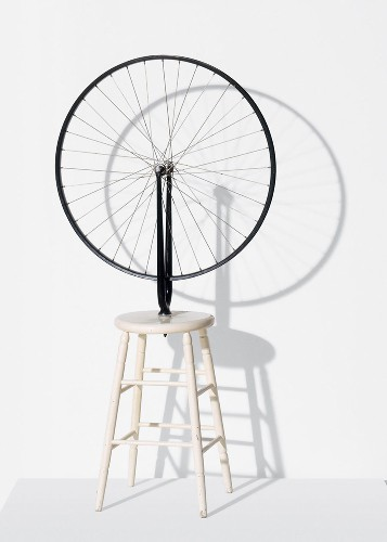
Their key pieces of work began with their first photobook in 1970 named ‘Anonymous Sculptures’, being their most well-known piece. The title was chosen through not only the referral of their images as ‘sculptures’ but due to Marcel Duchamp’s ready-mades:
This noted that the Bechers acted as if these industrial pieces of history were like found objects. This photobook acted like an encyclopaedic inventory, documenting kilns, blast furnaces and gas-holders, categorising them into their related sections.
Bernd and Hilla’s work left a legacy that led to influence minimalist and conceptual artists such as:
- Ed Ruscha
- Carl Andre
- Douglas Huebler
Alongside being photographers themselves, they were also professors at The Dusseldorf School of Photography, continuing to influence their German students such as Andreas Gursky, Candida Höfer, Thomas Ruff and Thomas Struth. Bernd died on June 22, 2007 in Rostock, Germany, while Hilla died on October 15, 2015 in Düsseldorf, Germany. Today, their works are included in the collections of the Art Institute of Chicago, The Museum of Modern Art in New York, the National Gallery of Art in Washington, D.C., and the Tate Gallery in London.
Urban Landscape Photoshoot
Urban Landscapes Context
What is the meaning of urban landscape photography?
Focusing on the study of objects and elements in urban environments, urban photography usually emphasises the surroundings and uses them to make statements about time and place. People are not always included in the images, unlike in street photography.
Photographs of things you wouldn’t normally give a second look as they aren’t usually seen as’ beautiful’ or fit into the standard of ‘pleasing’ to look at. However, famous photographers successfully execute this idea by using man-made features or un- aesthetic atmospheres.
Urban photography is a genre of photography concerned with capturing scenes from urban spaces, such as towns and other ecological spaces. It has become more popular over the years as the world has become more urbanized. It is an interdisciplinary study which links to landscape and street photography.
CONTACT SHEET-
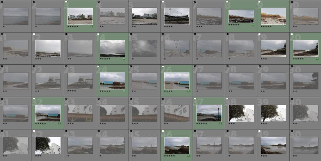
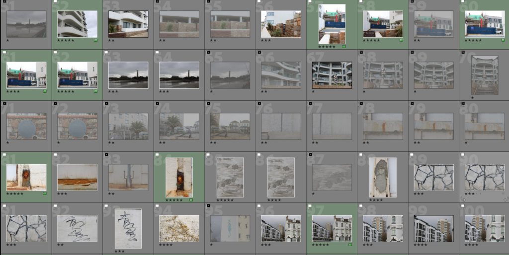
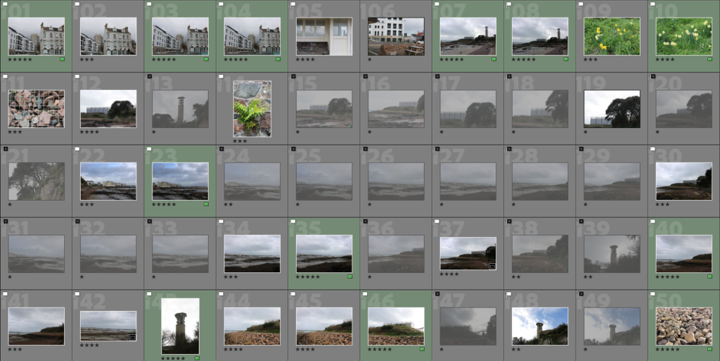
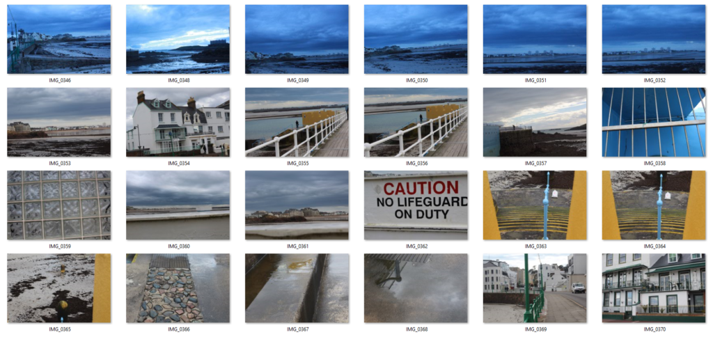
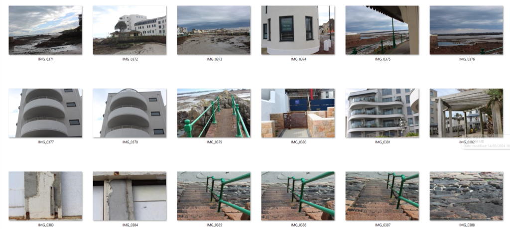
Firstly, I went around Havre De Pas and attempted to take urban landscapes obtaining natural scenery as well as industrial and man -made features. To help organize these images I started by flagging and rejected them therefore being able to give them the correct amount of stars. To finish this off, I lastly flagged my five star images green as they are my preferred ones therefore it will be more time efficient and easier to edit my favourite pictures therefore have a choice to pick my favourite one in the end of this project.
EDITING –
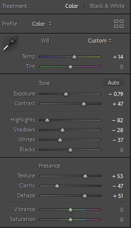
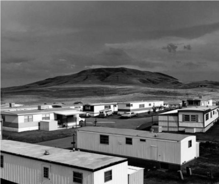
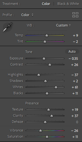
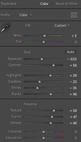
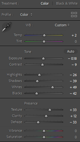
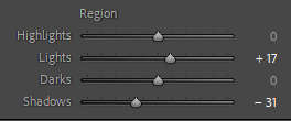
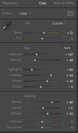
I chose this image as it obtains natural scenery such as the sand, seaweed etc and man-made features such as housing. The most interesting factor is the scaffolding and the different styles and wealth within each house. This significantly shows contrast between the man-made and natural scenery which ultimately links to Robert Adam’s famous image of the housing and the mountains in the background. I attempted to emphasize the clouds to make the image more interesting and eye catching to the viewer. I did this increasing the temp so it looked more aesthetically old and vintage which links to the theme of nostalgia as well as the aesthetic of the houses as they are not modern and are being renovated. I emphasized the clouds by decreasing the exposure as the image has no detail in the sky and increasing the contrast for more detail. I decreased the highlights so it looks slightly gloomy as in my opinion Adam’s images are as his work is mostly in black and white. Lastly, I increased the texture so the housing is not just the main factor of the image as the natural scenery such as the sky and sand is just as important. To do this successfully, I increased the texture to create more focus to create equality within both significant features.
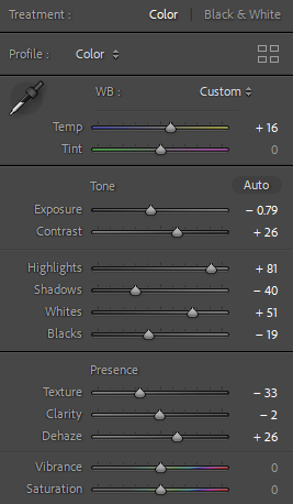
I found this image very interesting as it clearly and successfully shows different levels of wealth or how the world and humans adapt slowly throughout life. An example of this, is housing as it was traditional to have an old granite exterior and eventually it has been adapted to a modern organized dull but clean aesthetic house. This image shows the modern habits as well as the traditional habits. However the old traditional house has scaffolding around to be renovated like the other one which significantly shows the following of trends us as humans fall into. I decreased the exposure as the clouds were very white which made the image over exposed but ultimately within this image it was not necessary to over edit as there is already a lot of significant factors so I did not want to make it ‘ too much’ or over stimulated.
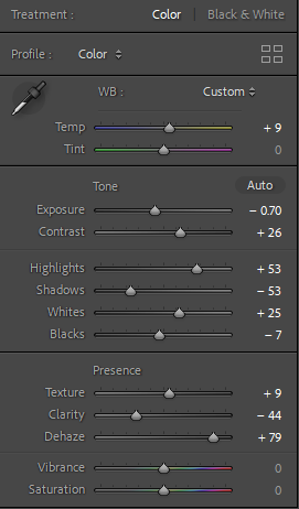
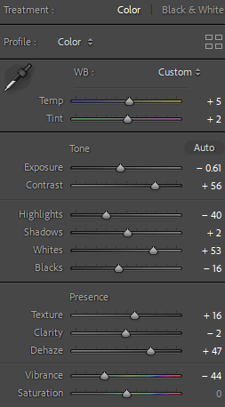
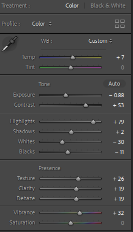
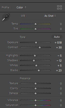
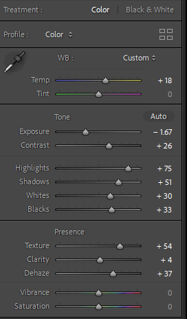
This is one of my preferred images as it contains the different stages and levels of wealth and poverty. The building on the left is modern and fits the human eye standard to this day. However the right building is more traditional and has an older aesthetic to it which is shown throughout the type of windows. the middle is a contrast of both as it is a tall structured building. All three of these buildings conflict within one another. I made the image more eye catching by lowering the exposure so it was correct for that image itself and increasing the contrast and highlights and decreasing the shadows to create more detail. Lastly, I decreased the clarity and increased the dehaze which ultimately made the sky look slightly more unrealistic however I believe it makes the image look a lot more aesthetically pleasing.
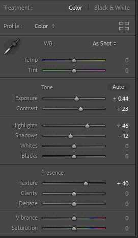
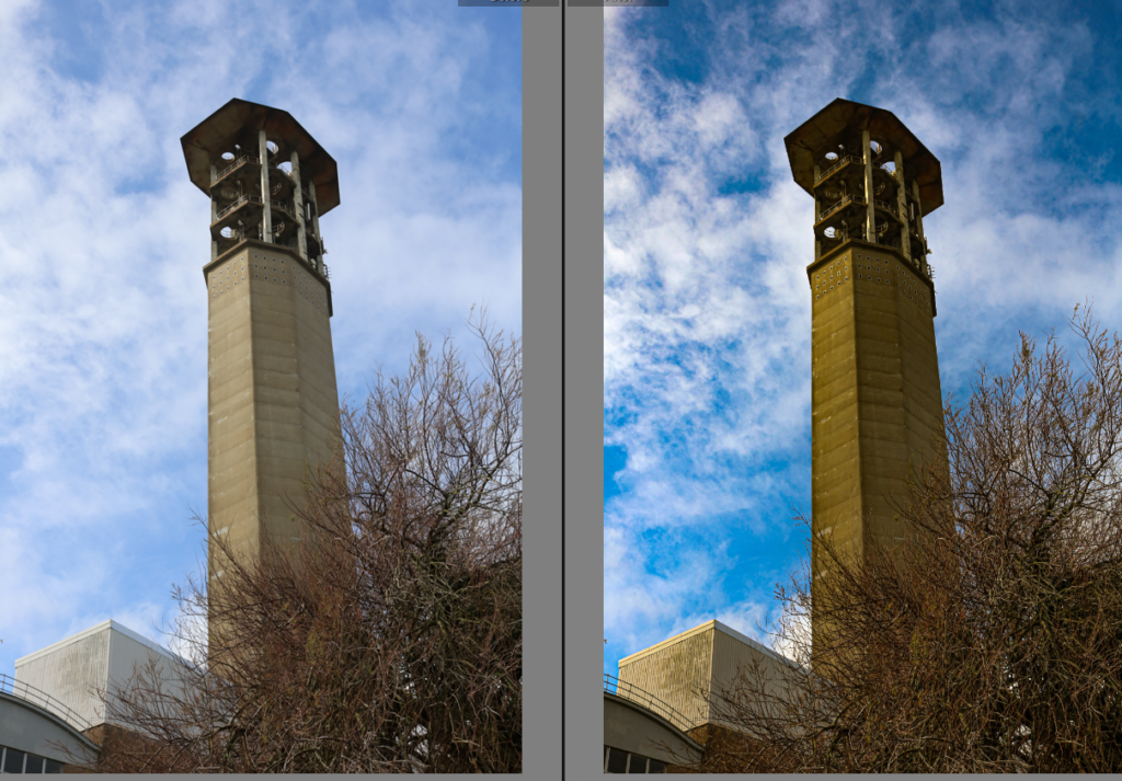
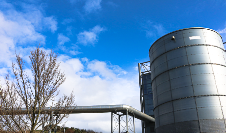
I like this image as it contains industrial subjects as well as non-man made objects that are seen as ‘beautiful’. Normally, industrial features are a necessity such as this one as it burns waste for the island. Therefore it isn’t really seen as a typical photograph you would take however Robert Adam’s took photos of a untypical photo that does not fit the ‘aesthetically pleasing’ expectation although he successfully made them interesting to look at and he grew in his career for that reason. Therefore I took this photograph as it obtains both factors and attempted to emphasize the sky to enhance the natural scenery.
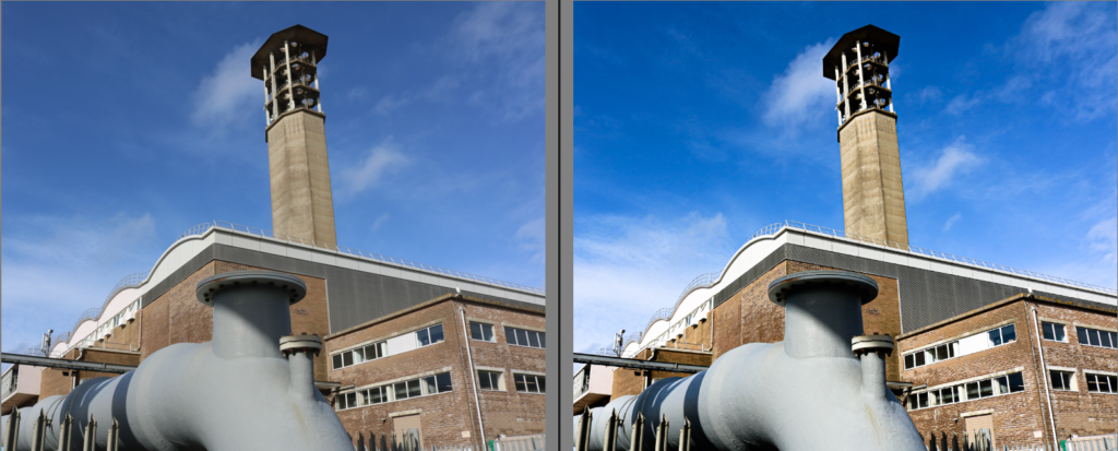
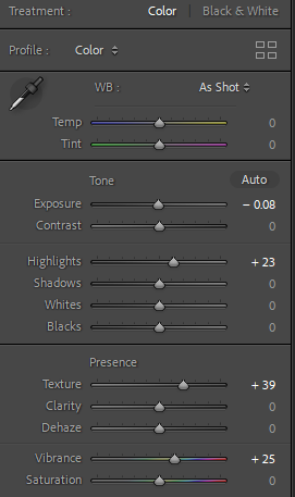
This image, to the viewer at first glance it isn’t significant. However, it isn’t necessary beautiful or pleasing in anyway but after I enhanced the vibrance and from the point of view I photographed this industrial subject it is clearly the main feature and the editing around it automatically makes the viewer look directly to this factor. This is interesting as viewers don’t normally give images like this a second glance however after editing the industrial feature to make it enhanced to make the viewer focus on it it changes the perspective. The point of view this is photographed is important as it is from the bottom looking up emphasizing the size and shape. It is also significant as it is showing what it would like to the naked eye’s perspective.
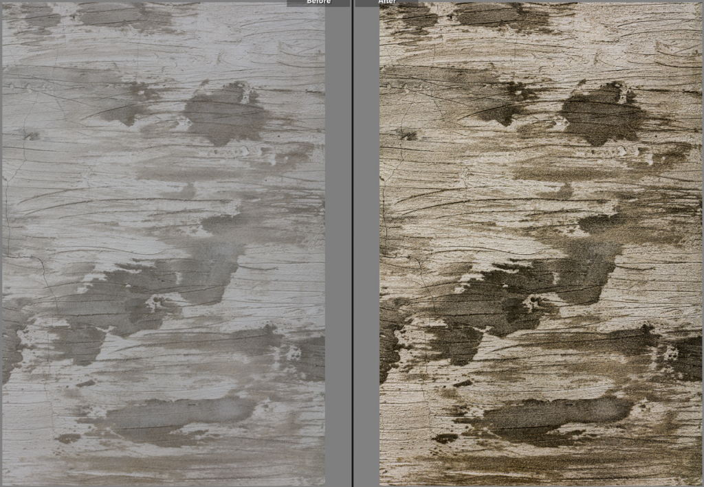
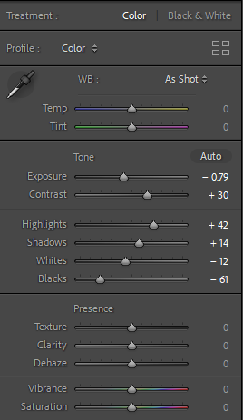
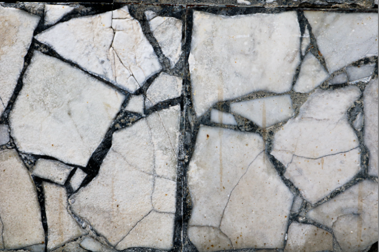
This image focuses on texture. I increased the temp to make it look older as the subject is already rusting. The most important edit technique I executed was increasing the texture as it showed the camera every detail in which the naked eye can not do as successfully.
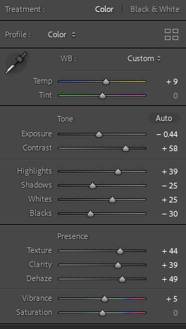
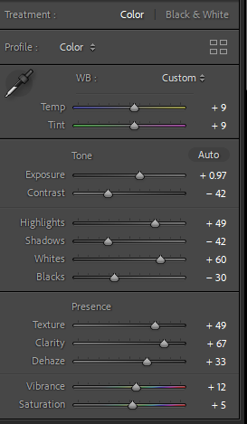
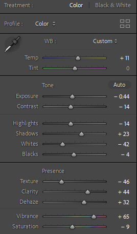
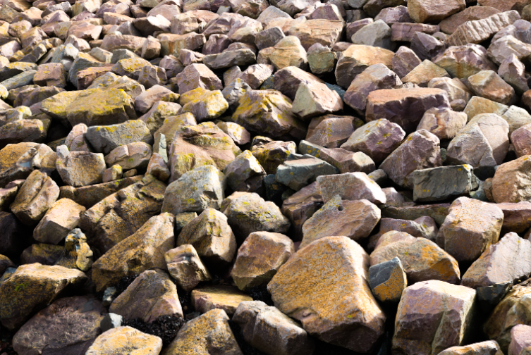
Straight away, I noticed 3 main factors of this image. Industrial, environmental/natural and textual features. An interesting part of this image is that the rocks are obviously not man-made however it is clear to the viewer they have been put around this island which was man structured and handled. This shows conflict and contrast and possibly the debate of whether it is man-made or not. We also can see the industrial building in the background which is impactful and significant as it is a necessity but not exactly seen as aesthetically pleasing or beautiful. I made this image look more unrealistic by increasing the texture, clarity and dehaze which created more detail within the texture on the rocks and enhanced the sky and clouds so the viewer wouldn’t forget about the importance of the environmental factor as they are all equally important in this specific image. Lastly, I increased the vibrance so the image looked brighter and less dull so it fit into the expectation.
A famous book- This Equals That by Tamara Shopsin & Jason Fulford
This book, shows juxtaposition and how both link and differ.
” One thing leads to another. Isn’t’ that the best way of being in the world?” Maira Kalman in response to this book.
This book, signifies and shows 2 opposite or similar images and makes you question how they are similar/different?
My response to this book –
This juxtaposition shows us rust which is the similarity both these images have. However, they are in different shapes, different textures and different lining and geometry. Although it has the same element, they are displayed in different ways. The texture tells us both of the rusts in these images would feel significantly different. The subject in the first image is more displayed portrait, although the second’s subject is not as observable and outstanding, and is rather landscape and subtle.
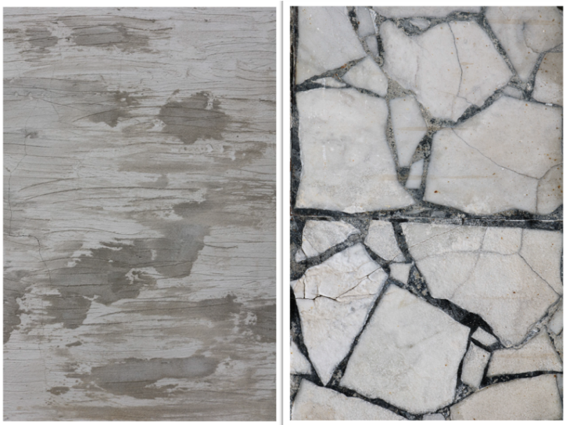
These two images have more to contrast, as they have less similar key features. These 2 images show significant natural damage. The difference is that the first one is scratches, and the second are cracks. A similarity they both have is that you actually cannot tell what each image is which keeps the viewer guessing and intrigued.
landscape photos
These were two separate shoots of landscape and nature.
Photographed at Harve de pas, la collate and near highlands college. I tried to encapture nature, background and landscape in my photos. There are many different angles with many different angles and shots. It is important to put in the time to learn the basics of photography, including the exposure triangle, white balance, focus and metering modes. Learn how to use filters such as polarizers, graduated neutral density filters and regular neutral density filters
Editing urban and industrial landscapes
What is an urban landscape?
An urban landscape means a dense accumulation of building structures with a rich stylistic variety of shapes, sizes and proportions located over a fairly extensive territory. The landscape, development block, and movement framework are the three main design elements of an urban project of any scale.
Urban photography is a genre of photography concerned with capturing scenes from urban spaces, such as towns and other ecological spaces. It has become more popular over the years as the world has become more urbanized. It is an interdisciplinary study which links to landscape and street photography.
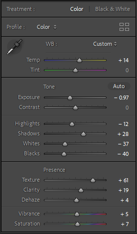
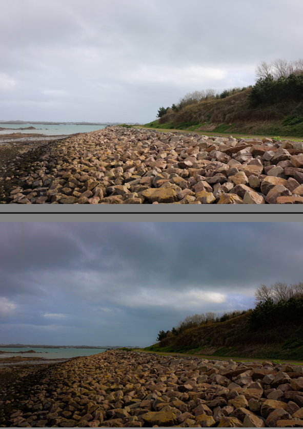
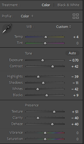
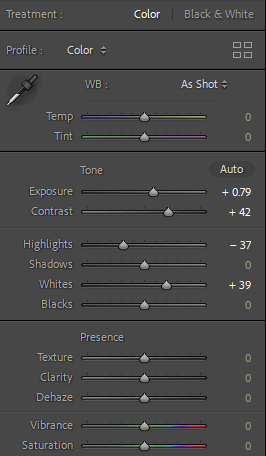
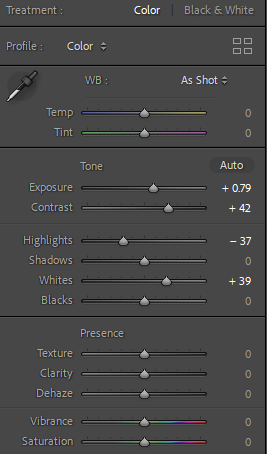
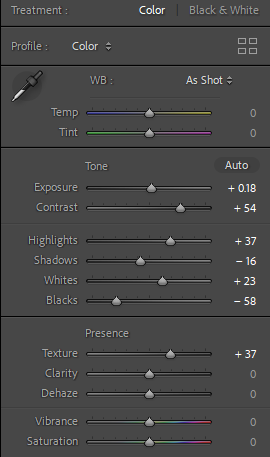
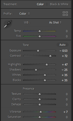
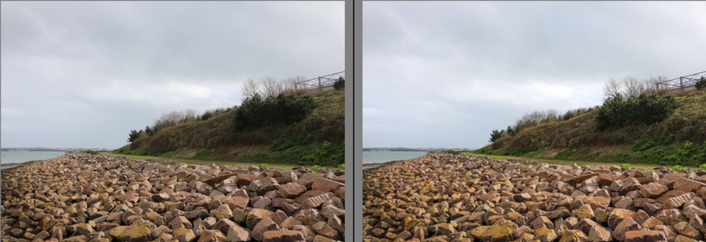
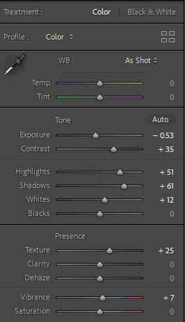
I photographed this image at a deadpan and low angle, to emphasise the different patterns and textures in the rocks, while also eye-catching the viewer. This helps bring their eye towards the contrast between the dull sky and the different sceneries such as the trees and the rocks. By increasing the contrast by a significant amount, I was able to add to this. The image is also interesting as there is a range of materials; man-made vs natural, therefore I did not want to edit it to a point where it looks surreal. To keep it realistic, I decreased the exposure in the photograph so it is possible to see the variety of tones throughout the sky, which helps add an ominous effect. However, in order for the image to not appear dim, I increased the whites which creates a bigger contrast between the shades.
For this image I did not edit too much as it is a minimalistic photograph with potential. With the colours only being black and white, this can also accelerate the modern vs industrial theme I have looked at within my photoshoots as it unites with the modern approach to many images today. I only increased the contrast and exposure to highlight the simple details, to appear more eye-catching, as well as juxtaposing the bright whites with the dark shades.
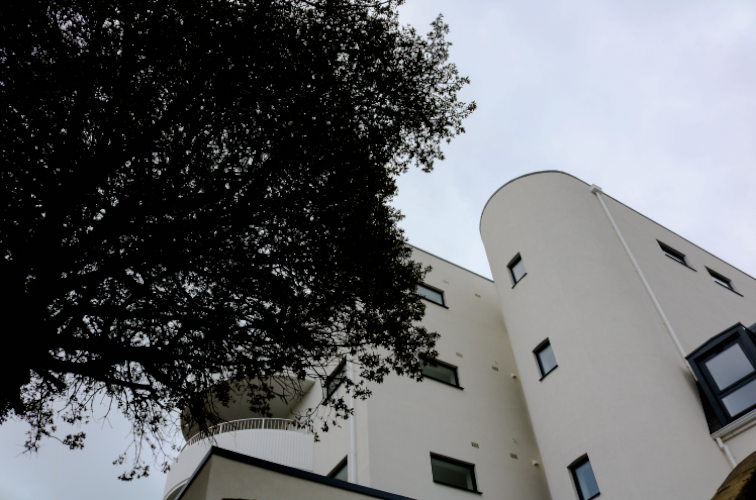
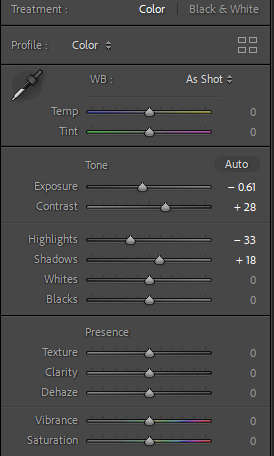
Within this image, there is another divergence between the modern and historical approach, as I have integrated the top of the apartments, where we can clearly assume they were newly built. Whereas I can infer that the tree is ancient, as it was extremely tall meaning it had been growing for decades. This adds interest to the overall outcome because by embodying ancient nature, I am able to encourage comparison of our present with our past. This can also successfully add a mood of nostalgia for the viewer. By increasing the contrast, it can foreground the plain colours in the image. I emphasised the clouds by decreasing the exposure as the image has no detail in the sky and increasing the contrast for more detail.
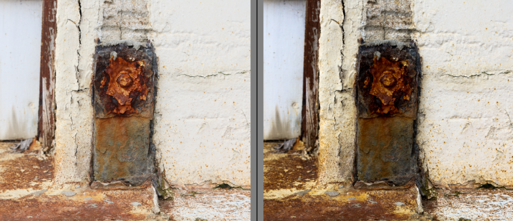
I photographed this image from As the purpose of this photograph I captured was to capture the texture, I kept the clarity and dehaze neutral, as I think it takes away from the distinctive details throughout. Therefore I made small changes like increasing the contrast in order to despair a range of tints and complexions within.
For this photoshoot we went to Havre Des Pas and took a closer look into the different urban landscapes such as industrial monuments and buildings. We attempted to focus on obtaining natural scenery (sand, seaweed etc) as well as industrial and man-made features (houses and buildings).
Within the image above, it has more man-made and modern features rather than historical which can be observed through the metal fountain as the subject of the image. This contrasts well against the other images of the natural scenery, taken by Ansel Adams. The photograph above links successfully to Robert Adams as he focused on housing as the main subject, but incorporating natural scenery in the background. My images differ from this as instead of embodying nature, I included the modern apartments.
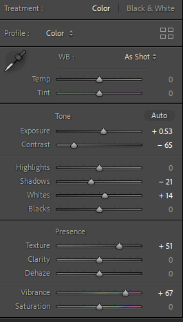
While editing this image, I increased the exposure to make the image appear brighter and reveal the details in the shadows. I wanted this photograph to appear bright as it contradicts the white buildings and the shiny monument in the centre. I decreased the shadows because I did not want an extreme contrast between the different colours and shades within the image, and I wanted to achieve an overall beaming and intense mood which highlights the modern man-made world in which humans have adapted to.
contact sheet-urban landscapes
selection:
The New Topographic Photoshoot
Artist Reference ~ Stephen Shore
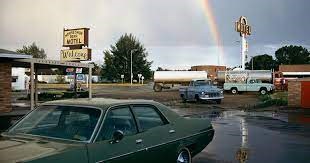
Stephen Shore is a Contemporary American Photographer, best known for his colour images of street corners and plates of food, suburban baseball fields and parking lots. Stephen Shore said “I discovered that this camera was the technical means in photography of communicating what the world looks like in a state of heightened awareness,” which made him take his photography seriously as his photos show a different side of the world.
Image Analysis
His images are recollections of experiences but they are taken in a careful and considerate way. His images are taken with a large format camera which makes his images a lot more precise and increases the quality of his images both in colour and in the form. The layout of this photo is very chaotic and there is a lot of things going on in the image which makes it quite confusing to look at. There is a petrol station and cars parked in a parking lot both in one photo which creates a more interesting concept. The rainbow in the sky creates a contrast between the dark colours of the cars and of the background of the image as its all very dramatic dark colours whereas the sky is a pale blue and white colour. The lines in this image from the car and from the reflection in the puddle act as leading lines to the focal point of the image.
Contact Sheet
Harve des Pas New Topographics Photoshoot
In this photoshoot, I focused on trying to merge the manmade world, such as the seawalls and buildings lined across the seafront, and the natural world, like the beach and the ocean.
I found that including wildlife in the photos also created a good mesh of natural and man made.
Here are the ones I though were best from this selection.
When editing these photos, I could play around with cropping the images into a square format and then presenting them as a triptych.
I also experimented with the rocks along the beach and trying to combine them with the built environment around Harve des Pas, such as the industrial buildings at La Collette.
In these photos, I tried to blend the buildings and the rocks by finding dips in the rocks where I could see the buildings in the background. Additionally, I tried to use the sea as kind of a middle ground to separate the natural rocks from the manmade buildings. Here are the ones I thought were best.
Here are some other photos I took also using these buildings in the background that I thought worked well as new topographic photos.
When editing these photos, I could play around with the cropping to make the buildings more contained in the frame and more of the focus in the shot. Additionally, I could make these black and white to emphasise the lack of emotion that is common in new topographic photos.
Editing
While editing these photos, I want to focus mainly on how these photos are going to be presented together. This means that the photos will have to be cropped the same way, the colouring will have to be the same, and I need to find a way to portray these buildings in a negative way. I could do this by displaying the photos together as different sections of the landscape, going from the beauty of the beach and the rocks to the drabness of the industrial buildings. I could also alter the colouring to go from happy and vibrant to sad and colourless.
To start with, I looked at the photos I took of the ducks. I also found that these photos had a blue sky, whereas the photos of the buildings were cloudy and drab. This meant that I could use this to help me with my idea of changing the colour between the photos.
Here is the first draft of the triptych I wanted to create with the photos of the ducks and the distant background of the coast.
With this draft, I was happy with how the photos turned out, but I felt that the two photos on either side were too similar, so I decided to change the one on the left to another photo.
I was much happier with this second draft, as it also followed my idea of gradually panning towards the industrial buildings, however I felt that the colouring of each photo wasn’t similar enough to create the same effect.
With this draft, I altered the colouring by taking the vibrance and saturation out more and more between each photo and making the photo colder. I also adjusted the exposure and the shadows to amplify this effect. I was very happy with this draft, and I felt that changing the colouring created the slow decline that I was aiming for.
I also tried this with black and white.
I felt that this worked very well, even more so than the previous draft. I was happy with this, so I then moved onto trying something with the industrial buildings. I was thinking of trying to add these photos with the triptych above.
This is what I came up with. My idea was that the top line of photos would gradually decrease in colour, and the bottom photos were completely black and white. However, I felt that these photos were too repetitive in triptych format, so I decided to separate these photos from the triptych of the ducks and rather make these their own presentation.
I thought that this combination turned out fairly well, and both of these photos clearly demonstrate new topographical work.
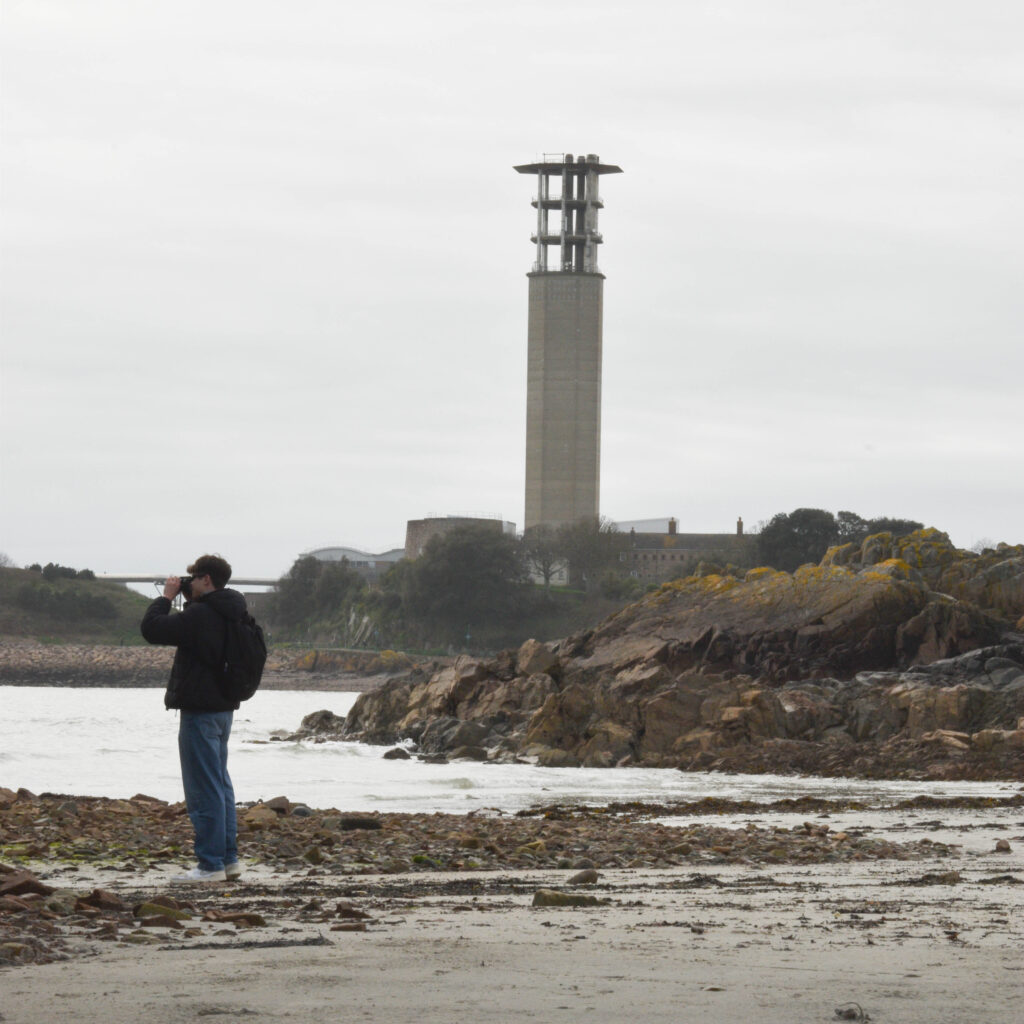
I also wanted to try and use these photos to tell a story of how mankind has ignored these new ugly developments. I had a few ideas in mind. Firstly, I could present the images like this from left to right. Secondly, I could present the images from top down in square format.
However, I wasn’t sure how I could present the photos in this format. Thirdly, I could crop out the subject in each photo and place them in one photo, and gradually increasing the opacity between each of them.
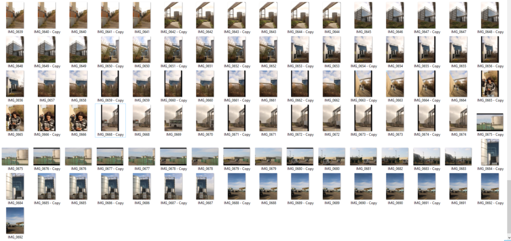
I thought that this idea worked fairly well and told the story that I had in mind. The subject walks past the tower, completely ignoring it, rather he focuses on something outside of the frame with his camera, demonstrating the aspect of ignorance that is presented in new topographics photos from artists like Frank Gohlke.
Final Images