Exposure bracketing and HDR imagery

When should you use exposure bracketing?

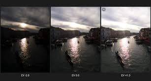
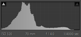
Exposure bracketing is where you take a sequence of photographs with different exposure levels, and then blend them together to create a photograph with a much higher dynamic range. It gives you all the details you will ever need in your photographs so you can create the exact image you had in mind.

if the scene has a high level of contrast, or you’re just really not sure that your exposure settings are even in the right ballpark, adding to the number of bracketed shots or setting a higher exposure compensation value increases the exposure range the camera captures for a wider range to choose, therefore it should be used every time your trying to achieve this certain style of photography.

What is HDR in image?

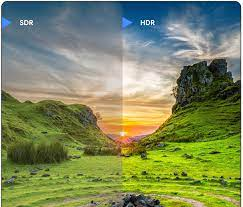
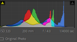
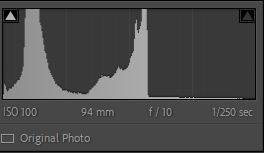
In photography, HDR stands for high dynamic range. Dynamic range is simply the range of the lightest tones to the darkest tones within a photo. Put another way it’s a measure of the light intensities from the highlights to the shadows.

What is the difference between exposure bracketing and HDR?

AEB stands for Auto-Exposure Bracketing. It is the method used to obtain HDR photos. It consists in taking several photos of the same scene at different exposure levels. HDR, High Dynamic Range, is the technique that superimposes the different photos to create a new, final photo.

The New Topographics 

What is the meaning of new Topographics?

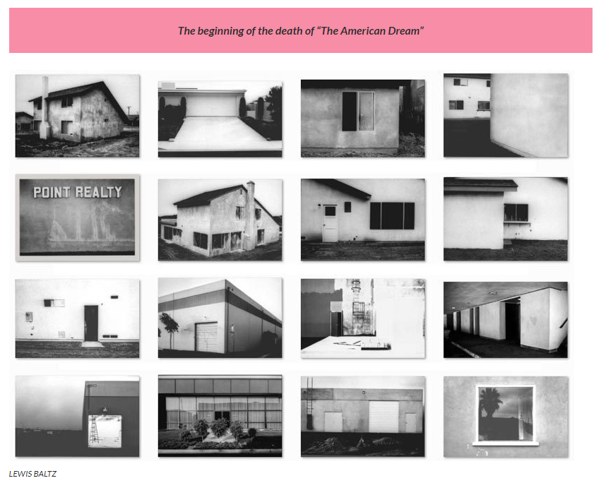
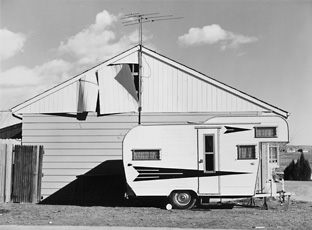
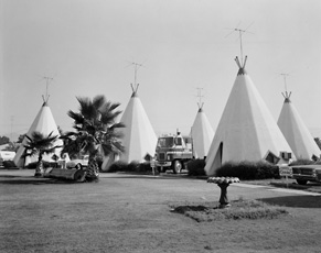
New topographics was a term coined by William Jenkins in 1975 to describe a group of American photographers (such as Robert Adams and Lewis Baltz) whose pictures had a similar banal aesthetic, in that they were formal, mostly black and white prints of the urban landscape.

What is Topographics?
Technique in which a scene—usually a landscape—is photographed as if it were being surveyed from afar, practiced most famously by the 1970s ‘New Topographics’ photographers, including Robert Adams, Lewis Baltz, Nicholas Nixon, and Bernd and Hilla Becher.

What was the new topographics a reaction to?
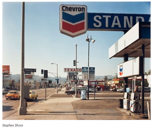
Their stark, beautifully printed images of this mundane but oddly fascinating topography was both a reflection of the increasingly suburbanised world around them, and a reaction to the tyranny of idealised landscape photography that elevated the natural and the elemental.

Post-war America struggled with

  • Inflation and labor unrest. The country’s main economic concern in the immediate post-war years was inflation. …
  • The baby boom and suburbia. Making up for lost time, millions of returning veterans soon married and started families…
  • Isolation and splitting of the family unit, pharmaceuticals and mental health problems
  • Vast distances, road networks and mobility

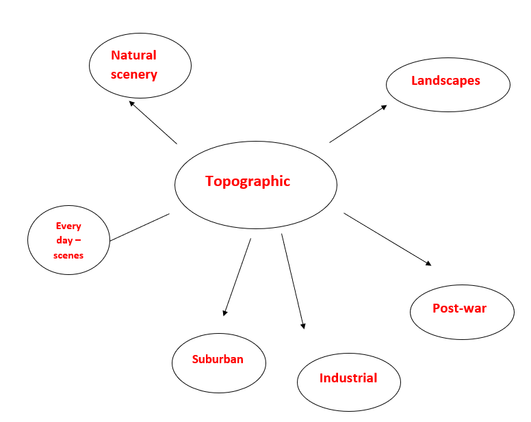
A turning point in the history of photography, the 1975 exhibition New Topographics signalled a radical shift away from traditional depictions of landscape. Pictures of transcendent natural vistas gave way to unromanticised views of stark industrial landscapes, suburban sprawl, and everyday scenes not usually given a second glance. This restaging of the exhibition includes the work of all 10 photographers from the original show: Robert Adams, Lewis Baltz and etc.

MOODBOARD

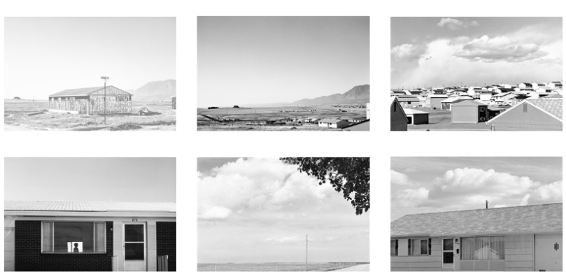
The New Topographics documented built and natural landscapes in America, often capturing the tension between natural scenery and the mundane structures of post-war America: parking lots, suburban homes, crumbling coal mines. The photographs, stark and documentary, are often devoid of human presence. Jenkins described the images as “neutral” in style, “reduced to an essentially topographic state, conveying substantial amounts of visual information but eschewing entirely the aspects of beauty, emotion, and opinion”.
Robert Adams

On the one hand, New Topographics represented a radical shift by redefining the subject of landscape photography as the built (as opposed to the natural) environment. To comprehend the significance of this, it helps to consider the type of imagery that previously dominated the genre in the United States.

An example

Robert Adams

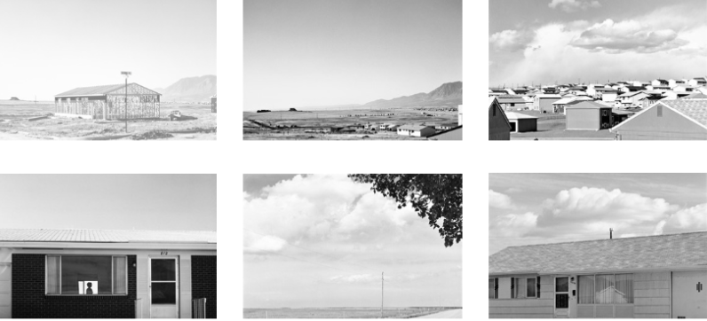
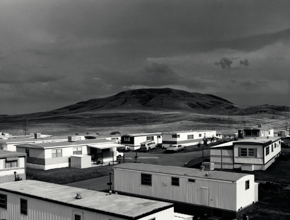
This image is a perfect example as the bottom half of the image is man-made with human activity objects as humans adapt which ultimately adds these subjects to the image. This contrasts to the top half off the image as it contains natural scenery therefore Robert Adam’s had contained both environmental factors. A significant feature about this image are the lines on the houses contrasting with the round/ not straight lines on the mountains showing clear meaning the houses are man-made and perfectly put together however the mountains are not but as humans we prefer the look of environmental features but housing is a necessity. Another interesting factor is the sun shining creating light highlights on the houses but in the distance dark shades with the clouds making light onto the floor which has an eye catching effect.
While visiting the exhibition, people voiced a range of reactions:

“I don’t like them—they’re dull and flat. There’s no people, no involvement, nothing.”
“At first it’s stark nothing, but then you look at it, and it’s just about the way things are.”

“I don’t like to think there are ugly streets in America, but when it’s shown to you—without beautification—maybe it tells you how much more we need here.” 

TYPOLOGY – the study and interpretation of types that became associated with photography through the work of Bernd and Hilla Becher

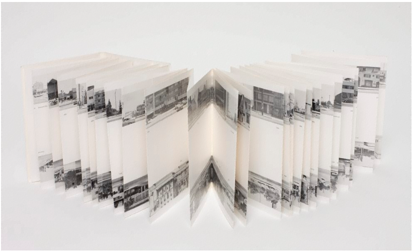
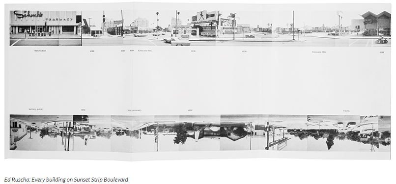
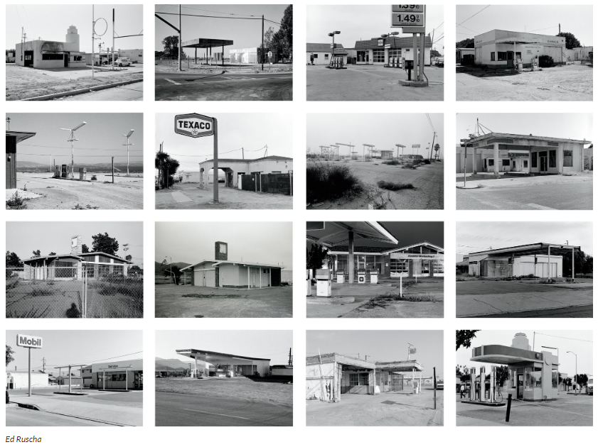
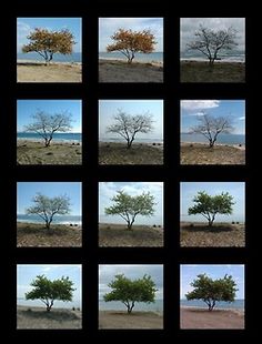
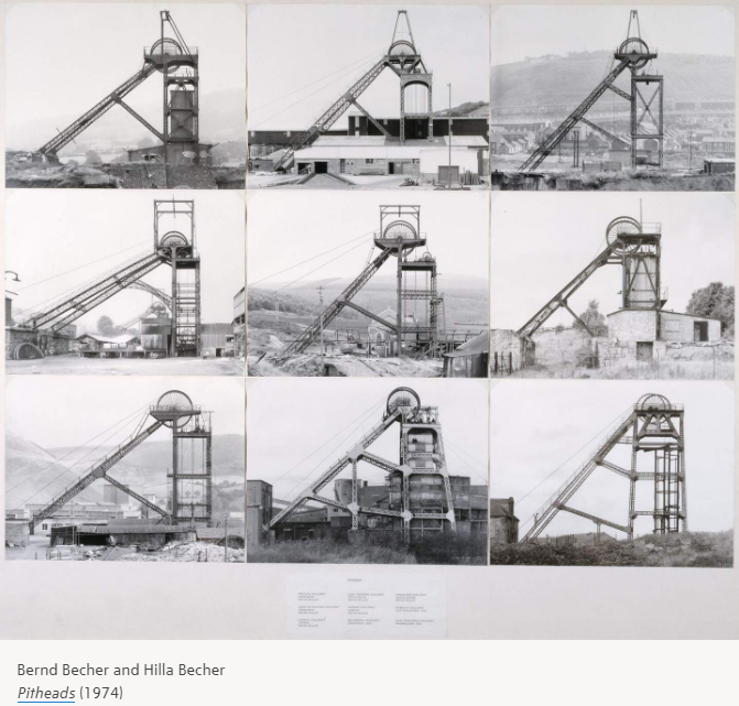
Landscape/Typology. The German artists Bernd and Hilla Becher, who began working together in 1959 and married in 1961, are best known for their “typologies”—grids of black-and-white photographs of variant examples of a single type of industrial structure.

A photographic typology is a single photograph or more commonly a body of photographic work, that shares a high level of consistency. This consistency is usually found within the subjects, environment, photographic process, and presentation or direction of the subject.
To create these works, the artists travelled to large mines and steel mills, and systematically photographed the major structures, such as the winding towers that haul coal and iron ore to the surface and the blast furnaces that transform the ore into metal. The rigorous frontality of the individual images gives them the simplicity of diagrams, while their density of detail offers encyclopaedic richness. At each site the Becher’s also created overall landscape views of the entire plant, which set the structures in their context and show how they relate to each other. The typologies emulate the clarity of an engineer’s drawing, while the landscapes evoke the experience of a particular place. The exhibition presents these two formats together; because they lie at the polar extremes of photographic description, each underscores the creative potential of the other.
A landscape typology is a systematic classification of landscape types based on attributes that describe properties of interest, such as land use, scenic properties, or cultural characteristics or history.

EXAMPLE

HDR Merge Images – Landscapes

What is a HDR image?

HDR stands for high dynamic range, which place in between the lightest and darkest contrasting parts of a photo. A HDR image is a final product composed of multiple shots that have used exposure bracketing to create a final product that pulls out the best colours in all of the images combined. You create a HDR image by using exposure bracketing. (as explained below)

When are HDR techniques used?

HDR is used when photographers are struggling to capture all the details and colours of a scene correctly so they use exposure bracketing, taking multiple photos using different exposure settings and then using technology to merge all the photos together making a HDR image. This creates the best result of all the shots pulled together, leaving a well saturated, balanced contrasting image.

Exposure Bracketing

Exposure bracketing is where the photographer will take multiple shots of the exact same scene altering the settings each time to get different exposures of the same image. This can also be done on the camera using settings so the camera will do it automatically. This means the photographer ether has many photos to pick from in the editing process or they can create a HDR image merge which will combine all the shots and create a best fit image for all of them.

How to Create a HDR image on Lightroom

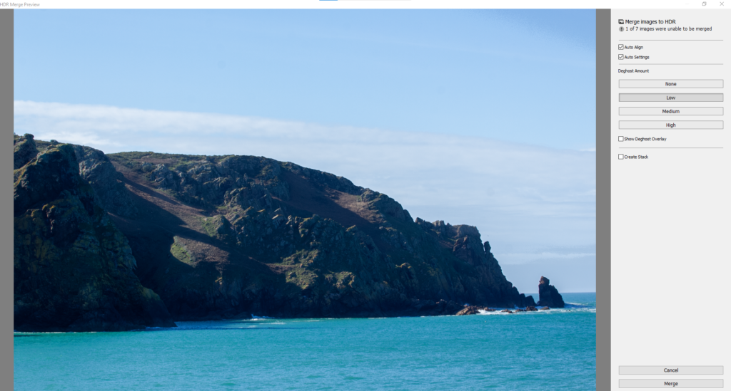
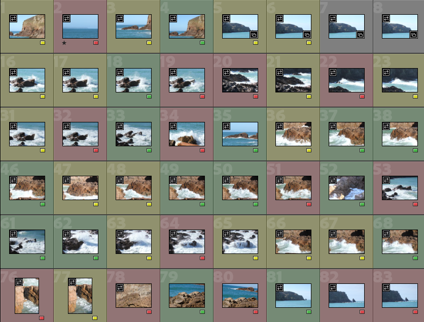
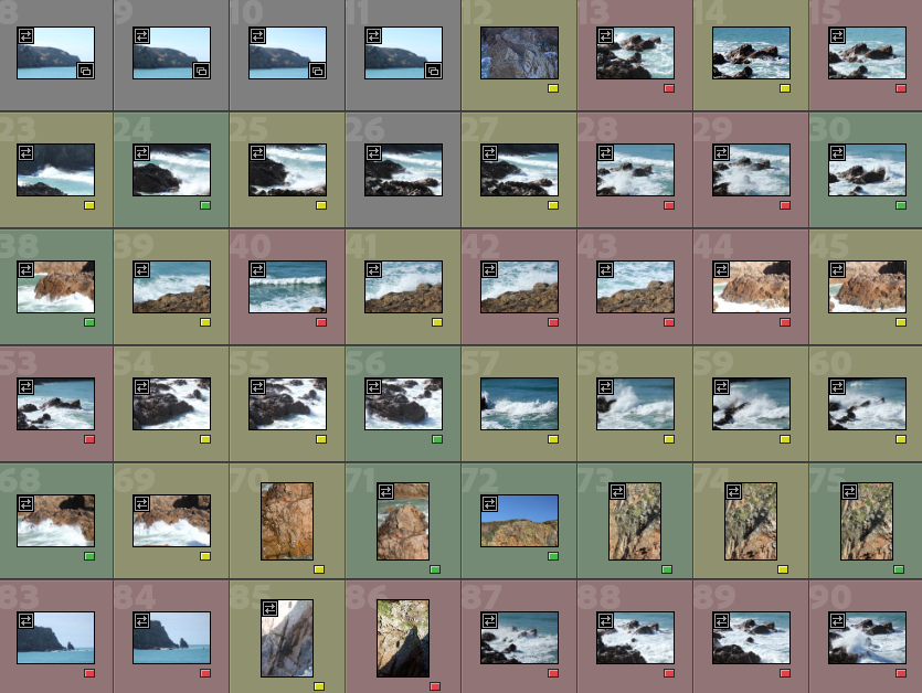
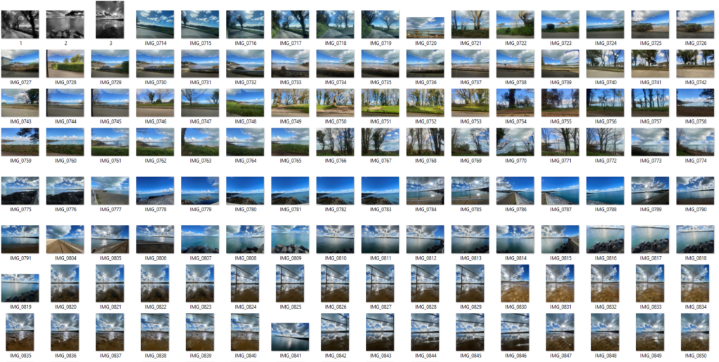
Gather all shots in one row and selected them all using the shortcut, clicking on the first image then pressing CTRL and clicking the last image.

Once all the shots are selected you right click and select photo merge.

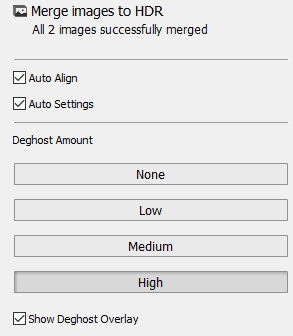
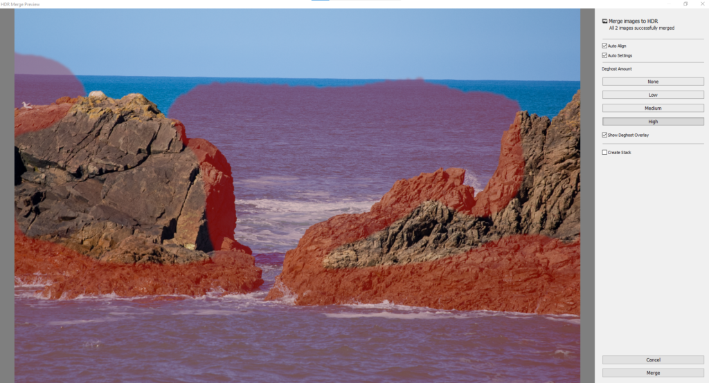
This option will come up before the images are fully merged allowing you to pick the amount of deghost for the final image.

It will allow you to see what and where the deghost effects as in this photo especially in each shot the waves were slightly different so if I changed through each deghost amount setting it would show the different details that changed. Once the deghost amount is selected press conform and then the image will create a HDR version.

Edit One

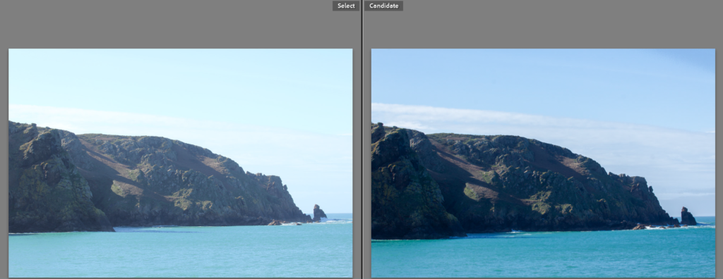
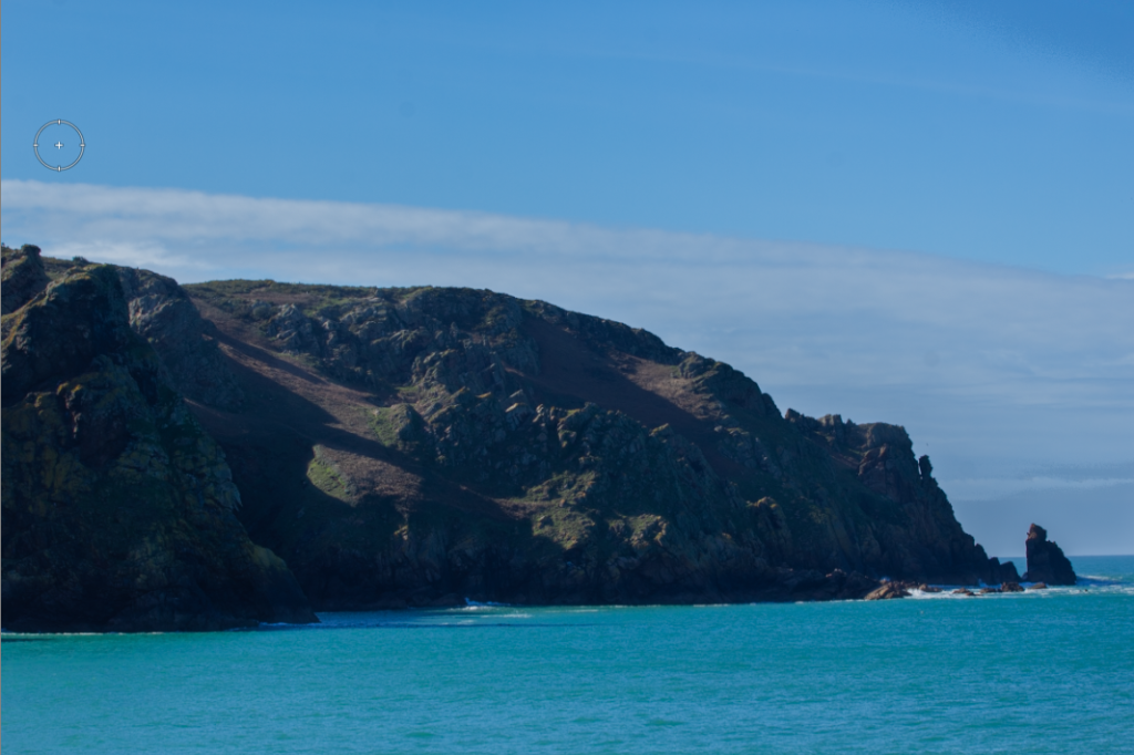
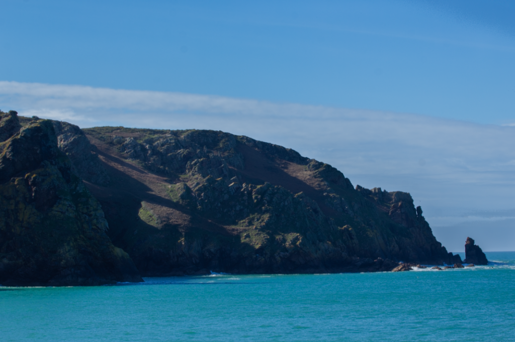
In this one you can see how it has increased the blue colour for the sea and brought back the clouds from being washed out but kept the rocks light enough to be seen and the details and tonal changes within them to be seen. Therefore creating an image much more similar to what I had seen when taking the photo.

Additional Editing

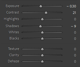
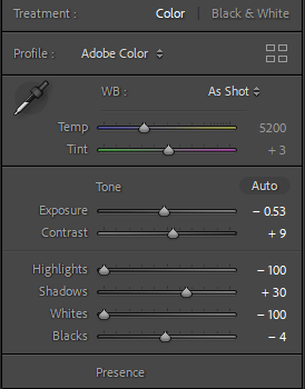
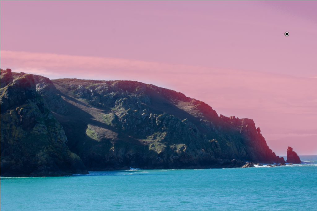
I felt this photo would benefit from further editing, using the adjustments tools and the brush tools, bringing out the sky and cliffs details in more depth.

Edit Two

For this edit, I started by using selecting two base images and then using the HDR photo merge.

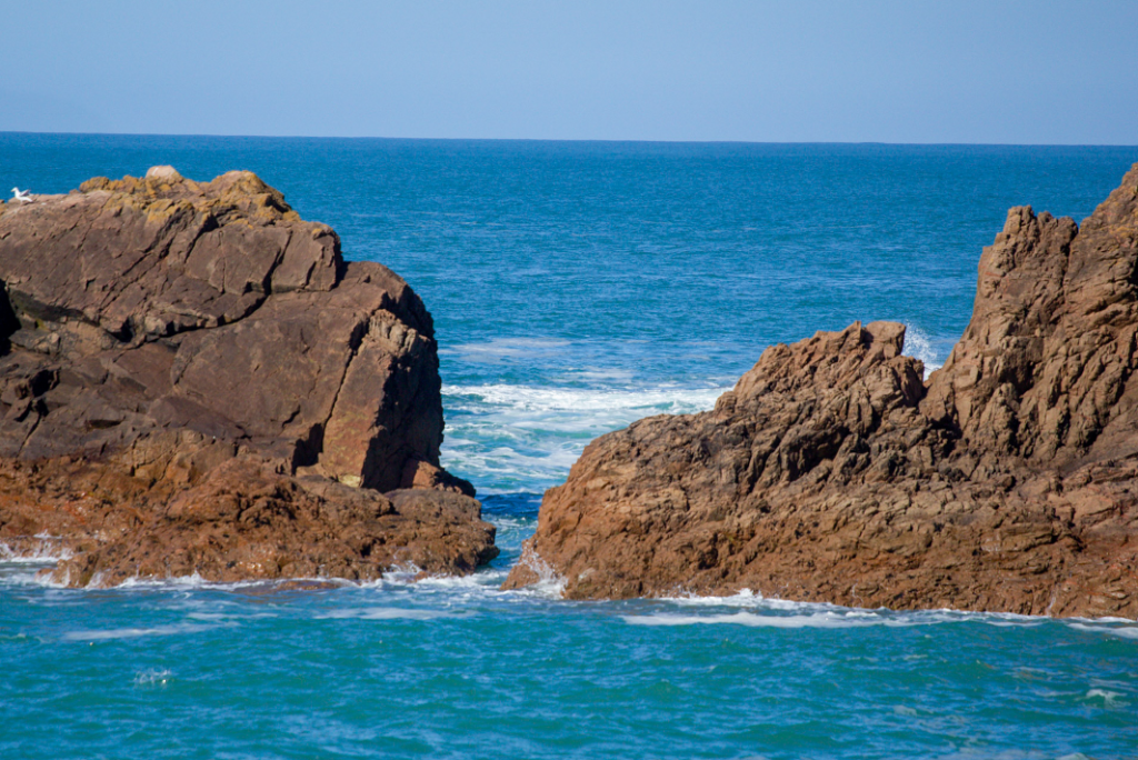
This is my second edit, for this one I used the same process but I chose to use the high setting on the deghost as it helped produce more detail in waves and added the splash back onto the rocks. I worked out which bits the different settings of deghost changed by using the deghost over lay filter.

Final Photos

This technique was useful to learn and the exposure bracketing was a new technique I hadn’t tried before. I am very happy with the results, I was limited on the day as it was very bright and I didn’t have a lens hood, this meant a lot of my photos looked similar even when reducing/increasing the exposure. The results while being slightly unrealistic in terms of saturation it does follow the HDR style.

Romanticism

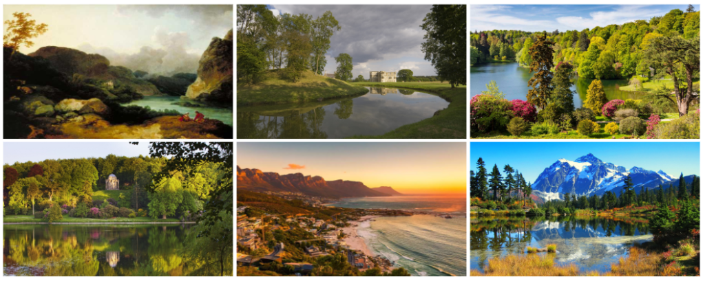
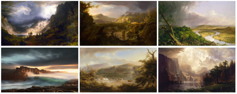
The beautiful, the sublime, and the picturesque are three key concepts in aesthetics and philosophy of art.

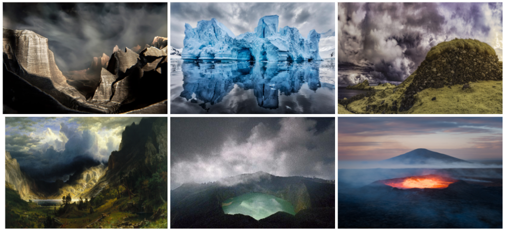
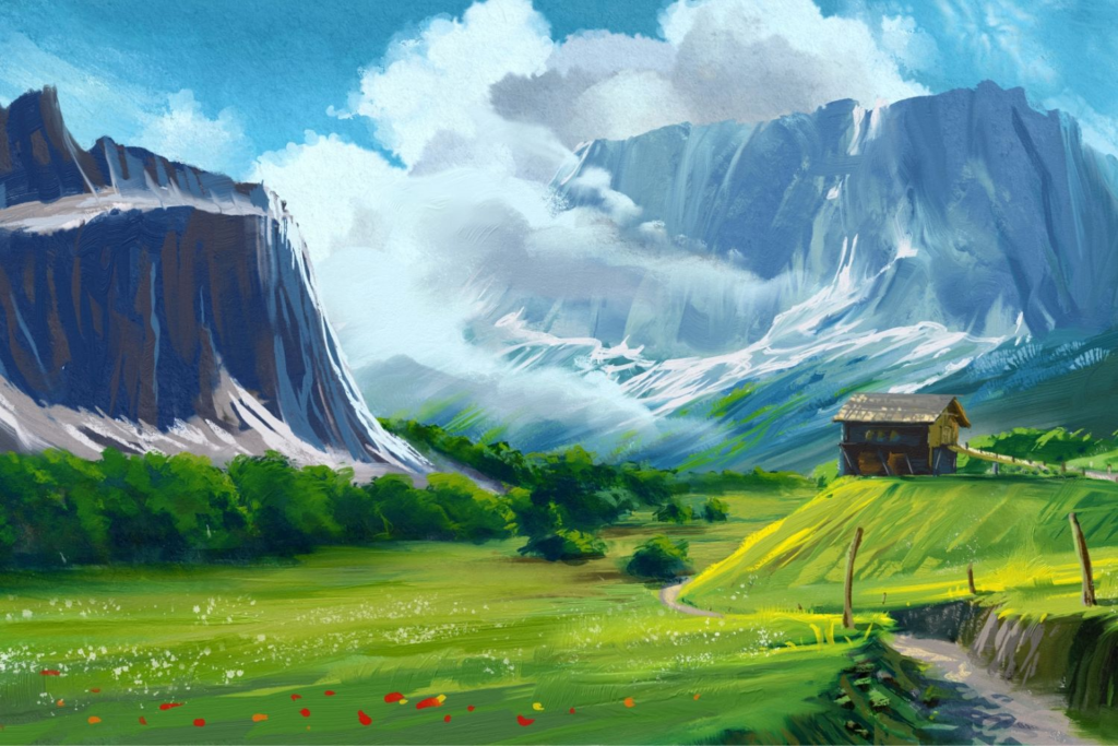
Romanticism was an artistic, literary, musical and philosophical movement that originated in Europe toward the end of the 18th century. It gained momentum as an artistic movement in France and Britain in the early decades of the nineteenth century and flourished until mid-century. It was characterised by its emphasis on emotion and individualism as well as glorification of all the past and nature, preferring the medieval rather than the classical. It was partly a reaction to the Industrial Revolution. It incorporates a deep feeling of emotions such as apprehension, horror and terror, and awe. Romanticism was a huge step away from the subtleties of photography and instead looked very bold and striking. Romantic landscapes are typically “moody” in atmosphere; they are more about the subjective feelings of the artist, than an objective record of the observable world.

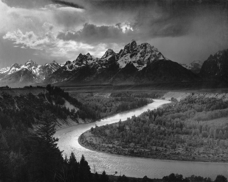
Romantic artists often sought to capture the moods, feelings, and emotions of their subjects, using expressive compositions, vivid colours, and dramatic contrasts of light and dark to do this. Photographers who also took up the romanticist approach aimed to sensationalise the overall look of their images by enhancing certain colours in order to make their images surreal, glorified and to dramatize certain areas of their photographs.

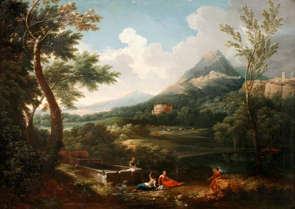
Romanticism first showed itself in landscape paintings, where British artists in the 1760s began to turn to wilder landscapes, storms, and gothic architecture.

The Sublime

The sublime is the quality of greatness, whether physical, moral, intellectual, metaphysical, aesthetic, spiritual, or artistic. The term especially refers to a greatness beyond all possibility of calculation, measurement, or imitation.

It is defined as a pleasure in the way that nature’s capacity to overwhelm our powers of perception and imagination is contained by and serves to vivify our powers of rational comprehension. It is a distinctive aesthetic experience. For Romantics, the sublime is a meeting of the subjective-internal (emotional) and the objective-external (natural world).

The sublime is closely associated with the Romantic movement, the concept of the sublime began to be employed by those who wished to challenge traditional systems of thought that were couched in the old language of religion, a rhetoric that now seemed founded on outdated conceptions of human experience. 

Edmund Burke noted that there were certain experiences which supply a kind of thrill or shudder of perverse pleasure, mixing fear and delight. He shifted the emphasis in discussions of the sublime towards experiences provoked by aspects of nature which due to their vastness or obscurity could not be considered beautiful, and indeed were likely to fill us with a degree of horror.

At one extreme was the sublime (awesome sights such as great mountains) at the other the beautiful, the most peaceful, even pretty sights. In between came the picturesque, views seen as being artistic but containing elements of wildness or irregularity. One of the earliest theorists of the picturesque, Uvedale Price, situated the picturesque between the serenely beautiful and the awe-inspiring sublime. A picturesque view contains a variety of elements, curious details, and interesting textures, conveyed in a palette of dark to light that brings these details to life.

Romanticism inspired photoshoot:

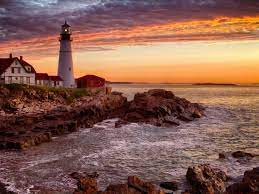
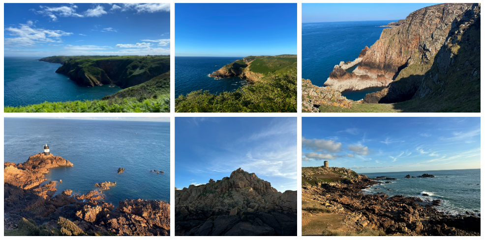
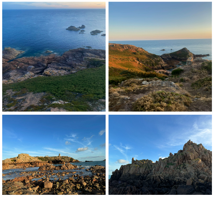
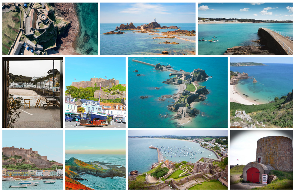
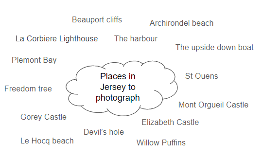
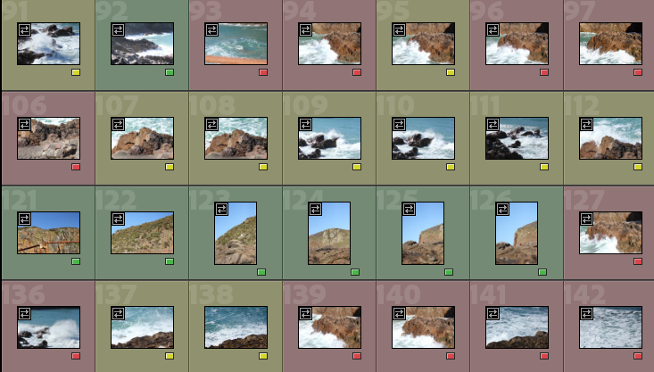
For this photoshoot, I went to different places around Jersey and photographed various different natural landscapes eg La Corbiere Lighthouse. I took my images in both portrait and landscape in order to get a variety of outcomes and make my images more interesting to look at instead of them all being in the same rotation. I think I successfully managed to capture the beauty of these places in my photographs through the bright colours and detail in each image. I enhanced the colours on photoshop using levels and curves. One improvement I would make for next time, is I would try and photograph some landscapes in other whether conditions as most of my images are sunny. But, if I photographed some in other whether conditions like fog or when its cloudy, I could enhance this feature in order to get more of a romanticised image as the scary whether conditions would provide that theme of fear in romantic images, given to the person who looks at my images.

Rural Landscape

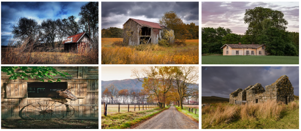
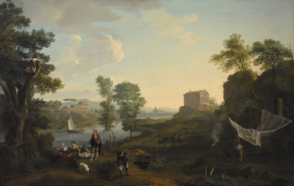
Rural landscape photography is in many ways similar to photographing urban landscapes. The difference is rural photography is about capturing the “life” in the countryside. Rural landscapes include a variety of geological and geographic features such as: croplands, forests, deserts, swamps, grasslands, pastures, rivers and lakes.  This style of photography serves as a narrative, telling stories of places and lifestyles often overlooked in our fast-paced modern world. Unlike urban landscapes that often focus on the grandeur of architecture and the complexity of human-made structures, rural landscapes focus on the beauty of simplicity. 

Bucolic= a bucolic may be either a person who lives in the country (cf. rustic below) or a poem celebrating the pleasures of country life,

Pastoral= is the Eclogues of the Latin poet Virgil (70-19 BCE) are sometimes referred to as his Bucolics

Origins of landscapes

What does landscape mean?

Landscape photographs typically capture the presence of nature but can also focus on human-made features or disturbances of landscapes. Many landscape photographs show little or no human activity and are created in the pursuit of a pure, unsullied depiction of nature, devoid of human influence—instead featuring subjects such as strongly defined landforms, weather, and ambient light. landscape photography is a broad genre which may include rural or urban settings, industrial areas or nature photography.

When did landscape emerge as a genre in western culture?

Although paintings from the earliest ancient and Classical periods included natural scenic elements, landscape as an independent genre did not emerge in the Western tradition until the Renaissance in the 16th century.

When did classical landscapes emerge as a genre?

In the 17th century the classical landscape was born. These landscapes were influenced by classical antiquity and sought to illustrate an ideal landscape recalling Arcadia, a legendary place in ancient Greece known for its quiet pastoral beauty. In the Netherlands, pure landscape painting was more quickly accepted, largely due to the repudiation of religious painting in Calvinist society. Many Dutch artists of the 17th century specialised in landscape painting, developing subtle techniques for realistically depicting light and weather. In a classical landscape the positioning of objects was contrived; every tree, rock, or animal was carefully placed to present a harmonious, balanced, and timeless mood. 

What prompted the rise of landscape art during the late 18/19th century?

Landscape painting eventually gained prominence in the late 18th century with the rise of Romanticism, and often continued to carry a religious significance. Additionally, it became a method of self-expression, with the emotions of the painter and their appreciation of nature demonstrated in the painting. The invention of the tin tube for paint (1841) and the invention of the portable collapsible easel (in the mid-19th century) revolutionised the landscape genre by allowing artists to venture out of the studio and study and paint their subjects first hand.

When did landscape photography originate?

the earliest known evidence of a landscape photograph was taken between the years of 1826 and 1827. It was an urban landscape photo taken by a French inventor by the name of Nicephore Niepce.

Shoot Two – Inspo. Ansel Adams – Landscapes

Edit One

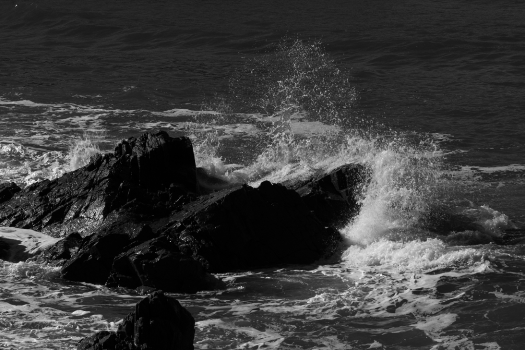
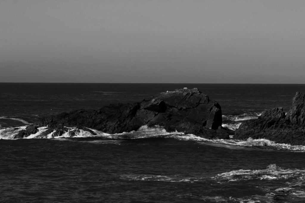
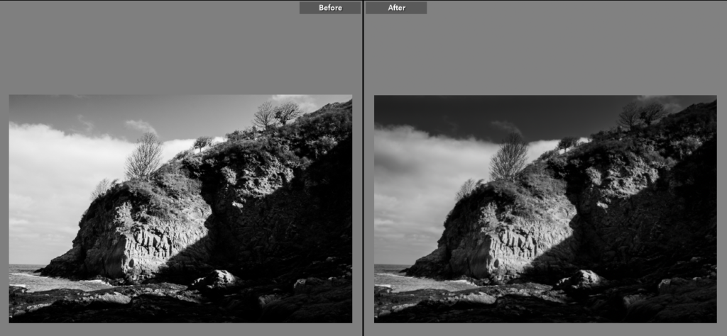
For this edit I made sure to make the rocks stand out in the dark grey sea as I didn’t want the imagine to appear flat. The harsh horizon line adds depth to the image and well as contrast from dark grey of the sea to light grey of the sky. By then using the brush tool I make the pure white less luminescent and instead just pure white. This helped add more detail back into the waves.

Edit Two

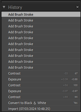
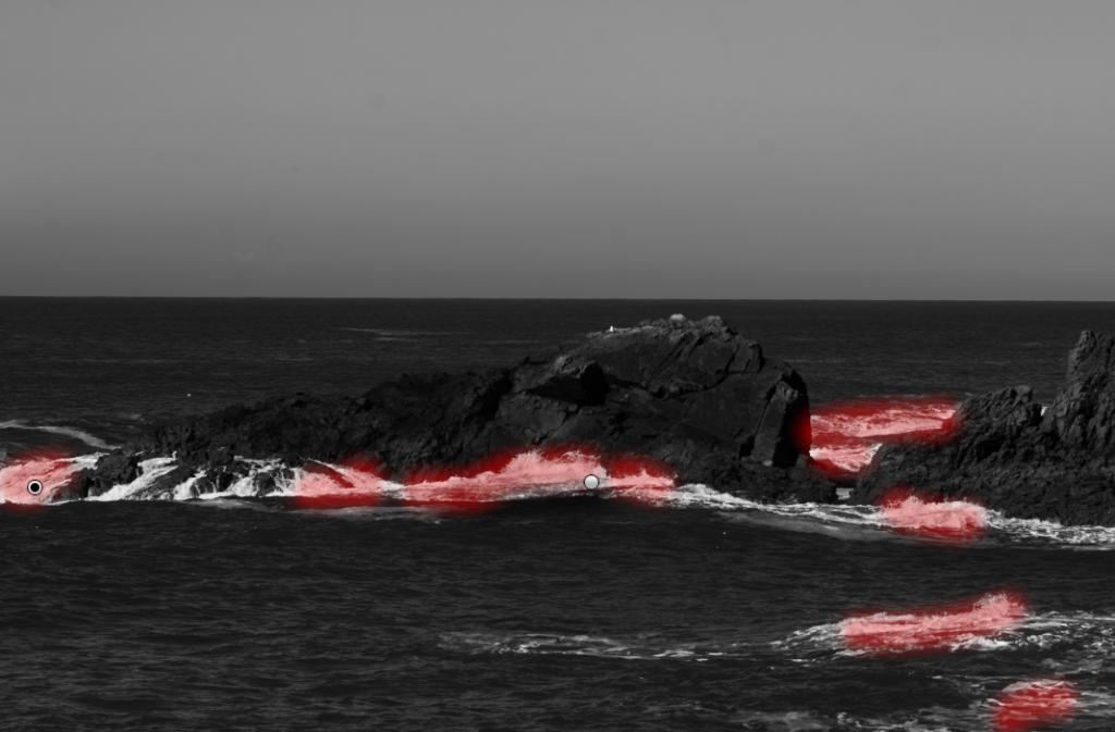
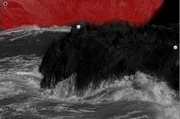
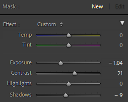
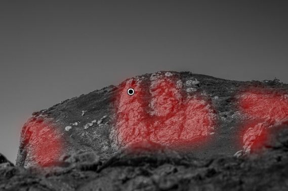
For my next edit I made sure to make the rock face bold as it is the subject of the photo, the waves I kept lighter with white to reflect the zone system. By decreasing the exposure I increased the details in the waves which had been washed out by the bright light. I then again used the brush tool to add contrast to certain points of the photo adjusting the settings each time to create distinct tonal separation.

Edit Three

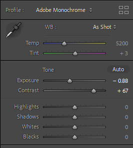
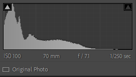
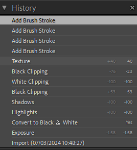
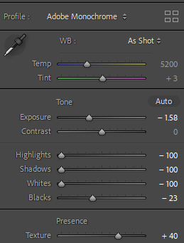
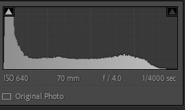
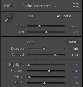
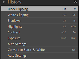
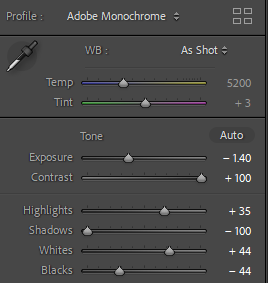
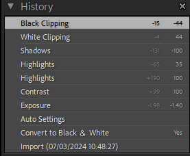
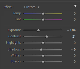
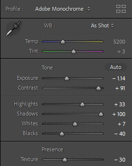
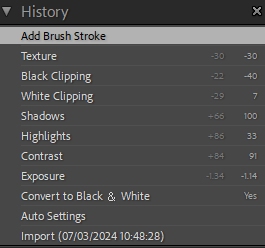
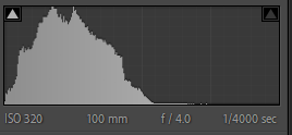
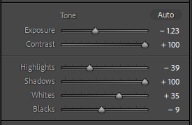
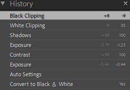
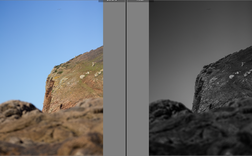
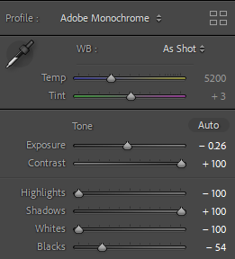
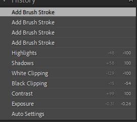
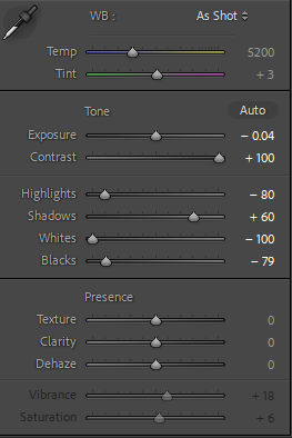
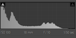
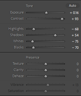
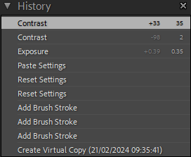
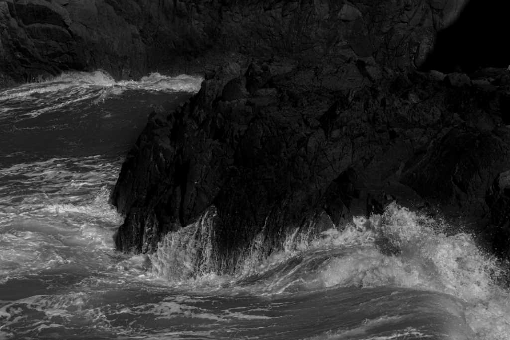
This shot isn’t my strongest so I chose to just use basic editing of the contrast and shadows mostly after using the Adobe monochrome auto settings to increase detail in the rock and bring back the waves details that had gotten washed out with over exposure.

Edit Four

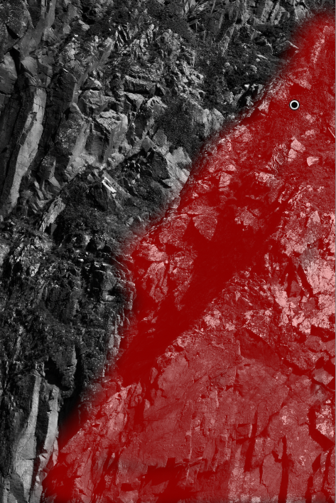
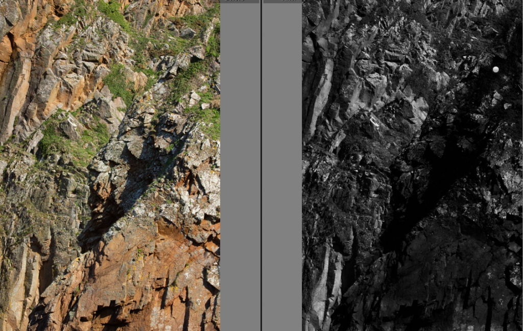
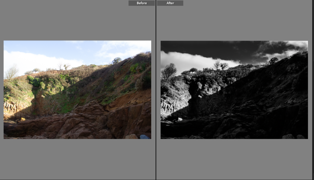
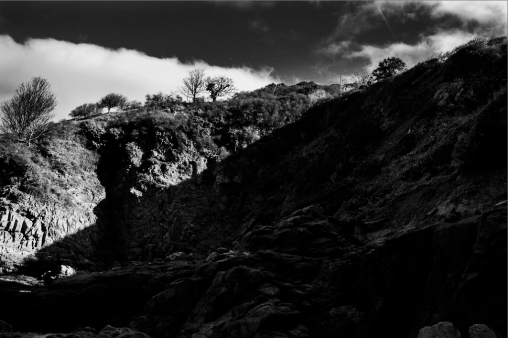
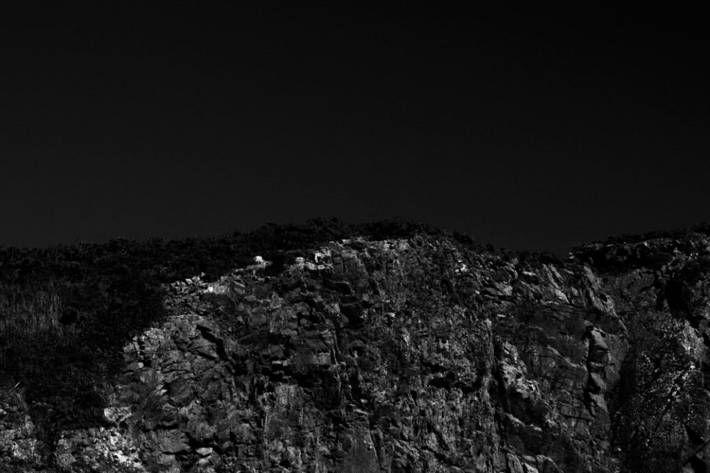
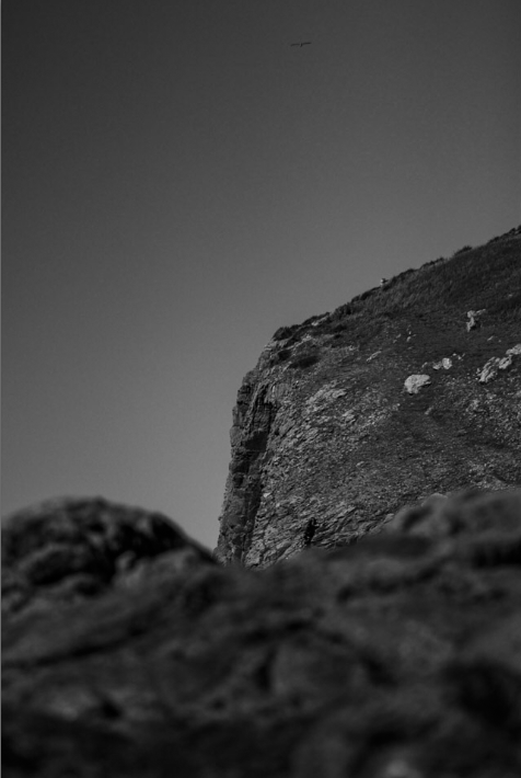
This photo just needed the exposure reducing to get the dark sky and the highlights increasing to get the white flecks of rock to show up and contrast with the otherwise similarly coloured bracken on the left side of the photo. The editing helped the shapes and lines in the image stand out making for an interesting but natural looking photo with depth.

Edit Five

Edit Six

Edit Seven

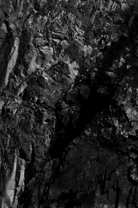
For this edit I wanted the lighter rock to show up more. To create this I used the black and white setting and then used the adjustments tools to create the contrast I wanted before adding further depth and contrast with the brush tool.

Edit Eight

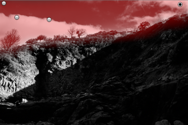
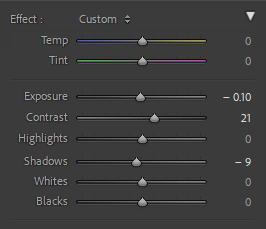
For this photo I used the Adobe monochrome and the adjustments tool. After that I then used the brush tool with a low exposure adjustment to make sure the clouds stood out and the sky wasn’t washed out creating the high contrast, dramatic photo.

Edit Nine

Best Final Photos

Photoshoot

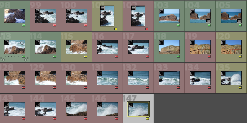
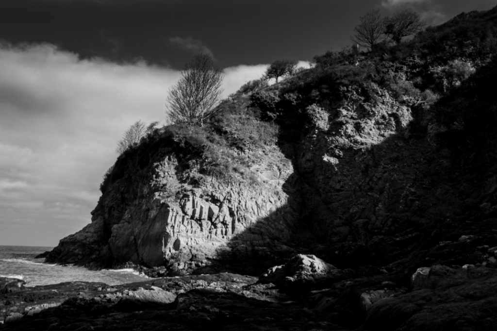
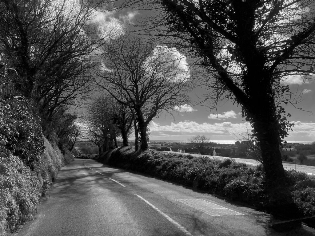
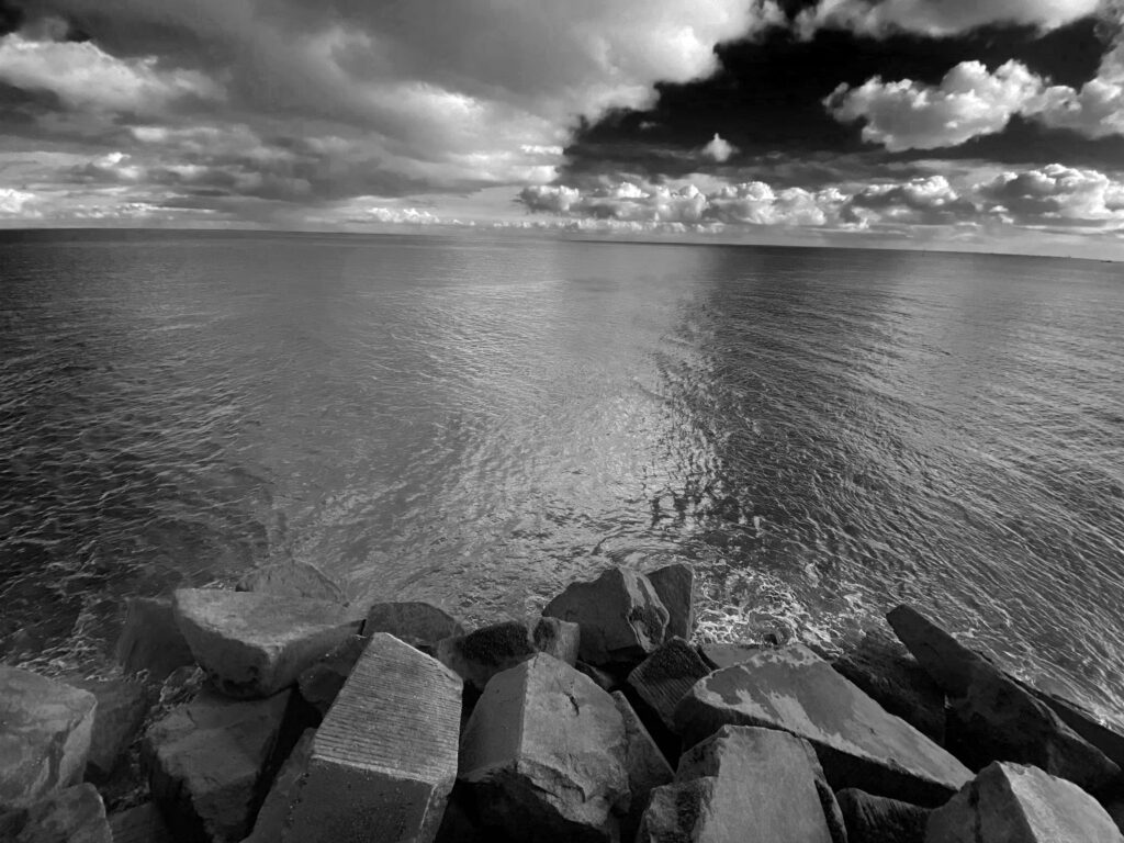
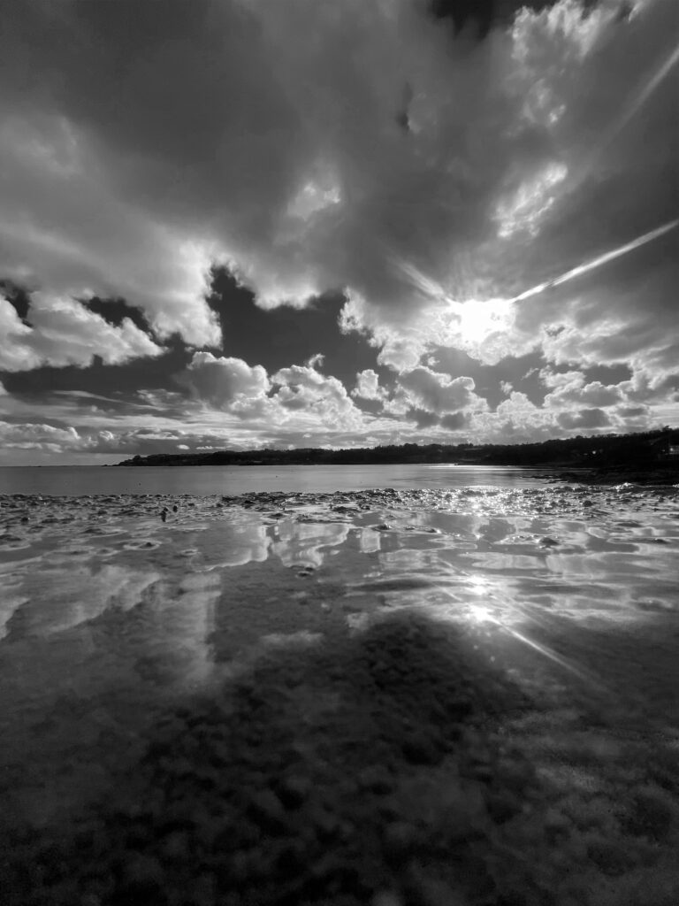
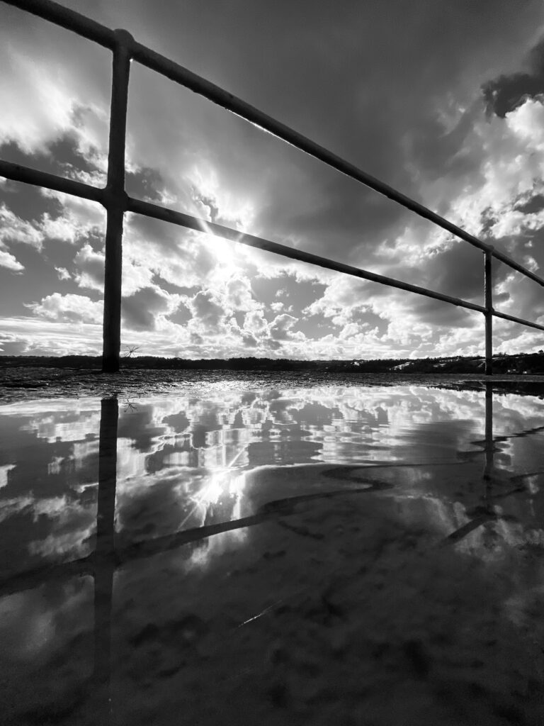
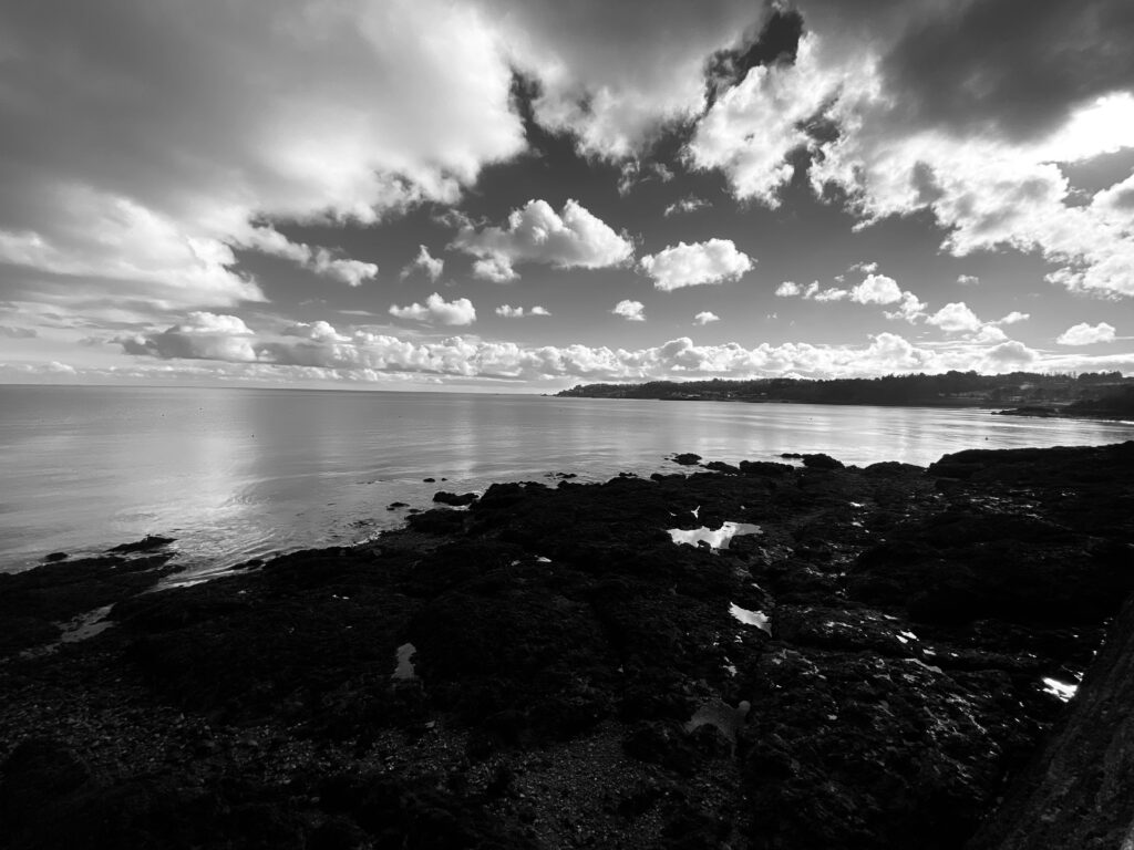
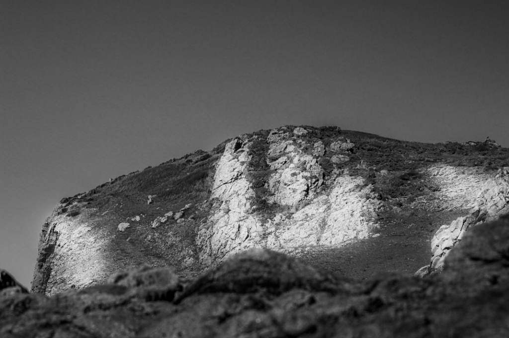
Here i selected some of my best photos and presented them in black and white to represent Ansel Adams work, I also like how the black and white effect makes the photo look a lot more mysterious and a sense of the unknown.

Here I went to St Catherine’s to take some landscape photos, and here are some of the results above. I turned the photos black and white to match Ansel Adams work as I was inspired by him to go out and take some photos, I really like how these photos turned out as they show such a natural side of the world where there isn’t any people, the world looks really peaceful and still. However I have taken a few portrait photos, so I could really show the view in different sizes and shapes.

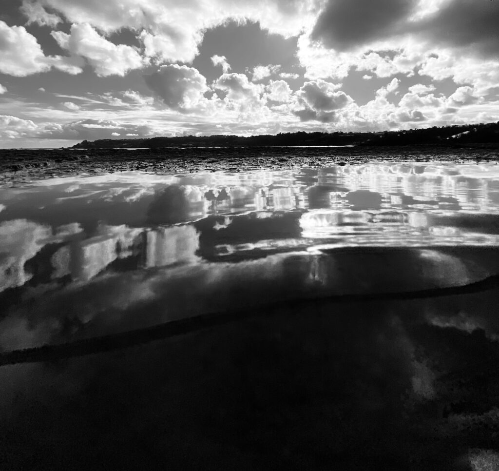
Here I tried to take a picture with a reflection of the view by using water on the ground and positioning the camera in a certain way. If I were to do this again I would try to get the water right to the end of the pier to get a better reflection and not have a rocky surface at the end, which sort of ruins the photograph. would also like to get different locations to different viewpoints and see what it would give me. I really like the idea of having a reflection at he bottom of the photo as it makes it more unique and different, I also really like how it was a sunny day when I took these photos and there were clouds all over the photo, this makes the photo look more detailed and full. To edit these photo I simply when onto photoshop and pressed “image” then “adjustments”, lastly I clicked “black and white” and this gave me options to control the whole photo and what part is darker or lighter in certain sections of the photo.

The Land and Us

The Land and Us |  La Tèrre et Nouswas born out of a need to reconnect and prioritise Jersey’s precious ecosystem. In the exhibition, visitors will be guided through newly commissioned artworks exploring our past, present and future habitation of the land. Travelling from our ancient neolithic past, when the land was a sacred site of ritual, through our farming traditions, oral histories and earthly language of Jèrriais, to our woodlands, indigenous species and pathways that encircle the Island, The Land and Us is a place to gather and reflect on the natural world.‘ – ArtHouse Jersey

This exhibition shows different ways of portraying art. All of the pieces make you appreciate our environment more and think about it in more depth.

This was one of my favourite parts of the exhibition. I think it was really clever to create a pathway with gravel and dirt just like a natural one.

I also really liked this piece of art as it wasn’t just a visual experience, it allowed you to feel every texture of the slice of wood. I think this is really unique as it leaves more of an impression on you afterwards.