Who is Siskind and why is he famous?
Aaron Siskind was an American photographer best known for his black-and-white, close range, and aerial photos of surfaces and objects. With the transformative properties of monochromes and their lack of scale or context, Siskind’s photos can seem both sculptural and vast or diminutive and painterly.
Siskind was born December 4, 1903, New York, Siskind began to photograph in 1932, while he was an English teacher in the New York City public-school system. As a member of the Photo League, he participated in projects designed to document neighbourhood life during the Depression.
Siskind was a grade school English teacher in the New York Public School System for 25 years, and began photography when he received a camera as a wedding gift and began taking pictures on his honeymoon.
What technique did he use?
He created pictures by closing in on his subjects, framing out distracting elements to enhance the emotional sense or allusive aspect he found compelling. Later he focused on surfaces to further condense the energies of splashed paint, graffiti marks and crumbling materials.
Aaron Siskind’s quote, “In photography, it is not the subject that matters, but how it is captured,” encapsulates the essence of artistic expression through the lens.

Example of his work–

MOODBOARD

My work


Why does he prefer to edit them to black and white?
Aaron Siskind’s work is all done in monochrome, this makes the photograph more impressive as you are left to your imagination of the colours, therefore to what the original object was.
Black and white photography feels timeless. Here’s a common reason why photographers shoot in black and white: It adds a timelessness to your images. For one, black and white photography has existed since the beginnings of photography, which means that a black and white image cannot instantly be dated.
My thoughts on his work/ similarities
When the viewer has a first glance, I noticed that every picture is in black and white as Siskind prefers it as it leaves imagination of not knowing the colour to the viewer. This is significantly impactful as it suggests a sense of mystery with his images potentially creating the viewer to imagine what they individually want his image to be and look like, it also reduce the chances of his images being outdated as ‘ black and white is timeless’ and can make an image more personal. By vaguely glancing I can see that Siskind focuses on the visual elements such as texture, shape, pattern, line and even tone. The main ones that stick out to me is texture and shape/lines. Some of his images are easily predicted which creates a clear picture to the viewer however some images makes the viewer guess what the photograph itself is which ultimately creates a mysterious factor, as well as Siskind not using colours which creates even more difficulty. An example of this is-
Image Analysis

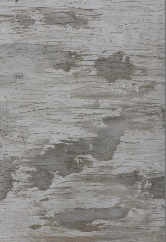
This image is difficult to understand and interpret the correct clear result. Although it is Siskind’s aim (conceptual) to create secretive and mysterious factors to his image and make the viewer imagine themselves. A benefit of Siskind’s aim is that it makes the viewer predict which ultimately forces the viewer to focus and question the texture, patterns, shapes and tones. We cannot see what the image is itself however it is interesting to note that viewers still find this pleasing to look at because of the imagination. Because it is unclear of what the image is, it creates every viewer to stare and draws them in to look at all important factors Siskind emphasized. For example, the cracks signify imperfection and every shape is different which slightly tells the viewer that this image is potentially all natural. Another interesting factor is that all shapes are different tones but also connected. This shows the tone isn’t based off the weather as it looks as if it is taken from a birds eye view and they are all connected. Lastly, another impactful feature is the texture as in my opinion each shape is a significant different pattern which the viewer would predict it is the texture. This links to his quote “In photography, it is not the subject that matters, but how it is captured,” As we do not know what the subject is but the viewer still finds it very significant and interesting.
My Image

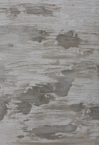
Personally, I think this image relates to Siskind’s work as it contains different visual elements such as tones, lines, irregular pattern of shapes, texture and not a clear view of what the subject is. This creates a mysterious sense like Siskind’s. As shown, some shapes have a vary of tones which prevents the image from being dull and boring as each visual element is different. You would assume this image is natural as most man-made subjects are usually to be built perfect. This makes you guess what this image is itself and what made it look this way which is mainly the contextual side of it. It has a few irregular lines if you look deeply as the varies of shapes are the first noticeable feature. There is a few cracks which signifies the imperfections of this image which helps the viewer understand it is not man-made and creates a significant amount of mystery.
A famous book- This Equals That by Tamara Shopsin & Jason Fulford
This book, shows juxtaposition and how both link and differ.
” One thing leads to another. Isn’t’ that the best way of being in the world?” Maira Kalman in response to this book.
This book, signifies and shows 2 opposite or similar images and makes you question how they are similar/different?
My response to this book –

This juxtaposition shows us rust which is the similarity both these images have. However, they are in different shapes, different textures and different lining and geometry. Although it has the same element, they are displayed in different ways. The texture tells us both of the rusts in these images would feel significantly different. The subject in the first image is more displayed portrait, although the second’s subject is not as observable and outstanding, and is rather landscape and subtle.

These two images have more to contrast, as they have less similar key features. These 2 images show significant natural damage. The difference is that the first one is scratches, and the second are cracks. A similarity they both have is that you actually cannot tell what each image is which keeps the viewer guessing and intrigued.
