

For this photoshoot we went for a walk from Havre Des Pas to the energy station. I took photos of textures and the environment. I went into the photoshoot knowing will want some panorama photos (will merge them in lightroom), so went to wide open spaces and took photos of the vast beach landscape. I tried to find interesting perspectives and objects to take photos of (e.g. using a worms eye view). I used a high f-stop to get more detail in every photo (foreground and background with be in focus). It was a cloudy day so I wouldn’t need to worry about the dynamic range of the photo, so I didn’t use the HDR method. I also used a low ISO level, but not too low as I did not have a tripod. I used the aperture priory setting in my camera so I can change the focal length, I kept it quite high for this to allow more focus in a larger range.

Above is the route I took, I went down a few more robust areas with less people and 60-90s architecture. Here are a few of my strongest photos, with the editing process.
photos 1


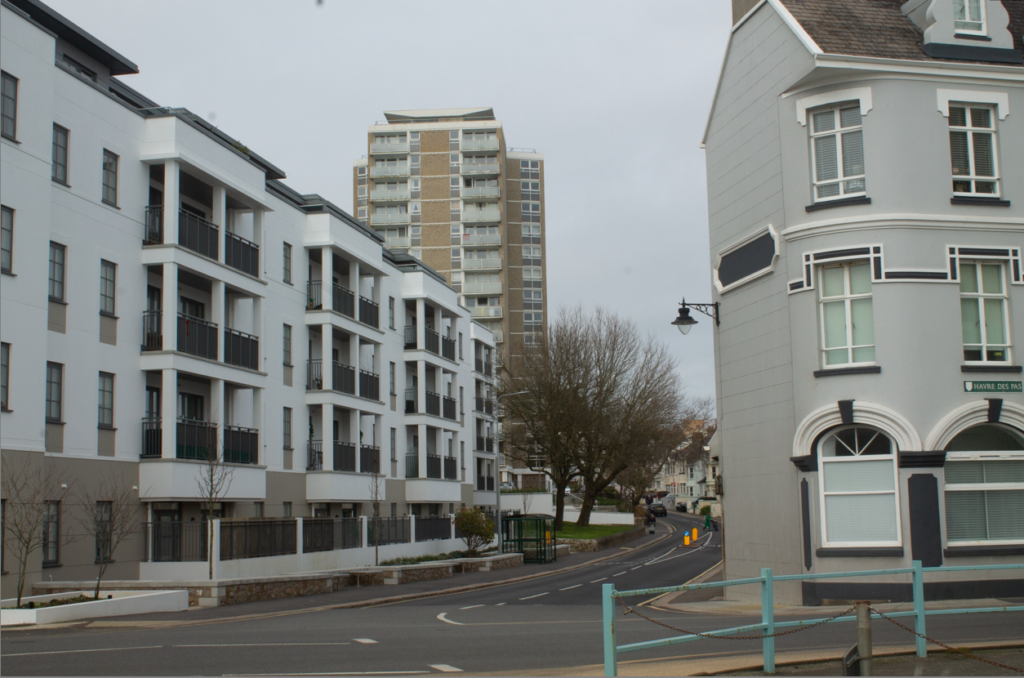
I didn’t edit this photo too much, only adding a B&W setting, with increased contrast, decreased highlights and whites, and increased texture. This was done to add a bit more depth to the image without making it too exciting as many of Robert Adams photos where ‘dead pan’, with little interest to most of them with a first look. The 3 main building’s in this image have very different architecture, making the final image look more ‘ugly’ and less pleasing to the eye. The building in the back especially draws the viewers eyes as its been built with little care and inspiration, only being made for its purpose.

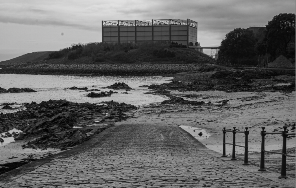
Here is a picture of the power station, with leading lines from the pebbled road towards it. For editing these 2 photos, I didn’t do much except increase the contrast and decreased the whites , to make the clouds more visible. Since I was getting a lot of my reference from Robert Adams, who has a deadpan effect on lots of his images to show the ‘truth’, I didn’t want to make the image too dramatic.
Photo 2

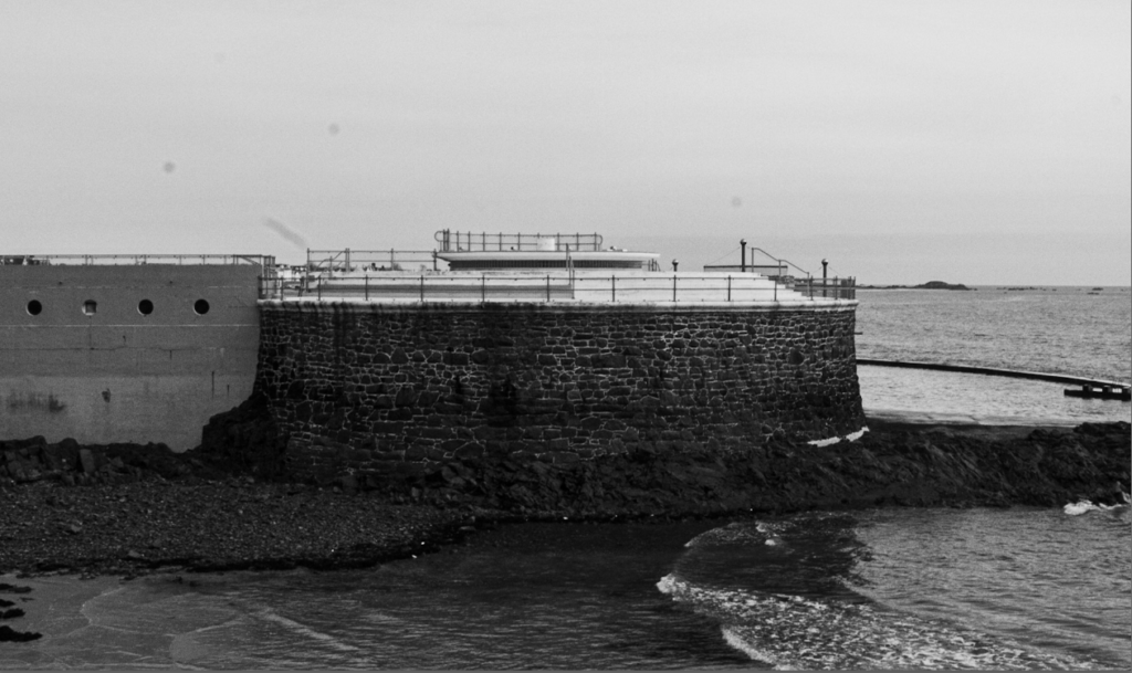
Above I was inspired by Bernd and Hilla Becher’s photos, like the one below. They where well known for there topology photos and creating a form of photography arranged by type that, through repetition, encourages viewers to engage deeply with the formal qualities of the subject matter. Bernd and Hilla Becher aspired to direct the audience’s attention away from the photograph, emphasizing the content rather than light, perspective, or other artistic choices. So for these photos, I repeatedly took photos of a large tank, at different angles.
Other strong photos:


