Urban Landscapes Context
What is the meaning of urban landscape photography?
Focusing on the study of objects and elements in urban environments, urban photography usually emphasises the surroundings and uses them to make statements about time and place. People are not always included in the images, unlike in street photography.
Photographs of things you wouldn’t normally give a second look as they aren’t usually seen as’ beautiful’ or fit into the standard of ‘pleasing’ to look at. However, famous photographers successfully execute this idea by using man-made features or un- aesthetic atmospheres.
Urban photography is a genre of photography concerned with capturing scenes from urban spaces, such as towns and other ecological spaces. It has become more popular over the years as the world has become more urbanized. It is an interdisciplinary study which links to landscape and street photography.
CONTACT SHEET-
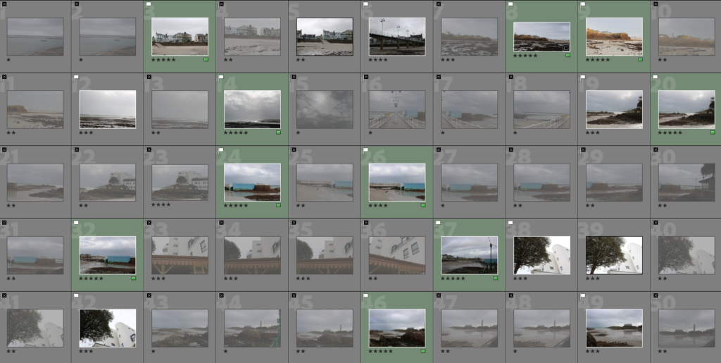
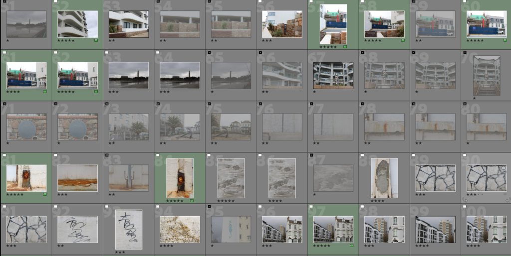
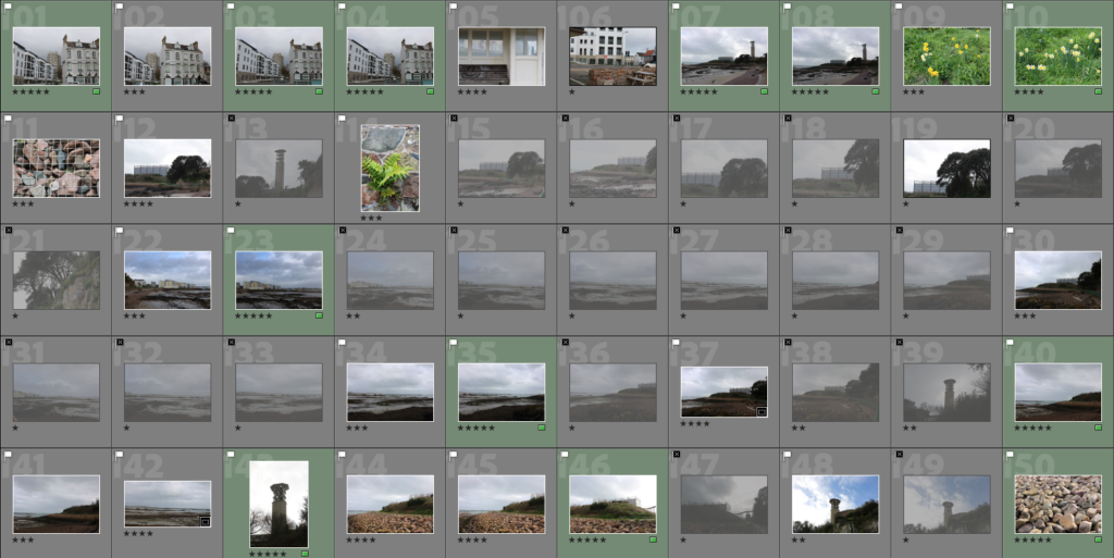

Firstly, I went around Havre De Pas and attempted to take urban landscapes obtaining natural scenery as well as industrial and man -made features. To help organize these images I started by flagging and rejected them therefore being able to give them the correct amount of stars. To finish this off, I lastly flagged my five star images green as they are my preferred ones therefore it will be more time efficient and easier to edit my favourite pictures therefore have a choice to pick my favourite one in the end of this project.
EDITING –

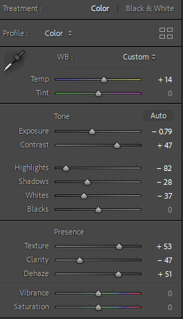
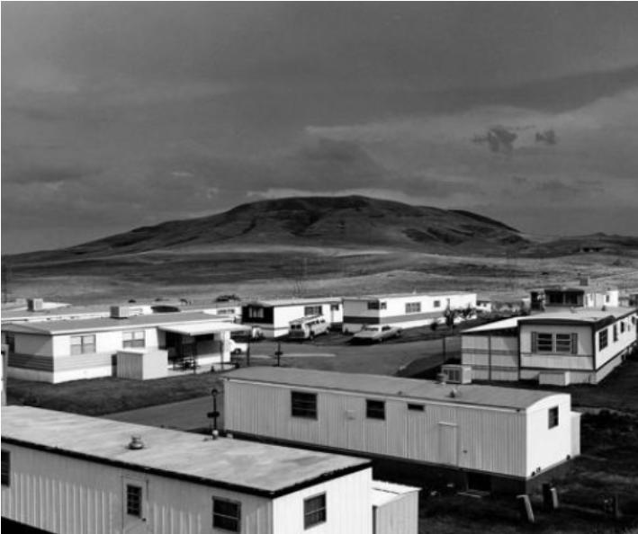
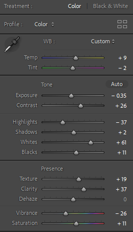
I chose this image as it obtains natural scenery such as the sand, seaweed etc and man-made features such as housing. The most interesting factor is the scaffolding and the different styles and wealth within each house. This significantly shows contrast between the man-made and natural scenery which ultimately links to Robert Adam’s famous image of the housing and the mountains in the background. I attempted to emphasize the clouds to make the image more interesting and eye catching to the viewer. I did this increasing the temp so it looked more aesthetically old and vintage which links to the theme of nostalgia as well as the aesthetic of the houses as they are not modern and are being renovated. I emphasized the clouds by decreasing the exposure as the image has no detail in the sky and increasing the contrast for more detail. I decreased the highlights so it looks slightly gloomy as in my opinion Adam’s images are as his work is mostly in black and white. Lastly, I increased the texture so the housing is not just the main factor of the image as the natural scenery such as the sky and sand is just as important. To do this successfully, I increased the texture to create more focus to create equality within both significant features.

I found this image very interesting as it clearly and successfully shows different levels of wealth or how the world and humans adapt slowly throughout life. An example of this, is housing as it was traditional to have an old granite exterior and eventually it has been adapted to a modern organized dull but clean aesthetic house. This image shows the modern habits as well as the traditional habits. However the old traditional house has scaffolding around to be renovated like the other one which significantly shows the following of trends us as humans fall into. I decreased the exposure as the clouds were very white which made the image over exposed but ultimately within this image it was not necessary to over edit as there is already a lot of significant factors so I did not want to make it ‘ too much’ or over stimulated.
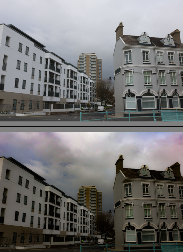
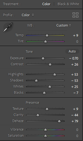
This is one of my preferred images as it contains the different stages and levels of wealth and poverty. The building on the left is modern and fits the human eye standard to this day. However the right building is more traditional and has an older aesthetic to it which is shown throughout the type of windows. the middle is a contrast of both as it is a tall structured building. All three of these buildings conflict within one another. I made the image more eye catching by lowering the exposure so it was correct for that image itself and increasing the contrast and highlights and decreasing the shadows to create more detail. Lastly, I decreased the clarity and increased the dehaze which ultimately made the sky look slightly more unrealistic however I believe it makes the image look a lot more aesthetically pleasing.

I like this image as it contains industrial subjects as well as non-man made objects that are seen as ‘beautiful’. Normally, industrial features are a necessity such as this one as it burns waste for the island. Therefore it isn’t really seen as a typical photograph you would take however Robert Adam’s took photos of a untypical photo that does not fit the ‘aesthetically pleasing’ expectation although he successfully made them interesting to look at and he grew in his career for that reason. Therefore I took this photograph as it obtains both factors and attempted to emphasize the sky to enhance the natural scenery.
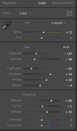
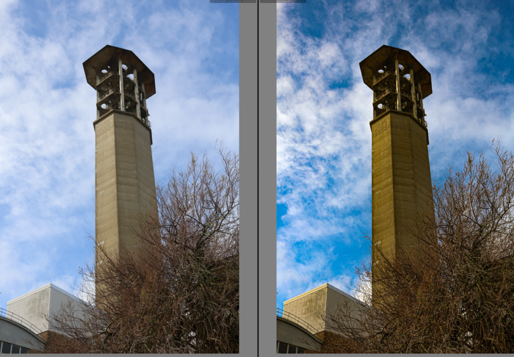
This image, to the viewer at first glance it isn’t significant. However, it isn’t necessary beautiful or pleasing in anyway but after I enhanced the vibrance and from the point of view I photographed this industrial subject it is clearly the main feature and the editing around it automatically makes the viewer look directly to this factor. This is interesting as viewers don’t normally give images like this a second glance however after editing the industrial feature to make it enhanced to make the viewer focus on it it changes the perspective. The point of view this is photographed is important as it is from the bottom looking up emphasizing the size and shape. It is also significant as it is showing what it would like to the naked eye’s perspective.
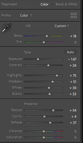



This image focuses on texture. I increased the temp to make it look older as the subject is already rusting. The most important edit technique I executed was increasing the texture as it showed the camera every detail in which the naked eye can not do as successfully.
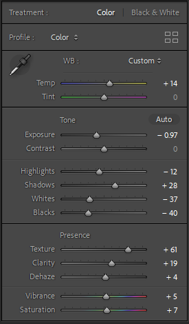
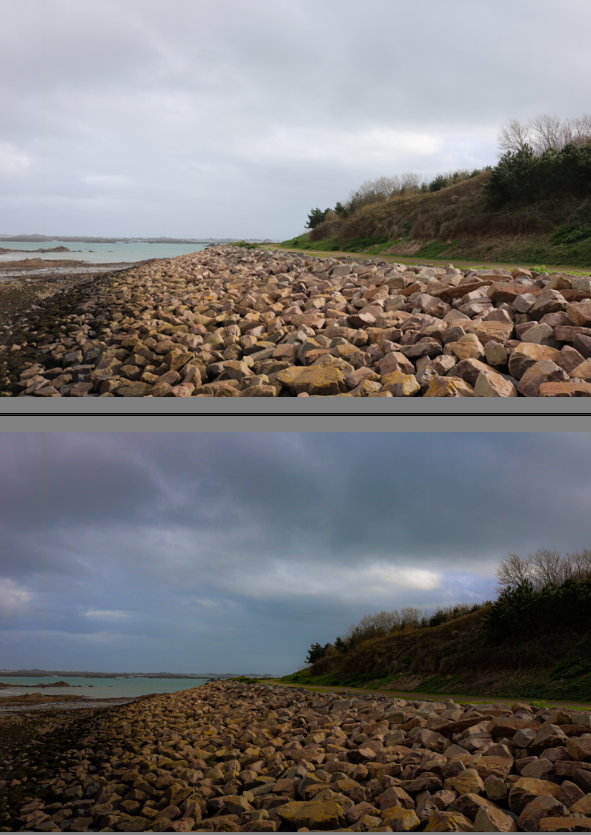
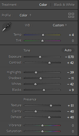

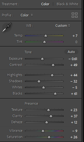

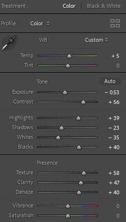

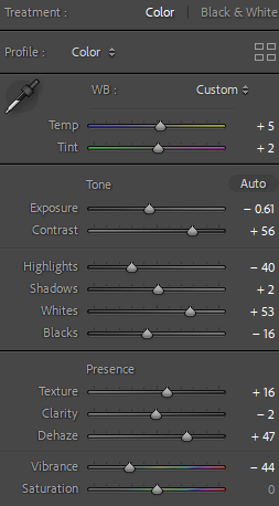
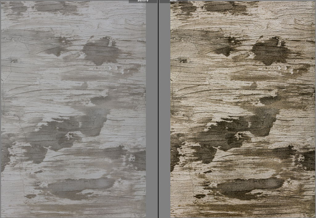
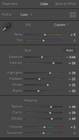

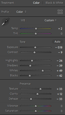

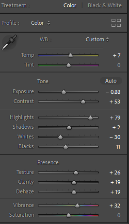

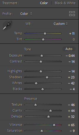
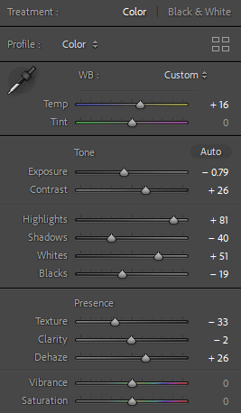
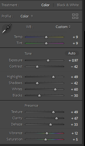
Straight away, I noticed 3 main factors of this image. Industrial, environmental/natural and textual features. An interesting part of this image is that the rocks are obviously not man-made however it is clear to the viewer they have been put around this island which was man structured and handled. This shows conflict and contrast and possibly the debate of whether it is man-made or not. We also can see the industrial building in the background which is impactful and significant as it is a necessity but not exactly seen as aesthetically pleasing or beautiful. I made this image look more unrealistic by increasing the texture, clarity and dehaze which created more detail within the texture on the rocks and enhanced the sky and clouds so the viewer wouldn’t forget about the importance of the environmental factor as they are all equally important in this specific image. Lastly, I increased the vibrance so the image looked brighter and less dull so it fit into the expectation.

A famous book- This Equals That by Tamara Shopsin & Jason Fulford
This book, shows juxtaposition and how both link and differ.
” One thing leads to another. Isn’t’ that the best way of being in the world?” Maira Kalman in response to this book.
This book, signifies and shows 2 opposite or similar images and makes you question how they are similar/different?
My response to this book –

This juxtaposition shows us rust which is the similarity both these images have. However, they are in different shapes, different textures and different lining and geometry. Although it has the same element, they are displayed in different ways. The texture tells us both of the rusts in these images would feel significantly different. The subject in the first image is more displayed portrait, although the second’s subject is not as observable and outstanding, and is rather landscape and subtle.
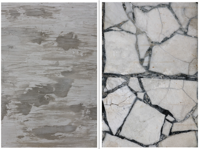
These two images have more to contrast, as they have less similar key features. These 2 images show significant natural damage. The difference is that the first one is scratches, and the second are cracks. A similarity they both have is that you actually cannot tell what each image is which keeps the viewer guessing and intrigued.
