What was The New Typo graphics
The new Topographics was a term coined by William Jenkins in 1975 to describe a group of American photographers such as Robert Adams and Lewis Baltz who had a similar Banal Aesthetic, in that they were formal, mostly black and white prints of the urban landscape. The photos often captured the tension between natural scenery and the mundane structures of post war America.
What Inspired the New Topographics
Many of the photographers associated with new typographics including Robert Adams, Lewis Baltz, Nicholas Nixon and Bernd and Hiller Becher, were inspired by the man-made, selecting subject matter that was matter-of-fact.
Image Analysis
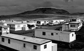
This photo separates the natural beauty of the mountain and then the trailer park below it juxtaposing the negative and the positive of the post was in America as many Americans lost their homes from the destruction of the was and couldn’t afford to stay in their houses any longer as they might of lost their families or their partners to the war. The colour in this image is in Black and white which makes the image look more dramatic and more powerful, which gives the image a dark and sombre look to it.
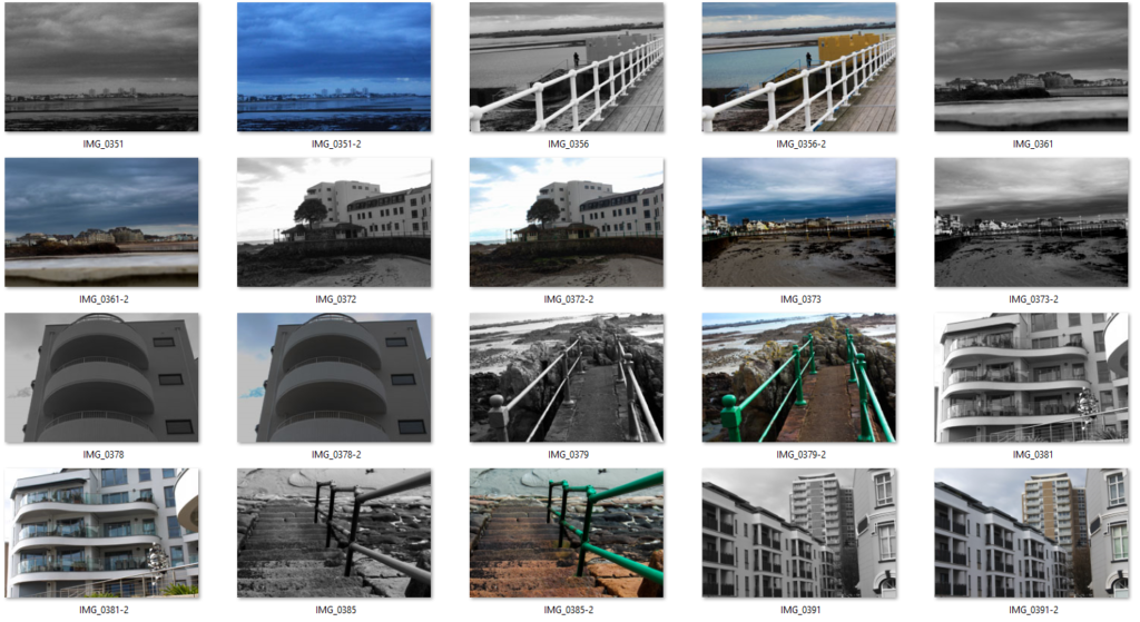
Industrialised building photoshoot
Edited Images
Best Images

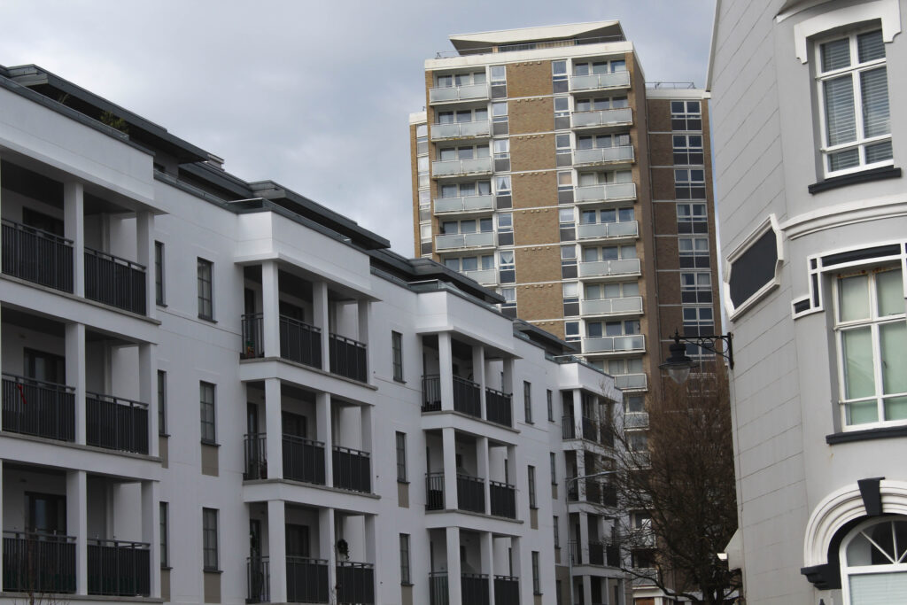
These are two of my best images as they capture industrialisation the best. The lines and shapes in these two images make the photos look so much more interesting and different. The line of the poles in the first image is a really good focal point and the lines in the sand direct your eyes to the focal point. The colour of the sky also makes the poles stand out more as the contrast between the dark sky makes the white look more vibrant.
In the second image the building in the background has been there for many years and is quite old but in the foreground the building has only just been built and is very modern . Which contrasts between old and new. The tree in the background suggests that this place was once overflowing with nature until industrialisation took over and buildings needed to be built to accommodate for the growing population.
Edited best photos
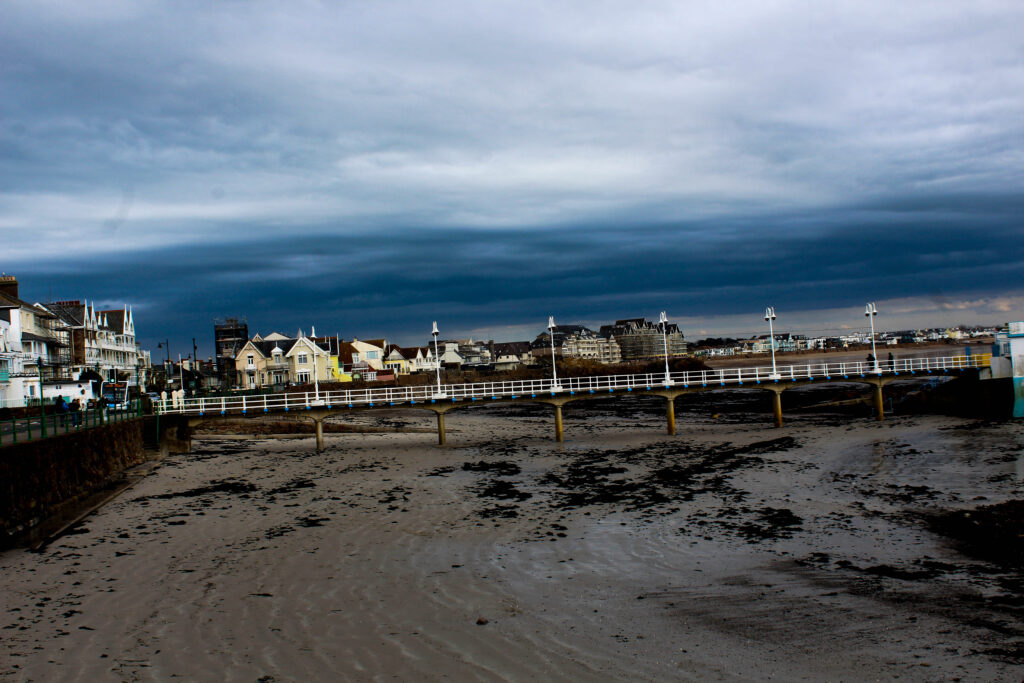
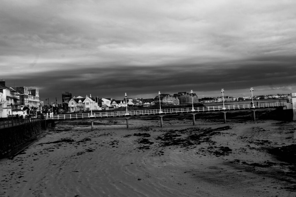
I changed the colour into black and white and then changed the darkness of the sky to give a more dramatic and darkened contrast between the sky and the rest of the image.
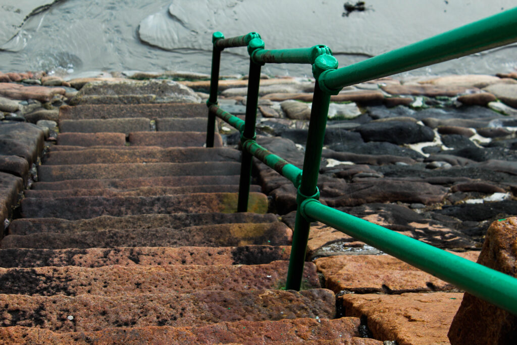
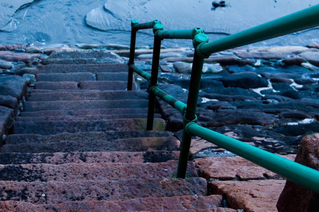
I further experimented with my photos and made this image of the stairs a darker shade of blue and altered the angle of the stairs making the stair rail straighter and look more in line with the stairs.

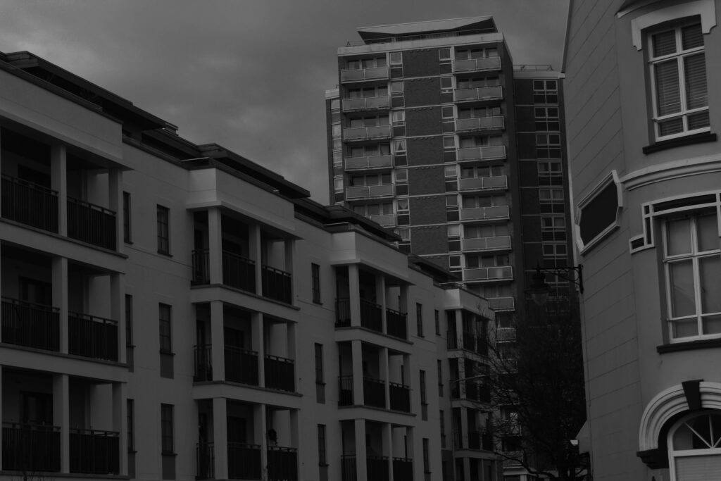
For this image I made the image on the right a lot darker by increasing the shadows and decreasing the amount of whites on the image.
