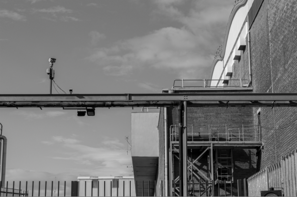
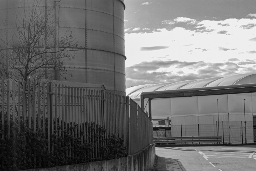
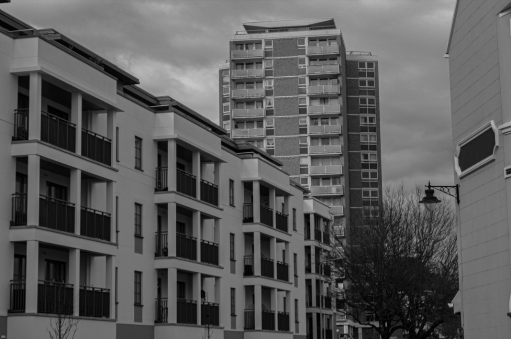
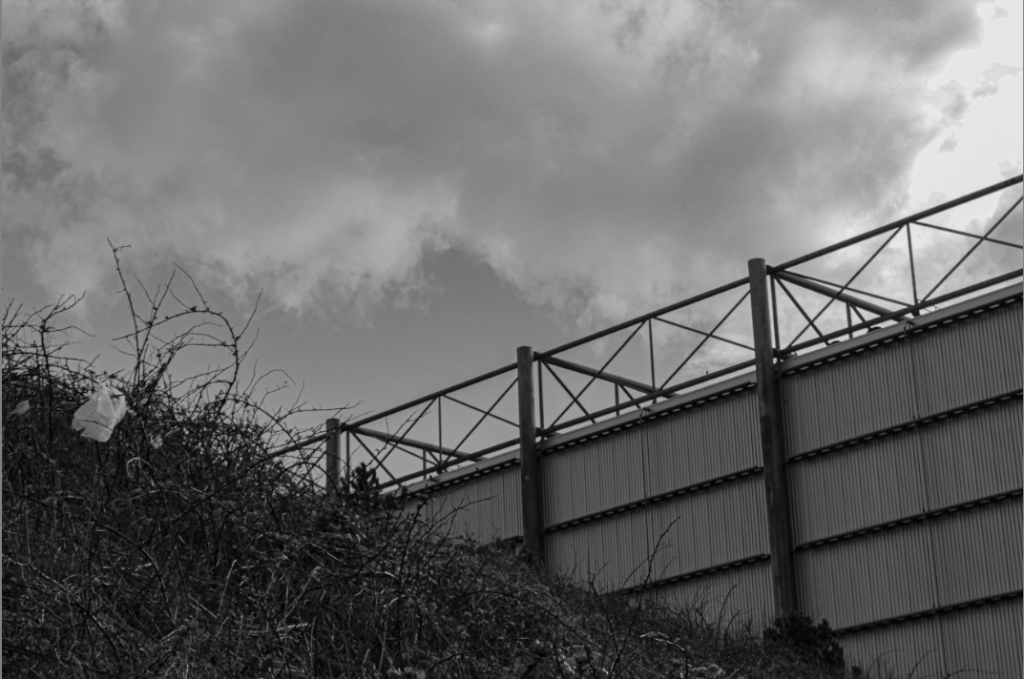
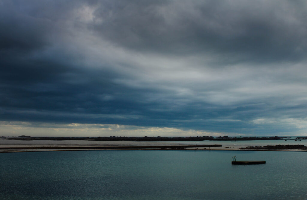
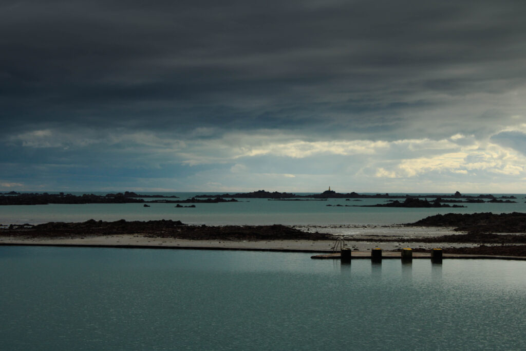
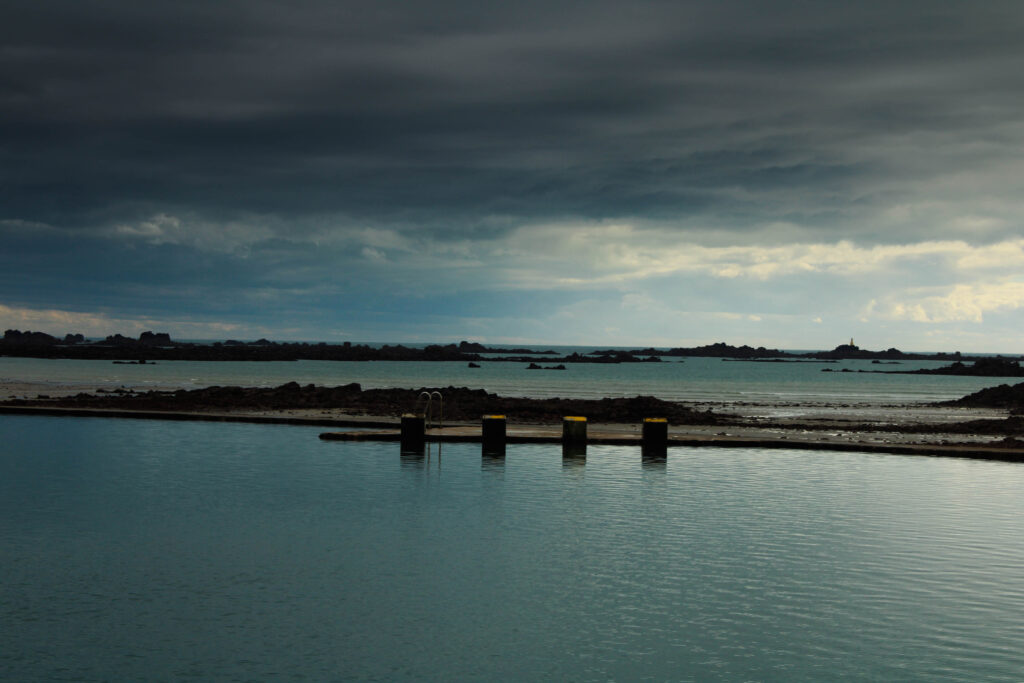
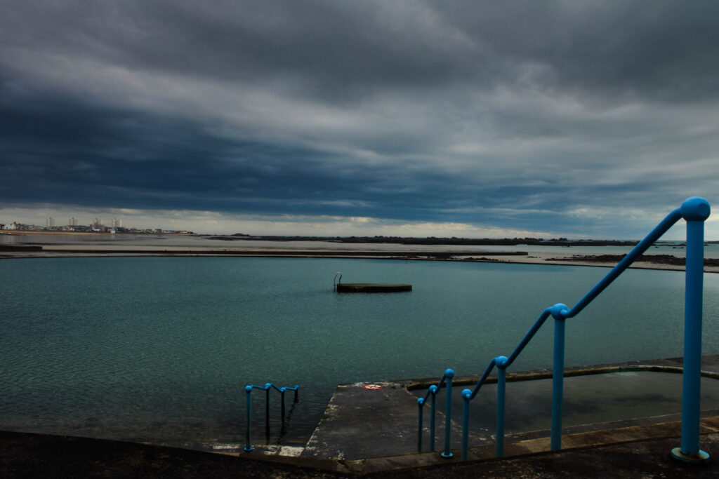
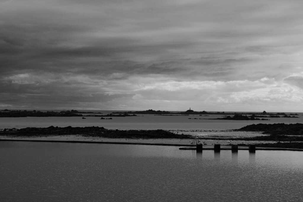
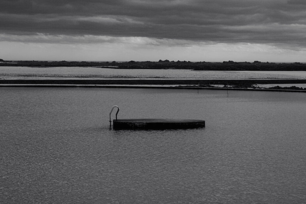
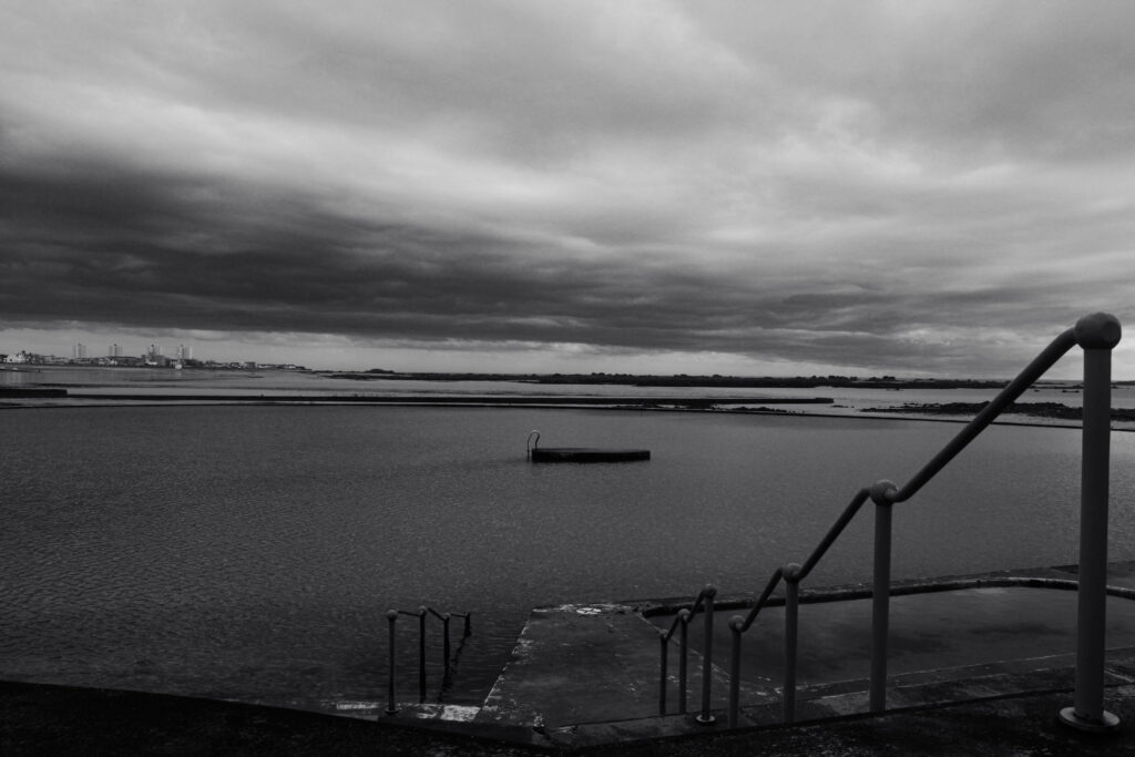
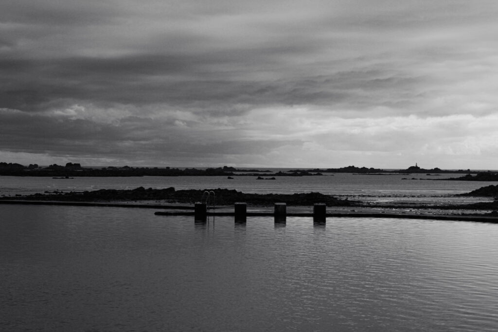
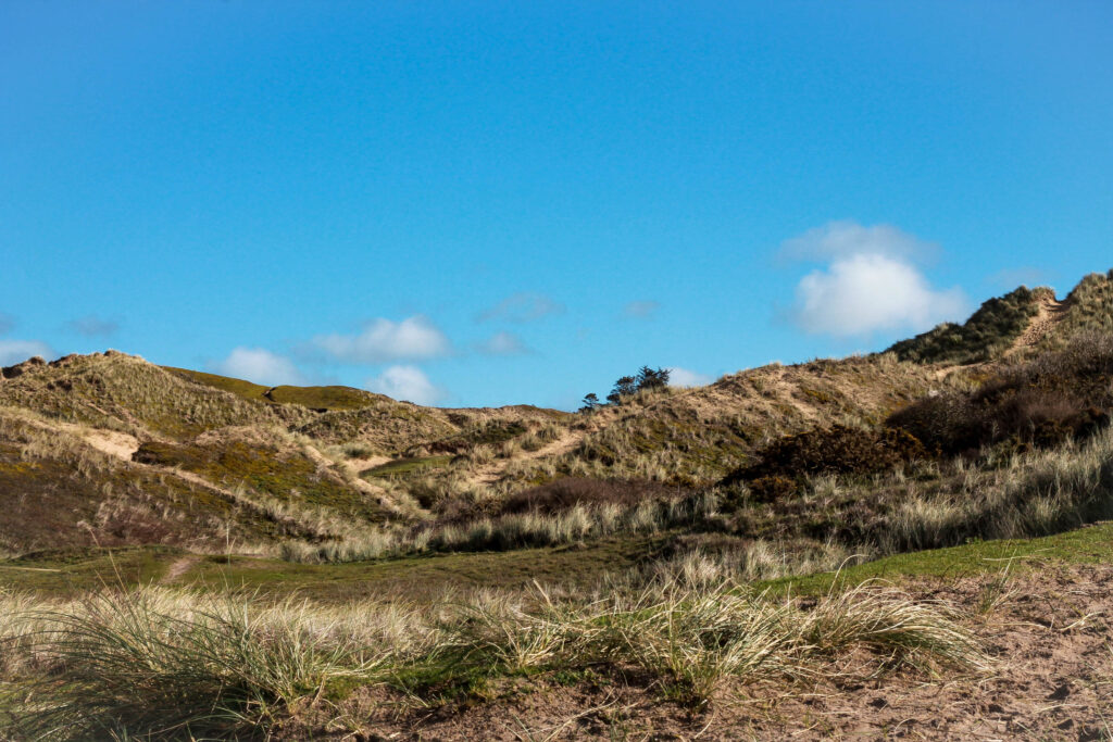
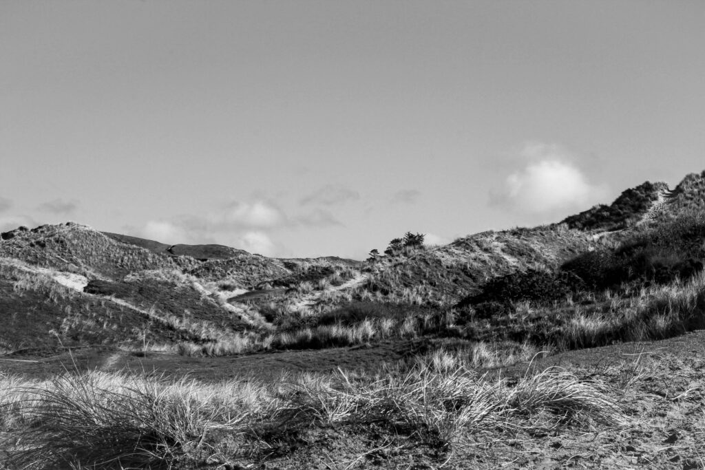
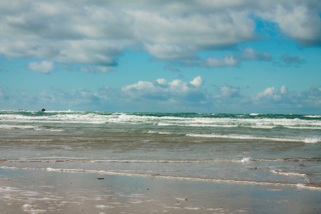
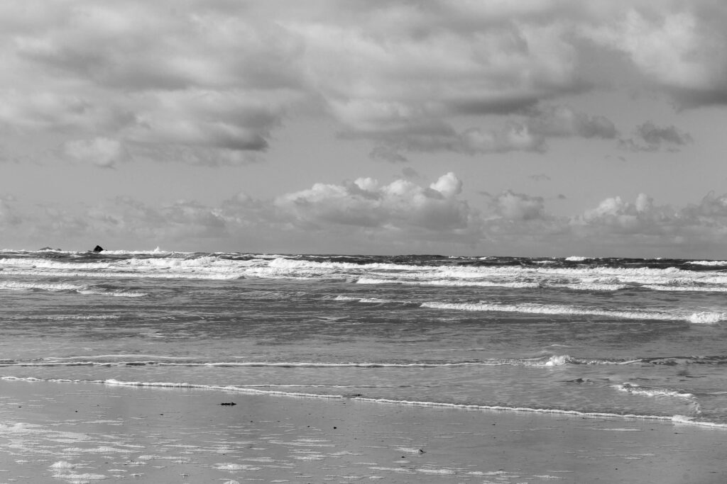
St Ouen Photoshoot

For this photoshoot, I went with a diverse approach and used multiple locations around St. Ouens and St. Brelades. This was so that, later when the sun was setting, I had a location in mind that I thought would look best that day. This is because I believe Jersey looks the best during the golden hour, and this day was the perfect day to demonstrate that.

Location 1

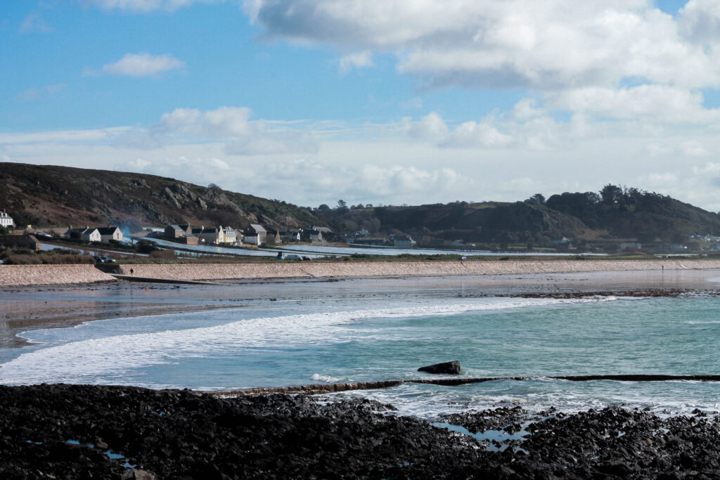
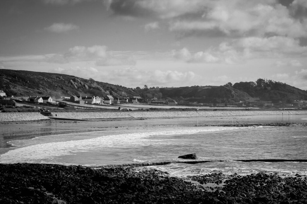
The first location I decided on was La Pulente in St. Brelades.
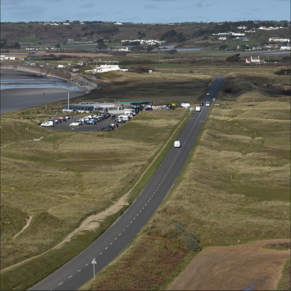
This photo shoot was partially inspired by Joe Deal, a new topographic photographer who is known for his bird’s eye view photographs. I thought that this location was best for this because the hill looks out onto the beach, where La Rocco tower is, and the 5 mile road which leads towards the La Braye cafe. I knew I could use this in inspiration of Joe Deal because both key points in the landscape are demonstrations of the manmade world mixing with the natural world. However, I had a few ideas of my own that would differ my work from Joe Deal’s.

Firstly, I wanted to include people in my photos. Joe Deal preferred to do the opposite and removed people from his shots to make the buildings and the infrastructure the focus of his photos. However, I am taking photos of the natural beach and sand dunes rather than the manmade city suburbs or landscapes, and I wanted to show how the people of Jersey enjoy the Jersey landscape, and not how it is full of boxy eyesores like cities are.

Secondly, I wanted to include the horizon in some of my photos. Joe Deal commonly doesn’t include the horizon in his photos. However I thought that, because some of the other Channel Islands can be seen in the horizon at La Pulente, my photos would be enhanced if I did include them. I find that they add an additional point in the landscape so that the viewer can understand the distance more clearly in the photo.

In my landscape, the only obvious, city-like building I could use was the La Braye Cafe with the 5 mile road running alongside it. However, I also wanted to show in the photo that the cafe is not an eyesore, and it doesn’t ruin the landscape like a city would. Here are a few different ways I tried this.

In the top left photo, I framed the road parallel to the ocean and made the cafe quite small and out of the way in the frame. In the top right, I cropped out the cafe to see how the photo would look without it. In the bottom photo, I aimed to make a photo more like Joe Deal, so I cropped the photo into a square and enlarged the road and the cafe to make them the focus of the photo.

Best Images

Location 2

The second location I went to Les Monts Grantez in St. Ouens.

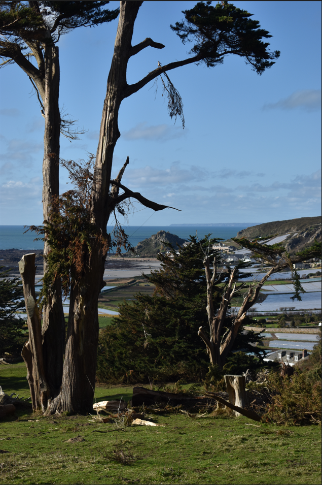
I chose this location because of the extreme storm damage to the rare trees that stand tall on the headland. Additionally, the location offers a beautiful and awe-inspiring view of L’Etacq, which is especially sublime during the sunset.
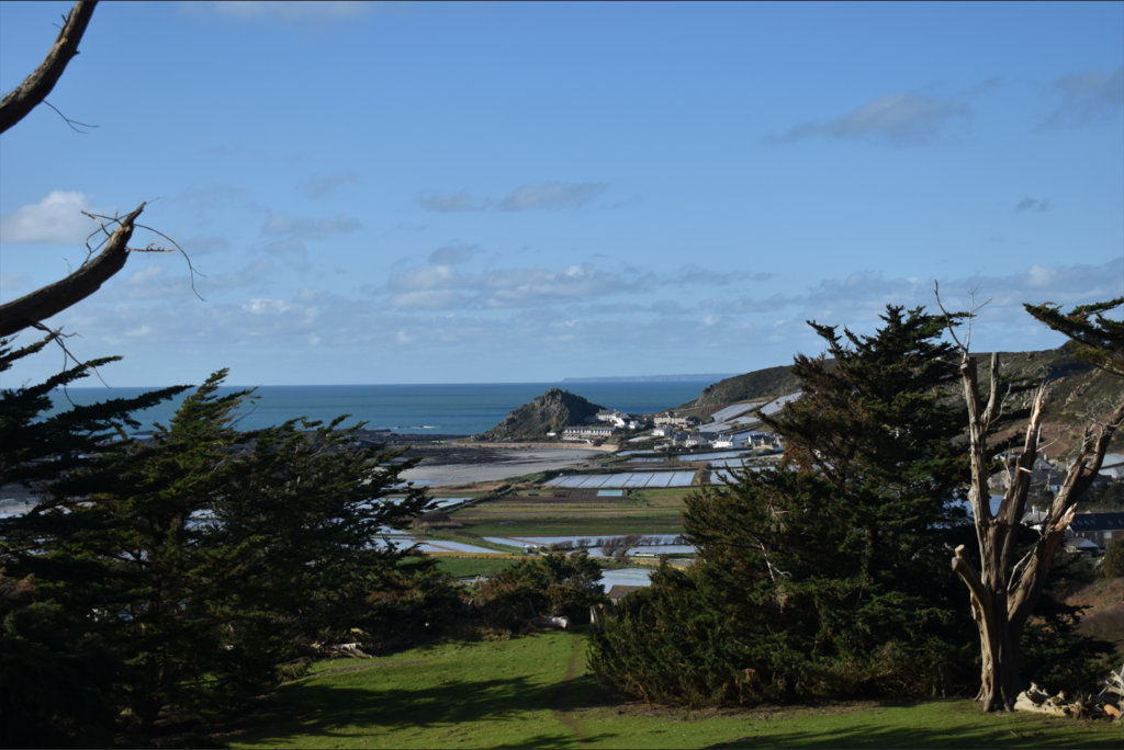
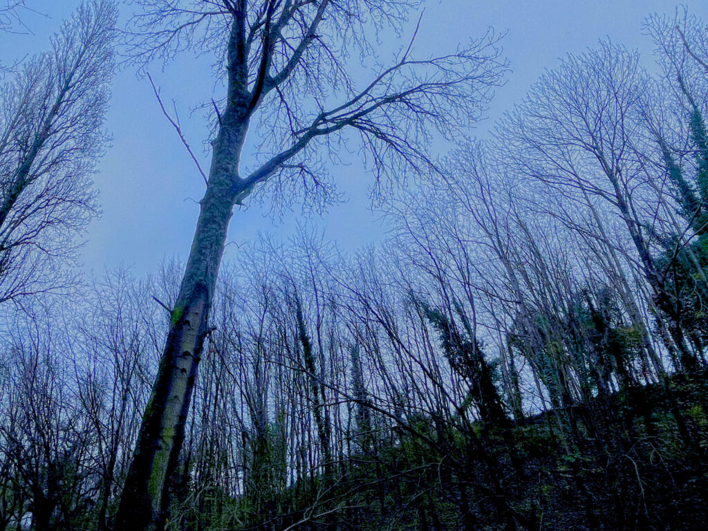
However, the view towards L’Etacq is quite misleading in consideration of the rest of the location. The trees along the edge of the headland seem untouched by Storm Ciaran, and their deep green pigment makes them appear strong and lively. However, directly behind this angle shows a different story.

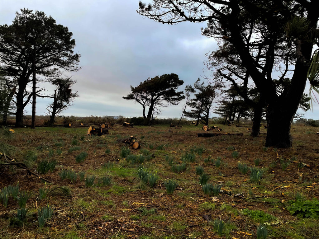
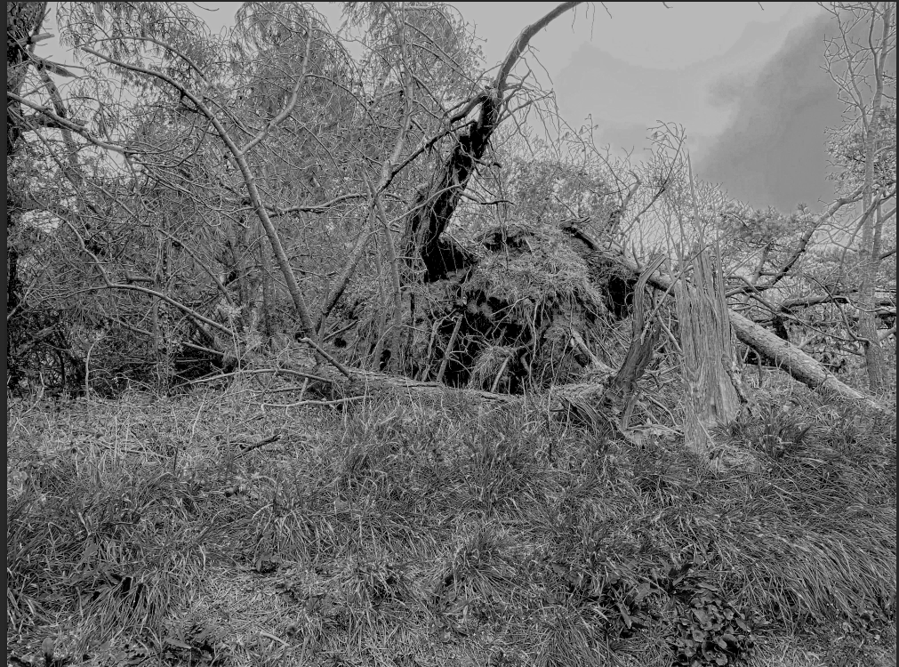
This specific species of trees, also known as ‘Scots Pine’, are indigenous to Jersey, and are the only ones of their kind. As you can see, these trees are severely damaged, at a time when they should be thriving. Large branches and cut-up logs lay scattered along the ground. It was dangerous for me to walk below the trees, as parts of the trees were still falling. You can even see that the remaining greenery at the tops of the trees are permanently affected by the harsh winds of the storm.

Although most of the damage caused by Storm Ciaran was in the east of Jersey, I thought that I should show how it has also affected the west of the island. Also, I wanted to show that, even though the storm didn’t affect much of the population of Jersey, it did harm some of the most beautiful scenery in all of Jersey.

Best Images

When photographing this location, I found that this angle of the L’Etacq ‘mountain’ stood out to me.
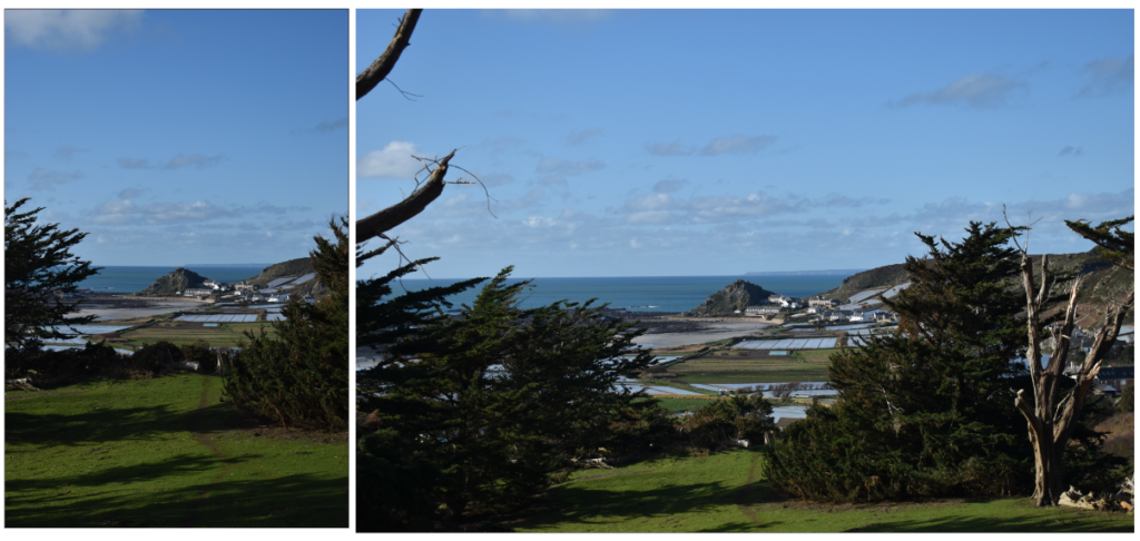
I decided that this would be the specific shot that I would work with later in the day when the sun was setting. But in the meantime, I had more ideas.

Location 3

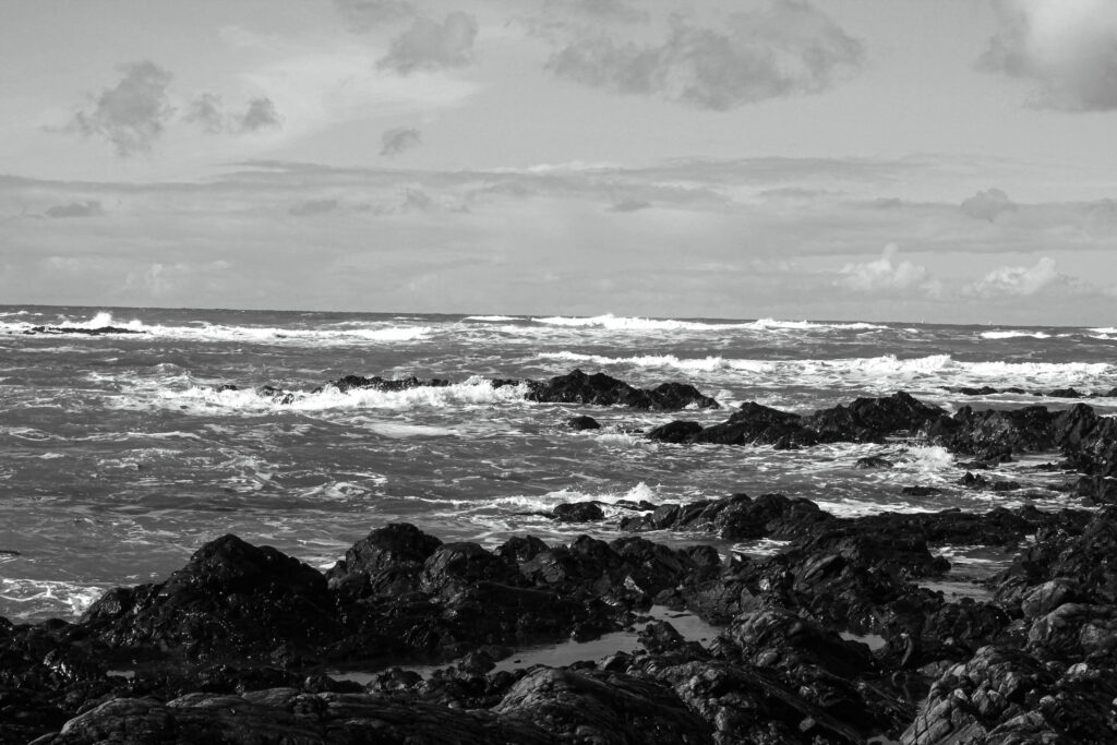
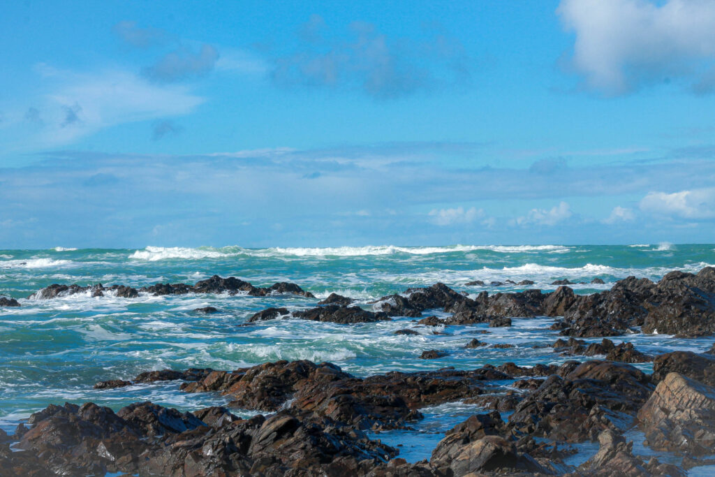
While at Les Mont Grantez, I saw that the tide was very low. I thought that this would be a great opportunity to work with the rocks at L’Etacq.

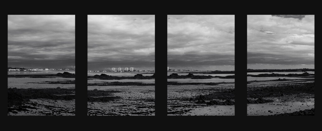
I used this photo shoot to try and work with a linear sense of distance. By this, I mean that the rocks and the ocean are flat, and the foreground, middle ground and background are all below the camera. When photographed it creates a flat scale which is easy for the viewer to interpret. I first experimented with this by using the rocky cliffs of Le Pinacle to fill part of the frame.

This was the best image to come out of the initial experimentation. I find that this image has a good blend of colours, and the placement of each environment in the photo is very separate and individual.

I also took this photo, which is similar to the previous one, but the rocks take up all of the foreground. I feel that this specific location is a very surreal place in Jersey. You are completely surrounded by the rocks, which are very tricky to navigate, and the cliffs at Le Pinacle provide an additional sense of sublime. However, I didn’t choose this location to be the one I would use during the sunset because I felt that this environment was better portrayed in harsh weather conditions when this tide is further up. This did end up being the inspiration for one of my later photoshoots.

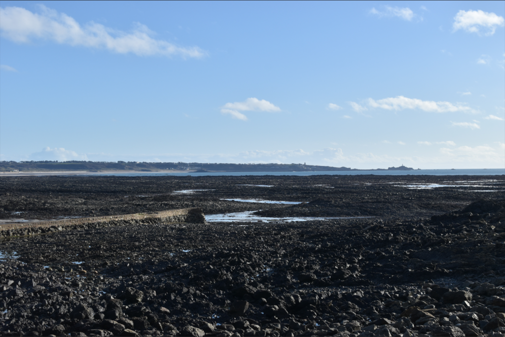
Moving further around this location, I found more ways I could experiment with the flat landscape.

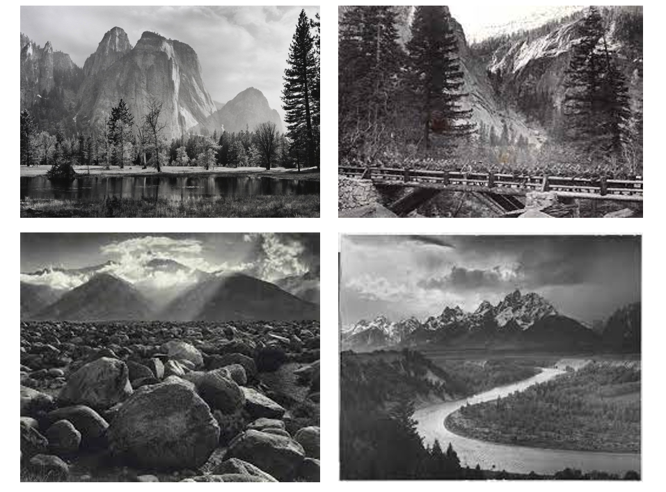
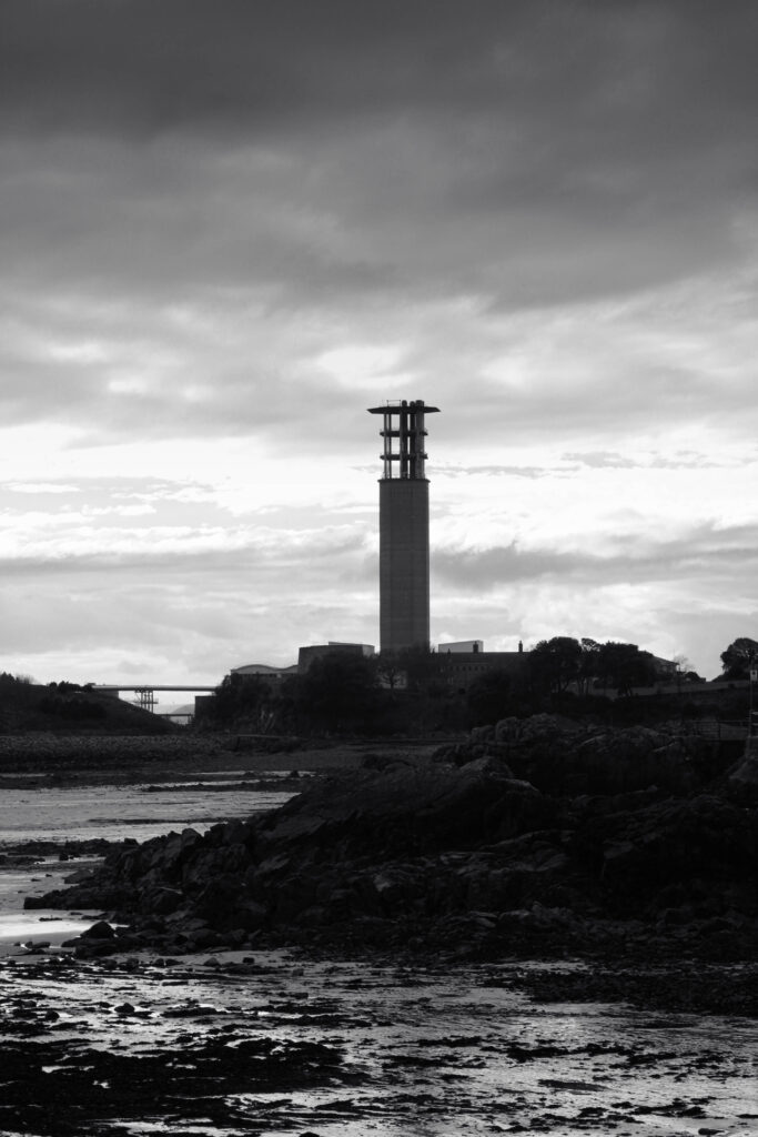
This was the first photo I took of this view. I was very inspired by this for three reasons. The first is the distant Corbiere lighthouse. I felt that it was a good background to include in the rest of these photos. The second was the flowing water in the middle of the frame. The water twists and turns like a river, and flows like a snake. I was also inspired by it because it looks like the river that appears in this photo by Ansel Adams.

Thirdly, I thought that the pier on the left of the frame was a great place to stand so that both the river and the lighthouse are positioned nicely in the frame. This was the photo that I got from this idea.

I was very happy with this photo. The distant lighthouse sits perfectly in the middle of the frame, and below it is the flowing body of water, that leads the eye towards the middle left of the frame, where two fishermen are walking along the side of the water. In editing, I plan to make them more obvious by dodging that part of the photo to bring up the exposure. Also, the colouring of the photo is two-tone, making it very basic and easy to look at for the viewer.

Best Images

Final Location

Finally, once the sun had begun to set, I headed back to Les Monts Grantez.

Here I produced a variety of photos, trying my best to include the different aspects of the sunset. I started by heading straight to this specific view I spoke about previously.

I had a few ideas in mind when first taking these photos. I first experimented with a few different fields of view, until I ultimately settled on the one I thought was best. Secondly, I changed where I was standing to make L’Etacq the main subject of the photo. Additionally, I experimented with landscape and portrait photos to perfect this photo. These are the two final photos I came up with for this specific angle.

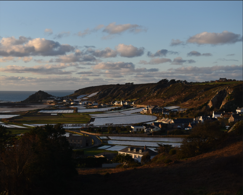
I then moved onto the other side of the bay, where the Corbiere lighthouse can be seen.

I experimented with a few different angles. I found that I really liked the green tint that the sunset created. Also, I tried my best to show how the sun was hitting the clouds above. Ultimately, I found that this photo does it the best.

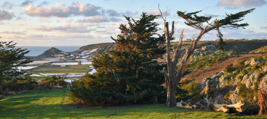
I then returned to the original shot that had inspired me to come back to this location to work on it a little bit more. The sun had since become unblocked by the clouds, and the greenery of the landscape was really coming out quite nicely.

I experimented with a few different angles. I mostly was trying to use the trees to lead the eye towards the ‘mountain’ at L’Etacq. I was also looking at how the sun was giving the photo a warm feeling, and I looked for certain colours in the frame that emphasised this. Ultimately, I ended up with these two photos.

I was extremely happy with these photos. They both capture the exact elegance of standing atop that headland with the life of the trees and the powerful greenery around you. The addition of the sunset creates this beautiful environment that really brings out these incredibly warm colours. I found that I was able to fill my frame up very well with everything around me. Ultimately, I finished the photoshoot there as it was getting too dark for my camera to handle.

Best Images (All of Photoshoot)

Virtual Gallery

Urban Landscapes – Contact Sheet

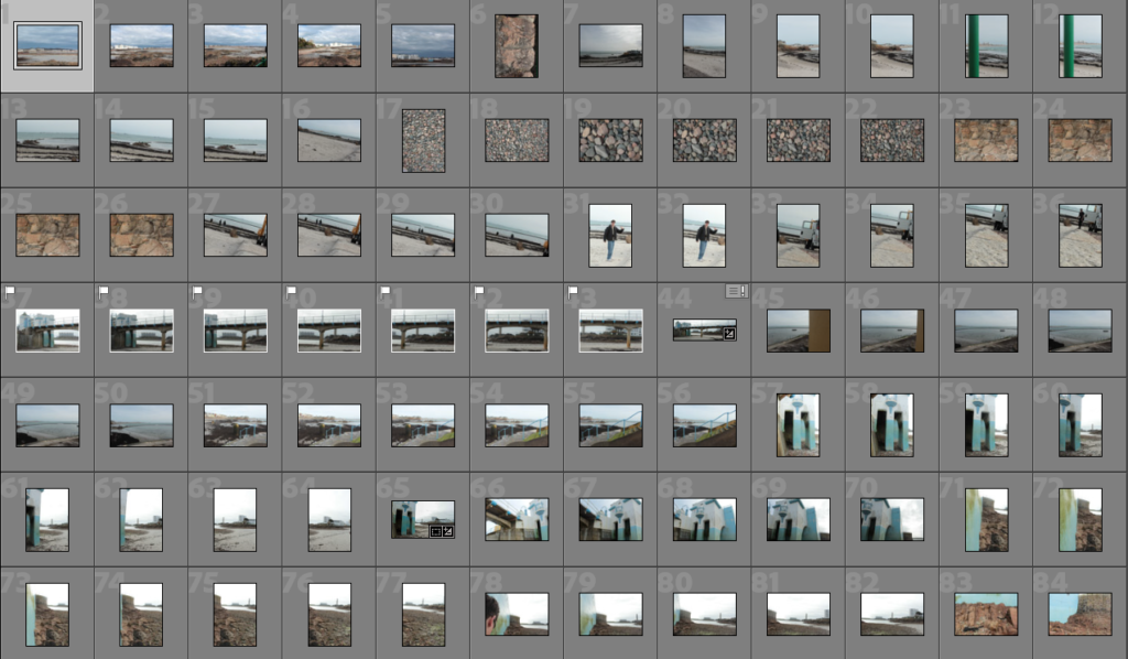
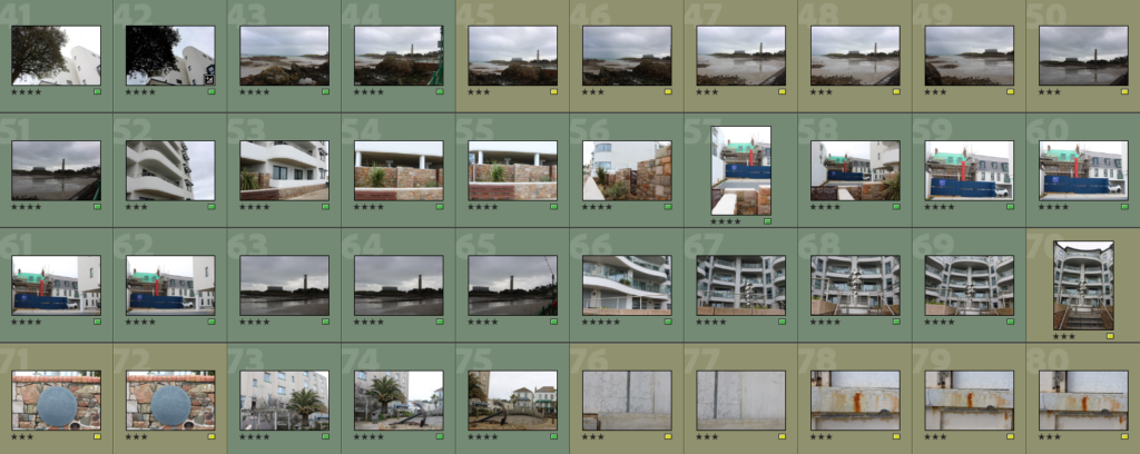
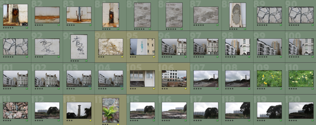
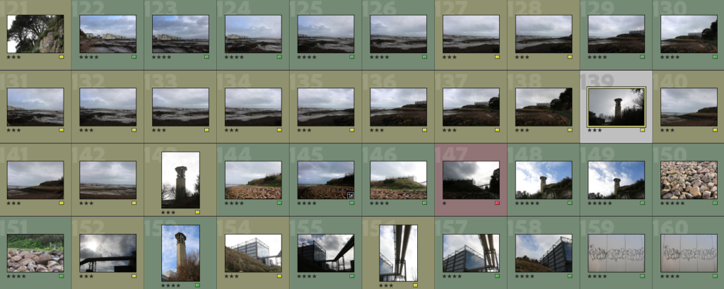
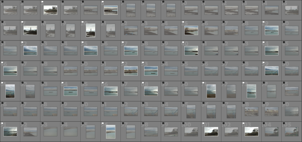
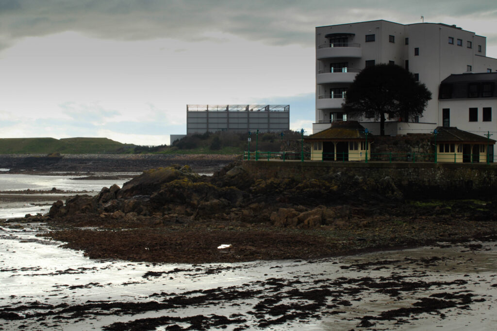
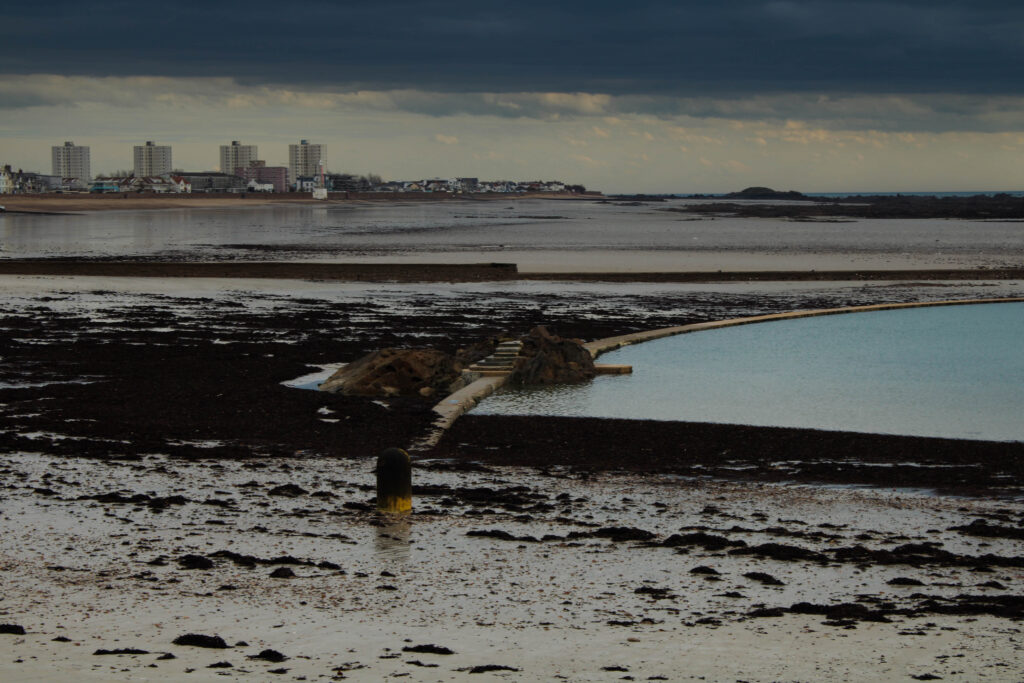
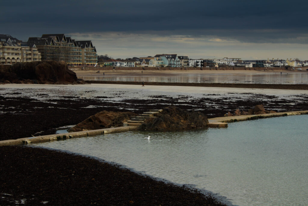
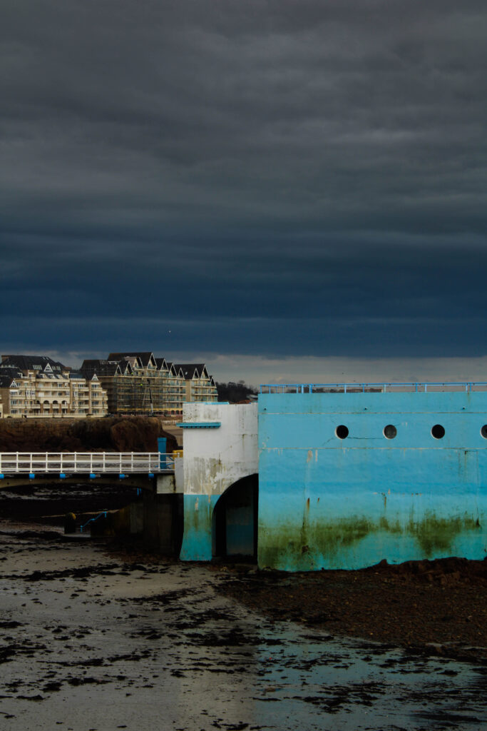
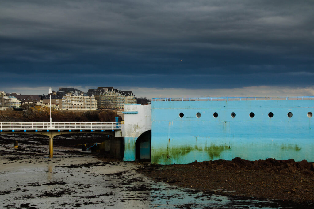
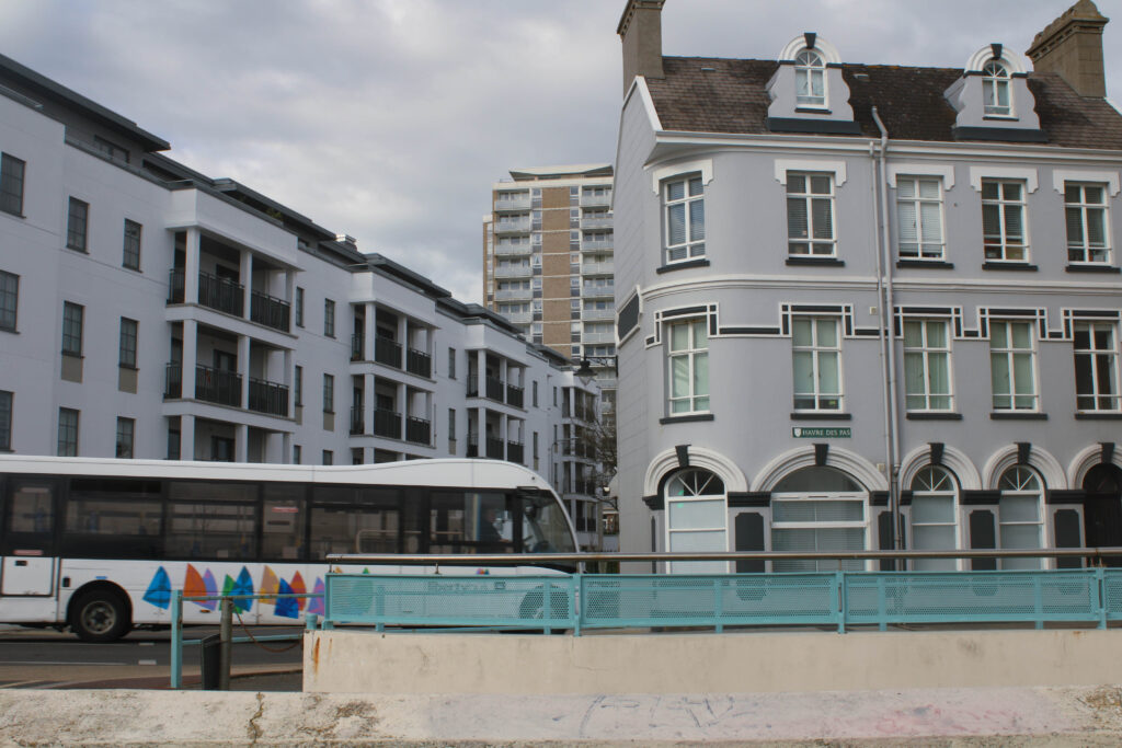
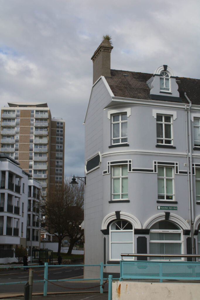
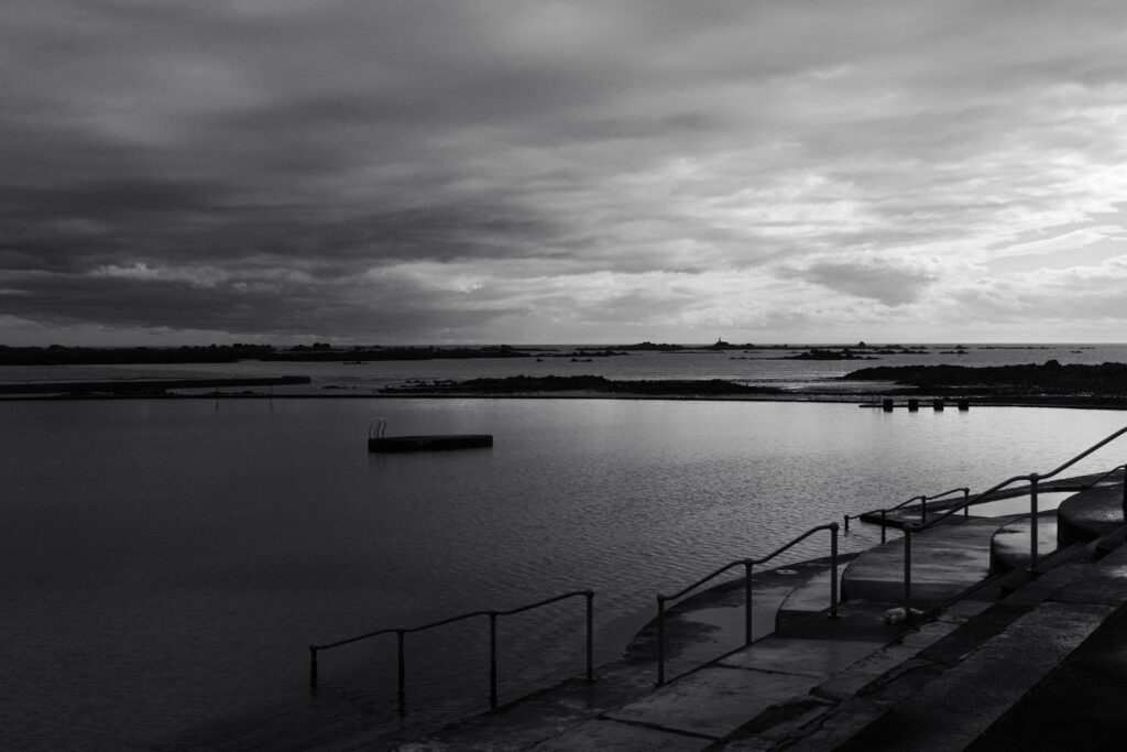
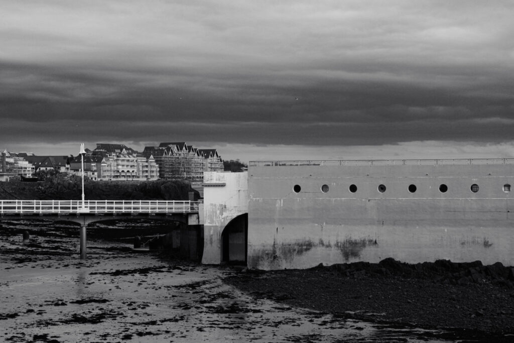
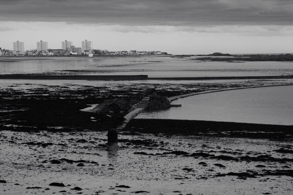
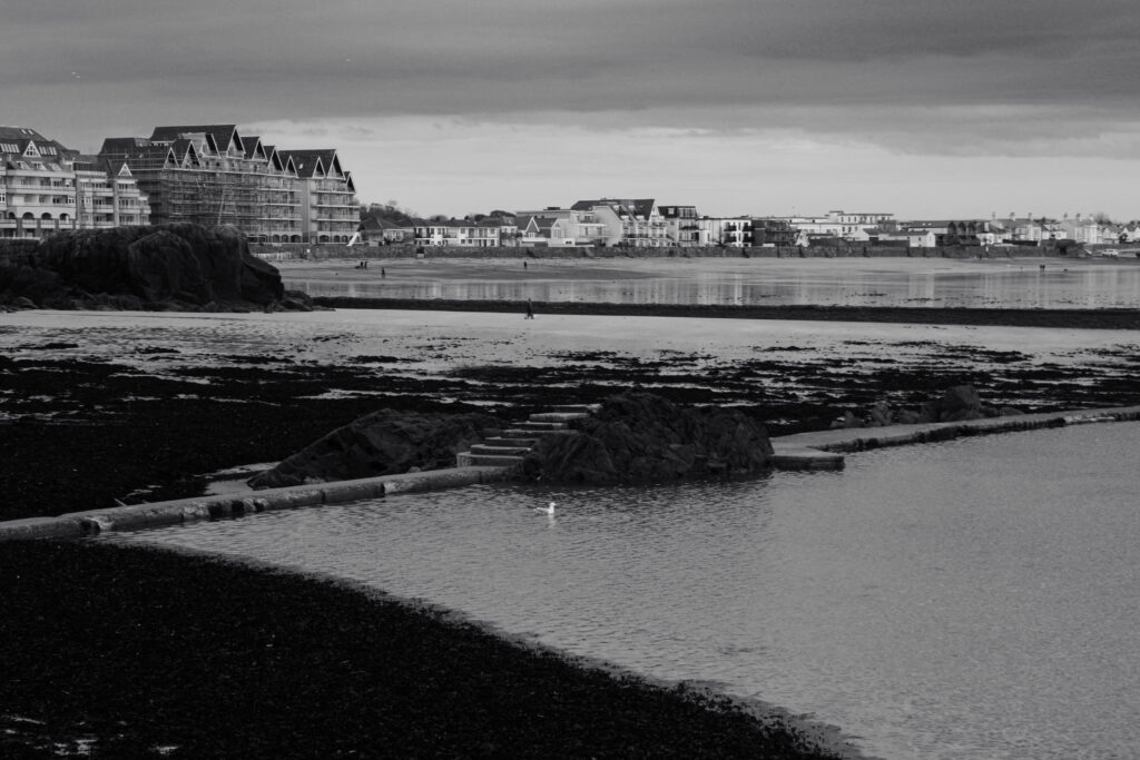
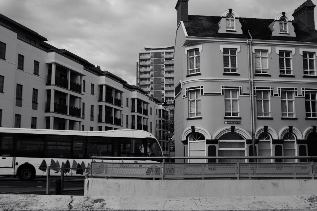
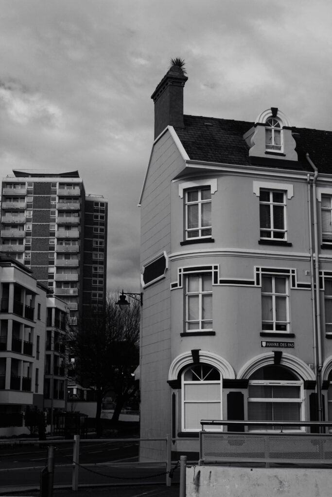
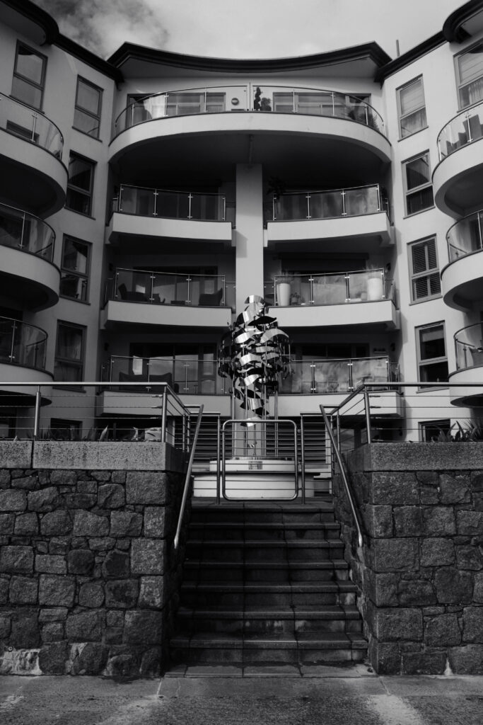
For this photoshoot we went down to Havre Des Pas and around the harbour to capture some of the modern / historical features in the area. We started at the bridge and made our way down onto the sand, where we were able to incorporate some of the ancient buildings, and the large rocks. We then walked down towards the Good Egg café, where I was able to photograph many of the recently-built apartments overlooking the sea. This worked well within the photoshoot as it contrasts with the historical and industrial monuments surrounding them, making the photoshoot successfully appear more interesting for the viewer, where they can observe how the modern world has adapted.

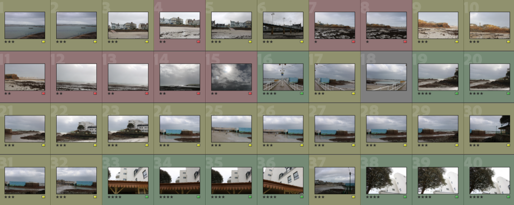
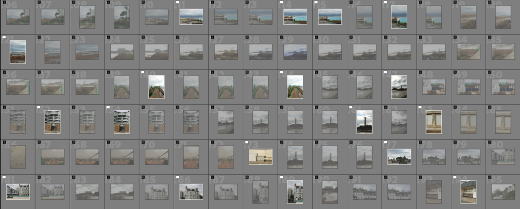
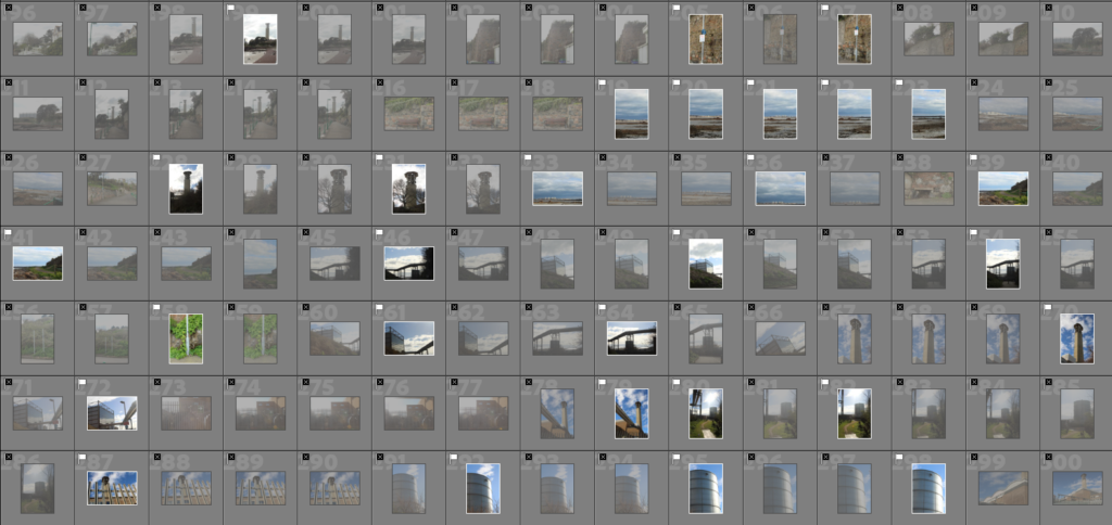
In order to filter and organise my images from the photoshoot, I flagged them first to arrange them into my best images compared to my worst images. This helps me identify which images to use for future projects etc. I then colour coded them into green (my most successful), yellow (potentially could be used), and red (my least successful) to emphasise how many effective outcomes I captured, and how I can improve for my next photoshoot. Furthermore, I rated each image out of 5 stars, to exaggerate which of my photos are fortunate and which ones need improvement. These approaches also allow me to use photoshop and lightroom on some of my unsuccessful photographs, and perhaps edit them to give them more eminence.

STORM CIARAN

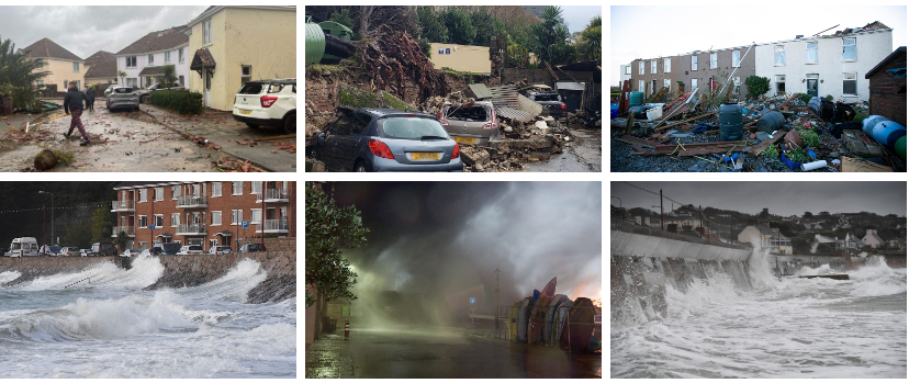
Storm Ciarán was a European windstorm that severely affected parts of Europe from late October to early November 2023. Part of the 2023-24 European windstorm season, Ciarán impacted north-western Europe and killed 21 people, eleven of whom were in Italy and four in France. It also caused mass disruption to transport. Widespread damage from 100 miles per hour (160 km/h) winds were reported in the Channel Islands, while 1.2 million French households were left without electricity. In Jersey it hit 167km/h (104mph). Storm Ciarán changed into named with the aid of using the United Kingdom`s Met Office on 29 October, even as the Free University of Berlin in Germany named the gadget Emir on 30 October. It changed into anticipated to convey winds of ninety to one hundred twenty km/h (60 to 70 mph) broadly with >a hundred thirty km/h (>eighty mph) on a few coasts. More heavy rainfall changed into anticipated to fall which might exacerbate the flooding from Storm Babet per week prior. The Met Office’s long-variety forecast said that Storm Ciarán might flow away on three November, with many locations nevertheless with blistering winds and rain spells. The Channel Islands have been because of be hit with gusts round ninety five mph (153 km/h) with colleges closed and a crimson climate caution in place. On 1 November, this changed into up to date to a Force eleven violent typhoon, with the Met Office pointing out that Storm Ciarán changed into present process explosive cyclogenesis. The typhoon might effect the Netherlands on 2 November. The typhoon particularly affected the Isle of Jersey, in which a robust thunderstorm fashioned a twister along the golfing ball sized hail with windspeeds of the typhoon accomplishing over a hundred mph (one hundred sixty km/h).

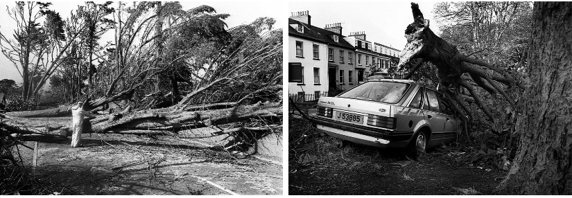
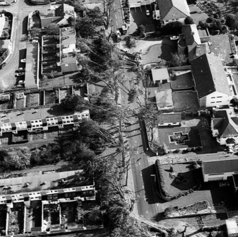
The damages caused by the Storm Ciarán in Jersey was similar to that seen with the severe ‘Great Storm’ in 1987. The great storm of 1987 was a violent extratropical cyclone that occurred on the night of 15–16 October, with hurricane-force winds causing casualties in the United Kingdom, France, and the Channel islands as a severe depression in the Bay of Biscay moved northeast. Forests, parks, roads, and railways have been strewn with fallen bushes and faculties have been closed. The British National Grid suffered heavy damage, leaving heaps with out power. At least 22 human beings have been killed in England and France. The maximum measured gust of a hundred thirty five miles in line with hour; 217 kilometres in line with hour (117 km) became recorded at Pointe Du Roc, Granville, France and the very best gust within side the UK of one hundred twenty mph; one hundred ninety km/h (one hundred km) became recorded at Shoreham, West Sussex. The hurricane has been termed a climate bomb because of its speedy development.
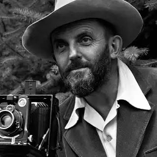
ANSEL ADAMS

“In wisdom gathered over time I have found that every experience if a form of exploration” – Ansel Adams
Adams was born in the Fillmore District of San Francisco, the only child of Charles Hitchcock Adams and Olive Bray and died April 22, 1984 (age 82 years), California, Untied States. He turned into named after his uncle, Ansel Easton. His mother`s own circle of relatives got here from Baltimore, in which his maternal grandfather had a a hit freight-hauling business however misplaced his wealth making an investment in failed mining and actual property ventures in Nevada. Adams`s first photographs have been published in 1921, and Best’s Studio started out selling his Yosemite prints the next year. His early photos already confirmed careful composition and sensitivity to tonal balance. In letters and playing cards to family, he wrote of getting dared to climb to the best viewpoints and to brave the worst elements.
Ansel Adams, America’s most beloved wilderness photographers, shunned romanticism to reveal the raw beauty of the outdoors. Ansel Easton Adams, arguably the most famous pioneering modern nature and landscape photographer.

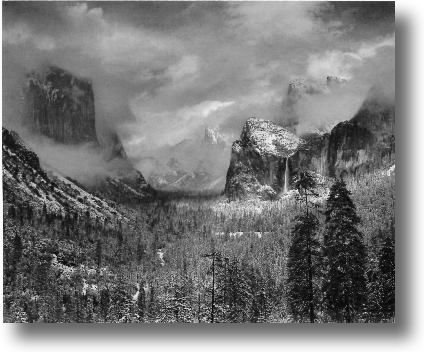
Clearing Winter Storm, Yosemite National Park

Clearing Winter Storm, Yosemite National Park, California is a black and white photograph taken by Ansel Adams, c. 1937. It is part of a series of natural landscapes photographs that Adams took from Inspiration Point, at Yosemite Valley, since the 1930s. This picture of a clearing and spent winter storm was taken on a day in early December. The storm, first of heavy rain and then turning to snow, began to clear around midday so Adams drove to New Inspiration Point, a place where he had taken many pictures and which gave this breath taking view of the Yosemite Valley. I love the way the image is set and how everything is so detailed and has so many different shades of grey and black. During the years in Yosemite there was an almost continuous opportunity to monitor the changes light and weather moods, hilly and mountainous regions regularly experience spectacular weather conditions. Such conditions however are often very fleeting and there is rarely the time to arrive at a suitable location for a photograph and set up the bulky and labor intensive 4 x 5 in or 8 x 10 in view cameras.
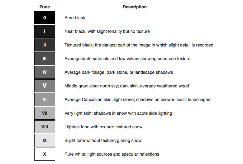
Zone System

The 11 zones in Ansel Adams’ system were defined to represent the gradation of all the different tonal values you would see in a black and white print, with zone 5 being middle grey, zone 0 being pure black, and zone 10 being pure white.

Even though the Zone System is over 80 years old, it is still relevant today whether shooting modern films or digital capture. This article is for photographers wanting to learn more about the Zone System for their particular workflow.

Group f64

On November 15, 1932, at the M. H. de Young Memorial Museum in San Francisco, eleven photographers announced themselves as Group f/64: Ansel Adams, Imogen Cunningham, John Paul Edwards, Preston Holder, Consuelo Kanaga, Alma Lavenson, Sonya Noskowiak, Henry Swift, Willard Van Dyke, Brett Weston, and Edward Weston. The name of this Group is derived from a diaphragm number of the photographic lens. It signifies to a large extent the qualities of clearness and definition of the photographic image which is an important element in the work of members of this Group.
Ansel Adams: Inspiration and Influence

Ansel Adams inspiration and influence is curated with the aid of using Drew Johnson, curator of images withinside the artwork branch and current winner of a California Book Award provided with the aid of using The Commonwealth Club for his book Capturing Light: Masterpieces of California Photography, 1850 to the Present (Norton, 2001). This exhibition is important, Johnson says, because “It locations Adams withinside the context of the records of images, specially West Coast images. Adams changed into strangely informed approximately the paintings of different photographers, each his contemporaries and that of 19th-century pioneers. This inspiration and have an effect on turns into obvious while his photos are studied next to the paintings of others.”
photoshoots editing

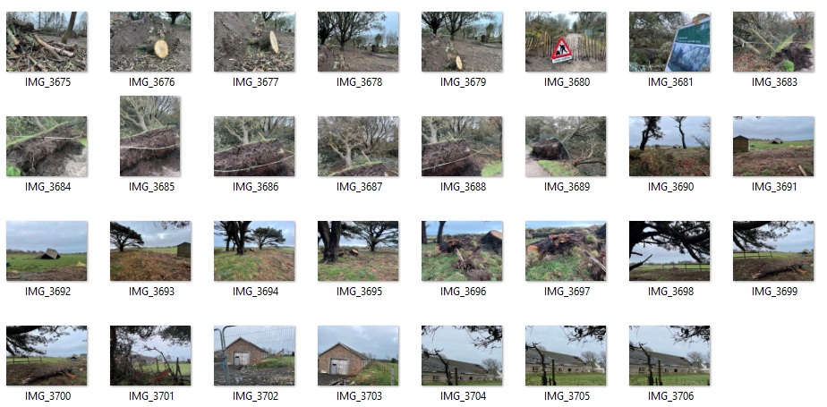
Storm Ciaran photoshoot plan:

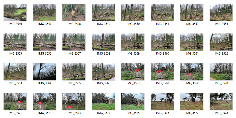
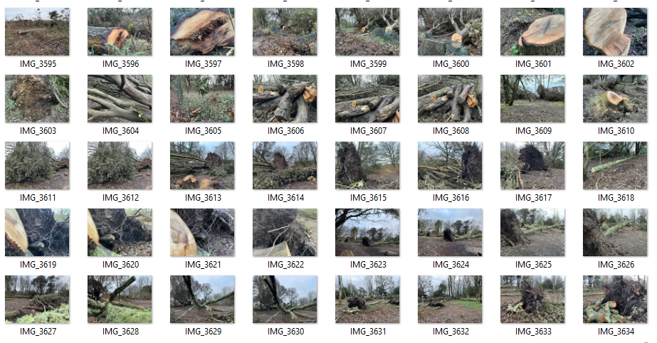
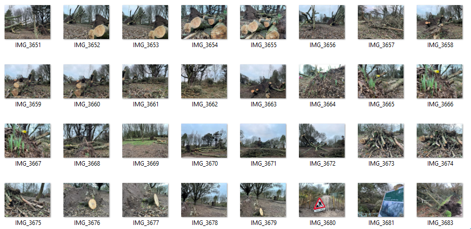
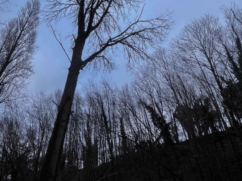
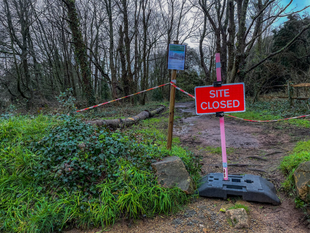
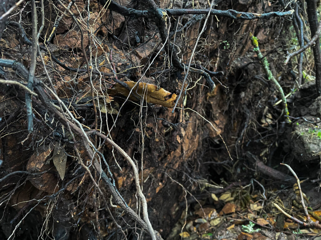
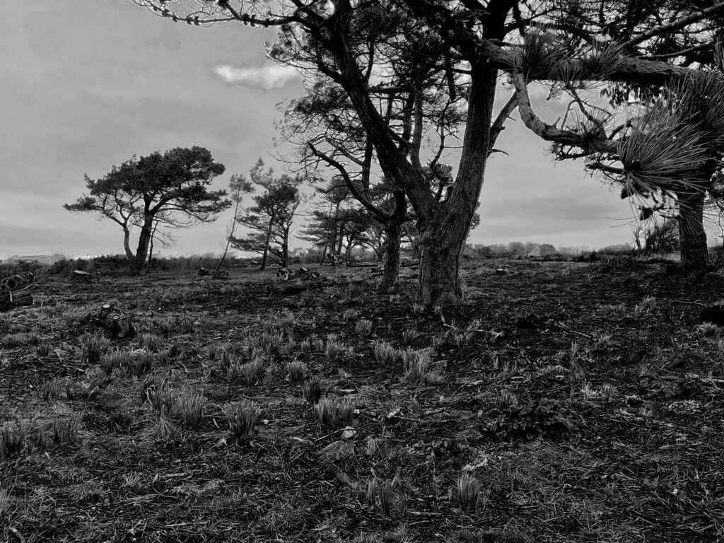
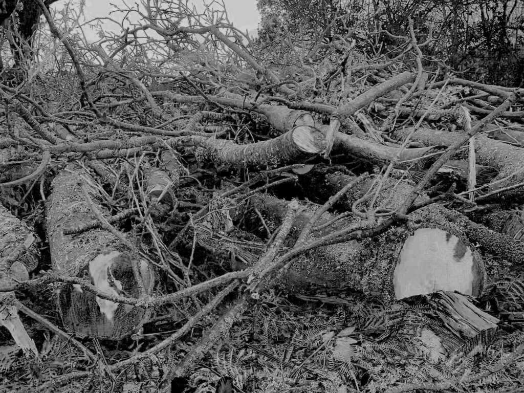
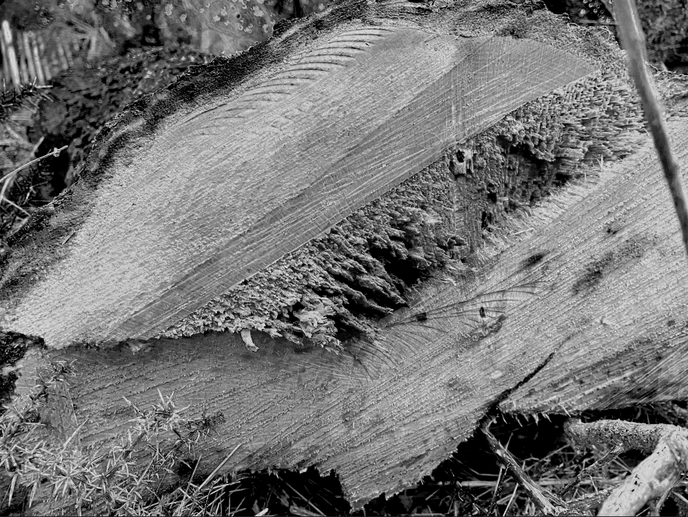
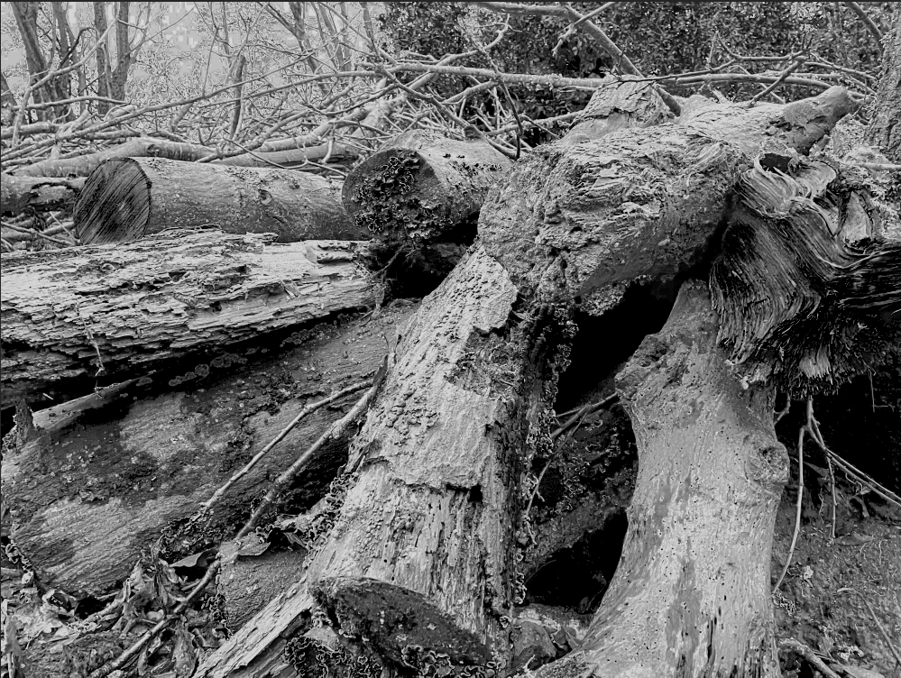
For my photoshoot of storm Ciaran I am going to go to noirmont woods to take photos of the devastating aftermath of the storm. I am going to go either early morning or early evening to get some different variations of lighting within my images.

Storm Ciaran photoshoot

Top 5 images

experimentation:

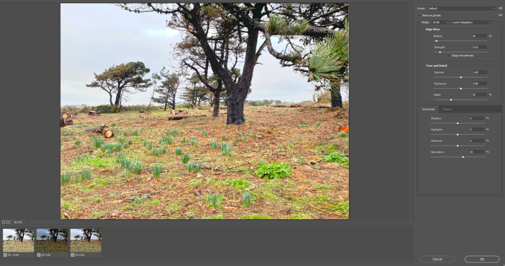
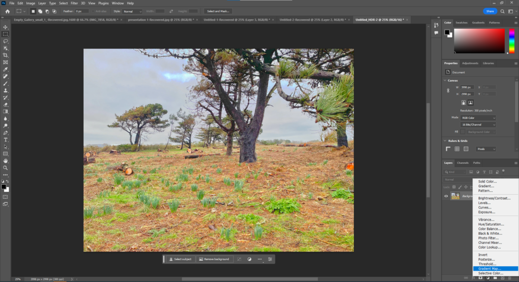
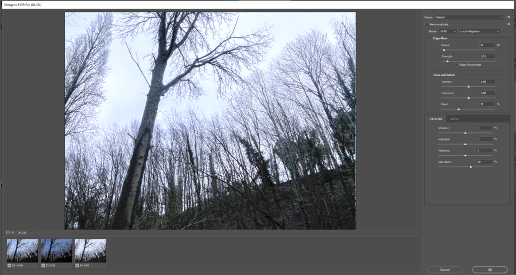
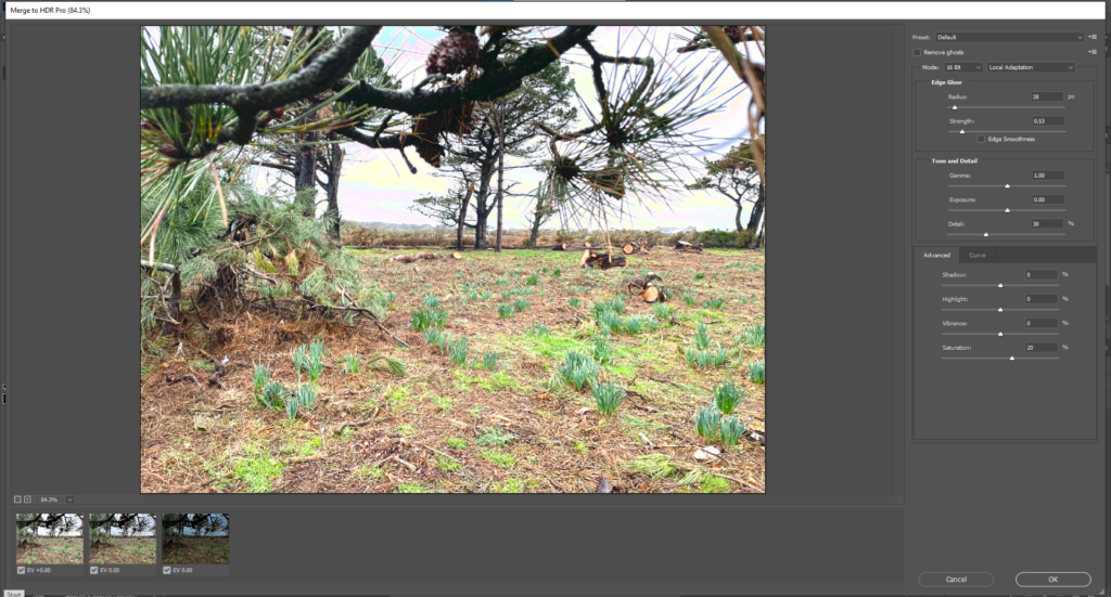
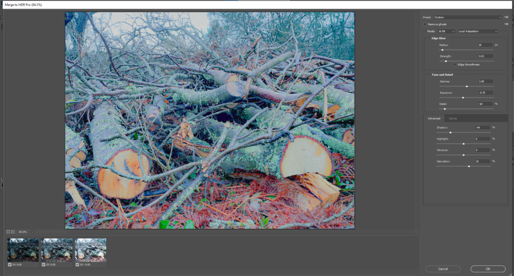
Here I have used photoshop to edit 3 images all with different exposure brackets and merged them together to create one image and made adjustments to the final image.

Final edit:

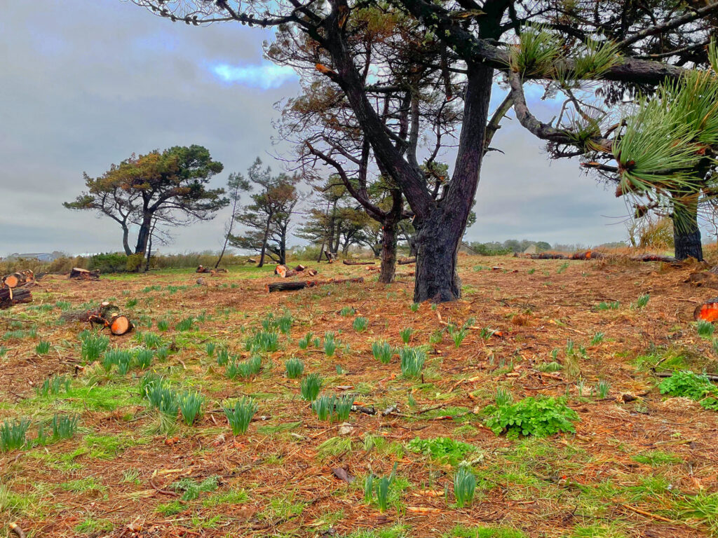
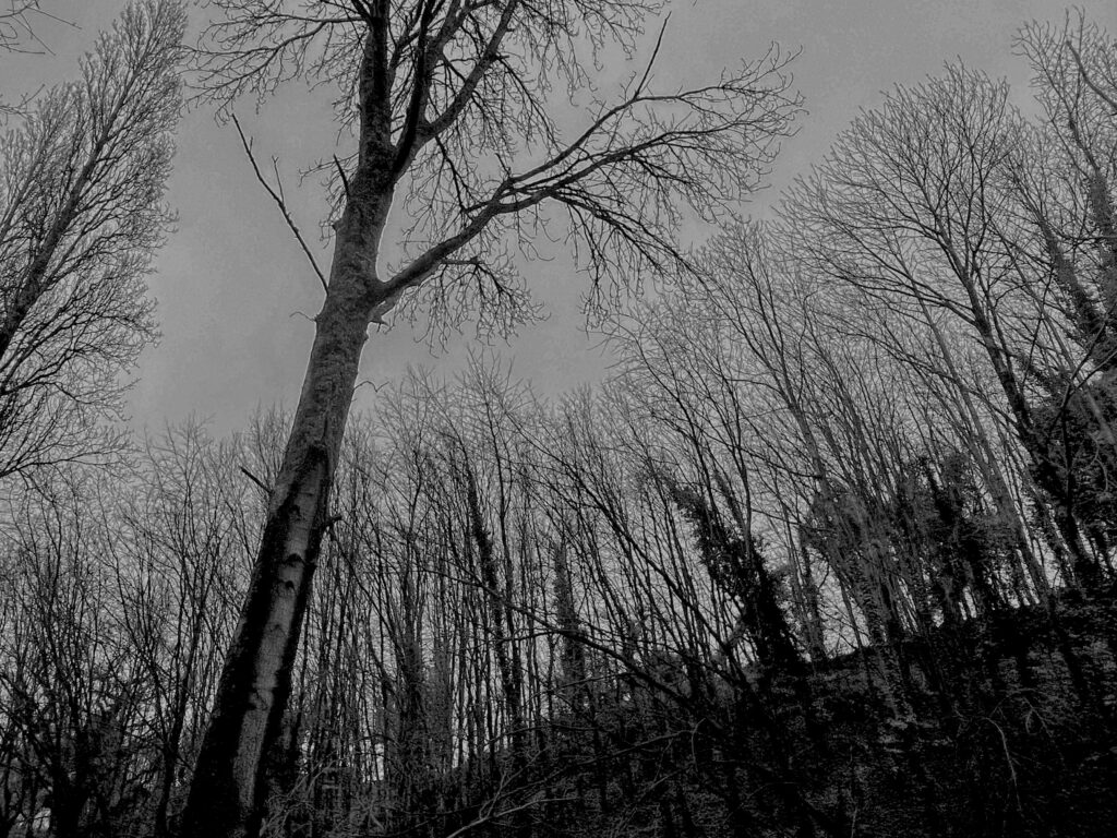
The image on the left is the before version which is fully edited and has had some adjustments to the colour and the saturation, and the graininess. The second image on the right is the final image in which I have added the black and white filter to create images in Ansel Adams’s style of photos.

Edit 2:

Final Edit:

The image on the left is the before version which is fully edited and has had some adjustments to the colour and the saturation, and the graininess. The second image on the right is the final image in which I have added the black and white filter to create images in Ansel Adams’s style of photos.

Edit 3:

Final Edit:

Edit 4:

Edit 5:

Edit 6:

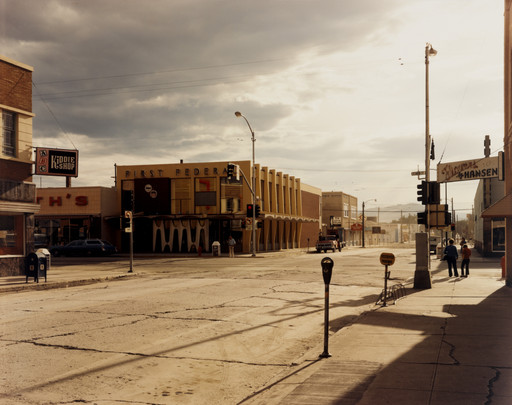
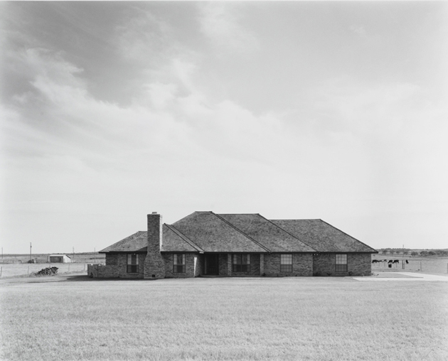
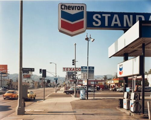
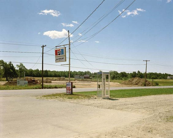
New Topographics.

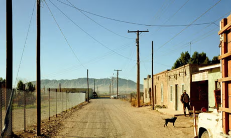
New Topographics: “Photographs of a man-made landscape.

This term was created by William Jenkins as a way to describe a group of keen photographers who all had something in common, their photography, which all shared the same aesthetic of a black and white landscape prints which shared a site of interaction between human+ non human contact.

The group consisted of:

  • Robert Adams
  • Bernd and Hilla Becher
  • Lewis Baltz
  • Joe Deal
  • Frank Gohlke
  • Nicholas Nixon
  • John Schott
  • Stephen Shore
  • Henry Wessel Jr

These photographers decided to ignore the beautiful landscapes the world has to offer, and instead pay attention to how easily and effortlessly man can alter them forever.

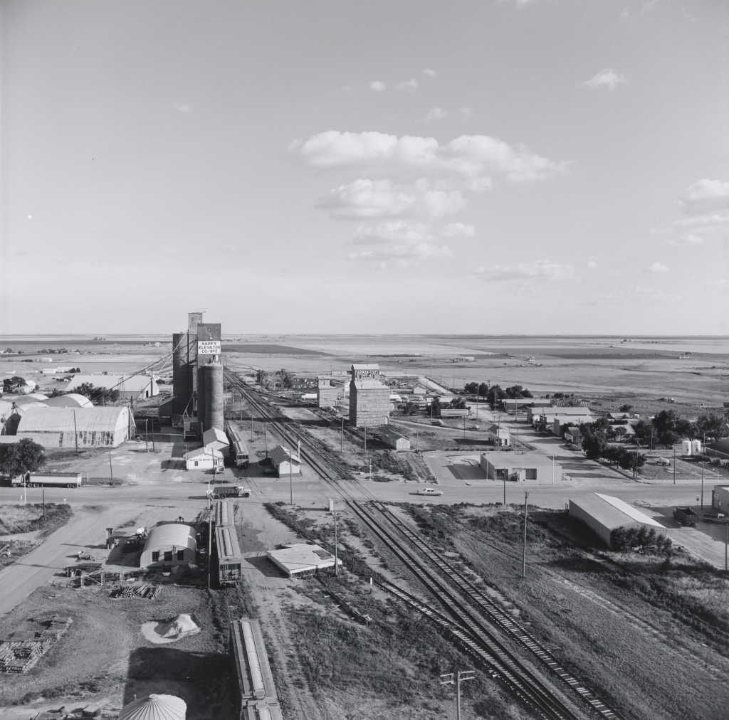
The topic of New Topographics was based on both built and natural landscapes in America, which highlighted the tension and difference between the natural scenery and the newly- built structures of post-war America.

“New Topographics: Photographs of a Man-Altered Landscape”This was a huge exhibition which commemorated the photographers and their creations, which also spread information and interest on the topic of urbanisation. The exhibition took place from October 1975-February 1976. It was held in Rochester, New York at the George Eastman House’s International Museum of Photography.

The photographs of the humanly altered landscapes mostly avoided any human presence- this was to that the images came across as, neutral in style, and focused mainly on the emotional, beautiful and opinionated visual information within.

Some examples of these altered lanscpaes are:

  • Motorways
  • Petrol stations
  • Industrial parks
  • Tract homes
  • Car parks
  • Suburban homes
  • Crumbling coal mines

Frank Gohlke.

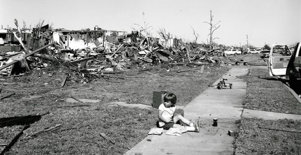
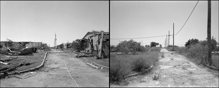
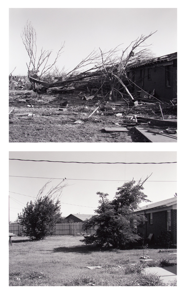
Born on the 3rd of April 1943, Frank Gohle was a photographer, he took photos of urban landscapes such as towns and old factories. Frank made a contribution to the New Topographics group and focused on the pure destruction and wreckage that urban areas faced due to natural causes. He took part in the New Topographics group and contributed He also stood out from different photographers because his photos captured the sheer destruction in urban areas from natural causes. An example of this is a tornado which struck his home town in Wichita Falls Texas, in 1979. I think his work perfectly ties into my work on the aftermath of Storm Ciaran as there was also a tornado that struck Jersey, and there was serious life- threatening weather conditions. Frank Gohlke is an especially important person in landscape photography, as well as being included in the New Topographics exhibition.

Examples of Frank Gohlke Photography.

I particularly like Frank Gohlke’s work because I think the black and white images particularly stand out, when it comes to New Topographics, due o the fact the bluntness and lack of emotion when the photos are black and white show the destruction and life taken out of the landscape and the emptiness from the wreckage.

My Frank Gohlke Inspired Photos.

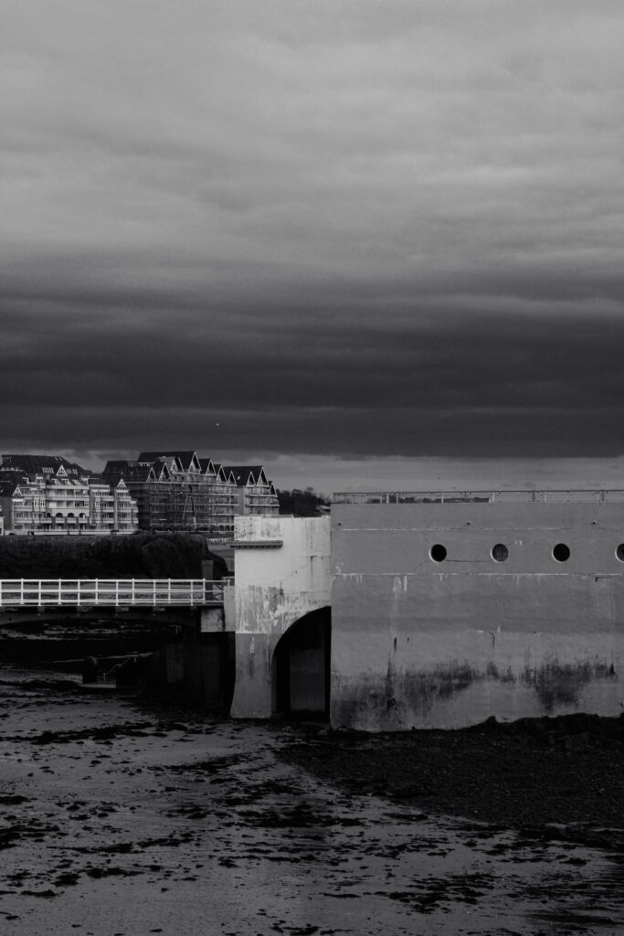
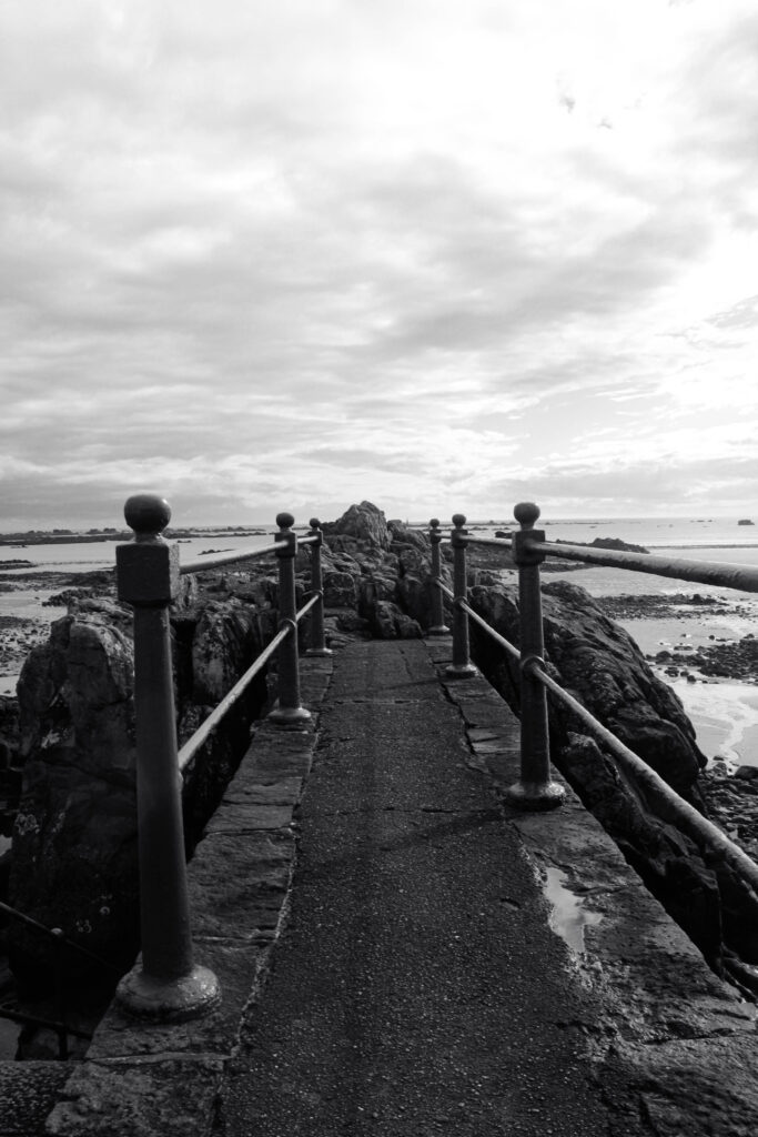
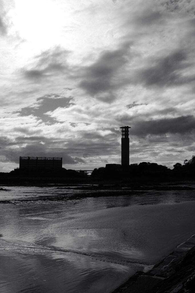
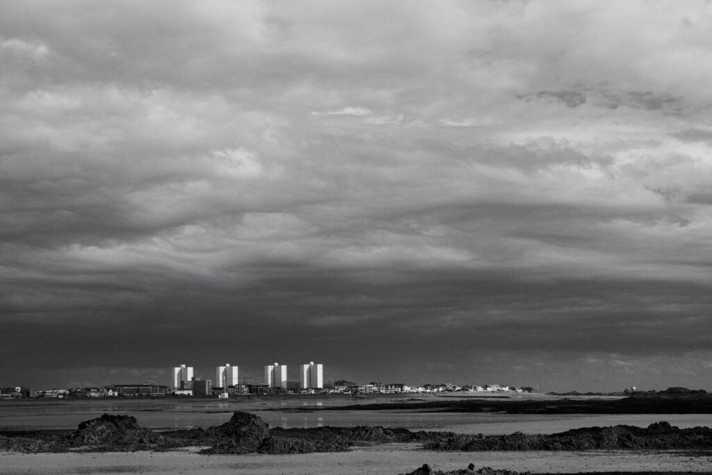
Whilst taking photos at Harve Des Pas beach, I attempted to replicate and take inspiration from Frank Gohlke and his images whilst attemping to demonstrate the same fascination with the world’s constant growth, destruction and unexpected change, by featuring different machinery, industrialisation, littering and urbanisation. I think I was able to capture a more modern approach from the present day, comparing to Frank Gohlke’s work from the 1970s through to 2004. 

Havre De Pa Photoshoot Trip

I plan to edit my photos in a way to show my inspiration from Robert and Ansel Adams. I will turn my images black and white and edit them further to show a more varied range of tones and shadows to create more depth and a dramatic affect.

Best Image Edits

Colour

Black and White

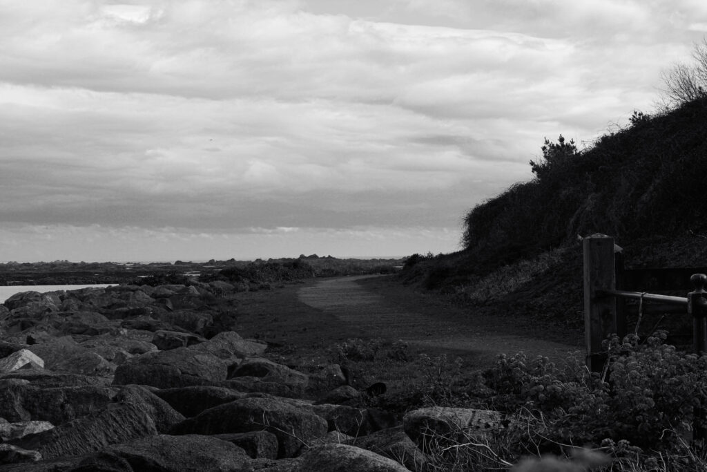
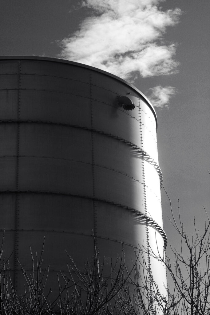
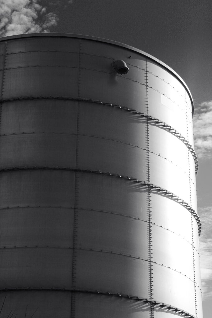
When editing these images I wanted to show my interest and inspiration from Ansel Adams and Robert Adams’ own style of editing. I aimed to have a high variety of tones and a lot of contrast within my images.

Overall Best Image & Analysis

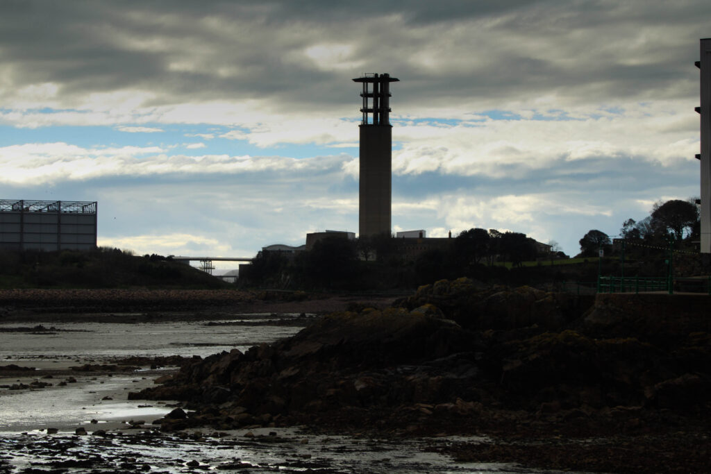
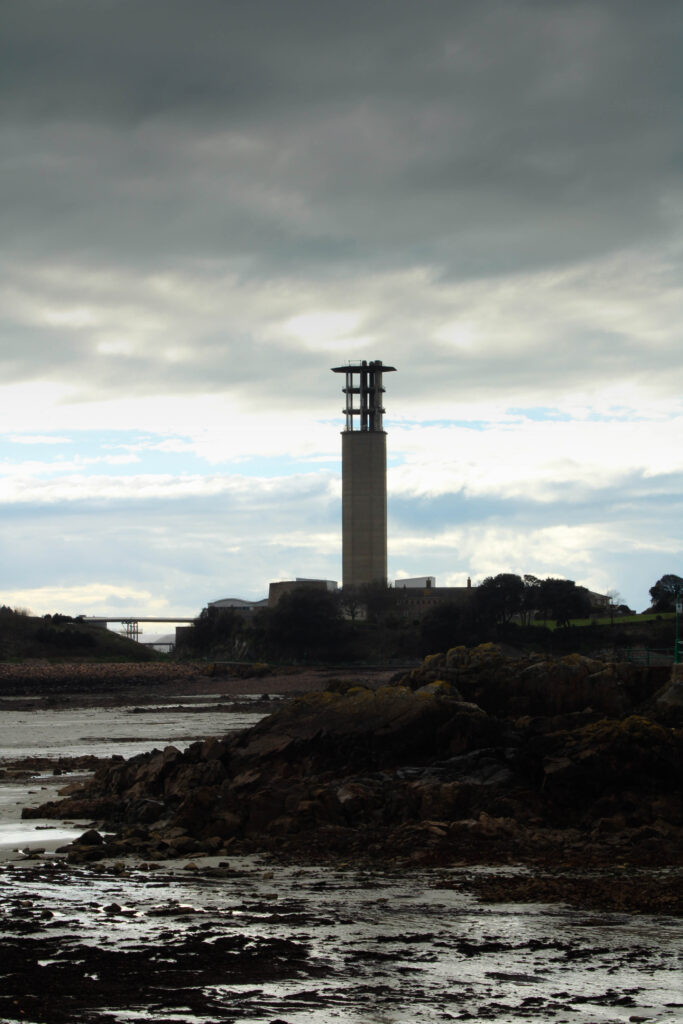
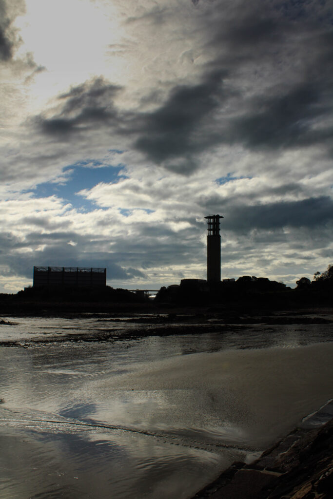
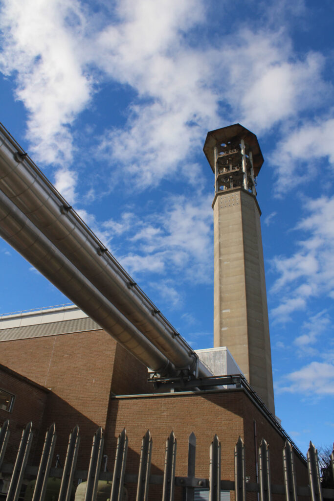
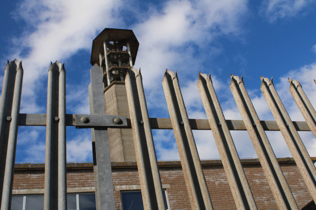
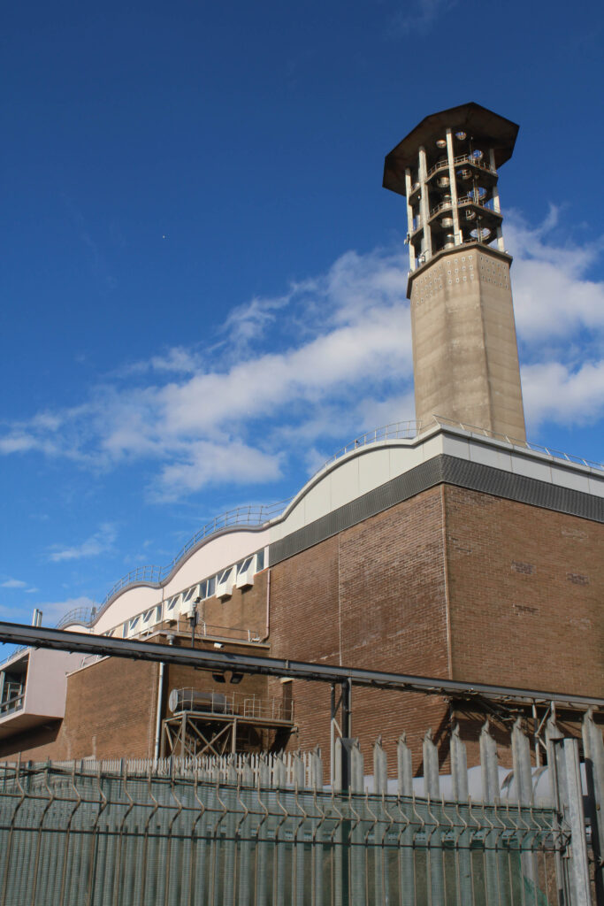
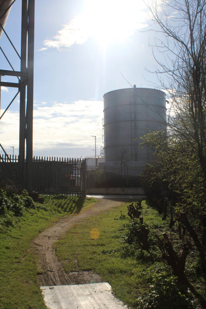
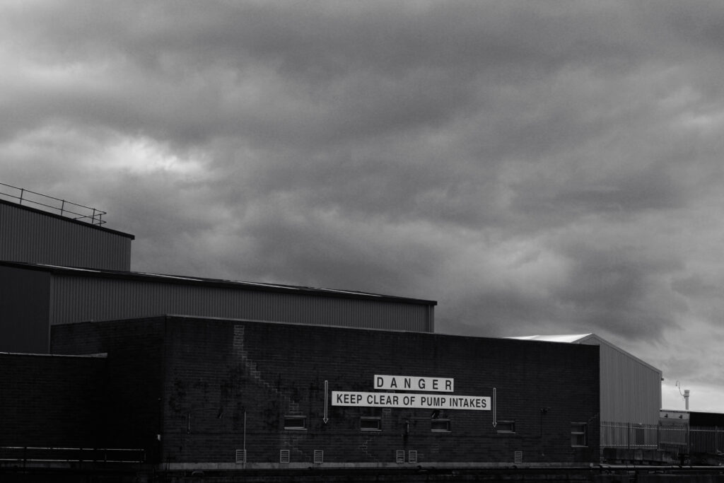
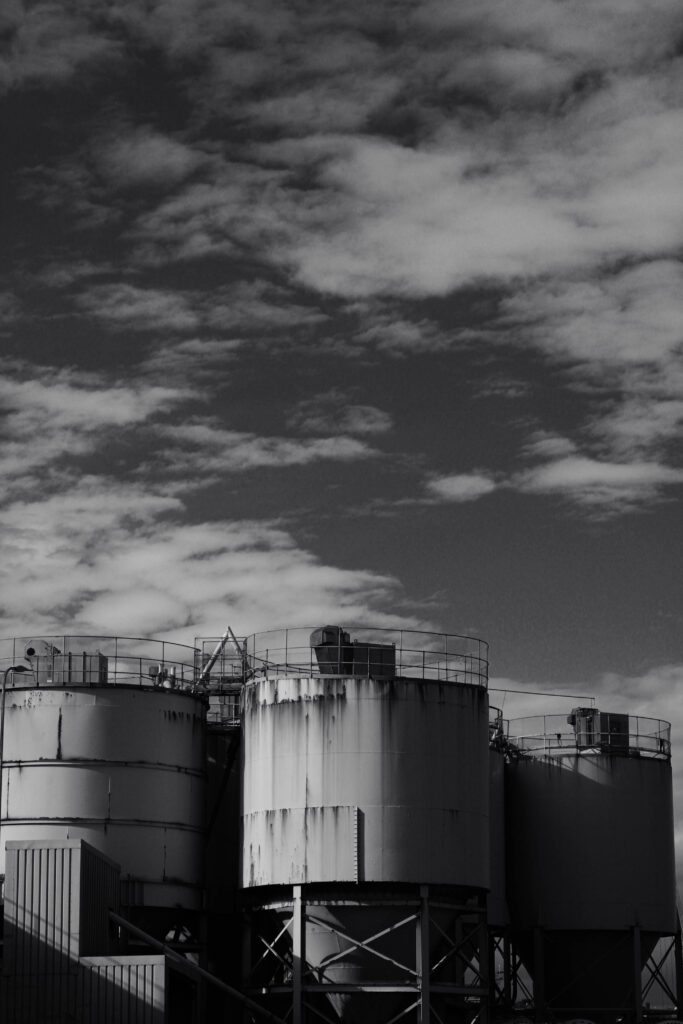
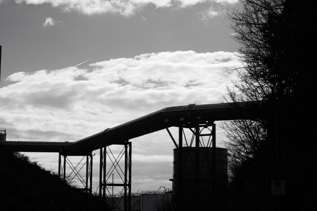
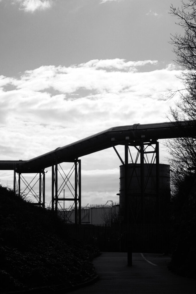
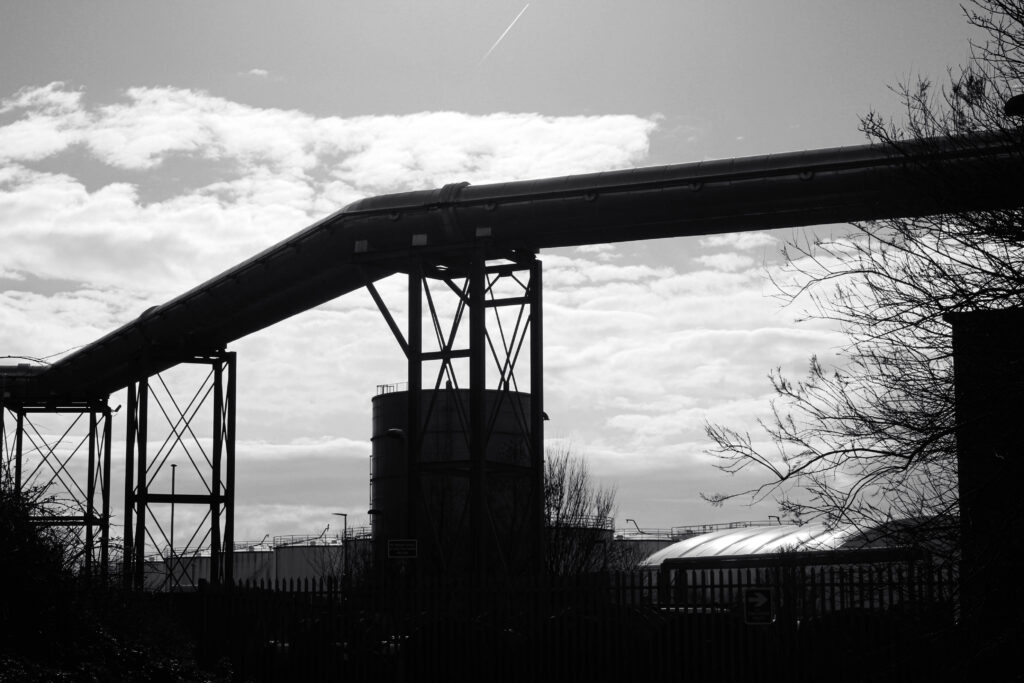
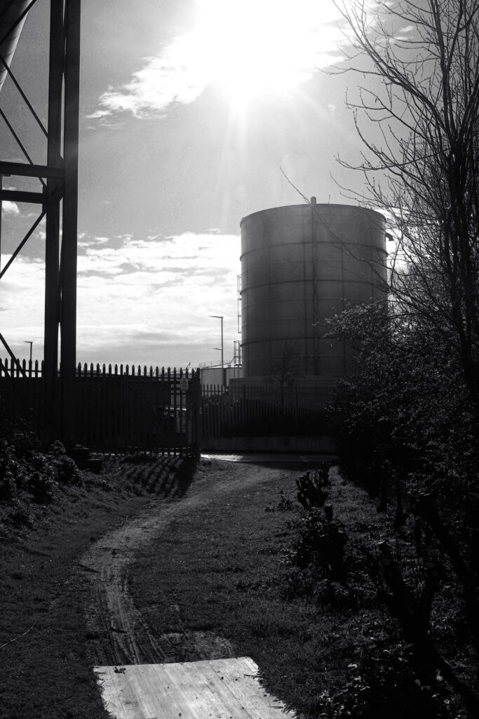
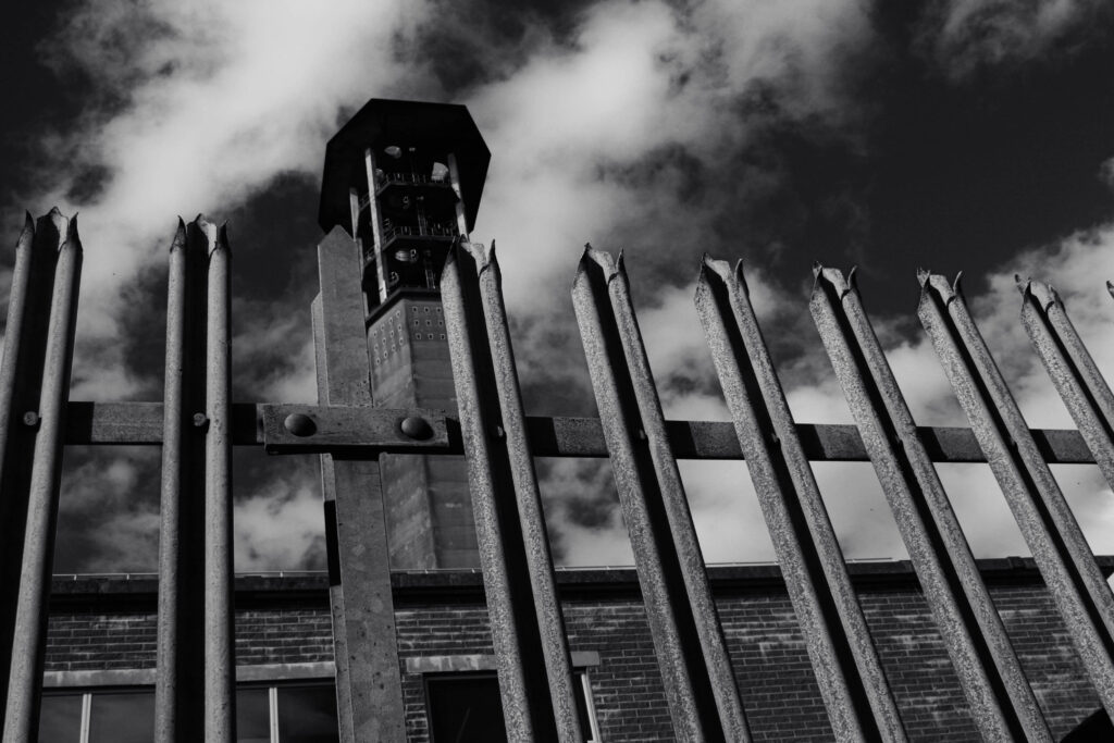
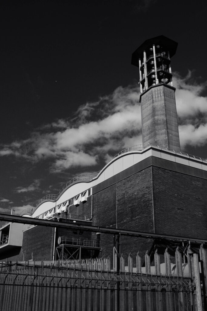
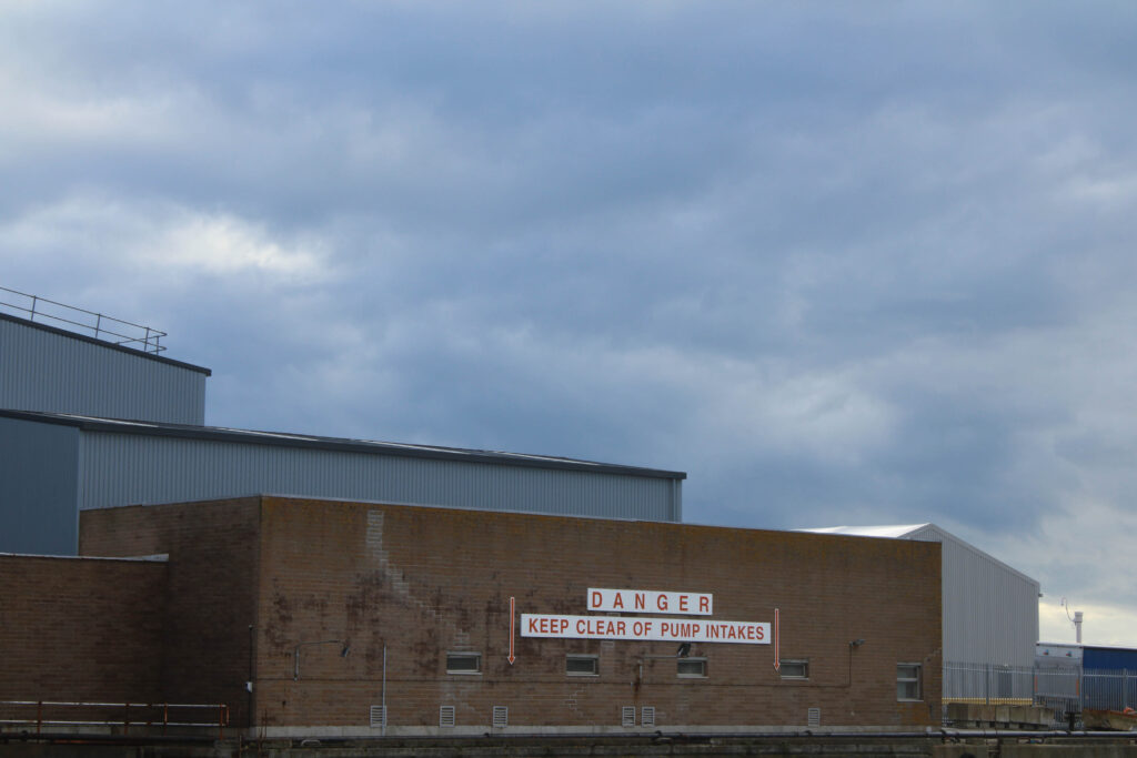
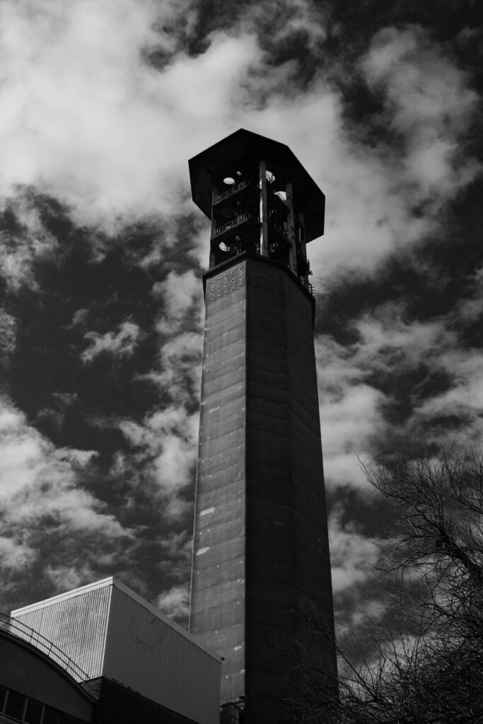
I believe this is my best image out of my entire photoshoot. I really like the variety of tones and the general composition of the photo. The positioning of the camera gives the building intimidating industrial look, It leads the eye from the fence to the dark tower and sky. The textured surfaces on the building contrasts with the soft cloudy background combined with the natural lighting.

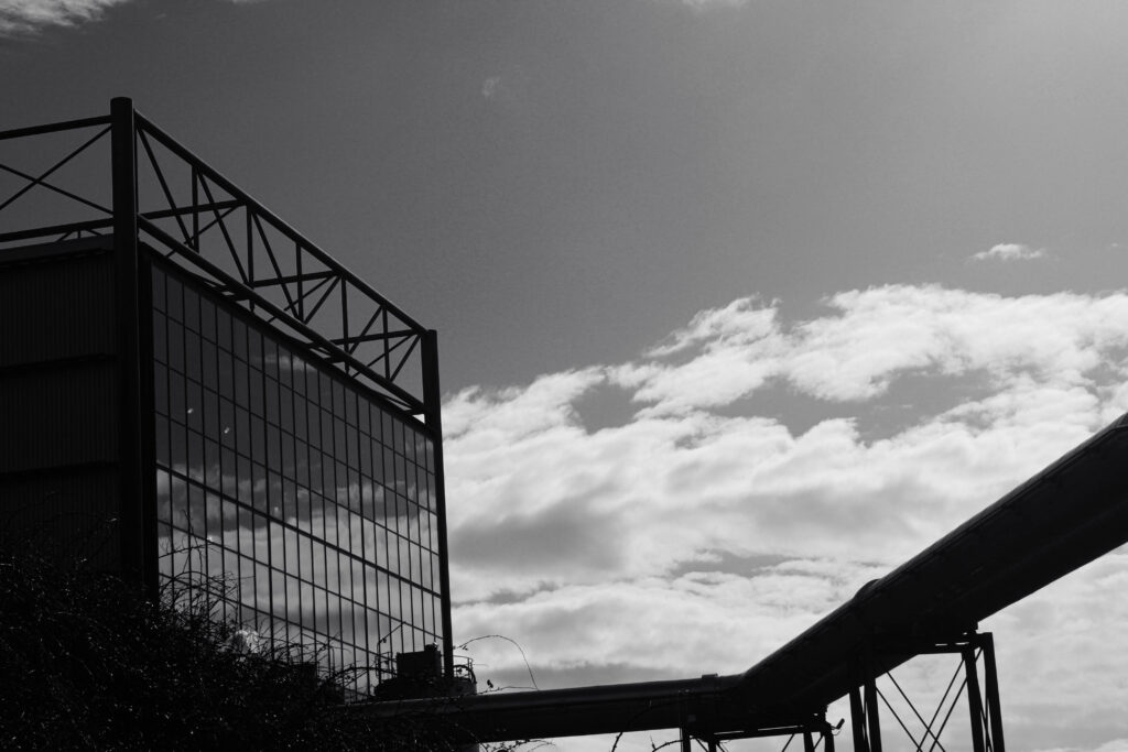
Overall I think this image shows my inspiration from the photographers I have researched the best because I’ve used a large tonal range and heavy contrast. I have also been able to captured plenty of textures and a variety of shapes in the buildings and clouds and kept a well balanced exposure.

Anthropocene photoshoot

contact sheet

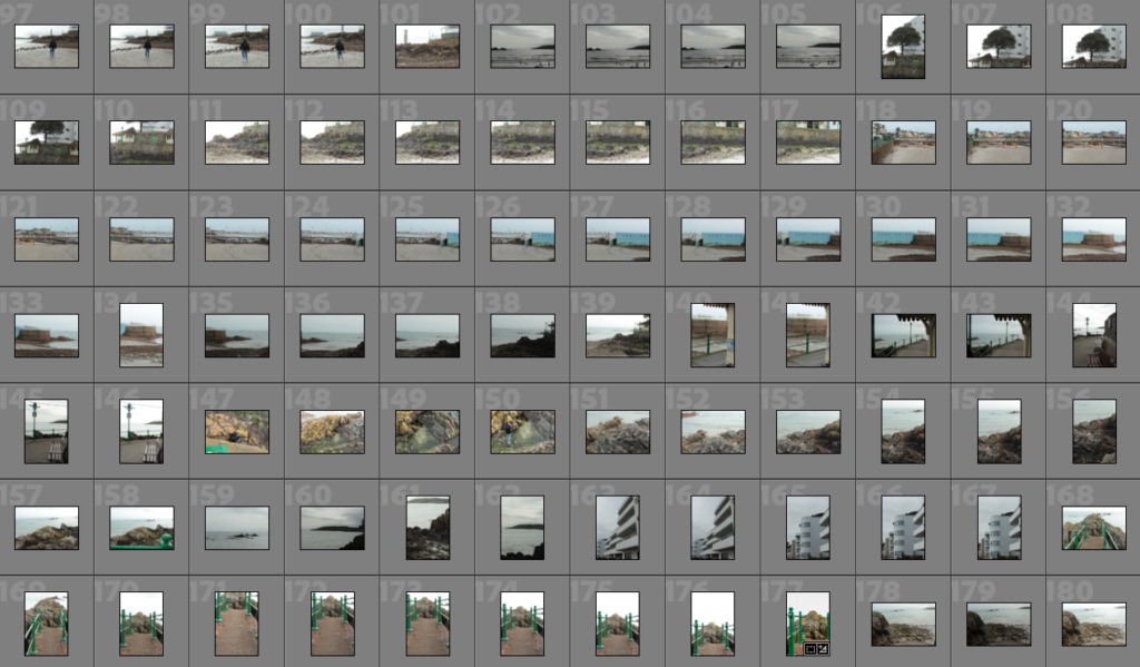
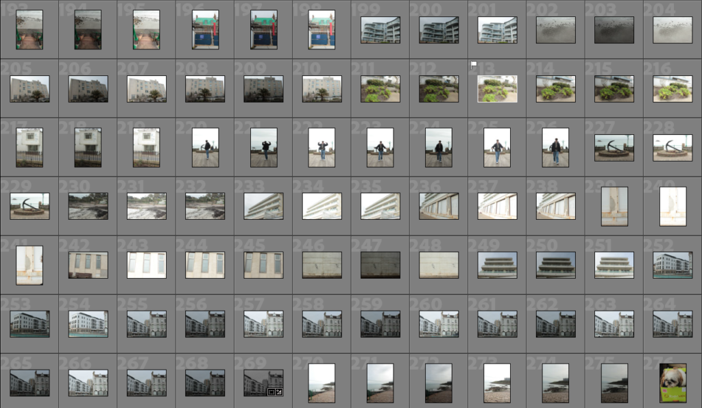
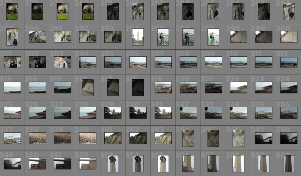
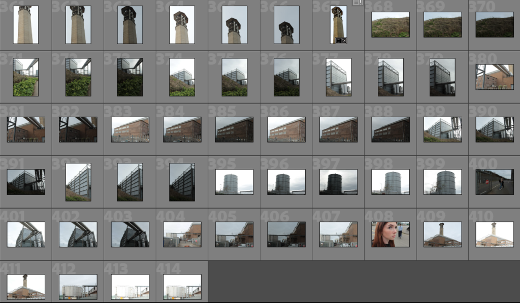
For this photoshoot I went into town to one of the car parks to try and how how this cliff has now been used and changed for us. Then I wanted to go to Fort Regent as I was trying to show overpopulation in jersey as it is quite a present issue for jersey and I thought the fort was a good place to do so as it is one of the highest points which looks into town.

The editing process

The editing for these images were quite simple I tended to crop the image to begin with and the just start to adjust things such as the highlands and shadows as it helps to give the photo better dimension.

I also changed the temperature of the image to more cool tone as the sun was white bright making the sky just very colourless and the buildings were extremely warm tone.

For some of the other photos I also did some photo merges as I feel as if my photos always come out very clear when I do that so for some of the images where I’ve got objects which are very far away I tended to use that.

finished edits

I based this photoshoot off the overpopulation in jersey. According to the government of jersey website Jersey is now at 106,8000 people.” the surplus of people coming into the Island – exceeded 1,000 for the fourth year in a row.”.

Overall I’m quite happy with how these images came out. I think the message is stronger in the stop photos as I think it better shows how busy town is as you can see all the buildings which are completely covering the town. And then having all the cars filling the roads practically stationary.

I think if I was to do this photoshoot again would try and maybe have one buildings which stands out or something and position it with the rule of thirds and I think that lots of the picture appear to be busy but missing something. However I do like the contrast

between the sky and ground as in most of the images you can see almost a sharp line between the two which makes the town appear more dramatic and busy due to how calm the upper half of the pictures appear.