
Edit One
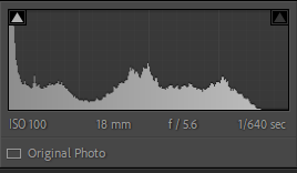
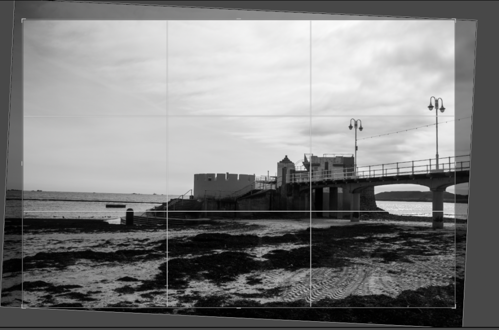
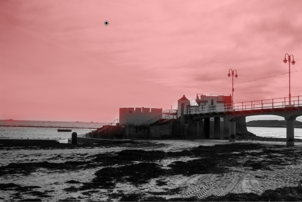
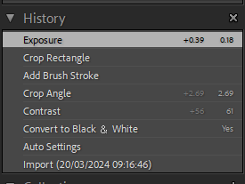
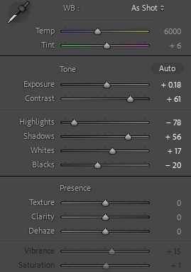
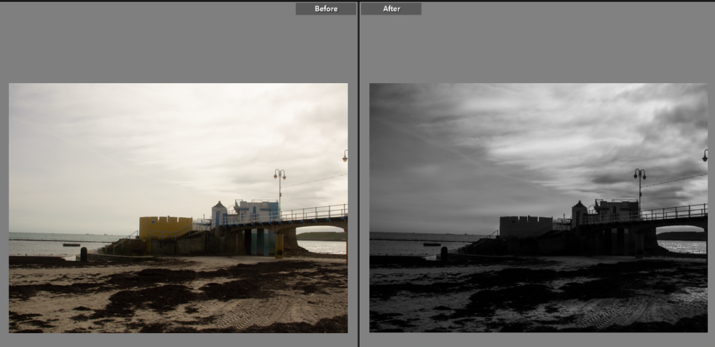
For this first photo I used the masking tool to darken the sky without changing the rest of the photo too much. I turned the whole photo to black and white in the style of Lewis Baltz and the new topographic movement. This helped the photo hugely as it added tone to an otherwise flat photo (created by the mix of dull yellows in the original).
Edit Two
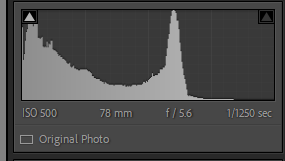
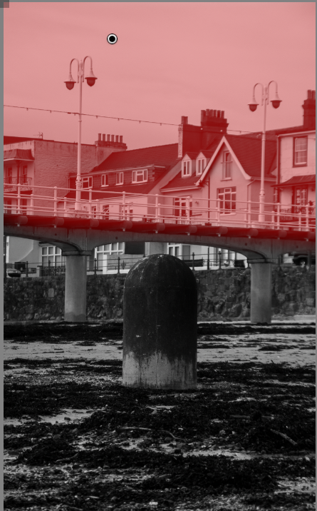
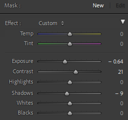
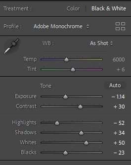
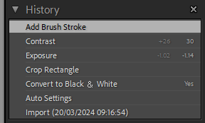
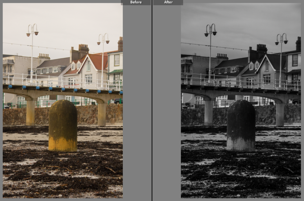
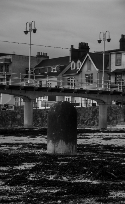
Edit two, this has a different subject point. Instead of being a landscape styled image this uses the pillar as a central point to the photo. To emphasis this I used a high contrast black and white adjustment, this helped keep the deadpan tone in the photo. By changing it to black and white removes the yellow tones that are otherwise distracting and makes the photo seem a bit average, where as the black and white gets people to look at the detail they normally miss.
Edit Three
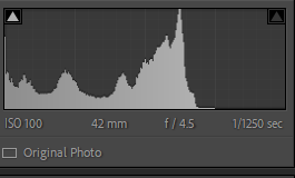
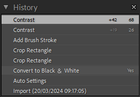
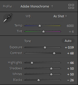
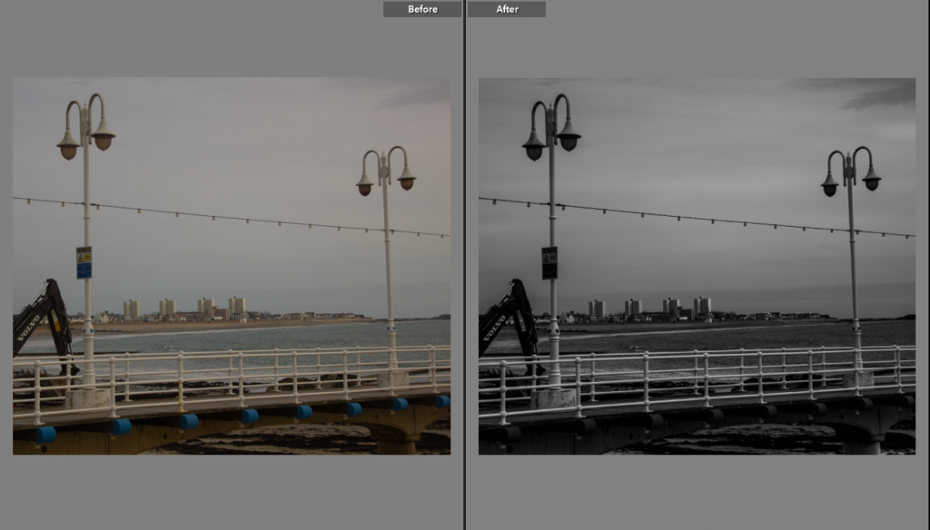
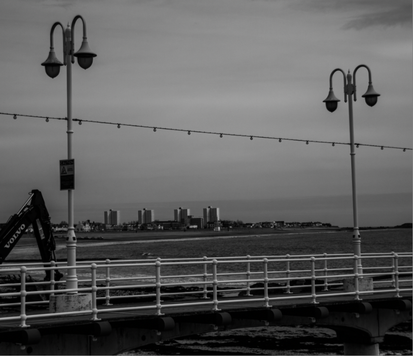
I wanted to use this shot as my third edit because it is a great shot showing the new topographic inspiration. While it is busier than most deadpan photos I used the black and white to reduce some of the atmospheric noise created by the different colours and textures of the sea and surrounding landscape.
Edit Four
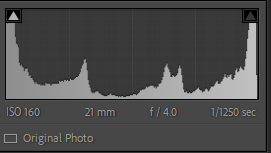
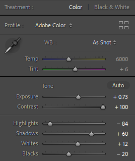
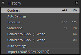
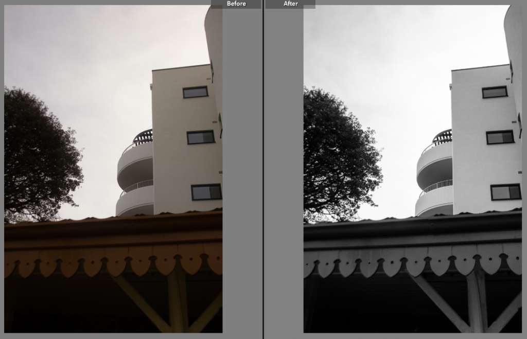
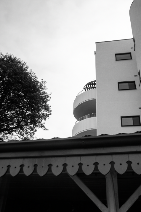
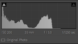
I loved this shot and thought it had a lot of potential so to help make it a better photo I levelled the building slightly using the crop tool and then changed the photo to black and white, looking at the tone and making sure the contrast wasn’t too high as I wanted the grey scale to be visible. Often in the New Topographic style and Lewis Baltz in particular grey scale is used as most of the photos are black and white but with low contrast to keep the deadpan look, this is often linked to Ansel Adam’s work as many believe the new topographics style is inspired by his work.
Edit Five
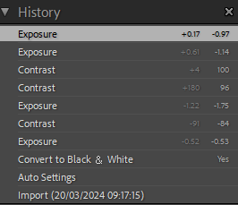
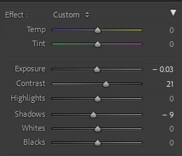

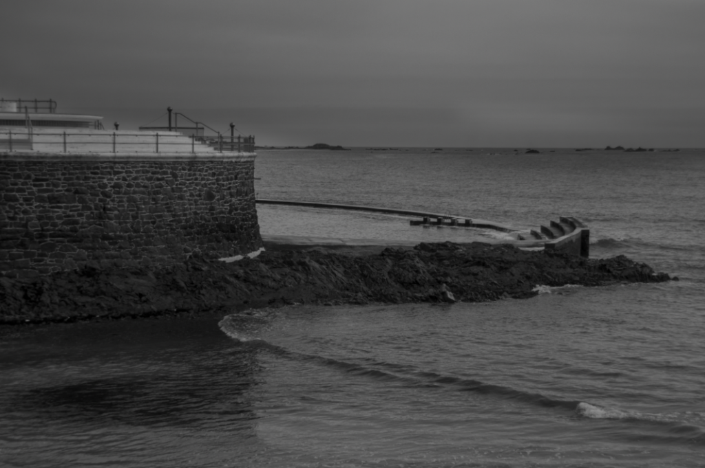
This was my final edit for this project so far as I liked how the water appeared almost still due to the moment the photo was taken the wave had just started to break at the edges. The black and white enhanced the photo, increasing the contrast helped the detail become visible as before the brick work wasn’t as noticeable nor did it really add to the photo and after the editing the photo seems much more joined and has a more deadpan look to the overall image.
Final Images
