Intro
Ansel Adams is a very well known photographer. He is best known for his incredible landscape photos that he took in the Yosemite Valley in California.

Adams was born in 1902 in San Fransisco. In his early life, he faced many problems due to a nose injury that left it permanently disfigured. Additionally, Adams was a very shy person. Because of this, Adams didn’t have a great school life, and was constantly moving schools. Eventually, Adams was homeschooled. This meant that he then had more free time to himself. This is most likely when Ansel found his love for nature and photography. It is said that Ansel enjoyed long walks in the sand dunes and forests around his home in San Francisco.
At age 14, Ansel and his family visited the Sierra Nevada mountain range in the Yosemite Valley. This was Adams’s first time in the Yosemite Valley. Adams was quoted saying, “That first impression of the valley—white water, azaleas, cool fir caverns, tall pines and solid oaks, cliffs rising to undreamed-of heights, the poignant sounds and smells of the Sierra… was a culmination of experience so intense as to be almost painful”. He had taken with him a Kodak Brownie Box camera, a portable camera in the shape of a box. With this camera, he began to take photos of the beautiful mountains and flowing rivers of the Yosemite Valley.
Techniques

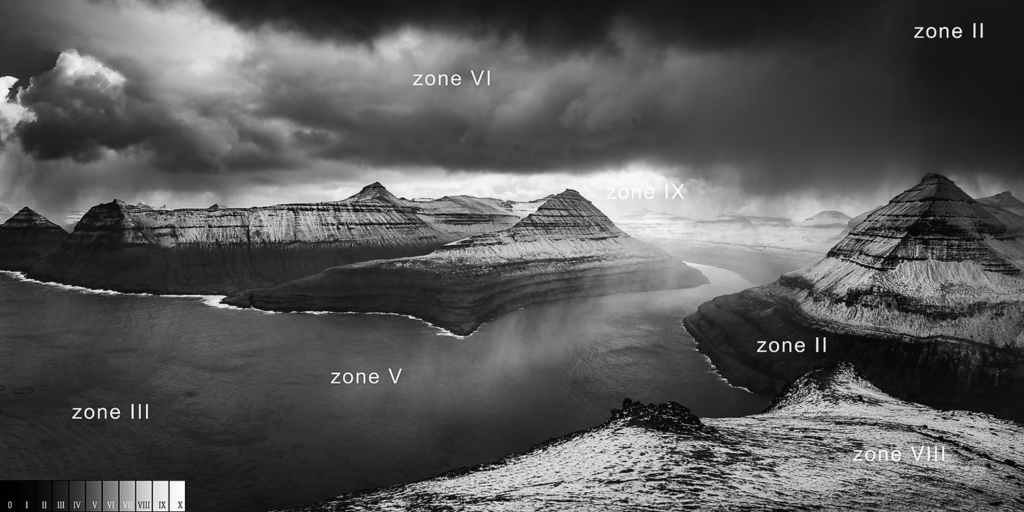
Over the years, Adams developed a few interesting photographical techniques. One of these was splitting the photograph into different zones, determined by the black and white gradient. This is called the ‘zone system’.

This is done by manipulating the exposure settings of the camera (e.g. shutter speed) so that there is no pure black or pure white, and all of the zones of the photo fit within the zone rule. His main rule was that you should “Expose for the shadows, develop for the highlights”. Adams would do this while he was taking the photo. He also liked to use filters as well to enhance his meticulous colouring technique. It is also worth noting that Ansel used a film camera to take his photos. With a modern digital camera, this technique is more difficult to replicate because the light comes out more linearly, and exposing and developing is not possible.

Additionally, Adams edited his photos after they were taken. In a darkroom where the images would develop, Ansel would ‘dodge’ and ‘burn’ his images. Dodging the photo means to place an object above a region of the photo to block the light in the darkroom from reaching it, therefore exposing the photo in that region. Burning is the opposite of dodging, placing an outline of the region above the image so that the light in the dark room only reaches the open region, therefore underexposing the region. Ansel was known for being very good at both of these techniques, and it became a vital part of his photographical process.
Analysis

This is a photograph of the Half Dome summit in Yosemite. It is an iconic part of the Yosemite landscape, and in this photo dominates the majority of the frame. Adams did this to make the summit look as grand and massive as possible, and filling the frame with it creates this effect. This technique also makes the image appear flat and almost two-dimensional. However, Adams uses this two-dimensional appearance to fit the moon in the frame. Additionally, the summit and the moon are on opposite sides of the frame. This was most likely done to fill the frame up better, rather than having a blank corner in the top left. The Half Dome summit is also a great object to photograph. This is because the steep cliff has these long vertical lines that lead the eye down the cliff. Also, the cliff stands very tall above its surroundings, which is helpful for getting as much light as possible.
The lighting in this photo is also used rather interestingly. Because of the shadow on the side of the cliff, I can guess that this photo was taken at sunset. Adams uses the shadows to remove parts of the frame. This is done with the dark cliff on the left, and the part of the Half Dome that is outside of the frame on the right. Adams did this for two reasons. One was to create this smooth shape in the middle of the photo with the shadows. Two was to underexpose the photo to remove the detail in the shadows. This is so that the parts of the photo that are shaded are basically removed from the photo entirely, which increases the viewer’s focus on the exposed parts of the photo.
The story of this photo is quite spontaneous. It was taken while Ansel Adams was travelling through Yosemite. Adams saw this view of the Half Dome and decided to bring it to its full potential. The Half Dome summit appears multiple times throughout Ansel’s work since the beginning, when he first presented this image titled ‘Monolith, the Face of Half Dome’.

Although this is the same Half Dome that we see in the previous picture, it is clear that this angle offers a different perspective and overall a different interpretation of the Half Dome from Ansel Adams. Adams is quoted saying, “I have photographed Half Dome innumerable times, but it is never the same Half Dome, never the same light or the same mood… The many images I have made reflect my varied creative responses to this remarkable granite monolith”. It is very clear that Ansel has a fascination with not only the Yosemite Valley, but the specific mountains and peaks that make it iconic.
Photoshoot
In my response to Ansel Adams, I want to reflect Adams’ fascination with the Yosemite Valley by setting my photoshoot in a location in Jersey that I enjoy visiting, Plemont Beach.
The photoshoot took place in sunny, mid-day conditions when the tide was very low, which was enhanced by the wide range of tides that we experience in Jersey during the springtime.


During the photoshoot, I was very much inspired by Ansel Adams and his connection to the Yosemite Valley. When looking through Adams’s work, it is very clear that he is mostly fascinated by the Yosemite Valley. I compare this to my fascination with Plemont Beach. My idea going into this photoshoot was to show the parts of Plemont that I love the most. These were concentrated on the right side of the beach where the sun was at the time.

I started with some basic postcard-like landscape photos that were mainly focused on filling the frame with the right amount of land, ocean and sky.

I then started to use the rule of thirds in a portrait frame. This then formed into making some deadpan photos.

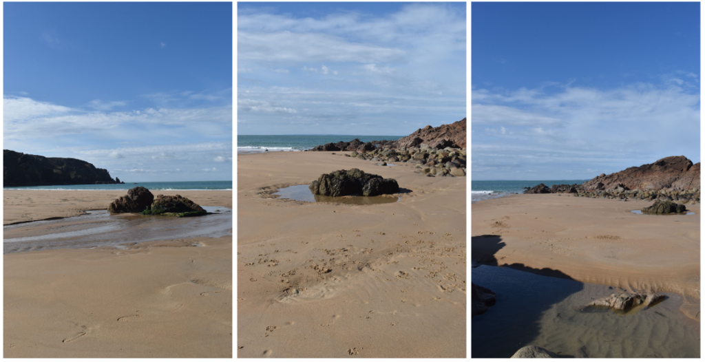
I was also very inspired by the rocks that were sat next to the ocean. I felt that I could use the rocks and the ocean, but also the other Channel Islands in the distance to fill the frame. I found that having a rock in the foreground of the image created a better environment in the photos.

I tried this idea with quite a few rocks that were scattered around that area of the beach. Eventually, I found the angle that I was looking for.

This was immediately a very powerful photo to me. The water flowing from the bottom of the image leads the eye towards the rock in the foreground, and moves on towards the final rock on the outside of the beach. In the distance, you can see Little Herm, Herm and Sark. The rule of thirds is also unintentionally used multiple times in this photo.
There are three islands in the distance;

the rocks in the foreground, the rock to the right of that and the islands in the distance also follow the rule of thirds;

and the flowing water follows the ‘left, right, left’ pattern that the example above does too.

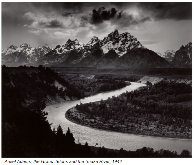
All of this accumulates into a very visually appealing photo. I would say that it was inspired by this Ansel Adams photo that demonstrates similar ‘snake-like’ features.

In inspiration of this photo, I also edited a black and white version of my photo following Ansel Adams’ ‘zone system’.

I also briefly took photos of a cliff face which is fairly hidden away at Plemont, and I thought that I may be able to replicate another specific photo from Ansel Adams.

I experimented with a few different perspectives, but unfortunately I was very quick photographing this area and I didn’t experiment very much. However, these photos did turn out very well.

The comparison between these two photos is very obvious. Both cliffs are used to lead the eye from the top of the photo to the bottom, where in my image you can see a pool of water. Arguably, Ansel Adams did a better job at leading the eye down the frame as there are very apparent lines in the cliff face that they eye can easily follow, however, I am pleased at how comparable these two images are.
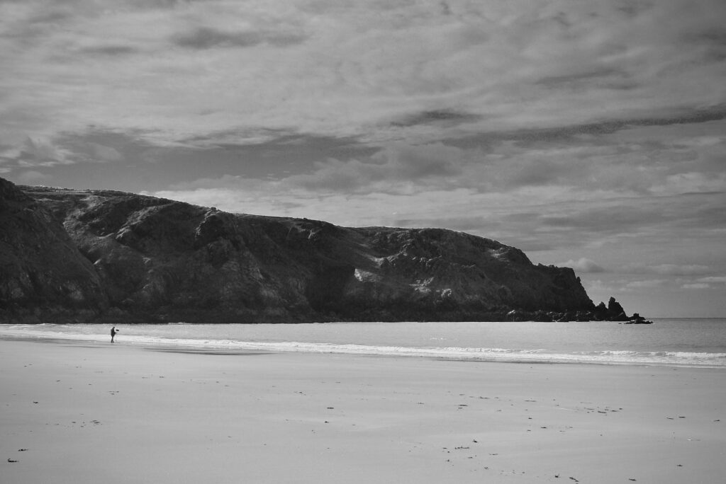
I also wanted to capture the sublime nature of standing alone between the vast cliffs either side of Plemont, and how empty it feels to stand alone in this vast landscape. Luckily, there was a person standing alone in the middle of everything. I knew this was a perfect opportunity for a great photo.


This second one I really liked. The sublime nature of this photo really stands out. The subject stands completely alone in the foreground, he is surrounded by the immense cliffs of Plemont, and towered by the cloudy sky above. I decided to experiment with this a little bit.
I tried to make a black and white version of this photo to enhance the feeling of emptiness prevalent in the photo.

I was very happy with how this turned out. I cropped the image to make the rocks and the subject equidistant to either side of the frame. The image is almost two-tone, which makes it fairly simple and easy to look at. The artistic message is very clear in this photo. The atmosphere is very lonely, and the photo feels quite mysterious and dark. However, I felt that the cliffs in this photo are too dark, so I decided to dodge that region of the photo to expose the cliffs.

Overall, I am very happy with this photo shoot in general. The weather conditions were perfect, and I was very able to capture Plemont the way that I had in mind. I may not have captured every part of Plemont that I had planned on, but I did end up with a good selection of best images.
Final Images


