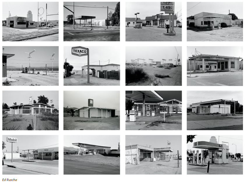
Mood Board:

Mind map:
- Typography
- Historical / industrial
- Black and white / dull tones
- Bright lighting and exposure
- Man-made
- Empty areas
Ed Ruscha was born December 16, 1937 in Omaha, Nebraska, US. He was associated with West Coast Pop art whose works provide a new way of looking at and thinking about what constitutes the American scene, as well as connecting the verbal with the visual.
Ruscha was raised in Oklahoma City, and in 1956 he made his way to Los Angeles. There he attended Chouinard Art Institute where he studied painting, photography, and graphic arts. He worked as a commercial artist, painting signs and creating graphic designs. As a result, he began to apply commercial techniques and styles to his own artwork. Initially, he experimented with Abstract Expressionism, but he soon turned to the found words and images drawn from vernacular culture that would come to inform all his work.
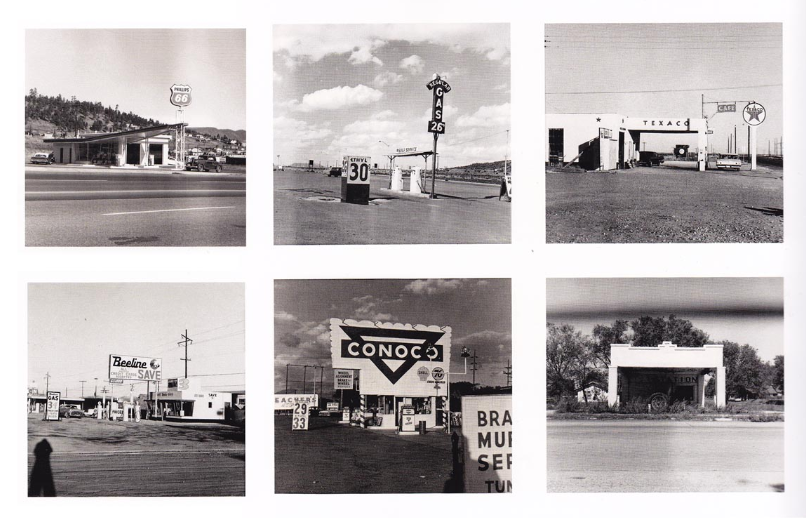
Between 1963 and 1978 Ruscha systematically photographed southern California’s built environments – including vacant parking lots, swimming pools, and nightspots. He made these photographs into wordless books, such as Every Building on the Sunset Strip. The 16 artist’s books he created in this manner were widely influential among a younger generation of artists.
Ruscha comments on myths of American Romanticism, commercial culture, and urban life in humorous and ironic pieces. He sometimes uses unusual media in his work, including fruit and vegetable juices, blood, gunpowder, and grass stains, in works such as his Stains series. In the 1980s, his style became more mystical, as he worked with rays of light, constellations, and other celestial themes. Ruscha is best known for his witty and enigmatic use of text in his paintings, which he continues to incorporate into his works today.
I started taking pictures when I was at school, with no serious intentions. I liked the idea of capturing what is right here right now, like an immediate reality that could be then evaluated and integrated to a painting” – Ed Ruscha

His painting is impregnated with American consumerism and visual standardization, including words and catch phrases in the pictorial composition. This may be significant as it adds context into each of his images, and gives the viewer something to focus on.
Also, Ruscha often experimented with typology – the idea of a system used for putting things into groups according to how they are similar. The reasons to create a photographic typology would be to either create a connection between subjects that share no obvious visual relationship. Or to compare and highlight differences and similarities between subjects that share a visual relationship. The typology approach is effective as it shows a range of different photographs that relate to each other, but with differences such as location or angle.
Image Analysis:

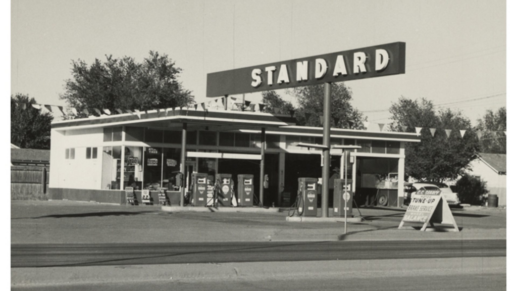
Standard – Amarillo, Texas’, 1962. © Ed Ruscha
This is one of Ruscha’s most famous images, taken in 1962. The location of the image is at a local petrol station, with no particular out-standing aesthetics. However, although it is seen as a perhaps unusual subject at first glance, there is important aspects beneath the surface of this image. I can rightly assume that the reason behind Ruscha photographing this would be to refer back to the American Dream, which was a huge concept of society in the 1930s.
The importance of Ruscha was that he managed to elevate each of his photographs, by simply adjusting his camera settings to alter the image to however he desires. This photograph specifically has many dull tones, in which it is not completely black and white. It seems to have some warmer tones within it, where we can make assumptions about it; the sky is clear and bright blue and the weather is extremely calm as the trees are still.
The angle of this photograph is described as the “deadpan” approach, meaning it was taken from straight on. A deadpan photograph is devoid of emotion. It simply exists as a subject and photograph, yet it seems to be empty. There is no joy or sorrow, although some can argue that the deadpan itself is a mood of its own. The deadpan approach as well as the filters on the photograph gives the viewer an immediate impression of mystery, where we question why the image is in black and white, and why was the deadpan approach used? In photography, black and white photographs symbolize emotions distinctively. They can be used to show contrast, convey feelings of sadness or happiness, or mostly to create a feeling of nostalgia. They can also depict the passage of time or the changing of seasons.
Another significant factor of this image is that despite Ruscha’s common theme throughout his photos is the man-made world, he manages to incorporate small hints of nature in the background. In this photo we can see large trees hanging over the gas station, perhaps implying anciency. From this we can assume that maybe Ruscha has used this gas station before, or grew up near it. This gives the image a sentimental mood because from the first look, the aesthetics of the photo did not imply any of this. This makes me feel included and more involved, as just by analysing and taking a closer look at Ed Ruscha, I am able to make assumptions about the backgrounds behind his work.
Similarities and Differences:

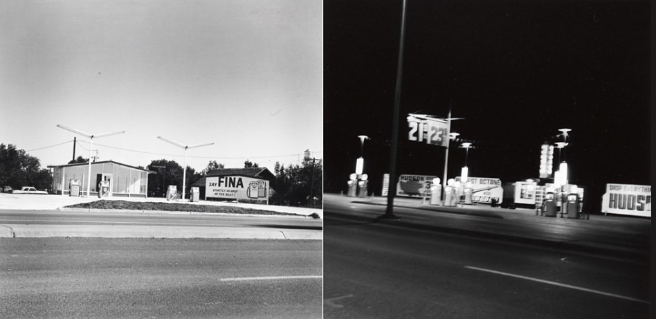
These are two more photographs captured by Ed Ruscha, where they have clear similarities and differences to one another.
The image on the left has much brighter shades and tones throughout as it was taken in the day time. This is significant in The New Topographics because other photographers such as Lewis Baltz and Robert Adams used this technique. They preferred to take their photos in the middle of the day rather than dawn or dusk, as the exposure is higher and the lighting is better. The left photo has also been taken from a lower angle than the image on the right, yet both photos seem as if they have been captured from inside a vehicle, whilst it was moving. This creates a blurry sense, which enhances the images by giving a shallow depth of field. In the photograph on the right, there is a clear absence of light, in which this emphasises and enhances the decorative lighting. The lighting may be viewed as the subject of the image because without it, the image would be pitch black, which draws the viewer in. Also unlike with daytime shoots, the light is not changing – it’s very much the same throughout the night. This is effectual as there is also a contrast created between the luminous lighting and the dark background.
Overall, I think Ed Ruscha’s images are very successful in the way he plays with different lightings, yet comes out with similar outcomes. The use of taking two similar photos but with opposite lighting, allows the viewer to observe how lighting can affect the mood and overall tone of the photograph.
