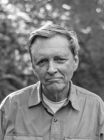
A turning point in the history of photography, the 1975 exhibition New Topographics signalled a radical shift away from traditional depictions of landscape. Pictures of transcendent natural vistas gave way to unromanticised views of stark industrial landscapes, suburban sprawl, and everyday scenes not usually given a second glance. This restaging of the exhibition includes the work of all 10 photographers from the original show: Robert Adams, Lewis Baltz, Bernd and Hilla Becher, Joe Deal, Frank Gohlke, Nicholas Nixon, John Schott, Stephen Shore, and Henry Wessel.
When you think of “landscape photography,” what comes to mind? Whatever pictures you’re imagining, they likely look different from the photographs in the 1975 exhibition New Topographics: Photographs of a Man-altered Landscape.
Robert Adams is one of the most important trailblazers of modern American photography; a key figure in the New Topographics movement (a term coined by William Jenkins to describe the visual documentation of “man-altered landscapes”), he revolutionised the way in which the American West was depicted on film, highlighting the effects of industrialisation upon what was once a vast, imposing wilderness that would have made Lord Byron swoon.
Born in 1937, in Orange, New Jersey, Adams’ family relocated to Wheat Ridge, Colorado, a suburb of Denver, when he was 12. Adams spent much of his childhood and adolescence hiking and mountain climbing – a passion which stuck with him into adulthood. Having majored in English, it wasn’t until 1963, at the age of 26, that Adams bought a 35 mm reflex camera and began photographing nature and architecture. His fascination with the medium burgeoned, and – after a fortuitous meeting with John Szarkowski, the curator of photography at the Museum of Modern Art in 1969, which resulted in MoMA’s purchase of four of his prints – he opted to pursue his passion full-time.
Adams’s visual education came in part through the work of photographers who had preceded him in the West a century before.
The New West Mood Board
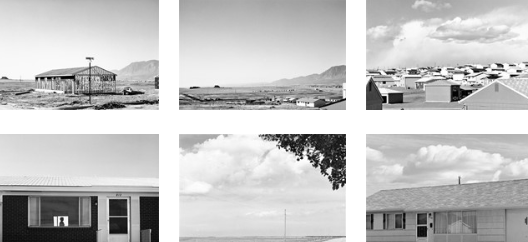
Adams’ monochrome style – at once formal and evocative – was influenced by 19th-century photographers like Timothy O’Sullivan, William Henry Jackson and Carleton Watkin, who also focussed on the landscape of the West (in its more primitive state) as well as Lewis Hine, Edward Weston, Dorothea Lange and Ansel Adams, all of whom married social and aesthetic concerns in their work. Adams’s visual education came in part through the work of photographers who had preceded him in the West a century before.
Critic Sean O’Hagan, writing in The Guardian, said “his subject has been the American west: its vastness, its sparse beauty and its ecological fragility…What he has photographed constantly – in varying shades of grey – is what has been lost and what remains” and that “his work’s other great subtext” is silence…
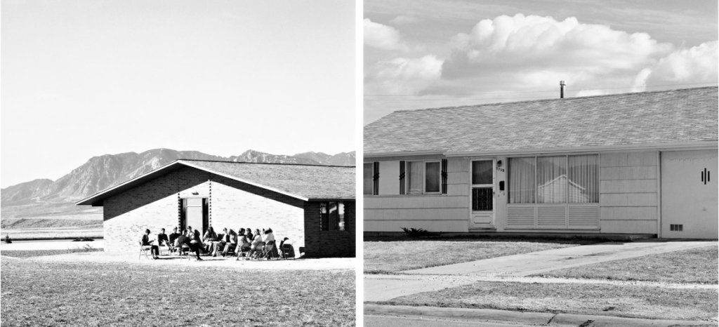
The turning point in Adams’ career was the publication of his highly acclaimed photo-essay, The New West, in 1974, which catapulted the image-maker into the public eye. e are first confronted with two, light-drenched images of sprawling prairies, where the only sign of human intervention are electricity pylons and wooden fence posts. Then these open fields are shown bearing signs, first: No Trespassing, then: For Sale or Lease, and you begin to feel the shadow of commercial opportunism ominously approaching. Sure enough, the next section depicts the rapidly growing expanse of tract houses and mobile homes popping up along the Front Range, breaking us in with an image of the foundations of a single tract house being laid in a sparse stretch of land, before presenting us with an entire town of these compact white abodes, which nevertheless appear tiny and somehow insignificant against the backdrop of the towering mountains and an omnipresent sky.
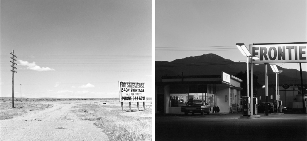
Depicting the unwavering presence and beauty of nature in the face of human intervention was, for Adams, a key element of the project. As he explains in the book’s introduction, “Why open our eyes anywhere but in undamaged places like national parks? One reason is, of course, that we do not live in parks, that we need to improve things at home, and to do that we have to see the facts… Paradoxically, however, we also need to see the whole geography, natural and man-made, to experience a peace; all land, no matter what has happened to it, has over it a grace, an absolute persistent beauty.” And indeed, even when Adams zooms in on the man-made – be it a woman strikingly silhouetted between two windows of her neat brick bungalow, a packed Denver carpark or a peak-side gas station, complete with enormous sign – there is an inherent, inescapable allure, stemming from the photographer’s aptitude for composition and ability to encapsulate the atmospheric quality of light so unique to the area.
The American Dream
At its core, the American Dream of the Colonial times surrounded the pursuit of opportunity and the idea that a poor person can become rich and successful through hard work and determination. The Westward Expansion was greatly aided by the American Dream as people rushed west to find gold and riches.
IMAGE ANAYLISIS
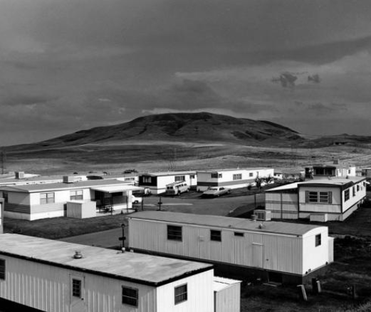
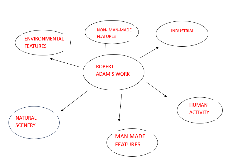
This image is a perfect example as the bottom half (foreground) of the image is man-made with human activity objects as humans adapt which ultimately adds these subjects to the image. This contrasts to the top half off the image (background) as it contains natural scenery therefore Robert Adam’s had contained both environmental factors. A significant feature about this image are the lines on the houses contrasting with the round/ not straight lines on the mountains showing clear meaning the houses are man-made and perfectly put together however the mountains are not but as humans we prefer the look of environmental features but housing is a necessity. Another interesting factor is the sun shining creating light highlights on the houses but in the distance dark shades with the clouds making light onto the floor which has an eye catching effect and the success of presenting this considering majority and including of his images are in black and white. You cannot tell what time in the day this is however it is exposed and saturated effectively. Another noticeable feature is the layout and pattern of the housing compared to the free natural scenery which implies the difference between the two main subjects. Normally, photographers take ‘landscape’ photos which your first instinct is that landscapes capture beautiful scenery however Robert Adams in this image captures poverty and cultural views based on the housing but where it is placed.
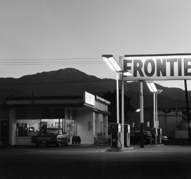
This image is similar in certain ways. In the background is still obtains natural scenery however this image does not have a significant contrast and exposure of different shades. However, it does have other eye catching features through bright light such as the ‘R’ missing in the word ‘ Frontier’ which potentially could be Adams trying to imply how landscapes have changed and been adapted overtime. It is interesting to note he took a landscape of a petrol station which is also a necessity and a basic need. Adams photographs in black and white and photographs basic needs such as the other image such as living no matter political problems such as poverty. In this image, although it isn’t the first thing you notice it captures the wires across the petrol station which could also signal poverty. This could mean Adams is photographing things that are not the ‘ beautiful’ standards and ugly things in life but makes it look aesthetically pleasing. A large factor to make this is the background of natural scenery and environmental factors. Although from the shop to the mountains it is hard to spot the difference as the shade is almost the same and dark you can tell through the lines and texture. Adam’s keeps the foreground clear through light shades contrasting with dark to keep the main subjects important and impactful with a darker background however it massively creates to the image.
Personally, I really like Robert Adam’s work as he captures unknown ‘ beautiful’ features and makes it look aesthetically pleasing whilst maintaining environmental factors. This brings conceptional and contextual ideas to his images for good reasonings. It creates the idea that his images don’t only say one thing. I like how they are in black and white and how he typically photographs natural scenery with modern subjects which creates contrast within itself and creates a vintage and nostalgic aesthetic. Because he is already contrasting modern and present features he does not have to contrast his shades and use the zone system like Ansel Adams however I do think it would bring more too certain images but may be too much in some to the point viewers wouldn’t know where to look. I also like how they are realistic looking which creates a whole new aesthetic compared to Ansel Adams and sublime etc.
The only reality is the Self and you are That. Why look for anything else? Everything else will take care of itself. You’ve got to abide in the Self, just in the Self.
