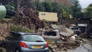
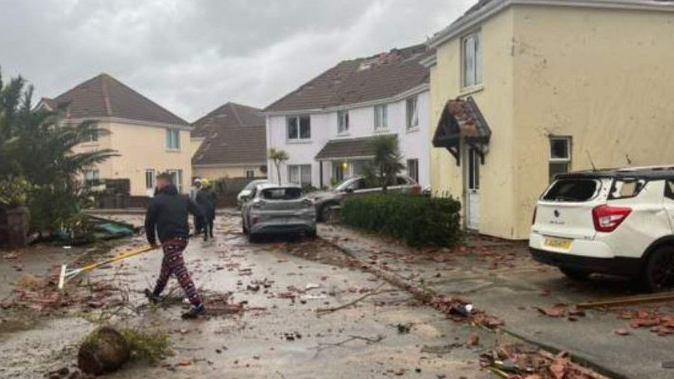
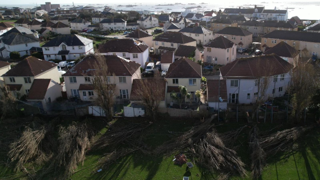
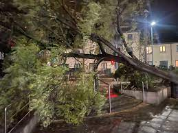
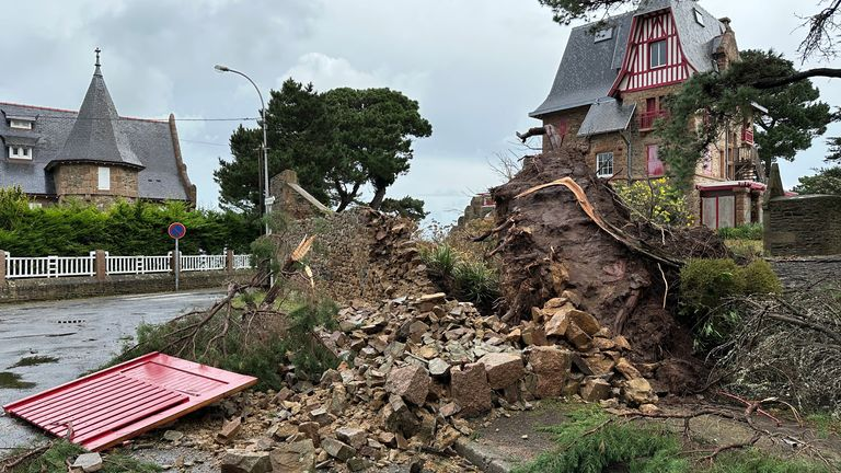
I took a series of images focusing on the damages around the island from Storm Ciaran however I also took images that involved Romanticism and the Sublime.
My Inspiration from the Storm:
Photoshoot:
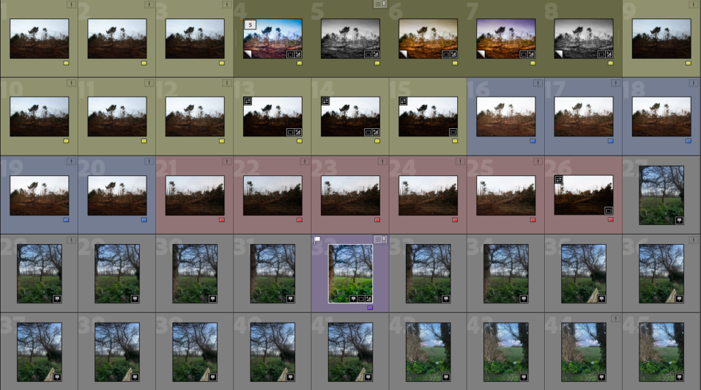
I focused on the area of St Clements for my photoshoot as it was one of the areas in Jersey that was affected the most severely therefore it would still have damage and debris around.
Photoshoot 1 best images:
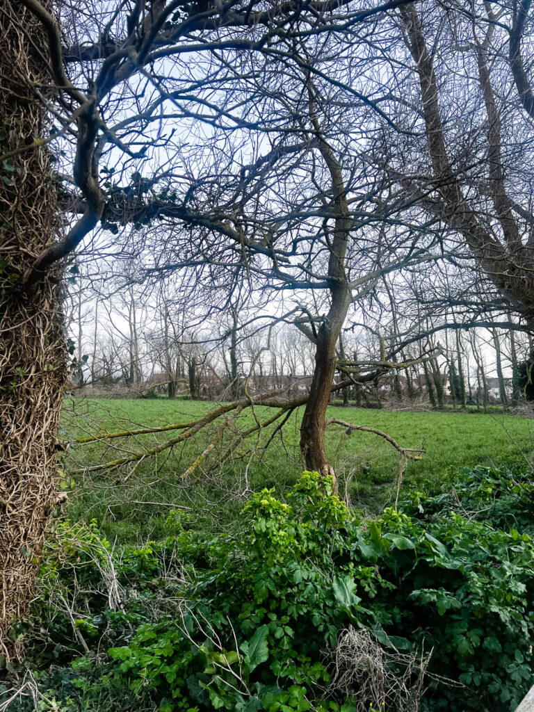
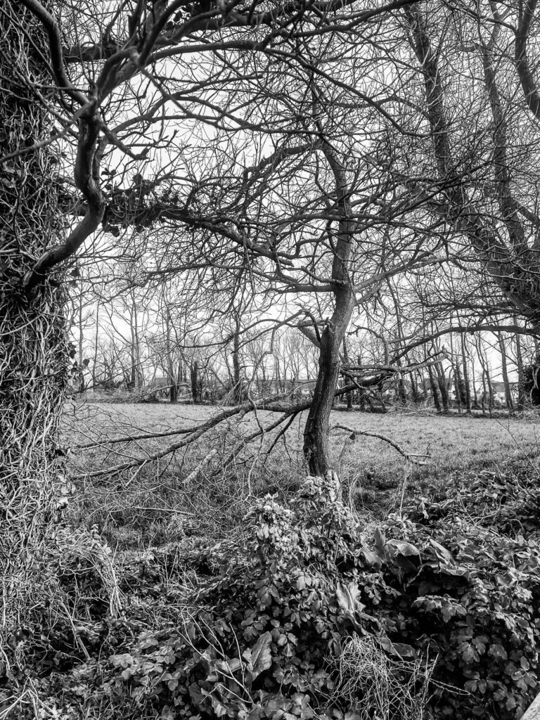
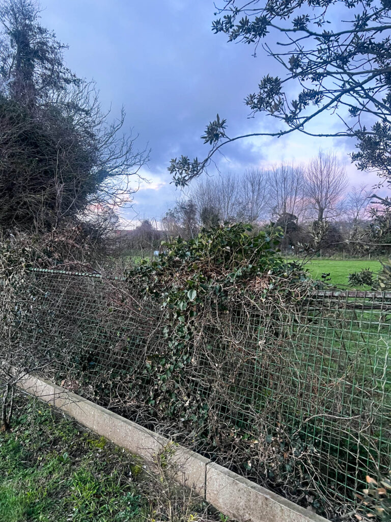
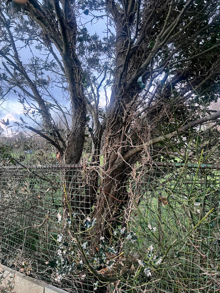
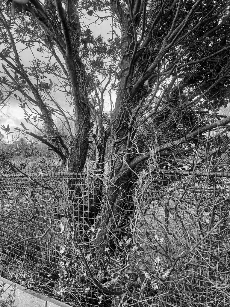
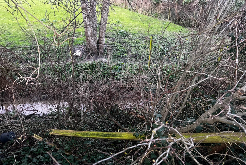
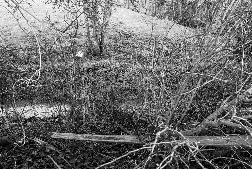
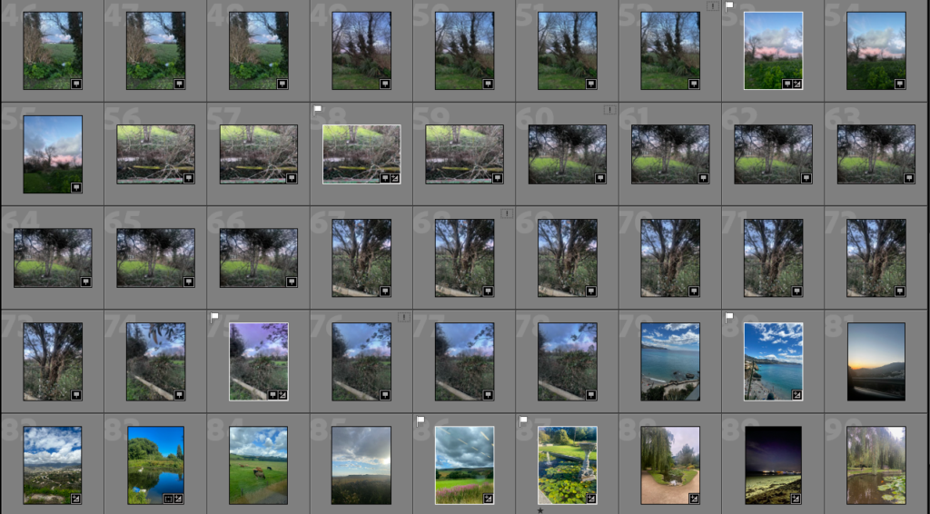
For these images I focused on the surrounding areas of a row of fields as I felt that this would be an area where there would be not only a lot of damage from the storm but also many different locations and perspectives to find.
For most of my images I created virtual copies of them and made them black & white to represent Ansel Adams’ work as his were also monochrome. I also feel that this shows the distinct and unique forms that the branches take on due to the strength of the wind. I really liked this area as there was a combination of natural and man-made resources, as well as many twisting branches varying in size. Many of them twisted forwards so I positioned the camera in certain angles the create depth in the image. For some of my images I used HDR to combine 3 images so that the exposure was suitable, this also resulted in the images looking more vibrant by saturating the green tones more. However, this wasn’t necessary for all images as I wanted some to have a more pastel shade such as in the sky as I feel that this creates a calming and tranquil tone for the viewer, representing ‘the calm after the storm’. As well as this, in the majority of my images I used the graduated filter to create a smoother gradient from the top of the image through to the middle, then increasing or decreasing the contrast.
Photoshoot 2 best images:
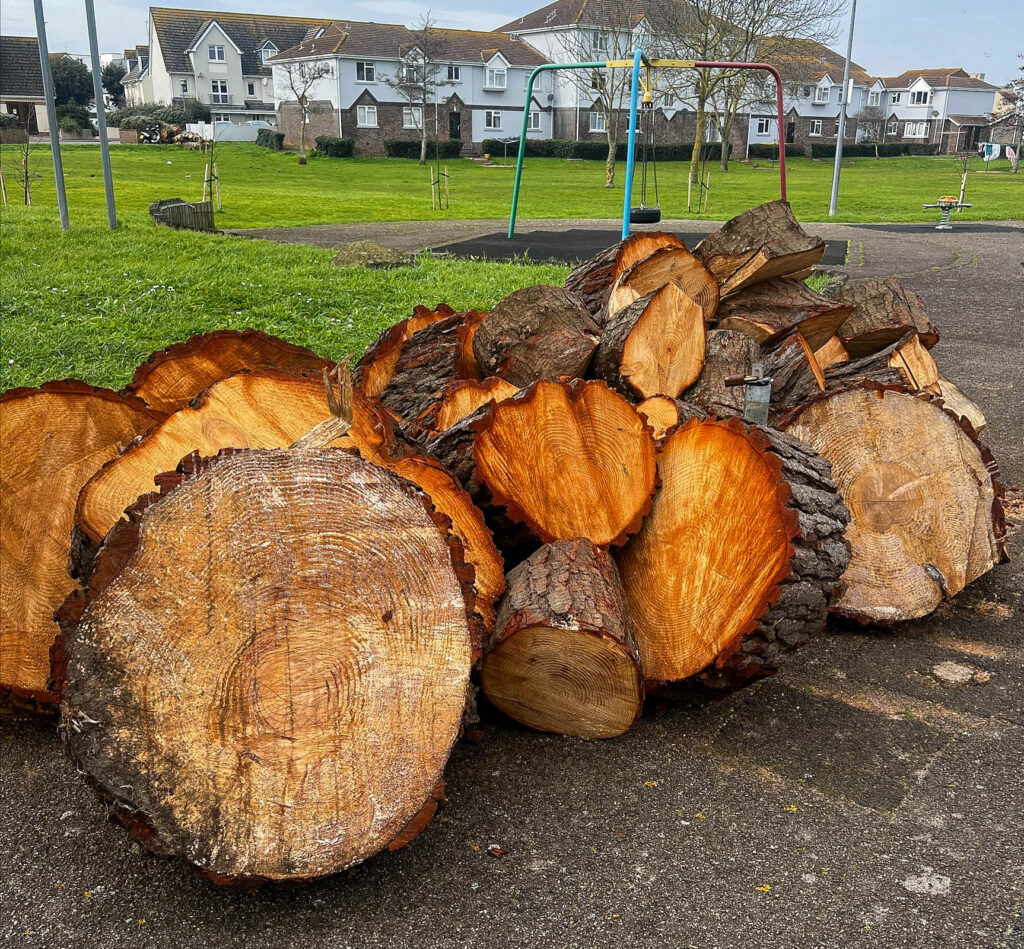
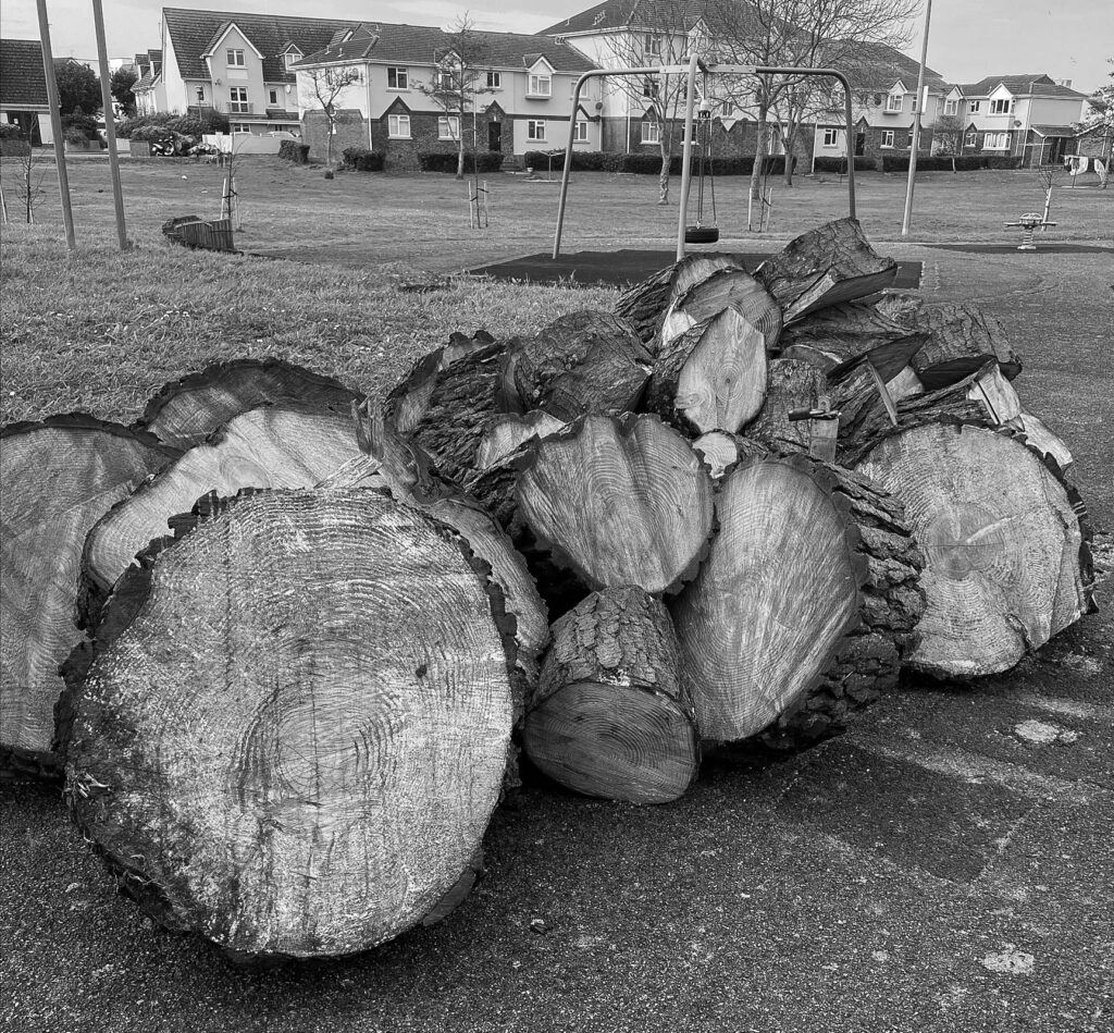
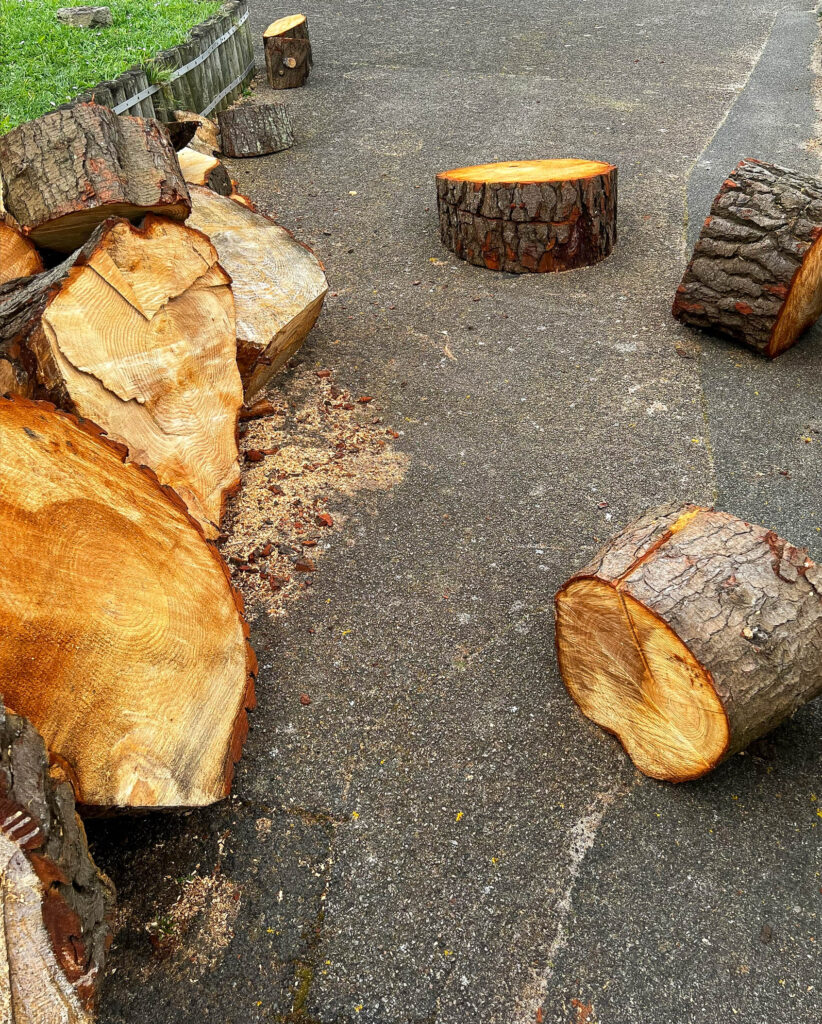
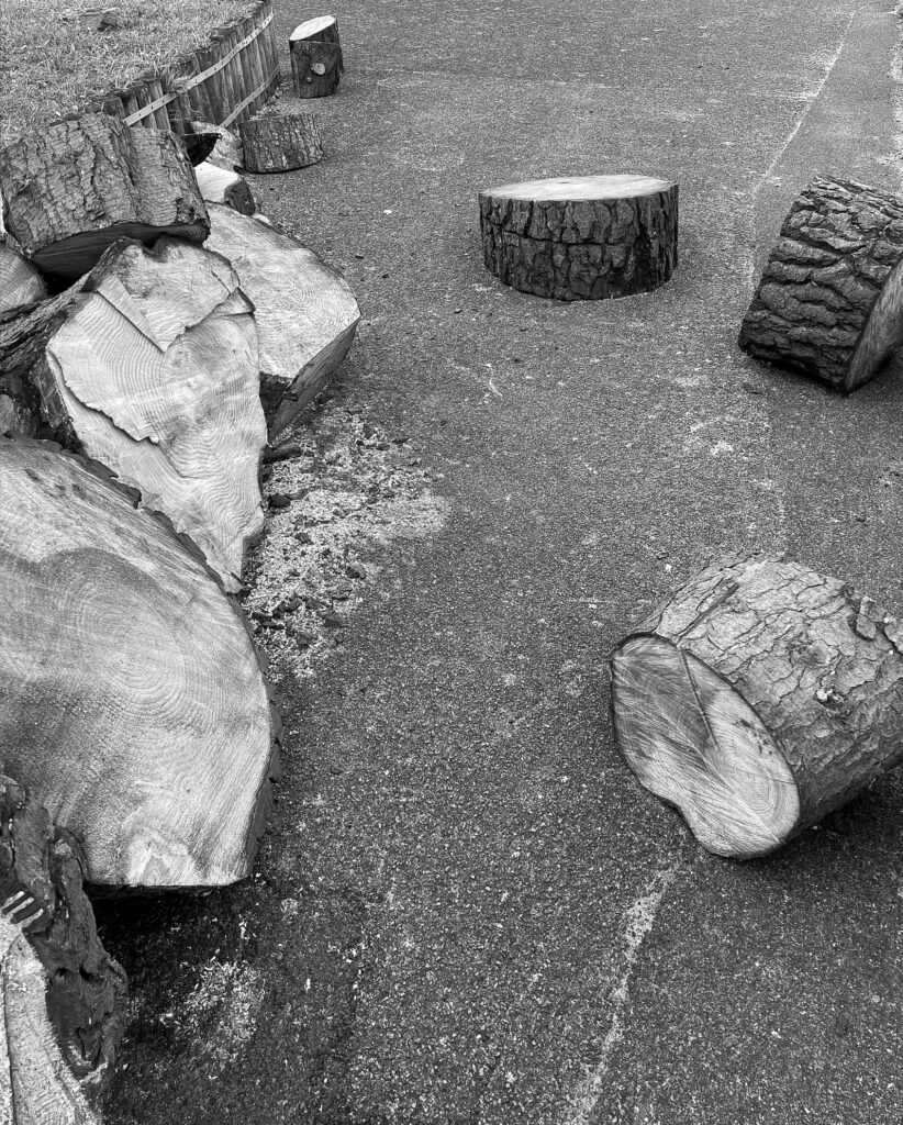
For these images I chose to go into a more public space. This was a pile of chopped wood from trees that had fallen down and been piled up on top of each other. I really liked the way they had been placed and all the details that would’ve been hidden within the tree have been exposed that wouldn’t normally be shown. I also liked the way some smaller pieces had rolled off as the position each of them have landed in makes it look intentional yet relaxed. I created some blank and white versions of these images too because I wanted to show aspects of Ansel Adams work in my own.
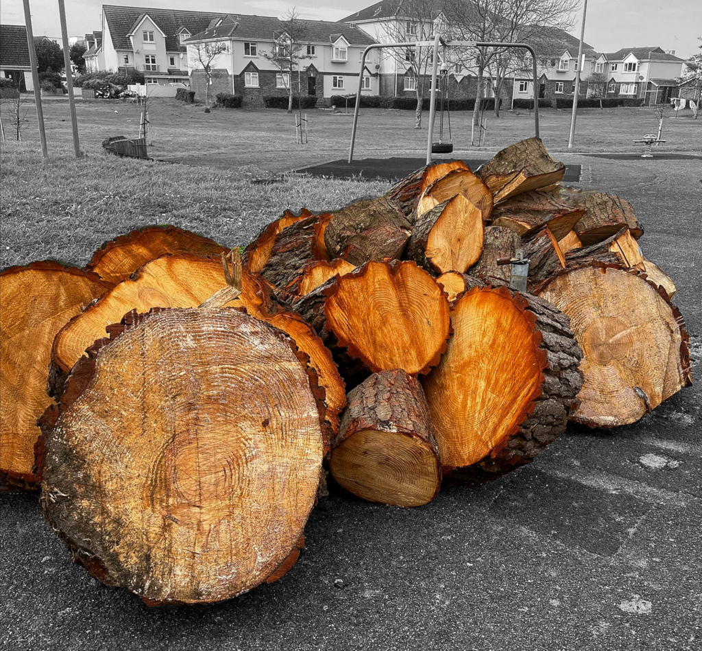
I created an idea using Photoshop, keeping the main part of the image in colour and the background in black and white. This adds more vibrancy to the orange/brown tones and makes each layer stand out more.
