Shoot Two – Inspo. Ansel Adams – Landscapes

Edit One

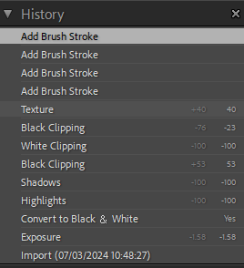
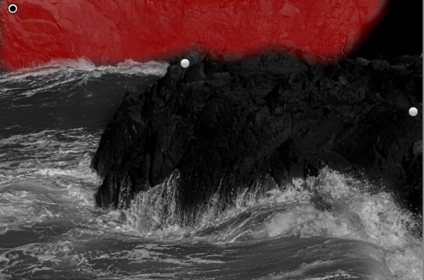
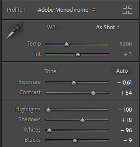
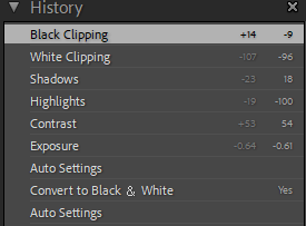
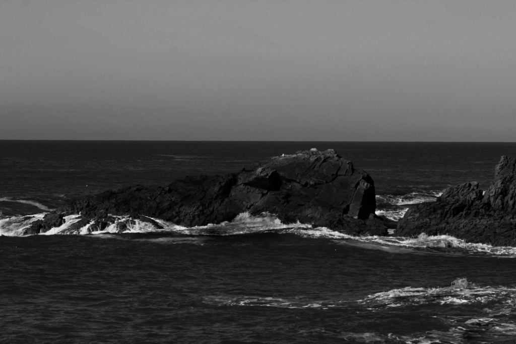
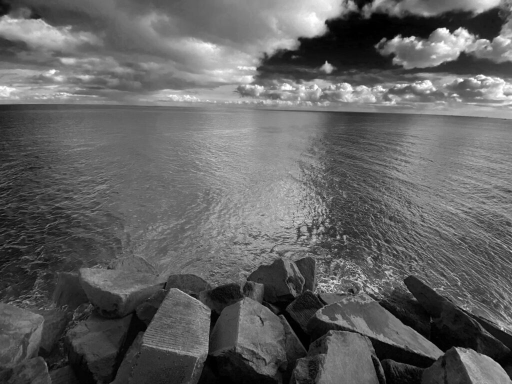
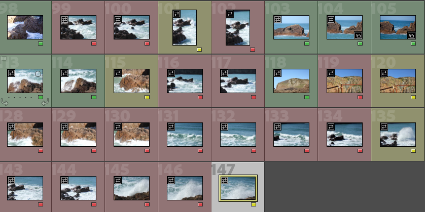
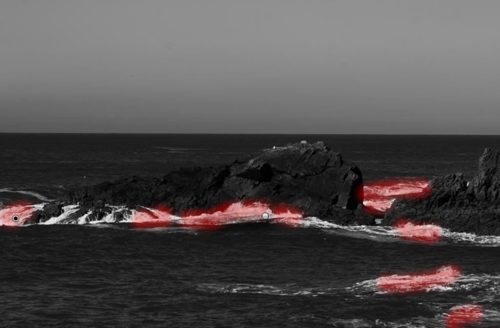
For this edit I made sure to make the rocks stand out in the dark grey sea as I didn’t want the imagine to appear flat. The harsh horizon line adds depth to the image and well as contrast from dark grey of the sea to light grey of the sky. By then using the brush tool I make the pure white less luminescent and instead just pure white. This helped add more detail back into the waves.

Edit Two
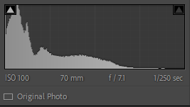
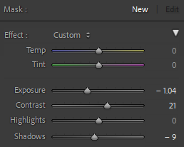
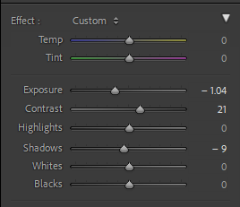
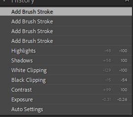
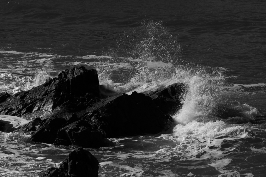
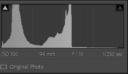
For my next edit I made sure to make the rock face bold as it is the subject of the photo, the waves I kept lighter with white to reflect the zone system. By decreasing the exposure I increased the details in the waves which had been washed out by the bright light. I then again used the brush tool to add contrast to certain points of the photo adjusting the settings each time to create distinct tonal separation.

Edit Three
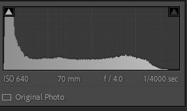
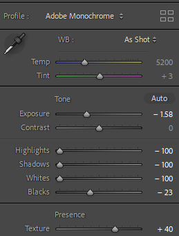
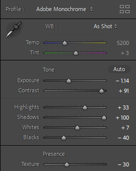
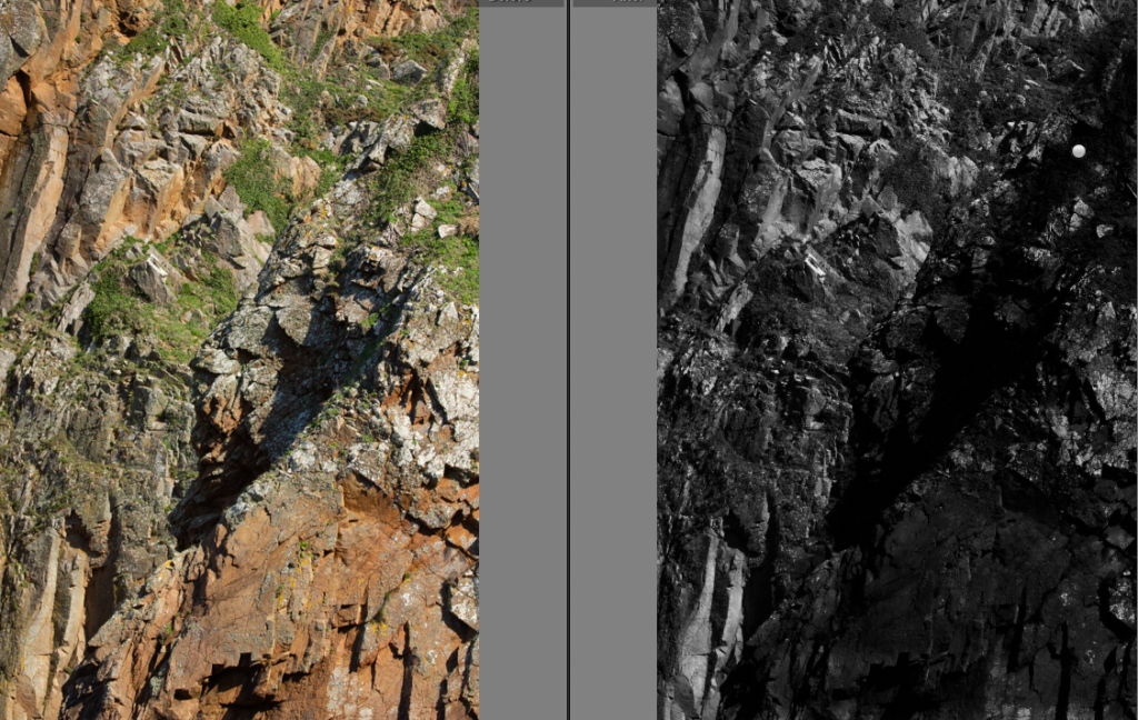
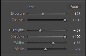
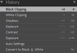
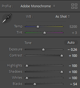
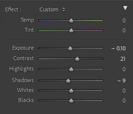
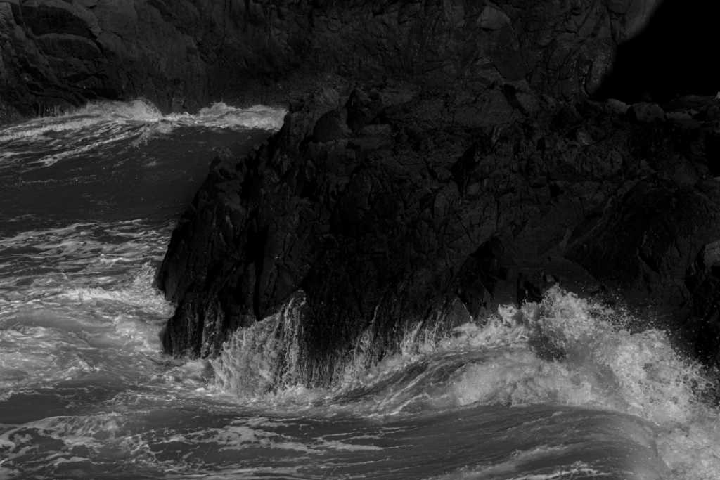
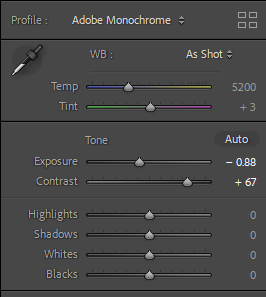
This shot isn’t my strongest so I chose to just use basic editing of the contrast and shadows mostly after using the Adobe monochrome auto settings to increase detail in the rock and bring back the waves details that had gotten washed out with over exposure.

Edit Four
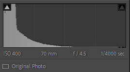
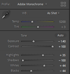
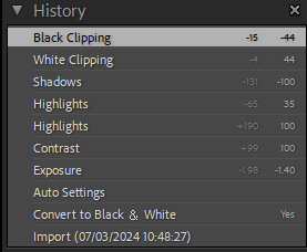
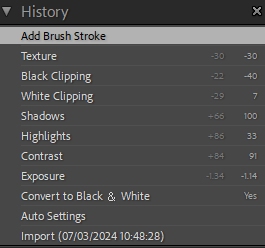
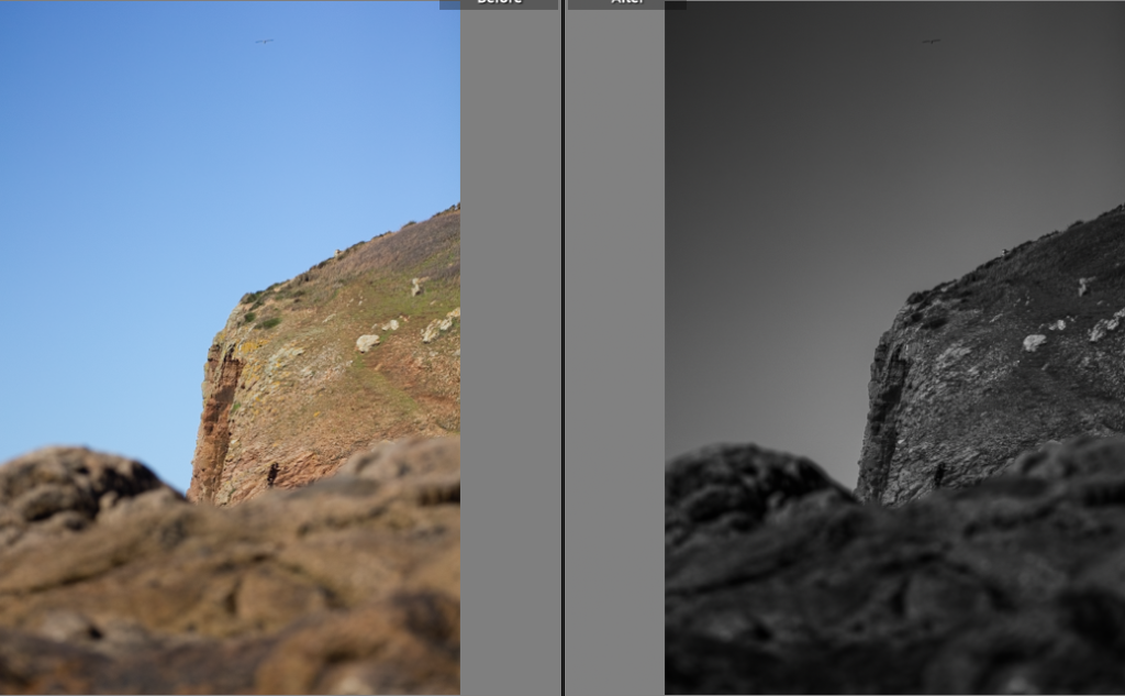
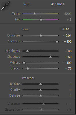
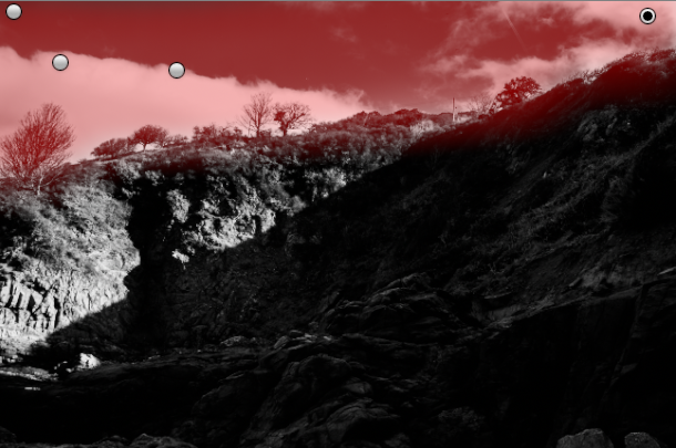
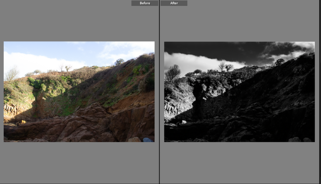
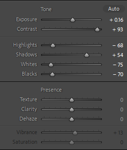
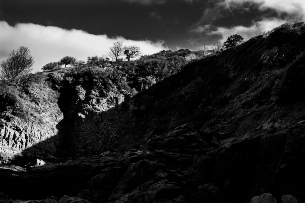
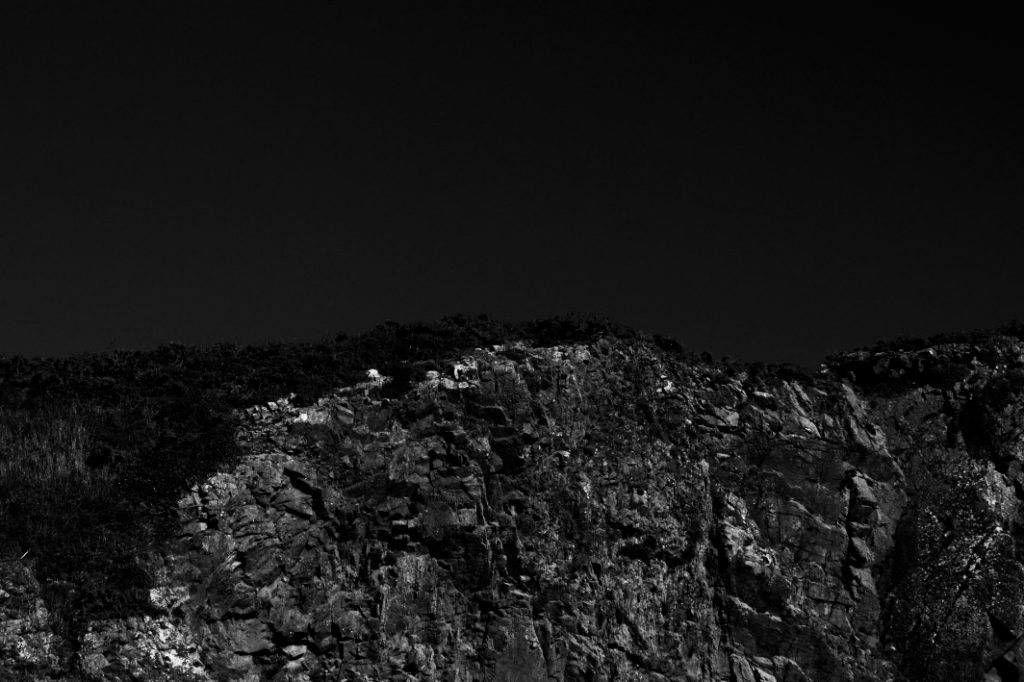
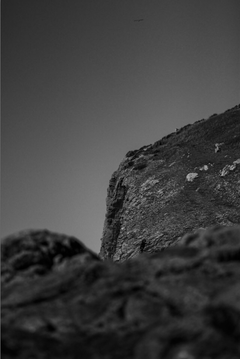
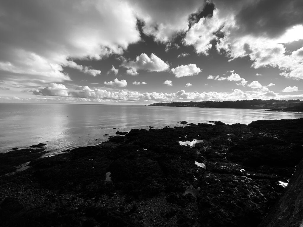
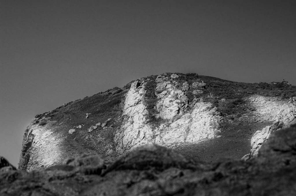
This photo just needed the exposure reducing to get the dark sky and the highlights increasing to get the white flecks of rock to show up and contrast with the otherwise similarly coloured bracken on the left side of the photo. The editing helped the shapes and lines in the image stand out making for an interesting but natural looking photo with depth.

Edit Five
Edit Six
Edit Seven
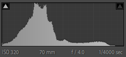
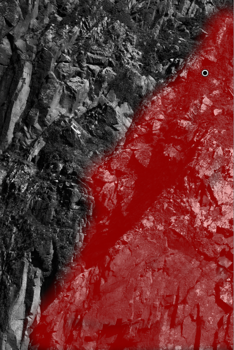
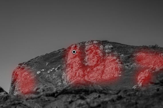
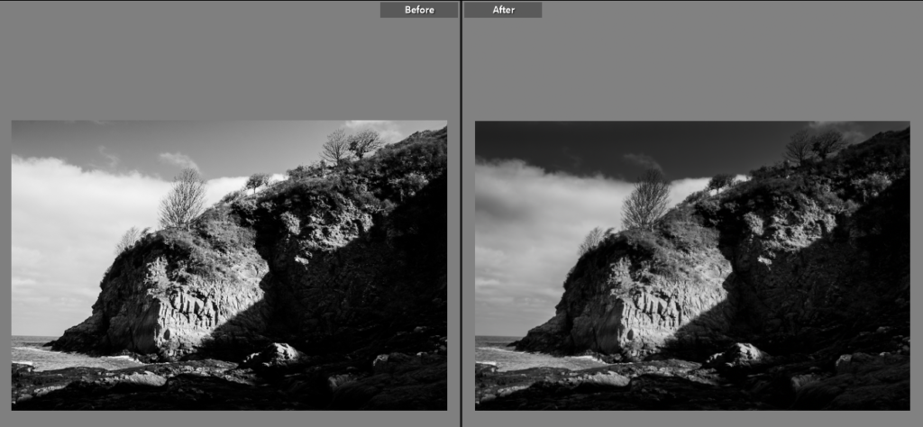
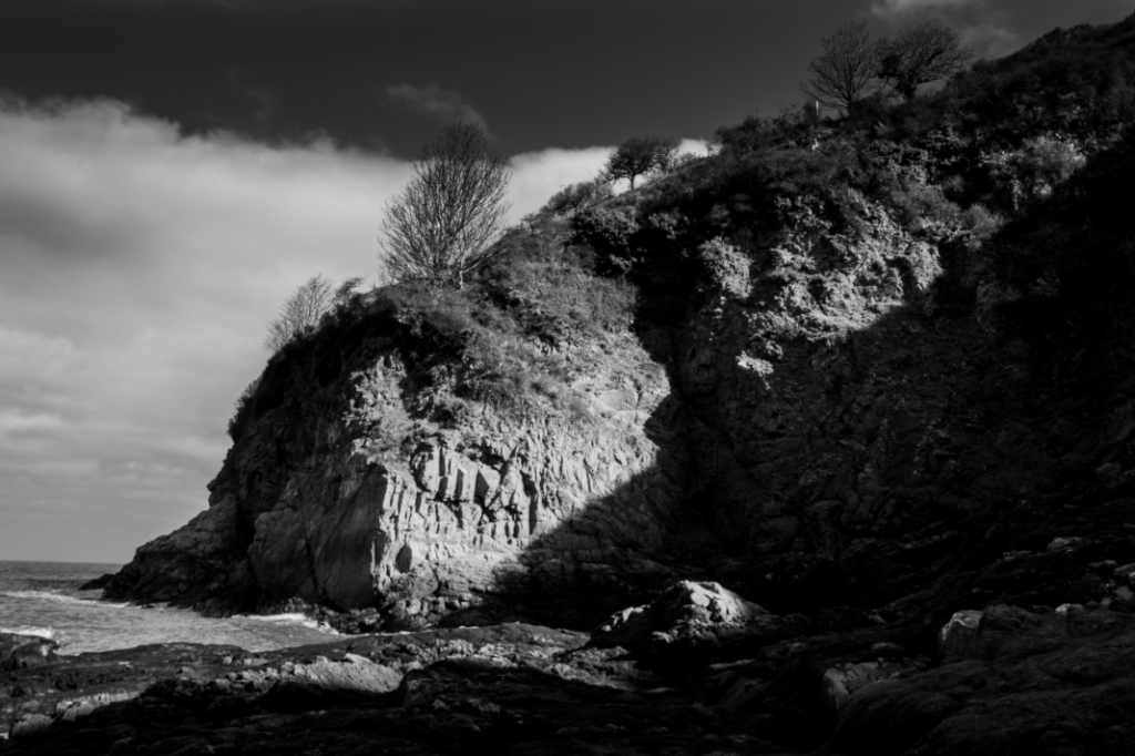
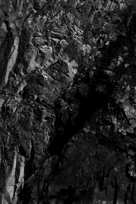
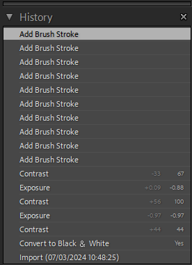
For this edit I wanted the lighter rock to show up more. To create this I used the black and white setting and then used the adjustments tools to create the contrast I wanted before adding further depth and contrast with the brush tool.

Edit Eight
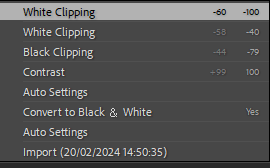
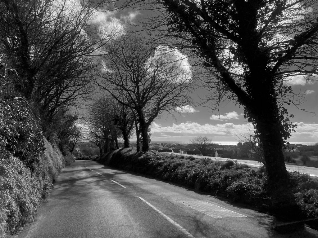
For this photo I used the Adobe monochrome and the adjustments tool. After that I then used the brush tool with a low exposure adjustment to make sure the clouds stood out and the sky wasn’t washed out creating the high contrast, dramatic photo.

Edit Nine
Best Final Photos
Photoshoot

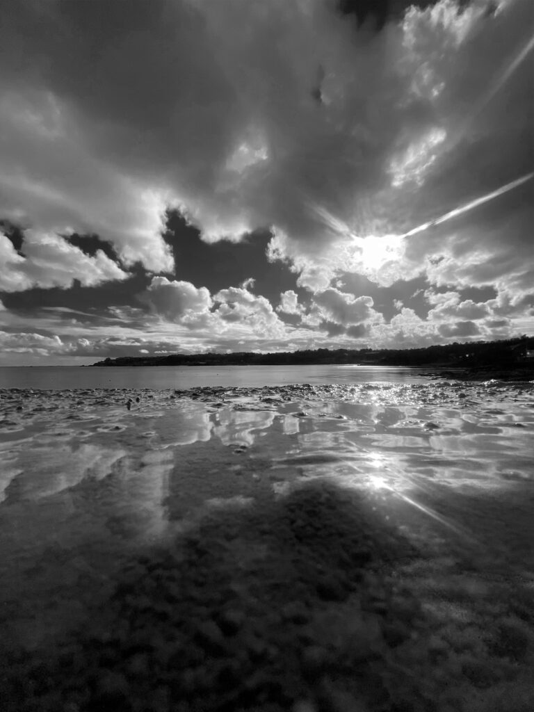
Here i selected some of my best photos and presented them in black and white to represent Ansel Adams work, I also like how the black and white effect makes the photo look a lot more mysterious and a sense of the unknown.

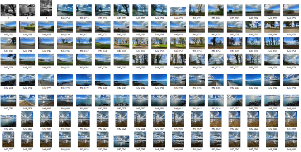
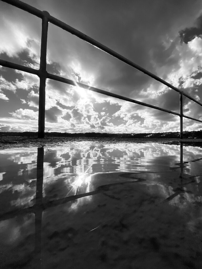
Here I went to St Catherine’s to take some landscape photos, and here are some of the results above. I turned the photos black and white to match Ansel Adams work as I was inspired by him to go out and take some photos, I really like how these photos turned out as they show such a natural side of the world where there isn’t any people, the world looks really peaceful and still. However I have taken a few portrait photos, so I could really show the view in different sizes and shapes.

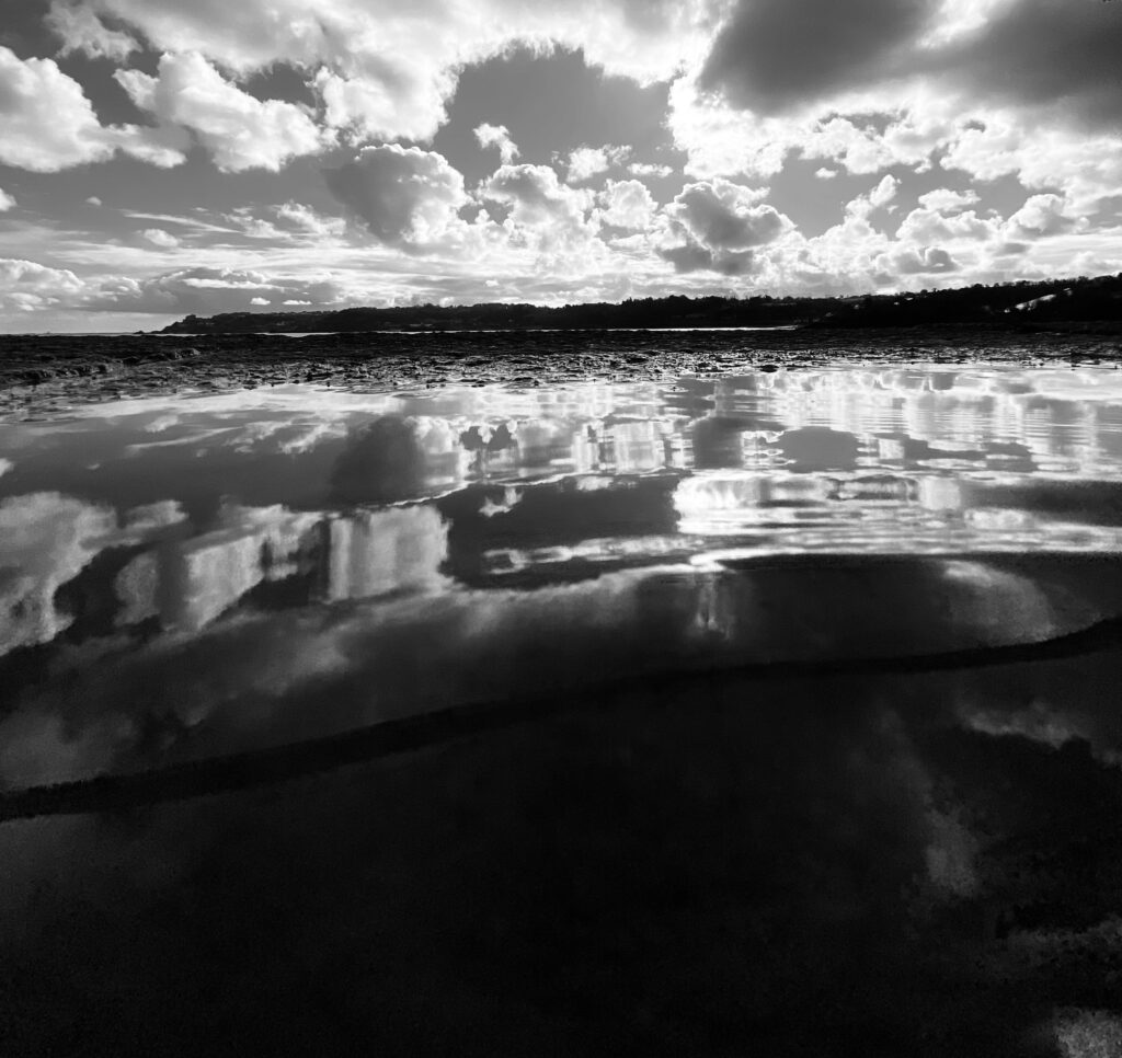
Here I tried to take a picture with a reflection of the view by using water on the ground and positioning the camera in a certain way. If I were to do this again I would try to get the water right to the end of the pier to get a better reflection and not have a rocky surface at the end, which sort of ruins the photograph. would also like to get different locations to different viewpoints and see what it would give me. I really like the idea of having a reflection at he bottom of the photo as it makes it more unique and different, I also really like how it was a sunny day when I took these photos and there were clouds all over the photo, this makes the photo look more detailed and full. To edit these photo I simply when onto photoshop and pressed “image” then “adjustments”, lastly I clicked “black and white” and this gave me options to control the whole photo and what part is darker or lighter in certain sections of the photo.

The Land and Us

The Land and Us |  La Tèrre et Nouswas born out of a need to reconnect and prioritise Jersey’s precious ecosystem. In the exhibition, visitors will be guided through newly commissioned artworks exploring our past, present and future habitation of the land. Travelling from our ancient neolithic past, when the land was a sacred site of ritual, through our farming traditions, oral histories and earthly language of Jèrriais, to our woodlands, indigenous species and pathways that encircle the Island, The Land and Us is a place to gather and reflect on the natural world.‘ – ArtHouse Jersey

This exhibition shows different ways of portraying art. All of the pieces make you appreciate our environment more and think about it in more depth.

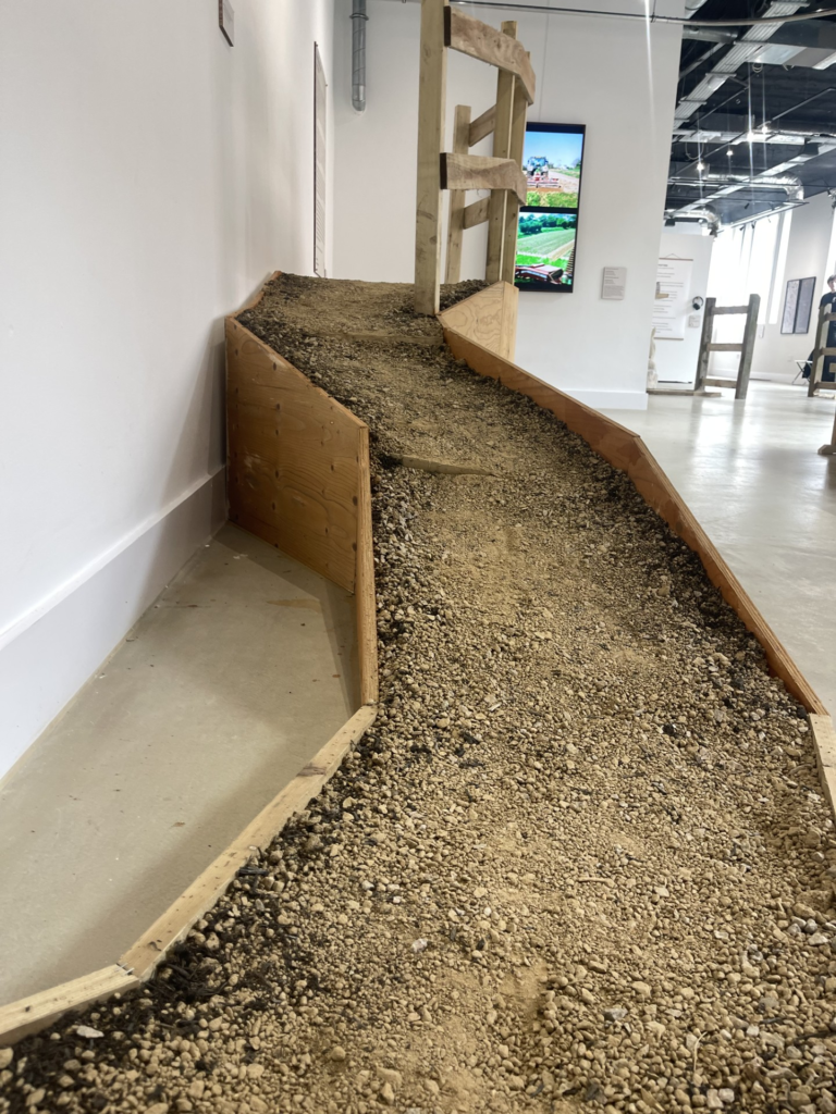
This was one of my favourite parts of the exhibition. I think it was really clever to create a pathway with gravel and dirt just like a natural one.

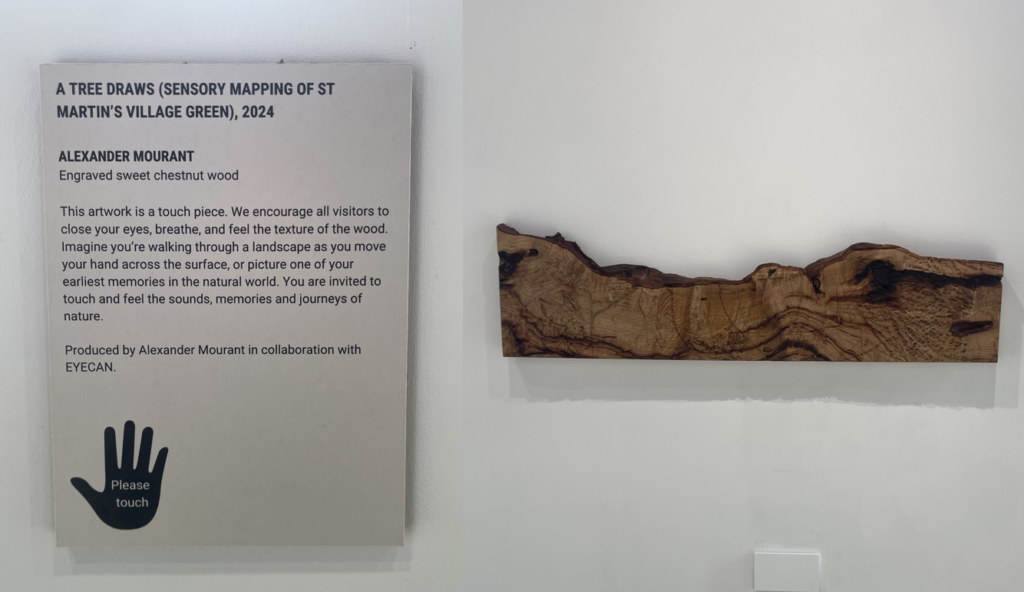
I also really liked this piece of art as it wasn’t just a visual experience, it allowed you to feel every texture of the slice of wood. I think this is really unique as it leaves more of an impression on you afterwards.