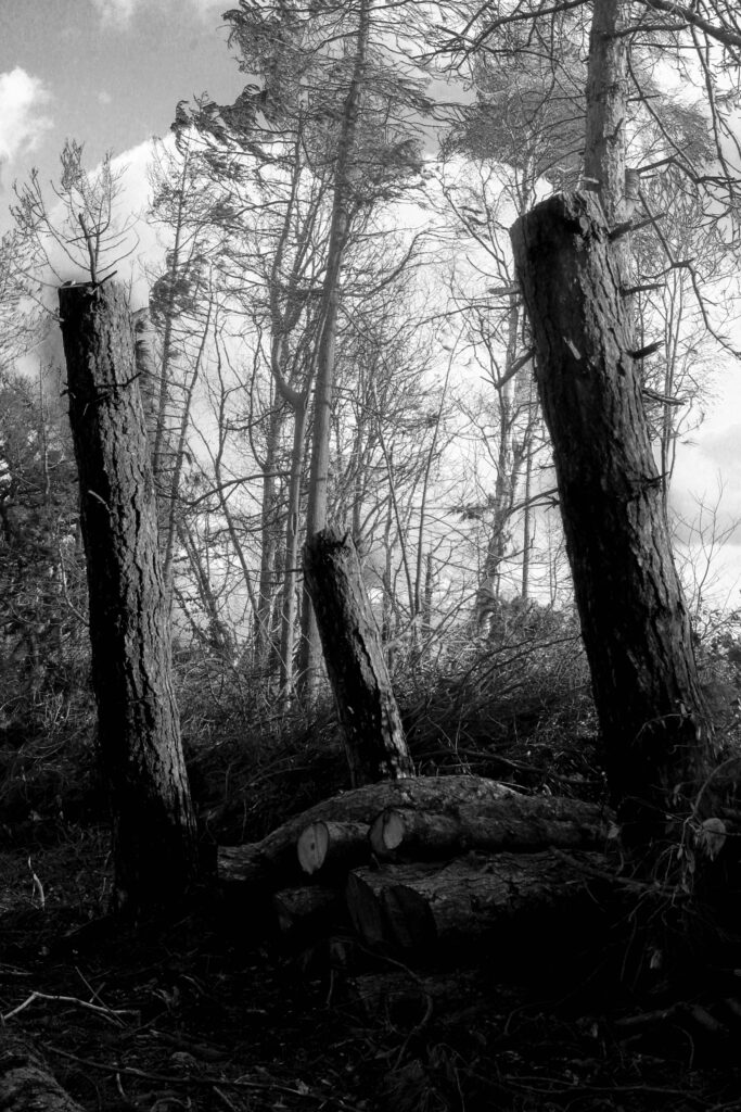
First Edit Plan:
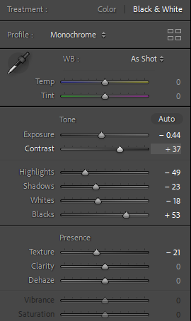
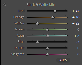
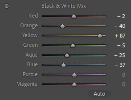
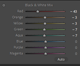
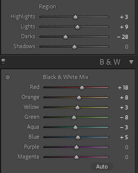
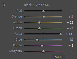
For my Photoshoot I will edit my pictures in the style of Ansel Adams landscape photos. To replicate his aesthetic of dramatic tonal range I will use settings in Lightroom to do this, since Ansel Adams didn’t have the advantage of technology and having to use yellow and red glass panels I will use the Black and white mix to make these colours within in the image stand out more when converted in to Greyscale.
First Edits:
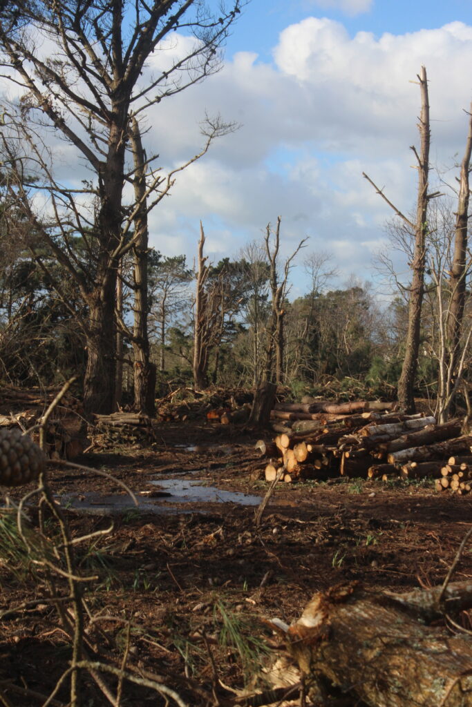
Before:
Edit settings:
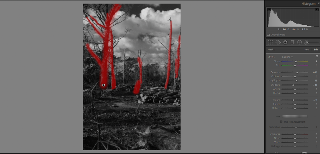
Using an exposure brush I was able to high light some of the trees that I thought weren’t bright enough inside the picture. With the sky before being a nice bright blue, Once converted to grey scale I used the Black and White mix to make the sky seem darker like how Ansel Adams did in his Photos,
Final result:
Before:

Edit Settings:
Using a HDR merge, I was able to create a more artificially exposed image, although not natural looking to nature, it provided a vibrant tonal once converted to grey scale. Like in the previous image instead of darkening the sky, I thought it would contrast to much with the shadows in the foreground, instead I played around with the yellow and green to make them stand out more.
Final Result:
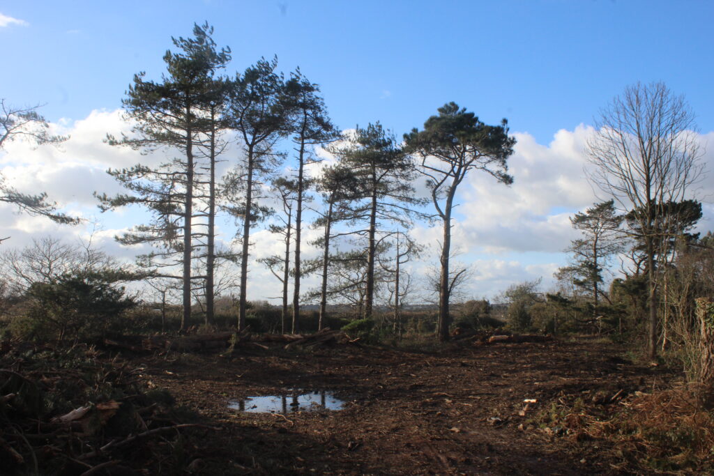
Before:
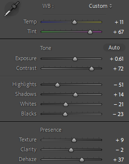
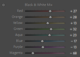
Edit settings:
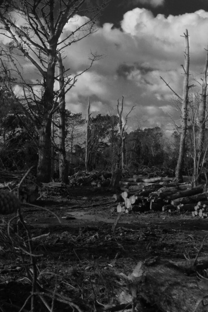
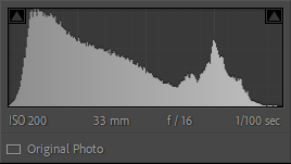
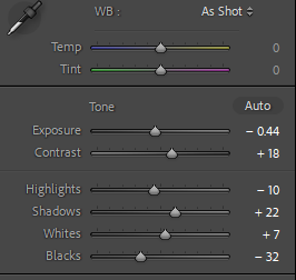
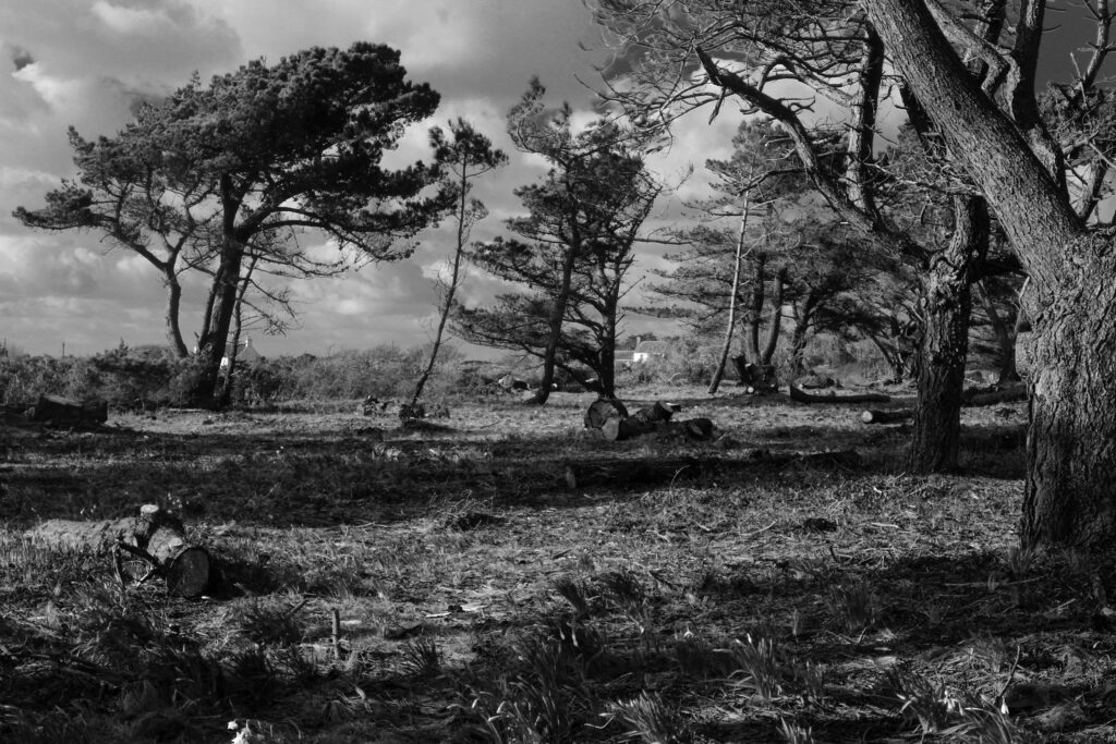
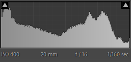
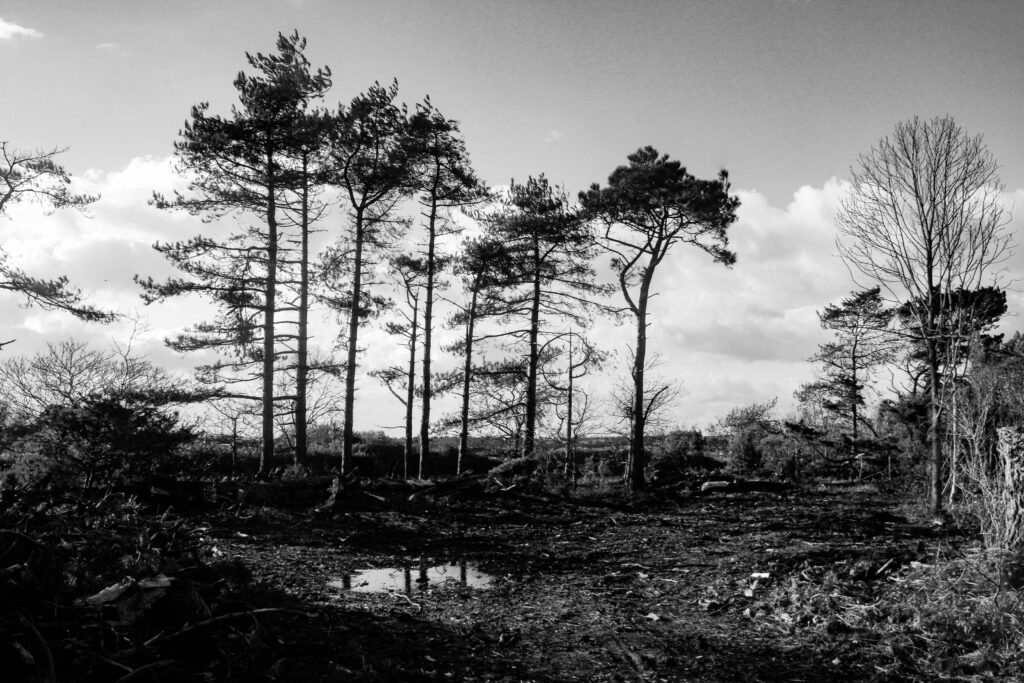
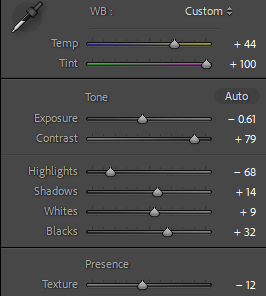
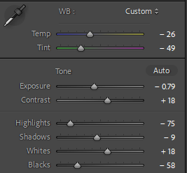
In this image I tried to make a sharp contrast from the sky and the surroundings in the foreground. By Using large variations in exposure, contrast and highlights I was able to add more detail to the composition of the image that can said to go fairly unnoticed when not in black and white.
Final Result:
Before:
Edit settings:
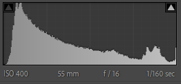
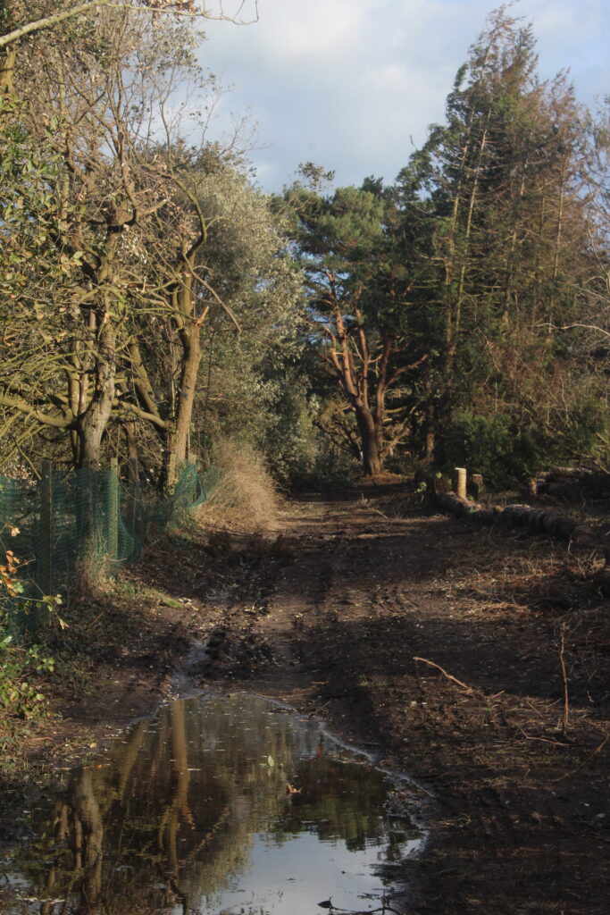
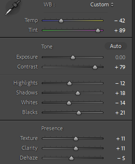
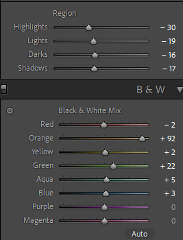
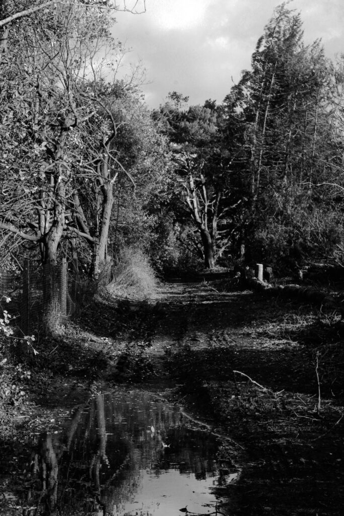
Using tint settings as well as the contrast, I was able to create a more diverse difference in the shadows of the image. Using visualisation I saw the how the long path way could create an interesting depth to the image. Using Adam’s Zonal system, I was able to create a large range of tone. With darker tones being in the lower half of the image and gradually getting lighter towards the top.
Final Result:
Before:
Edit settings:
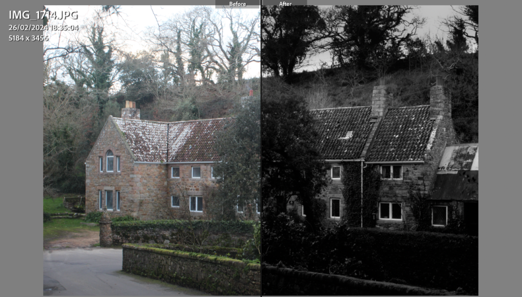
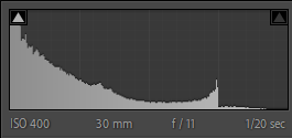
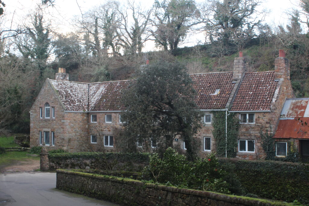
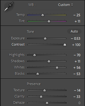
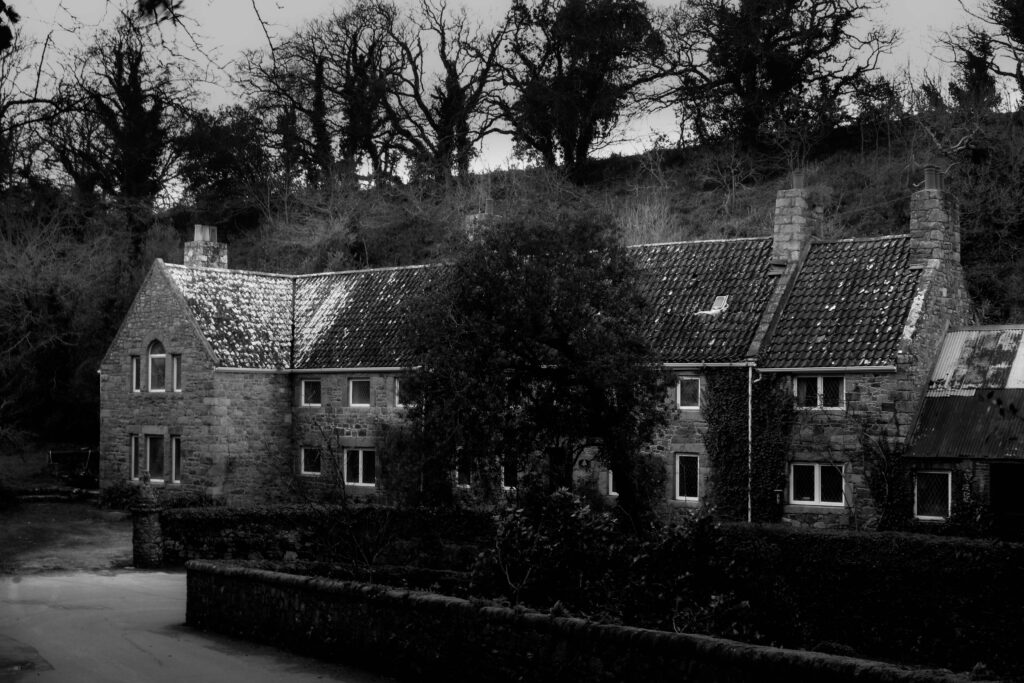
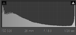
Due to the image being over exposed, I lowered it down and added some more depth by adjusting the tone with less highlights and more whites to make features on the old stone farm house pop out some more.
Final Result:
Before:
First Edits:
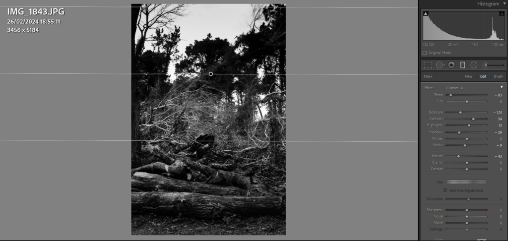
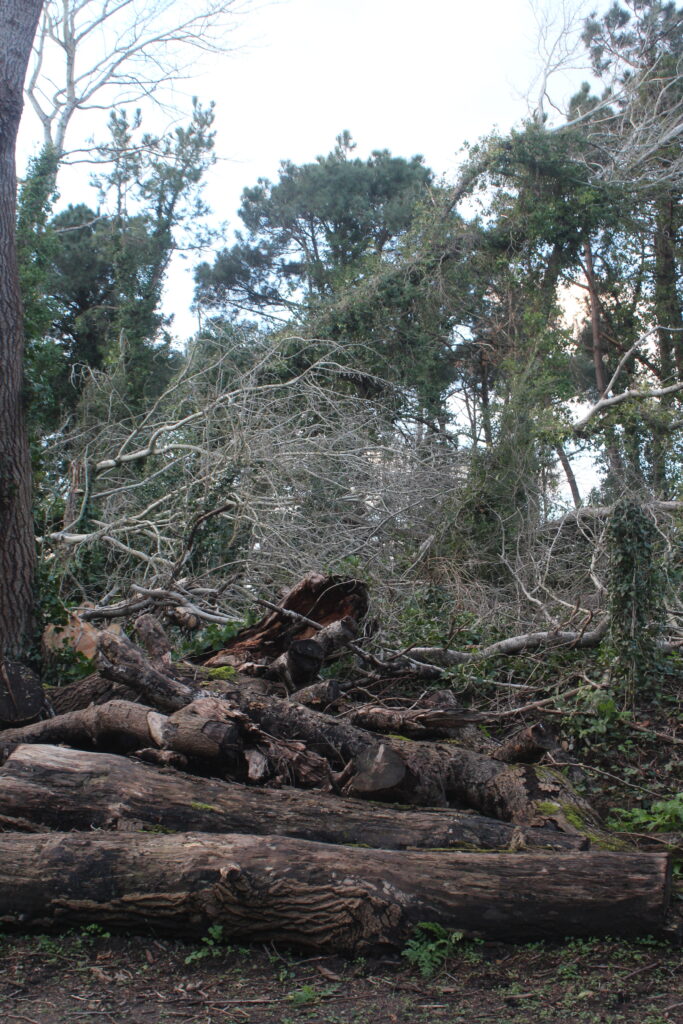
In this image, I edited this image to have stages on tone from top to bottom. With darker tones in the trees above I used a graduated filter to create that transitional effect of dark tones into the lighter tones of the thin branches.
Final Result:
Before:
First Edits:
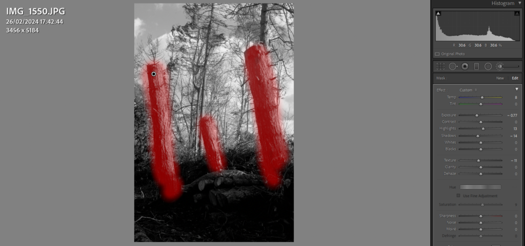
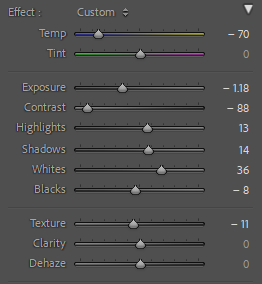
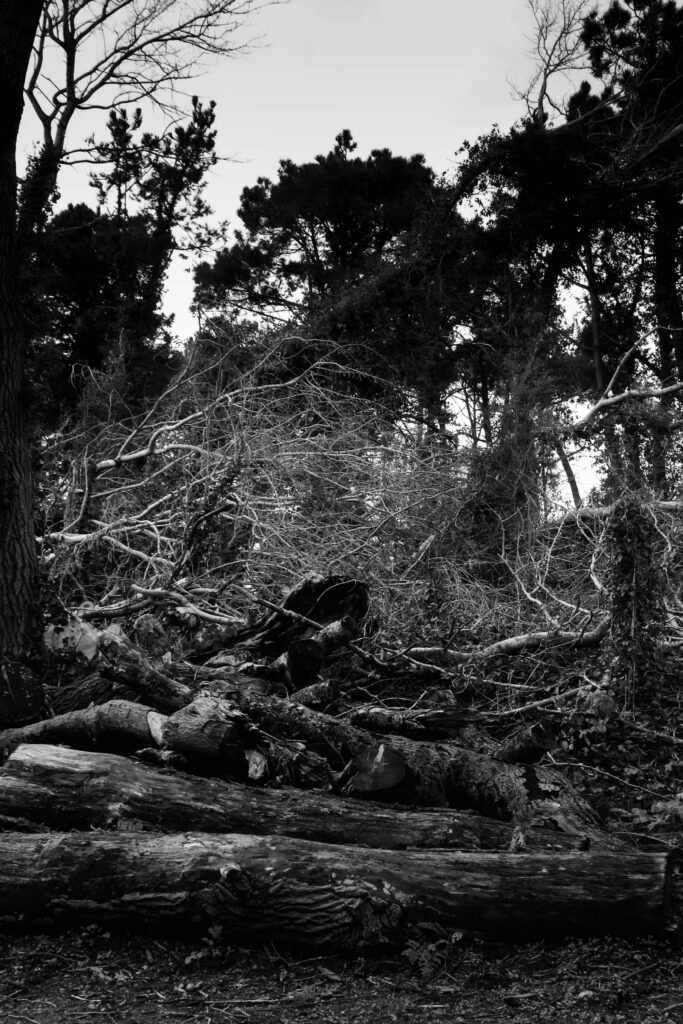
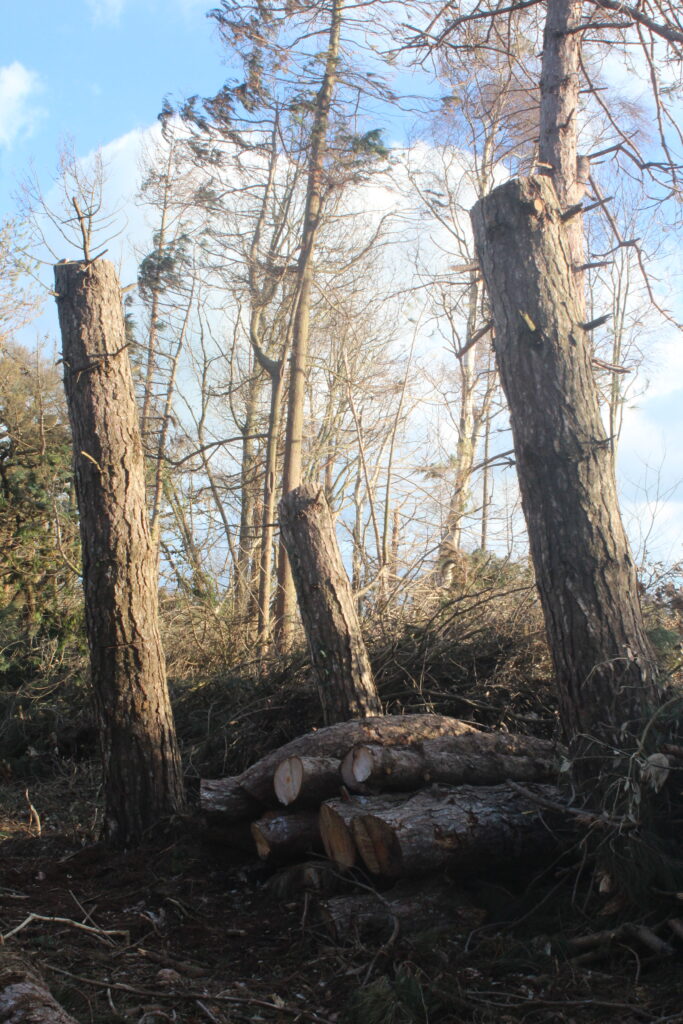
With this image, I used a highlighting brush to increase the tone of the 3 trees, making a contrast from the trees in the background I completed this by altering a lot of the exposure, white and black balance and highlights.
Final Edits:
