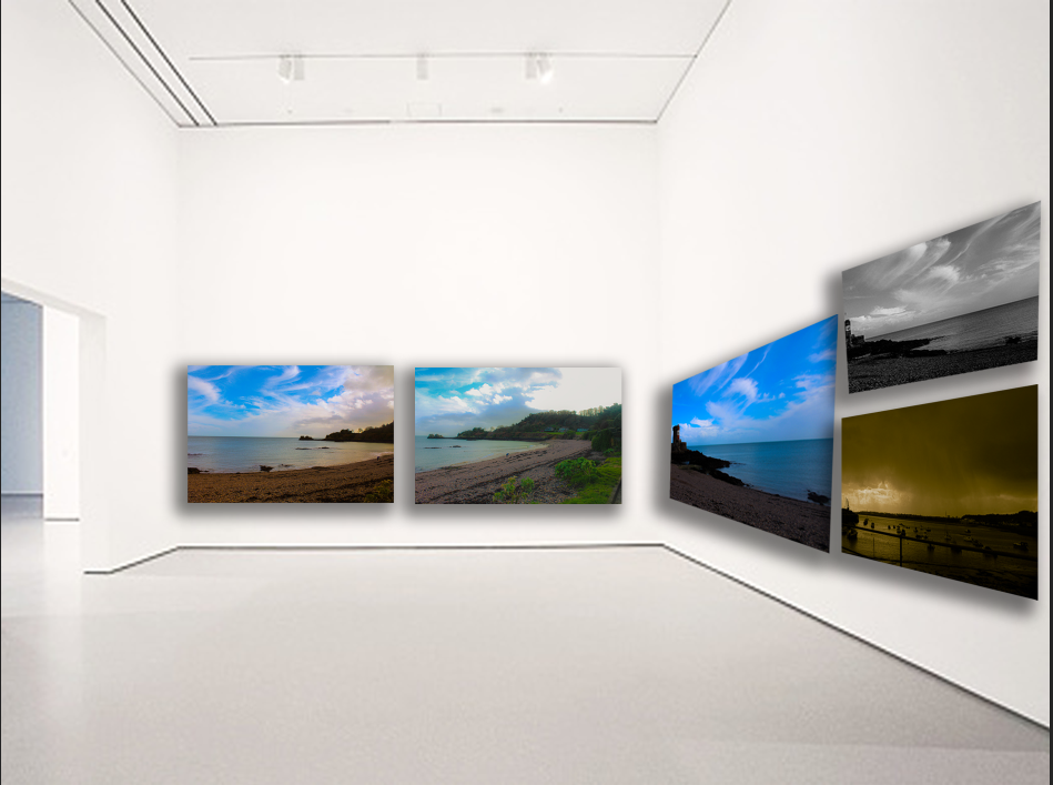
Contact Sheet- Picked/Rejected and rated
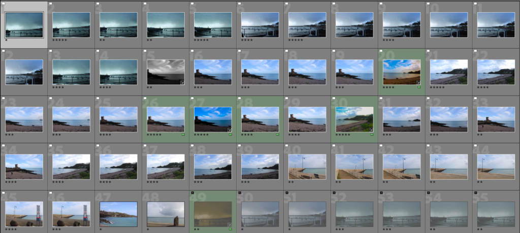
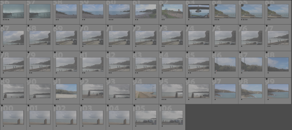
We went to St. Catherine’s, Gorey and Rozel to capture different type of natural scenery such as cliffs, piers, the sand, the sea and historical landmarks. Including in our images is a few man-made objects such as boats, cars and railings which can significantly add to an image to make it more realistic and natural. We adjusted the exposure and aperture to allow more light and get the correct scenery of the weather.
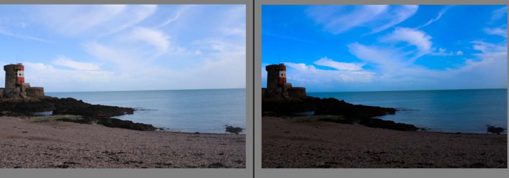
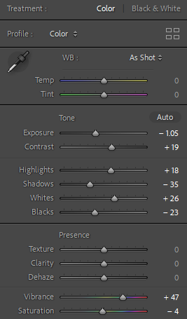
I decreased the exposure and increased the contrast to create more visible detail such as the clouds in the sky. I emphasized this by increasing the highlights and decreasing the shadows and lastly increasing the vibrance to make the image more bright to create an interesting factor. Finally, I decreased the saturation to obtain it to be natural.

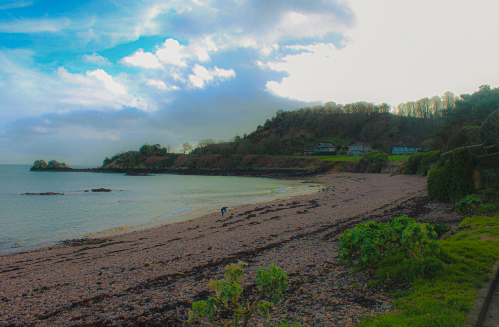
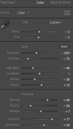
Firstly, I decreased the exposure as the image at first was overly exposed to create more detail and eye catching and decreased the contrast to create more detail around the lining of features to increase visibility such as being able to see the sky and sea separate and the rocks on the far end. I kept the shadows the same as I didn’t think it was necessary. I increased the texture on the rocks/pebbles to create different textures and more visibility. Lastly I increased the vibrance and saturation to make the image more saturated and vibrant to each tone and colour to make it look more romantised.

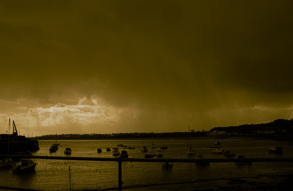
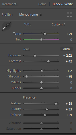
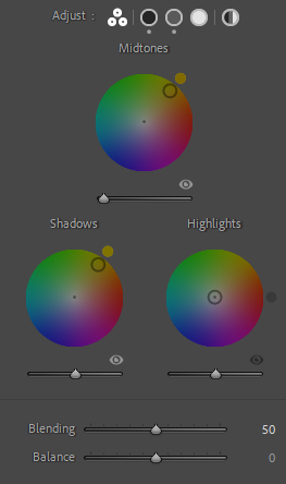
Within this image, I experimented something different by putting it in black and white first as it is harder to create different exposure levels in different areas. I increased the temp to create a warmer look to this image. Once I had done that I continued to decrease the exposure but increase the contrast and highlights so at the top of the sky is a lower shade and forms into a much lighter shade to create more visibility which makes the image almost look surreal. As shown the sun is slightly shining through the clouds which editing emphasized however it has a slight reflection on the sea to create a lighter shade on the left hand side of the sea, this creates different type of contrast which ultimately makes the image more interesting to look at as it has better features. I increased the texture to see the ripples and detail in the sea more visible which separates it from being mistaken as the sky. I increased the dehaze to create a blend in the sky from a dark shade to a lighter shade. Lastly, I adjusted the mid tones and shadows to a warm yellow- orange colour to create a vintage and nostalgic look to make it look old which links to Romanticism as the genre was invented years ago from the industrial revolution which in my opinion adds to the image.

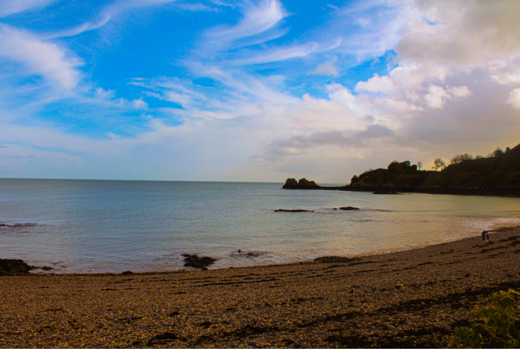
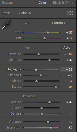
Within this image, I used visualization as this image would not appear like this to the naked eye as this photograph looks significantly surreal. I think this is important because it links to the topic sublime and romanticism. I increased the temperature and tint to create warmer tones. I decreased the exposure as it the exposure was too high and decreased the shadows to create more detail around the clouds as in my opinion it is the main subject of the image. I increased the texture to create different texture on the rocks. Lastly, I increased the vibrance so the sky had a more eye catching feature and to make the weather look better and higher saturation which creates a golden filter around the edge which emphasizes the surreal and romantised look.

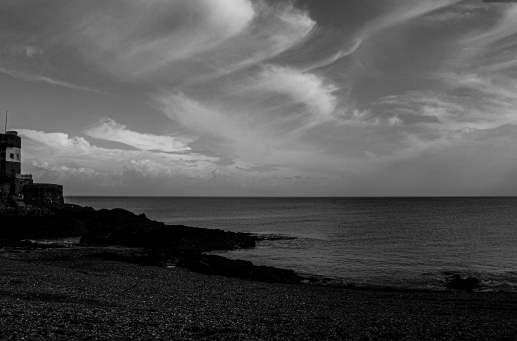
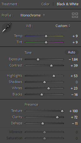
I experimented putting the image in black and white as Adams preferred this. I decreased the exposure to emphasize the shades and tones and increased the contrast to create more definition. Added highlights and increased the whites so the photograph wasn’t too dark and dull. I kept the shadows the same as I didn’t think it was necessary to adjust them. Increased the texture and clarity to create definition and more of a surreal and interesting factors to create more significant and different textures.
Virtual Gallery – My favourite images
