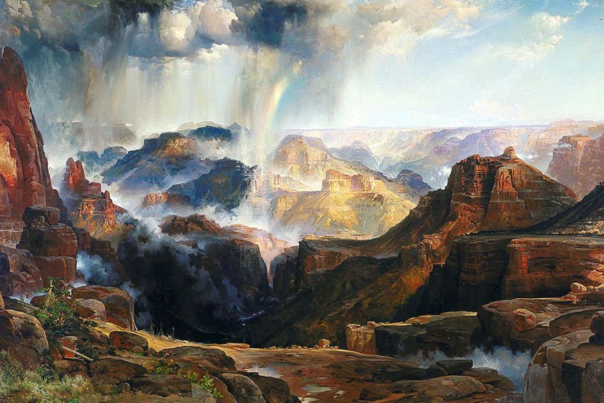
TECHNICAL: The lighting on this photo is very bright and exposed and shows a lot of the rocks natural colours, the intensity of the lighting makes the photo look really powerful and dominated and shows off the disasters, All the colours are positioned in different places, as all the bright colours are at the top and all the darker colours are at the bottom, it almost shows a blend in the colours. Each type of lighting can effect a photo, for example natural lighting isn’t seen as the best for for this photograph as it would destroy the point of this photo, although this is a painting and not actually a photo it still shows the point of what the the beautiful disaster’s. This photo gives off a cold tone as most of the colours a shade of green or blue which makes it have a cold tone, this makes the photo stand out a lot more than if the colours were warm as the bottom colours are quite dark and need some lighter cold colours to balance out the photos. In this photo there are still a few warm tones scattered around the photograph like in the middle of the photo it looks quite orange or yellow which just adds a sophisticated look to the photo. The photo looks slightly over exposed as it is very bright in the background, however it does draw the viewers eyes towards the photo. The level of control of this photo is quite strong as it shows how steady the photo is, but it would have bee nice to have seen different angles of this photo to see if any of the colours would had changed and which, would it because the sun in is now in the way and everything is a lot brighter and less dull or the opposite the whole photo becomes darker.
VISUAL: The layout of this photo was well positioned as everything seems to work well and look well in place. The texture of the photo looks very rough and dangerous however the photo itself looks really pretty and natural and that’s the conflict between the opposites of this image. The rocks look very detailed and have a very hard and unsmooth surface on them. This makes the whole image looks very dangerous its self, it could put images into our heads to think of the worst, such as someone slipping and hurting themselves because of the rough rocks, therefore this images gives a negative representation although the imagine itself looks really detailed and looks like a positive image, it gives us an overthinking feeling when it comes to explaining how this images makes us feel. The whole image is 3D, which makes all the colours stand out and attracts the eye compared to if the image was flat then nothing wold really stand out and the disaster wouldn’t be captured as well.
CONTEXTUAL: There are many colours around the photo which sort of represents the opposite of romanticism, romanticism is meant to represent the goodness of the world, Romanticism all started with the emphasis on the imagination and emotion. Its mean to be positive and give off a good vibe where as sublime is meant to do the opposite its meant to be a natural disaster that would destroy the world but the photograph taken makes the disaster seem beautiful with all the pretty colours in the photo, its meant to show the positive in all the negative. It shows a convey of opposites, for example heavy rain pouring down, this can make people upset as they don’t want rain they would prefer it to be sunny hover the rain can be really heling, it can water plants and give water to any animals that have a lack of water. sublime isn’t meant to represent the worst but it can be seen as a very bad situation or idea of something, although there will always be something special that will lighten up the photo/situation. Another example of sublime is just the world in general, the world is full of beauty and allows people o live and survive, for us humans the world is our home and non of us would be alive if it wasn’t for the earth, but things such as global warming, world wars and conflicts, poorer countries, starvation, all of these things turn the world into such a nasty thing. If only life was that simple but there is always bad things happening around us and some of us are oblivious, these are the people who choose not to care and not to help and they help impact the world with their selfishness.
CONCEPTUAL: The idea of this image presents a significant meaning, it helps people to see the good in every bad situation, These types of photos shows the true significance of nature, there are not any manufactured items found in the photo and everything is natural, there are no people or any animals seen , it almost gives a peaceful and quiet effect. Overall this phot makes me feel as though I am not safe, it looks really dangerous and rough to be around and this can lead to overthinking about the image, although the image looks chaotic the point of the image defeats the that whole idea of chaotic. The landscapes taken are the beauty of earth and capture the exact natural surroundings and movements of the photo. As landscape photos are meant to capture the true beauty of the world the fact that sublime does almost the opposite it creates an idea thta the image is capturing beauty and a disaster whereas landscapes tend to just capture beauty.
