Ansel Adams
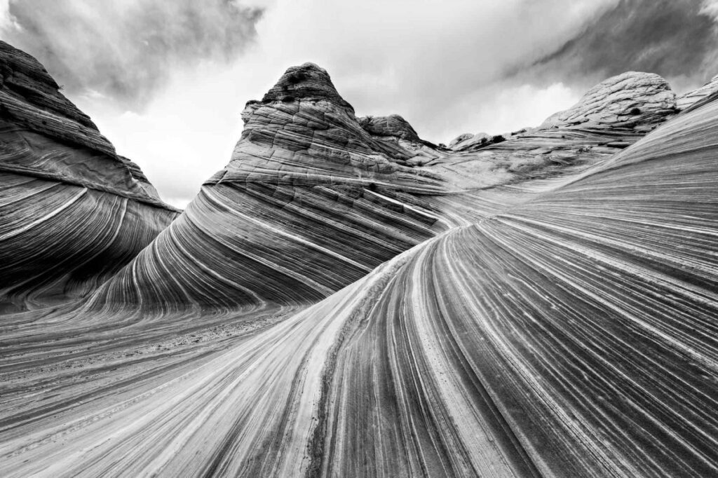
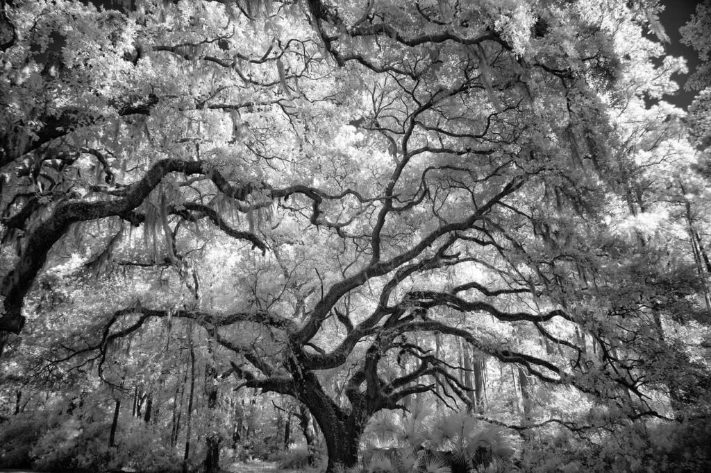
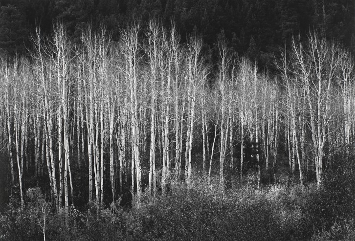
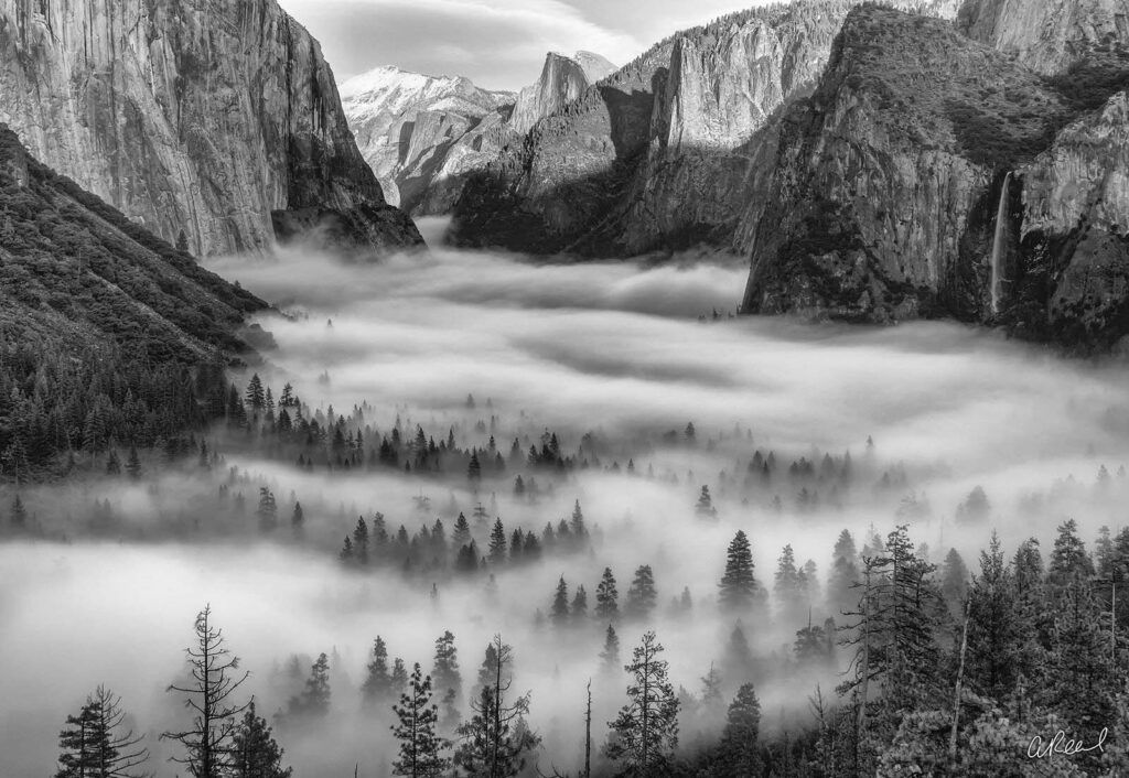
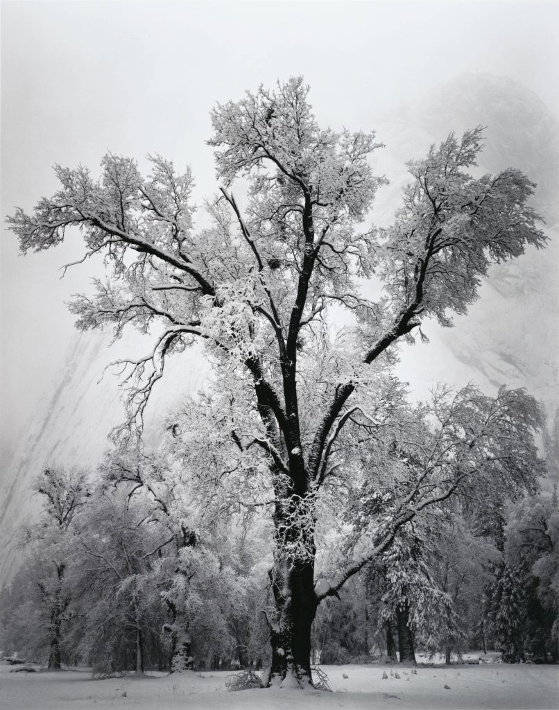
Ansel Adams was a talented pianist before an accident which damaged his confidence. This damaged confidence pushed him away from music and instead towards a different creative outlet: film photography. At 12 his uncle gave him a camera (Kodak Brownie which was the first ready available and reasonably priced at $1 when released(about £30 now) and introduced many amateurs to the subject), he began to take uninspired photographs on his trip to Yosemite National Park. It wasn’t until he finally decided to experiment that he had his first ‘successful’ photograph of the half dome:
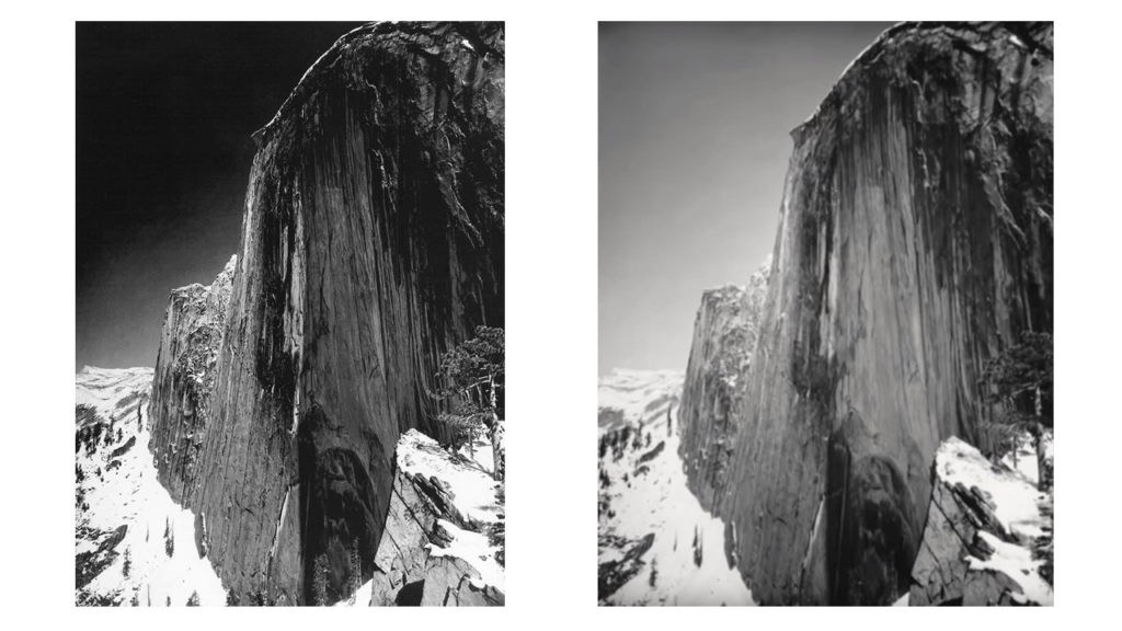
He used both a yellow and red filter on his camera(Now a large format camera). The yellow filter (right) has the exact same composition as the red filter(left) only the red filter gave the photograph a greater variety of tone. The sky is much darker and the stone has more contrast creating an image with a stronger identity and looks significantly more dramatic. Using film was expensive and difficult which meant that you could only take a handful at once maximum. This resource management lead him to develop the zone system. The zone system was an 11 part gradient means to visualise how colours would translate into black and white where colours were assigned numbers on a scale with ‘0’ as pure black and ’10’ as pure white. In addition he began to take his photos 2 stops under exposed for exaggerated tonal values and edited them slightly while the glass films were developing. This 11 shade system shows the contrast in his images best when pixelated. The above is this same image with each pixel showing the tonal shades. Every neighbouring pixel is a different value and range massively across the image, this showcases the contrast present in the image. This process is reflectivitve of the quote “You don’t take a photograph, you make it” which was said by Ansel Adams himself. A photograph can be deceiving or awinspiring similar to art and requires much input from the photographer themselves. It was not just shot and taken away instead it was carefully planned and developed, requiring the photographer to make and weave a narrative. His well known grand images popularized art photography among the American public and inspired many to truly appreciate the natural landscape. The zone system also affected how other photographers could control exposure and achieve richer tone in their own images.


Group f/64 was made up of 11 photographers with a common style of photograph with sharp focus and careful framing. It was founded in 1932 by Ansel Adams with the name referring to the aperture on a camera resulting in sharp images. Ansel Adams was an environmental conservationist and his photographs were a way to protest the abuse of land. His photographs were made to showcase the beauty of the land to push for its protection. This was a sentiment that was common among the group of landscape photographers. The group was made up of Ansel Adams, Imogen Cunningham, John Paul Edwards, Preston Holder, Consuelo Kanaga, Alma Lavenson, Sonya Noskowiak, Henry Swift, Willard Van Dyke, Brett Weston, and Edward Weston.
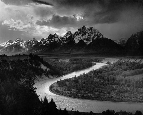
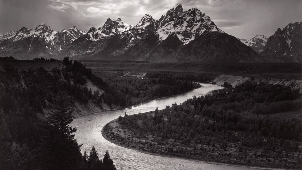
This photograph showcases a landscape of the American west. In this specific photograph value 10 is present in reflective river and the left snowy mountain without any overhead clouds. The river is surrounded by much darker trees which makes the brightness stand out significantly and is also near the centre of the image which helps to draw the eye. The value 0 frames the bottom of the frame which pushes attention upwards of the frame and makes it seem shorter which in tern makes the landscape seem wider and larger and therefore more impressive. The large range of tones makes the image seem like it has genuine depth, similar to how it would look to the natural eye. This makes the image seem much more impressive as it almost looks as though it could creep out of the frame. The whole photograph was lit with natural lighting, diffused by the clouds overhead for a softer outcome. The details are sharp throughout the whole image requiring and was taken 2 stops underexposed. The viewpoint was up on a bank which flows around the left of the frame. This angle allows the river to run below and be visible in its entirety. A grassy plane many meters away is visible clearly which would only be in frame if the viewpoint was higher like it is.
His work is reflective of romanticism. This one in particular encapsulates the sublime with grand, towering mountains. These large mountains and gushing rivers are awe-inspiring but also dangerous. The viewpoint alone could be dangerous with its height however provides a beautiful vantage point. Ansel Adams also valued the environment and large land masses. He created his photographs in an attempt to have the land protected by photographing and capturing the beauty in the landscape and to raise public awareness. He deliberately framed his images to cut out any human activity to show how the land should stay and to appreciate the natural landscape.
Edward Weston
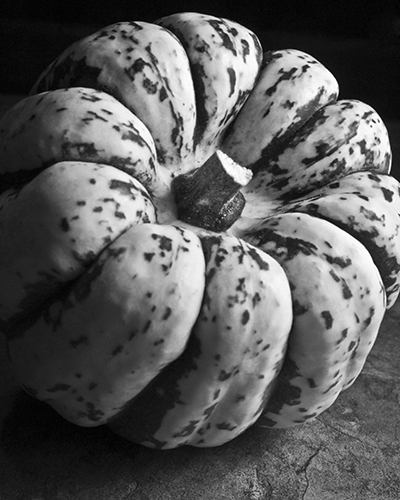


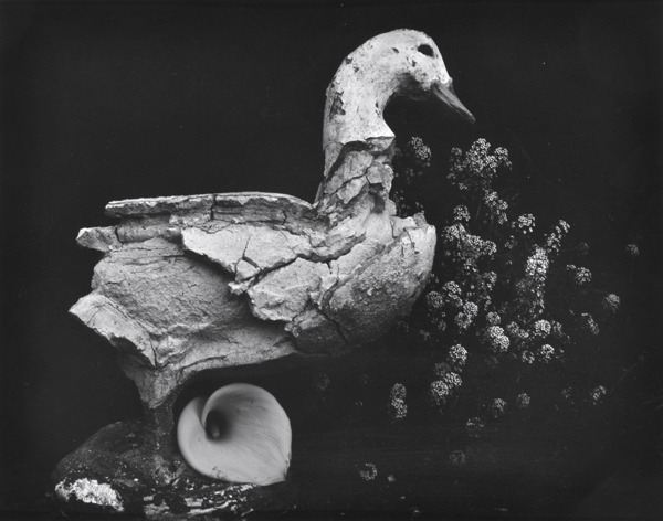
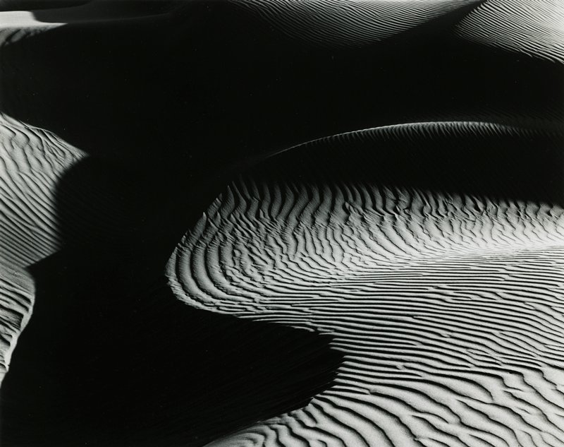
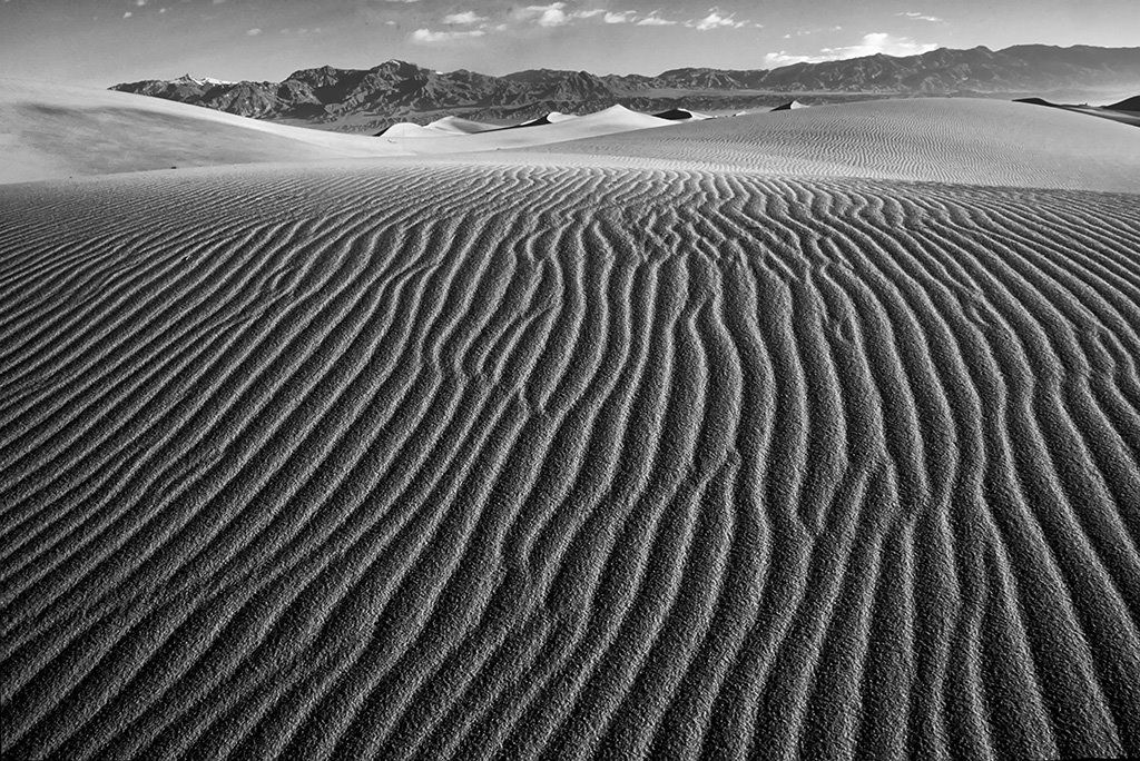
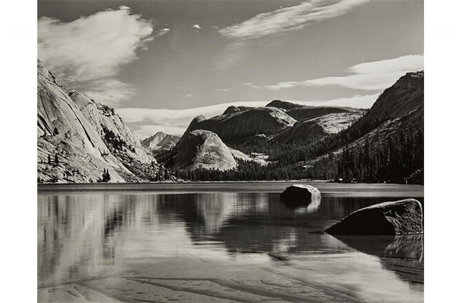
Over the course of 40 years, Edward Weston photographed in monochrome. His work varied between still-life, landscapes and even parodies. He also photographed the American west and was the first photographer to earn a Guggenheim Fellowship. In 1974, for the final 10 years of his life he was diagnosed with Parkinson’s disease and focused on printing over 1000 of his most famous images.
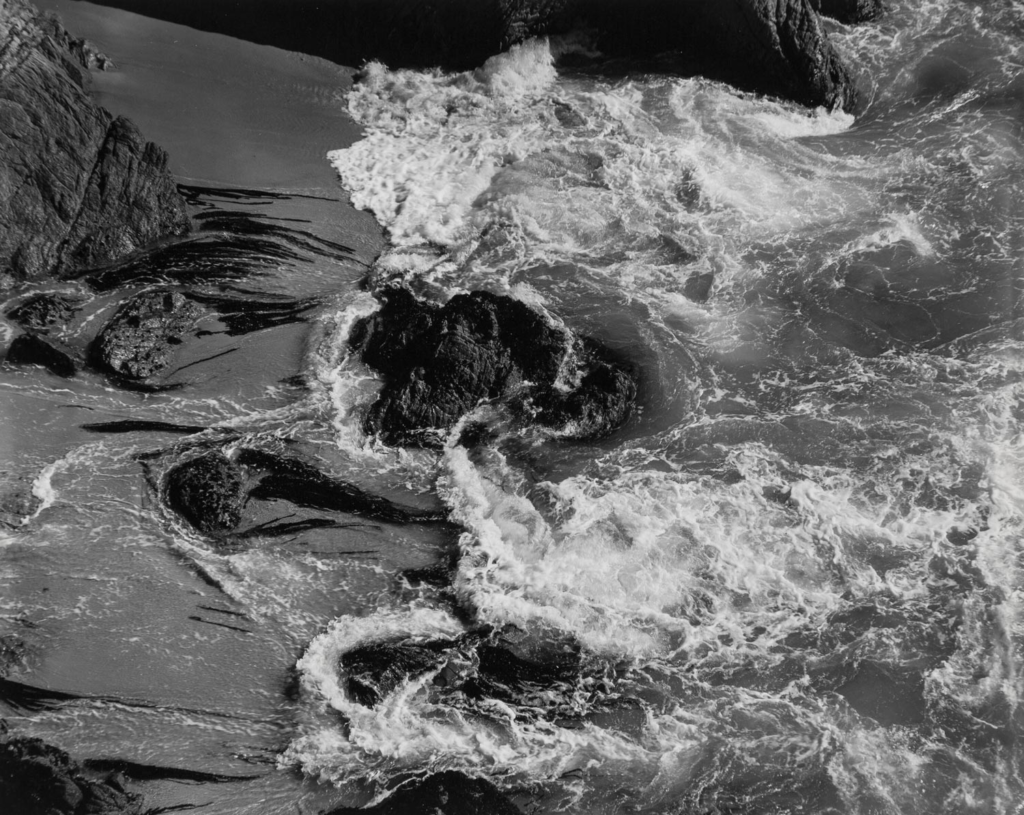
This photograph encapsulates the sublime through the crashing waves. It is taken from a high viewpoint in order to capture a birds eye view and the effect of the waves along the beach as opposed to a normal viewpoint which would focus on the skyline. This photograph is in black and white and in a 4×5 frame. The sand is all one shade without contrast which is broken by the rocks and sea. Pure whites, shade 10, is present in the foaming waves and creates a clear contrast from the rest of the sea. This contrast shows the movement of the water while also showcasing danger which is furthered through the high viewpoint is looking directly down a drop. Pure black is present in the rocks which creates contrast with the fluffy water.
Compare & Contrast
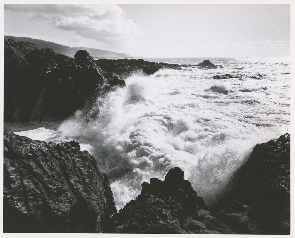
This photograph was taken by Ansel Adams and also shows a beach with moving waves. This photograph however has darker rocks and lighter water. This creates greater contrast across the image as mid-tones are almost non-existent. This one was also taken from height however looks across at the landscape instead of down. By looking across at eye level the photograph is not looking down or belittling the sea. This gives the sea more power and therefore makes it more dangerous. This image also shows the sea during heavier winds with larger waves which are more dramatic. The raging waves juxtapose with the sunny, clear sky above and shows the dual nature of the natural world. Romanticism was the movement that acknowledged and marvelled at nature and I believe that both photographs reflect ideals carried forwards from the movements impact such as the sublime. I believe that both images are representative of the sublime however Ansel Adams shows much more danger and therefore is more intriguing.
Ansel Adams and Edward Weston were two visionaries in photography and both were a part of f/64 with similar styles and ideals. They both took high contrast photographs of nature and travelled together on occasion.
— A letter from Edward to Ansel in 1936
“I cant tell you how swell it was to return to the simplicity and natural strength of your photography … I am convinced that the only real security lies with a certain communion with the things of the natural world.”
Around this time saw the great depression and the world wars which were major events and seen as even bigger ‘failures’ of modern society. The great depression was caused by banks going bust and loosing money which created an unsteady, unreliable and unforgiving environment. This understandably soured people opinions of the government and the ways the county was evolving. Not only were people wishing to go back before the banks crashed, but also back to simpler times without the need for them. In addition more people then ever were working on farms or ranches and pushed them closer to nature which were reliable. People embraced nature and again romanticised a simpler life.
High Dynamic Range
Exposure bracketing is when 2 or more of the same images are taken at different exposures. One under-exposed and one over-exposed taken with the same composition so that they can be layered together, needing a tripod. High Dynamic Range (HDR) combines these images to create a uniquely exposed image as a camera has a limited dynamic range and can typically only capture lights or darks in detail.
Lightroom
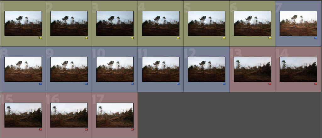
This selection of images shows a normal exposure, 1 up/down and 2 up/down. This means there are a minimum of 5 different exposures for a range in detail.

I selected each exposure I was going to use and right clicked to create the drop down. One option: Photo merge, has an option called ‘HDR’ which automatically masks and layers the different exposures.
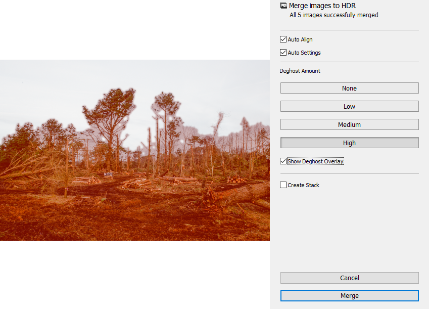
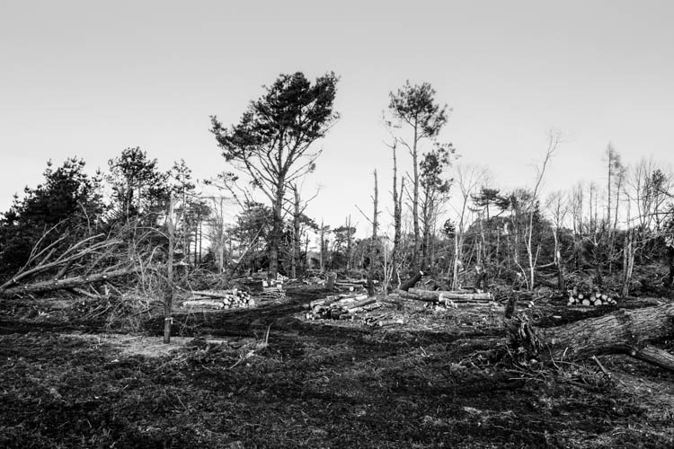
This opens a pop up which has 4 total options of customisation. I selected the ‘Deghost Overlay’ which shows in red the masking this option used. I then used the graduated filter to change the sky slightly so that it would not be one flat shade. This also meant that it would contrast with the trees. I then set the image in black and white and adjusted with some basic editing. This was to achieve a similar outcome to Ansel Adams where there would be high contrast in greyscale.
Photoshop
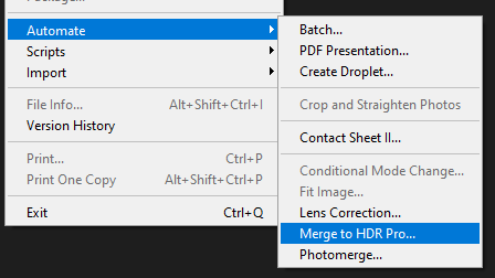
In photoshop, file has a drop down with option ‘Automate/Merge to HDR Pro’. This allows you to add in all the exposure brackets after selecting the option and also has more options than Lightroom.
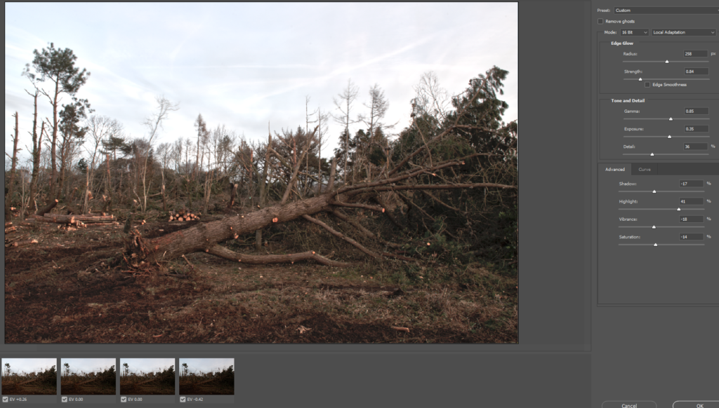
These options include saturation, gamma, exposure, edge glow etc. These options allow for more control over the final outcome than Lightroom provides.
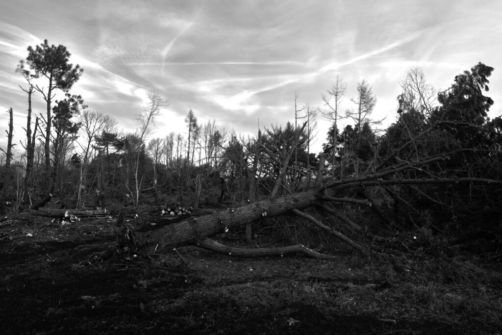
For the final outcome I again set it in black and white and adjusted the hues. Red and yellow made the most differences to the contrast whereas magenta changed very little. In normal images the sky did not have as much detail as the ground however this editing allowed both to have detail. I used the dodge tool to lighten the wooden whites as there was no other light parts in the ground which had little contrast. The sky had lots of light shades however that was the only light in the whole image. Overall I prefer how the photoshop one came out as I had more control to make the image how id planned. It has more contrast and detail. The Lightroom was too light with little dark whereas the photoshop one had more darks which made the split more even.
