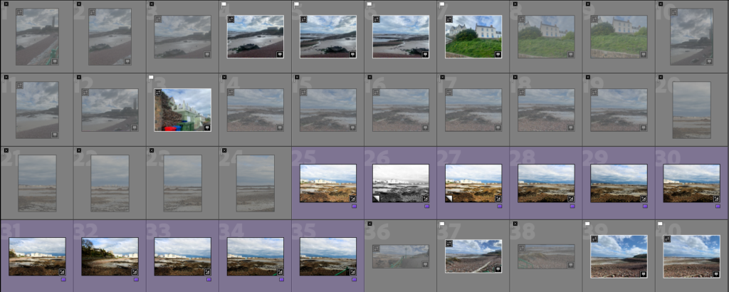
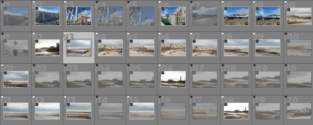
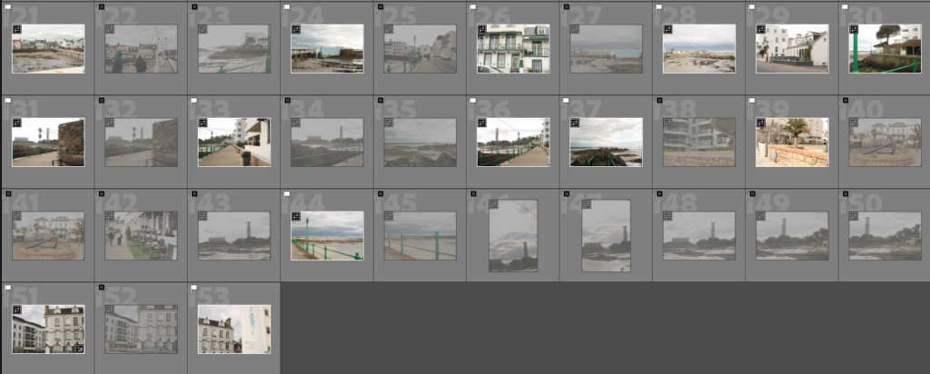
As an introduction to landscape photography I visited Havre De Pas to take photos of both natural and man-made landscapes such as buildings. I then went through all my photos and selected my best and worst ones. I also took photos to turn into a panoramic image which are highlighted in purple. I took some of these photos with a camera and some with my phone.
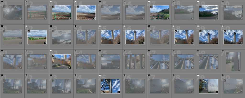
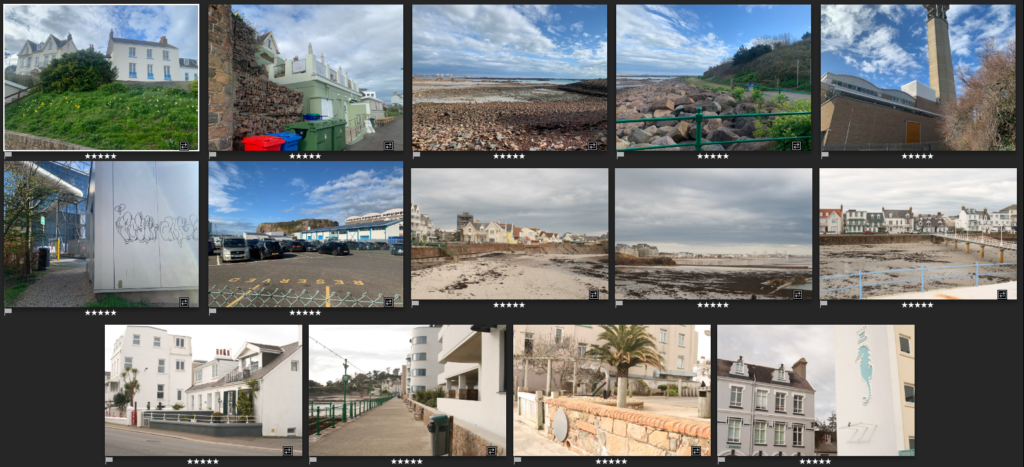
Best photos
I selected these photos as my best ones and I will improve some of them through editing.
Editing
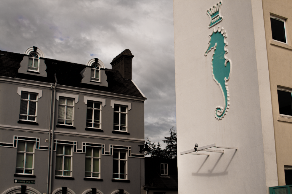
Black and white:
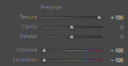
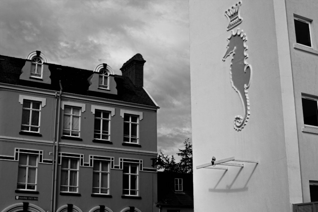
I then made the photo black and white by removing the saturation. I also increased the texture as I wanted it to be detailed.
Comparing:
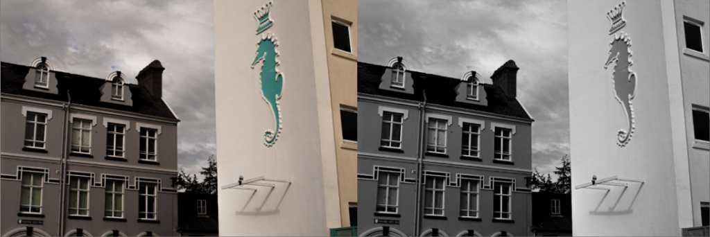
I prefer the black and white image as it looks more contrasted compared to the one with colour which sort of looks faded as the colours are dull.
More edits:
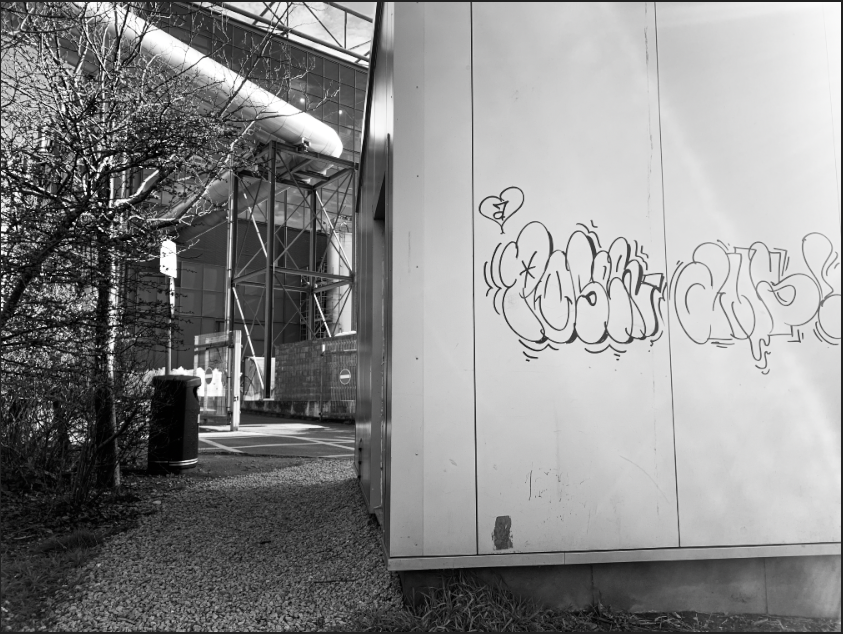
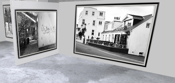
I chose to edit this photo as it links with the next theme of ‘Anthropocene’ (how humans have negatively impacted the earth). This photo is an example of that as it includes graffiti which is seen by many people as vandalism however it makes you think of the greater issues going on such as other things classed as vandalism such as littering which has a much larger impact. Littering has a huge impact on marine life and animals however people choose to frown upon things such as graffiti rather than the bigger problems. I like how this photo was taken as the graffiti stands out due to the viewpoint which the photo has been taken at. The graffiti takes up majority of the image however there is still a background which adds more details to the photo. However due to the photo being taken with a phone there is an area of light which makes the photo not as good.
Before and after:
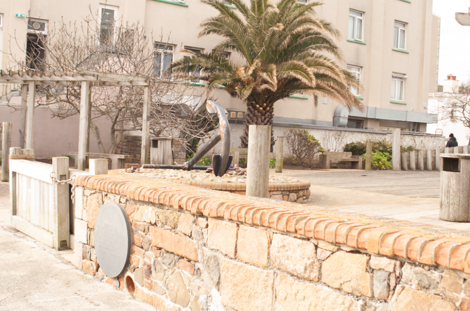
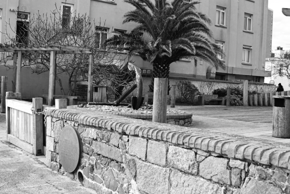
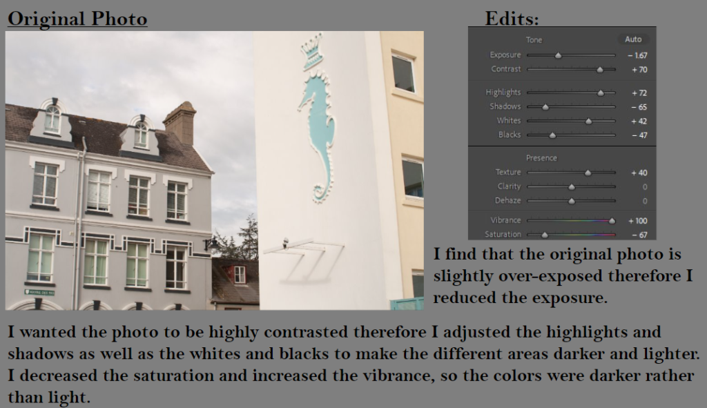
This photo is overexposed which you can see due to it looking washed out and overly bright. I like the position in which the photo was taken from as it is not a straight on photo it is slightly from the side which creates an interesting composition.
I decreased the exposure using editing as it was overexposed. I then made it black and white through removing the saturation as by making it black and white the photo looks less dull and the individual details stand out more compared to the before.
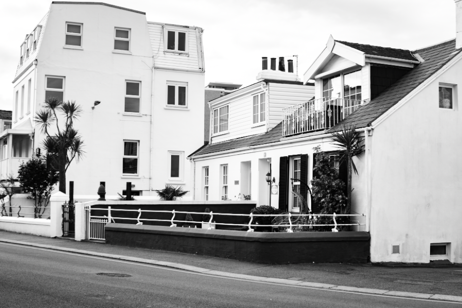
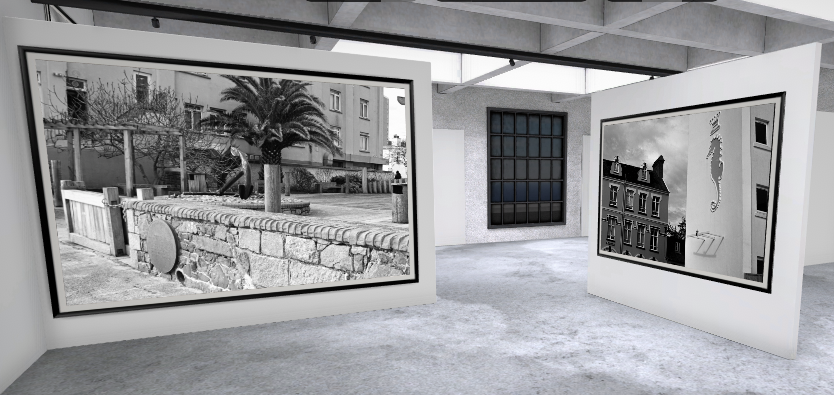
For my final edit I chose this photo of buildings as it has a lot of detail which I believed would look good in black and white which is why I edited the photo into a black and white image. I like how there are many sharp details in this photo as it makes it stand out.
virtual gallery
