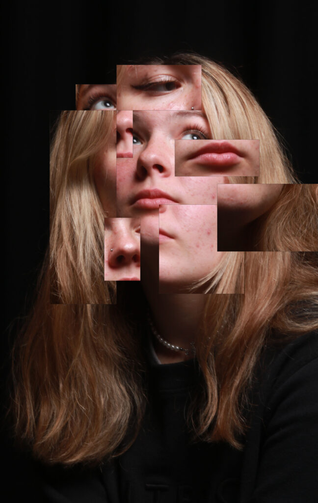
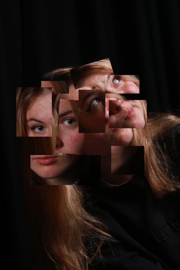
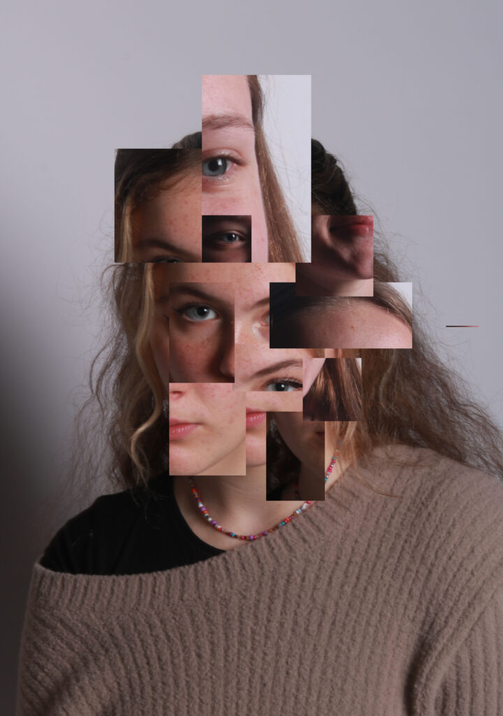
I’m very happy with how this photoshoot came out I think the first one is my favourite because I think it looks good that u can easily tell which part of the face unlike some of the others where it’s not as clear I just don’t think it works very well as it makes the photo look overly busy and chaotic. Whereas although there is a lot going on in the first image it loos quite organised.
I also think the contrast in the first one works really well because the models face is well lit up which contrasts nicely against the dark background which does draw more attention to her face
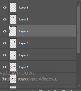
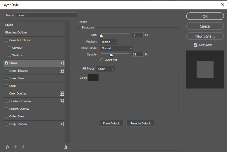
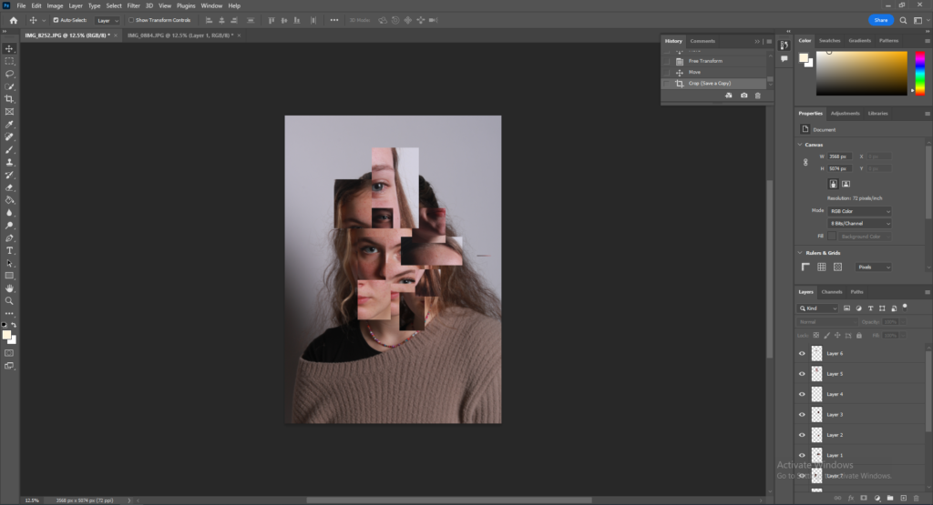
For photomontage I was inspired by David Hockney’s work. For the editing what I had to do was find two images for the first two edits i did I used two pictures of the same model however for the last edit I did I used two different models. Then you need to select small sections of the image and use layer via copy . You can also add whets called as a “stroke” which gives you a slight boarder around the small section which adds more dimension to the image.
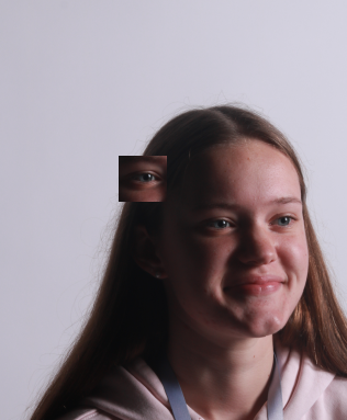
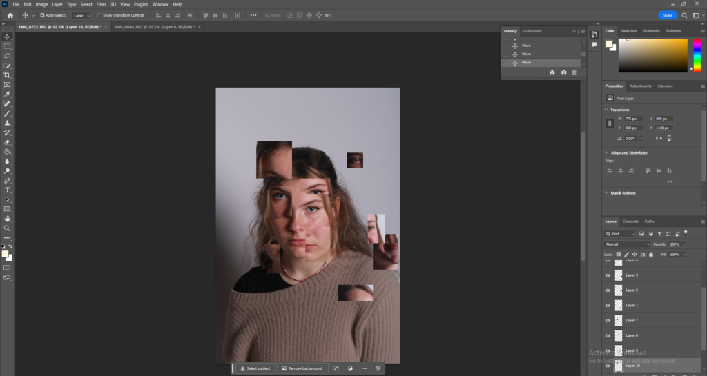
Then all I had to do was drag the parts I selected off the other model onto the image I wanted. Next all that was left to was arrange all of the selected little images so that I basically creator and new face and it helps to layer some of the pictures on top of each other.
