Final Photos/ Evaluation

I have chosen the following images as my final photos, because they have the best lighting, composition and represent the themes femininity and masculinity the best.


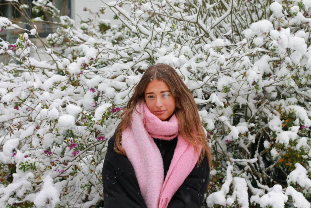
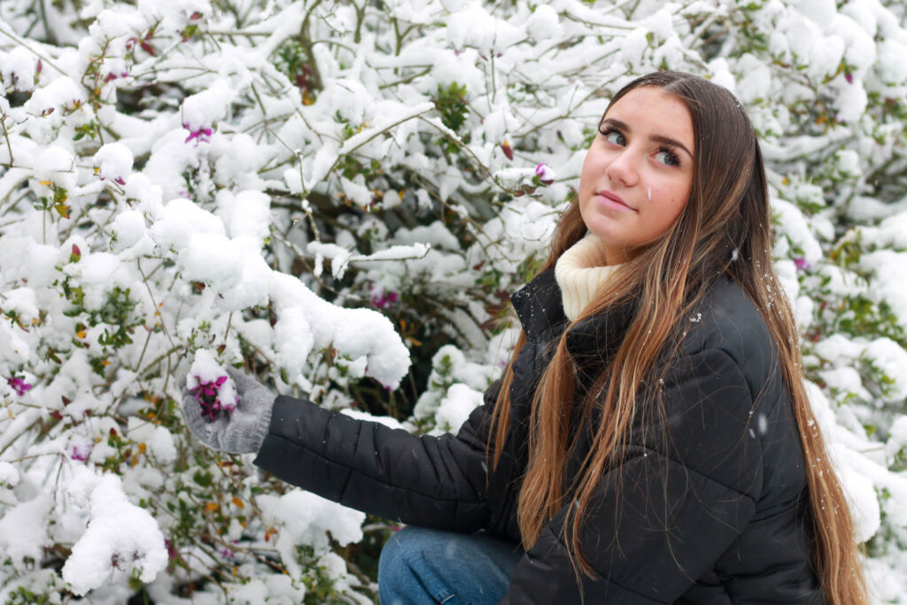
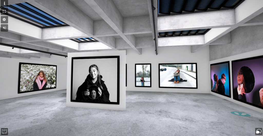
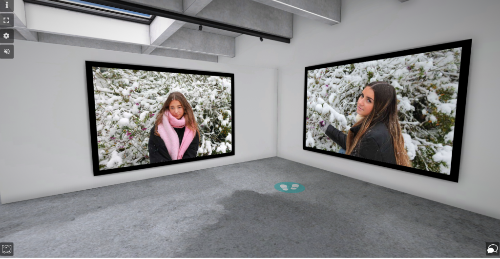
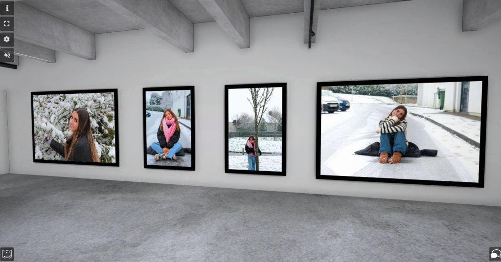
These are my favourite images from the snow, because they use different props, such as the pink scarf and the pink flowers. I think this helped really represent the theme femininity, because it showed how stereotypes, such as flowers and the colour pink represent women. However, the beauty and delicacy of the snow also represents femininity.

These images use natural lighting, because they were taken outside in the snow. The lighting of these images had little control, because they photos were located outside. The colour cast was very white and used cool tones. The camera settings are shown below:

F-stop: f/5

Exposure time: 1/125 sec

ISO: ISO-100

The photograph included mainly the colour white, because of the snow, but it also included the pink scarf, which was used a prop to show stereotypes. The snow in these images was used to portray femininity, because snow is beautiful and delicate, which is also interpretations of women. The tone of the image was very light, because of the white snow all around. The photos that used the flowers used different lines (from the twigs) and shapes (the flowers). This made the photo more interesting, as it added texture behind the model. In the images of the models sat you can see the texture of the ground and the snow, as tire tracks were left in the snow. The viewpoint of all these images were always the model, because they are what represented the femininity theme, as well as some props. The model was also mainly the centre of the photo, so the viewers eye would be drawn more to them. However, in the last image the model is off to the right, so that the viewers eye would be drawn to the flowers instead. There is also lots of contrast between the model and snow. These images were all taken to portray different stereotypes of women and to show femininity in different way.

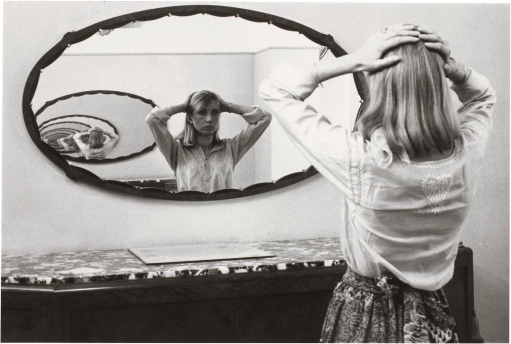
I made these images, so that I could represent femininity. I took different inspirations from Claude Cahun and Cindy Sherman, because they both present femininity by using different props and stereotypes. The props I used was the pink scarf, because the colour pink is stereotypically associated with femininity. I also used flowers and snow, because both are beautiful and delicate, which is what women are seen as. Flowers are also more related to women, because the women is the one who ‘should be given flowers.’
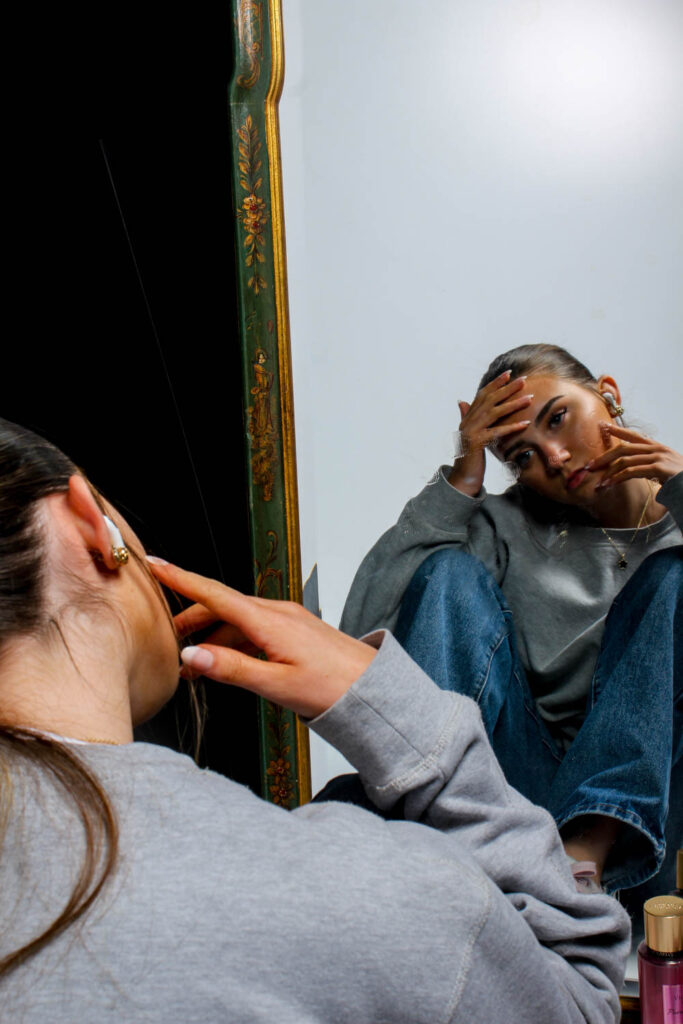
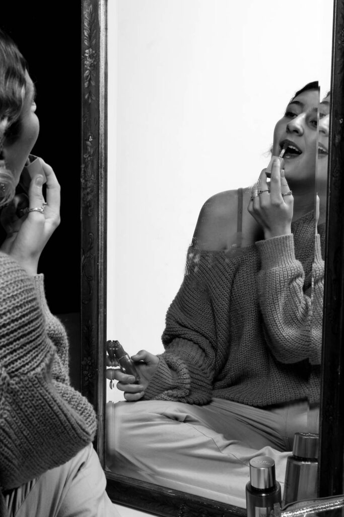
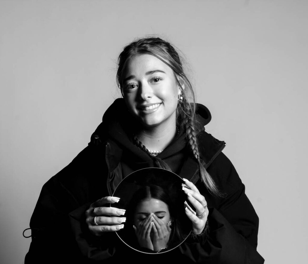
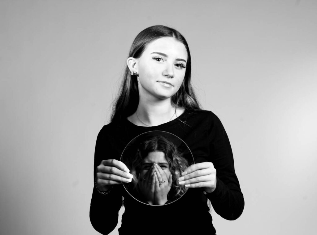
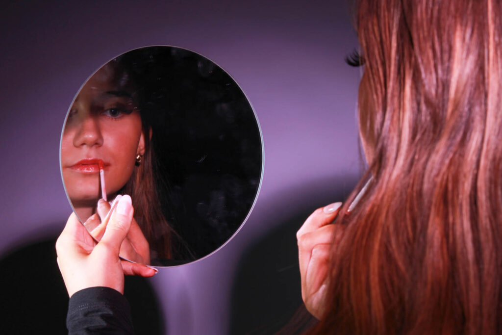
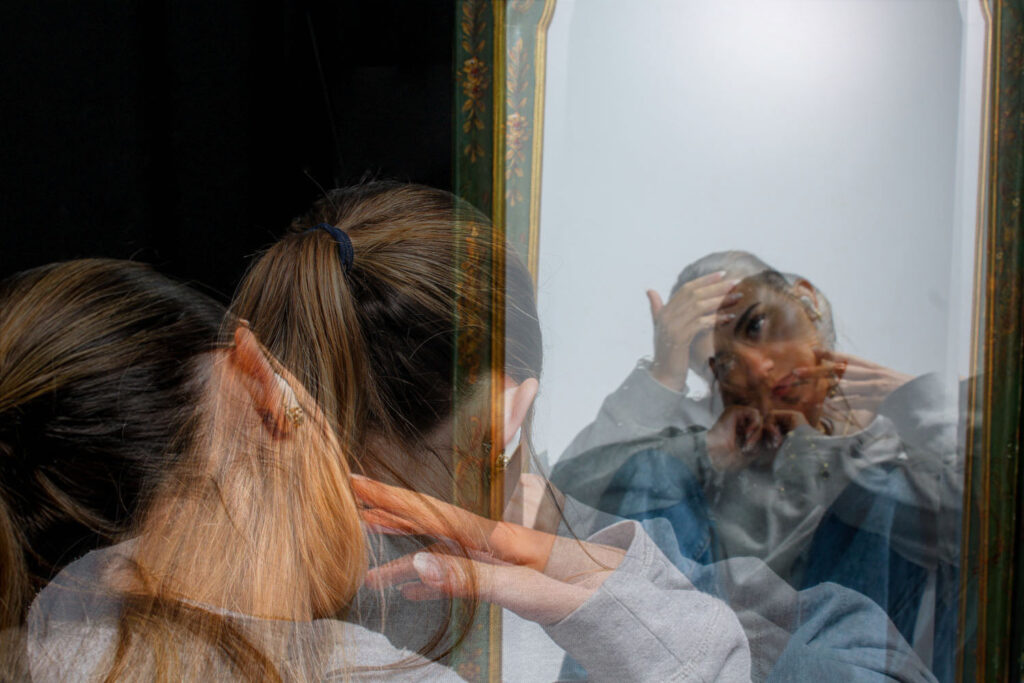
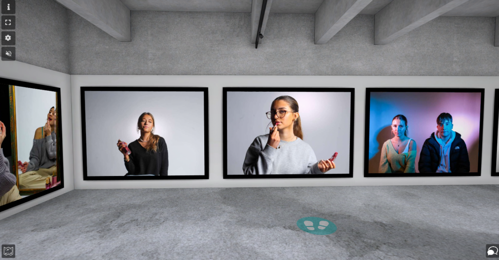
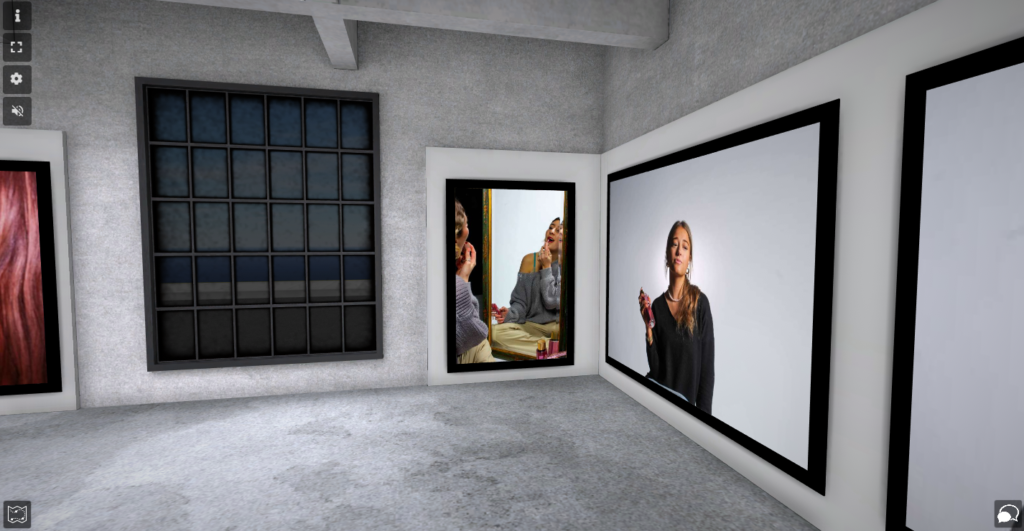
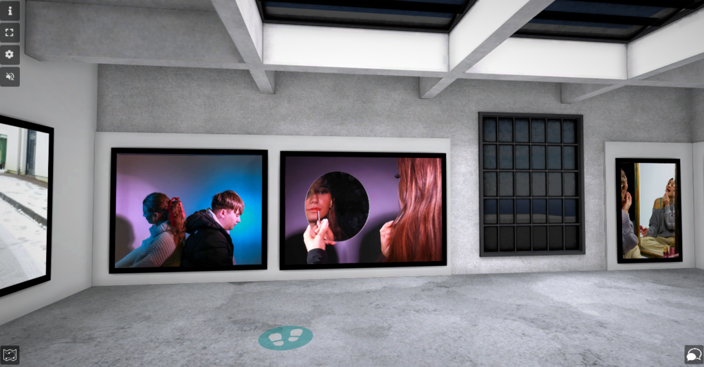
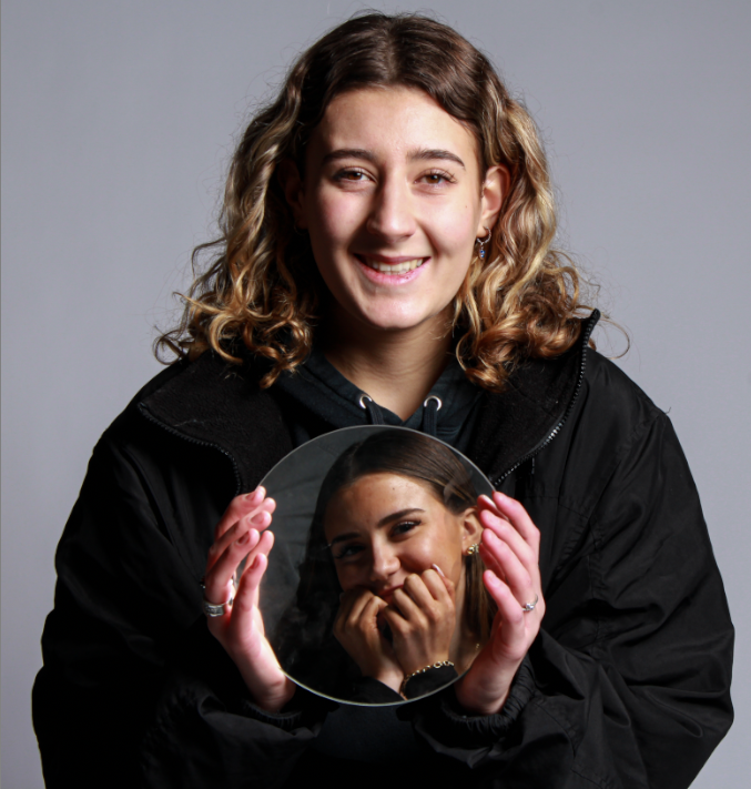
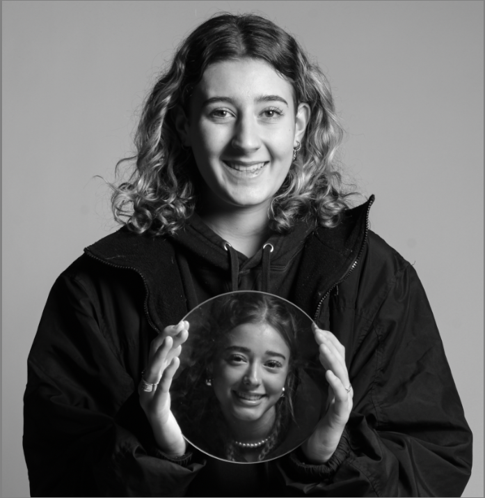
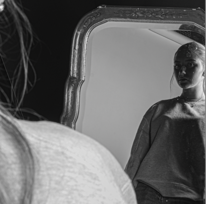
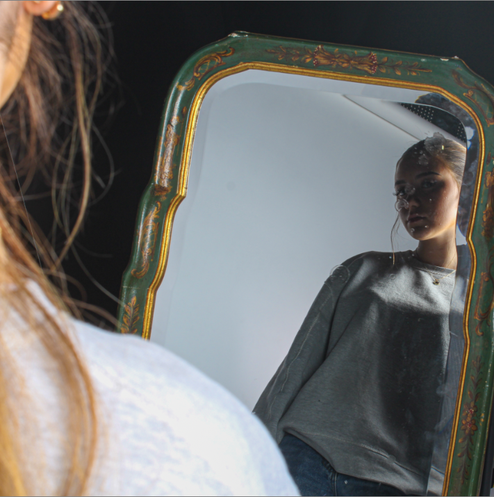
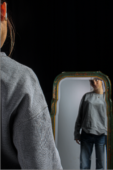
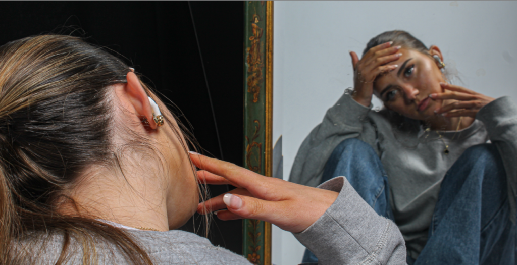
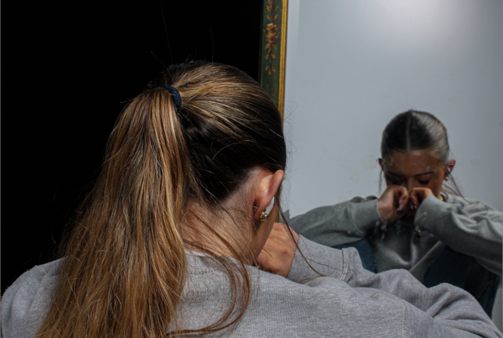
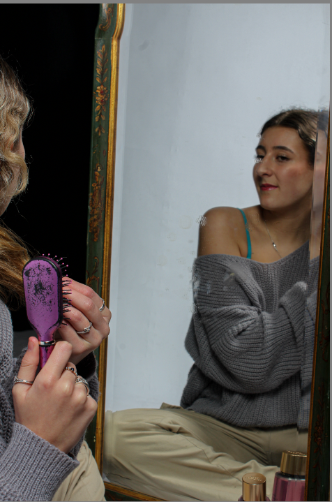
These are my best images using mirrors as props, because I feel like they all tell a story. They show insecure females, who are emotional about their looks, so they apply make up, so they can be beautiful. This also correlates with different stereotypes, such as women are too emotional and women should wear makeup to be beautiful.

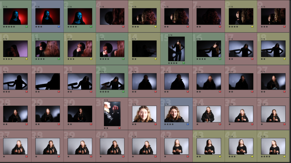
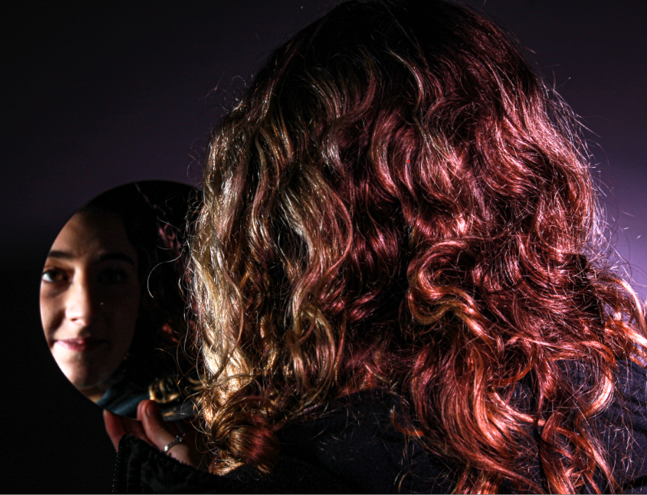
Different types of lighting were used in these images, but they were all indoors studio lighting. The white flash was used in the first four images, so it would present a white light. However, in the last image pink lighting was used by covering the light with a pink film. This was used to represent femininity, as a stereotype of females is that they relate to the colour pink. The lighting was very controlled in this shoot, because the lights could be positioned in different ways and the distance and intensity and the lights could also be manipulated. This photo shoot used cold white lighting, but the pink lighting was more warm. The camera settings are shown below:

F-stop: f/11

Exposure: 1/125 sec

ISO: ISO-100

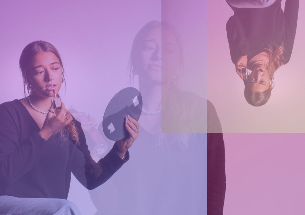
The three black and white images have a higher contrast and contain light and dark tones. They also contain different shapes mirrors. The models holding the mirror were centre in the image, because they are the main focus of the image, so I wanted the viewers eye to be drawn to them more. The images also create a depth of surface illusion, because it looks like the model is stuff inside the mirror. In the image of the model applying make up in the mirror, the mirror with her in is the main viewpoint, because we can clearly see her applying it, even though it is not centred, it is still the view point. This image uses space between the mirror and the model, and also creates a depth of surface illusion, because the mirror creates depth, making the model seem further away. The first image of the model holding her face looking in the mirror contains lots of colours, such as her blue jeans, pink perfume, grey jumper and gold/ green mirror. This image also has different light and dark tones, which creates more contrast in the image. The model is not centred in the image, but she is the main view point of the photo, because she is displaying the theme of femininity. The photo also creates a depth of surface illusion, because the mirror makes the distance of the model from the camera much larger than it actually is. The last image uses the colour pink in the lighting and in the makeup, because the colour pink is associated to women stereotypically. The model in the mirror is the main viewpoint of this photo, even though she is not centred in the image. This photo also creates depth of surface illusion, because of its use of mirrors, which make the model look a different distance away than she actually is.

The model has her hands positioned on her face in this image, because she is insecure. This is a stereotype of women and I took inspiration from Cindy Sherman for this photo, because she also produced a women looking in the mirror looking insecure with a lot of make up on, which also relates to my photos of the models applying make up in the mirror. Make up links to femininity, because makeup is seen as something women should wear and not really men. The two images with the circle mirror show different emotions of the models being sad in the mirror, because a stereotype of women is that they are too emotional. However, the models not in the mirror are happy, because women are not allowed to show that they are being too emotional.
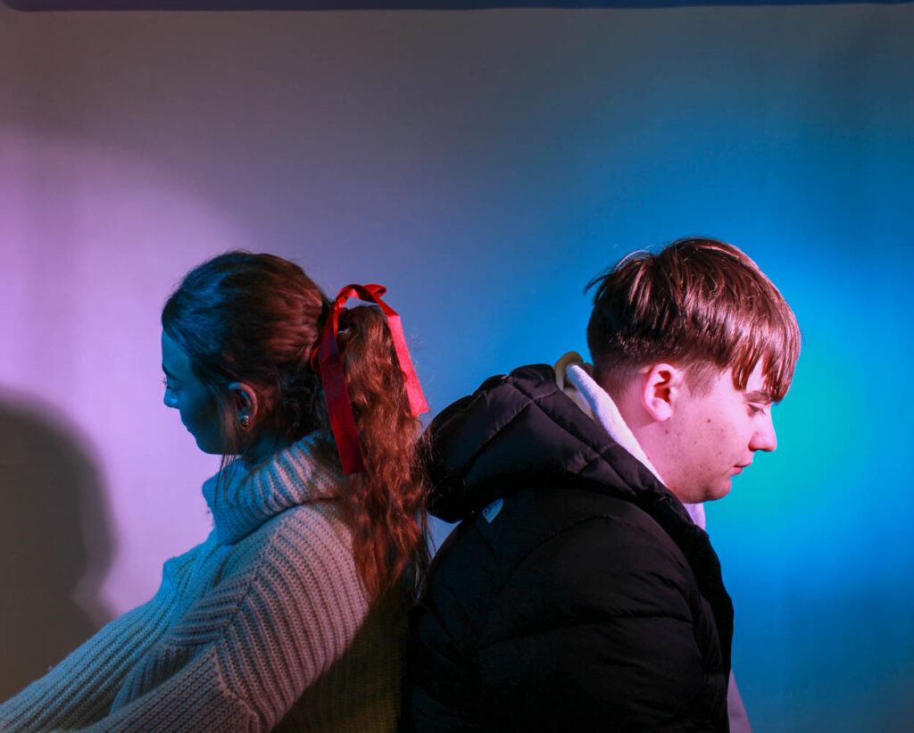
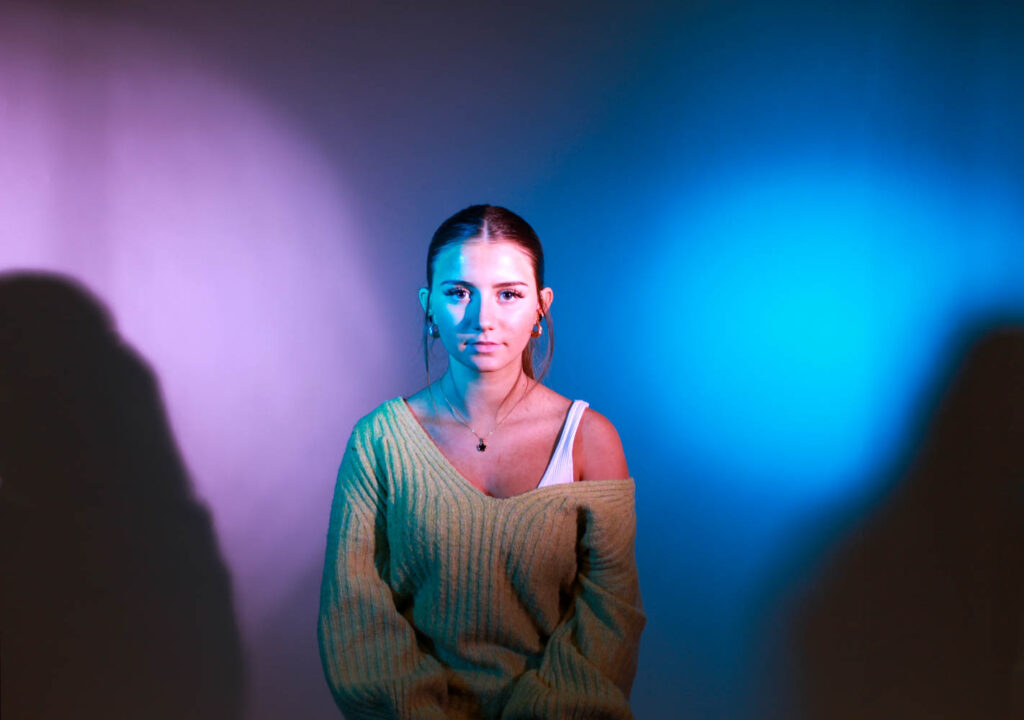
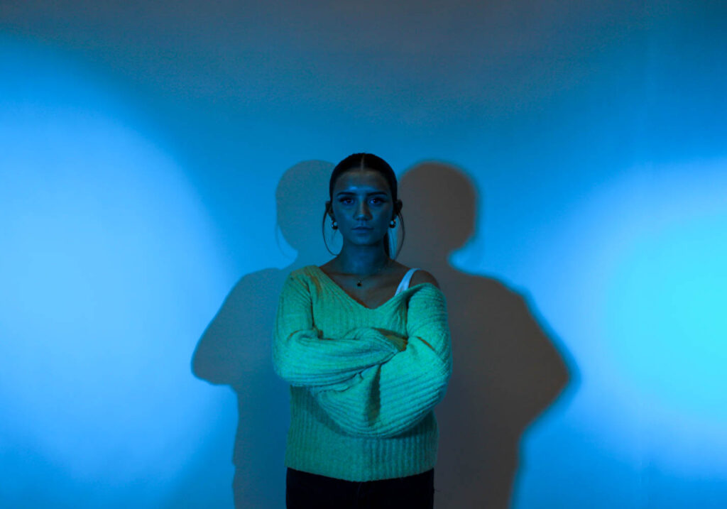
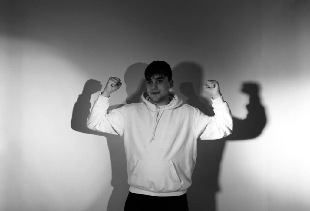
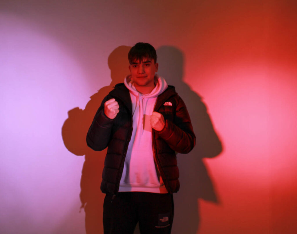
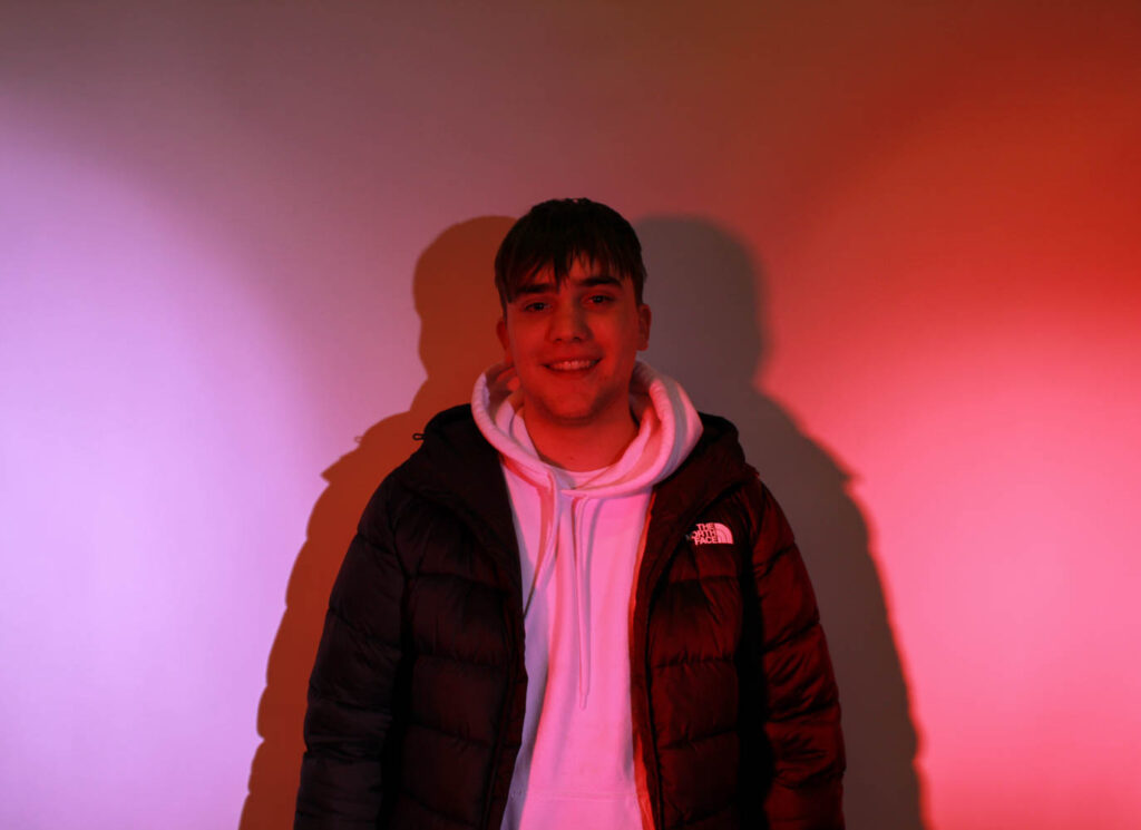
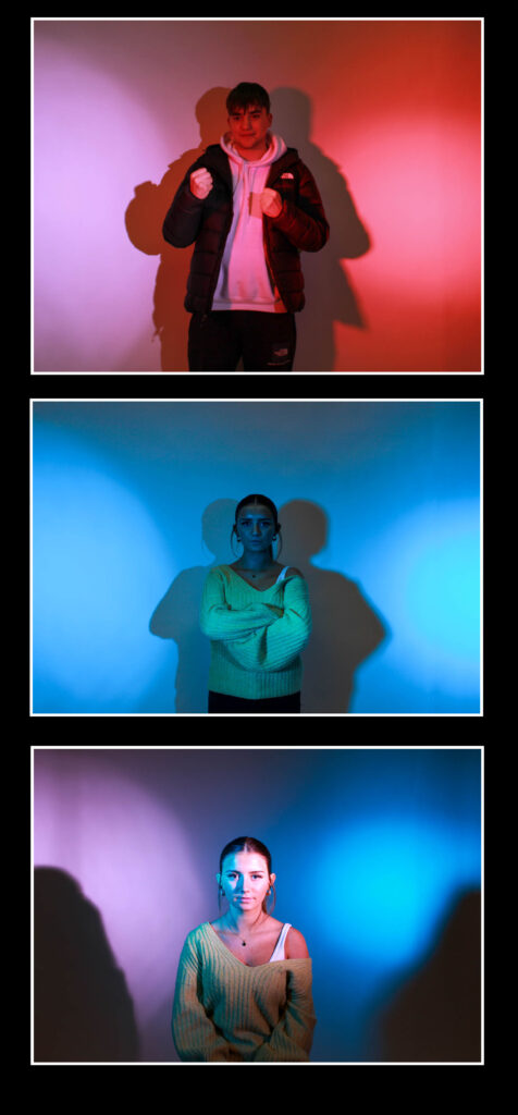
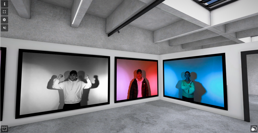
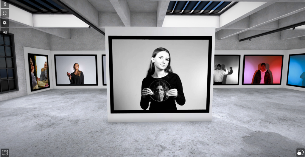
These are my best photos, when using different coloured lighting to portray different stereotypes. These are my best, because they present the different coloured stereotypes well, while also presenting other male stereotypes and going against stereotypes. The stereotypes presented are that men are strong and tough, but also that they are aggressive, which are shown. However, both the female and male model go against the colour stereotypes, as they pose in the opposite colour (eg man in pink lighting).

These photos all used indoor studio lighting, which was either pink, blue or white lighting. The lighting was very controlled in this shoot, because the colours, positioning, distance and intensity of the lighting could all be controlled. The images used different tonal ranges, because it used different coloured lighting. The black and white image used white lighting and the image using just blue lighting use cold tones. However, the images using pink lighting only use warmer tones. The images using both pink and blue lighting have both warm and cold tones. The camera settings are shown below:

F-stop: f/4.5

Exposure: 1/60 sec

ISO: ISO-100

These images either use blue, pink or both colours. They have light and dark tones and have bits of contrast, however the black and white photo has more light and dark tones and more of a contrast. These images contain shadow shapes behind the model. The model/ models are centre in all these images, because they are the main view point and I wanted the viewers eyes to go directly towards them. These images had different layout, where the male model would be in pink and the female model in blue vies versa. The models also had many different poses throughout, such as flexing muscles to present the stereotype that men are strong and tough, or squaring up to show that they are aggressive.

I took inspiration from Claude Cahun and Cindy Sherman in this shoot, because they both present different stereotypes, however Cahun also goes against stereotypes, so I also experimented with that by having female models stand in blue light with a male pose or stance and vies versa. I also had my male model stand in the same lighting that he did when he was being aggressive, and instead of being aggressive just smile, so he could go against the stereotype that males are aggressive.

Virtual Galleries and Evaluation

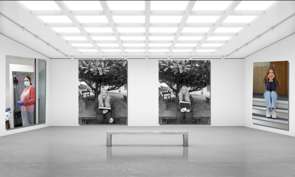
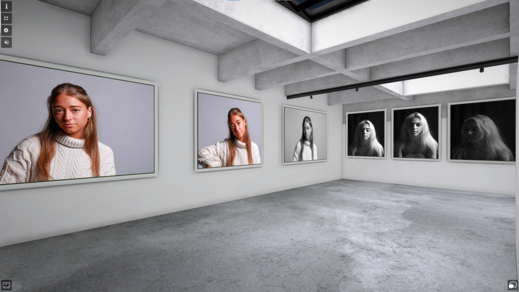
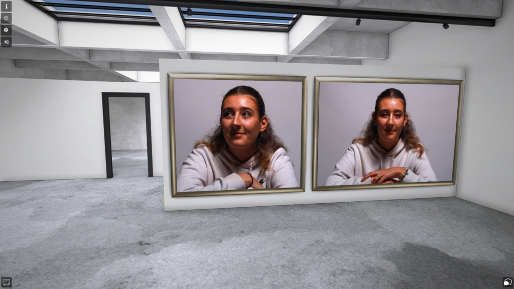
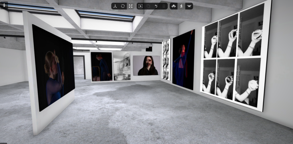
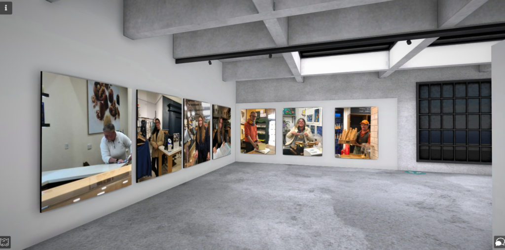
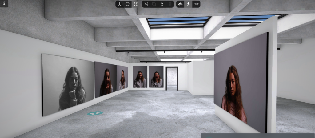
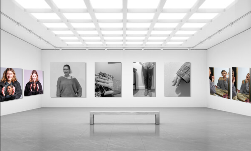
I made virtual galleries of each theme in portraiture using Photoshop.

Femininity vs Masculinity:

Environmental portraiture:

Headshots:

(Using Artsteps)

MY EVALUATION & CRITIQUE:

Overall, I really enjoyed portraiture however my favourite has been femininity vs masculinity as I had a lot of ideas on how to be creative and experiment further which I feel I achieved. I really enjoyed researching identity politics and culture wars because I found a lot of information for context and it helped me come up with ideas of how to represent gender in society which is really important. I think that my images in this theme produced well as I was able to not only represent modern stereotypes but also show gender fluidity through the inspiration of my artist references. I like the way I have used coloured and monotone images in my work because both of my artists tend to use black & white yet I still wanted to add vibrancy to my work to make it more personal to me which meant that I wasn’t just using one or the other. I think that my intentions for the photoshoots are clear in my final images because it is clear what I was trying to create and they distinctly correlate with my Francesca Woodman, Shannon O’Donnell and Cindy Sherman. My work relates to Francesca Woodman as I have created a motion blur that covers the subject’s face using a slow shutter speed that creates the same mysterious look. Shannon O’Donnell’s – That’s Not The Way The River Flows– has been represented in my work through the images of my subjects hands and body with feminine and masculine characteristics also produced in black and white. I also think my work relates to Cindy Sherman’s work as she represented different stereotypes of women in the 1950s/1960s whilst I have represented the modern stereotypes of young girls and women. However, I feel that I should use a further analysis into my artist references’ work in the technical area because it would show a greater understanding of how they have managed to create the image as this will help me to produce similar and related images, as I will know how to do it.

Photoshop/ Virtual Gallery

Photoshop

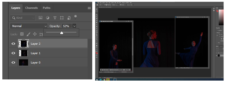
I created this edit on photoshop. Firstly, I imported the two photos that I wanted into photoshop. I then selected one of the layers and adjust the opacity. Then, I positioned the images to where I wanted and played around with the opacity until I liked how it looked.

I created this on photoshop. Firstly, I painted a black background. Then, I important the three images that I wanted into photoshop and resized them all and repositioned them. I then added the white boarder to one image and copy and pasted the effect onto the other 2 images.

I made this image on photoshop, by exporting my chosen three images and resizing them and positioning them where I thought looked good. Then, I changed the opacity of each image and added a different colour gradient to each one. I also changed the opacity of the gradient.

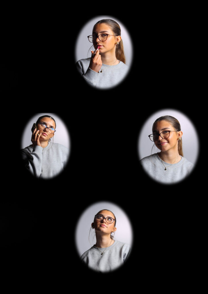
I created this diamond cameo, by exporting my four chosen images then cutting oval shapes and selected create via layer. Then, I deleted the layers that I know longer needed and made the edges of the circles less harsh, by feathering them. Finally, I repositioned them all where I wanted them.

Virtual Gallery

I used ArtSteps to create my virtual gallery. Firstly, I imported all the photos I wanted to use for my virtual gallery into ArtSteps. Then, I dragged and placed the images where I wanted them and then moved them around until they were the right height and width apart. Finally, I added a black frame to each photograph.

Masculinity and Femininity | Artist References | Claude Cahun

About the artist

Claude Cahun (1894-1954) was a surrealist photographer (and much more) known for exploring themes of gender identity and sexuality with different characters in their self-portraits. Their androgynous appearance challenged gender roles during their time.

Analysis

Claude Cahun explores absurdity in their portraits. Each of their works comes together as a whole to symbolise a spectrum of ideas.

Self-Portrait (1939)

Cahun’s composition of themselves in the photo above is them looking away from the camera and like most of their photos an organic pose which decorates the image with the impression of pure human expression and identity – these ‘organic’ shapes are seen in other art forms like contemporary dance, which focuses on bodily awareness and mindfulness, fluidity and emotional expression – displaying that they don’t need to comply to others ideas of how people should present themselves.

Claude Cahun and Solange Roussot in costumes for Le Mystère d’Adam.

I like this photo because of the unusual, curiosity evoking costumes worn by Cahun and Solange Roussot as if they are rebelling against the traditional religious connotations of Le Mystère d’Adam.

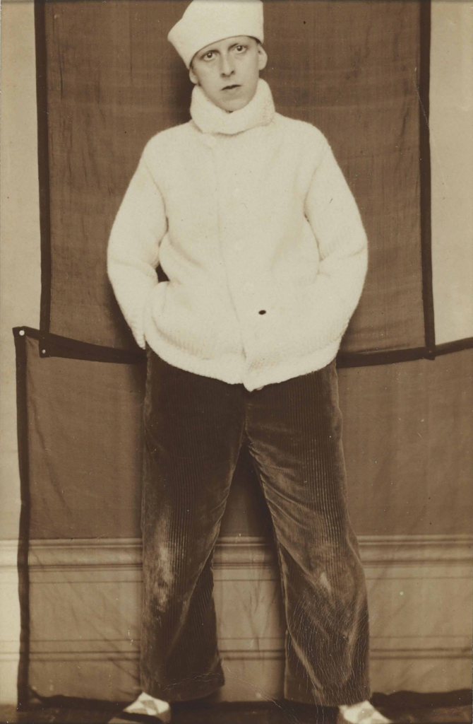
Cahun appears to use natural light and fleshes out backgrounds with often unusual impressionist or household objects with interesting textures and shapes such as curtains, towels or botanical objects, faux and real. For example, in Self-Portrait in Sailor Hat the silky, bumpy reflection of the corduroy trousers that pairs quite well with the scratchy and thin rectangular sheets in the background.

Often these cloths and curtains are used to create shade contrast in the contemporary black & white style – creating negative space and bringing forward the subjects to the viewers.

I also really admire how even though Cahun’s photos are quite unusual the repetitive patterns from tassels on towels or parallel straight lines on the skirting board add a sense of familiarity and relatability that let their photos speak more.

Self Portrait in Sailor Hat 1920

Another feature of Cahun’s work is their use of typical masculine objects like dumbbells and masculine clothes (see below) to illustrate the inner conflict with their identity during the period of their life where they took on the appearance of a man in order to have the ability to live out another aspect of their person without prosecution. The hysterical nature of it is protesting against and dismantling the defined cisnormative stereotypes Cahun feels trapped by. Their photographs are artfully tinted with absurdist and extremist appeal which are considered as foundation for modern feminism.

Claude Cahun with gym equipment

Femininity vs Masculinity Final Outcomes

Final Outcomes

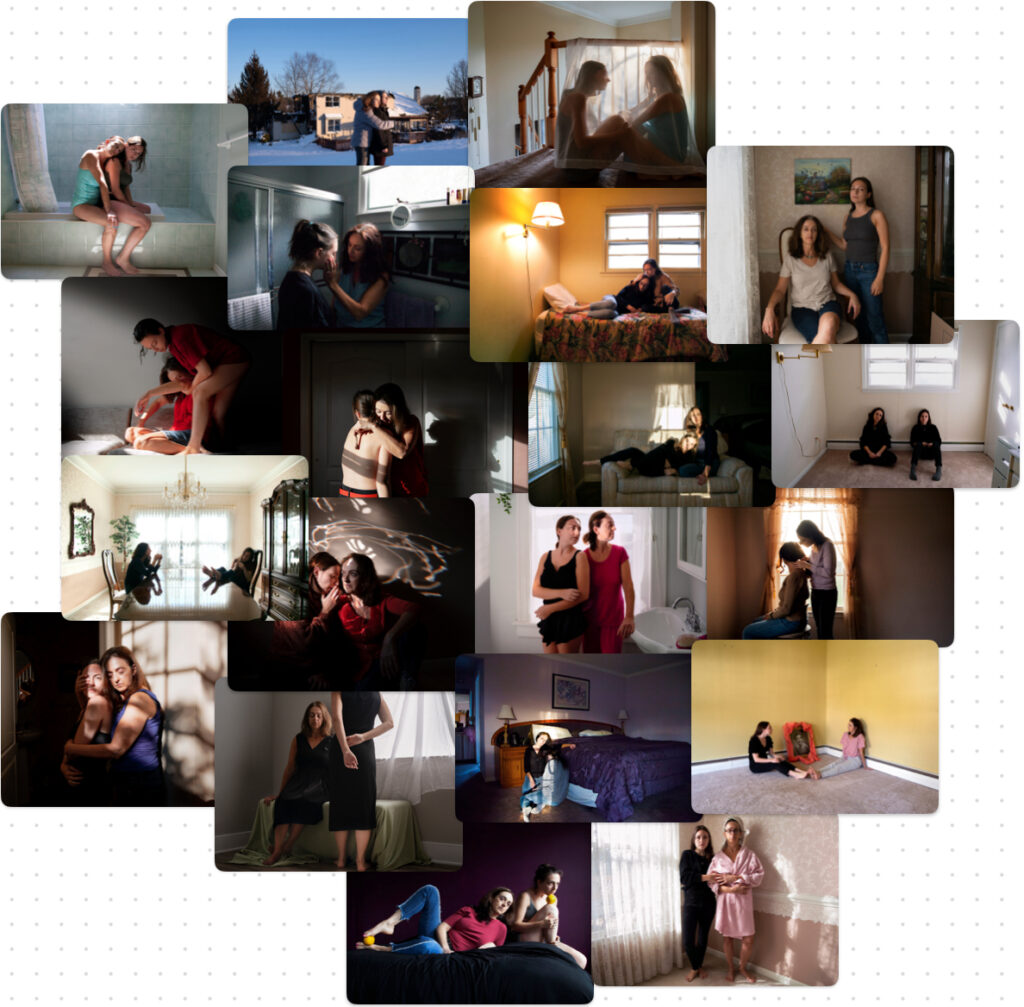
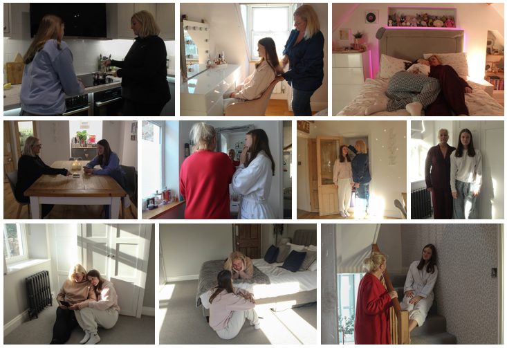
Inspired by Hannah Altman’s ‘Indoor Voices’

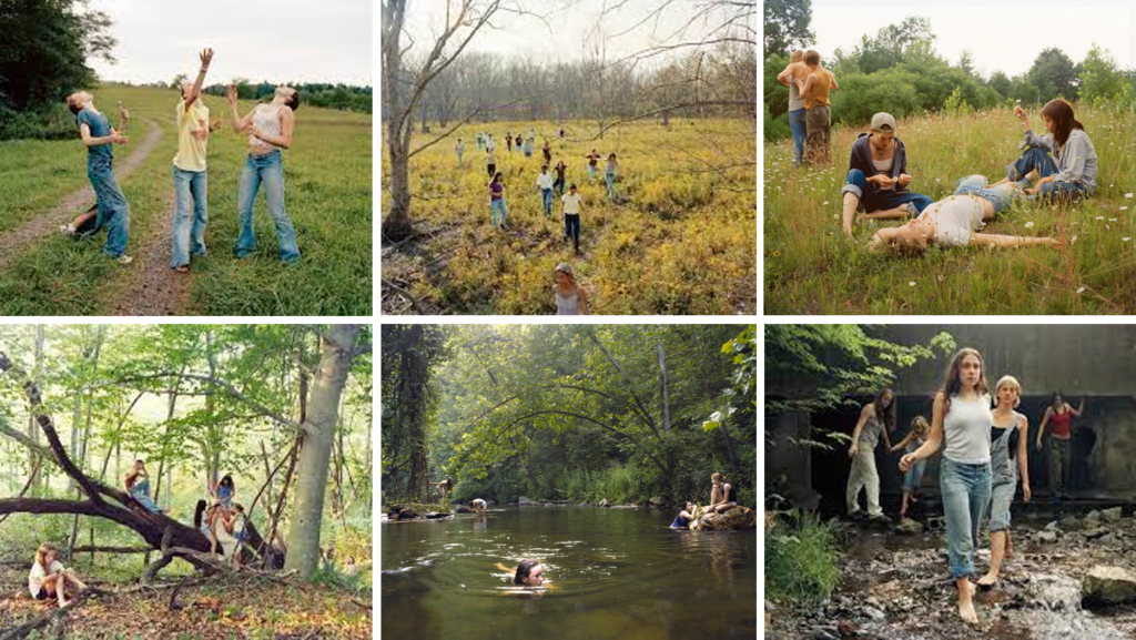
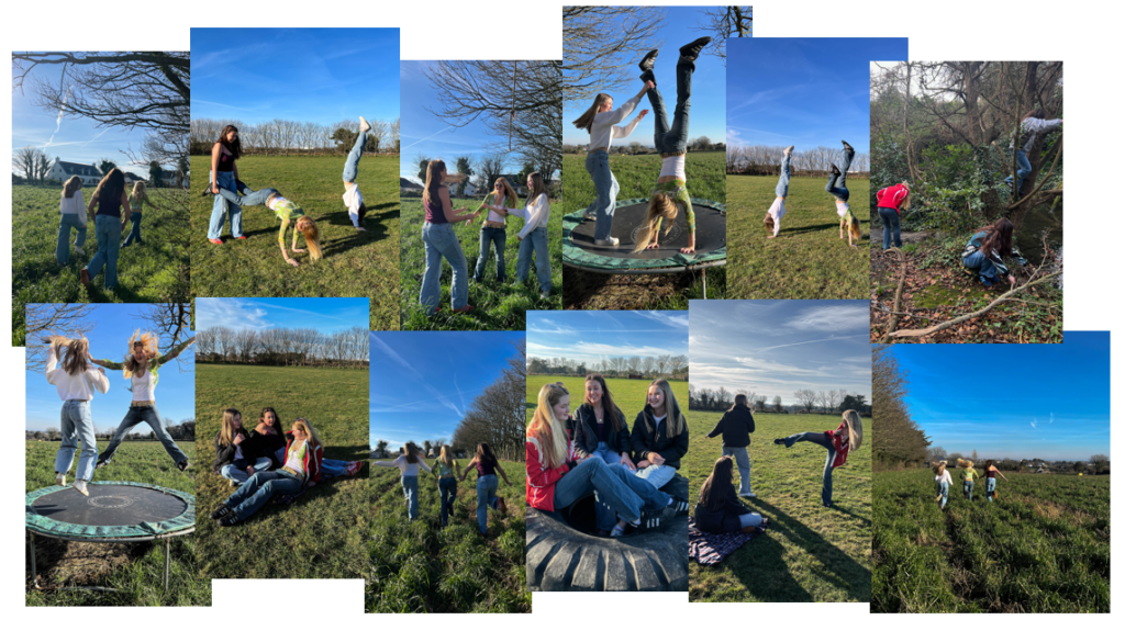
Inspired by Justine Kurland’s ‘Girl Pictures’

This image has an empty alt attribute; its file name is image-1757.png

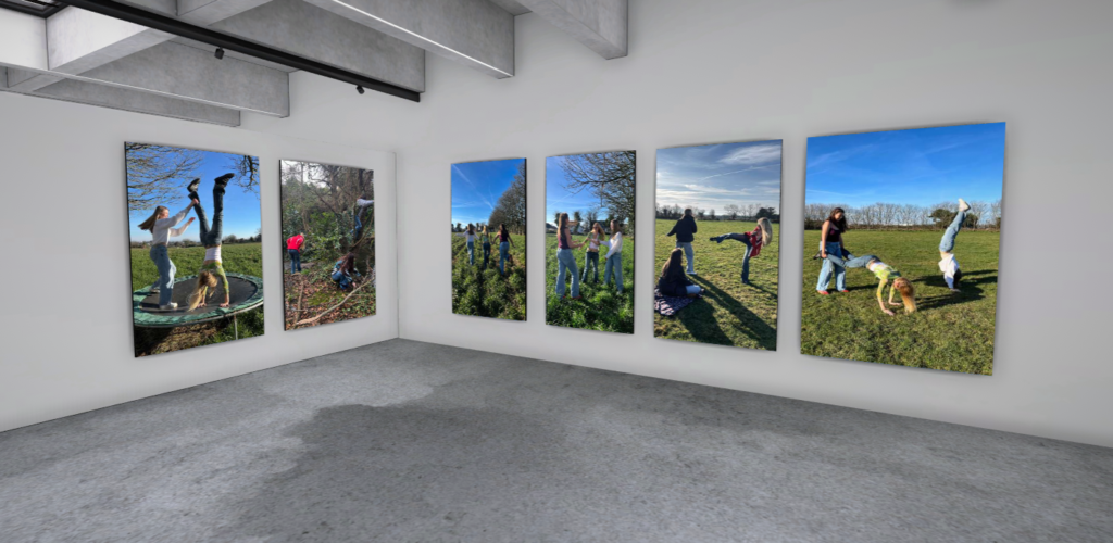
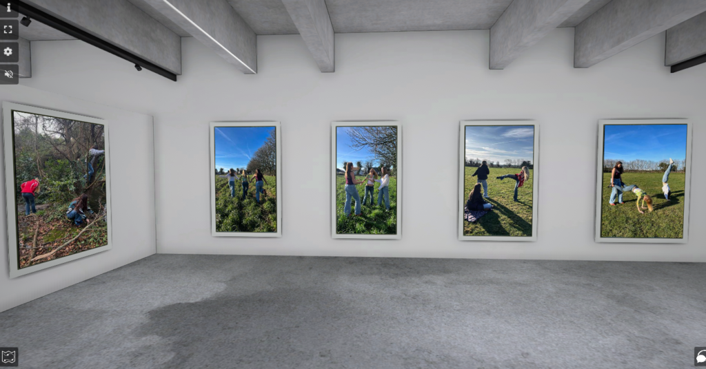
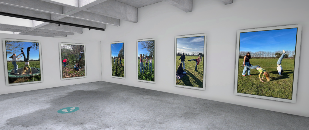
Virtual Gallery

Inspired by Hannah Altman’s ‘Indoor Voices’

Inspired by Justine Kurland’s ‘Girl Pictures’

Compare and Contrast to Artist References

Hannah Altman’s ‘Indoor Voices’

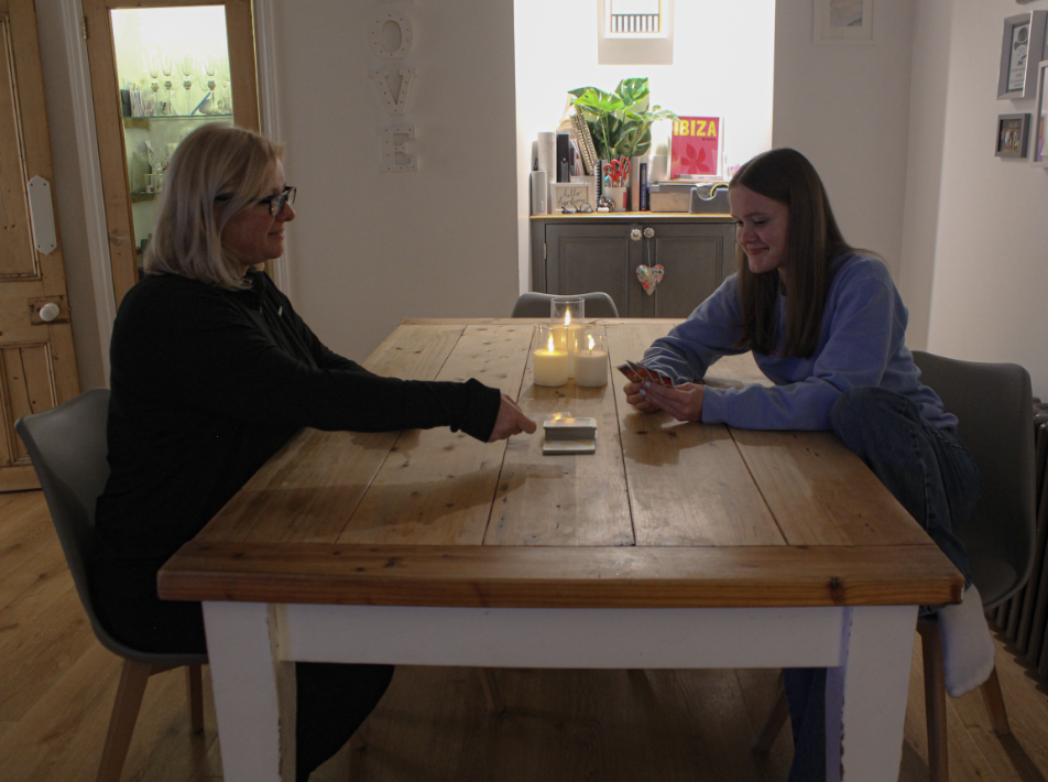
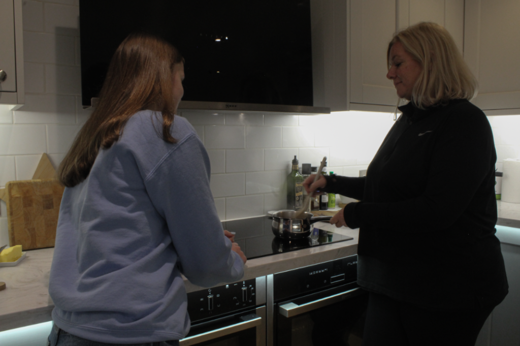
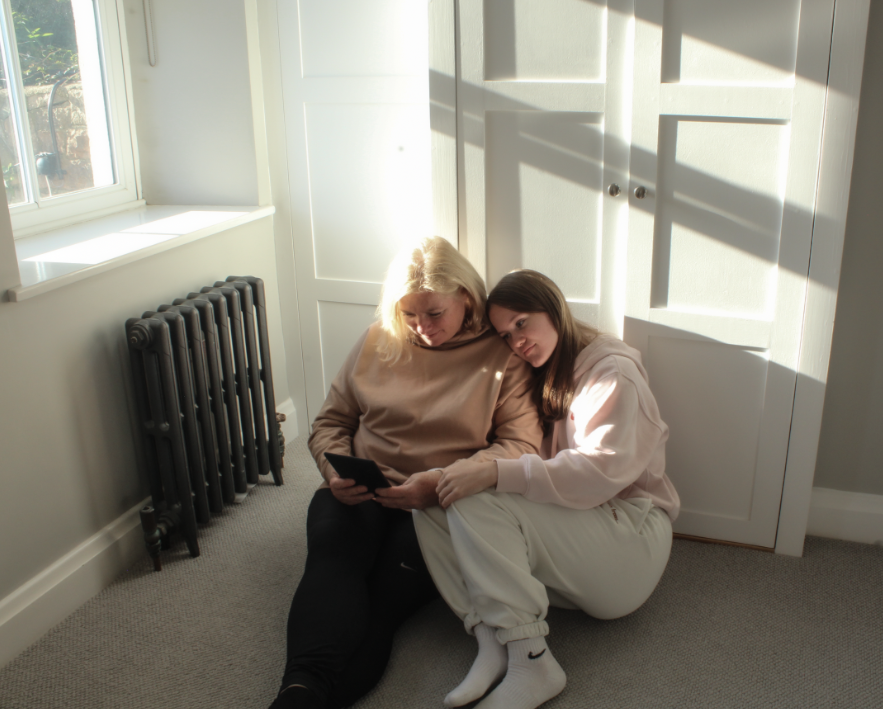
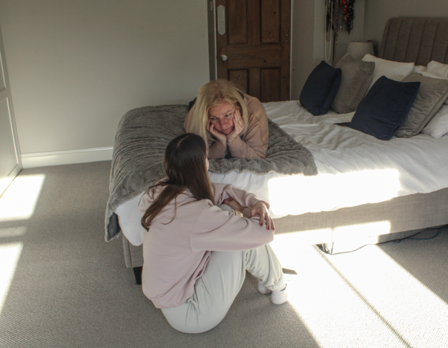
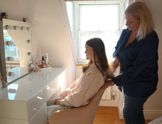
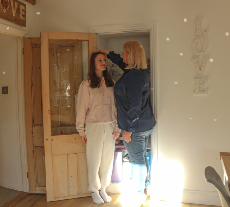
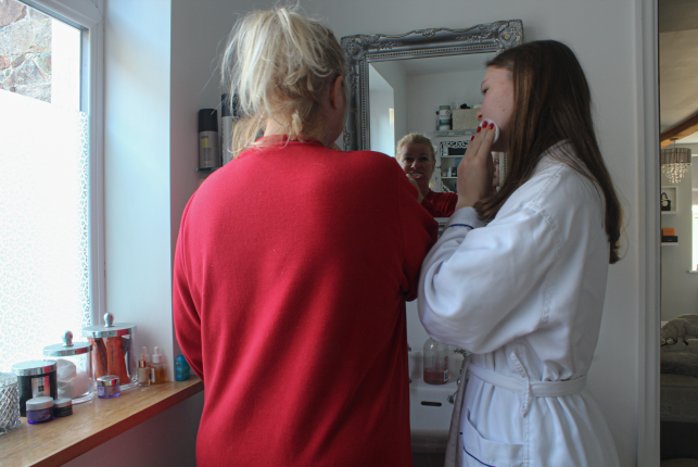
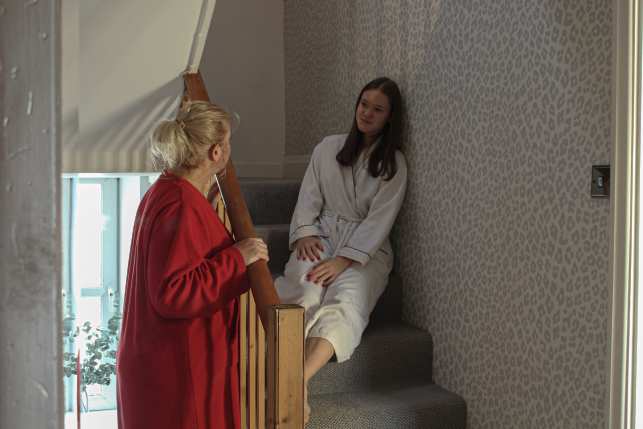
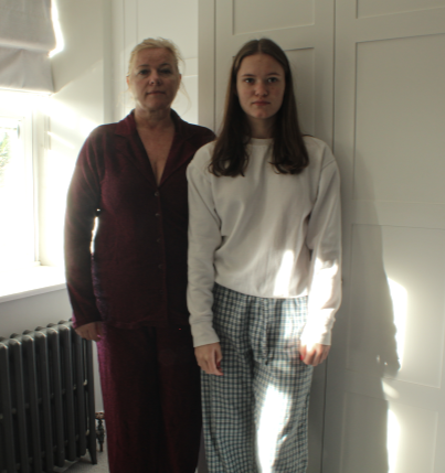
I personally think that my work is very similar to Hannah Altman’s in terms of displaying the relationship between a mother and daughter. I also attempted to make use of natural light, as also seen in Hannah Altman’s photos. On the other hand, I think that my photos also oppose her work as the relationship displayed in my photos appear more normal and traditional. What I mean by this is that in a lot Hannah Altman’s photos the subjects appear to be doing things such as holding an orange in their feet or sitting together on the side of a bathtub which are not things you would expect to see a mother and daughter do in person, whereas, in my photos, you would naturally expect to see a mother and daughter doing each of these things and consider them ‘normal’.

Additionally, I think these photos relate to Cindy Sherman through the use of ‘selfies’ as I took these photos of myself and my Mum by setting up a camera with a timer. Another way that my work relates to Cindy Sherman’s is by conveying female stereotypes, a mother caring for her daughter. Alternately, my work also differs to Sherman’s as she never displayed her real identity through the camera but in my photos my Mother and I aren’t depicting characters and are in fact just being ourselves.

Justine Kurland’s ‘Girl Photos’

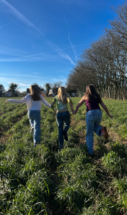
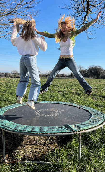
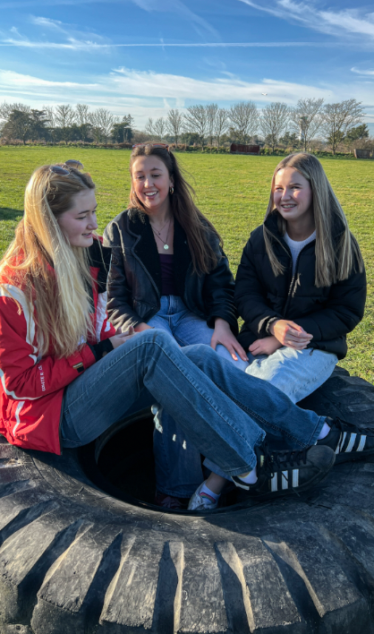
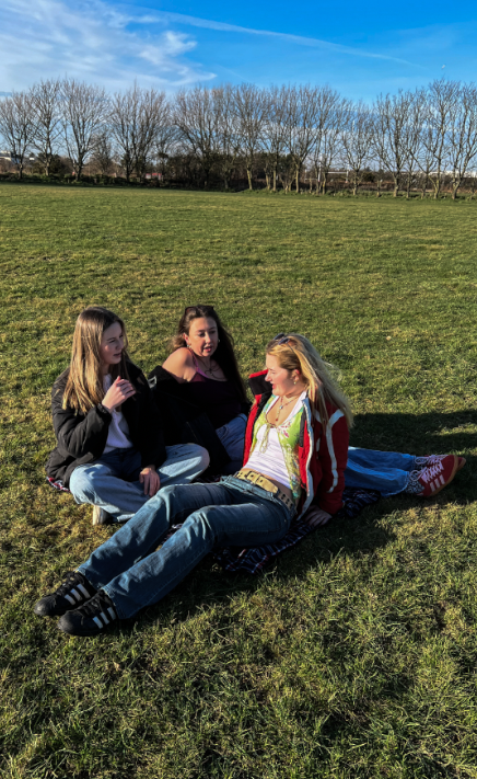
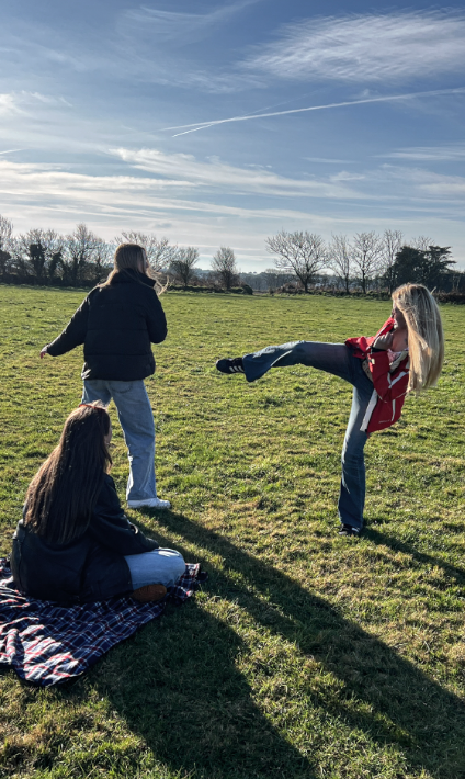
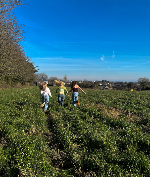
I personally think that by photos are quite similar to Justine Kurland’s in the sense that the girls are in a group outside having fun and exploring. These images also relate to Justine Kurland’s as they appear to have run away from home and are in random fields, however, the locations I took these photos weren’t anywhere near as good as Justine Kurland’s. For my photoshoot, I asked for my friends to wear jeans as they are mostly what is worn in Justine Kurland’s photos and I also made sure that we went to big, open grass spaces, similar to some of Kurland’s photos. On the other hand, my images are quite obviously less professional than Justine Kurland’s as they were taken on my phone and also went through less effort to find locations as we had no way of transport to the places we would have wanted to go.

My photos contrast to Claude Cahun’s in the sense that the girls in the photos appear confident with their identity, rather than trying to hide it. This is shown through the fact that they are just doing as they like with a smile on their face, whereas, Claude Cahun would dress up to oppose their identity and make you question whether they were actually male or female but you can clearly see that the subjects in my photos are females just living their lives.

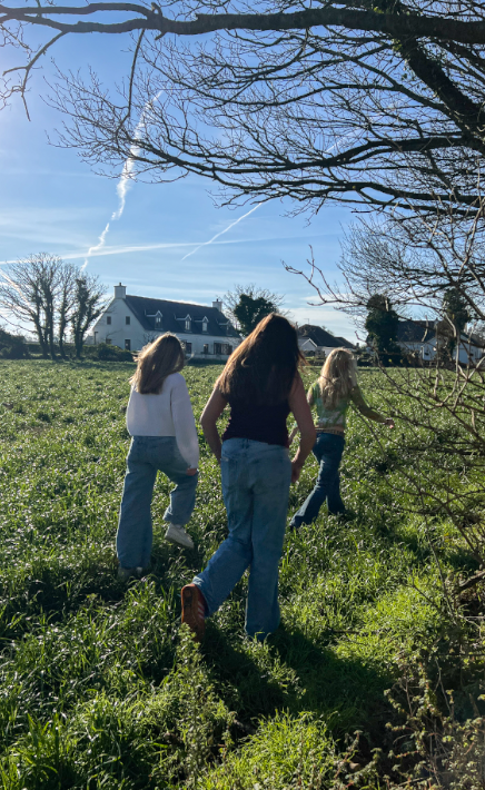
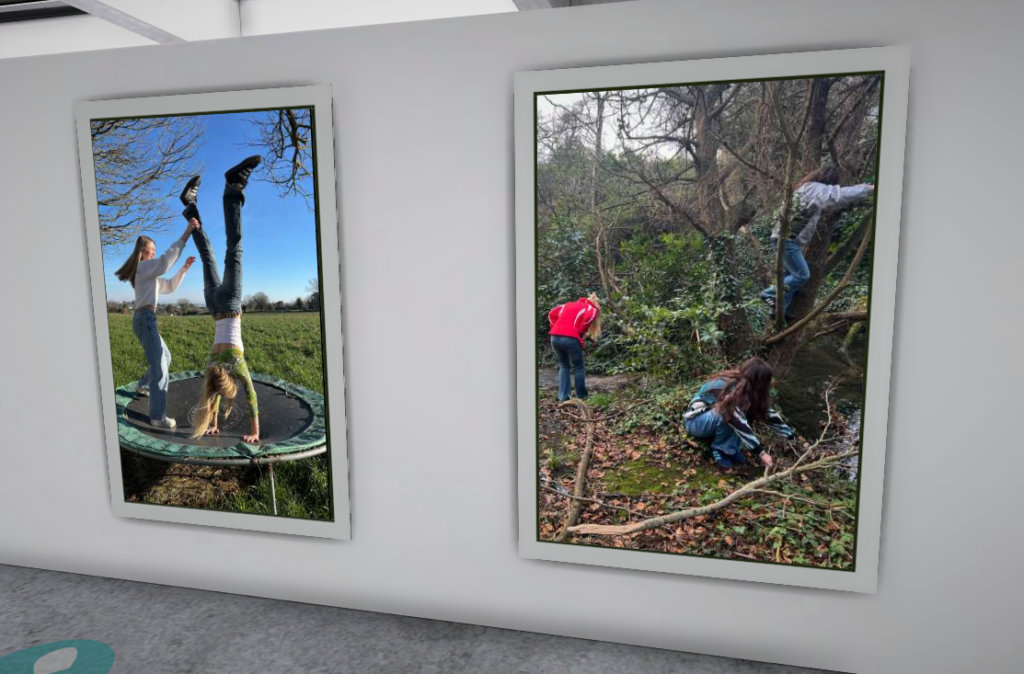
I think that this image specifically relates to Justine Kurland’s work as the girls look like they are running away from home to go explore the outside world.

Finally, I believe that this photo also portrays the girls as runaways who are potentially exploring the woods to build somewhere to stay. This relates to Justine Kurland’s work as a lot of her work portrays the subjects to have run away from home.

Evaluation and Critique

I am very proud of all my final outcomes as I think they definitely display and define femininity through two of the most important feminine relationships, with both a Mother and friends. Both photoshoots link to Girlhood, growing up into a woman.

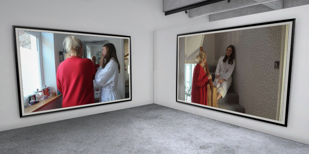
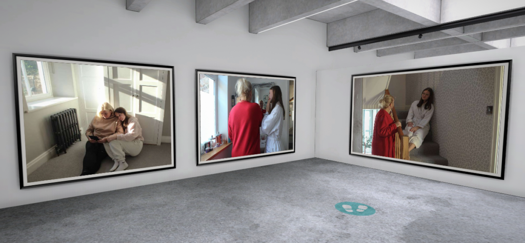
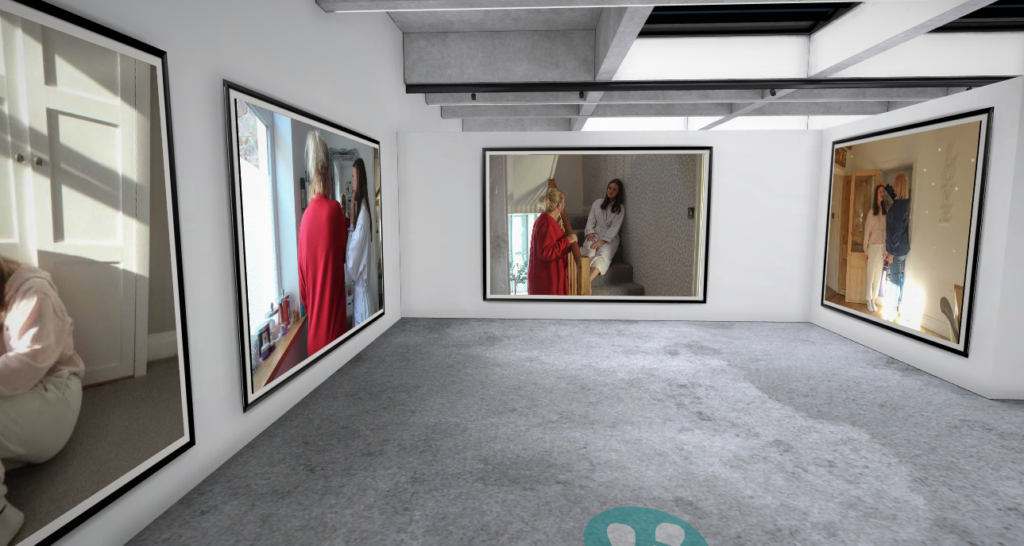
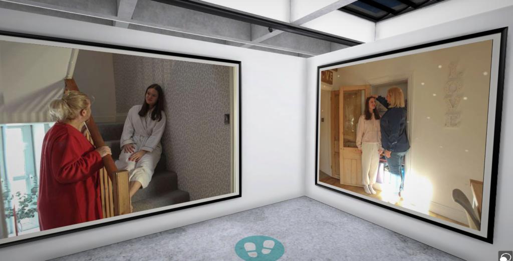
This is my personal favourite photo I took for this photoshoot as it was taken through the mirror, as you can see by the picture frame on the left. I also like the use of natural light as it has created shadows from the stair rails onto my face and the bottom of the stairs above. This photo gives off the impression that my Mum and I are having a nice conversation of the stairs after just getting out of bed, due to our clothing, my Mum’s body language and my facial expressions. I am very happy with this photo, therefore, I don’t think I would do anything to improve it as I just like how it looks natural.
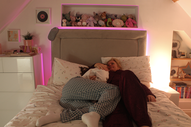
I also like this photo as, again, you can see the use of a mirror and natural light which I think makes it much more effective and looks well-thought out.

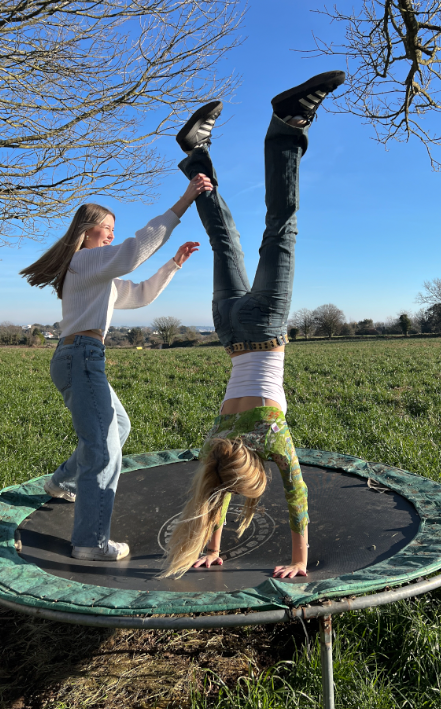
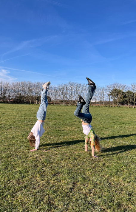
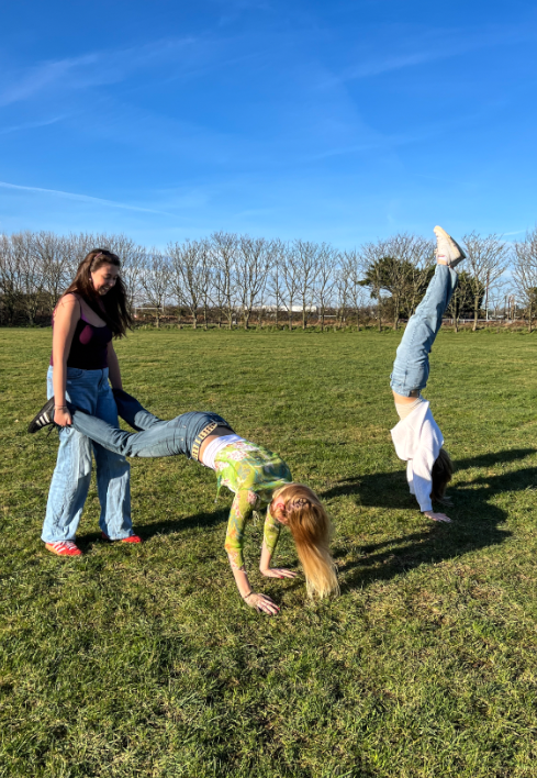
This is one of my favourite images I took, inspired by Justine Kurland. I think that this photo relates to her work through being outside, a common theme throughout Kurland’s ‘Girl Photos’. I also think this photo relates to her work as the subjects appear to be having fun and appear to have possibly found this trampoline whilst exploring. Additionally, I like how my friend is doing a handstand as gymnastics is seen as quite a feminine thing, linking to the theme of femininity. Finally, I enjoy looking at this photo because it just looks like a very natural, caught in the moment photograph and it gives me a somewhat peaceful, free impression due to the fact that they are enjoying the outside and you can see the sea far into the distance. If I were to change this photo to improve it, I would probably step a bit further back from the trampoline so that you can see more of the field around it.
Photoshoot Edits and Final Pieces + Evaluations

Cindy Sherman Femininity double exposure edit

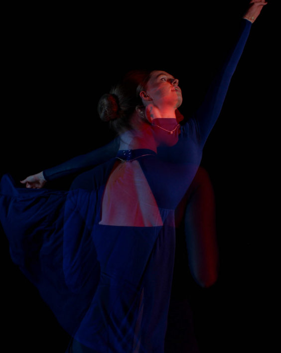
For this edit, I decided to use the technique double exposure. I used 3 different photos where the individual was holding different poses. These 2 photos were edited on Lightroom to increase the quality of them and then transferred to photoshop where I was able to change the opacity of one of the images so that they became transparent. I did this by getting my base photo and then dragging the other tab onto the base photo. from there, I selected the image one at a time and move it into place, adjusted the sizing and finally changed the opacity to about 50% Each of these images were taken with the addition of the red lighting so I decided to keep that common with the 2 photos so that they all had the red effect.

Evaluation of piece

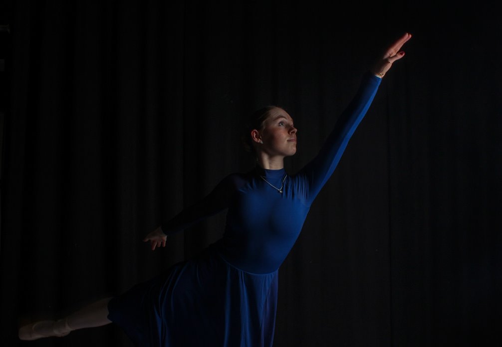
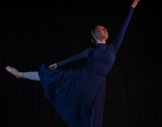
This final piece links to Cindy Sherman’s theme of femininity. Sherman likes to step into different woman identities and show the femininity side of them. I think my edit links to femininity and Cindy Sherman well as the main theme of my photoshoot was Dance. Though it is more gender neutral now, dance has very commonly been viewed as a female sport. I decided to use this stereotype to my advantage and capture pictures of a dancer showing the beauty of dance and femininity. I think the 2 photos that I took worked well as they are both showing the individual from different angles. For example, the one of them shows the individuals hair in a typical feminine style and also the open back of the dance outfit. In the other photo, you can more clearly see the individuals face where she can be seen showing more emotion as she is smiling. Lastly, the photo that shows her in the position of an arabesque represents the individuals hands and arms, she can be seen posing in a typical dance way where the arms float in a beautiful and feminine way. I also like how I’ve decreased the blacks and made the individual herself more of a dominant feature in the image and got rid of the black curtain slightly showing.

I think I could’ve improved the way I photographed some of the images too. The one of the arabesque captures a lot of her body but I think it would’ve made a better image if her hand was in frame and my foot was in frame to show the ballet shoes.

 Other photos that I liked

Evaluation of piece

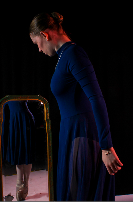
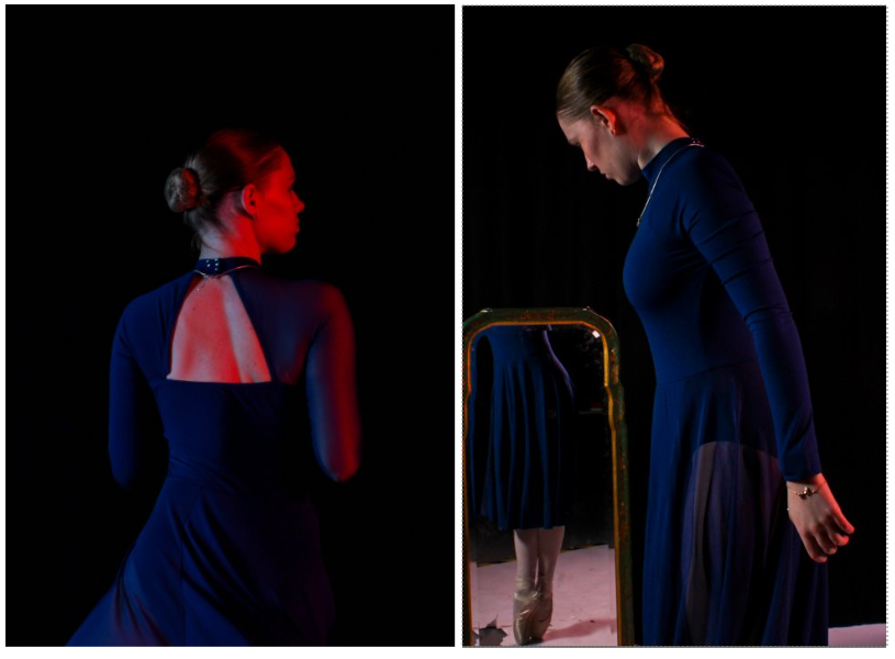
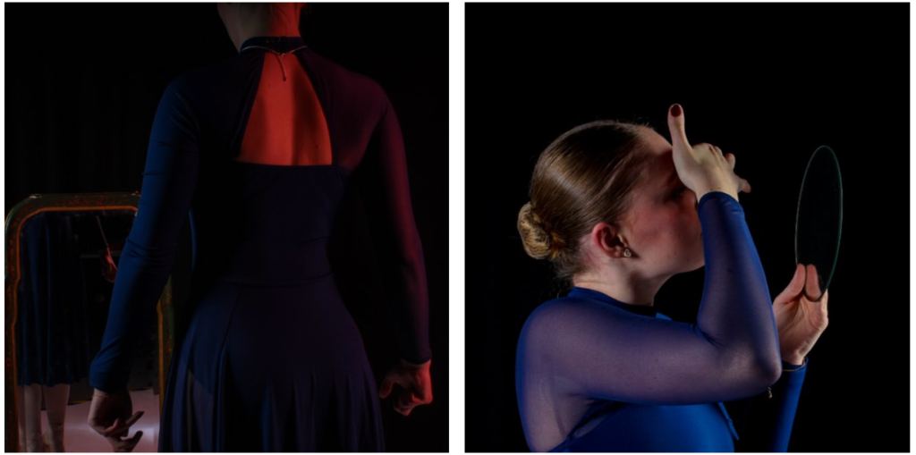
Overall, I like both of these images as they use the technique of reflection. In the first image I have managed to include the whole body in the shoot as the reflection of the ballet shoes are in the mirror. I think this is a good effect and further shows the theme of femininity that I explained in the last edit. I think showing the ballet shoes is important to bring across the theme of dance and to show a tricky skill ballet dancers are able to achieve. I also like the affect if red lighting that reflects off the back of the individuals head almost like she’s blocking it. Thought I really like this image, I blacked out the background but wasn’t able for the white flooring. I think, if it had been possible, the photo would have looked much better if the flooring was also black so bolden her ballet shoes a bit more.
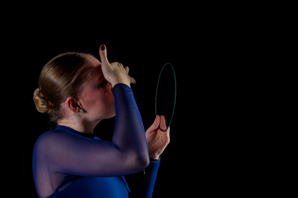
The second photo I one of my favourites and also aims to use reflection however the view of the reflection is not visible. This photo also shows femininity as its stereotypical for females to be linked to make up and beauty. In the image the individual can be seen attempting to touch up make up which shows a basic trait of a typical female. I also like this image as it was not planned and it was a natural photograph to take as the model wasn’t aware and was simply just going a natural thing. The angle of this image also shows other similar factors of femininity such as jewellery as the earring is very clear as it is directed right at the camera.
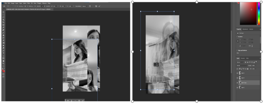
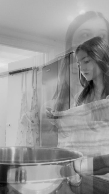
This edit was also inspired by Cindy Sherman’s theme of femininity. There is a handful of photos that Cindy Sherman created where it pictured a female in the kitchen. I decided to take this idea into my own hands and create my own take on it. As I used the same technique as the edit above, the editing process was similar. by getting my base photo and then dragging the other two tabs onto the base photo. I changed all of my photos from full colour into black and white as that was what Cindy Sherman did wit her photo. this also creates the effect of an older photo like hers was from there. I selected the image one at a time and move it into place, adjusted the sizing and finally changed the opacity to about 50%.

Evaluation of piece

Overall, I like this edit however I think the photos would be more effective if they were used as 3 separate ones mounted together and not in a double exposure edit. But I also like the use of double exposure as it shows3 natural film stills merged together to form some sort of story. I used photos at different angles however, each photo doesn’t show the individual looking into there camera which can create a more natural looking photo. The pose for the largest photo was inspired by one of Shermans most famous photo where she is looking over her shoulder. This could create a sense of fear or unknowing for the viewer as they cant see what the person is looking at as it is out of the frame. I think the use of black and white worked well as with colour, the double exposure could have made it look a bit confusing a busy.

This photo shoot links to femininity as years ago is was stereotypical for females to be more commonly pictured in a kitchen working at home and not in a work place as that would be for the men. I have the pan showing in the photo which will further bring across the fact that the setting is a kitchen. as well as the apron hanging on the door and the kitchen towel acting as a prop. I think I have done well to recreate Cindy’s ideas as well as adding my own twist on it.

Cindy Sherman Face Distortion

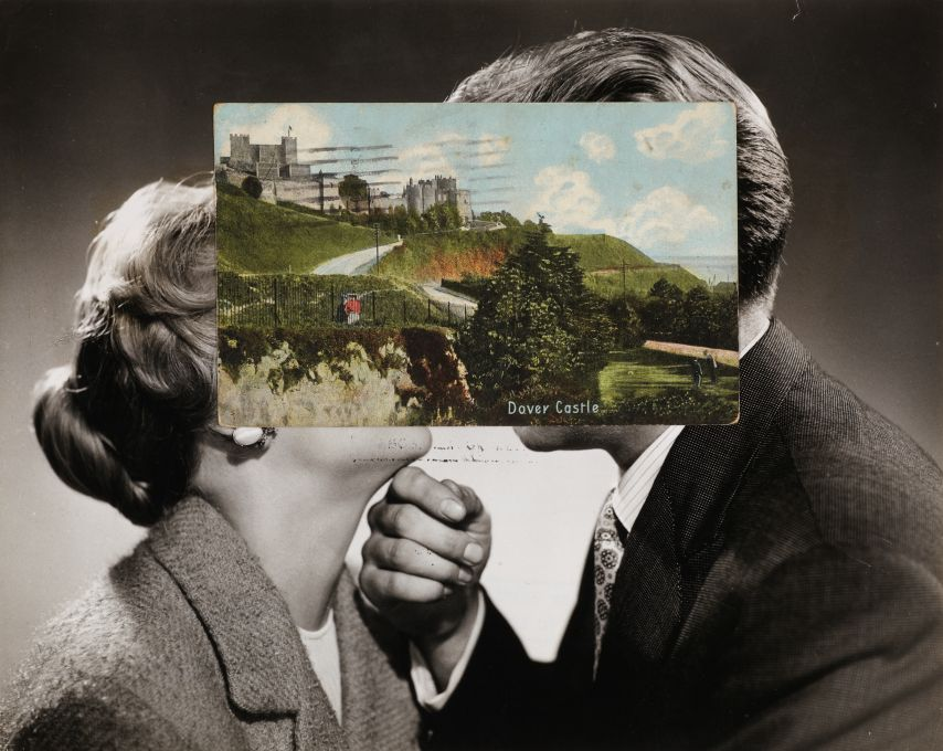
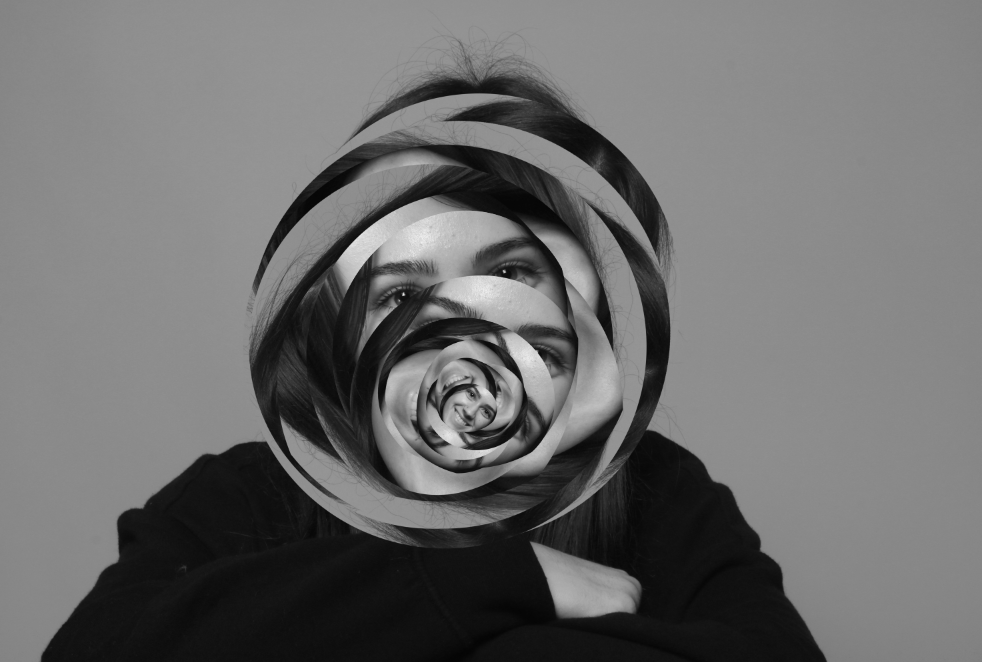
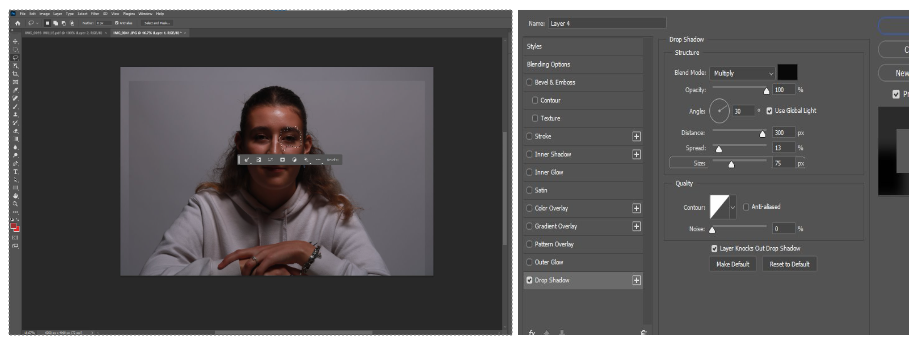
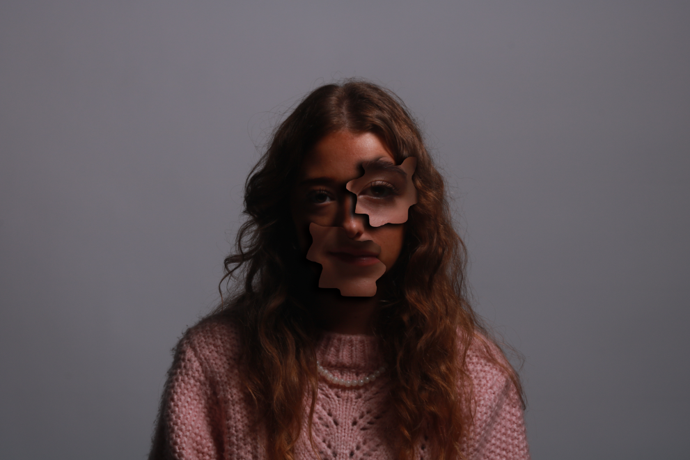
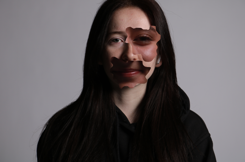
This final piece was also inspired by Cindy Shermans more recent work. I did these two edits by getting two portraits and choosing which one I was going to cut out and white one I was going to cover. I chose the photo and then used the lasso tool to cut out part of the eye and part of the mouth like Cindy Sherman also did. On the top photo I used the effect of a drop shadow to make the cut outs stand out more and on the second photo I kept it normal.

Evaluation of piece

I like this final piece as it is showing female facial features from not just one person. I think it was also an easy process for a good outcome. I think I did well to explore different techniques likes drop shadow. I like the use of the drop shadow in my images as it boldens the cut outs to further show that its out of place and makes it very apparent to the viewer. Though I used drop shadow on one, I do prefer the photo without it. I also like this photo more because I’ve enlarged the features to make them look more out of place and it also has more of a difference in skin tone than the top one so it pops out more.

In some of Sherman’s photos she also used the technique of black and white contrasting onto coloured portraits. I decided not to do that as I think the difference in skin tones also have a good effect. This photoshoot highlights parts of a female face by also making it look unusual and unique. This type of edit could be a representation of being insecure about yourself and Sherman takes that to another level by putting together an abstract piece and still managing to make it interesting and unique.

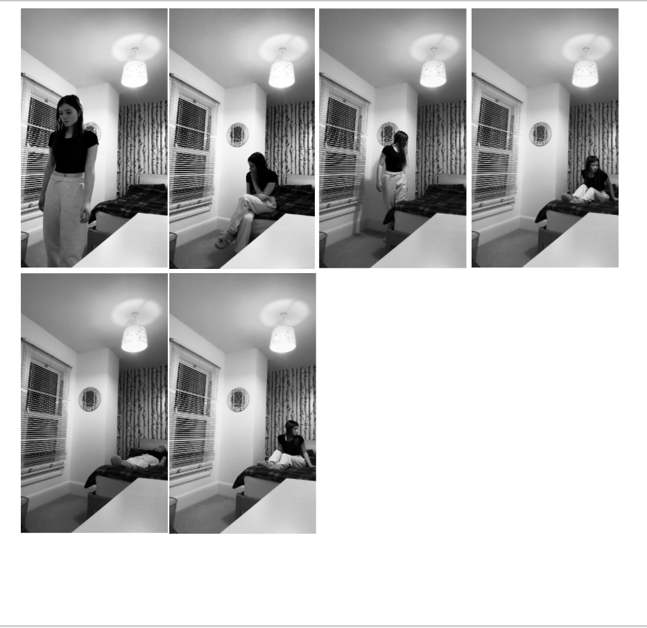
Duane Michaels film stills

Photo inspiration:

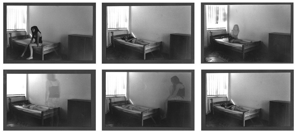
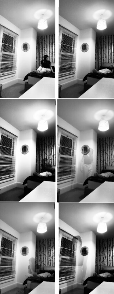
This edit was inspired by Duane Michals who is well known for creating photo sequences. I took this idea and recreated it myself. To edit this, I simply needed to work with the base photo (which was the individual laying down) and then layer the other photos above it and adjust the opacity. I also decided to make this shoot black and white as that was what Michals does in the photo I am most inspired by.

Evaluation of piece

I did a similar sequence of photos to what Michals did in his and I think mine also turned out well however if I did it again I think I would’ve preferred a landscape sequence of photos like Michals did. I like this final piece because it was a simple process however it is definitely not my strongest. I think the use of black and white worked well as it brings across the fact that the sequence of images isn’t very happy and it is more showing emotions of sadness, guilt, worry and anxiety. This photo was taken as a self portrait and I did not have access to a camera so my own resource was my phone. This is a negative as it means I wasn’t able to achieve the highest quality for my images. Another negative is the angle I chose, I think it would’ve looked much better if I had done it landscape and maybe included the whole bed in the frame

Duane Michaels Mirror Reflection

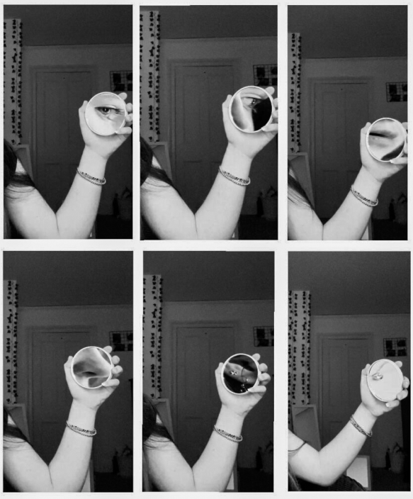
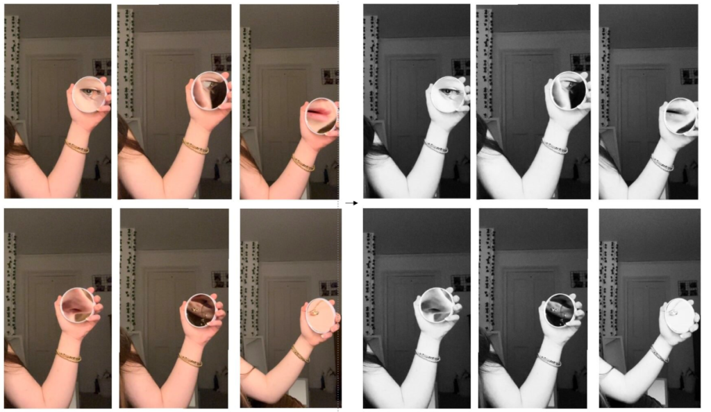
For this final edit, I simply needed to put all of the 6 photos side by side to create the film still effect that Michaels does. I decided to change the full colour to black and white as that is what he did in the photo I am inspired by.


Evaluation of piece


I think this photo shoot turned out well as it is very similar to Michals piece which shows that I have used an artist reference in one of my pieces. As well as this, I think this edit links to Femininity as I have zoomed in on aspects of a female face using a mirror. I also added an extra photo that focuses on the necklace. Though this isn’t part of the female face, it still shows a stereotypical female thing as they are more commonly the ones to be wearing jewellery.

I like this piece and how the mirror is only small so therefore only focusses on small aspects of the face. I don’t like how the two images on the end have the arm at different heights and I think I could’ve done better to make sure I stayed in the same position. I also think this piece would ha looked better if I had a plain background as sometimes a background with aspects induced may take the attention away from the main part.

Opposites

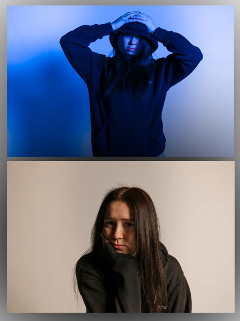
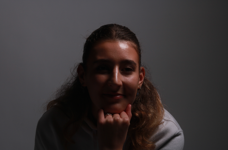
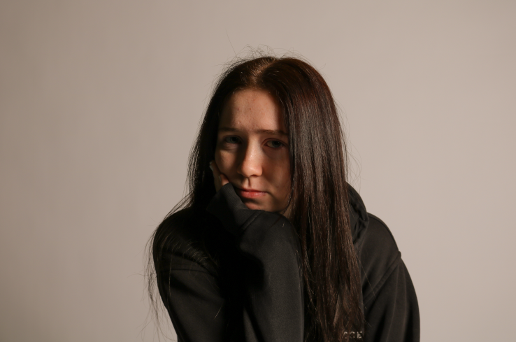
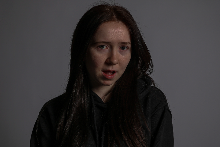
This photo wasn’t inspired by an artist but I wanted to represent opposites in one of my photos. For the top photo, I edited it by changing the lighting temperature to a cooler tone and then creating more of a shadow around the individual. With the bottom photo, I made it have a more warm tone.


Evaluation of piece


I think this final piece turned out well as it shows the contrast by the use of colours and poses. The first photo can be seen to picture a female holding more of a masculine pose with the hood up and hands on head whereas the bottom photo shows her with her full face visible and head resting on her hand. I also like the use of colour as the warmer toned bottom photo gives off a more soft a calming feeling which could represent more of a female character whereas the top photo is more darker, bold and blue which is stereotypically a male colour. I think this shoot was good as it was taken in the studio and with a camera which makes sure there is good quality and a plain background that won’t clash with the main aspects.

Femininity and Masculinity Gallery

Environmental portrait Gallery

Studio Portrait Gallery

Final Outcome 2

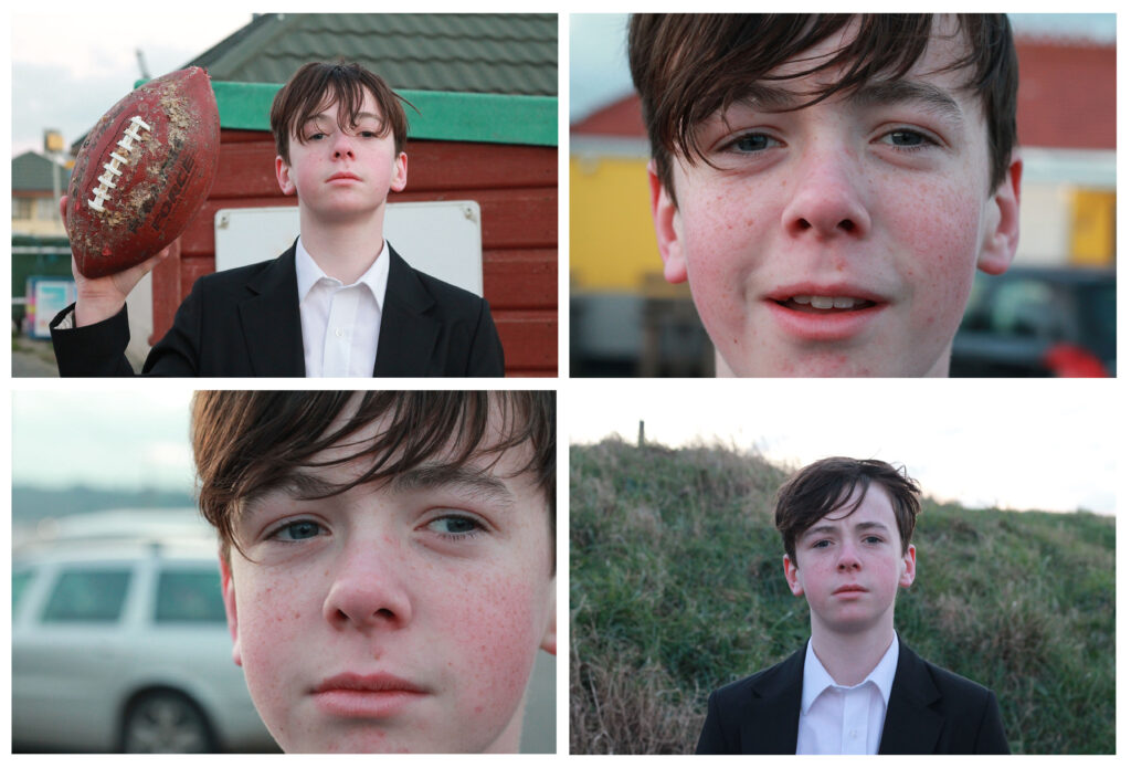
These photographs, are a few of my favourite ones from the photoshoot as a whole, as they allow you to picture this boys life and his personality through his looks. I like how the background of the close ups aren’t focussed so that all the attention stays on the face. I think the layout of these photographs work well grouped in 4 as it means I can show all of the images while they compliment each other. I particularly like the lighting of these images being the natural sky light. I think this helped to light up the different features on his face such as his freckles and eyes. The close ups of his face, feel more personal which I think really adds to the meaning of these photos.

Photoshoots

Stereotypes- Cindy Sherman

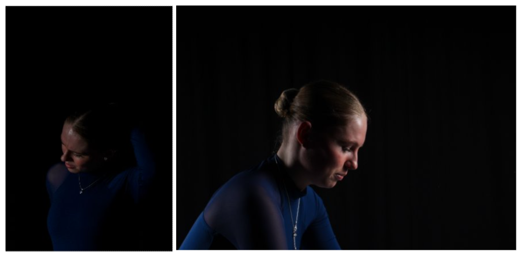
This photoshoot was taken in the studio. I used the use of the red lighting to contrast with the navy blue dance outfit and I think that worked well. I also used the use of an extra object which was the mirror.

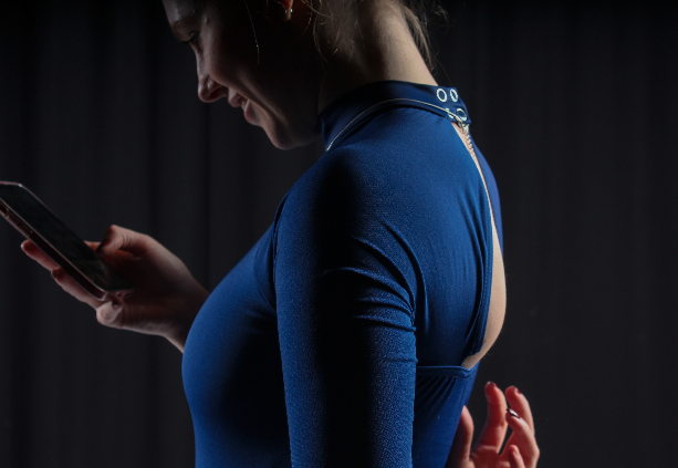
to edit these images, I adjusted the exposure, highlights and shadows. In my opinion, I think that the images being quite dark worked well. I took some photos with the subject posing and some photos where she was not aware she was being photographed and I think this worked well as it shows a more natural side to the photoshoot.

Cindy Sherman- Face distortion

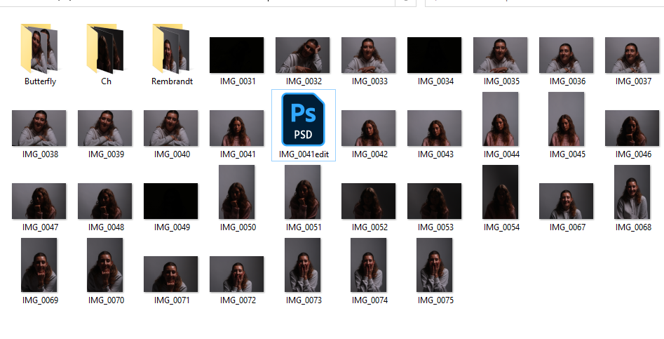
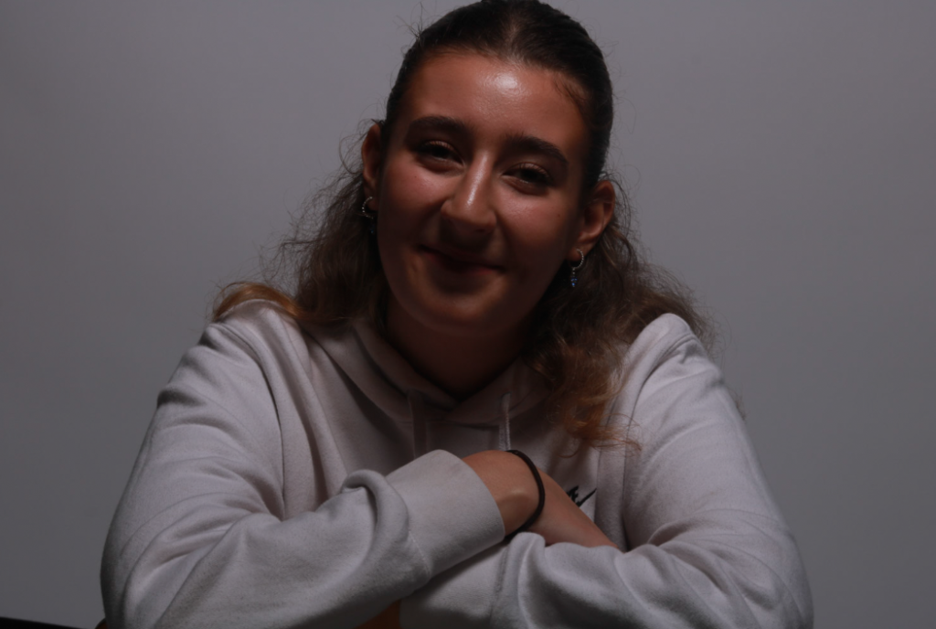
For this photoshoot, I simply needed to take normal portrait photos as the inspiration is only seen once the photos are edited in photoshop. I used some of the photos from the studio lighting photoshoot as well as some new ones. I am planning to make a few attempts of this photoshoot as I will make one person the main subject with the addition of face parts from the other people and then do this a few times and alternate the main subject.

I think these photos will work well as the individuals are posing for the photo and it’s not natural, this means that it will be easier to edit as the main focus is the face and not anything else.

Duane Michaels- Mirror Reflections and body parts

This photoshoot was taken in a natural setting which was my bedroom. This would be seen as a negative as the photos don’t have the addition of the studio lighting and quality.
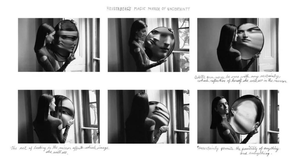
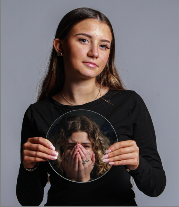
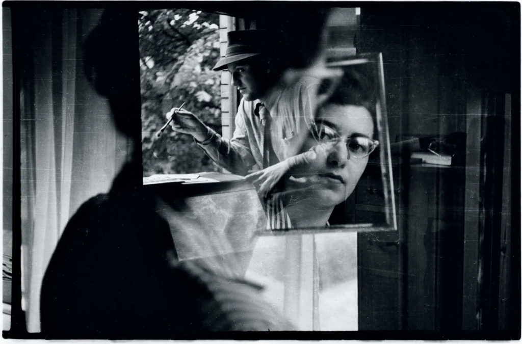
this is inspired by Duane Michaels as he did a similar shoot with a woman holding a mirror and twisting it to show different parts of her face. In my photoshoot, my mirror is significantly smaller so I decided to make the focus on individual aspects of the face. I took a few of these photos as Duane Michaels can be known for his photography being many photos put next to each other to create film stills.

Duane Michaels- Film Stills (for double exposure)

These photos were also taken away from the studio. They were also inspired by a few photos that Duane Michaels did with a few different people. I am planning to use these photos to edit them on photoshop by using double exposure and layering the photos on top of each other.

Femininity VS Masculinity Mirrors Photoshoot 2+ Artist Reference.

Artist Reference.

Saul Leiter

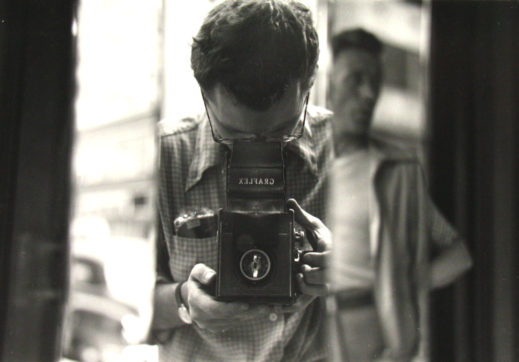
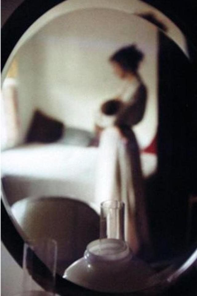
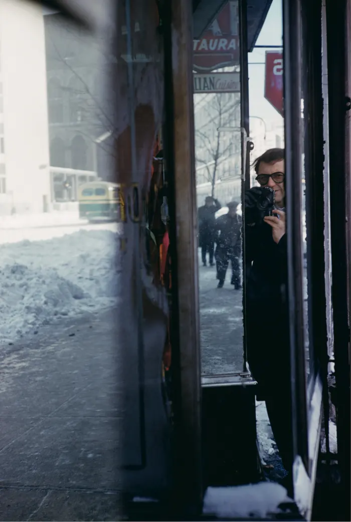
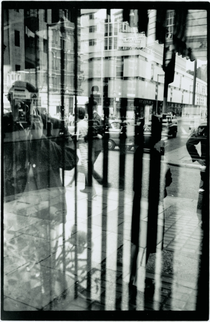
I decided to use Saul Leiter’s photography as inspiration for my photoshoot using mirrors. I researched his images and compiled a range of images that I felt I could attempt to replicate. Saul Leiter was seen as the greatest pioneer of colour photography due to his variety of photographs mainly focusing on the homeless, the elderly and their loneliness and immigrants. He lived from 1923-2013 and mostly took photos through specific reflections such as through windows, mirrors and doorways. His moments he captures have no intention or true meaning, instead he captures the more intimate and instant moments of the world which I truly admire. The quote

“I may be old- fashioned, but I believe there is such a thing as a search for beauty- a delight in the nice things in the world. And I don’t think one should have to apologize for it.”

I really like this quote because it portrays the simplicity and imagination the photographer has and I think this laid- back and chilled approach perfectly reflects onto his photography and work. Leiter was only more recently popular in the 1950s and 1960s as his extensive use of overexposure and deliberate soft focus gained an large audience. His work was then displayed in a huge exhibition in 1955 in the New York Museum of Modern named “The Family of Man” which includes the best in photography from around the world. His approach to colour in street photography and contribution to the development of colour photography becoming a true art form is greatly admired. I can see a direct comparison in the photography and work from Saul Leiter with the work from William Eggleston. This is due to the fact Eggleston “wanted to see things in colour because the world is in colour.” and his street photography has influenced fans to call himThe grandfather of colour street photography” another reason why these photographers are similar is that they have been known to explore colour, abstraction, and the poetics of everyday life throughout their street photography.

Image Analysis

What did I notice first?

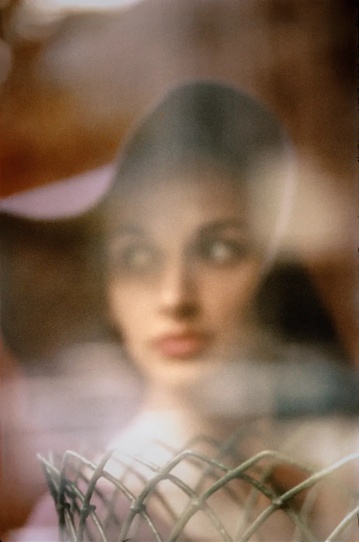
I first noticed the woman being the subject and the focal point of the piece. I can notice her red lips and defined features capturing my attention.

What’s Happening in the Image?

There is a woman stood whilst looking to her left and she is outside. She seems to be fondly looking at something and be concentrated on her surroundings. She is also looking over her shoulder and she looks very feminine and stylish.

What people and objects are shown? How are they arranged?

There is some sort of wire which is placed closer to the camera than she is stood. This creates a perspective effect on the photo.

What is the physical setting? Is place important? Are there details that suggest the time period this image relates to?

The background is not specifically familiar however I can tell she is outside and the weather looks sunny due to the light effects shining on he face.

Photoshoot.

Photoshoot, Part 1.

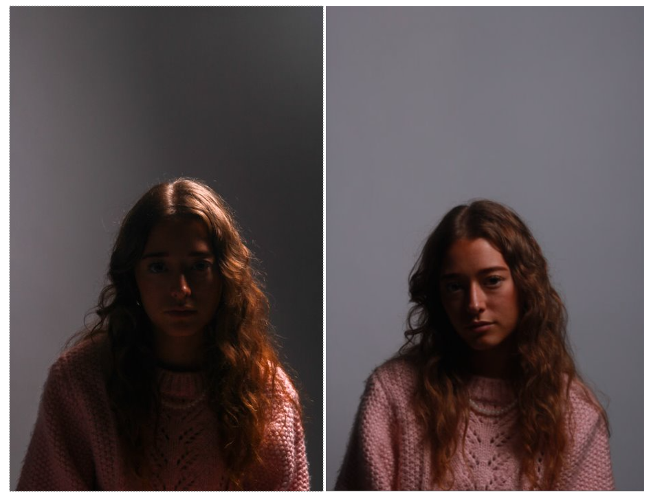
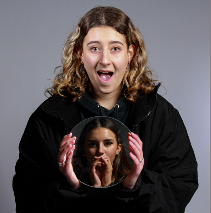
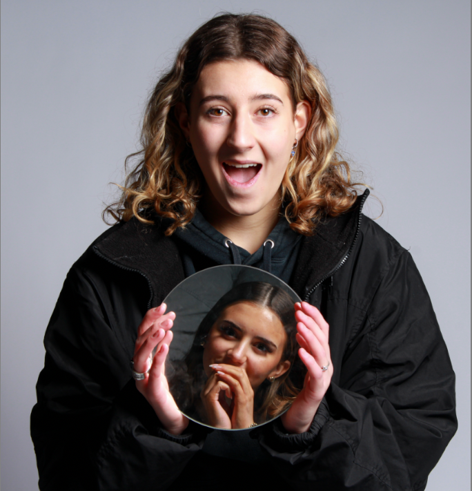
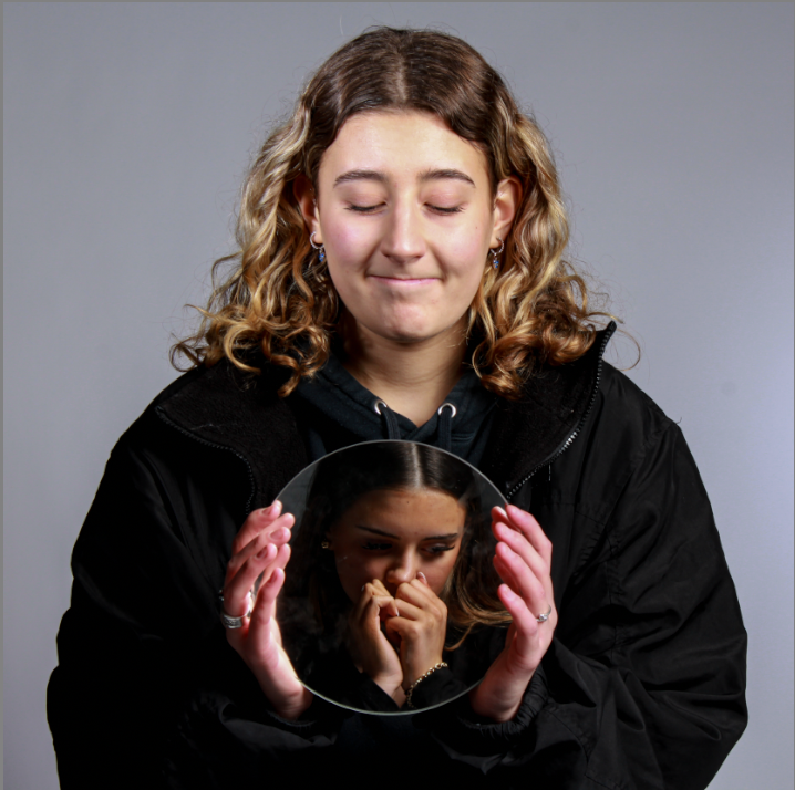
I wanted these photos to relate to Saul Leiter’s work, whilst also having my own twist on it. For this photoshoot, I chose for my models to include a mirror to tie into his work. I had one model sit on the floor diagonally to my other model who is sitting higher up, on a chair. My model on the chair then shone the mirror to perfectly frame the person on the floors’ face, to capture their emotion whilst also showing themselves. This technique is perfect for a contrast of people and emotions in a creative way. To improve this,

  • I think the mirror could be bigger
  • Take our time more.
  • Create a wider array of emotions
  • Have both female and male models.

Photoshoot, Part 2.

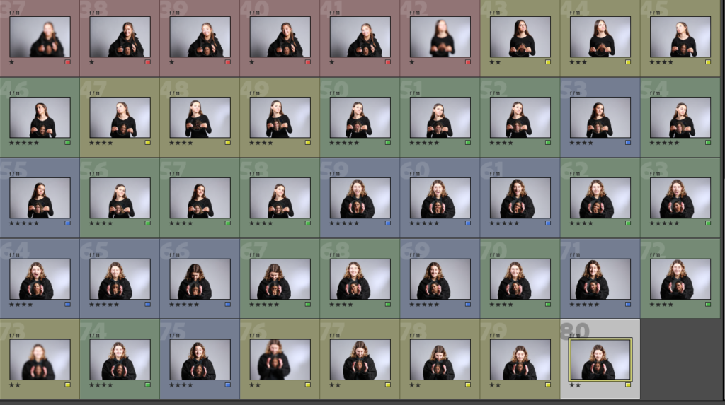
For this part of the photoshoot, I had my models standing in front of the mirror and looking at herself. She is looking with a confused/ blank expression on her face at first, and then her head tilted to the side. This is to represent her judging herself and looking at her reflection and body negatively. This is tied into femininity due to the way women tend to feel and look at themselves. She is then shown sat down with her head in her hands, which signifies stress, despair and upset about her appearance.

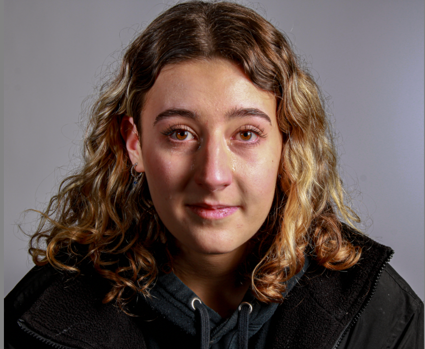
I really like this photo as it expresses human emotions and how females may be seen as ‘overreacting’ or dramatizing human genuine emotions. This photo Is especially moving and meaningful because my model is crying actual tears whilst also holding a straight face. This may convey the idea of concealing your emotions in order to avoid judgement or attention for feeling upset or hurt especially in females. This may also relate to masculinity as It is seen as not masculine and unusual for a boy to show their emotions.