Photoshoot One- Identity

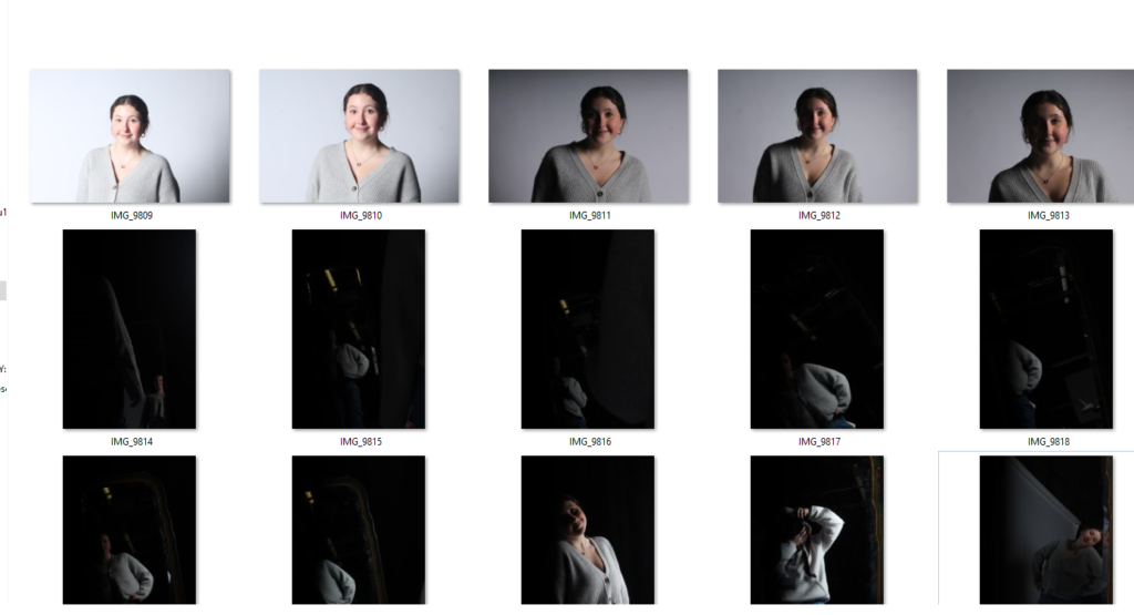
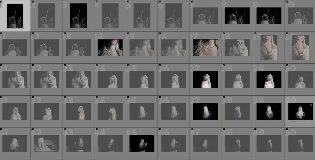
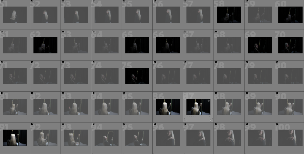
I have marked the photos with a colour coding system so the green ones are the ones I like and are good photos where as the red and yellow aren’t as strong or I just don’t think they are what I intended. For this shoot I chose to do self portraits inspired by Kayla Varley’s work of herself with close up angles and unusual composition but strategic focusing. I found while there was a couple of photos I liked there was only one that was what I originally intended to get. (pictured below) I will now go onto look at my work from other shoots and pick the best ones to edit and produce my final outcomes.

This is my strongest photo prior to editing as my eyes are in focus where as my nose is out of focus drawing the attention to my eyes. I also like how the smaller less noticeable details are visible like the freckles scattered across my nose. I like how subtle the glitter ‘tears’ are in this shot but for the next shoot I will definitely try some bolder glitter that stands out better. The framing of the shot is similar to that of Varley’s work with the close crop and close up view of the subjects face.

Julia Margaret Cameron- Artist Reference

Julia Margaret Cameron was a British photographer who is considered one of the most important portraitists of the 19th century .She is known for her soft-focus close-ups of famous Victorian men and women, for illustrative images depicting characters from mythology, Christianity, and literature, and for sensitive portraits of men, women and children.

After showing a keen interest in photography for many years, Cameron took up the practice at the relatively late age of 48, after her daughter gave her a camera as a present. She quickly produced a large body of work capturing the genius, beauty, and innocence of the men, women, and children who visited her studio at Freshwater, and created unique allegorical images inspired by tableaux vivants, theatre, 15th-century Italian painters, and the work of her creative contemporaries. Her photography career was short but productive; she made around 900 photographs over a 12-year period.

Cameron’s work was contentious in her own time. Critics derided her softly focused and unrefined images, and considered her illustrative photographs amateurish and hammy. However, her portraits of respected men (such as Henry TaylorCharles Darwin, and Sir John Herschel) have been consistently praised, both in her own life and in reviews of her work since. Her images have been described as “extraordinarily powerful” and “wholly original”, and she has been credited with producing the first close-ups in the history of the medium.

Why was Cameron’s work criticised?

Her talent, however, left her known as one the greatest photographers in history. Still, many of Cameron’s contemporaries considered her work to be inept, for it was blurry, smudged and scratched, and instead they believed that the best photography should be about technical perfections superseding all artistic intent.

The statement ‘Julia Margaret Cameron accidentally created soft-focus photographs’ is true due to her technical inexperience. She later embraced and intentionally used this soft-focus technique, significantly impacting portrait photography.

PHOTO ANAYLYSIS

The Red Roses ( 1865)
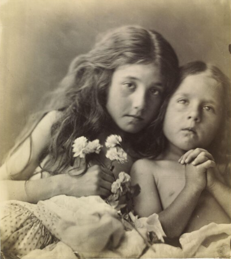
The meaning of this picture is ambiguous as the red roses of the title are not clearly identifiable. In the Victorian Language of flowers, red and white roses signified unity, discernible here in the closeness of sisters Kate and Elizabeth Keown. The hands clasped in prayer evoke Christian iconography, where red roses stand for martyrdom and white for purity. Cameron often borrowed many of her subjects from religion, history and literature. One of her famous images is ‘ My Grandchild, 1865’
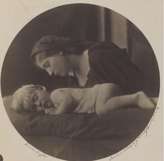
In this image, Cameron transforms a portrait of her grandson asleep into the study of Madonna and her Child. Making this image simultaneously a religious study and a family portrait.

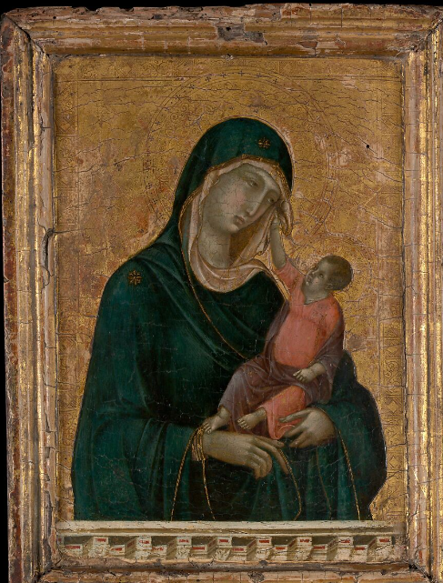
Madonna and Child was painted by one of the most influential artists of the late 13th and early 14th century, Duccio di Buoninsegna. This iconic image of the Madonna and Child, seen throughout the history of western art, holds significant value in terms of stylistic innovations of religious subject matter that would continue to evolve for centuries.

This lyrical work inaugurates the tradition in Italian art of envisioning the Madonna and Child in terms appropriated from real life. The Christ Child gently pushes away the veil of his mother, whose sorrowful expression reflects her foreknowledge of his crucifixion.

The word Madonna means “My Lady” in Italian.

This painting from the late 13th century by Italian painter Duccio di Buoninsega, in contrast, expresses the emotions of love and tenderness between mother and child. The infant Jesus returns the Madonna’s placid but intense gaze.
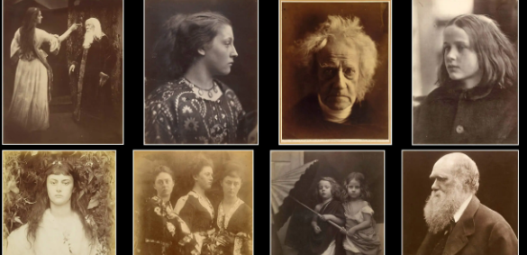
MOODBOARD
MY WORK INSPIRED BY CAMERON
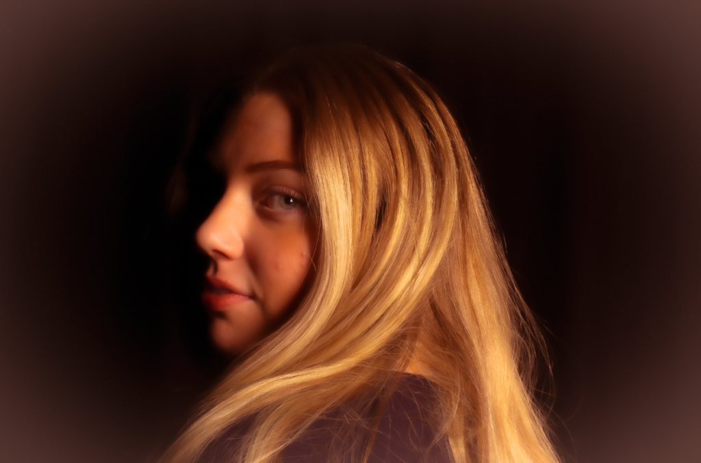
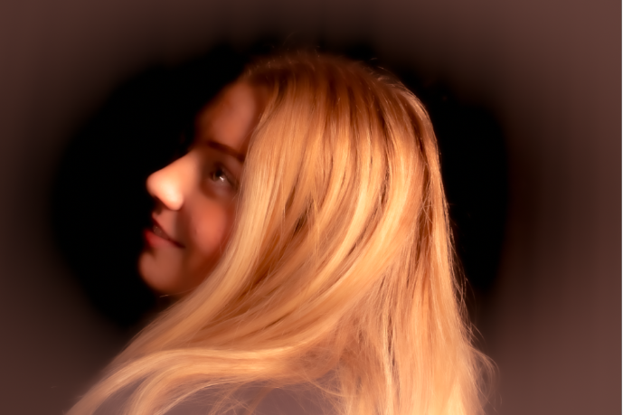
This image has an empty alt attribute; its file name is image-1434.png

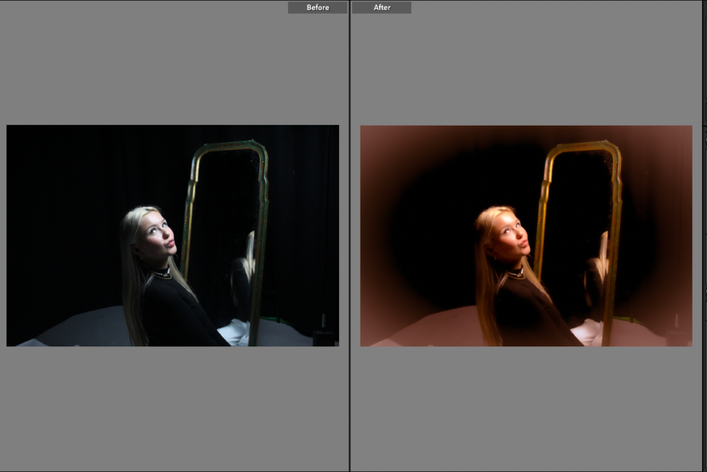
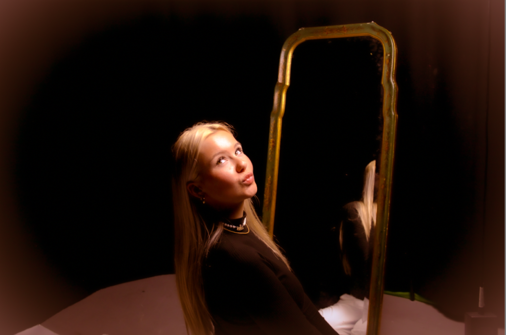
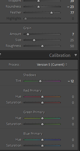
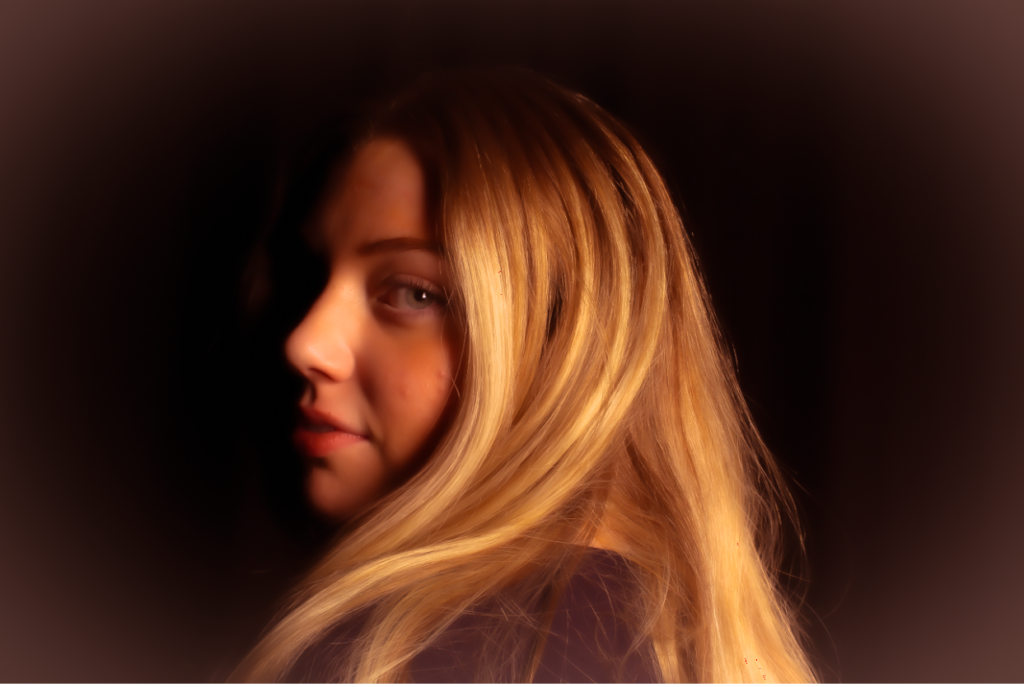
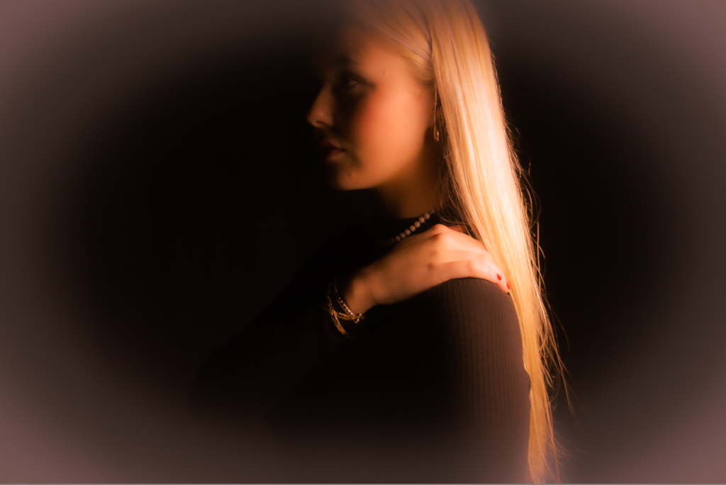
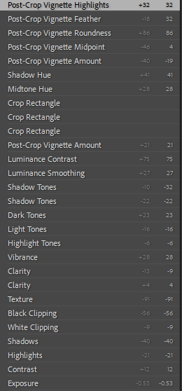
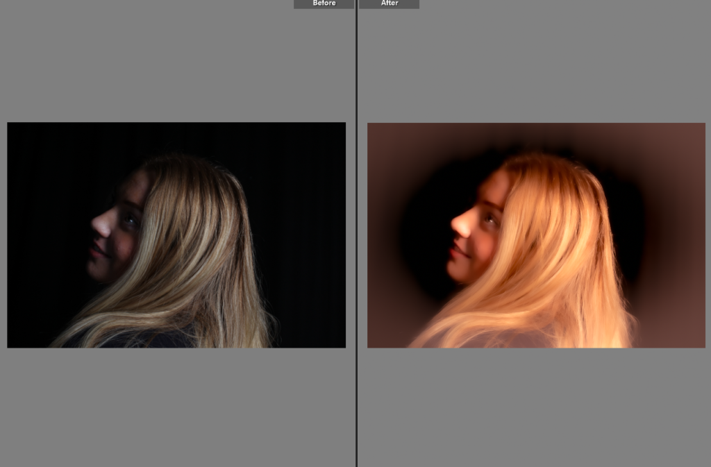
I edited these images to creative a less detailed focus in the centre surrounded by a feathered border with warm tones to create a vintage and old look so it fit Cameron’s work in the 19th century. I kept the portraits more focused around the outside like Cameron’s work although she got criticized for it but ended up embracing it and in my opinion I think it makes the image look a lot more elegant and gentle which is a typical female stereotype.

Image Editing and Experimentations

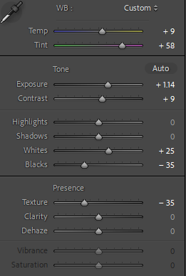
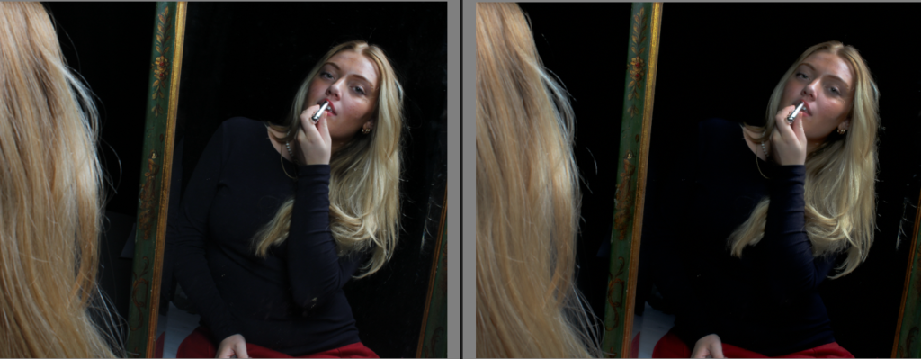
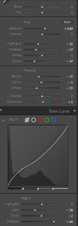
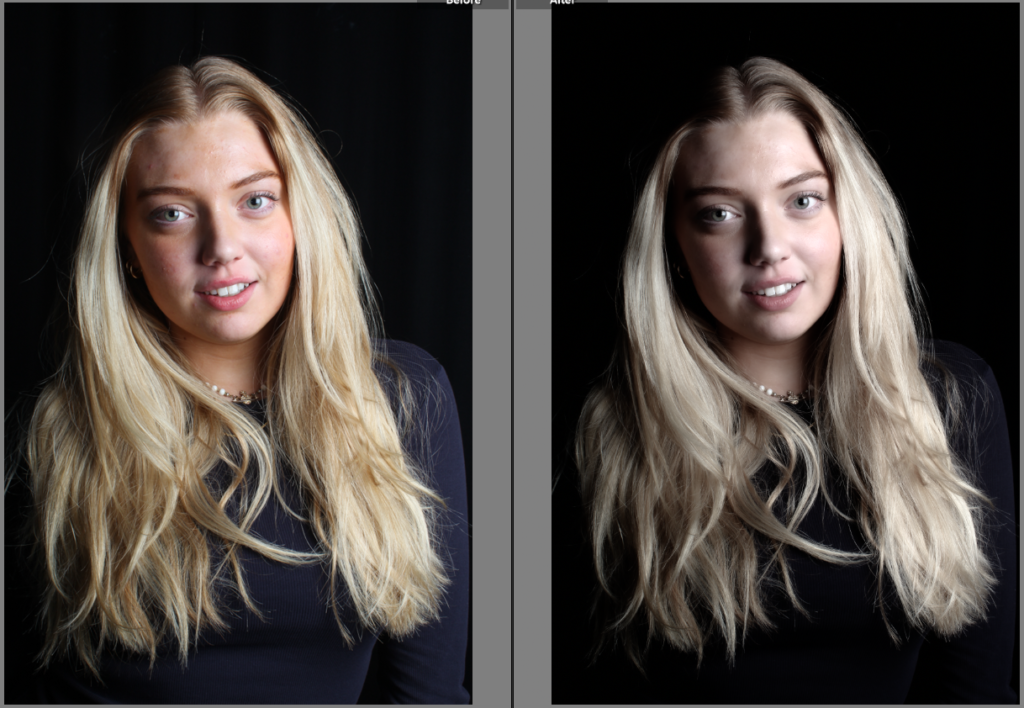
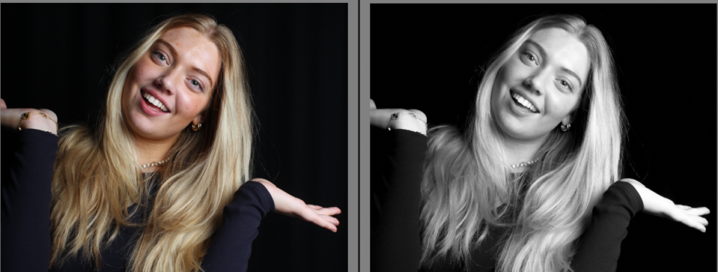
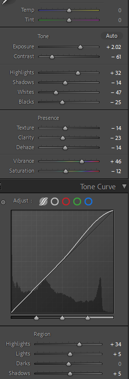
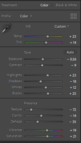
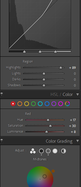
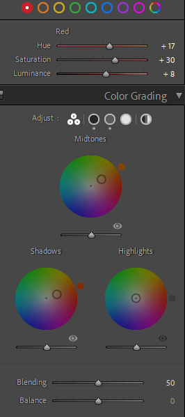
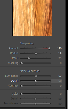
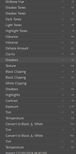
For my first edit, I knew I wanted it in black and white because I think it portrays a similar resemblance to many photos of Marilyn Monroe. I increased the exposure because I think it adds an advantage to the lighting, making the model’s face look brighter against the dark background.

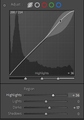
For my second image I went into further depth with the editing, to achieve more unique outcomes; I decreased the lights and darks to create more of a contrast between them, and also adding shadows to give the outcome more definition.

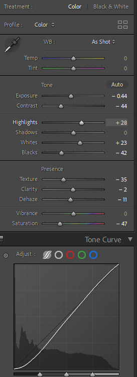
For this image I wanted to create more of an ancient effect, in order to do that I had to decrease the saturation. I also decreased the texture so the model looked flawless like Marilyn. To prevent any distractions from the subject, I decreased the blacks so the background is easier to ignore. I also increased the highlights so the image didn’t look dull.

In this photo I made it black and white again, while decreasing the contrast so the image did not look too extreme. Although I increased the vibrancy because I didn’t want the image to look uninteresting, as well as increasing the highlights.

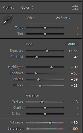
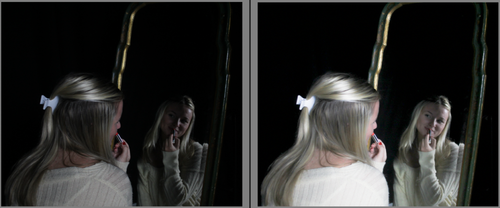
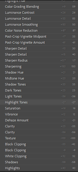
This image I also experimented further with as it started off as one of my most characterless photos, due to the lighting. I increased the highlights and vibrancy to substitute for the poor lighting. I decreased most of the other options such as shadows, whites, blacks, saturation and dehaze in order to emphasise the lights.

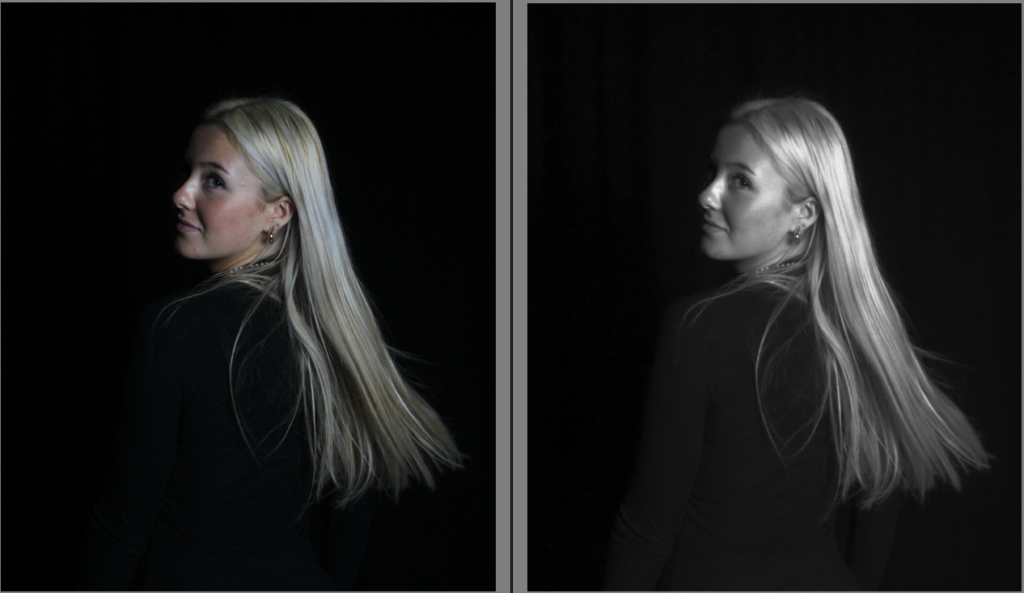
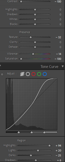
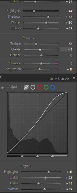
This photo I made it black and white by decreasing the saturation to -100, and also decreasing the vibrancy slightly. However I increased the highlights to emphasise the blonde in my hair, as this closely resembles Monroe.

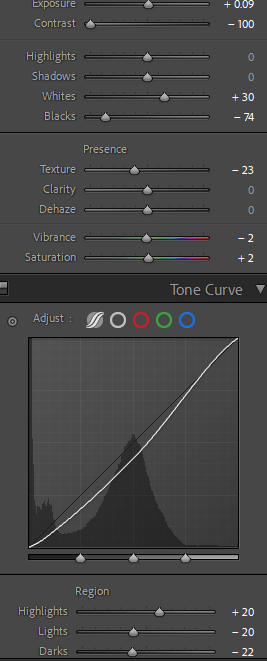
Within this image, I decreased the texture as I knew it would benefit how classy it looked altogether. By increasing the whites and decreasing the blacks I was able to create a visible contrast, which I think brought out the jewellery in the photo, which is the main subject. Also, by increasing the whites it helped to emphasise the blonde tones in the hair.

In this image, the main subject has many lighter tones such as the jewellery, hair and skin complexion. I knew that in order to draw attention to these features, I had to decrease the blacks, while also bringing out the shadows to give the image definition.

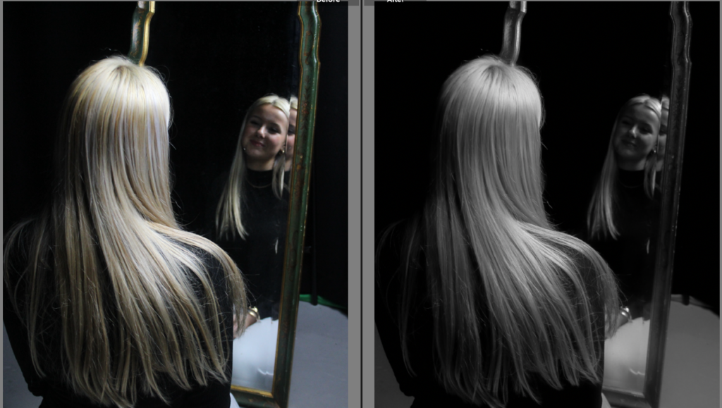
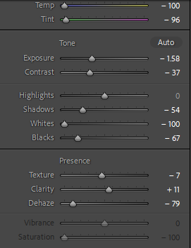
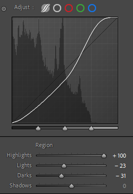
This image was originally extremely dull, with poor lighting. Therefore I decreased both the temperature and tint of the image, while bringing focus to my hair. I wanted to keep the image quite dull, to add a sense of mystery, so I also decreased the lights and darks. However, I adjusted the highlights to 100 so my hair was still eye-catching, whilst being black and white.

I edited all of these images in Lightroom hoping I could achieve similar outcomes to Marilyn Monroe. Most of my photos are in black and white, which I also believe is useful as Cindy Sherman and Claude Cahun both embody black and white images in their work too. This way I am able to incorporate artists we have looked at, as well as embracing my own creativity and ideas. The use of black and white is successful because it gives the photos an ancient theme to them, which adds a sense of realism throughout my work. I believe this is important because Monroe became popular in the 50’s, in which all photos were black and white. I also cropped all of my photos so there would not be any unnecessary background distracting the viewer from the subject of the image. A common theme throughout my edited photos is increasing the exposure, which I did because I think it perfectly separated the light and dark tones in each of them, helping to highlight the different shades. Furthermore, I increased all the blacks and all the whites in each photo too, which made it easier to identify the main subject. This means that there was hardly any background in any of them, allowing the viewer to stay focused. Additionally, I decreased the texture in all of my images because I wanted to achieve as similar to Marilyn Monroe as possible, in which she always looked flawless in every photo.

Image Editing

FIRST IMAGE

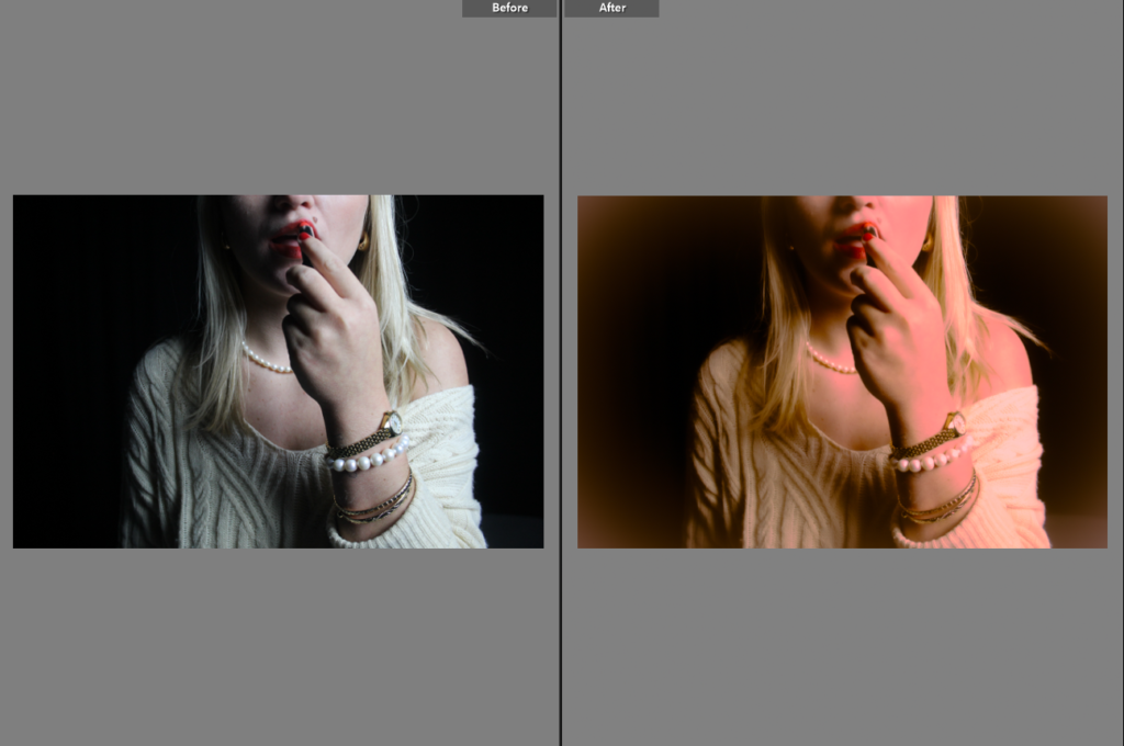
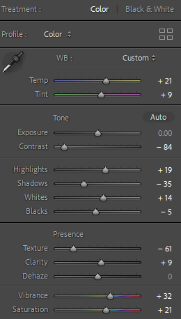
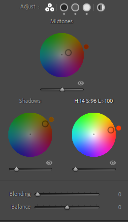
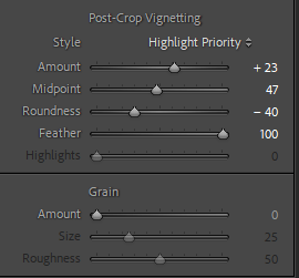
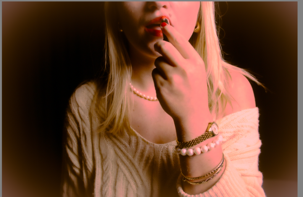
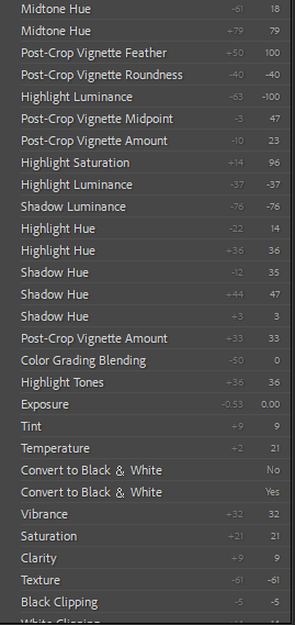
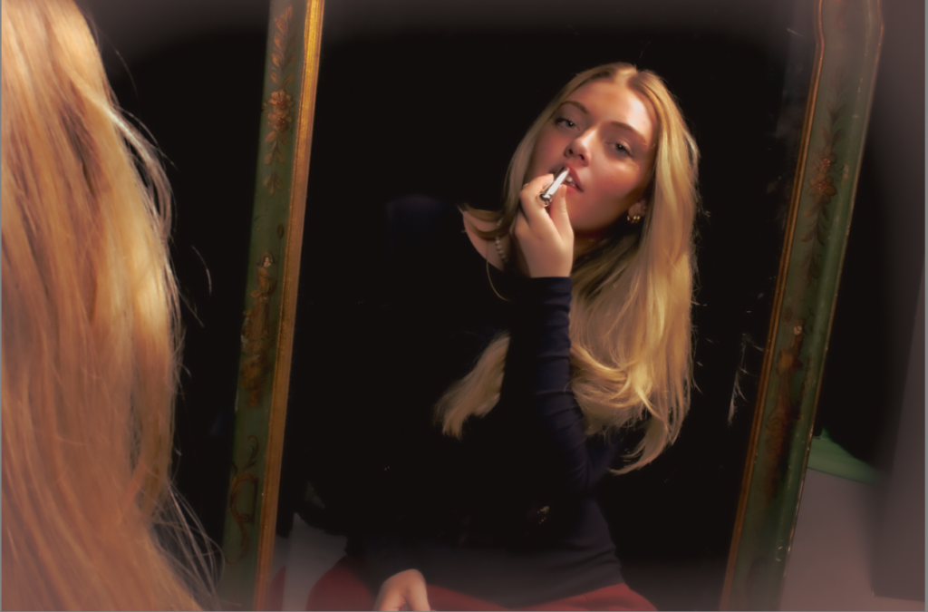
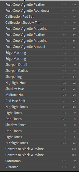
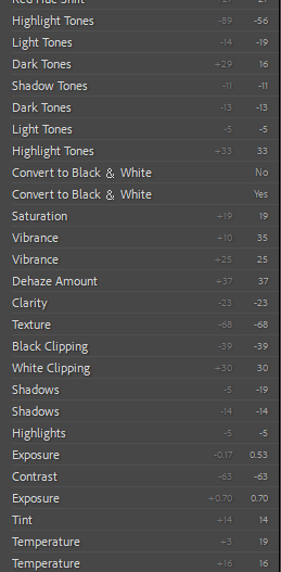
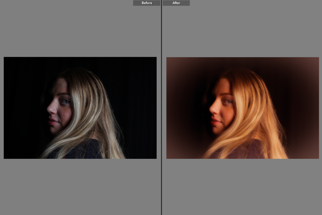
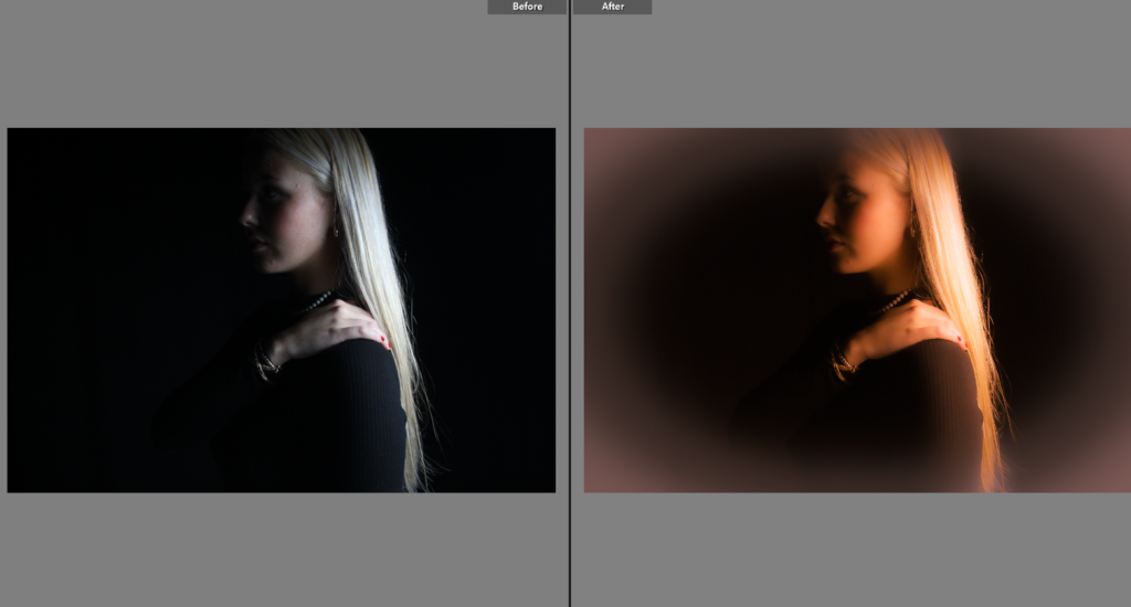
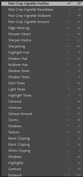
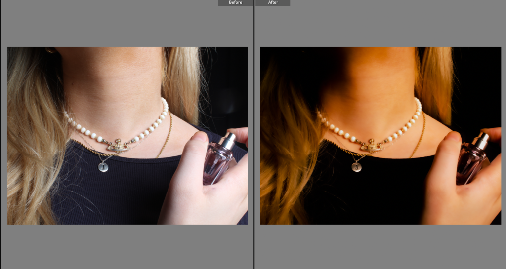
Firstly, I edited the image all in light room to begin, to edit it for it to look vintage and nostalgic so it does not look modern. Therefore, I added some warm tones with a dusty looking border feathering the edge.

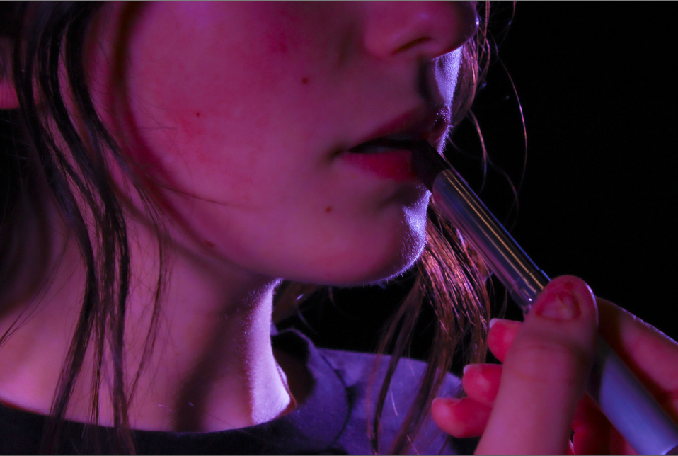
The main factor of this image is the red lipstick as it is a main subject which draws to the eye meanwhile having women’s rights movement connected and Marilyn’s large factor. As well as the red lipstick stereotypes as confident and bold. Therefore meaning, I cannot put this image in black and white as it defeats the whole purpose of the image. This isn’t my favourite image as it has a pink undertone and that is not my preferred aim.

The Jewellery of this image also creates a sense of femininity especially the pearl necklace as it relates to my inspiration Monroe as she was known and wore pearl necklaces frequently.

IMAGE 2

I personally chose this image as we are using the prop of red lipstick and a stereotype of red lipstick is confident and seductive and in this image the subject looks both of the stereotypes. Another reason why I chose this image is Marilyn was seen as a sex symbol and a seductive blonde and I think this image perfectly relates to the seductive and beauty look within femininity.

IMAGE 3

I chose this image as the subject of the image is pouting which is a very feminine act or pose. The subject also has very enhanced cheek bones which could be seen as feminine however can also be masculine. The subjects eyes are looking away which is a main factor and draw catching to the image. The eyes are very detailed and feminine as well as the long blonde hair.

IMAGE 4

Further more, I chose this image as it is using Chiaroscuro lighting and as you cant see the rest of the face because of the lighting and shadows it could be seen as mysterious. The hair and the gleam in the subjects eye is seen as beauty which is a femininity stereotype. I edited it to look vintage and old using warm tones like Julia Margaret Cameron. I could relate this image as Cameron’s work instead of Monroe’s as this is a self portrait and does not contain the main factors to make it a Marilyn photo.

Image 5

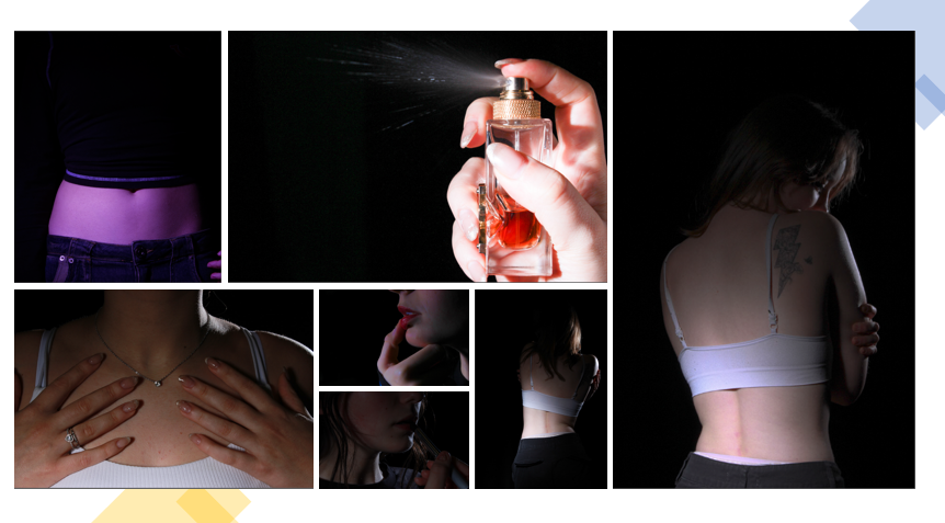
I used this image as it also is using Chiaroscuro lighting and the jewellery and the red nails create a sense of bold, confident and feminine.

IMAGE 6

I chose this image as it is different to the others and gives variety. This image is seen to be feminine through the jewellery and perfume. Even the collar bones could be seen feminine.

IMAGE 7

I chose this image as the image is using Chiaroscuro lighting and the subject is looking away whilst smiling which ultimately looks elegant and gentle which is a female stereotype. I edited this image tom look vintage as Monroe was in the 50’s so I want them all to come out not looking modern. This relates to Julia Margaret Cameron’s images as she did pictorialism in the 19th century.
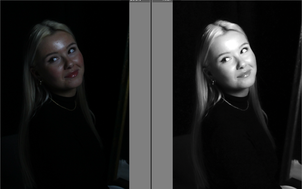
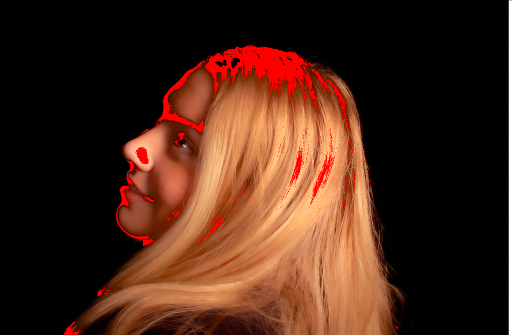
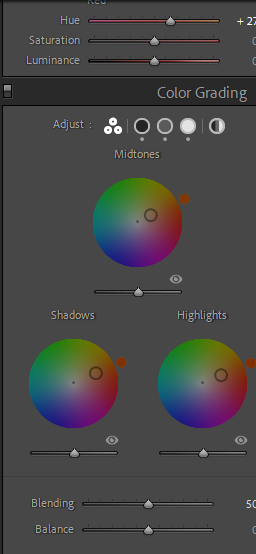
I then decided to experiment and add red highlights which I thought looked cool however it didn’t fit with my inspirations and themes so I decided not to keep it that way.

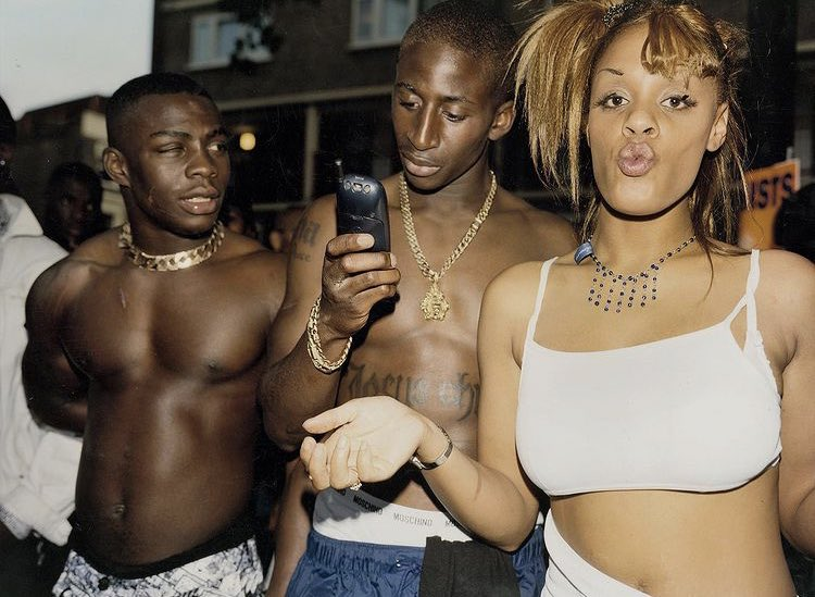
photoshoot inspired by Liz Johnson Artur.

Inspiration:

Outcome:

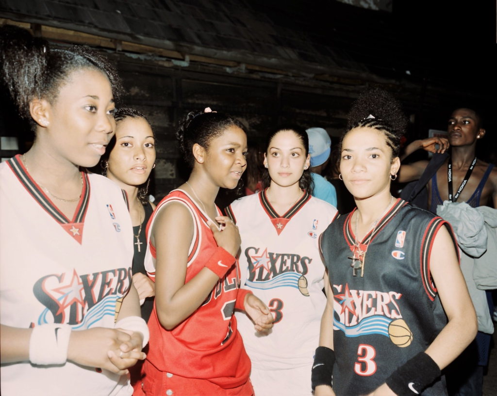
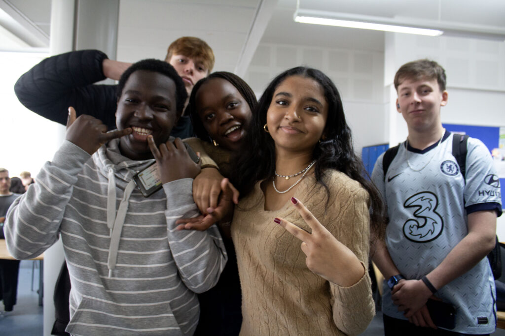
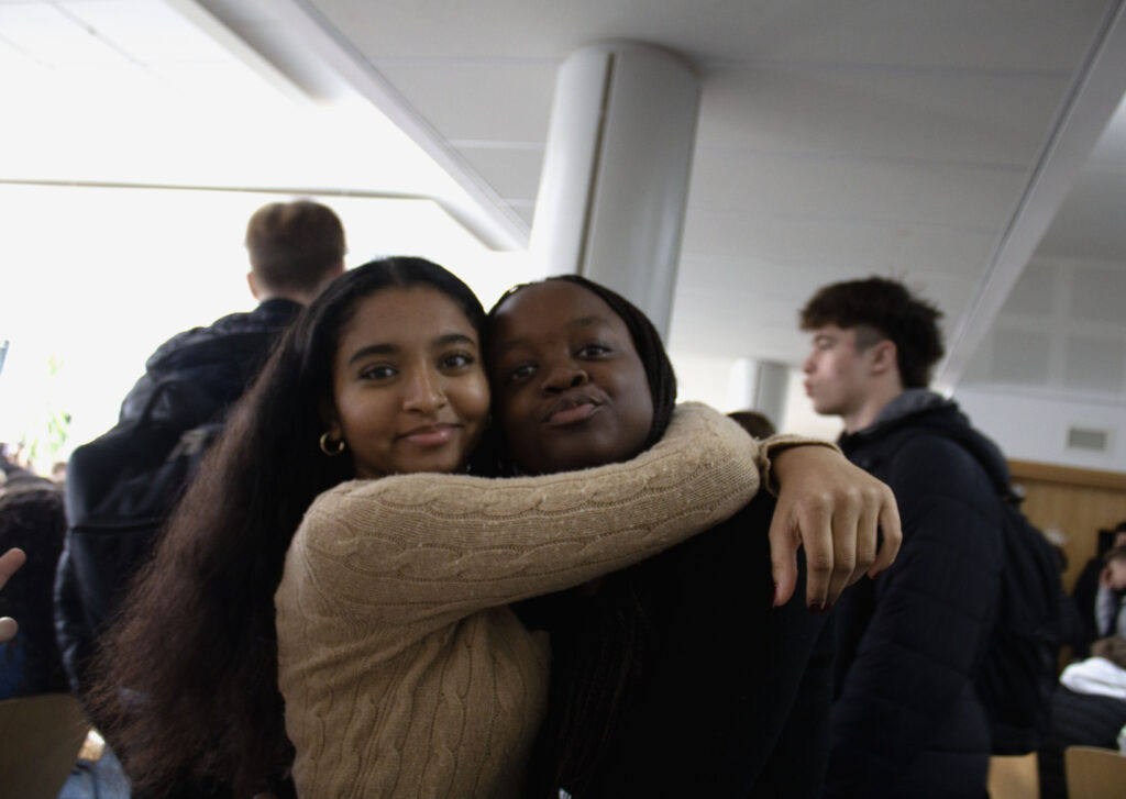
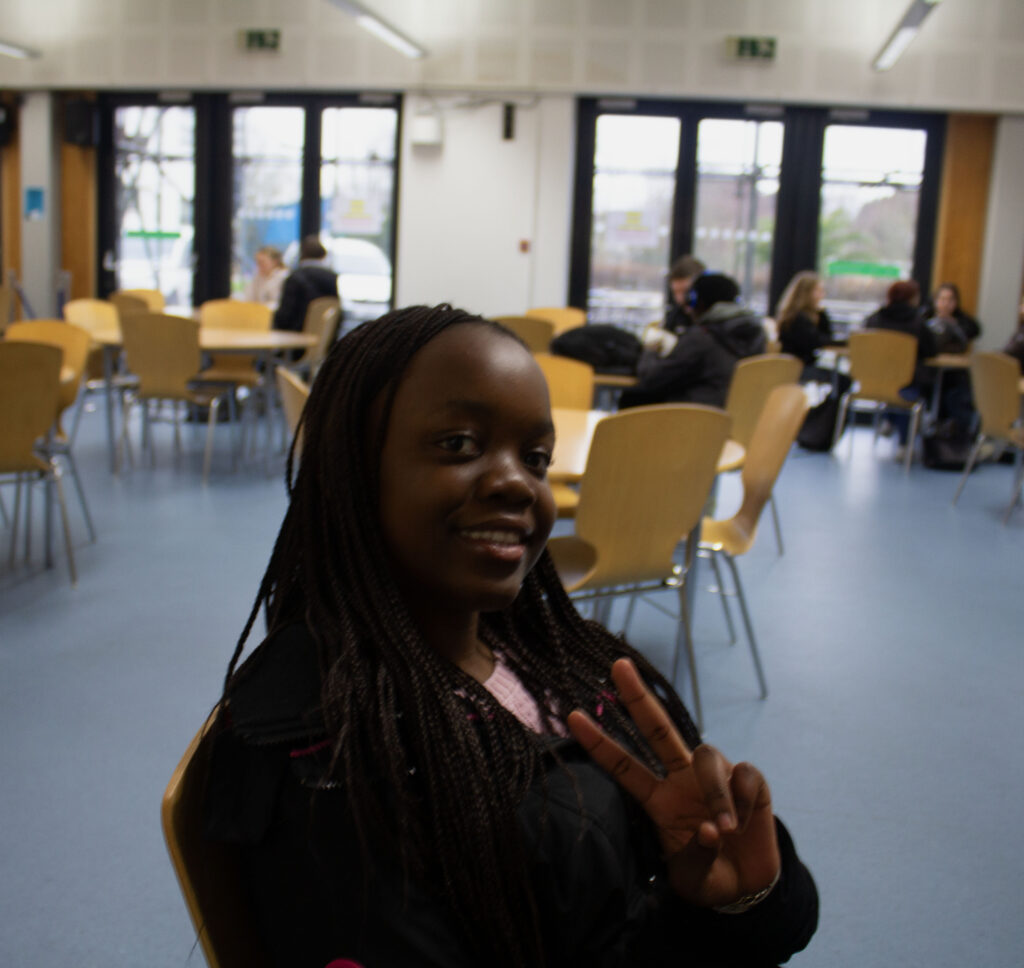
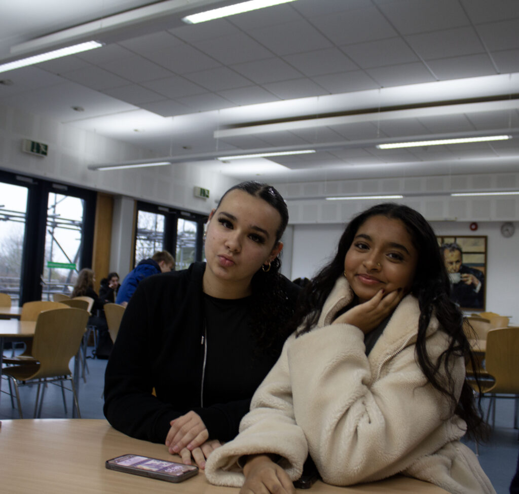
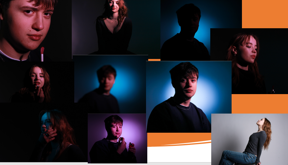
This type of photoshoot is also based on how people dress, how the different races wear certain clothing, how boys wear different clothes to girls, boys tend to wear baggy jumpers and girls tend to wear tighter jumpers with crop tops. Each gender and race don’t have a particular clothing they should wear, they just tend to stick to normality and what each gender is expected to wear. Most of these photos weren’t planned therefore they are more neutral and aren’t set up, most people only has a few seconds to pose which makes the photo seem less planned and more in the moment.

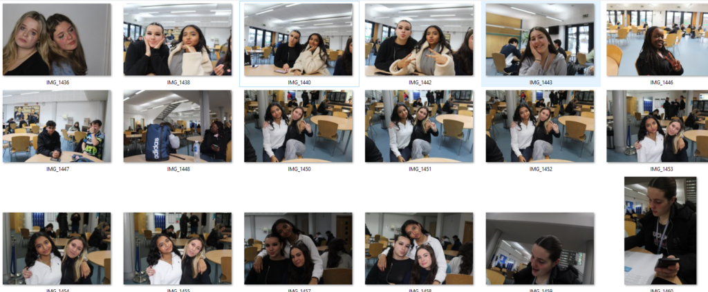
Here I went round my school and took picture of the students with different races and ethnicities, this is meant to show that everyone is equal no matter the colour of your skin or what language you speak, I look at an artists Liz where she focused more on race and how that certain race acts as a whole, what most of them have in common and heir hobbies, i tied to make my photoshoots have more people who could look similar or the total opposite. I chose the best photos that i took to present and left them in colour as the artists did the same, this type of photoshoot is based on how people act in general and why they act certain ways, for example there is a stereotype that certain races are better at dancing then others. This could be looked in a way where everyone is unique and has an opinion, although the theme isn’t masculinity vs femininity
Artist References – Femininity and Masculinity

Claude Cahun

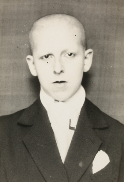
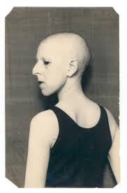
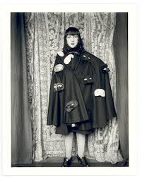
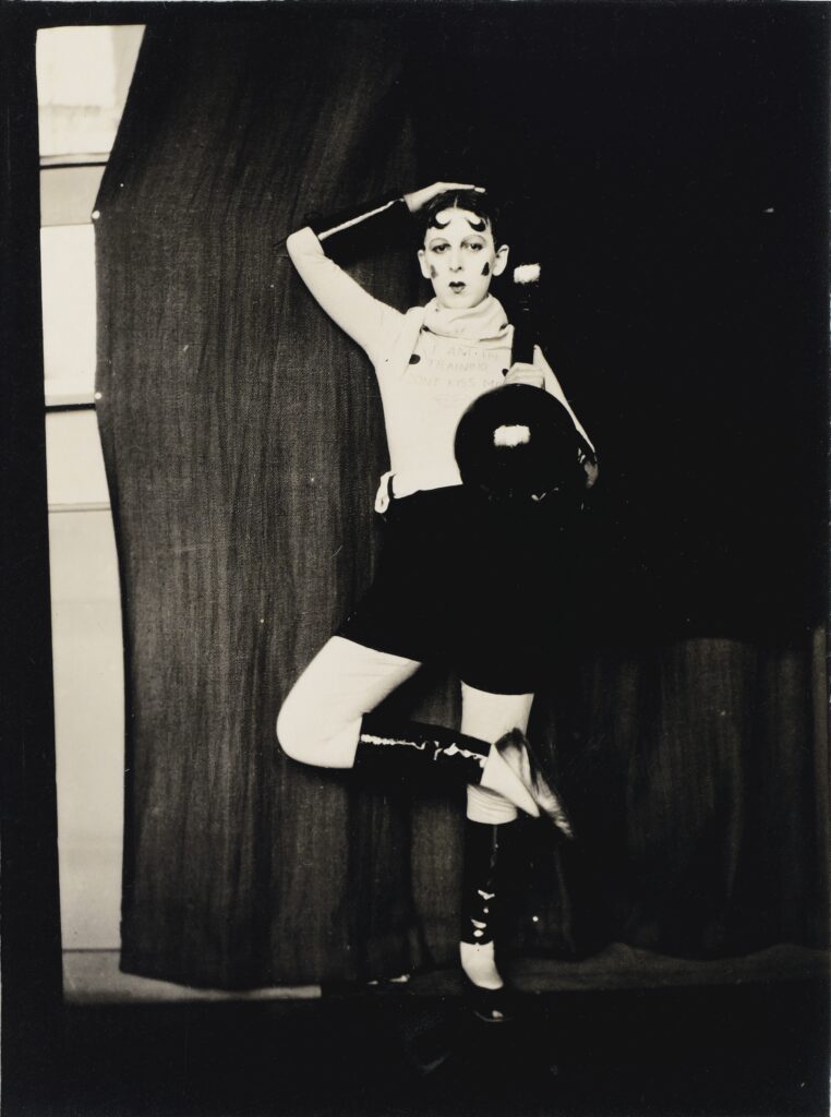
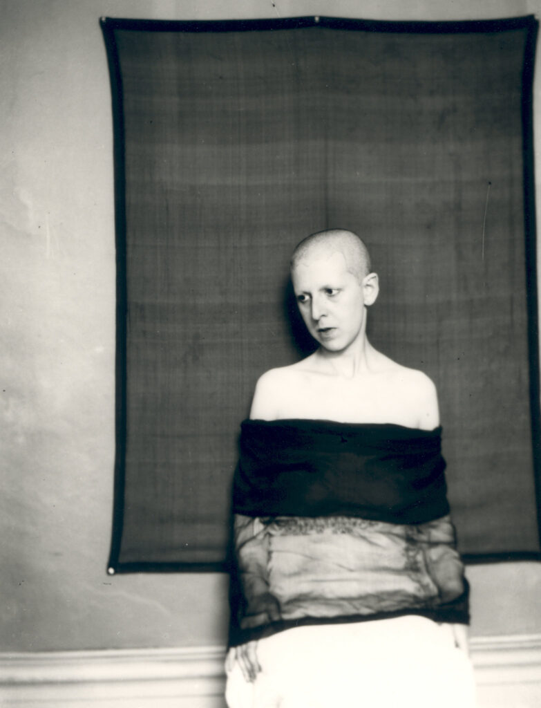
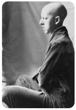
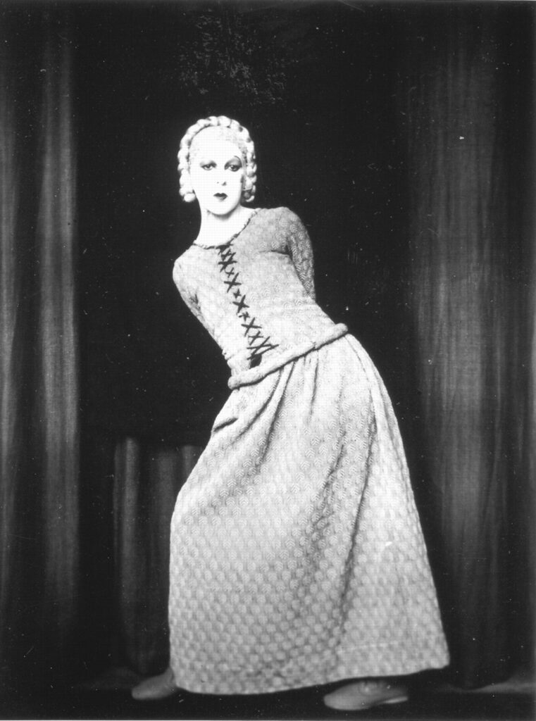
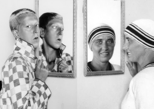
Claude Cahun, also known as Lucy Renee Mathilde Schwob, was a French genderfluid surrealist photographer, sculptor, and writer. Cahun was well known for her androgynous appearance, which challenged the strict gender roles of her time.
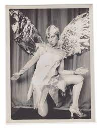
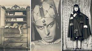
Cahun was also well known for her surreal self-portrait photographs which show her dressed as different characters. She questioned the accepted status-quo, particularly the position of women, through her art and in the way she lived her life.
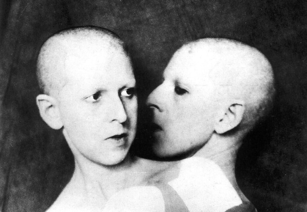
She began making photographic self-portraits as early as 1912 and continued taking images of herself throughout the 1930s. She experimented with gender presentation and the role of the viewer to a greater degree.

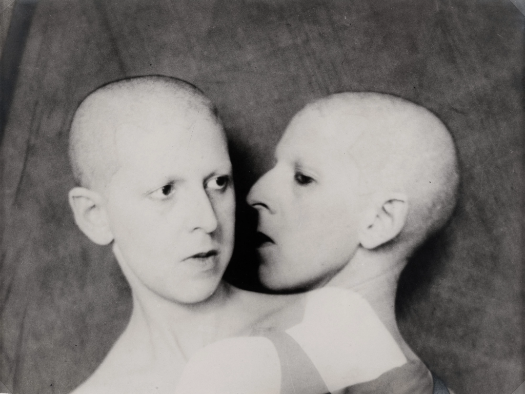
She often used the double exposure technique which is a technique that layers two different exposures on a single image, combining two photographs into one. This technique is seen being used in the photograph below.

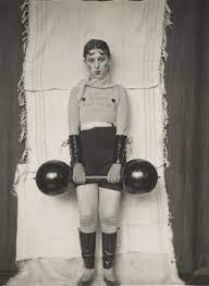
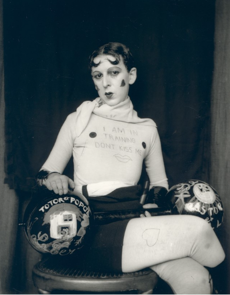
Some examples of Cahun’s work:

I have chosen to analyse this self portrait because I find it quite interesting, the pose Cahun has chosen makes her look feminine however her leg positioning makes her look dominant and somewhat powerful. In the background we can some sort of black board which makes a portion of Cahun’s body stand out and allows us to pay more attention to the details of her outfit and face.

The image is quite over exposed which has caused the details of her face and body to be almost invisible, I believe she had used a slow shutter speed and a tungsten light. I think the meaning behind this image is that Cahun was attempting to experiment with gender with her androgynous face and appear to look more feminine however I think she tried to add elements of masculinity within her leg positions and quite flat chest.

I’ve chosen Claude Cahun as one of my inspirations because she explores the themes of identity and femininity + masculinity very well, I also enjoy her style and abstract ideas, as well as the way she has challenged gender stereotypes and her identity.

I like how Cahun has used various outfits that play around with gender and identity as well as the use of masks in one of her photographs which I think relates back to a quote she had said;

“Under this mask, another mask; I will never finish removing all these faces.”

(Claude Cahun, Disavowals, London 2007, p.183)

I believe this quote meant that Cahun had many identities and wouldn’t stick or be fixed to just one of them. It could have also meant that she would never be clear of what her identity really is.

In future photoshoots I would like to use elements that Cahun has used herself to inspire me and my work, I would like to incorporate her bold style such as her poses and the use of makeup.

Tsoku Maela

“An archivist of a future African past in the present time”

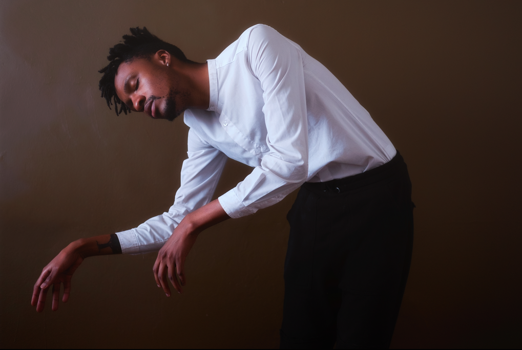
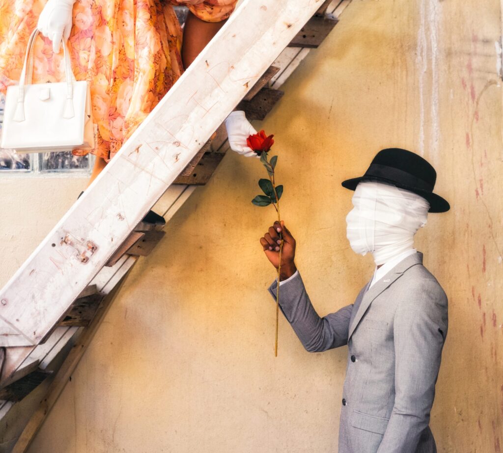
Tsoku Maela is a South African visual artist, suffering from anxiety and depression, who works predominantly in photography, film and text. His work navigates the human condition through the body, psyche and environment, his work scouts for ways to define human connection through exploring the themes of strength, willpower, life and death which all links to the theme of identity. He had started to take photographs to translate his thoughts and experiences into images, as a means of finding himself after he had experienced a perplexing medical emergency.

Maela had began his journey through capturing surreal, metaphorical self-portraits and using digital manipulation to realise his visions, channelling dreams into tangible realities. He had moved on to street photography then to sophisticated and thoughtful portraits and narrative series.

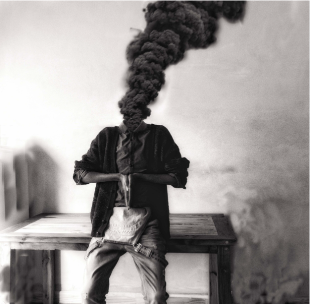
His is widely known for his “Abstract Peaces” self-portraiture series which studied and reflected on a subject at different states with their mental illness. In this body of work, he creates images that are meant to demonstrate an artists’ battle with depression.

He also reflects on the violent and destructive doctrines of manhood, Maela aims to open up a dialogue among men and boys about their own belief systems in the construction of contemporary masculinities. He also aims to destigmatize mental illness especially in the black community.

He has a book named “Book of Maskuline” which explores ideas of gender socialisation, particularly with respect to forming behavioural practices in masculinity, by drawing parallels to the biblical story of Jesus and his relationship with God.

He is inspired by many other artists such as Samuel Fosso, David Lynch and Frida Khalo.

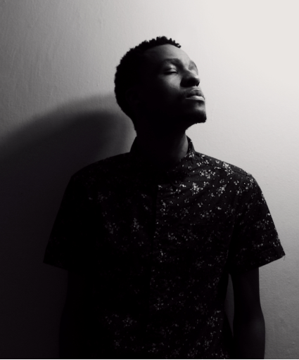
Examples of his work:

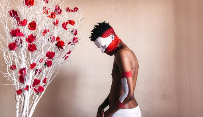
I have chosen to analyse this self portrait of Maela because I think it ties in with the theme of identity quite well and because it had caught my eye. I think Maela had used natural lighting in the making of this photo and a well balanced white balance.

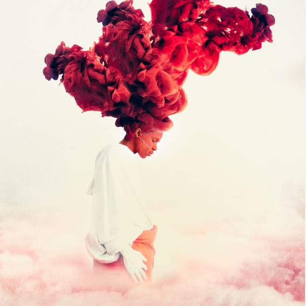
I think the meaning he had tried to convey in this image is that he or other men aren’t allowed to speak about their feelings regarding their mental health, Maela may have felt as if he was unable to speak up and be able to be free, I believe he had added the tree with roses to symbolize freedom.

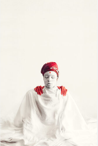
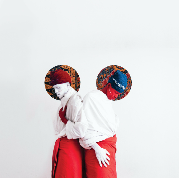
I like how Maela has used red and white because it creates a nice contrast and it complements his skin tone and the background which I find makes it more interesting.

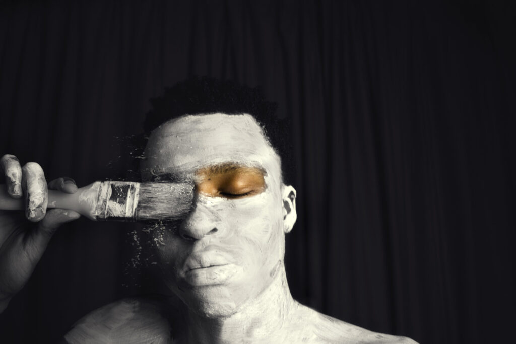
Many of his photographs are self portraits, Maela is either seen engaging with a prop, such as a rose or paintbrush, or is digitally altered in some way in hopes of more accurately catching the essence of what it’s like to live with depression.

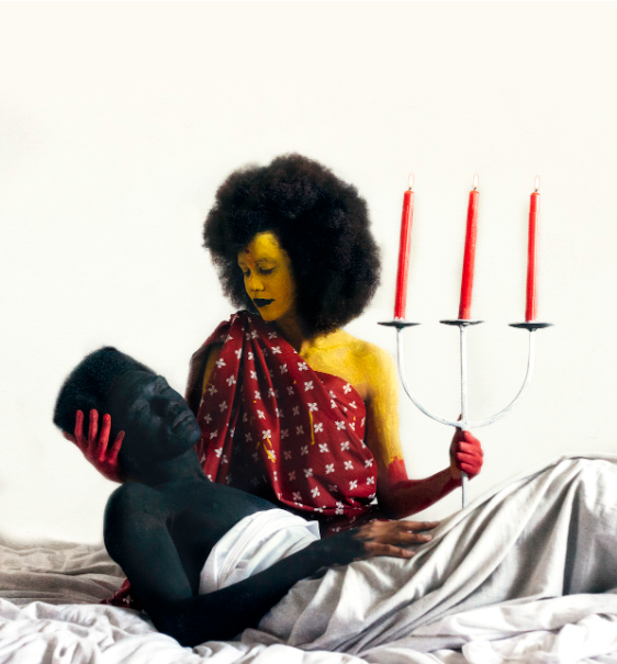
I have chosen Tsoku Maela as my second inspirational photographer because I also enjoy his style. I like how he has explored identity as well as mental health. I am inspired by the use of bright and bold colours in the majority of his work because I believe colour can reveal meaning and story behind some photos, it could symbolise or represent things or even just brighten and image and make it more interesting, however I also like the use of monochrome to create a more dramatic or old affect.

The way Maela uses his own traditional cultural clothing to show his identity inspires me a lot as it explores the theme of identity and his own cultural background.

I like the use of dramatic poses and blank expressions that use uses within his work. I would like to incorporate elements of this in my own work to show where I have gained by inspiration from for my photoshoots.

Comparison

Both Maela and Cahun explore the theme of identity, however they explore it in different ways. Maela focuses more on Masculinity, mental health and religion, while Cahun focused on challenging traditional ideas of gender, sexuality, and identity.

Both photographers use drama whether it’s through make up, bright colours or poses. I think this adds more to the theme of identity because it could be how they present themselves in person and it also adds more meaning to the images to maybe show how dramatic or serious identity is to them personally and maybe to others that they are representing, Cahun may have represented the genderfluid community.

Cahun refused to conform to gender norms, adopting a masculine appearance and using gender-neutral pronouns to assert her identity, while Maela is tries to catch the essence of what it is like to live with depression as well as reflect on the violent and destructive doctrines of manhood and masculinity.

Both of these photographers have an abstract style, their work challenges the norms by using bright colours and outfits. They use themselves to convey the meaning of their work and beliefs.

Femininity Contact Sheet

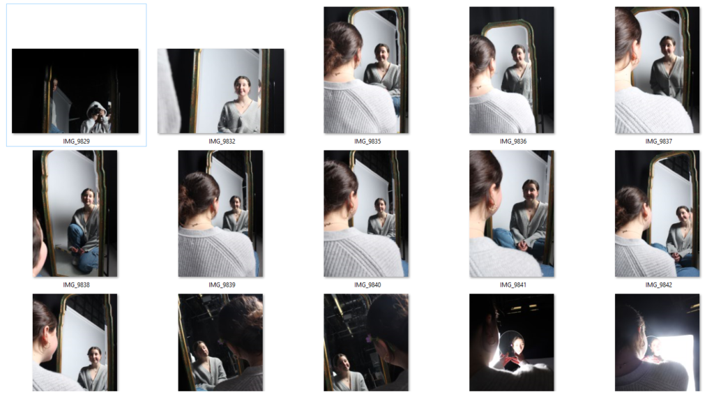
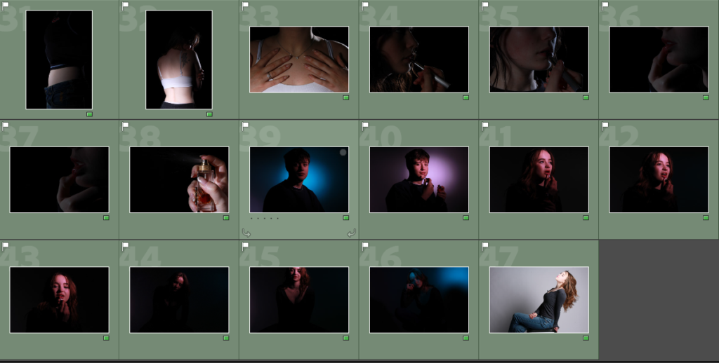
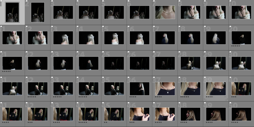
These are my femininity photos and the inspiration was from Cindy Sherman. The lighting is quite bright in the images where I’m holding the mirror so that it makes my face stand out in the small mirror. The images where I’m in front of the mirror shows that vulnerable feminine position. It shows exposure and vulnerability.

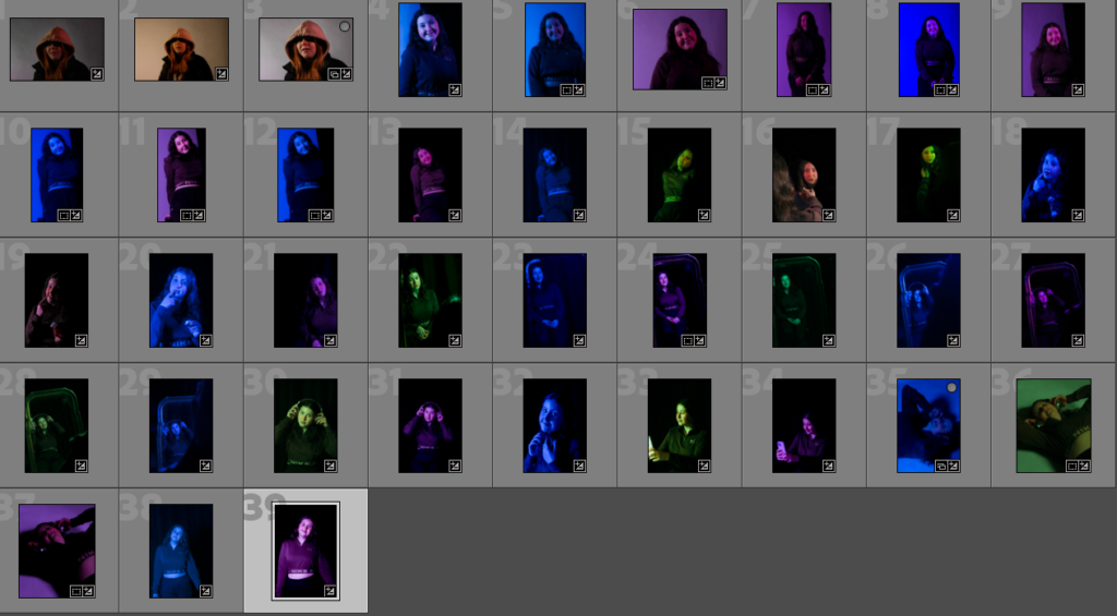
The colour in these images shows the pink being for a girl and the blue being for a boy and then I chose green for the other colour because it suggests being neither a girl or a boy colour and gave me the inspiration from Claude Cahun who dressed up as neither a boy nor a girl.

Photoshoot Action Plans :

Femininity :

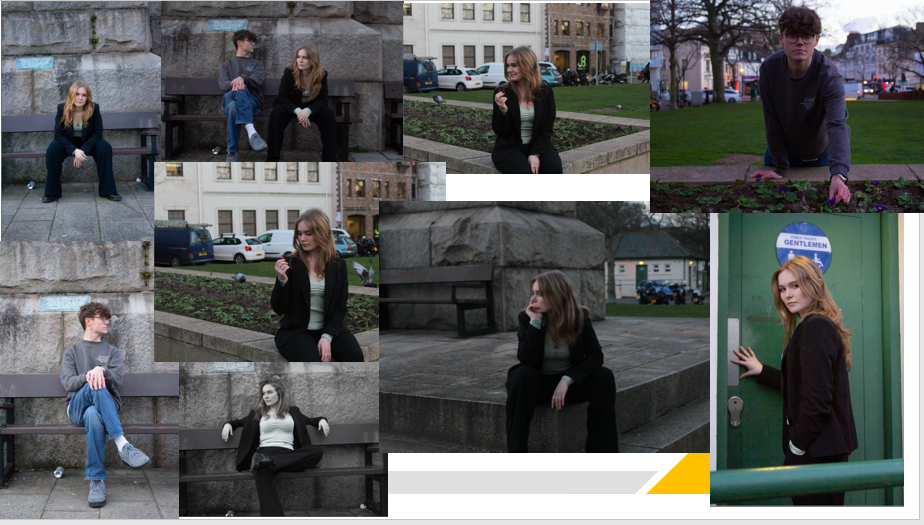
firstly I am going to find props and things I can relate to women such as a mirror, flowers, cute outfits etc. I am going to be photographing my friend Eden as the model for my photoshoot where I will take a range of images including various different poses both using and not using a mirror and other feminine props.

Masculinity :

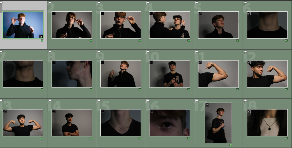
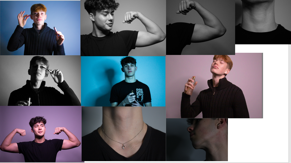
For this shoot I am going to be using my younger brother as my model, for the shoot I’m going to find many props that I would relate to men such as tools, muscles, strength and anything along those lines to represent and capture what a man is known as in todays society.

Editing

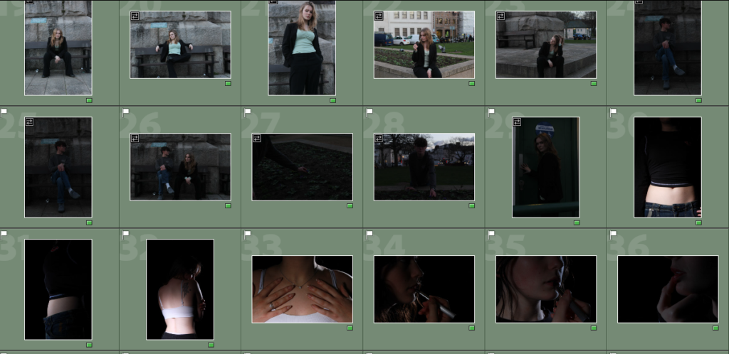
These are some of my favourite photos before i edited them highlighted in green.

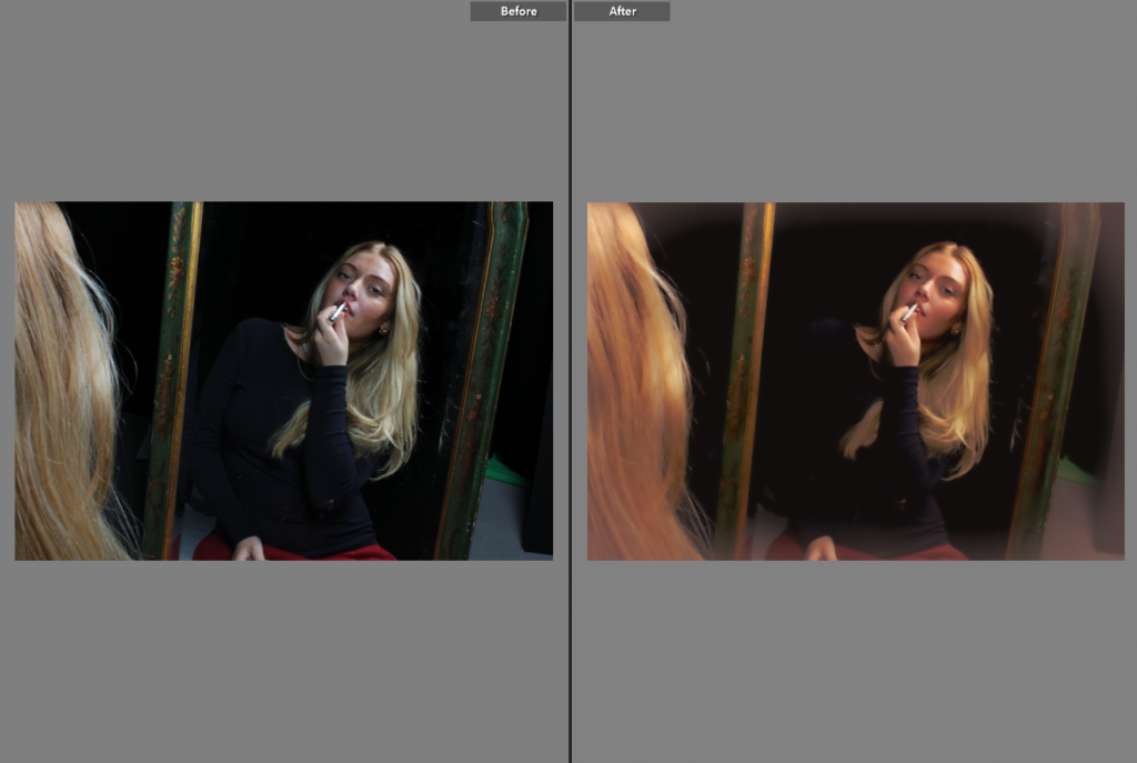
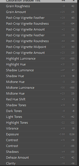
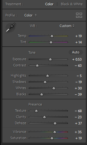
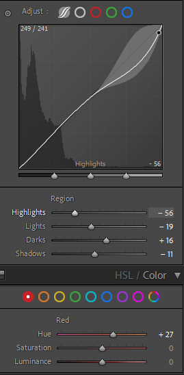
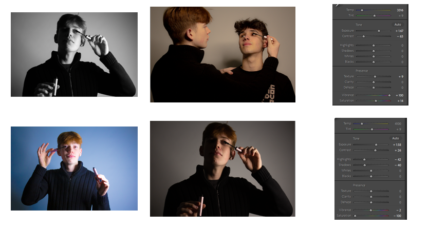
Examples of how I edited some of these photos

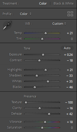
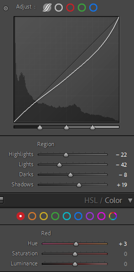
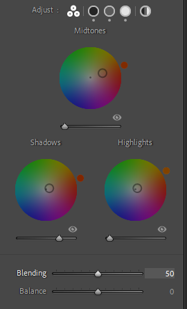
These photos were all edited on adobe Lightroom to mainly just alter exposure and experiment colour, I am now going to edit on adobe photoshop to finish my final outcomes.

While editing on my images for my final outcome I had no idea how I would present them, so was experimenting a lot on what seemed most like my inspiration and showed my pictures in there very best way.

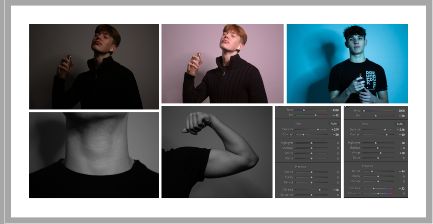
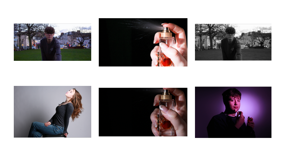
I picked a final few from each of my photoshoots that I am going to use on photoshop and make my final outcomes and placed them separately and highlighted them purple

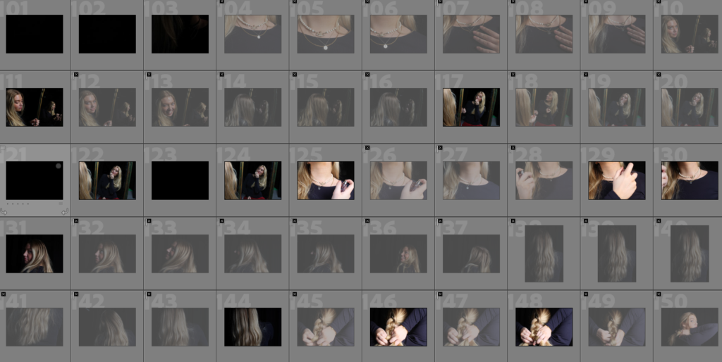
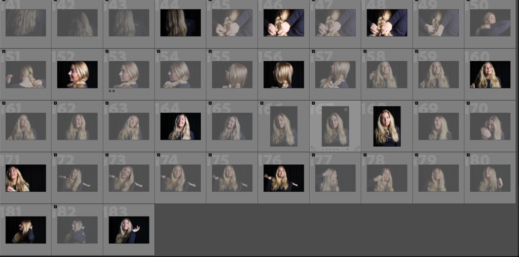
I went from 125 photos to 37, selecting the few I will actually present. These are also my first edits on these images, which isn’t much as I am generally just changing exposure in lots because they were too dark or I am changing colours of the photo either to black and grey or pink and blue to match into my theme.

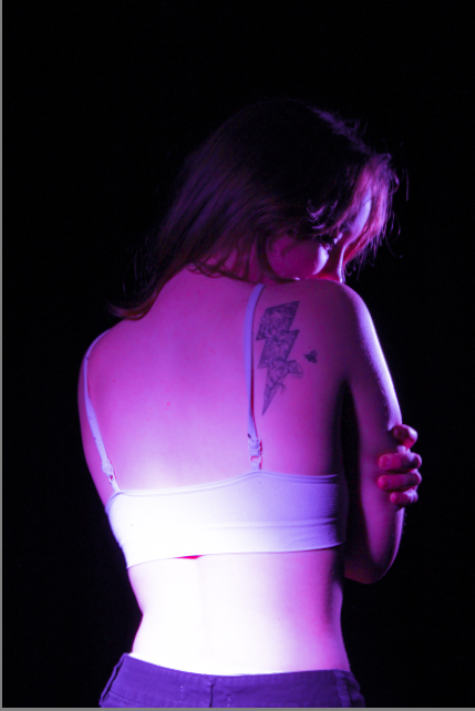
Majority of my stereotypical feminine photos are edited with a pinkie purple overlay lighting as I think it shows the feminine side more, as that is the colour most assumed with females, I also had more shadows on the women’s faces as a way to indicate they might be hiding there true self or having to hide from the world as they are a woman.

artist reference- Claude Cahun and Cindy Sherman

Claude Cahun (Lucy Schwob) was a French photographer and writer. she has a very good reputation for being one of the first people to explore gender fluidity through photography, making her working advanced for her time even through it would have been seen as quite controversial as gender fluidity would have been looked down upon by the majority of the public in the 1940s .

Claude Cahun was born on October 25th 1894 in Nantes France, who would later move to jersey in 1937 a few years before one of the most historical things would ever happen in jersey (the Nazi invasion). she would eventually have to hide her religion and her identity to pretend to be German. making her work even more of a risk during the occupation as the Nazis were against any sort of gender fluid idea as they wanted to create the “perfect race”.

Cahun photographed herself in many different outfits and settings in self portraits to explore many different identities. her reasoning behind this was because she liked the idea that femininity and masculinity could be altered and challenged in multiple different ways as shown in the photos above and bellow

this photo is titled “under this mask, there’s another mask”

Cindy Sherman

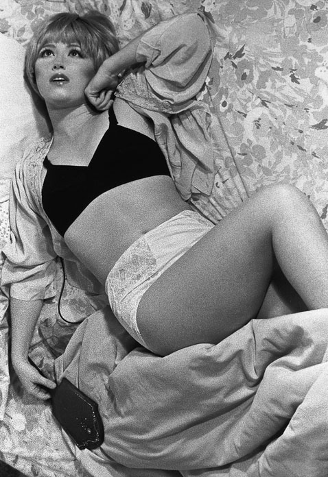
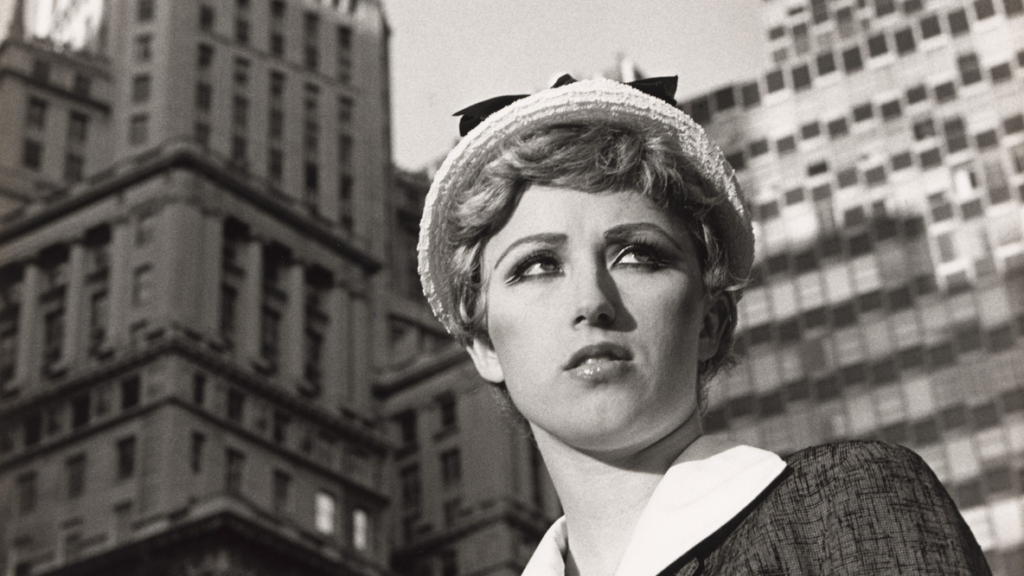
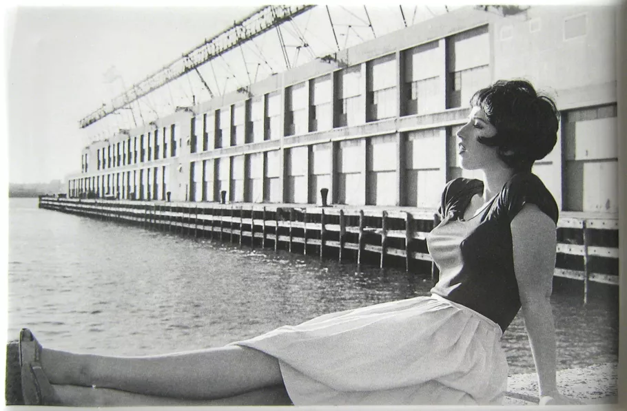
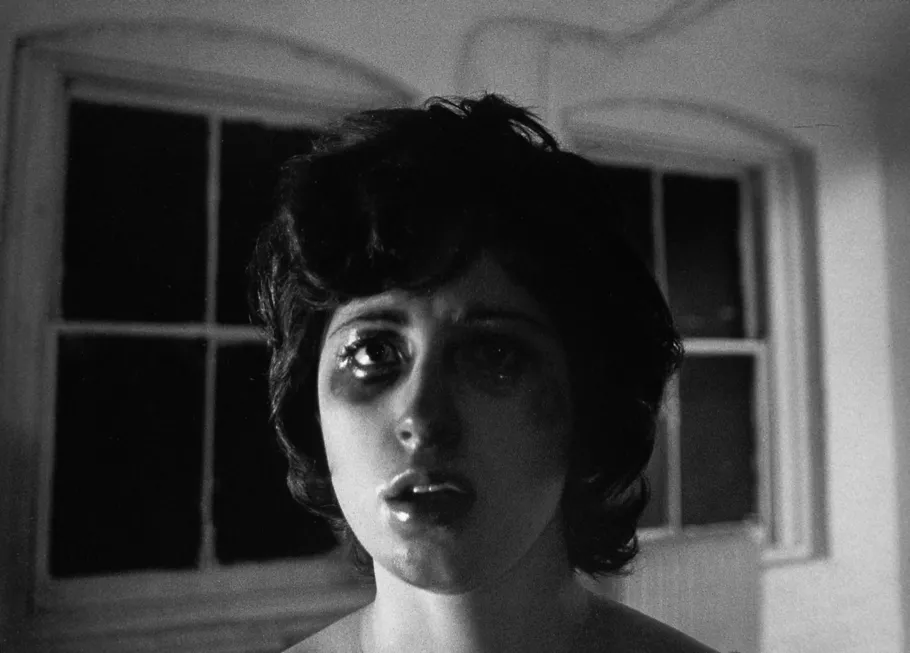
born in united states, in 1954 Cindy Sherman is a photographer who was known for her feminine characters and the identities she would create, it was as if she was playing a character in each photoshoot. she was the idea behind it all as she was the model, photographer, stylist and the make up artist.

over a period of 4 decades she took a numerous amounts of photoshoots exploring the idea on how to create and represent femininity. Cindy Sherman’s most famous pieces came from the “untitled film still #21” which was essentially Cindy Sherman in black and white photos where she would have multiple different outfits and personas.