Final outcomes and presentation-clare rae

Final outcomes:

Presentation:

Presentation 1:

Presentation 2:
Presentation 3:

Evaluation, critique and comparison.

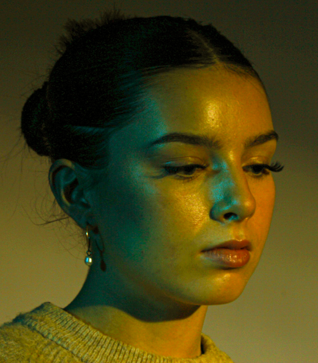
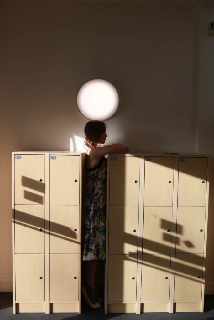
First of all, I think I really achieved that awkwardness Clare portrays in her photos. I did this by making the people who I am photographing in awkward and uncomfortable positions. By doing this, I was able to portray the ideas of performance and the gesture to interrogate and subvert domination modes of representation.

She uses her body to communicate word she is not able to say or doesn’t want to say directly. Her use of her body is a powerful message that implies that one can communicate without words. I think I successfully show this in my pictures. However in my pictures I wanted to show the awkwardness of being objectified. I was still using my subjects body to communicate my message but it was a different type of message.

The portrayal of a certain discomfort within my pictures due to objectification, can be taken personally or indirectly, just like Clare Rae. The use of her body to explore her own personal experiences is something that she makes apparent. I, however did not use myself in these pictures, which I should have, so that I could show how I was heavily influenced by Clare, herself.

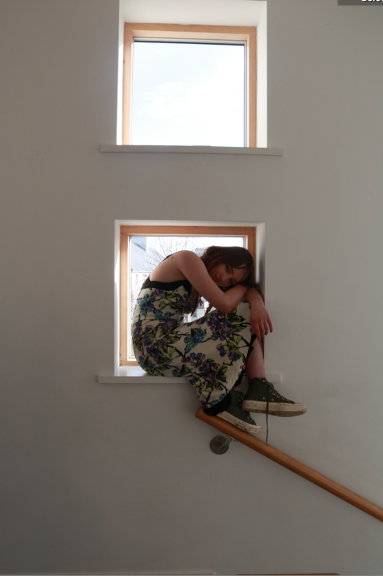
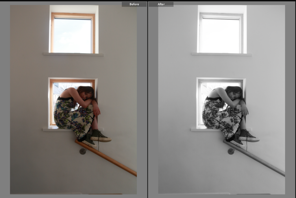
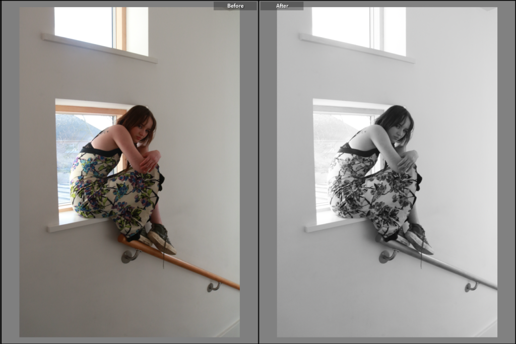
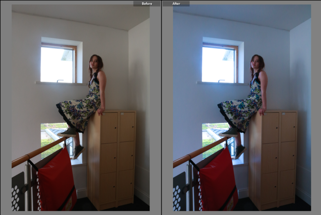
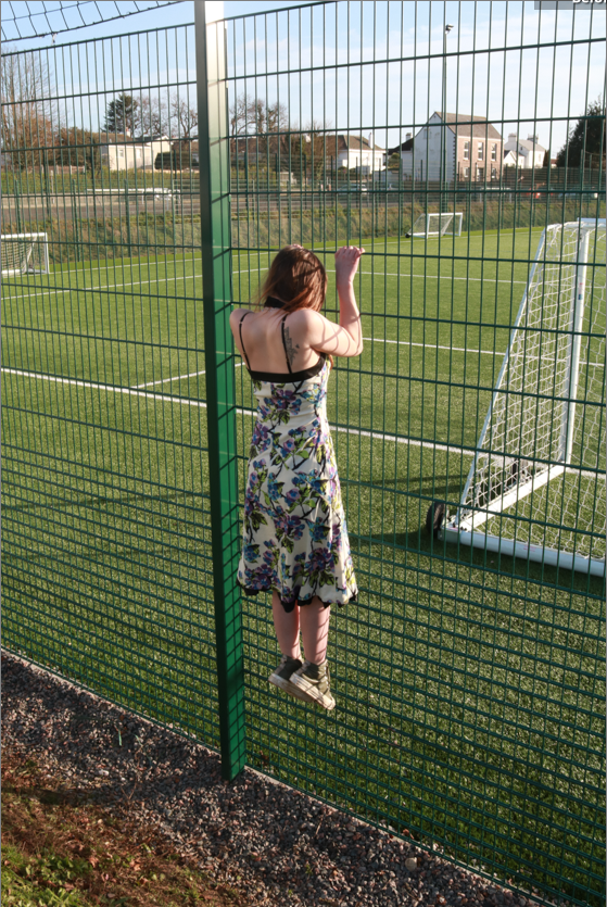
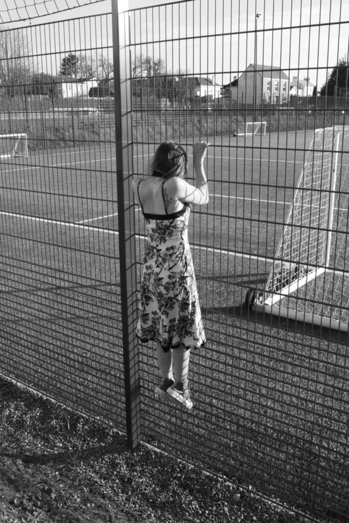
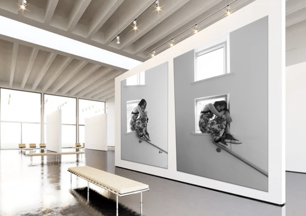
Furthermore, a way that I showed how heavily inspired I was by Clare Rae was producing a picture with similar settings and colours. As seen above, there is two pictures that shows a girl in a confined space just like what Clare did when she visited jersey and famously took a picture of her in a similar situation. That picture was in black and white so I also edited mine to black and white.

It also is evident that I have some coloured pictures and some black and white pictures, just like Clare Rae.

Overall, I think that my final products relates to Clare Rae’s work. I believe that, next time I should focus more on important details like, producing more pictures with a similar settings as hers and taking pictures of myself, like she does.

Presenting my final images & Evaluaton

As Collier Schorr is my artist reference I wanted to present my final images as a collage, so I started off by selecting images I want in my collage and putting them in a folder I probably won’t use all of the images in the folder but this is a good starting point.

Creating the collage

⬆ I started Selecting a few images and moving them around until I came up with this layout. I like the way the images positioned however I want to experiment even more and see if there are any other layouts I like.
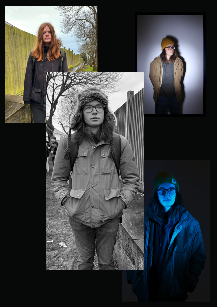
After moving the photos around I also came up with this layout I prefer this layout more than my previous one as I like the composition and the way the photos use the space more.

Virtual gallery

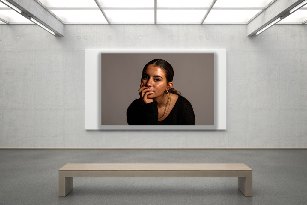
Above is my virtual gallery which includes my final images. On the left of the gallery is photos I took in the lighting studio which have been edited and used as my final images as they are the best outcomes from the photoshoots I did in the studio with the lighting.

In the middle is my response to Collier Schorr’s Americans collage which includes some of my final images which have been edited and placed in a collage form. This is also why I put it at the centre of my gallery.

On the right is some more of my final images but they are more natural ones and are more simplistic than my other final images but are still equally important.

Evaluation & Comparison

Overall I am pleased with my final outcome and all the time and work I put into this project.

I felt that my final outcome is quite successful as it is like Collier Schorr’s work but with a more modern feel to it, this is because my work resembles more of modern masculinity with the use of lighting and the studio in some of the photos. It is like a comparison to Collier Schorr’s photos which looks quite old and use more older men in the photos, some of the men are cowboys which gives her photos a more wild western feel.

However, there are some similarities such as the pose and facial expression in the main middle photo on both pieces of work which may hint that even though the idea of masculinity is changing, some things are still the same I also tried to use similar visual and technical references in the middle photo on my response, but for the other photos in the collage I tried to be more creative. If I could do the project again I would try and produce multiple outcomes and use a wider range of people in my photoshoots to make my photos more diverse.

FINAL PHOTOS.

These are the photos I have decided to place into the print folder.

I decided to first choose I Rembrandt lighting technique photo, this is due to a strong background and a strong pose whilst perfectly demonstrating Rembrandt lighting.

I decided to also choose these 4 photos to use in a sequences they all compliment each other. I tested how these would look in a row on photoshop with multiple backgrounds.

I picked these two photos to place next to each other with a black background, I think these two photos also compliment each other very well.

These two photos are my other Cindy Sherman inspired photos, these will be displayed on their own as A4 images.

Virtual Galleries.

I have also created virtual galleries for all 3 portraiture photoshoots of:

  • Cindy Sherman inspired photoshoot
  • Experimenting with lighting photoshoot
  • Rembrandt lighting techniques photoshoot

Cindy Sherman inspired photoshoot.

Experimenting with lighting photoshoot.

Rembrandt lighting techniques photoshoot.

Chosen Photos from photoshoot and Editing process

Picture 1: (no editing)

Picture 2: (no editing)

Picture 3:

Editing Process:

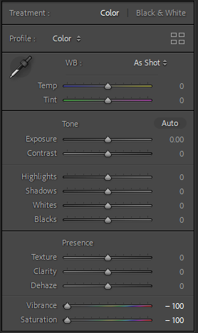
This is how I edited this picture

Picture 4:

Editing process:

This is how I edited this picture

Picture 5:

Editing process:

This is how I edited this picture

Picture 6:

Editing process:

This is how I edited this picture

Picture 7

Editing process:

This is how I edited this picture

Picture 8:

Editing process:

This is how I edited this picture