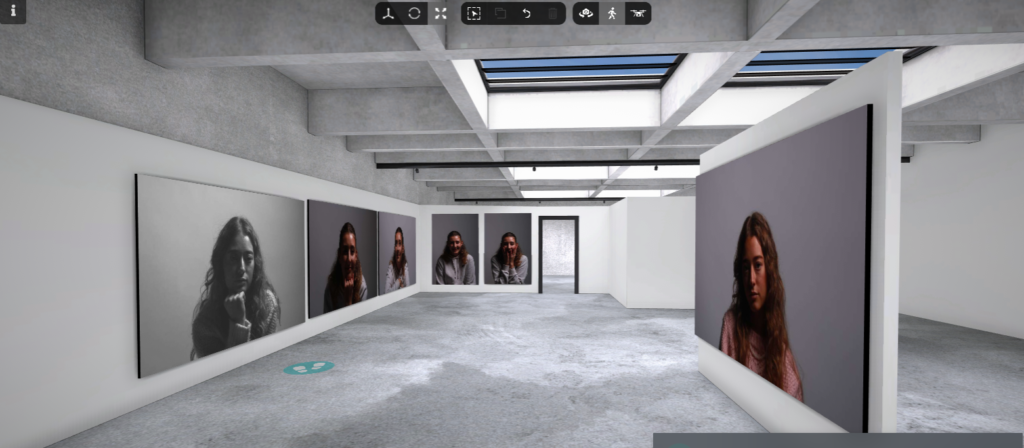
Cindy Sherman Femininity double exposure edit–
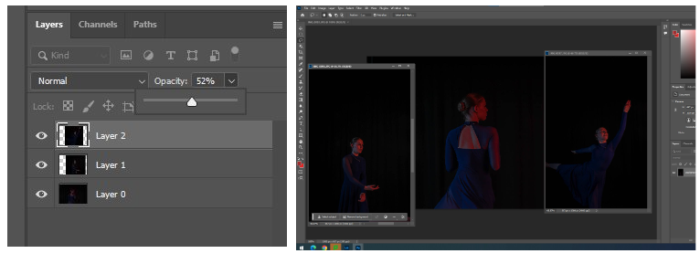
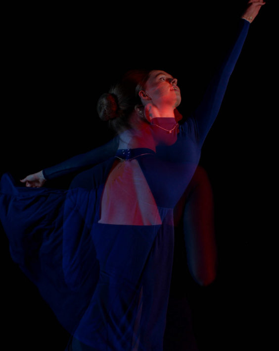
For this edit, I decided to use the technique double exposure. I used 3 different photos where the individual was holding different poses. These 2 photos were edited on Lightroom to increase the quality of them and then transferred to photoshop where I was able to change the opacity of one of the images so that they became transparent. I did this by getting my base photo and then dragging the other tab onto the base photo. from there, I selected the image one at a time and move it into place, adjusted the sizing and finally changed the opacity to about 50% Each of these images were taken with the addition of the red lighting so I decided to keep that common with the 2 photos so that they all had the red effect.
Evaluation of piece
This final piece links to Cindy Sherman’s theme of femininity. Sherman likes to step into different woman identities and show the femininity side of them. I think my edit links to femininity and Cindy Sherman well as the main theme of my photoshoot was Dance. Though it is more gender neutral now, dance has very commonly been viewed as a female sport. I decided to use this stereotype to my advantage and capture pictures of a dancer showing the beauty of dance and femininity. I think the 2 photos that I took worked well as they are both showing the individual from different angles. For example, the one of them shows the individuals hair in a typical feminine style and also the open back of the dance outfit. In the other photo, you can more clearly see the individuals face where she can be seen showing more emotion as she is smiling. Lastly, the photo that shows her in the position of an arabesque represents the individuals hands and arms, she can be seen posing in a typical dance way where the arms float in a beautiful and feminine way. I also like how I’ve decreased the blacks and made the individual herself more of a dominant feature in the image and got rid of the black curtain slightly showing.
I think I could’ve improved the way I photographed some of the images too. The one of the arabesque captures a lot of her body but I think it would’ve made a better image if her hand was in frame and my foot was in frame to show the ballet shoes.
Evaluation of piece
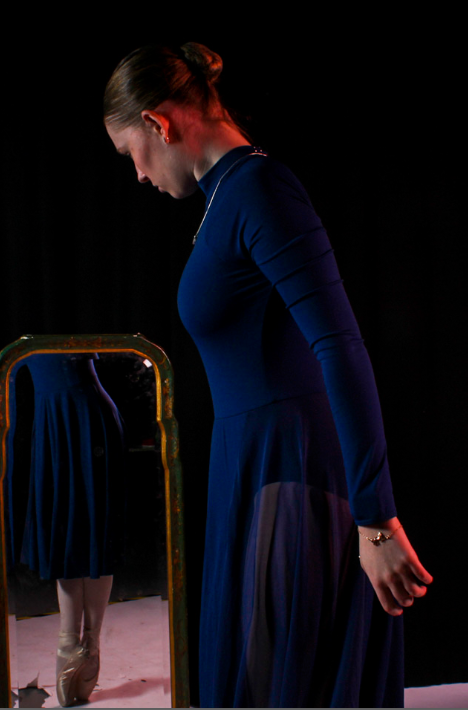
Overall, I like both of these images as they use the technique of reflection. In the first image I have managed to include the whole body in the shoot as the reflection of the ballet shoes are in the mirror. I think this is a good effect and further shows the theme of femininity that I explained in the last edit. I think showing the ballet shoes is important to bring across the theme of dance and to show a tricky skill ballet dancers are able to achieve. I also like the affect if red lighting that reflects off the back of the individuals head almost like she’s blocking it. Thought I really like this image, I blacked out the background but wasn’t able for the white flooring. I think, if it had been possible, the photo would have looked much better if the flooring was also black so bolden her ballet shoes a bit more.
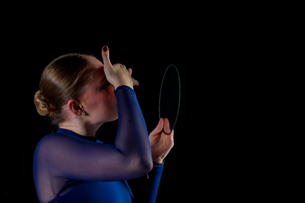
The second photo I one of my favourites and also aims to use reflection however the view of the reflection is not visible. This photo also shows femininity as its stereotypical for females to be linked to make up and beauty. In the image the individual can be seen attempting to touch up make up which shows a basic trait of a typical female. I also like this image as it was not planned and it was a natural photograph to take as the model wasn’t aware and was simply just going a natural thing. The angle of this image also shows other similar factors of femininity such as jewellery as the earring is very clear as it is directed right at the camera.
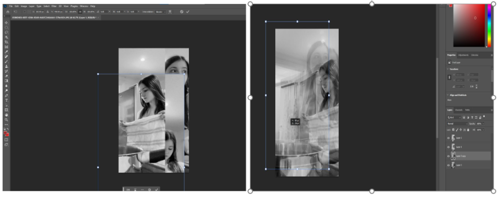
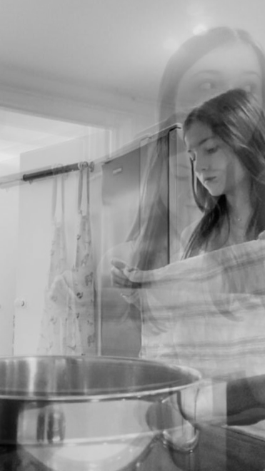
This edit was also inspired by Cindy Sherman’s theme of femininity. There is a handful of photos that Cindy Sherman created where it pictured a female in the kitchen. I decided to take this idea into my own hands and create my own take on it. As I used the same technique as the edit above, the editing process was similar. by getting my base photo and then dragging the other two tabs onto the base photo. I changed all of my photos from full colour into black and white as that was what Cindy Sherman did wit her photo. this also creates the effect of an older photo like hers was from there. I selected the image one at a time and move it into place, adjusted the sizing and finally changed the opacity to about 50%.
Evaluation of piece
Overall, I like this edit however I think the photos would be more effective if they were used as 3 separate ones mounted together and not in a double exposure edit. But I also like the use of double exposure as it shows3 natural film stills merged together to form some sort of story. I used photos at different angles however, each photo doesn’t show the individual looking into there camera which can create a more natural looking photo. The pose for the largest photo was inspired by one of Shermans most famous photo where she is looking over her shoulder. This could create a sense of fear or unknowing for the viewer as they cant see what the person is looking at as it is out of the frame. I think the use of black and white worked well as with colour, the double exposure could have made it look a bit confusing a busy.
This photo shoot links to femininity as years ago is was stereotypical for females to be more commonly pictured in a kitchen working at home and not in a work place as that would be for the men. I have the pan showing in the photo which will further bring across the fact that the setting is a kitchen. as well as the apron hanging on the door and the kitchen towel acting as a prop. I think I have done well to recreate Cindy’s ideas as well as adding my own twist on it.
Cindy Sherman Face Distortion
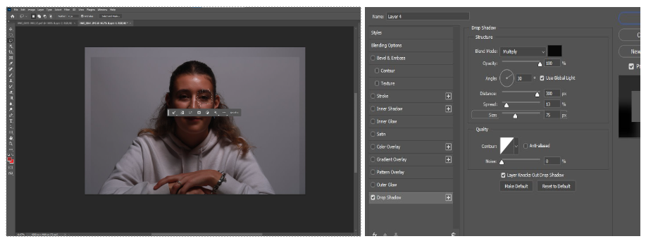
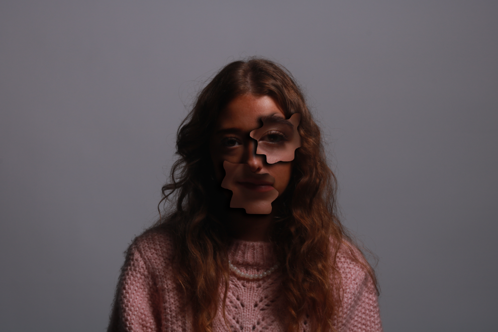
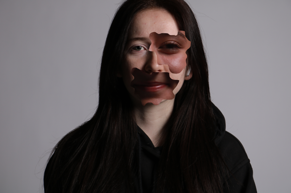
This final piece was also inspired by Cindy Shermans more recent work. I did these two edits by getting two portraits and choosing which one I was going to cut out and white one I was going to cover. I chose the photo and then used the lasso tool to cut out part of the eye and part of the mouth like Cindy Sherman also did. On the top photo I used the effect of a drop shadow to make the cut outs stand out more and on the second photo I kept it normal.
Evaluation of piece
I like this final piece as it is showing female facial features from not just one person. I think it was also an easy process for a good outcome. I think I did well to explore different techniques likes drop shadow. I like the use of the drop shadow in my images as it boldens the cut outs to further show that its out of place and makes it very apparent to the viewer. Though I used drop shadow on one, I do prefer the photo without it. I also like this photo more because I’ve enlarged the features to make them look more out of place and it also has more of a difference in skin tone than the top one so it pops out more.
In some of Sherman’s photos she also used the technique of black and white contrasting onto coloured portraits. I decided not to do that as I think the difference in skin tones also have a good effect. This photoshoot highlights parts of a female face by also making it look unusual and unique. This type of edit could be a representation of being insecure about yourself and Sherman takes that to another level by putting together an abstract piece and still managing to make it interesting and unique.
Duane Michaels film stills
Photo inspiration:
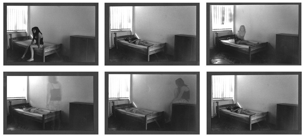
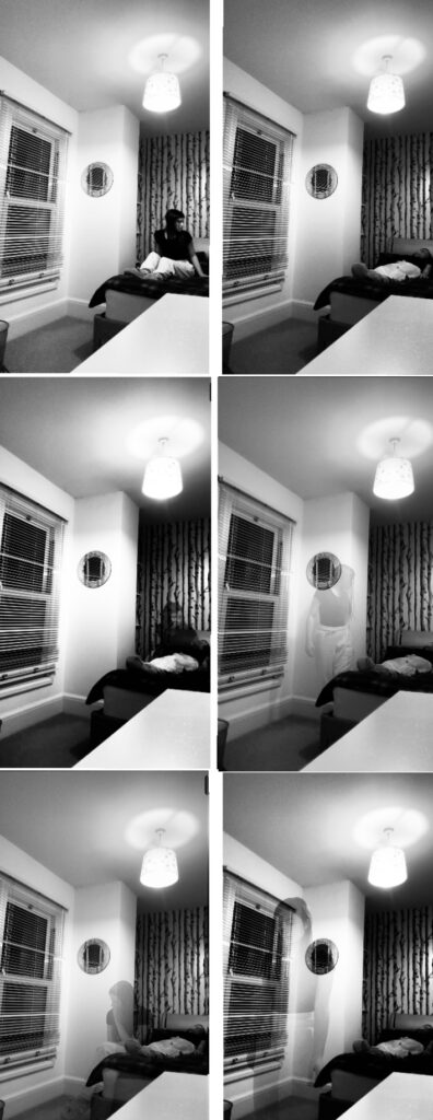
This edit was inspired by Duane Michals who is well known for creating photo sequences. I took this idea and recreated it myself. To edit this, I simply needed to work with the base photo (which was the individual laying down) and then layer the other photos above it and adjust the opacity. I also decided to make this shoot black and white as that was what Michals does in the photo I am most inspired by.
Evaluation of piece
I did a similar sequence of photos to what Michals did in his and I think mine also turned out well however if I did it again I think I would’ve preferred a landscape sequence of photos like Michals did. I like this final piece because it was a simple process however it is definitely not my strongest. I think the use of black and white worked well as it brings across the fact that the sequence of images isn’t very happy and it is more showing emotions of sadness, guilt, worry and anxiety. This photo was taken as a self portrait and I did not have access to a camera so my own resource was my phone. This is a negative as it means I wasn’t able to achieve the highest quality for my images. Another negative is the angle I chose, I think it would’ve looked much better if I had done it landscape and maybe included the whole bed in the frame
Duane Michaels Mirror Reflection
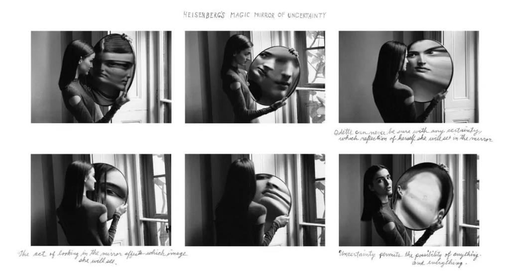
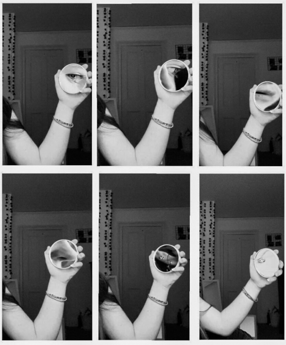
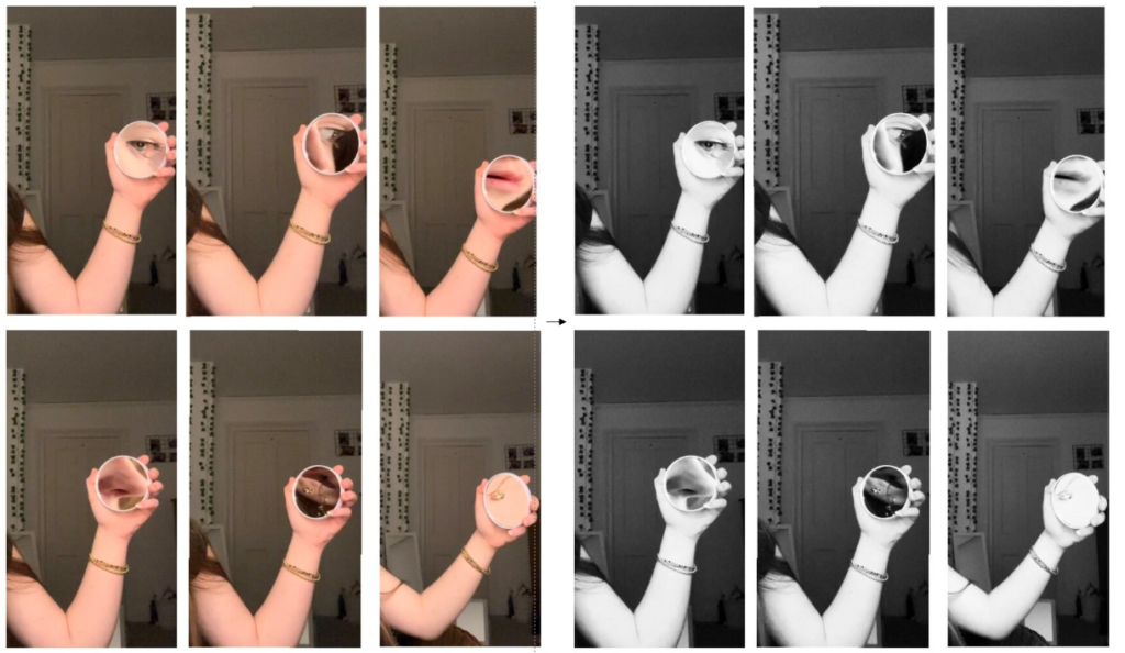
For this final edit, I simply needed to put all of the 6 photos side by side to create the film still effect that Michaels does. I decided to change the full colour to black and white as that is what he did in the photo I am inspired by.
Evaluation of piece
I think this photo shoot turned out well as it is very similar to Michals piece which shows that I have used an artist reference in one of my pieces. As well as this, I think this edit links to Femininity as I have zoomed in on aspects of a female face using a mirror. I also added an extra photo that focuses on the necklace. Though this isn’t part of the female face, it still shows a stereotypical female thing as they are more commonly the ones to be wearing jewellery.
I like this piece and how the mirror is only small so therefore only focusses on small aspects of the face. I don’t like how the two images on the end have the arm at different heights and I think I could’ve done better to make sure I stayed in the same position. I also think this piece would ha looked better if I had a plain background as sometimes a background with aspects induced may take the attention away from the main part.
Opposites
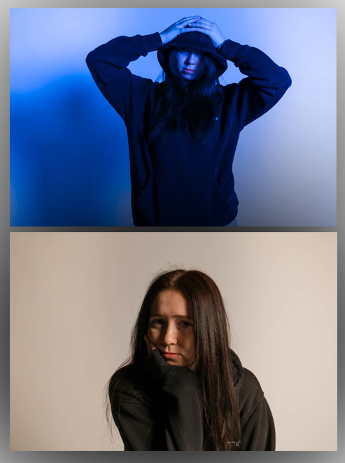
This photo wasn’t inspired by an artist but I wanted to represent opposites in one of my photos. For the top photo, I edited it by changing the lighting temperature to a cooler tone and then creating more of a shadow around the individual. With the bottom photo, I made it have a more warm tone.
Evaluation of piece
I think this final piece turned out well as it shows the contrast by the use of colours and poses. The first photo can be seen to picture a female holding more of a masculine pose with the hood up and hands on head whereas the bottom photo shows her with her full face visible and head resting on her hand. I also like the use of colour as the warmer toned bottom photo gives off a more soft a calming feeling which could represent more of a female character whereas the top photo is more darker, bold and blue which is stereotypically a male colour. I think this shoot was good as it was taken in the studio and with a camera which makes sure there is good quality and a plain background that won’t clash with the main aspects.
Femininity and Masculinity Gallery
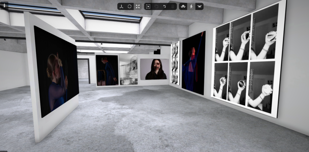
Environmental portrait Gallery
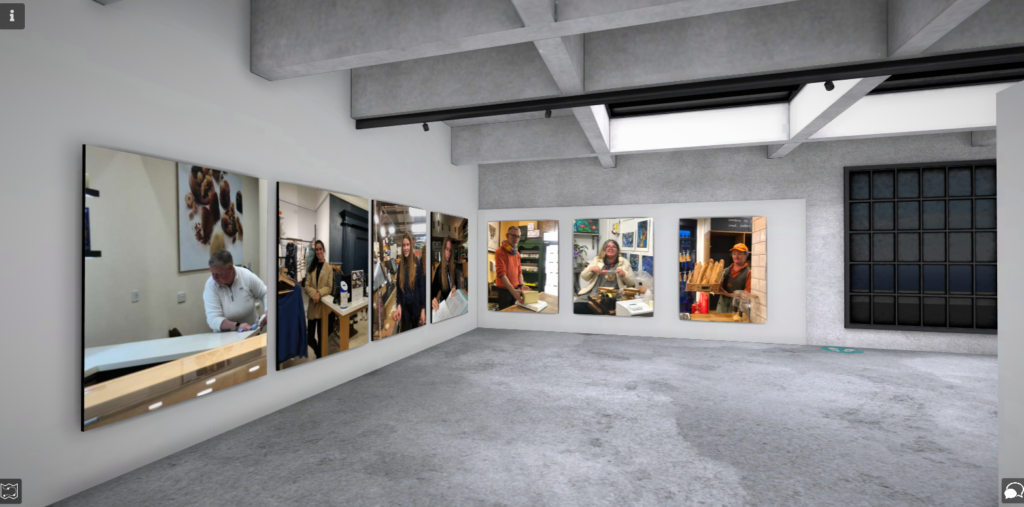
Studio Portrait Gallery
