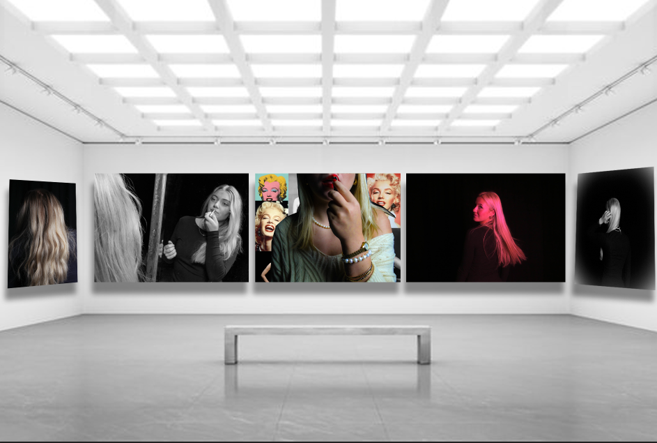
This is my virtual gallery and I put my favourite images in it. I chose these specific images because they are the ones I experimented most with and I love how they turned out. They are all unique and different but they all match the theme of femininity and Marilyn Monroe which I’m really proud of.
The image in the centre is the one that stands out the most and it immediately catches your eye as it is vibrant and colourful. I ended up putting two landscape images next to it as they are a bit longer than the others so they wouldn’t have fit along the outside walls. I like how the images are even moving out from the centre image it makes it look more professional but also pleasing to the eye. The images on the outer sides of the gallery are both of the back of the head. One is in colour and the other is in black and white this contrasts to the photos next to them where the photo on the far left is in colour while the image next to it is in black and white, and it is the same on the other side but it reverse. I liked how this looked because it didn’t look too even yet it looked good.
