Final Outcome 1:
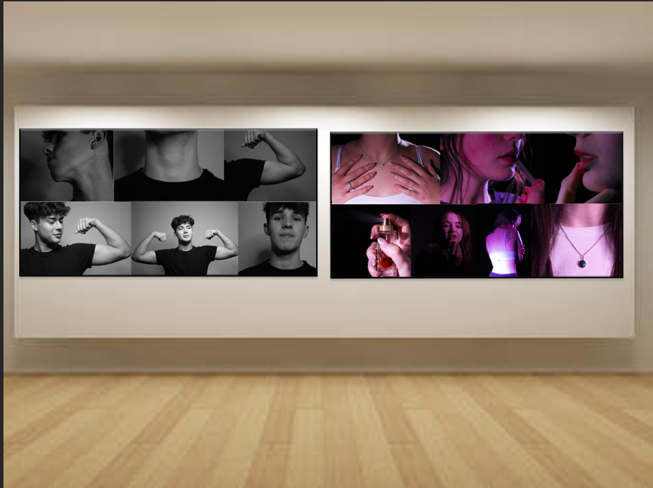
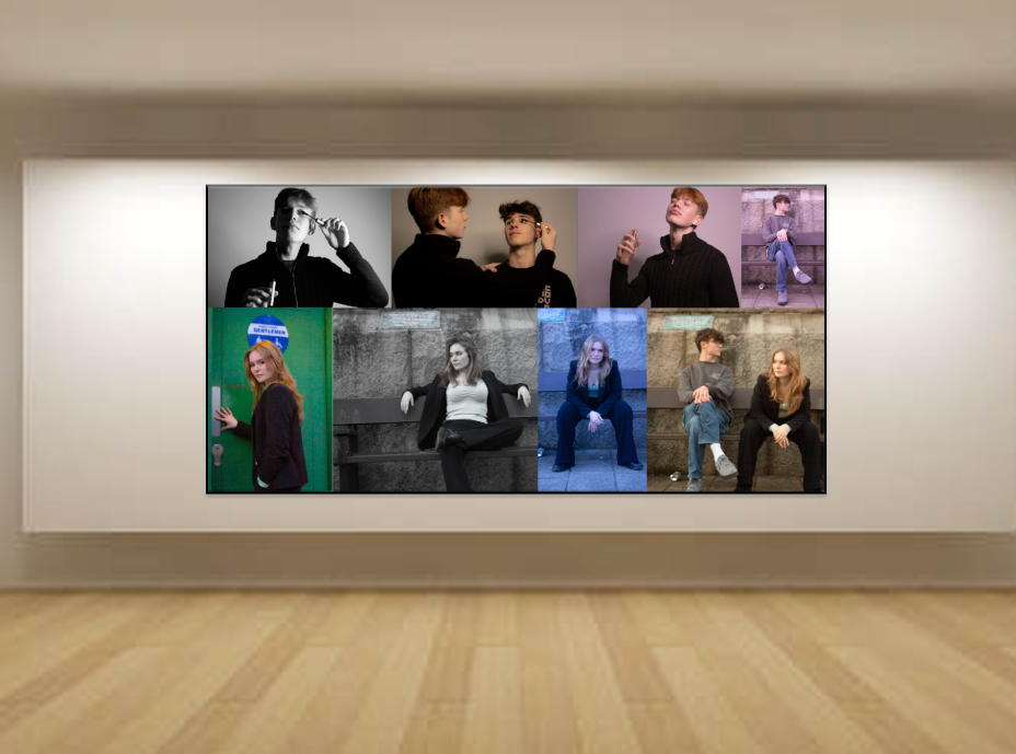
This is one of my Outcomes laid out in a virtual gallery. I presented it like this because if it was a real gallery you would be able to walk through and see the story it tells, firstly you see a stereotypical masculine selection of photos and then a stereotypical feminine selection of photos. So the viewer can see the life we are presented with since we are children. After seeing those selections, there is a final selection of masculine and feminine photos presented by the opposite gender, to fight against gender norms and society’s thoughts.
I like all the selections, I prefer the masculine and feminine separate selections as they are all similar colours and work together when the mix between both they are a mix of colours looks more oddly placed, but in a way, it does work as there is no stereotypical colour to gender and it shows more you can be whoever you want and whatever you want, you don’t need to set and stay to societies standards of gender norms, but in a way, I find it quite annoying and uneven.
I like how I edited these photos and enjoyed putting them in a collage for this way of expressing photos but I do think more would look good separately and edited slightly differently which I want to try, other outcomes that I will make I believe they would all together fit in a massive gallery and collectively tell a story.
Outcome 2:
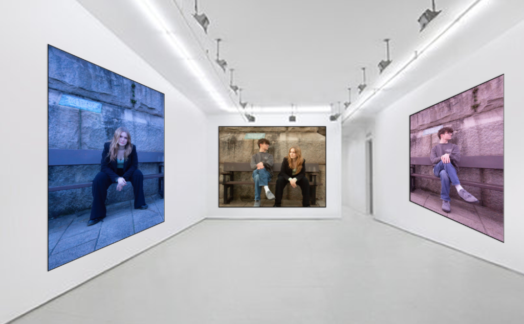
This is my second gallery which i actually really like because i have the pink tinted photo for a male who is sat in a common female pose, and then opposite is a female in a common male pose in a blue colouring, to show opposites and also how gender is seen but also how it can be presented. In the final photo the main one is in a yellow tint as it is gender neutral with both male and female sat in their poses, showing opposites as they look different ways, and it is taken in the same place.
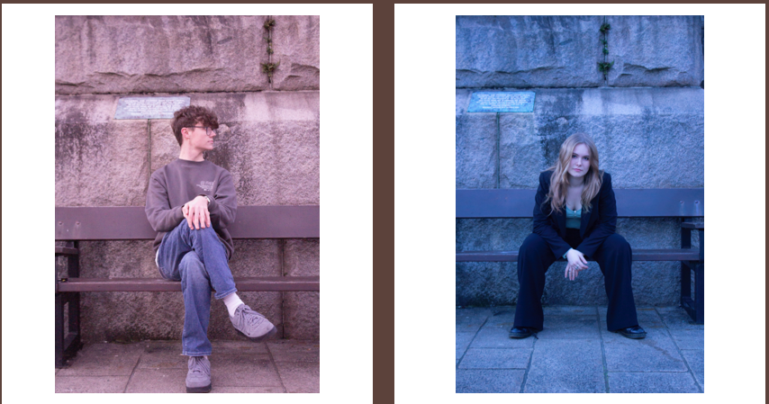
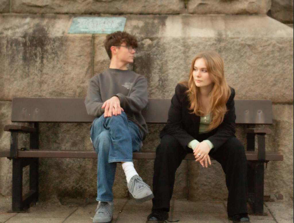
These are the photos in large to be seen better, I like them because the setting and how they are sat in same place in each photo, I had to edit out some rubbish and things that was on the bottom because I think they took away from the photo, I didn’t edit them too much apart from changing exposure and lighting colour over them. I really like them but there is still room for improvement as in the third photo of them both together I don’t think they are full even and that bugs me but other then that they work out quite well and accurate.
Some photos I want to present just on there own in a gallery because I think they look good by themselves.
Final outcome 3
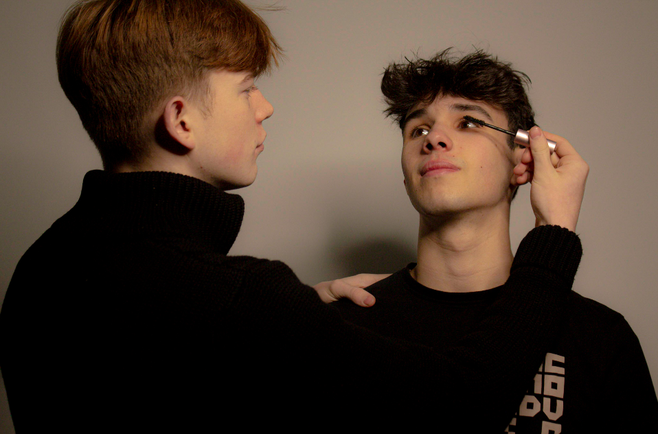
This photo i really like but I do find it’s a bit basic and not very exciting, the lighting wasn’t very good at first which I fixed but I feel like there is more I can add maybe make it brighter or add some colouring but I was a bit unsure on what I wanted to do with this photos and I still did like it as it clearly showed what I was looking for as they makes, yet they are doing make up and are helping each-other as girls would with each other.
Final outcome 4:
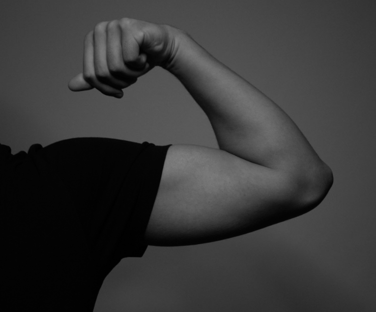
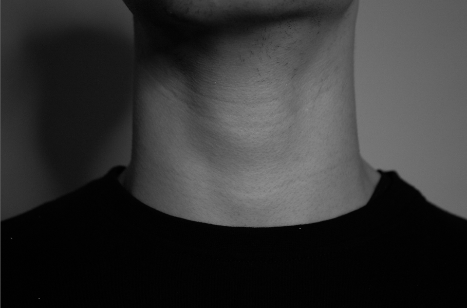
these two photos give similar vibes with the same lighting, I thought the grey and black worked better as it gave a more classically masculine and showed off the stereotypical features of a male like the muscles and Adam’s apple. I thought they looked quite cool actually and that was enough editing, these photos are also shown in my first final outcome, to show signs of masculinity, but also means that even though you can see these stereotypical masculine features does not mean that is all there is about these people and maybe even the lack of colour is showing them hiding their true self, and true colours and hiding behind things they think they should be.
Outcome 5
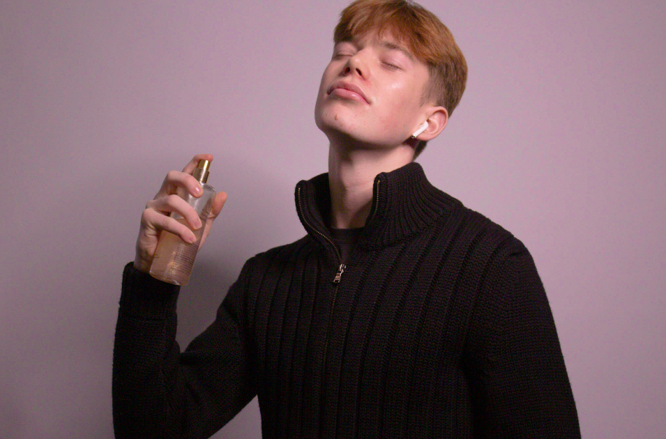
This is one of my favourite photos as I think the pink tint on that back works, I had to fix the exposure which again just looks better, I am very pleased with the outcome of this photo and upped the brightness just because I wanted to the pinky sparked of the perfume to come out more. I think it gives the vibes of a perfume advert you would see on tv, I especially like it because he committed very well to the photos I was taking and it not only clearly shows his jawline and Adam’s apple but also the perfume and glow from the makeup which just adds to the mixing of stereotypes, and he looks so confidence showing the viewer that he is confident in his gender that he decided and showing a feminine or masculine side to himself.
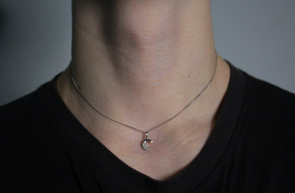
This photo is also slightly linked to the one above as they go together with the side of femininity, with the piece of jewellery and the masculine Adam’s apple. If I was going to do anything to fix this photo I might make it a more pink tinted colouring or at least brighten it more to show the emotions through the image of happiness and joy and confidence instead of it looking a little dark and gloomy, other then that t portrays what I am looking for again and links with the one above and I think they would look good together in a gallery.
Outcome 6
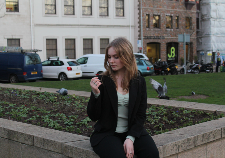
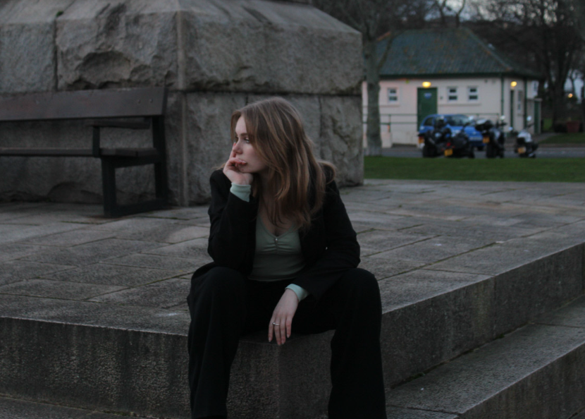
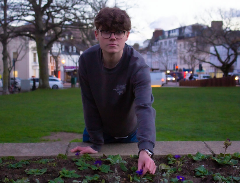
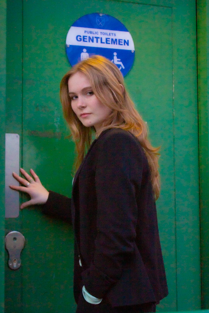
these four photos I love, I think they all go together really well as well as they go with the second outcome, I edited the vibrance of them which went together better, but I just like the masculine posing and contrast with the women going into the men’s bathroom and a man picking a flower or they women manspreading, it is just really denying gender norms like how Claude Cahun did they just please me and just show exactly what I was looking for and I plan to put them in a virtual gallery. I think the first two especially the flower one could use a bit more brightness and vibrance to match the vibe of the other two as I would love for the flowers to pop out more and also have it genuinely not looking so dark.
Outcome 7
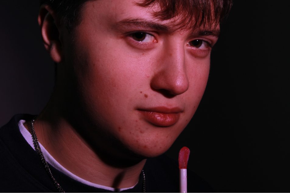
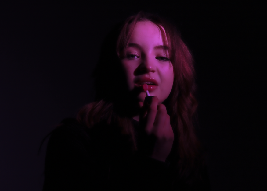
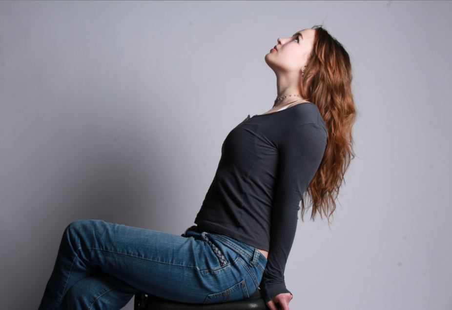
The first two very much work together as a man and woman using the same lipgloss, I like the third one and added it in with these as I like it and it was the same person and clearly showed feminity in a strong powerful woman way. Although in the first photo he is adding lipgloss he is still giving a powerful strong manly look which is also why I think it matches with the third one as they are both showing powerful sides of femininity and masculinity.
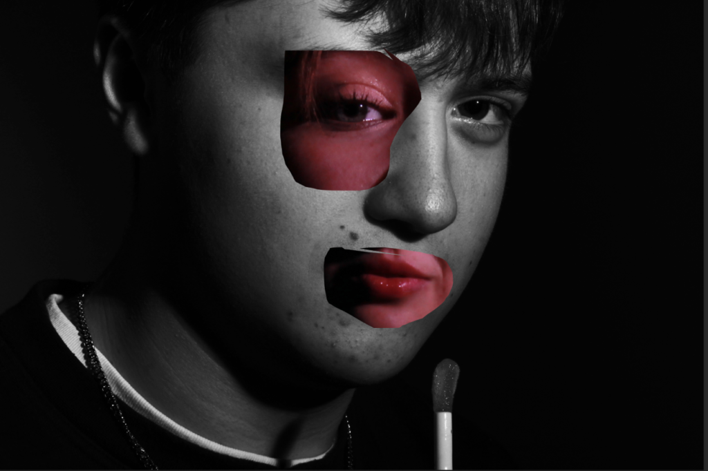
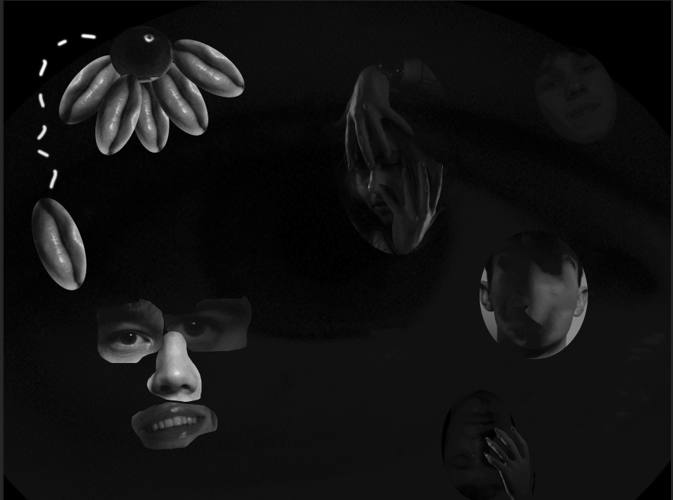
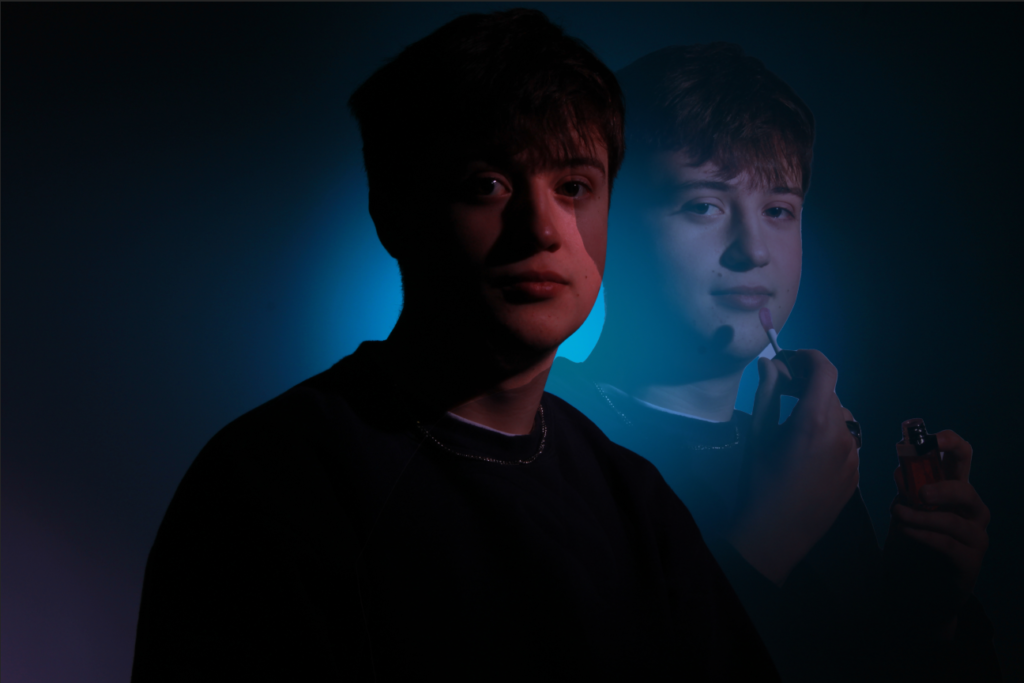
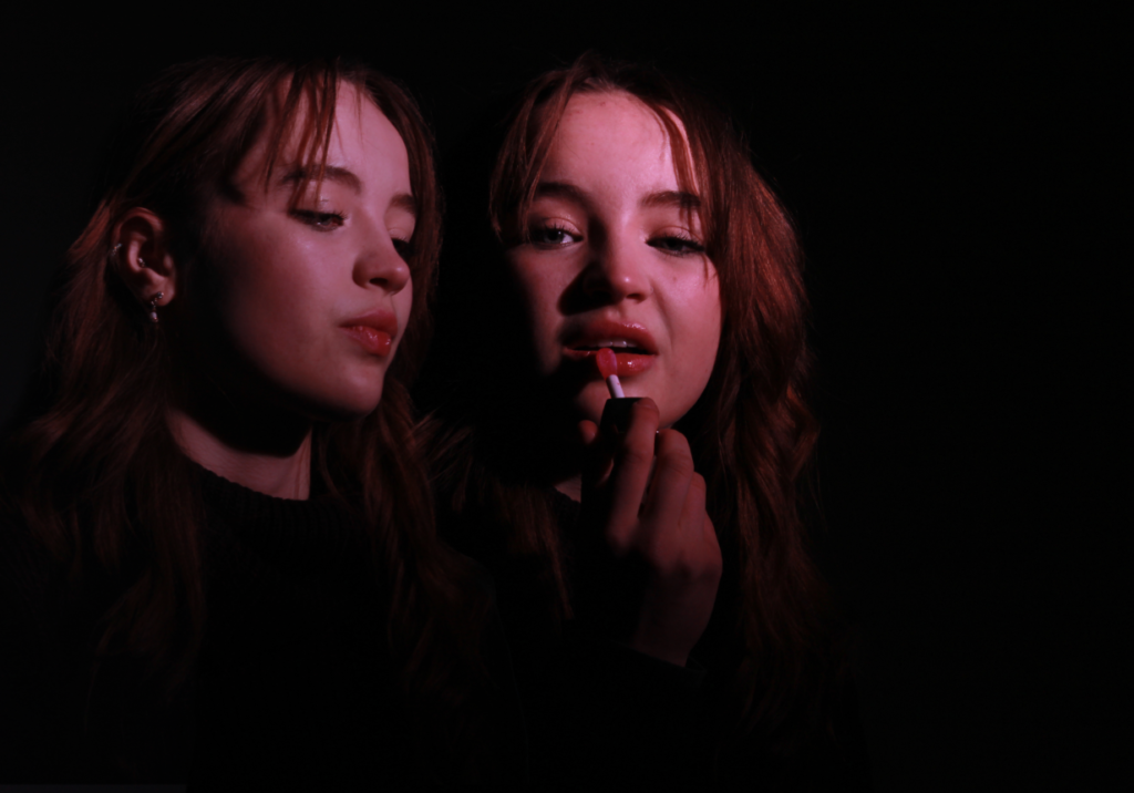
These are some of the final ones that I think were edited quite well and are mainly similar to my artist references and compare well with them, I love the lighting and poses in these photos and the second one did take some time to edit and I still think could be improved as there aren’t really enough misshapen faces and object around or not that you can fully see clearly.
