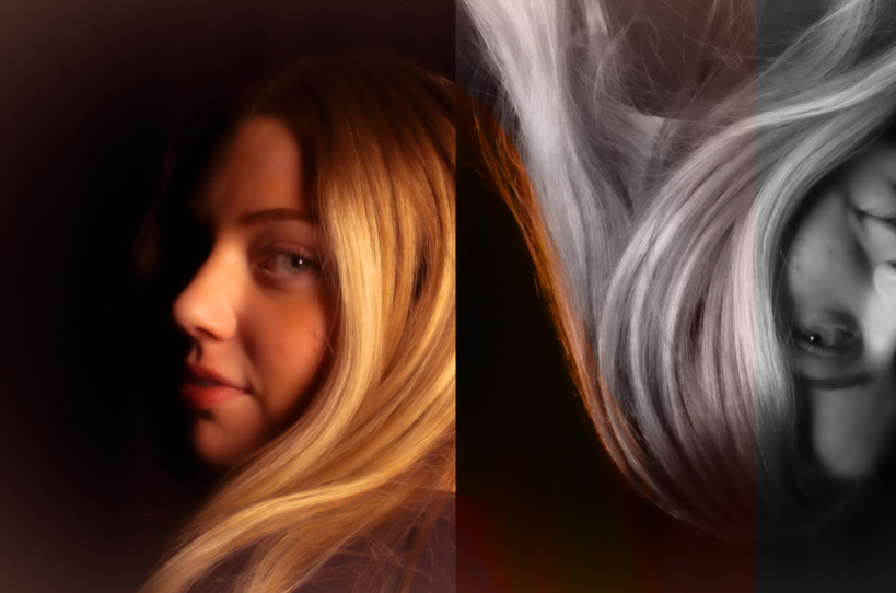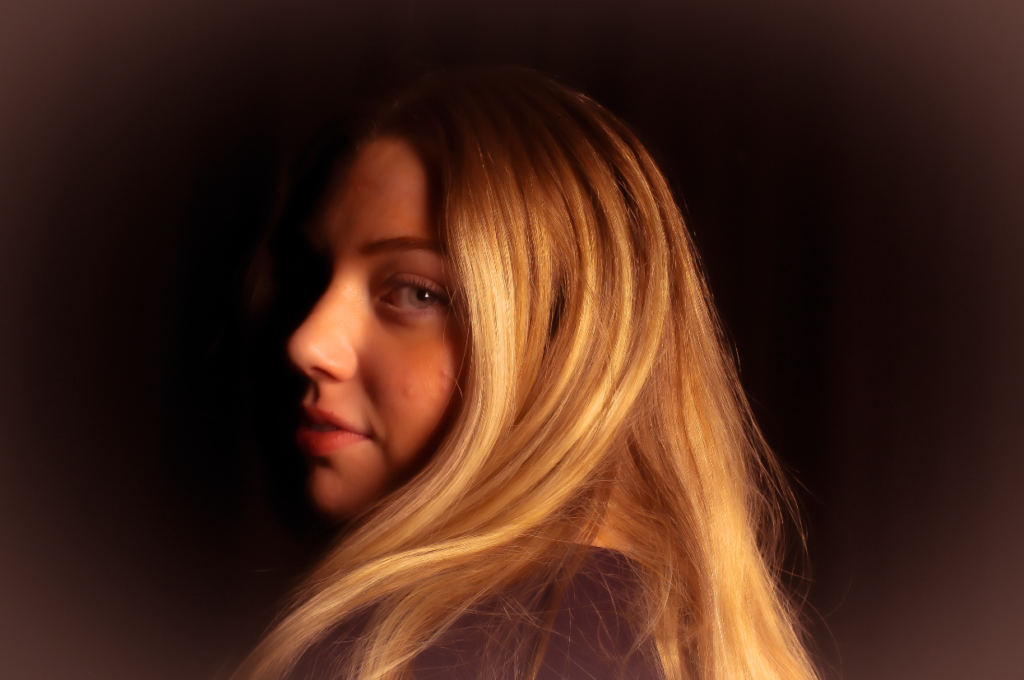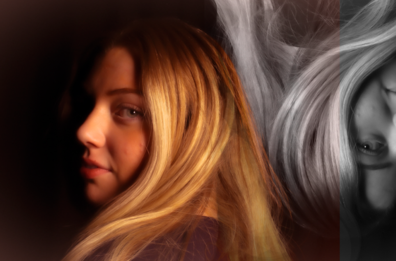

Within this image, personally I think in adobe Lightroom my editing went well. The shadows are visible and play a large factor in this image and I prefer this lighting technique (chiaroscuro) and glad I chose to execute this technique as it creates a sense of mysterious, gentle and beauty which is a big part of femininity. I like how I used warm tones to make it look vintage and not modern although it was shot on a modern camera I tried my best. I decreased the texture and clarity to create a soft focus and more professional look to the image which links to Cameron’s work. I preferred using a black background as it makes the subjects left side of the face unable to see as the way she is standing you would, this emphasizes the shadows and technique I chose to do to create it almost the first thing to notice as a viewer. Then I continued on photoshop and created another layer with the same image and turned it upside down and experimented with the highlights and filters. When I found the correct one for me I loved the way it looks purposely imperfect which could imply that females and males have a pressure to reach expectations but we are all imperfect and make mistakes. To make this image better I would move the first split/line more to the left to make the image equal in thirds. To experiment I tried to blend the images however I didn’t like it as much as it didn’t give off the same abstract effect.

